


Halo is a private halotherapy club created for those who actively care about their health and well-being. The main audience is people aged 35 to 45 years old who seek to spend their precious vacation with benefits, surrounded by like-minded people.
The concept of the club is to provide guests with a comfortable and high-quality stay. Each member of the club has the opportunity to get advice from a specialist doctor and valuable recommendations for maintaining and strengthening their health. Our institution is also proud of providing a variety of beauty and care procedures so that guests can not only strengthen their physical condition, but also enjoy a well-deserved relaxation.
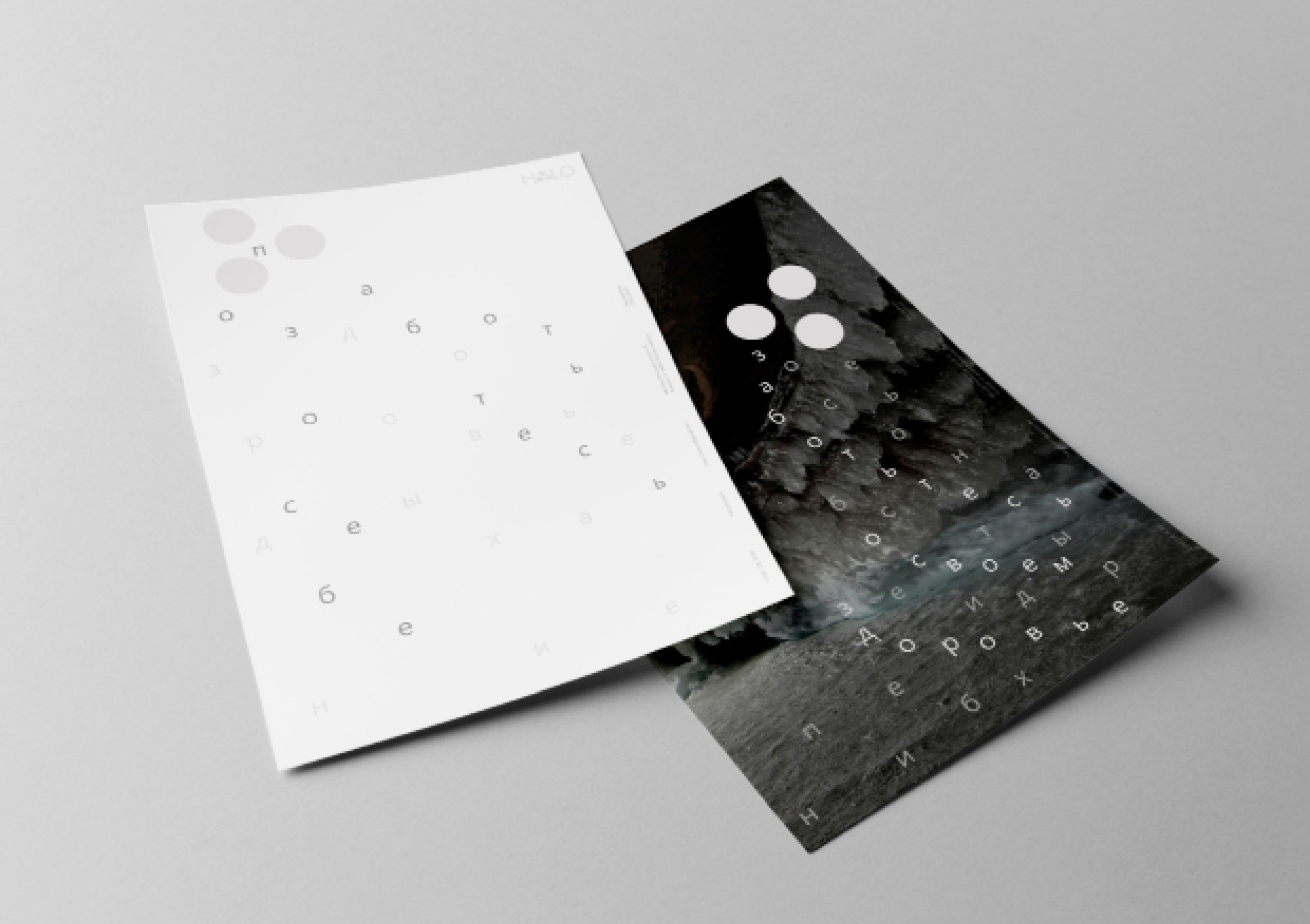
The unique concept of the corporate style was the symbol of the salt shaker, a characteristic and well-known symbol of salt. Texts pour out of it like grains of salt, forming a bizarre typographic solution.
In the design of the club and advertising materials, we actively use round shapes, which become the main element of the style and symbolize unity, perfection and constant movement. They remind us of salt crystals in a salt shaker, emphasizing our specialization and our uniqueness.
The club’s logo is not only its name, but also a key element of our style. A special feature of the logo is the replacement of the letter “A” with a stylized element reflecting the metaphor of the salt shaker and emphasizing the uniqueness of our club.
Thanks to the corporate identity, it turned out to create a cozy and inspiring place where people can not only take care of their physical condition, but also find new friends, enjoy communication with interesting personalities and recharge with positive energy.


CREDIT
- Agency/Creative: Kovalenko Ksenia
- Article Title: Halotherapy Club Halo Brand Identity by Kovalenko Ksenia
- Organisation/Entity: Student
- Project Type: Identity
- Project Status: Non Published
- Agency/Creative Country: Russia
- Agency/Creative City: Kovalenko Ksenia
- Market Region: Global
- Project Deliverables: Brand Identity
- Industry: Health Care
- Keywords: Kovalenko Ksenia, Brand Identity
-
Credits:
Tutor: Tanya Dunaeva


