Half & Half: Two Halves – One Life
What Can Be More Touching
than videos with kitties? This is the case when, three months after the start of the war, the Ukrainian manufacturer from Kharkiv applies for the development of its own brand of pet products with a quite wide range.
Meeting the team of Suziria Group, one of the largest distributors and manufacturers of pet products, inspired us as much as they are inspired by love and care for their pets.
Ukrainians passed the trials of the previous months, the social test of humanity, with dignity with their friends across all borders of the world and even on the front lines.
So, when we went through the first stage of strategy and positioning development together with the client, we identified friendship and the relationship between humans and animals as the core of the future brand. And this idea of friendship and closeness was later carried through all the media of verbal and visual branding.
Those Who Know Will Understand:
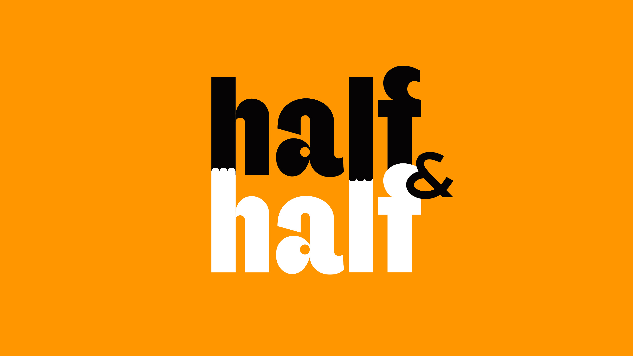
life is not the same without a dog or cat. It’s such an interesting mutual dependency, when you don’t know who is the master for whom. You live a fulfilling life when you share your life with your favorite pet. So, the idea for the brand name was not long in coming: Half-and-Half means to share everything in half and equally. Everything fits here, because it combines the clear meanings of the name into a single, multi-layered puzzle: human and animal, cats and dogs, food and non-food products.
Just listen to this name: huff-huff. It sounds like a dog, hungry after a walk, pouncing on food. Or a cat scratching on a scratching post. Or a rubber ball bouncing around the apartment.
Moreover, the client team was attracted to this name right during the presentation. So the puzzle was complete.
Later, the Halves
of the name developed into a conceptual logo, which forms the basis for the further visual duality of the entire project: a paw joins a paw, black joins white. Two halves become one life. This idea and philosophy was reflected in the brand slogan.
Such Pictures
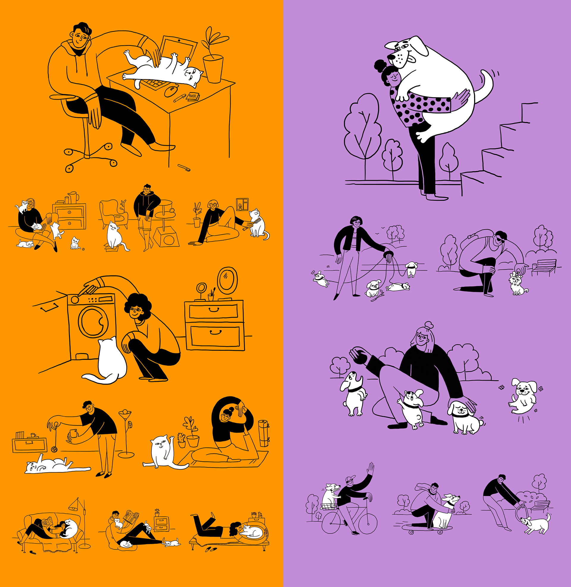
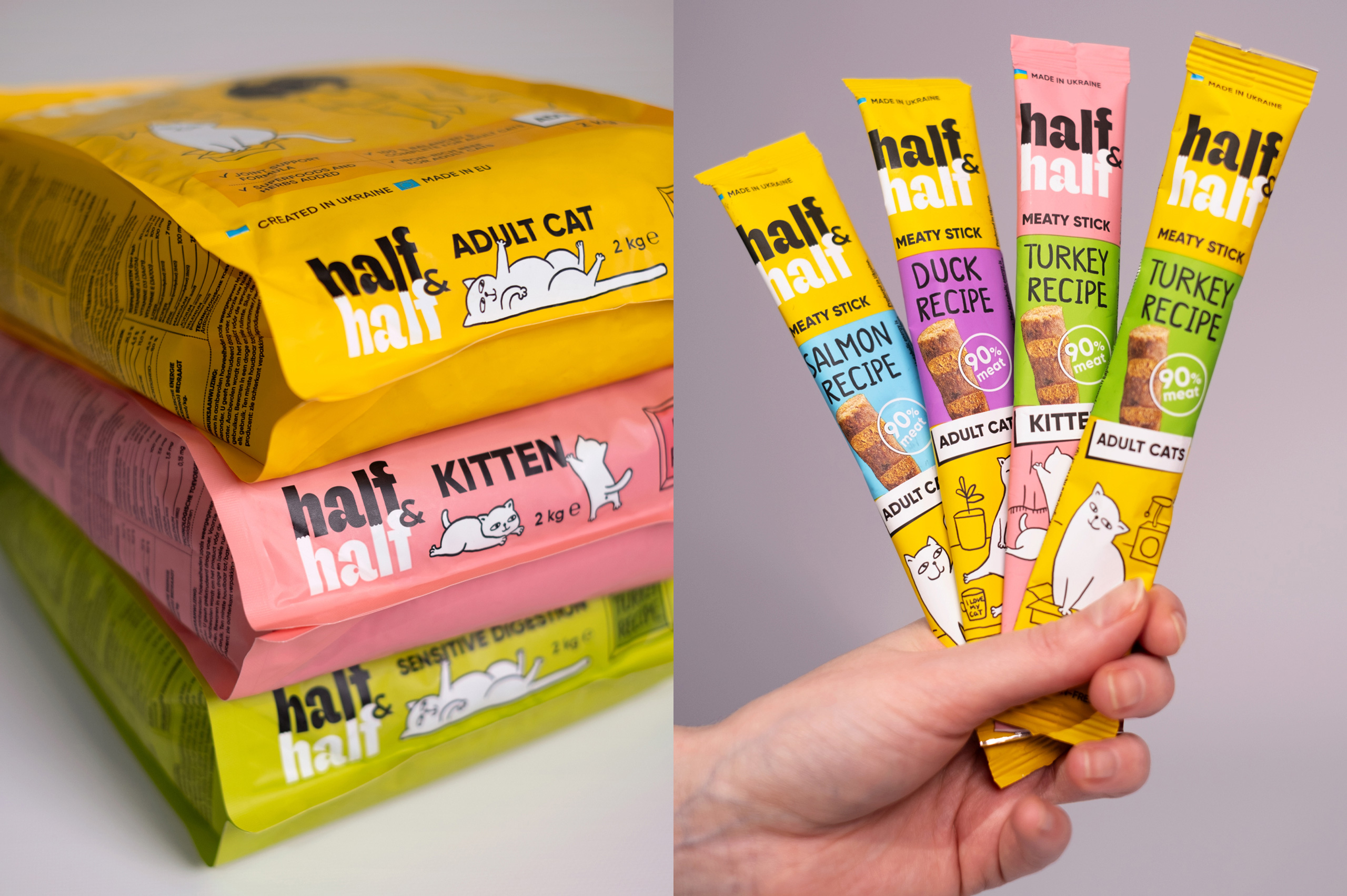
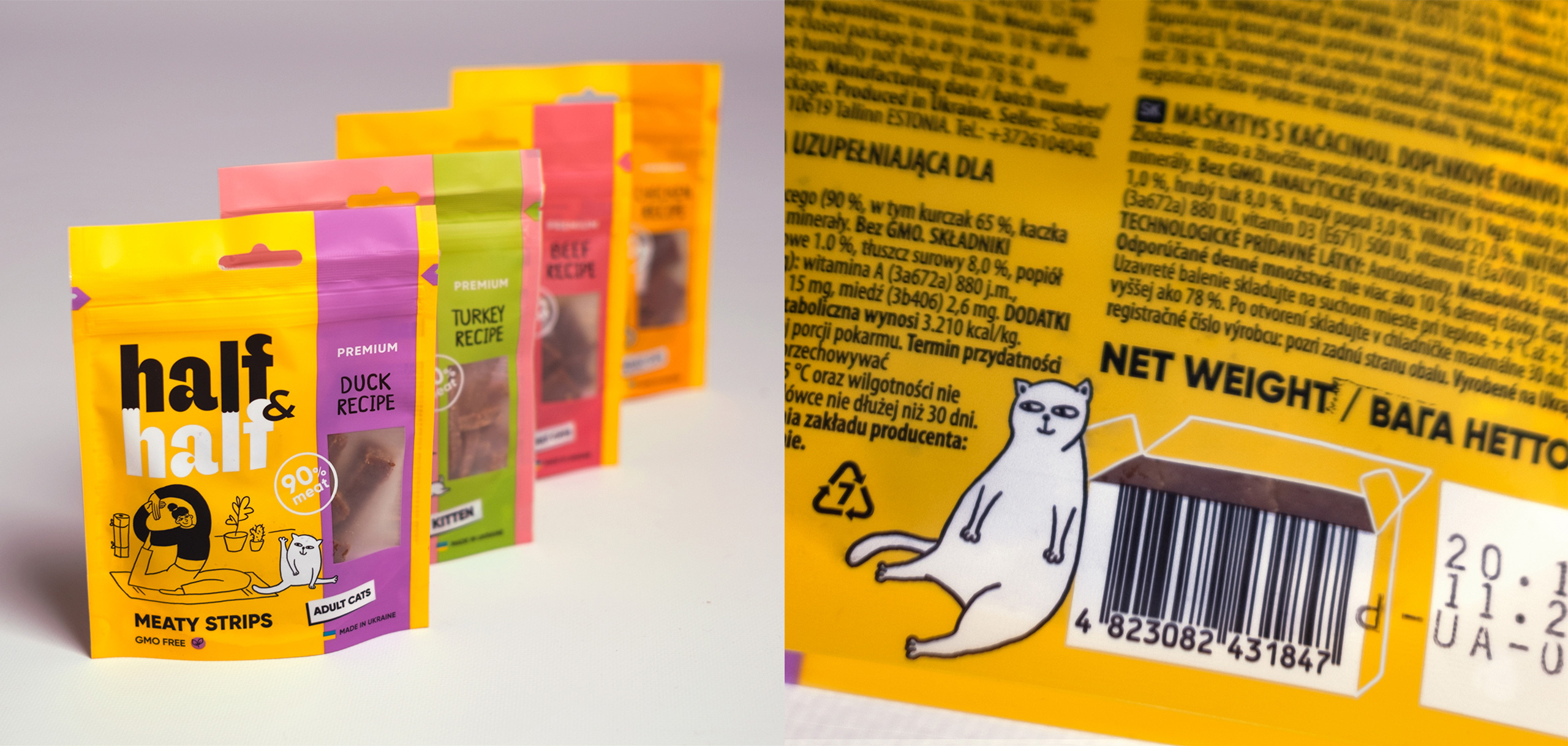
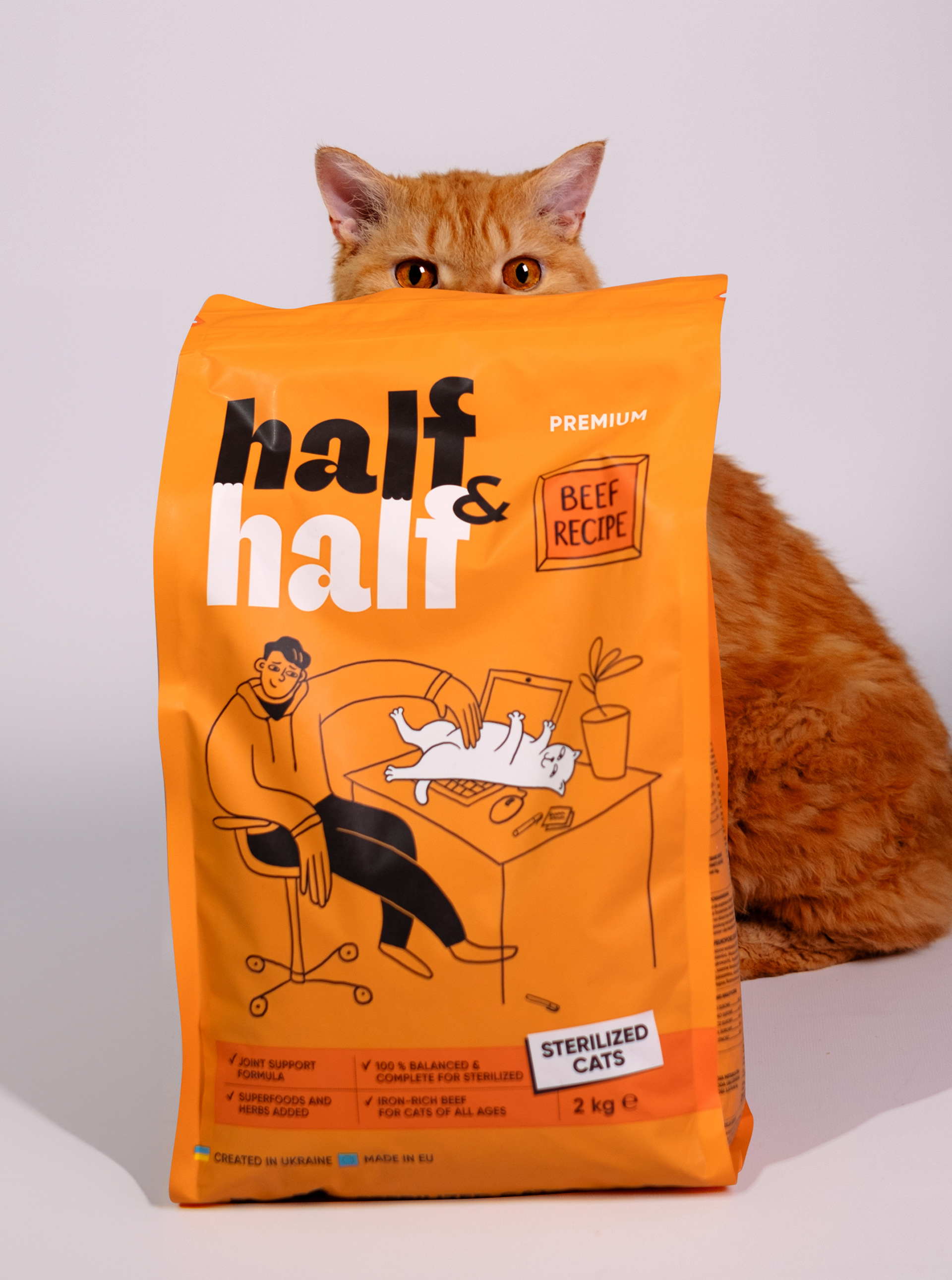
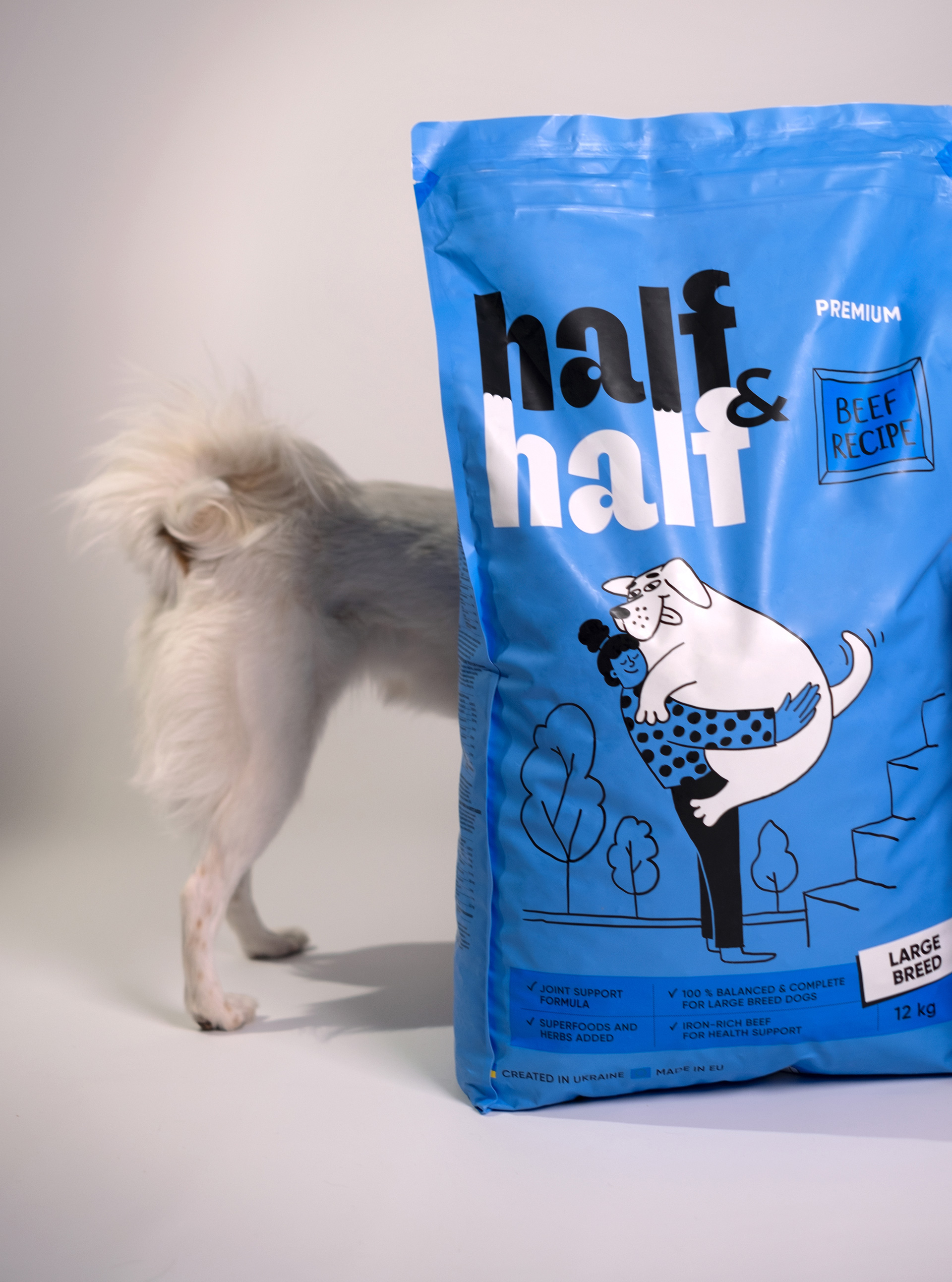
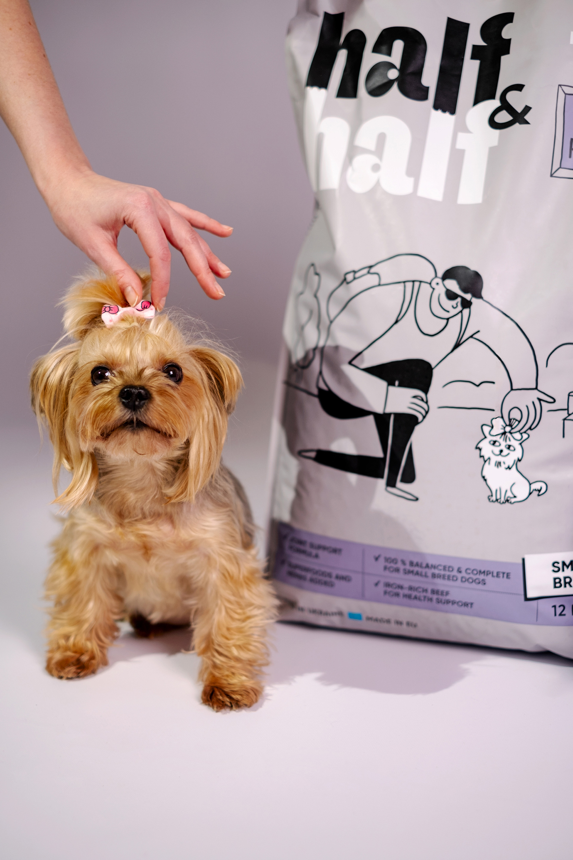
can be seen around us every day. But you don’t need super-realistic camera equipment to do it. Developing the packaging design, we decided to abandon the banal images of lonely animals and create a new world about true friendship. As if in a hurry, we sketched out how cool it is to play together, comfort each other, work on a laptop, share a sofa and a yoga mat… The harmony of duality has become an overarching idea in design. We can see a play of contrasts everywhere: human and animal, big and small, thin and bold, light and dark, calm and harmful, and finally, cats and dogs.
We have proposed a system of product categorization, name architecture and color-coding of assortment items in food and non-food categories.
Despite the Fact That Half&half is Strictly
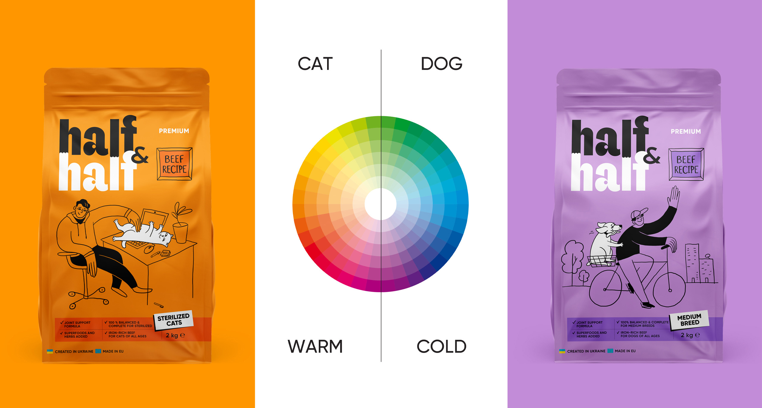
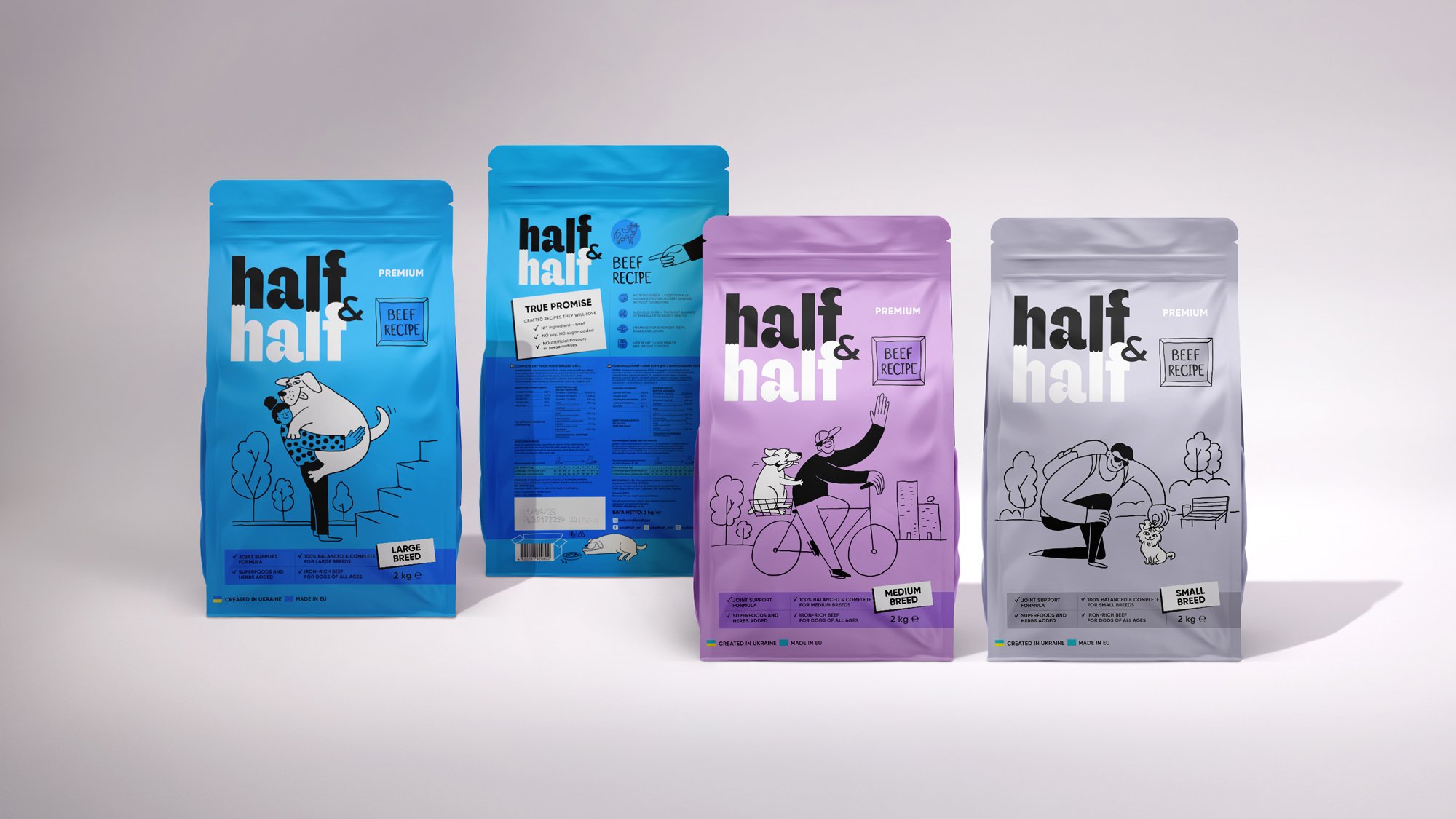
about warm-blooded animals, creating the overall style of the brand, we have developed certain temperature color rules for working with the product portfolio. Everything for cats is in a warm palette, everything for dogs is in a cold one. Wet foods are distinguished from dry foods by the addition of a contrasting color pair at the bottom of the package, which also serves as an additional flavor differentiator. These and many other principles are set out in the brand book.
Kitty, Kitty, Kitty
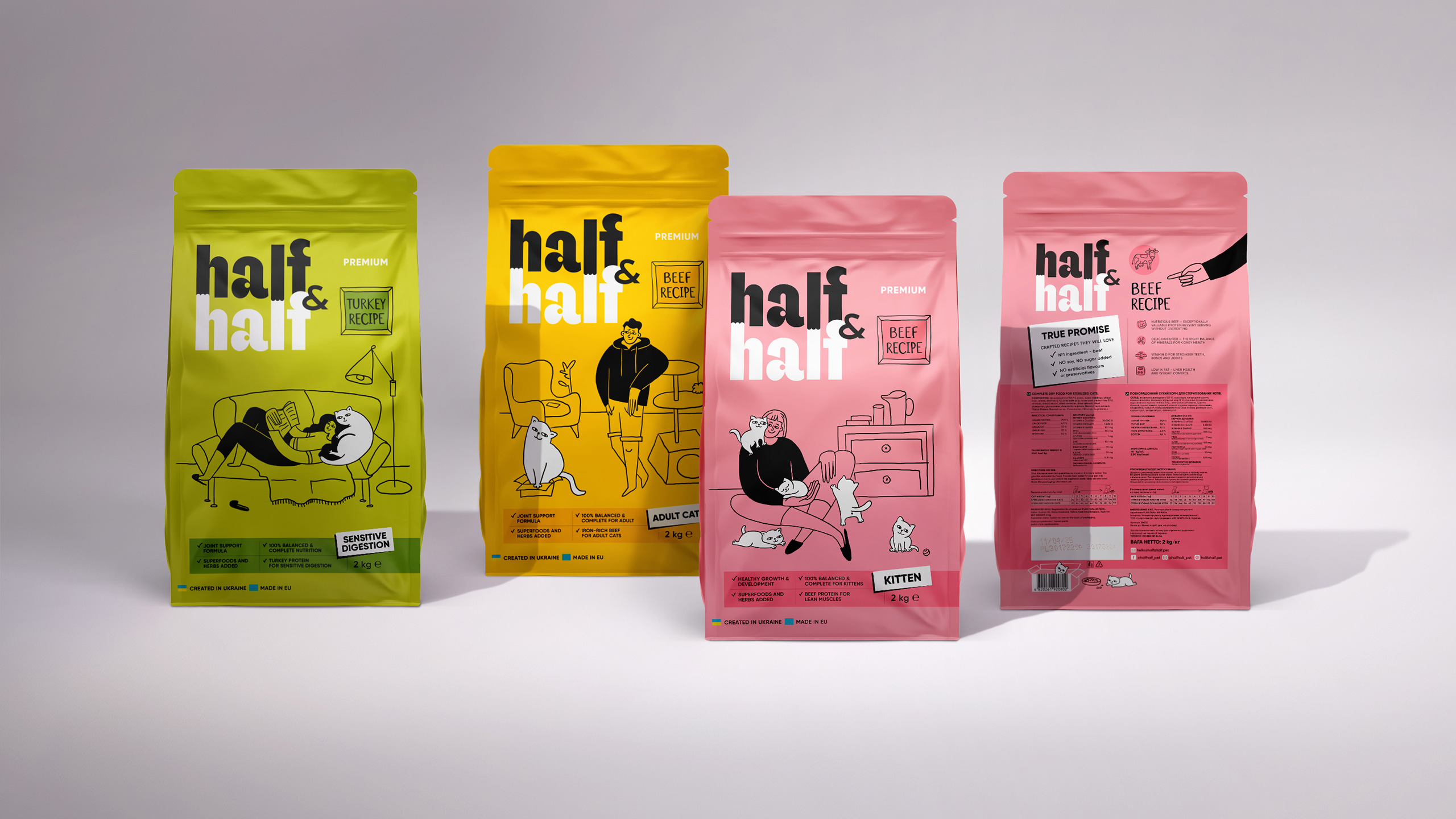
…hey, what are we having for lunch today? Duck meat sticks or crispy beef? We tell and show you everything on the packages. We use the surface to the maximum: On the bottom and on the back, you can see an easy illustrative game and funny pictures of little pranksters. We have chosen such interesting stories and warm appetizing colors for cats that it seems even the masters will not be able to resist enjoying these delicacies. But be careful: the white label says for whom this or that food is intended.
Give Me a Paw
or even two… Or give me two packages at once. Everything is just as tasty for dogs, but this time it’s for their dogs’ lives. Food windows appear on some portioned packages. The colors are cooler. Dogs have dichromatic vision. It is believed that they see only blue and yellow. They also see purple as blue. So we hope that just every dog will recognize our packages now.
Who Is This
pretty guy with Half & Half merchandise? We are always happy when the ideas developed to promote a brand are not restricted to being in a brand book, but are realized in cool, stylish and useful accessories.
We Can’t Miss
one more interesting thing we created for the brand: branded stand shelves. This is also an expression of the harmony of duality inherent in the brand’s philosophy and a continuation of the visual style that works on contrast. The interiors of the Half & Half world become a part of living interiors. We believe that fans of their furry friends will not pass them by on occasion. There’s another magic mirror that also reminds us: look at your mate and don’t forget the goodies for your friend.
The Rather Long Portfolio
of the brand gave us the opportunity to run the color wheel to the fullest. Warm and cold, bright and restrained hues — everything was used. On a rich and already quite bright shelf of pet products, Half & Half presents the most noticeable and positive range of packages. They provide not only goodies for pets, but also color therapy for their owners.
Half & Half Are Warm Stories
of food for tailed friends, but they also energize human hearts. Because they were started in a time that highlighted the truth: every life matters. Every love becomes twice as big when it is shared in half. Sometimes people save animals, and sometimes animals save people. And may these mutual fluffy stories never end.
In total, we delivered 40 packaging designs within the project. In 2024, the brand entered the market and in the first month of sales, the plans were exceeded by 25%. Exactly half of half.
CREDIT
- Agency/Creative: Dozen Agency
- Article Title: Half & Half Pet Products Branding and Packaging by Dozen Agency
- Organisation/Entity: Agency
- Project Type: Packaging
- Project Status: Published
- Agency/Creative Country: Ukraine
- Agency/Creative City: Kyiv
- Market Region: Europe
- Project Deliverables: Art Direction, Graphic Design, Illustration, Logo Design, Packaging Design
- Format: Blister-Pack
- Industry: Manufacturing
- Keywords: pet, food, pet treats, design, packaging, logo, illustrations
-
Credits:
Art Director, Illustrator: Elena Gavriluk
Illustrator: Anastasia Churbanova
Technical Designer: Maria Hlius
Brand Book Design: Roman Melnyk
Animation: Maryna Kizilova


