Singapore’s healthcare system is designed to ensure that everyone has access to different levels of healthcare in a timely and cost-effective manner. Despite the perceived affordability and availability of the support system, some chronic disease patients still encountered difficulties in managing care. There were barriers on care access, delivery and self-management. Furthermore, the quality of care usually deteriorated after patients discharged from hospitals.
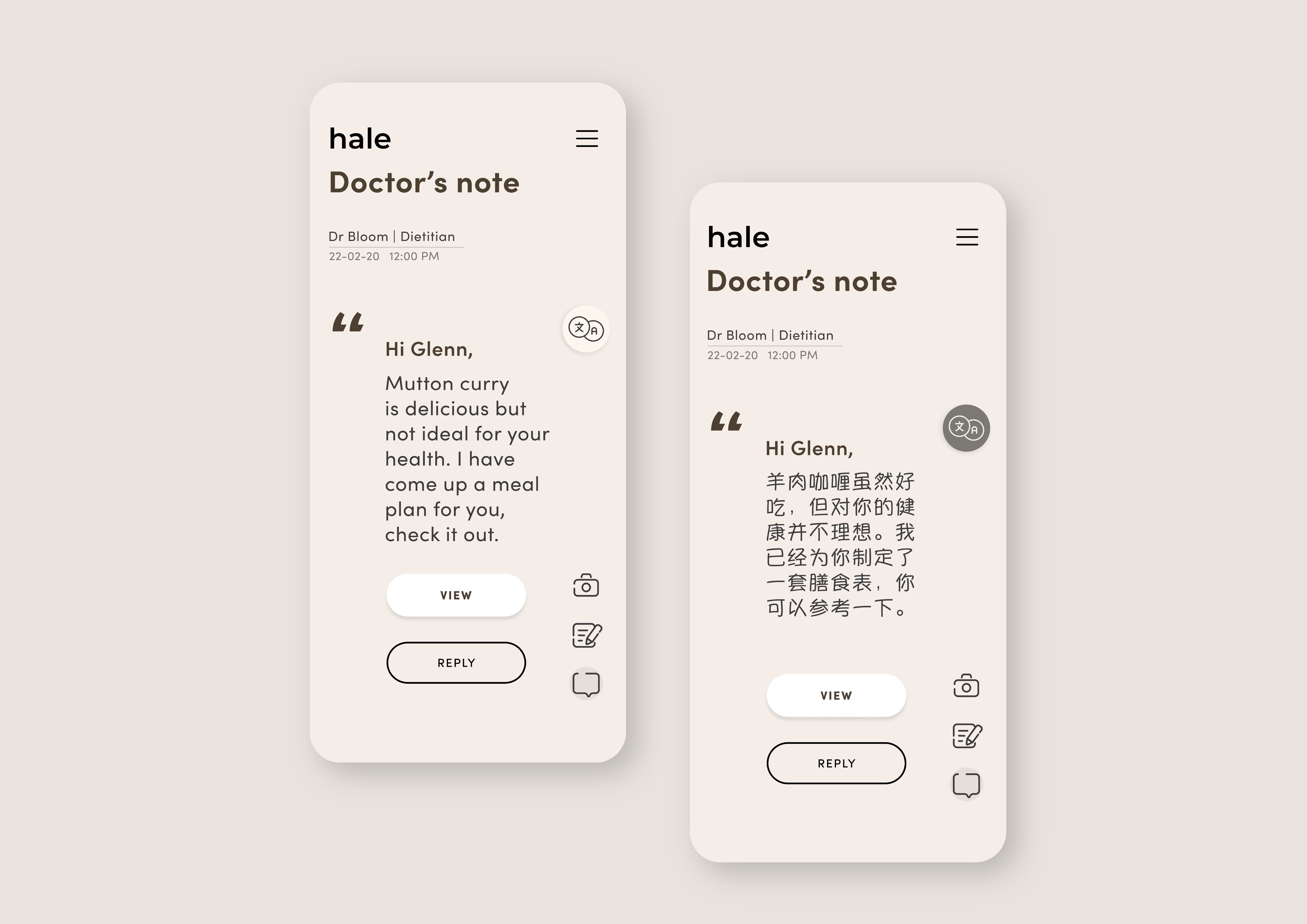
To tackle these issues, Hale is designed to be a hybrid of chronic disease and lifestyle management app. It aims to provide care continuity beyond hospital and help patients live a quality life. Hale means strong and healthy. The word itself also has a hidden meaning of “heal” when the alphabets are rearranged.
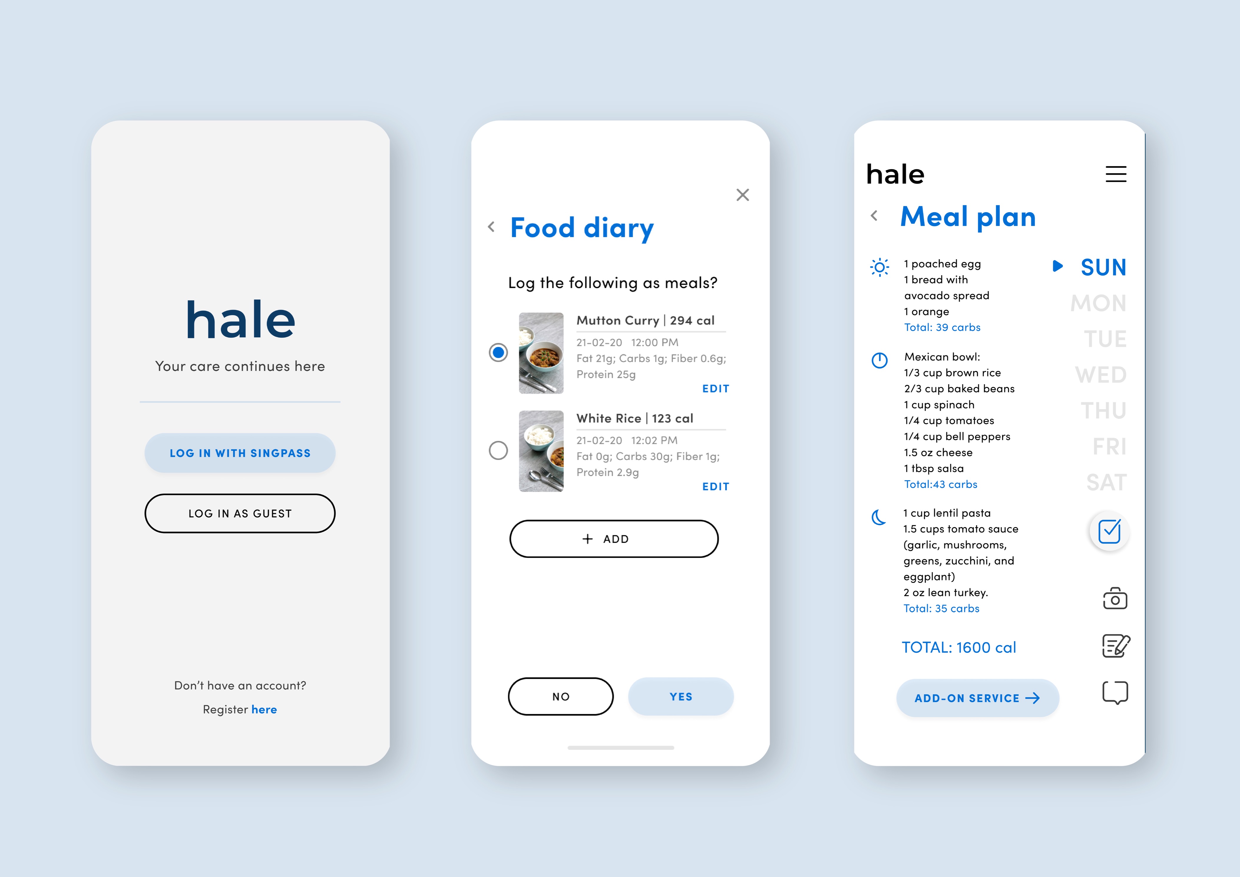
The main function of the app is to provide personalised and actionable insights to the user. This is achieved through the analysis of user’s data collected from various channels such as hospital lab reports, trackers, and medical devices. With user’s consent, the data is collected 24/7 after user is discharged from hospital. This data will speed up the emergency protocol in the event that the user falls down or heart attack occurs. In addition, the data will also be shared with user’s primary doctor. With remote monitoring in place, doctor can come out with a better treatment plan for the user.
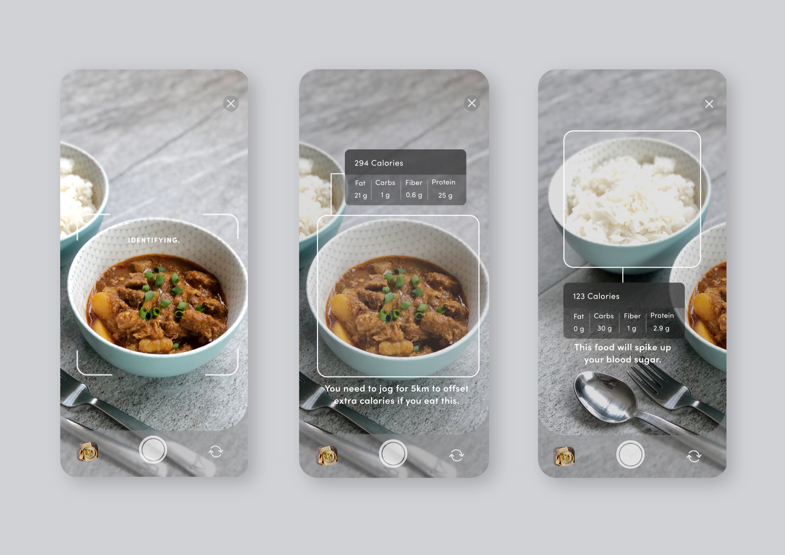
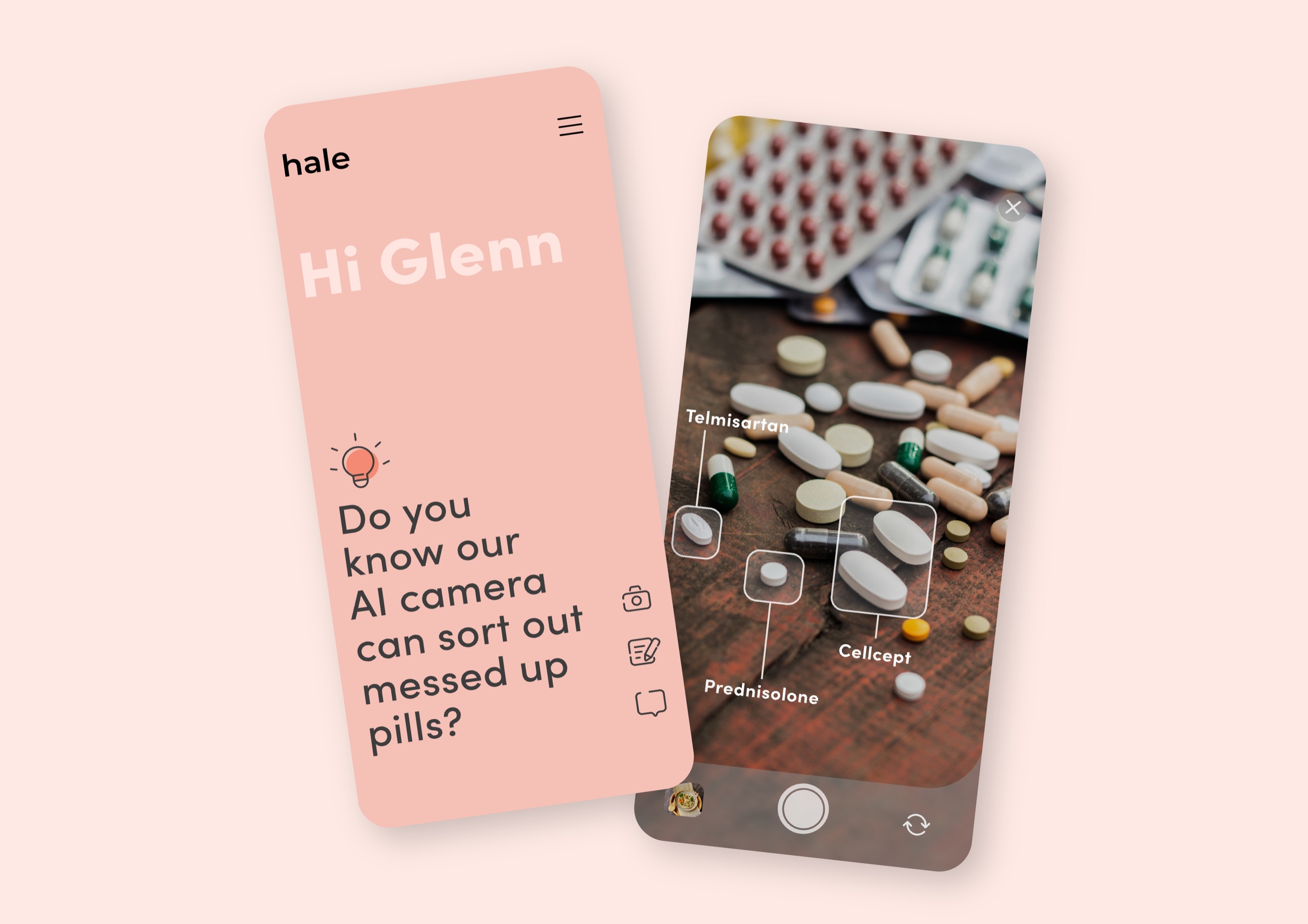
One of the highlights of the app is its AI camera that will show the nutrition value if user points the camera to a food. Besides food, the AI camera is also able to identify mixed up pills. Early user testing on prototype showed that many users were interested in the feature of AI camera for its convenience.
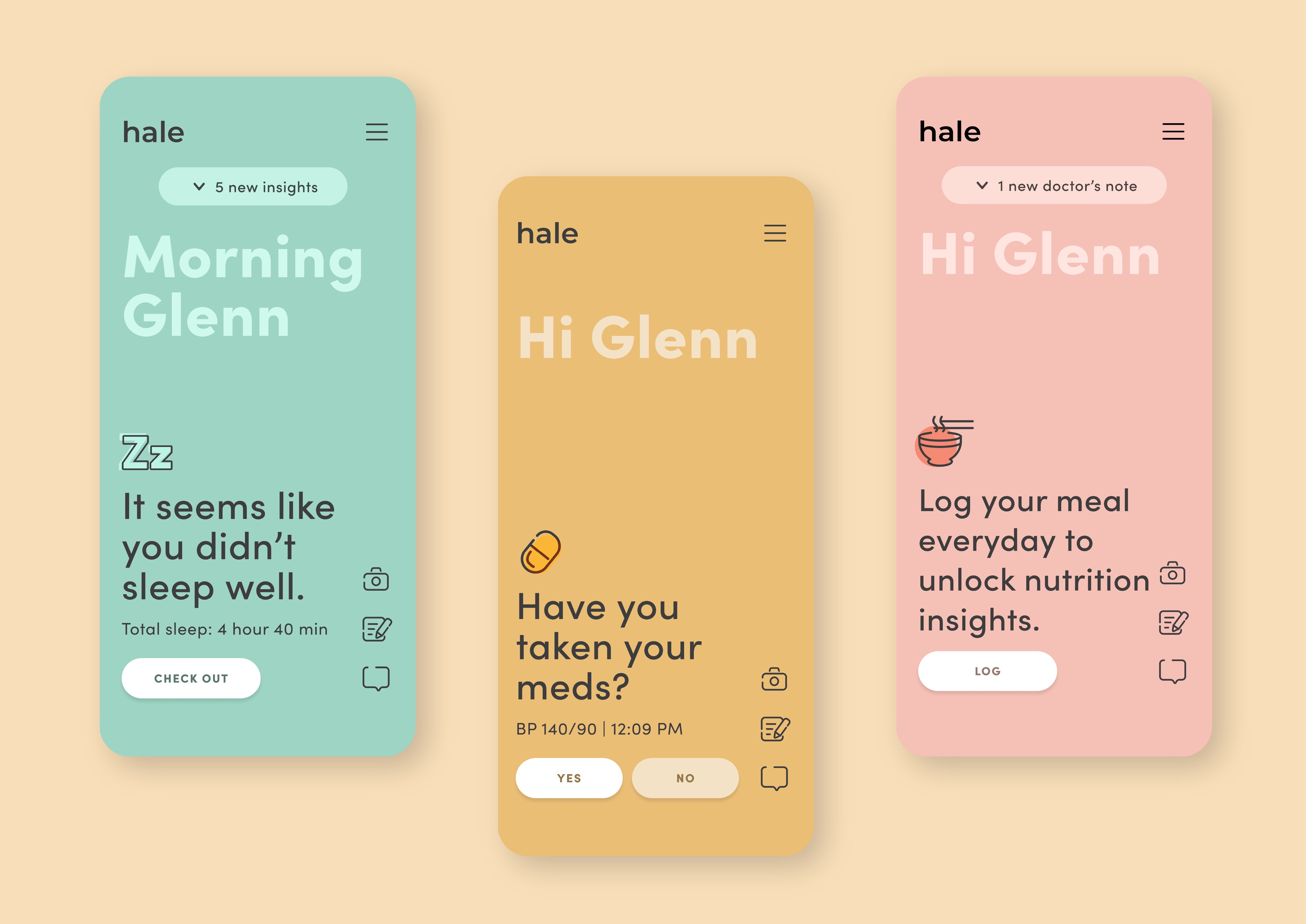
The interface of the app is very minimalist. It’s designed to help user focuses on one thing at a time and only necessary information will be shown on a page. Different background colours are also assigned for different themes such as yellow for reminders, pink for tips, green for analysis etc.
Living with chronic disease is not easy. It requires patience and support from family members to succeed. One of the challenges of the app is the low adoption of technology among the elderly. Therefore, the next step of the app is to develop the second line feature for caregivers to co-use the app with the patients.
CREDIT
- Agency/Creative: Yong Bangrou
- Article Title: Hale Digital Design Concept
- Organisation/Entity: Student
- Project Type: Digital
- Project Status: Non Published
- Agency/Creative Country: Singapore
- Agency/Creative City: Singapore
- Market Region: Global
- Project Deliverables: Digital Art
- Industry: Health Care
- Keywords: WBDS awards, Student
-
Credits:
Educational Institution: Orita Sinclair School of Design and Music - Interaction Design
Educator's Name: Chua Yee Ling
Photographer: Selina Thomas


