


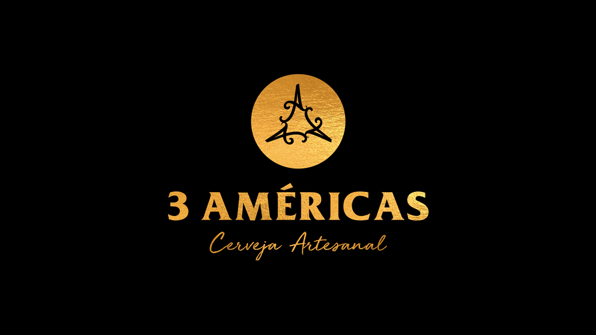
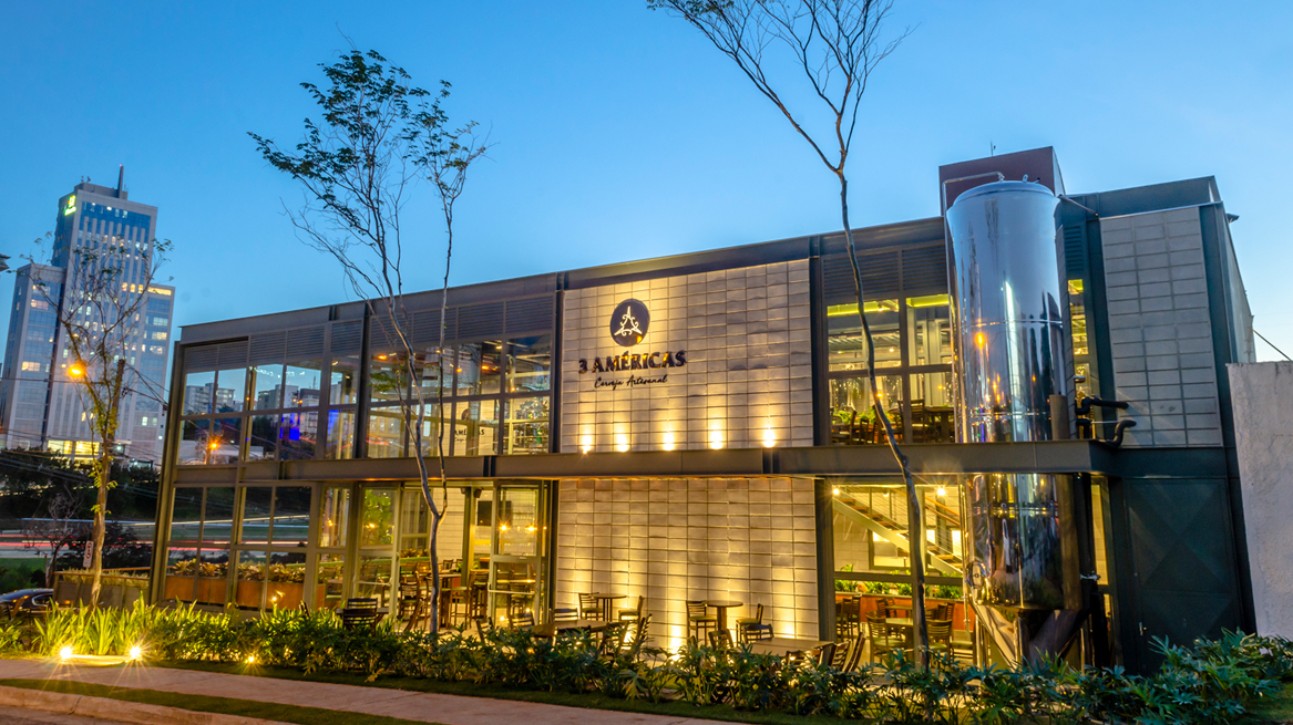
3 AMERICAS was created to demystify beer and provide the best aromas, flavors and textures. The satisfaction of tasting a beer made only with ingredients of the best quality and with extreme attention and dedication. 3 Americas, bluntly, is made by who and for those who like beer, the tireless hunters of the perfect tasting! Founded in 2019, 3 AMÉRICAS is a Brazilian craft beer company that has 12 beer styles to date. The styles follow the recipes of the 3 Americas: South, Central and North America. The company has two factories, one of which is a modern concept of restaurant, pub and factory in the same physical structure.
In Brazil, most beer brands follow styles from European countries, such as Germany, Belgium, England, Ireland, Netherlands, Denmark and the Czech Republic. To differentiate itself in the market and offer something new, the company decided to produce beers based only on ingredients from the Americas. This was well received by the consumers who fill the concept restaurant and also keep retail sales on the rise since the first year.
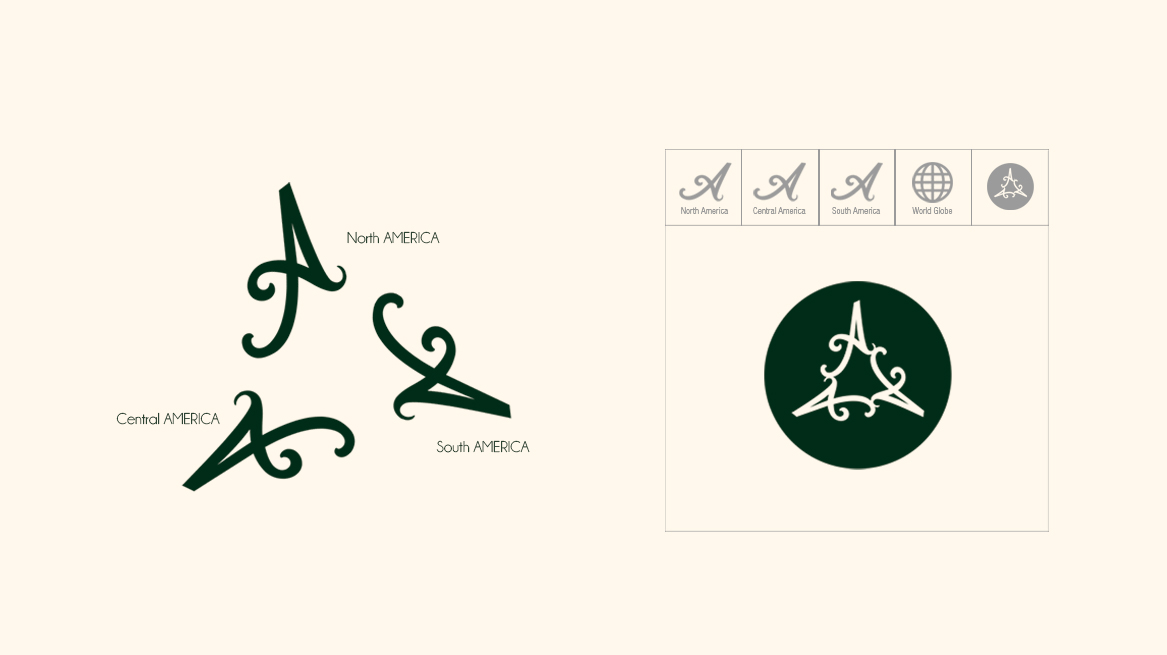
Our challenge was to create a brand that represented the 3 Americas without cliches, such as sailing ships, maps, Christopher Columbus or native americans. According to the client, previous design studios presented these easy solutions and were unable to meet their expectations as they were looking for something different and new.
The solution was to create an icon that covered the 3 regions using something in common between them: the 3 letters A. With a simple and clean design, without unnecessary elements, to become an efficient and lasting symbol of the company.
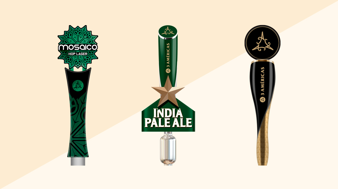
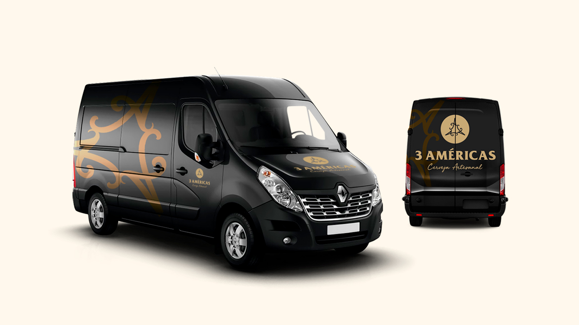
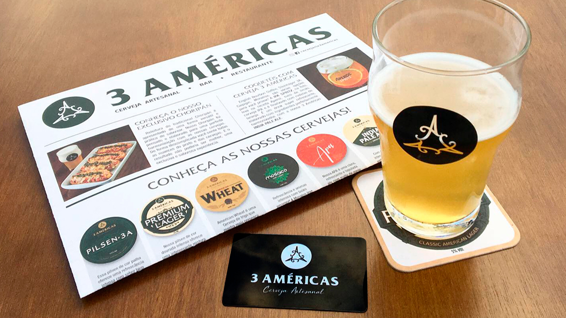
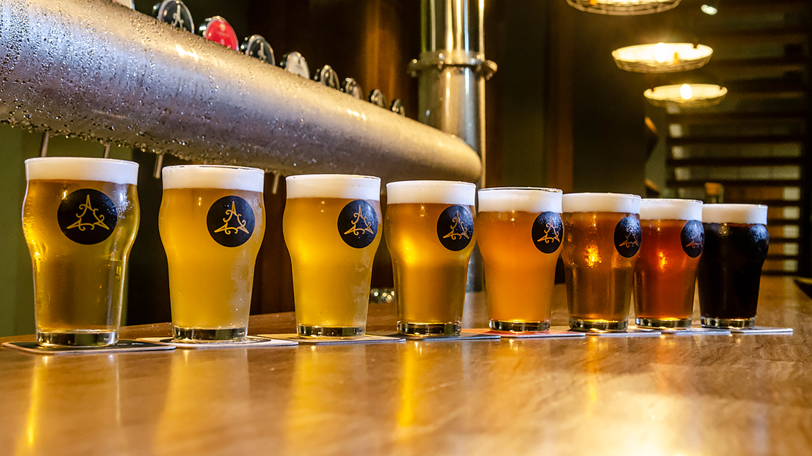
The structure of the logo is quite simple. The symbol is formed by three A letters, symbolizing the 3 Americas: América do Norte (North America), América Central (Central America) and América do Sul (South America) which together still form a big A letter. This iconization makes the identification of the brand easier, mainly in support materials such as pints, draft beer kegs, tap handles, stationery, truck fleet, etc. It also works as a watermark, adding ownership to printed or digital materials.
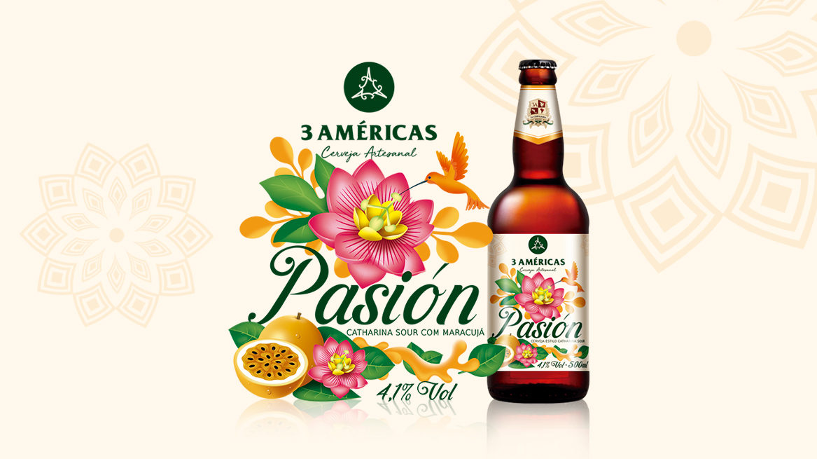
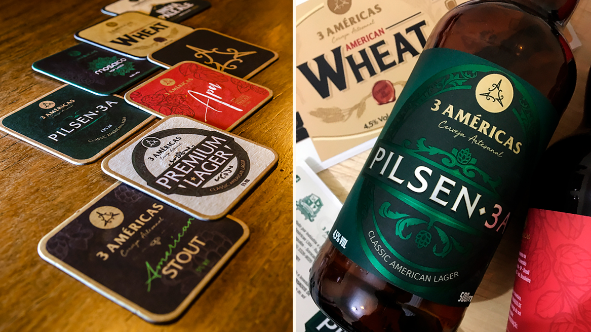
The beer labels are directly influenced by the logo, since the arts are created around it. It is a central component in the art of all labels, where we use different colors based on ingredients and characteristics of each beer style.
The visual identity was created with strong and classic colors, such as black, gold and green. To reinforce the brand presence, we emphasize colors along with a beautiful graphic pattern, designing elegant, modern and dynamic packaging.
CREDIT
- Agency/Creative: Hachiko Branding Studio
- Article Title: Hachiko Studio Creates Brand Identity For New Craft Beer Company
- Organisation/Entity: Agency, Published Commercial Design
- Project Type: Identity
- Agency/Creative Country: Brazil
- Market Region: South America
- Project Deliverables: Brand Creation, Brand Guidelines, Brand Identity, Brand World, Graphic Design, Illustration, Packaging Design, Research
- Industry: Food/Beverage
- Keywords: Craft Beer, Beer Brand, Beer Logo, Americas, Brand Design, Packaging, Label Design, Logo Design


