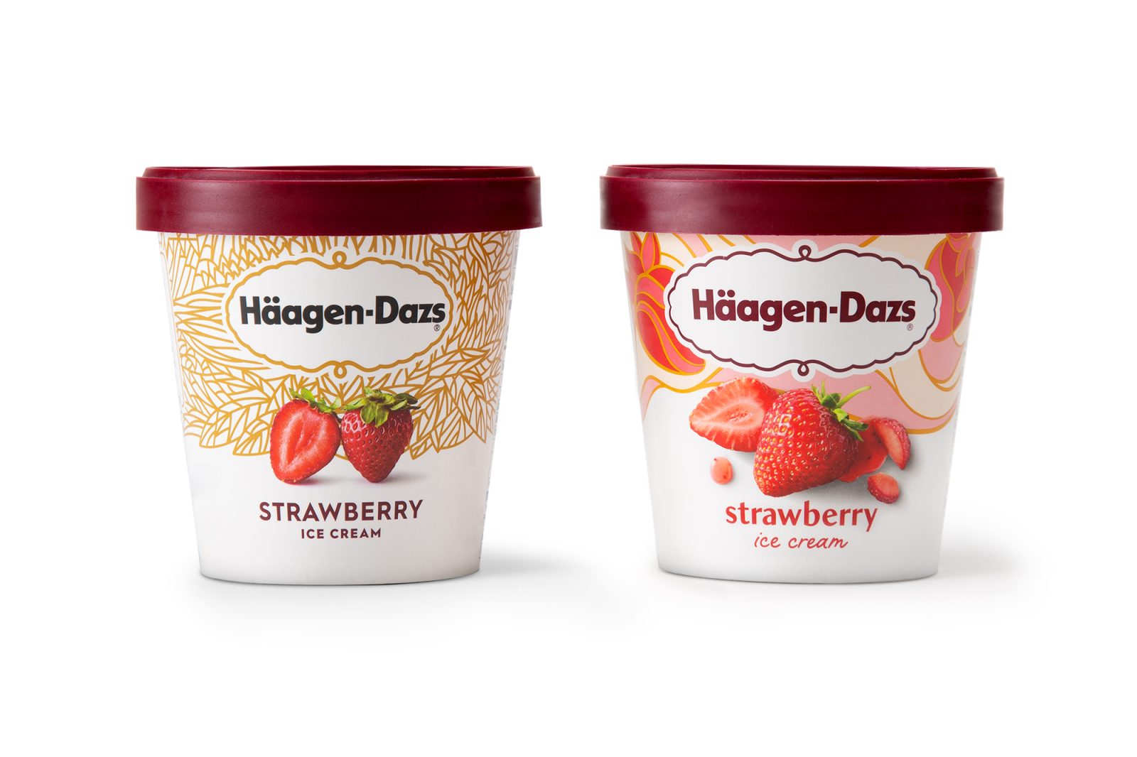
Häagen-Dazs was started with the vision of creating the world’s most luxurious ice cream using only the finest ingredients. For more than half a century now, Häagen-Dazs has stayed true to that vision, but the brand’s personality was stuck in a cold, old world aesthetic that was no longer relevant to today’s diverse consumer. Chase was tasked with re-imaging this classic to create an artful, pure, and playful experience, making luxurious ice cream accessible to all.
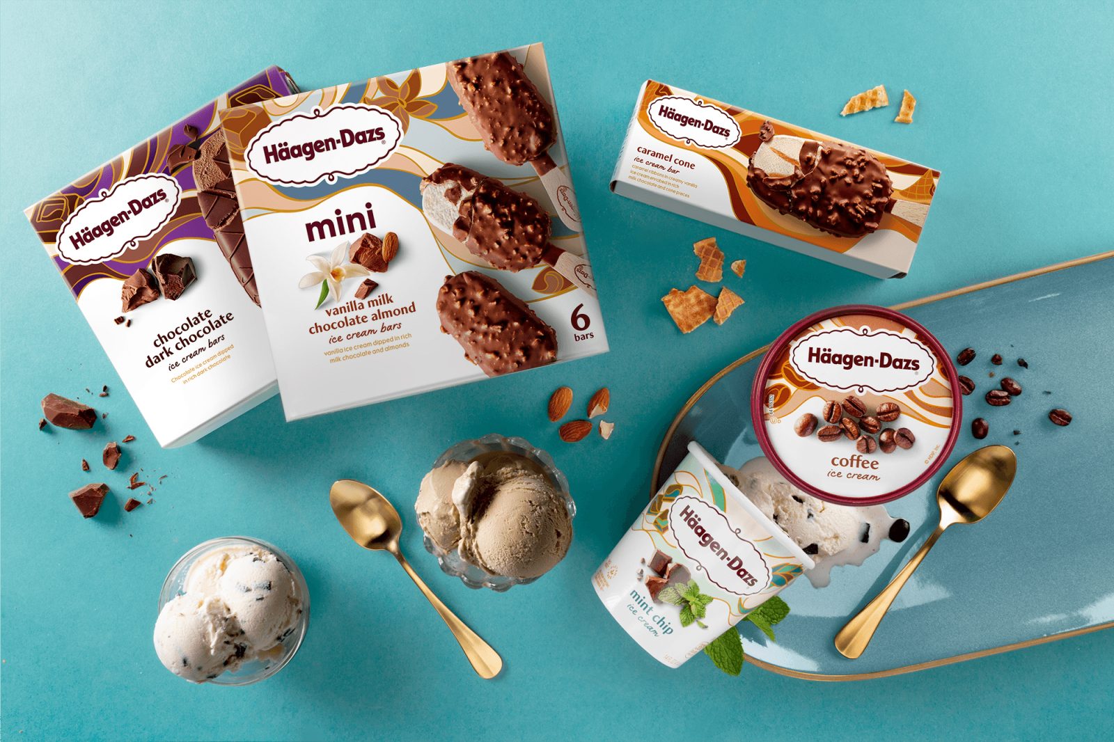
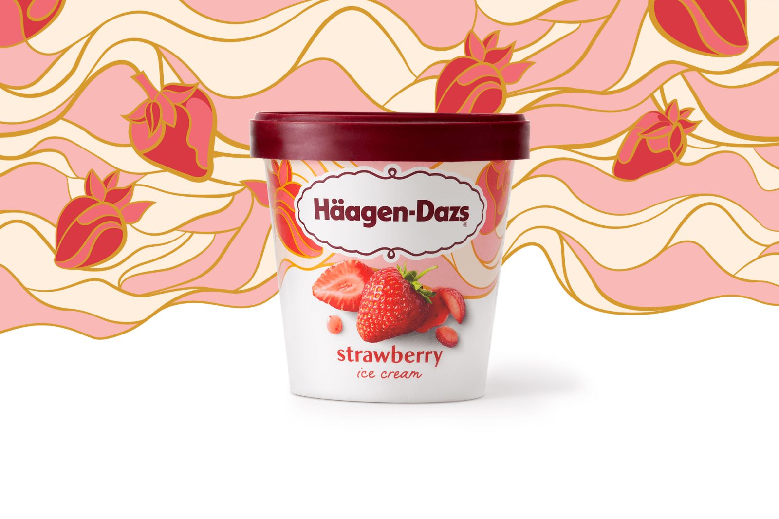
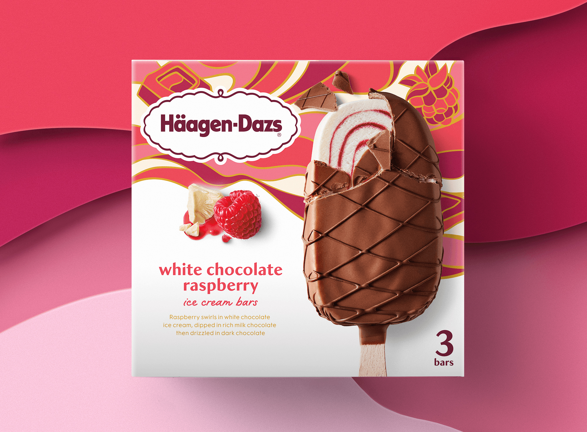
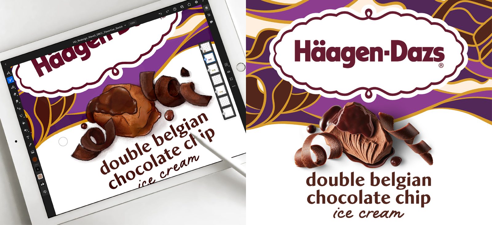
“Chase evaluated the brand’s core equities—logo, tapestry, flavor visuals, typography and colors—and lovingly re-crafted each element on pack. We wanted to celebrate each flavor’s uniqueness by injecting color, custom patterns, movement, and playfulness back onto the pack, approaching each product as a work of art.
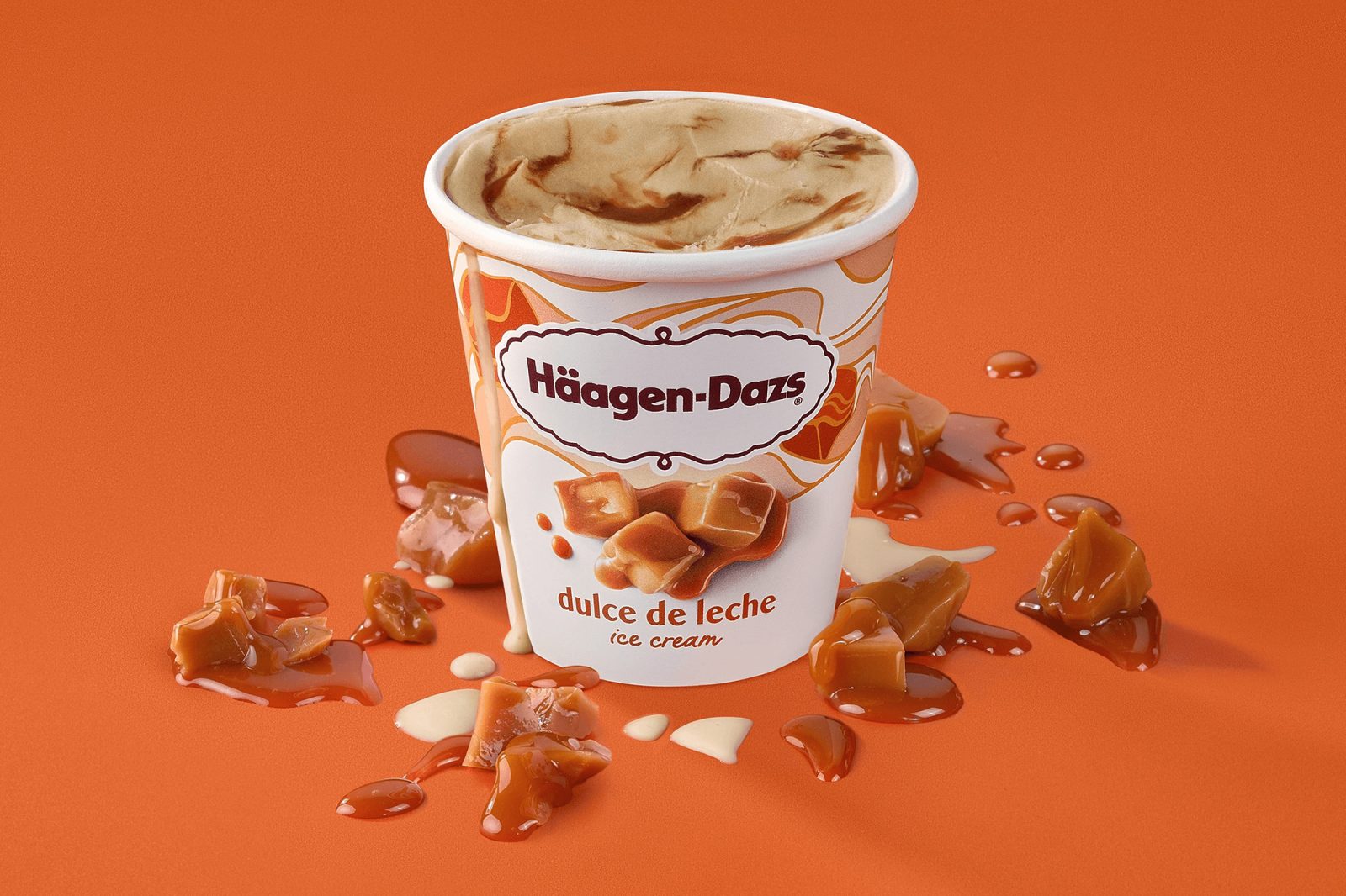
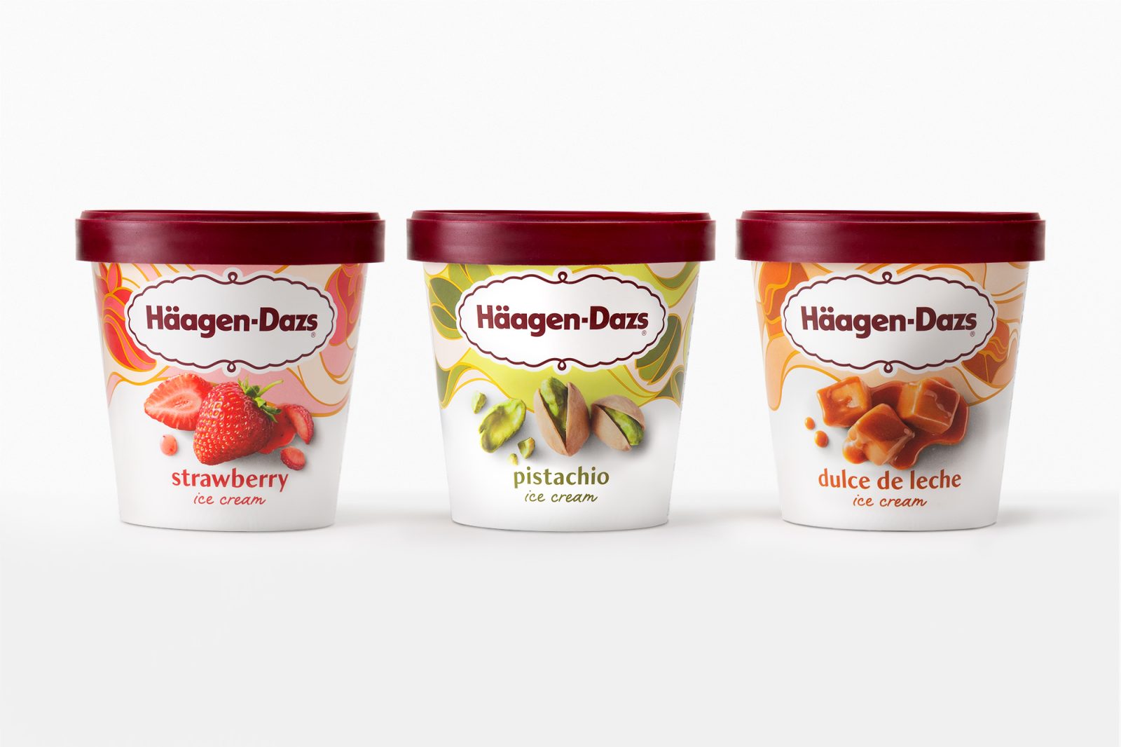
We expanded the color palette to include an exciting range of bright colors to showcase the depth and breadth of the line. Each flavor is adorned with its own unique, hand illustrated tapestry that adds color, energy and appetite appeal to the package. Ingredient photography is playfully positioned to enhance the purity and authentic flavor appeal while standing out against the bright range of colors.
A custom font called Dazs was created to complement the updated pack design. This high contrast sans-serif font is modern with a classic twist. It is premium without feeling unattainable and is as unique as the brand it’s named after.
The final result is a beautiful, attention grabbing design with an approachable new take on luxury. The new system is easily shoppable, while celebrating each flavor’s high quality, pure ingredients and diversity of flavors on shelf.”
Yes, since its launch, the brand has recorded a significant increase in sales and gains in market share over their main competitors.
CREDIT
- Agency/Creative: Chase Design Group
- Article Title: Häagen–Dazs Packaging Redesign
- Organisation/Entity: Agency
- Project Type: Packaging
- Project Status: Published
- Agency/Creative Country: United States of America
- Agency/Creative City: Pasadena
- Industry: Food/Beverage
- Keywords: WBDS Agency Design Awards 2022/23
-
Credits:
Creative Director: Paula Hansanugrum
Art Director: Jon Arriaza
Design Team: Beverly Hartono, Ryan Doro, Connor Murphy
Photographer: Sara Remington
Production Team: Ron Guillory, Mario Soto


