


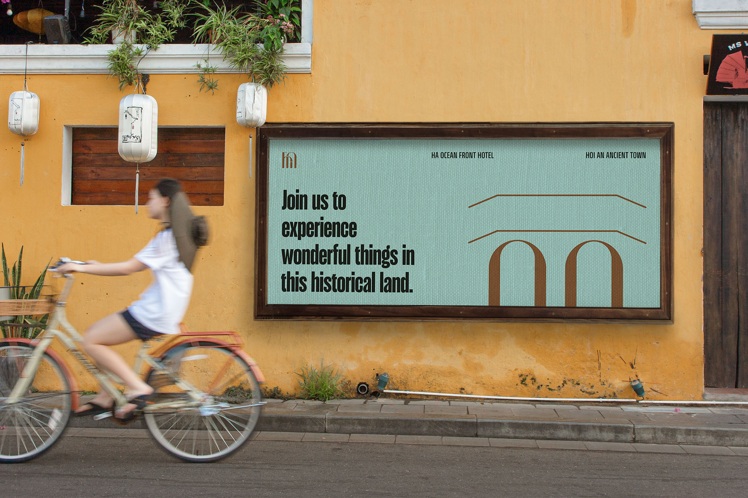
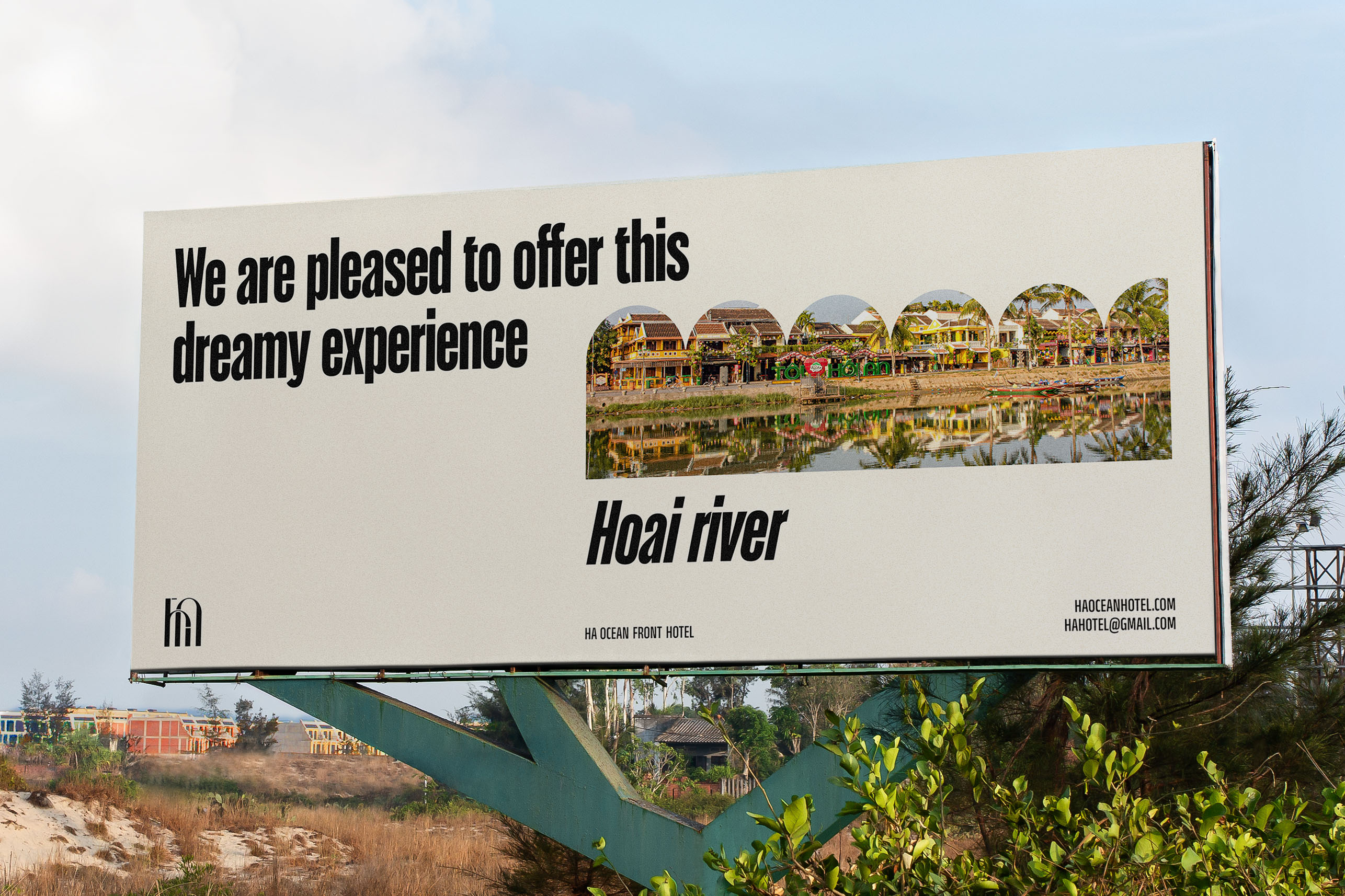
Hoi An is an ancient city in central Vietnam, famous for its historical relics and unique cultural features that attract millions of international tourists on a yearly basis. Many hotels and resorts have been formed to enhance the experience of tourists when staying in this ancient city.
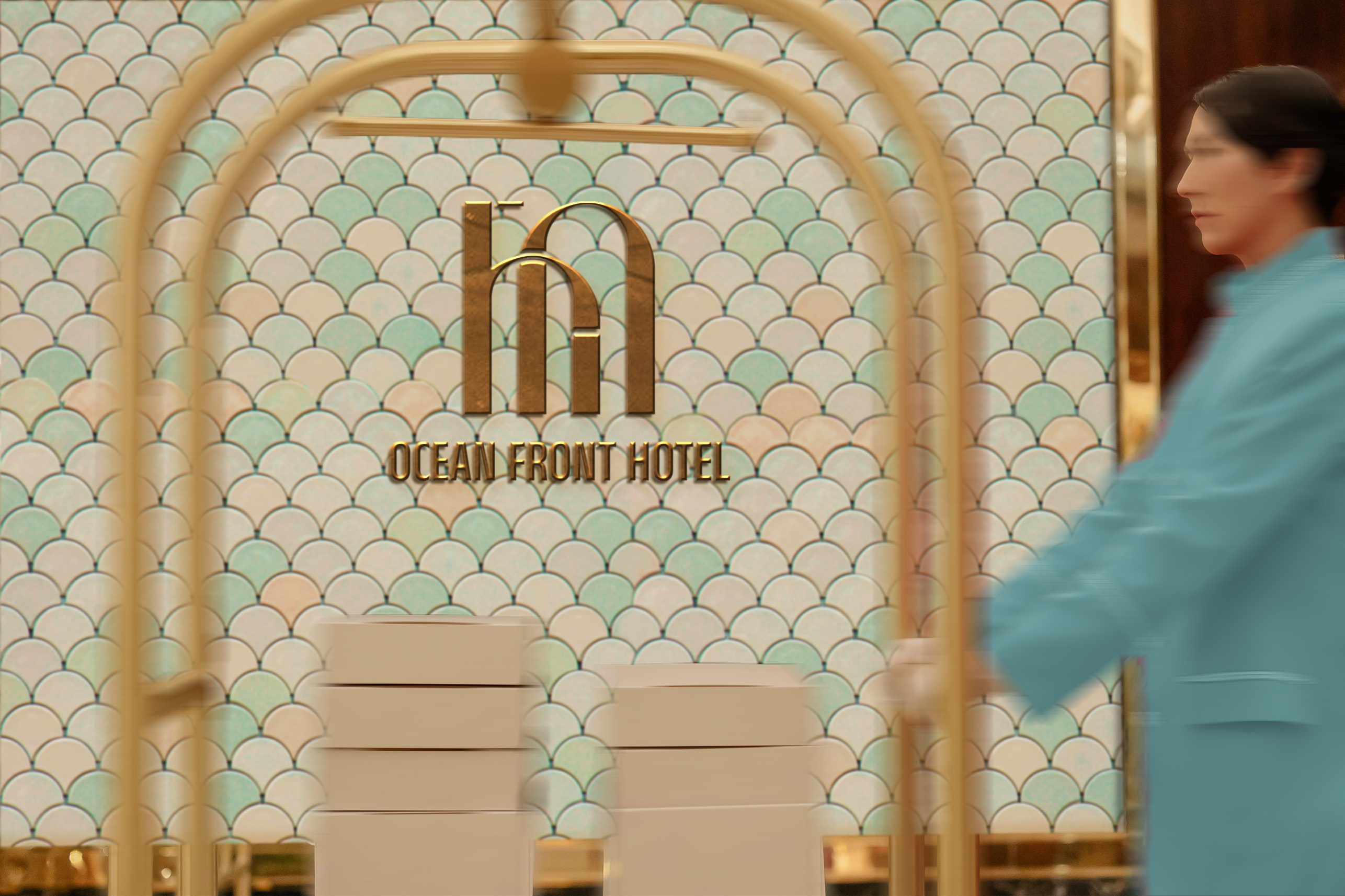
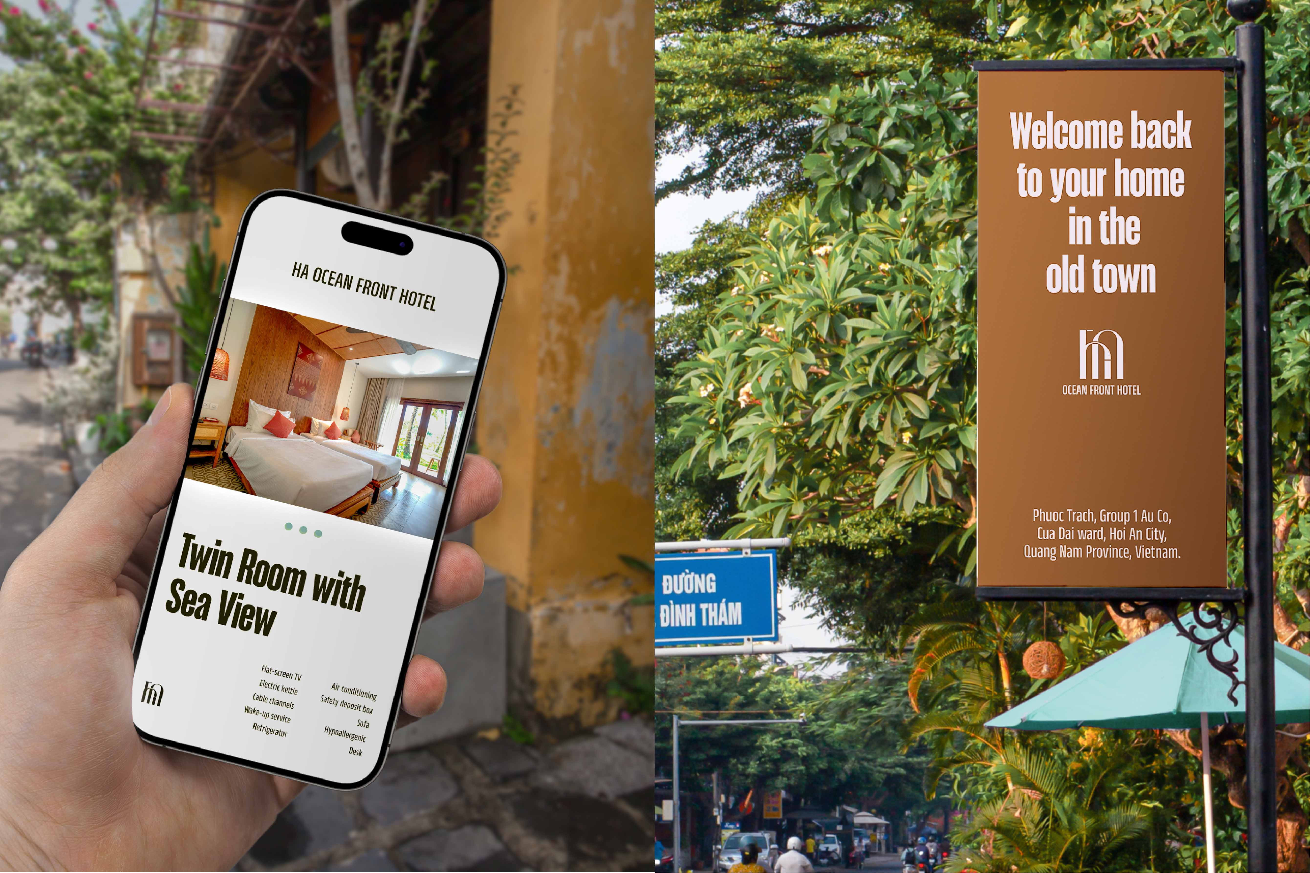
HA Ocean Front Hotel, a hotel located right on the green beach, welcomes visitors from all over the world with hospitality, friendliness, and closeness, to create an experience for visitors of a “home” image. The hotel would like to design the modern and simple brand in order that international friends can easily remember it, not only closely linked to famous images in the ancient town but also create harmonious combinations with ancient space.
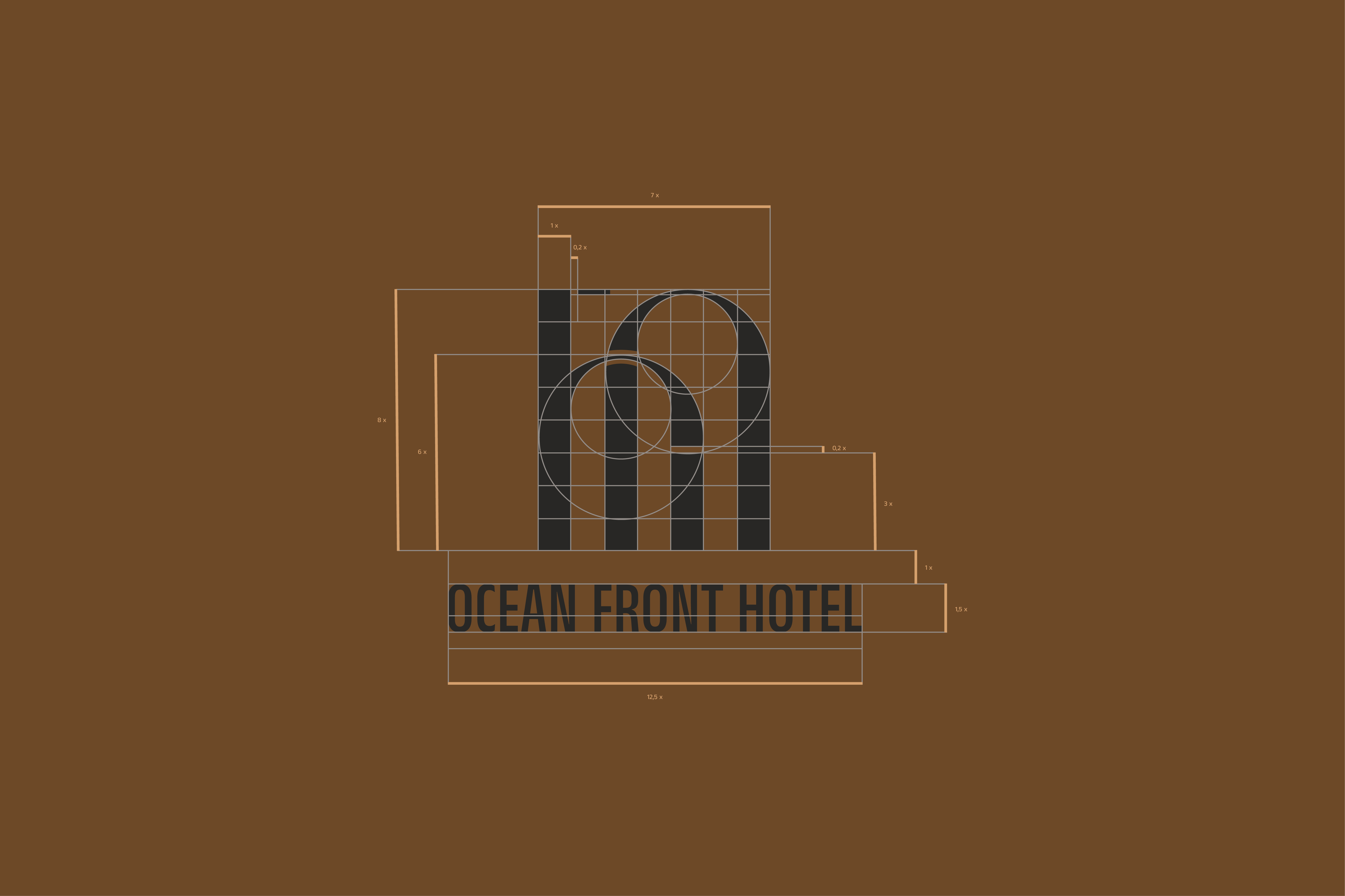
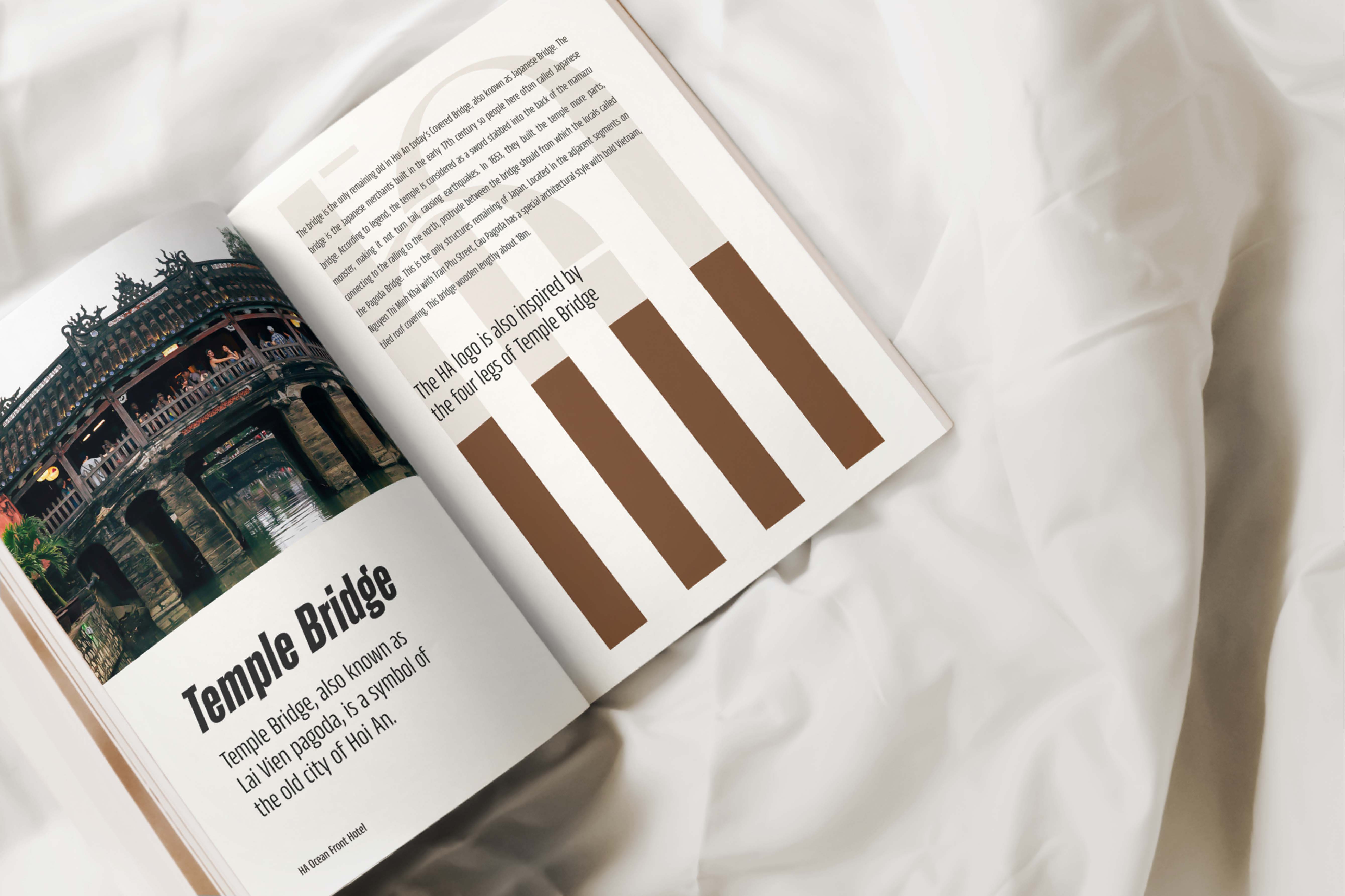
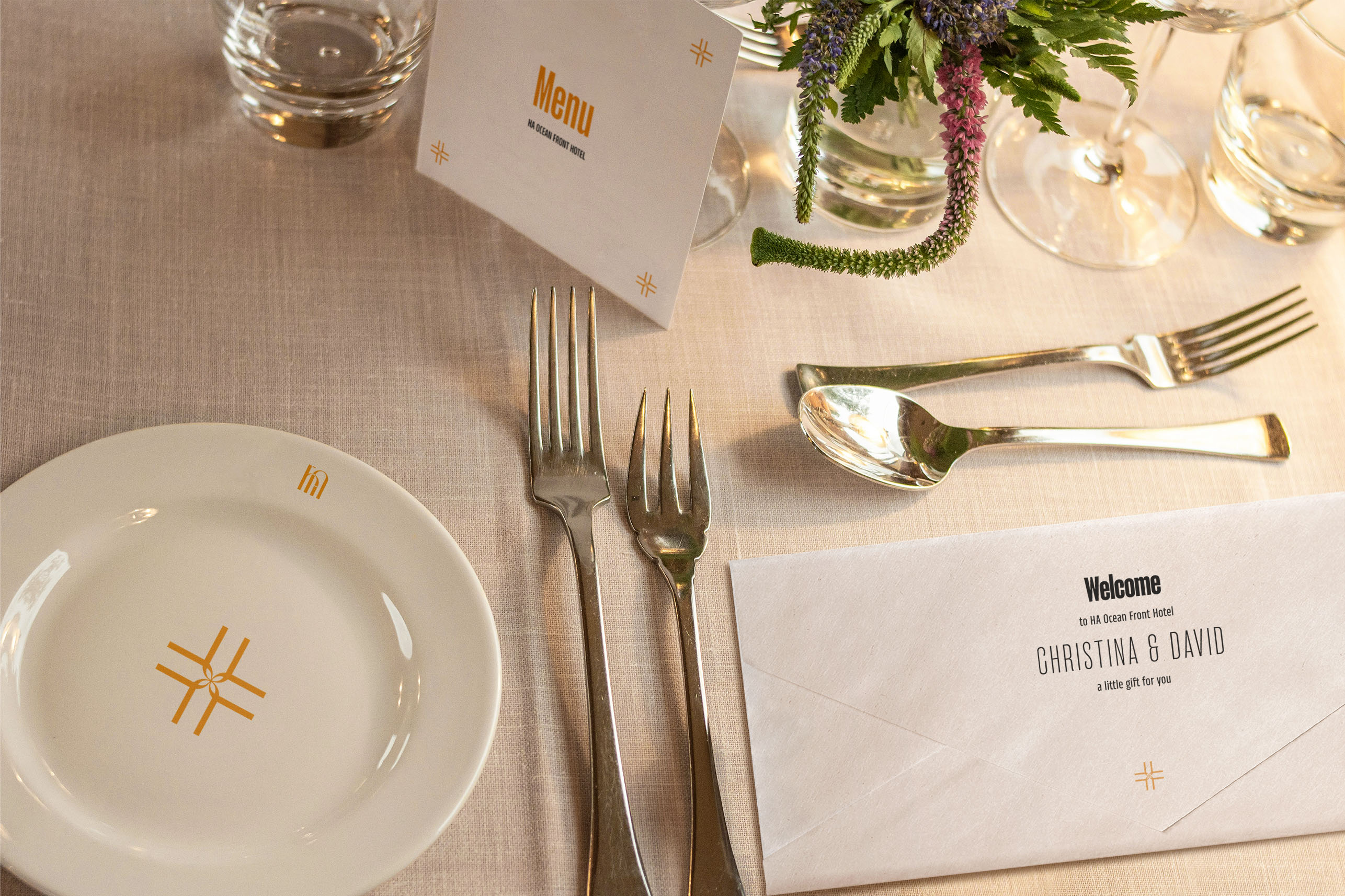
The shape of the logo is inspired by the most famous monuments in the area combined with architectural features commonly found in ancient houses to both represent the hotel’s HA name and show the brand mission: the door, a warm welcome, a factor that brings the feeling of a familiar home when customers are treated kindly like family.
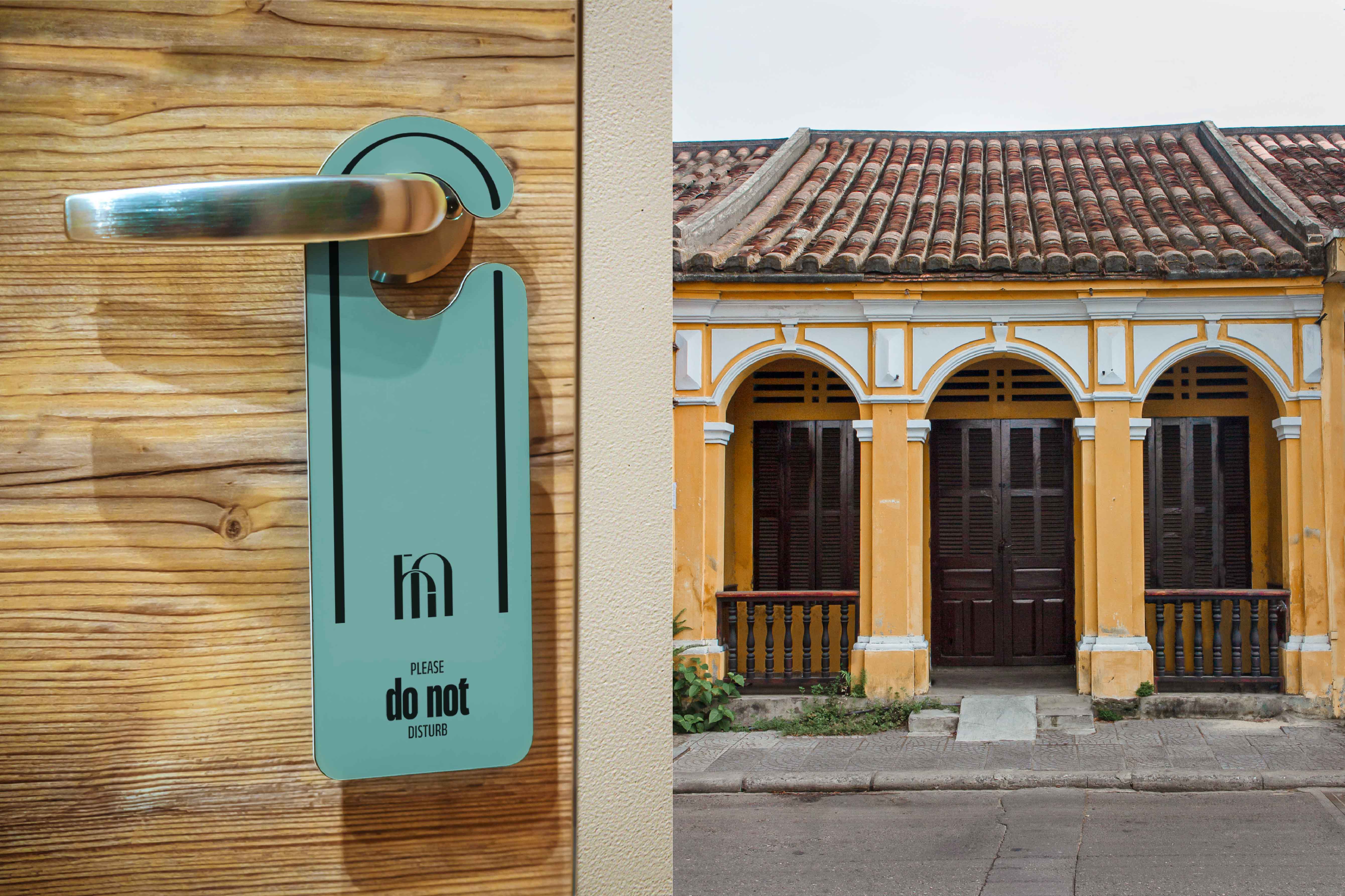
The brand’s colors are inspired by the yellow walls commonly found in most ancient houses, and the brown color of the tiled roofs that most houses have this roofing system. In addition, brown is also the color of wooden doors, wooden pillars, and wooden railings used in most architecture in Hoi An. The hotel is located right on the beach, so the turquoise color of the sea water is also used to create a fresh, dynamic, coastal resort atmosphere. These colors create a unified harmony with the ancient space in the old town.
Typo display was chosen as a typeface with stylized features in some characters that are very similar to accents in Vietnamese, this helps create a closer feeling for visitors when seeing publications and advertising signs in Vietnamese. local in Vietnam.
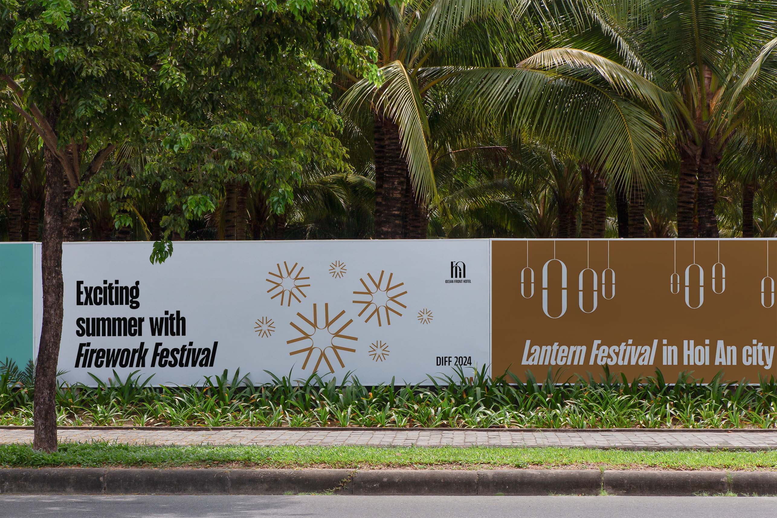
Brand visual is built from the almost original form of the logo to increase recognition as much as possible. Just need to copy, rotate, and assemble a little to be able to describe architectural symbols and the typical cultural features in Hoi An. Brand visual aims to be expressed in negative space to create memorability and depth.
This land had an interaction between many cultures as a result of trade activities with other countries in the past. Nowadays, HA Hotel is like a thread connecting generations, like a catalyst to create the interaction between modern cultures, so that people can become close, bonded and live an interesting life.

CREDIT
- Agency/Creative: Callis Creative
- Article Title: HA Brand Identity Design by Callis Creative
- Organisation/Entity: Agency
- Project Type: Identity
- Project Status: Published
- Agency/Creative Country: Vietnam
- Agency/Creative City: Da Nang
- Market Region: Asia
- Project Deliverables: Brand Identity
- Industry: Hospitality
- Keywords: Hotel, Hospitality, Callis Creative, Brand Identity, local tourism
-
Credits:
Made at: Callis Creative
Designer: Tu Nguyen


