


Estudio Argo – Michelini i Mufatto
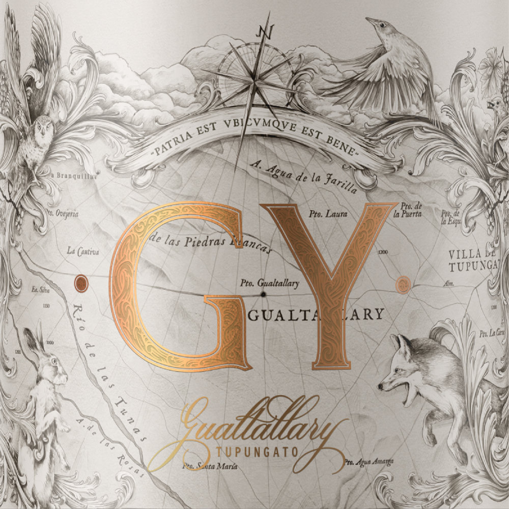
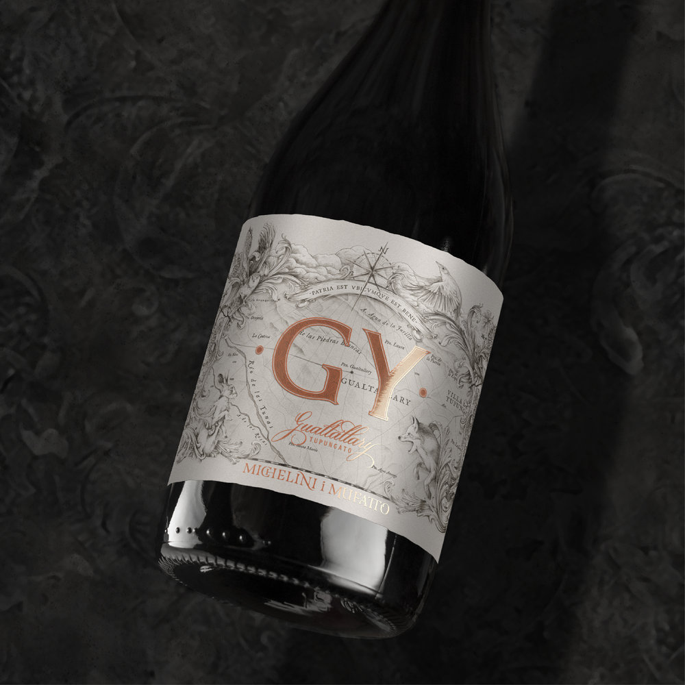
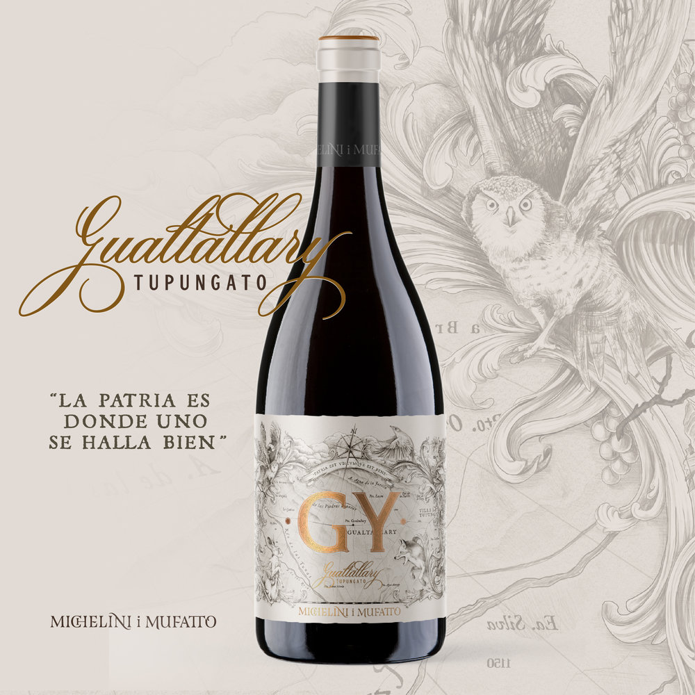
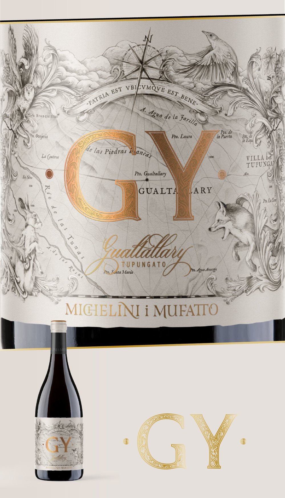
It was born as a concept of village wine or “village”. Its letters are the first and the last of Gualtallary, and the reference is to show it entirety, from beginning to end. It is the search to show the villa in its purest and most complex form, covering different vineyards, soils and heights, to achieve a wine that represents an exceptional place. All the majesty is reflected in the label through its flora and fauna. Patria est ubicumque est bene (the homeland is where one is well).

CREDIT
- Agency/Creative: Estudio Argo
- Article Title: GY – Gualtallary
- Organisation/Entity: Agency, Published Commercial Design
- Project Type: Packaging
- Agency/Creative Country: Argentina
- Market Region: Multiple Regions
- Format: Bottle
- Substrate: Glass
FEEDBACK
Relevance: Solution/idea in relation to brand, product or service
Implementation: Attention, detailing and finishing of final solution
Presentation: Text, visualisation and quality of the presentation


