Gunnar’s Wheated Bourbon, where heritage meets the “Wheat Revolution”. Originating from the wheat state of Kansas, in the small town of Sedan, housed in the historic Bradford Hotel. Gunnar’s Bourbon embodies the rich heritage and local pride, with a strong emphasis on using locally sourced ingredients, specifically wheat. Gunnar’s Bourbon represents the essence of Kansas and its agricultural legacy.
When Gunnar’s Bourbon approached us at Brand Hatch Creative, they gave us full creative freedom to reimagine their brand, including brand visual design, strategic positioning, and product naming. We were given the freedom to bring a voice to the brand. We developed comprehensive brand guidelines that would guide every aspect of their brand journey.
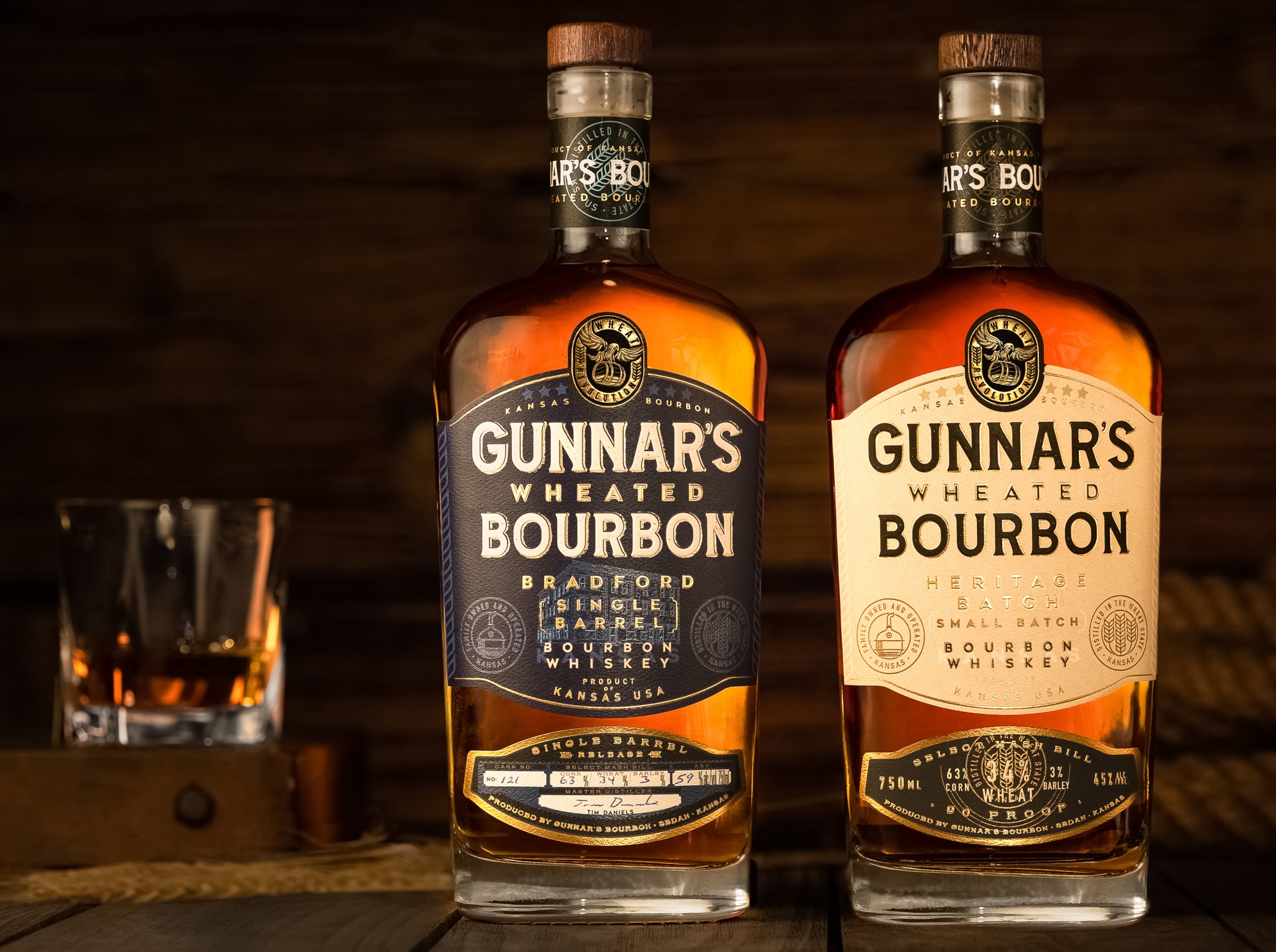
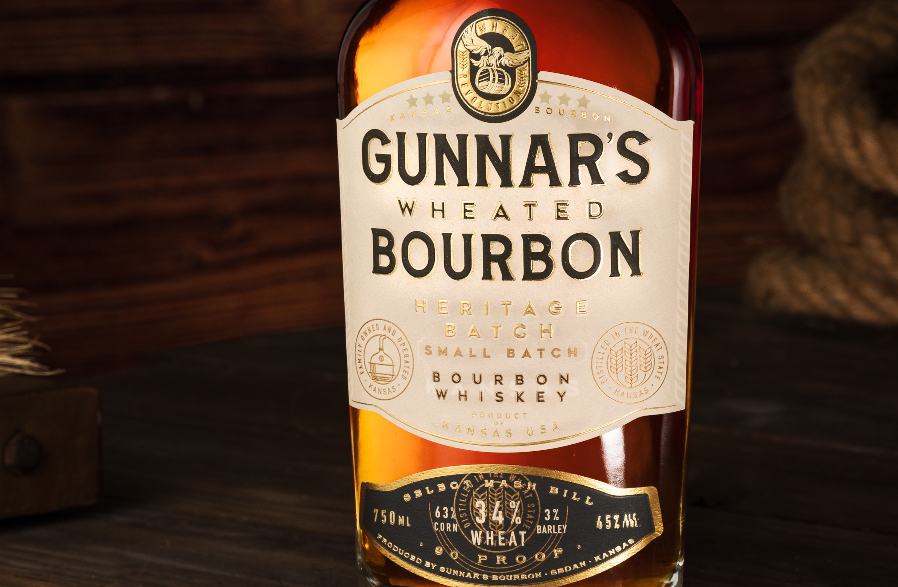
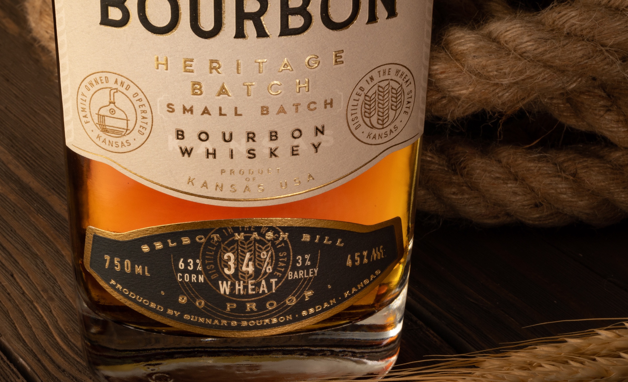
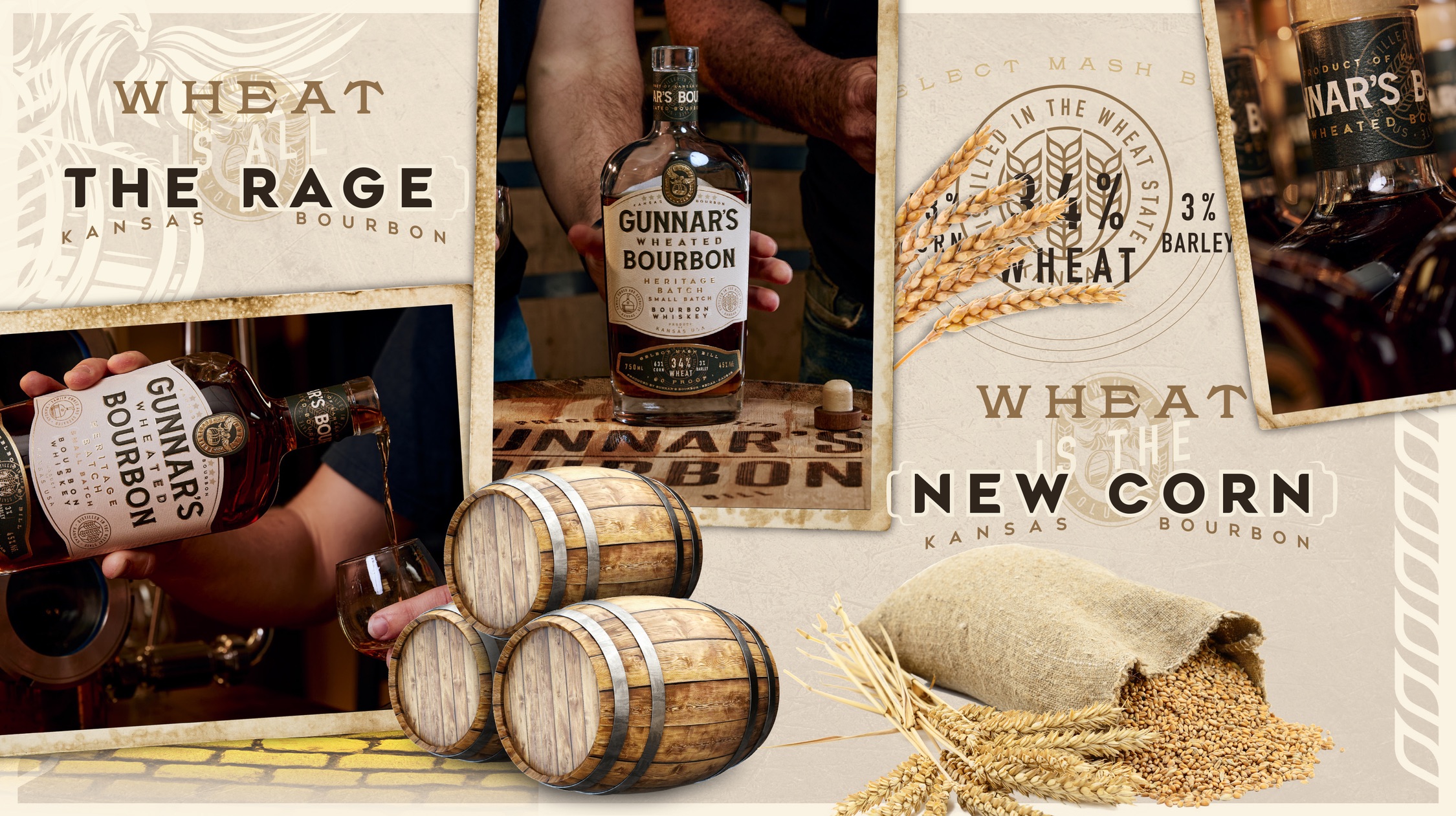
Our collaboration led to the creation of two remarkable offerings, each with its distinct personality and name. The flagship brand, Heritage Batch, represents the epitome of craftsmanship and balance. It combines a precisely crafted blend of grains—63% corn, 34% wheat, and a touch of malted barley—to deliver a perfectly balanced Wheated Bourbon. This remarkable spirit embodies the essence of the “Wheat Revolution,” capturing the beginning of something new and fresh. Join the Wheat Revolution with Heritage Batch.
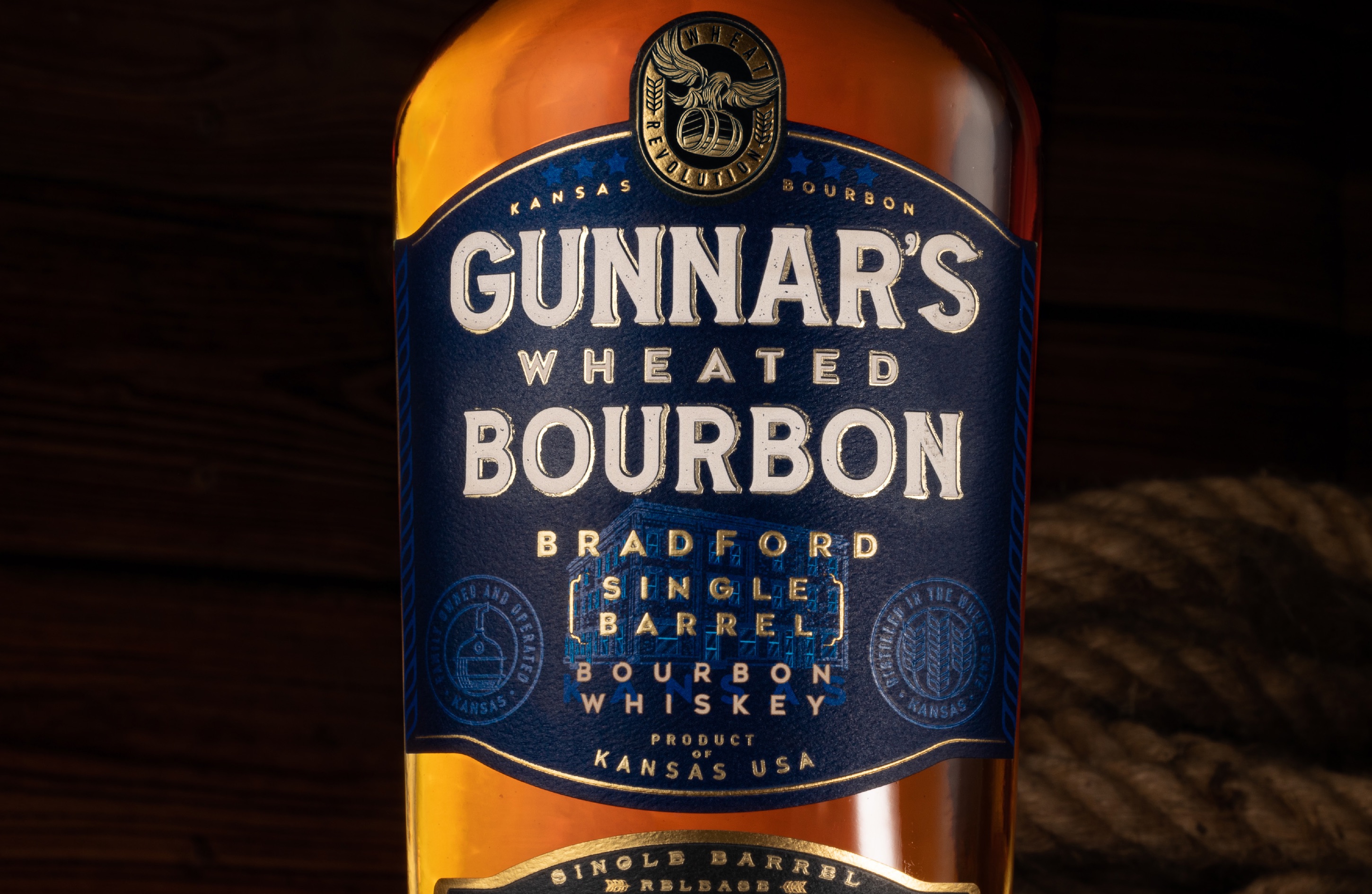
In addition to the flagship brand, we developed a Single Barrel bottling, naming it after the Bradford Hotel, Gunnar’s Bradford Single Barrel, tying it back to the local community, the heart of the town, the hotel’s legacy, and rich history. Each bottle features a unique mashbill, indulging in the flavors born from the heart of Kansas. The label design features an illustration of the Bradford Distillery, which is also incorporated into the overall branding of Gunnar’s Distillery.
The brand plays on the tradition of distilling with a modern approach, doing something different. The Revolution is where the brand tagline came from: Wheat Revolution. We also developed headline campaigns that stem from the term “…Is the new black,” referring to something that has suddenly become very fashionable or popular. Examples include “Wheat is the New Black” and “Wheat is the New Corn.”
Gunnar’s Bourbon is a brand of transparency, sharing their mash bill with their customers, so they can truly appreciate what they are drinking. With our collaborative efforts, we have reimagined the brand, honoring its roots and giving it a fresh, compelling identity. The tagline ‘Wheat Revolution’ encapsulates the spirit of heritage, history, and a new beginning, “Join The Wheat Revolution”.




CREDIT
- Agency/Creative: Brand Hatch Creative
- Article Title: Gunnar’s Wheated Bourbon Redesign
- Organisation/Entity: Agency
- Project Type: Packaging
- Project Status: Published
- Agency/Creative Country: United States
- Agency/Creative City: Chicago
- Market Region: North America
- Project Deliverables: Brand Design, Brand Guidelines, Brand Naming, Brand Redesign, Brand Strategy, Copywriting, Creative Direction, Identity System, Packaging Design
- Format: Bottle
- Substrate: Glass
- Industry: Food/Beverage
- Keywords: Whiskey, Bourbon, Wheated Bourbon, Kansas, North America, Redesign
-
Credits:
Designer / Creative Director: Christopher Lee
Photography: Brian Anderson
Client: Gunnar's Bourbon


