Guilherme Heimbach is a renowned Brazilian architect who has made a name for himself with his contemporary and minimalist approach to architecture. His designs are characterized by clean lines, simple forms, and a focus on functionality, which sets him apart from other architects. Heimbach’s aesthetic is reflected in his brand’s visual identity, which is designed to be a reductionist expression of his unique style.
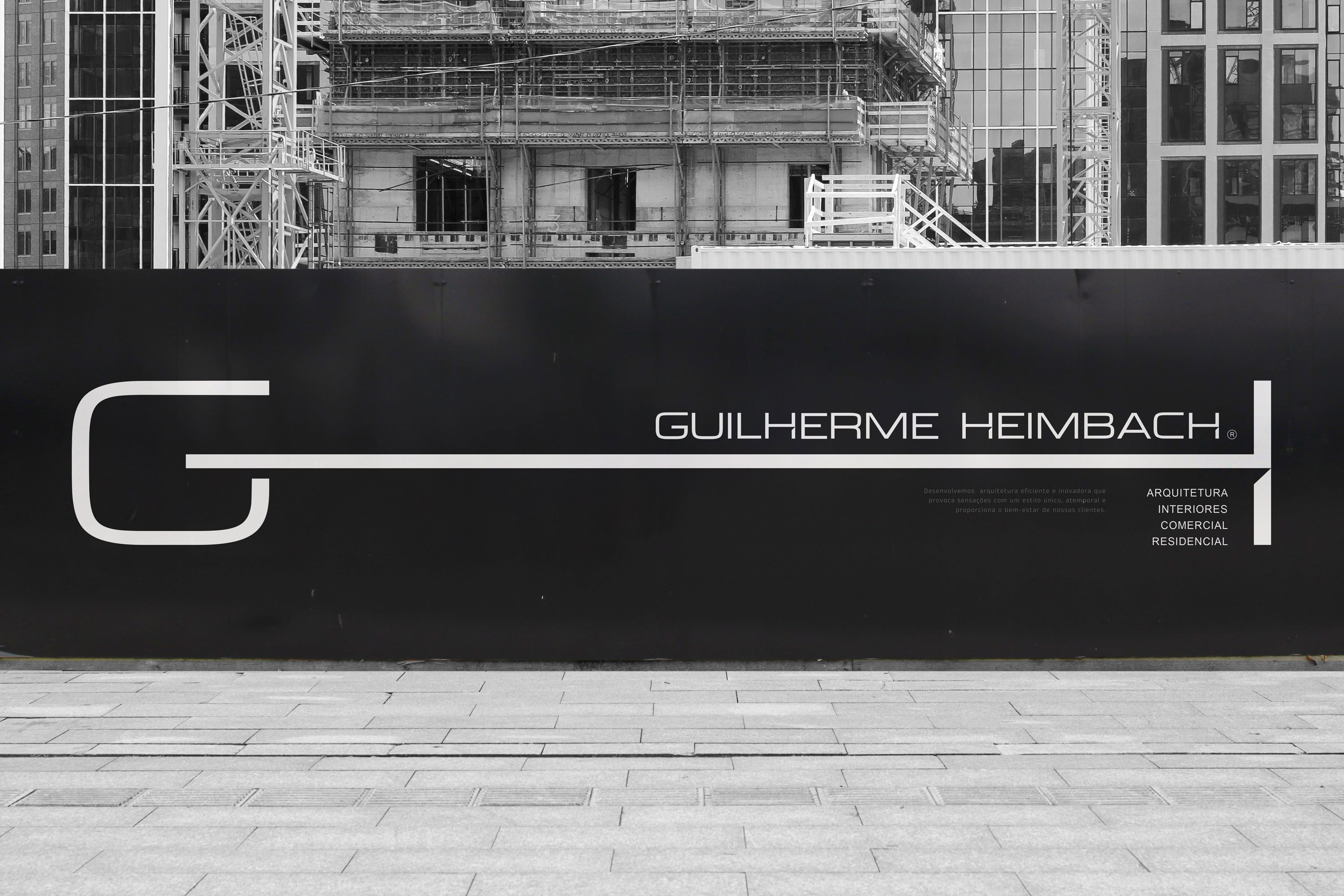
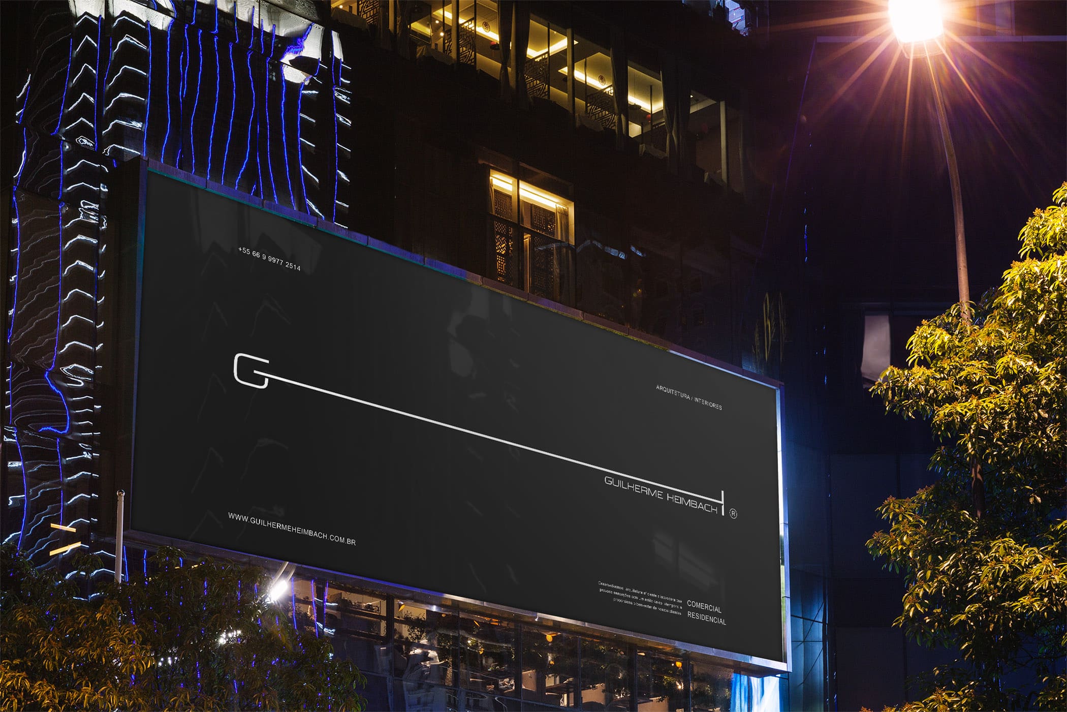
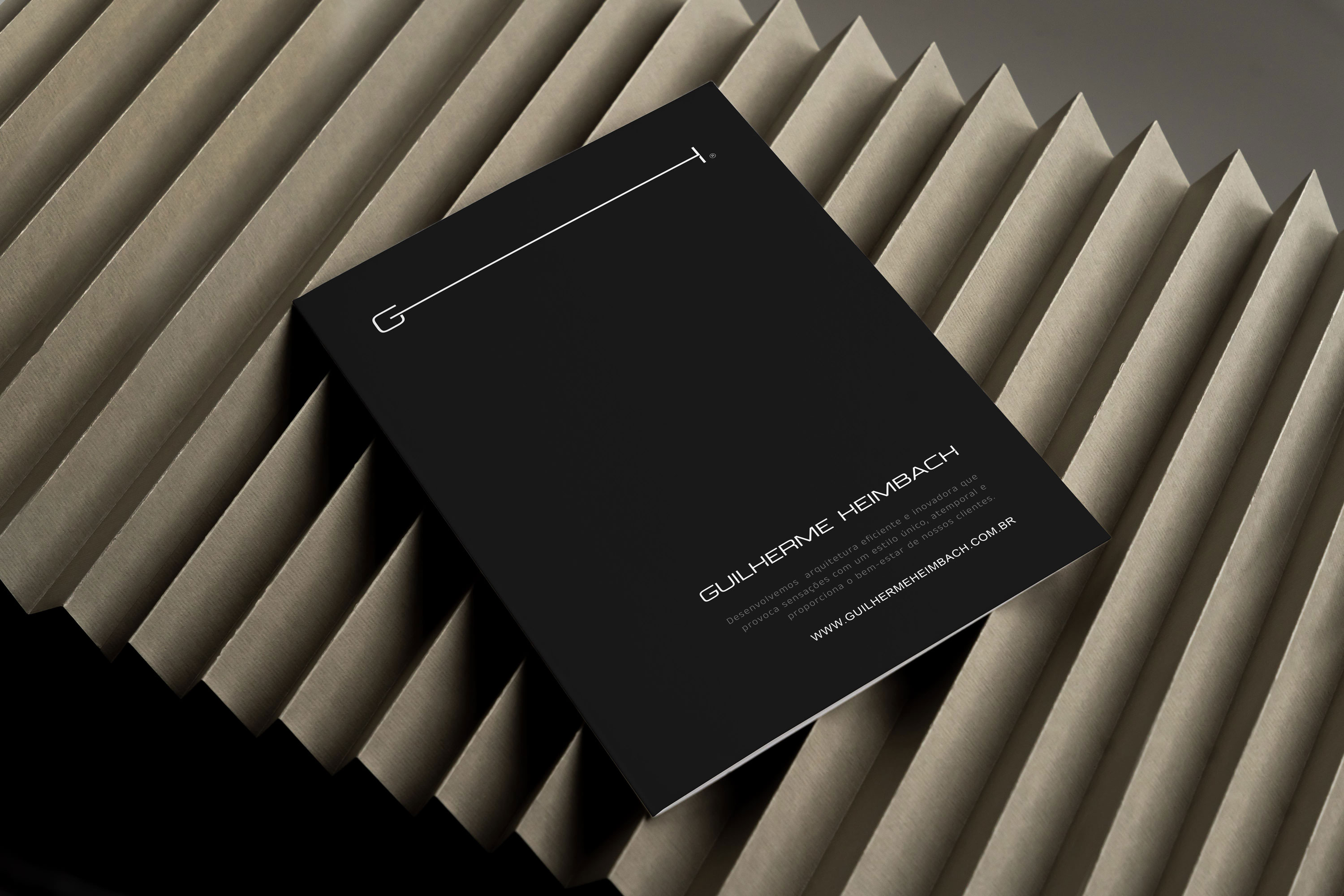
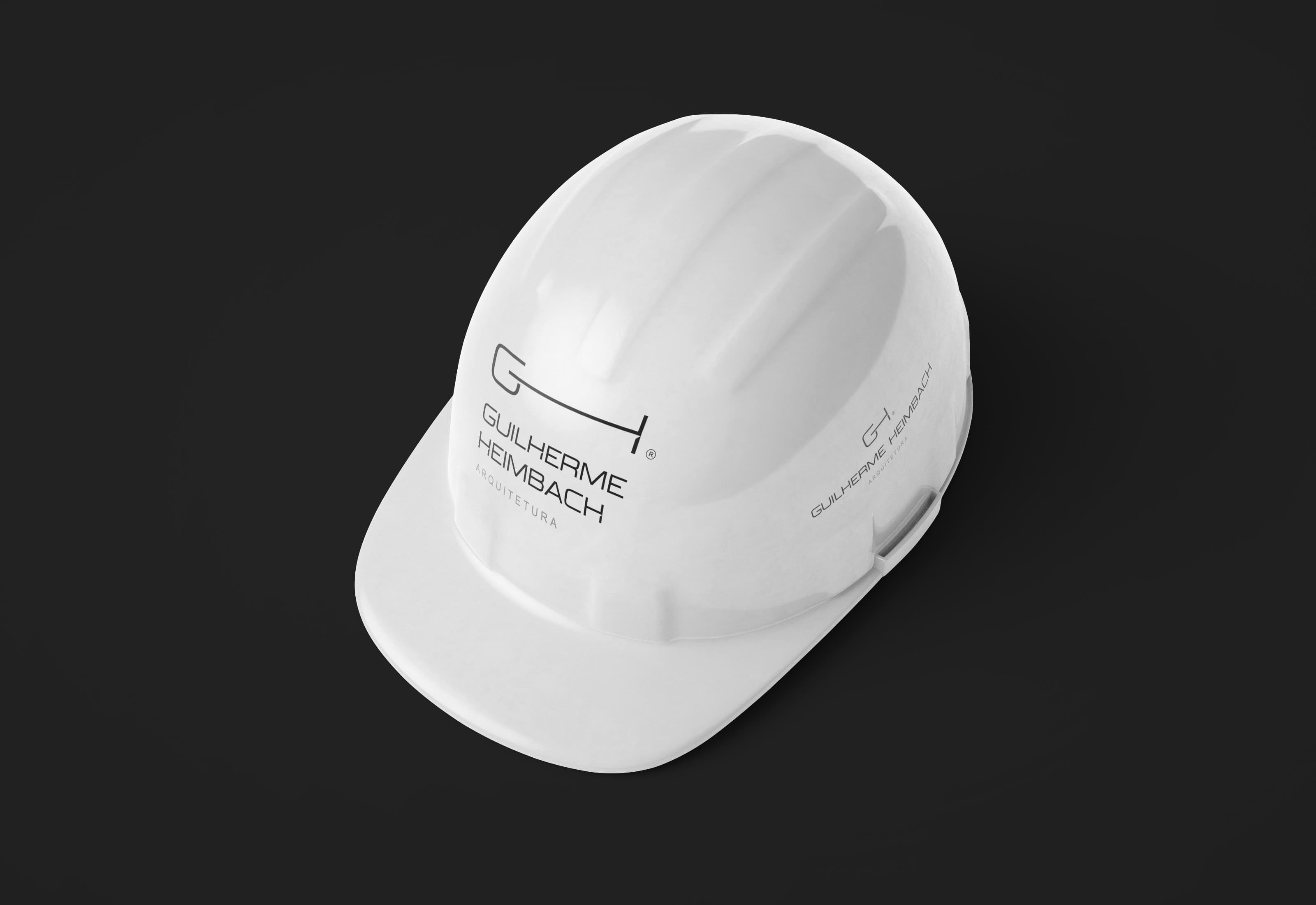
The GH logo is the ultimate reduction of Guilherme Heimbach’s brand, representing the core values of simplicity, functionality, and minimalism. The logo is a sleek and elegant design that embodies the architect’s philosophy, reflecting his belief that good design is about creating spaces that are both beautiful and functional. It also showcases his ability to distill complex ideas into their most essential forms, making his work easily recognizable.
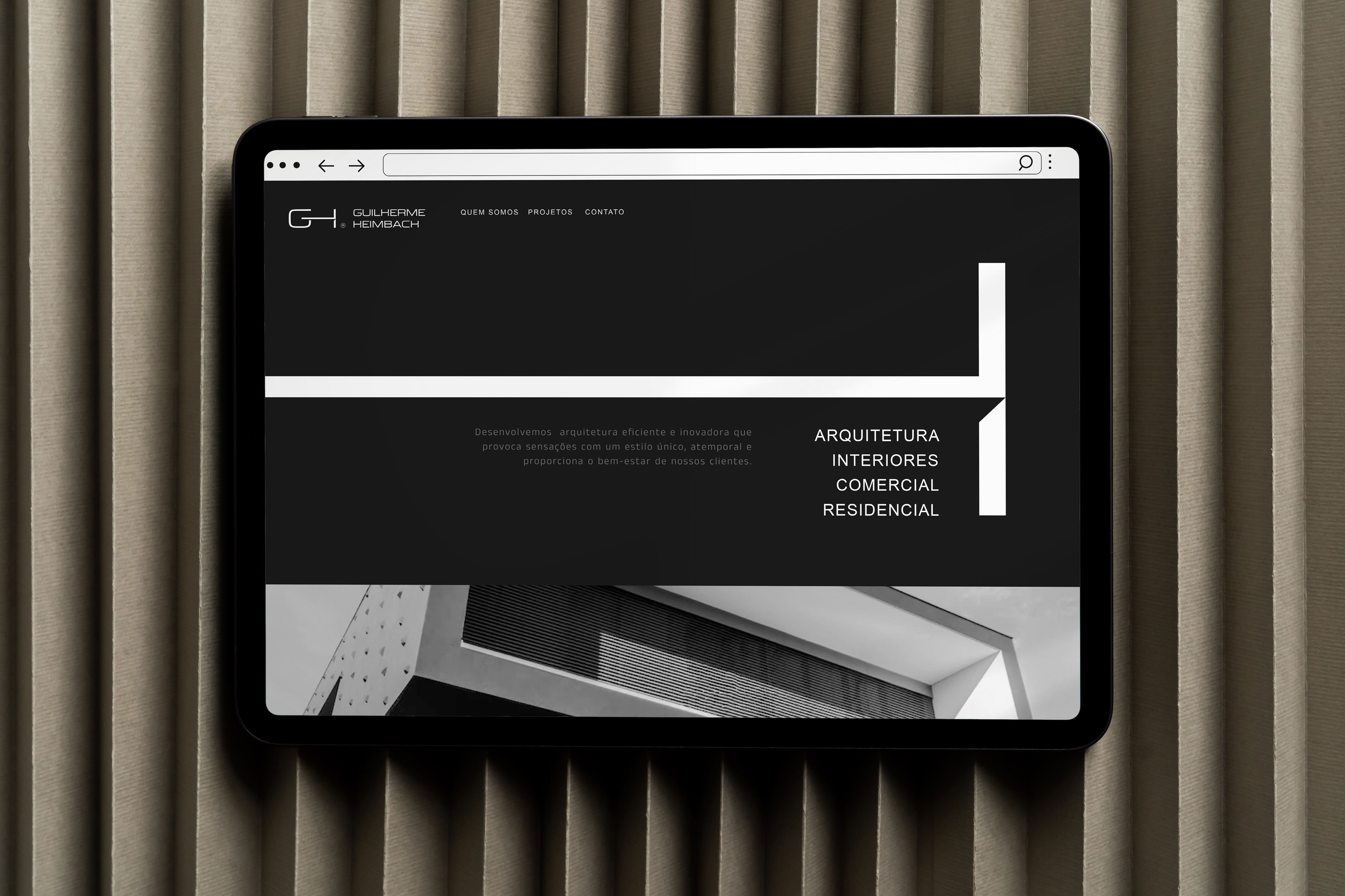
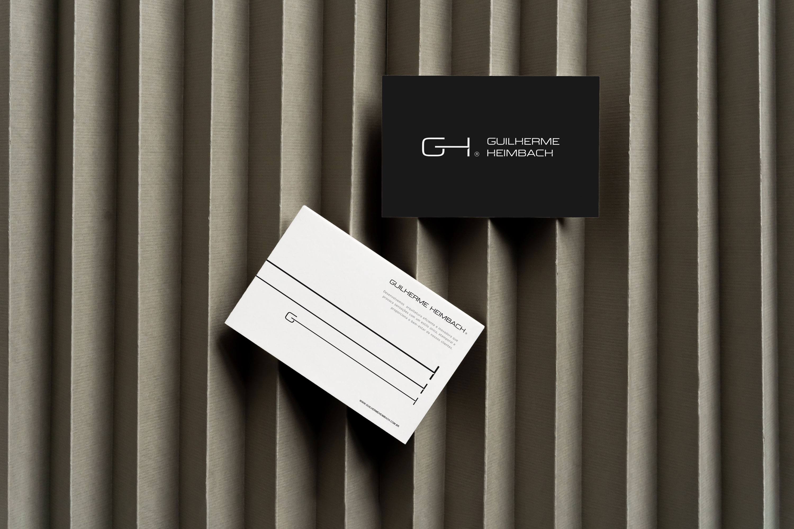
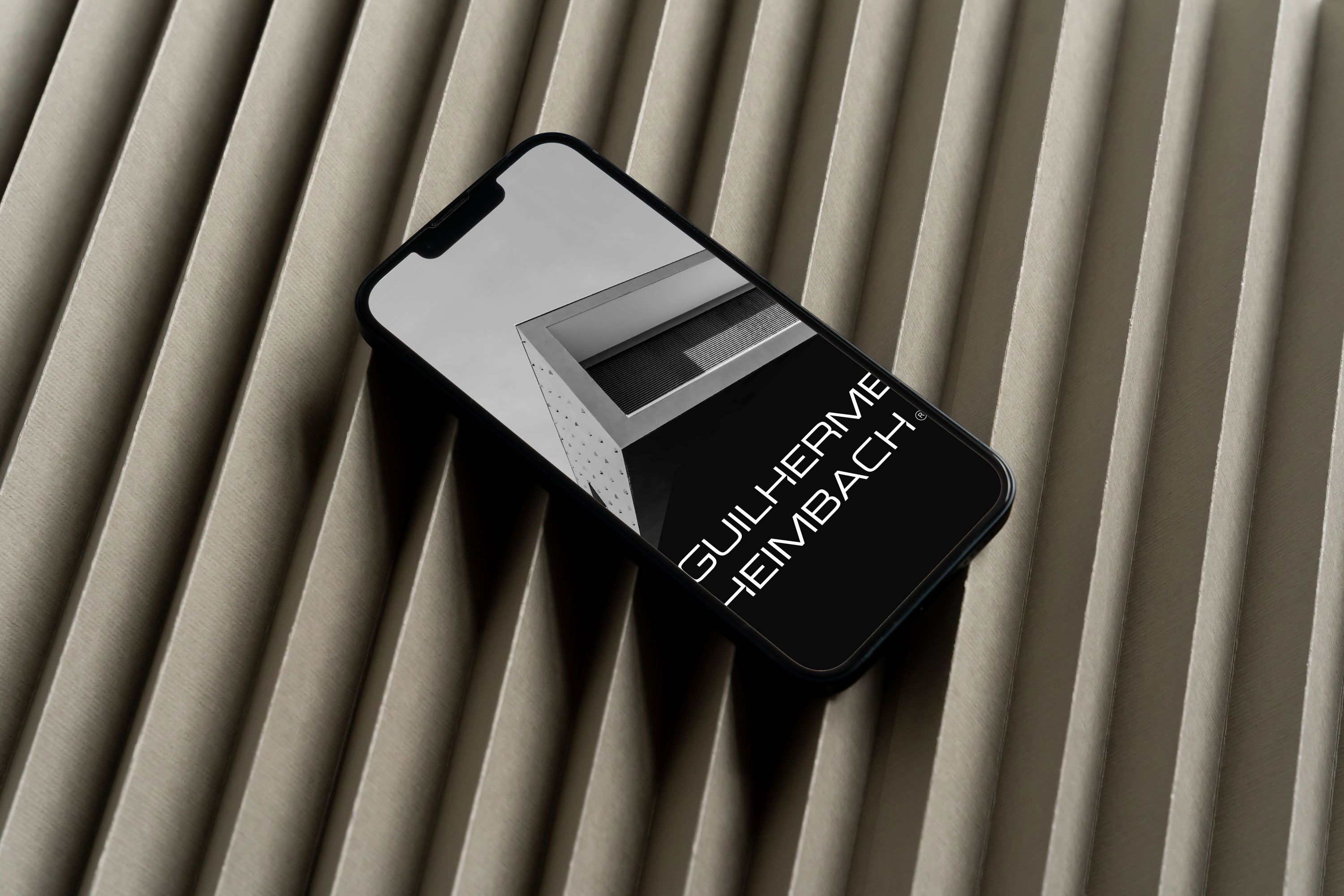
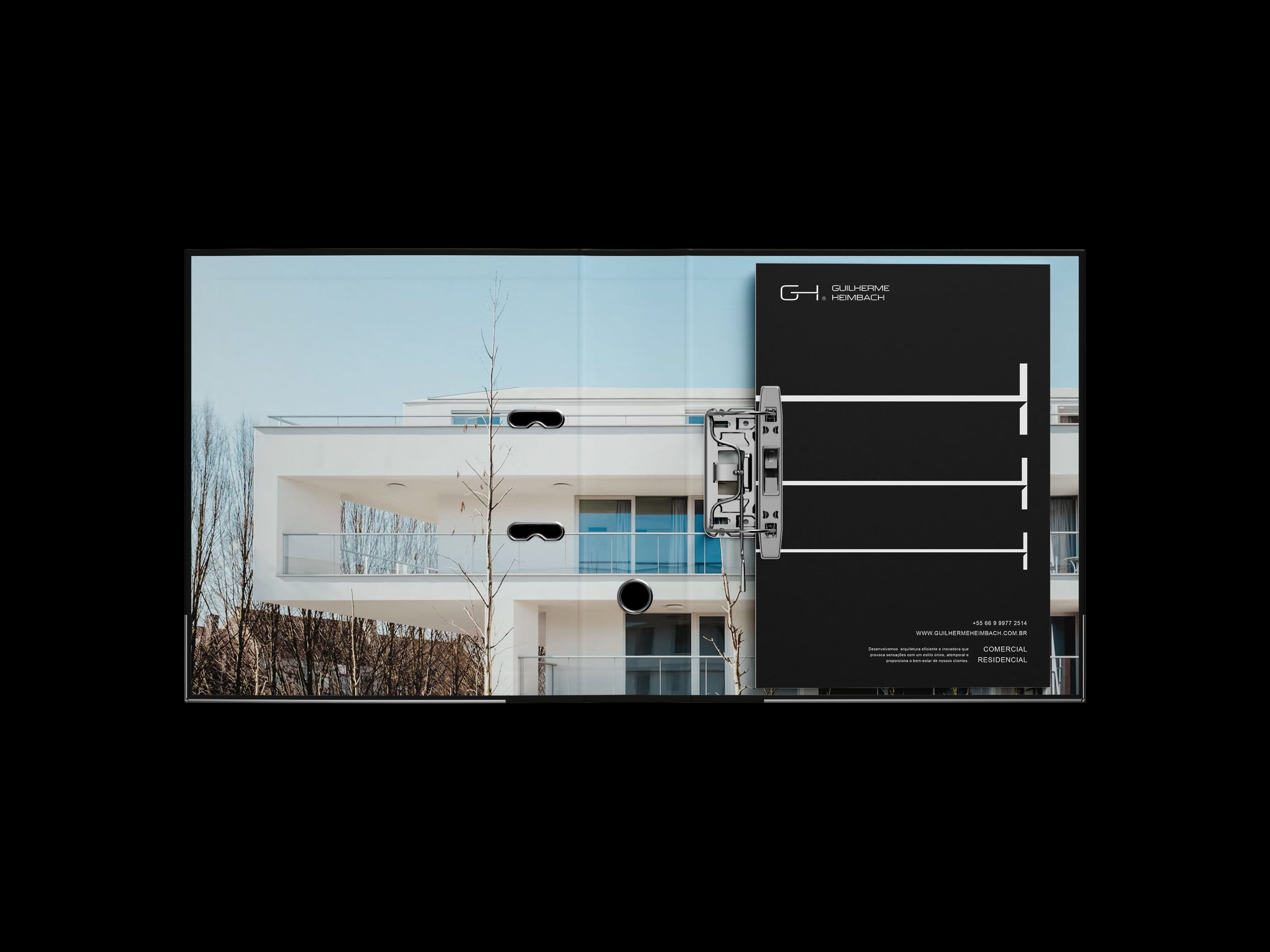
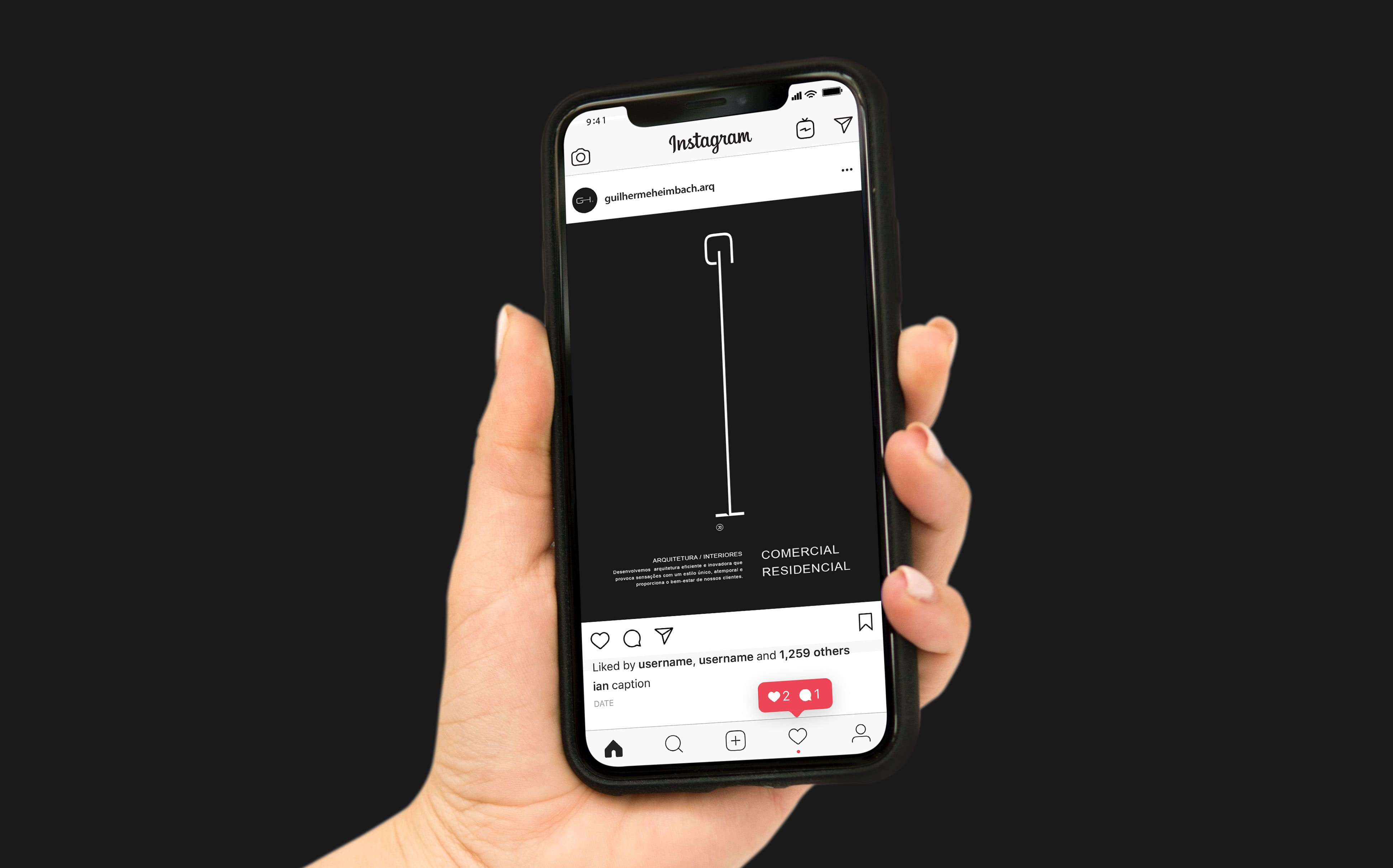
The visual identity of Guilherme Heimbach’s brand is a reflection of his minimalist approach to architecture. The use of negative space, limited color palette, and clean typography create a sense of clarity and sophistication. The minimalistic design elements also help to create a sense of balance, harmony, and tranquility in his work.
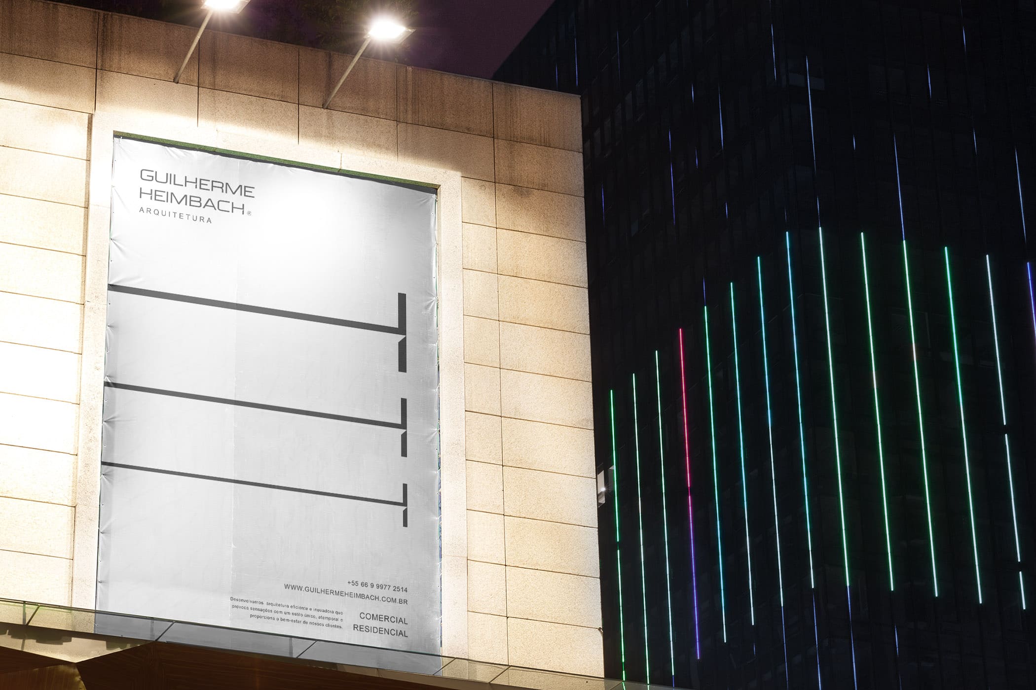
This visual language is consistent across all of his brand’s touchpoints, including his website, business cards, and marketing materials. The visual identity of his brand communicates a sense of quality, innovation, and attention to detail. It is a powerful statement of the architect’s commitment to creating spaces that are both aesthetically pleasing and functional.
Through his minimalist and contemporary approach to design, Guilherme Heimbach has established a unique and recognizable visual identity that sets him apart in the architecture industry. He has proven that less can be more, and that by stripping designs down to their core essentials, they can still convey a powerful and effective message. Guilherme Heimbach’s brand is an excellent example of how a minimalist approach to design can result in a timeless and powerful visual identity.
CREDIT
- Agency/Creative: Lotipa Brands
- Article Title: Guilherme Heimbach Architecture
- Organisation/Entity: Agency
- Project Type: Identity
- Project Status: Published
- Agency/Creative Country: Brazil
- Agency/Creative City: Lotipa Brands Studio
- Market Region: South America
- Project Deliverables: Brand Identity
- Industry: Construction
- Keywords: architecture contemporany Logo design Color scheme Typography Brand guidelines Graphic elements Stationery design Signage design brandingPresentation materials
-
Credits:
Creative director: Antoniel Felaínne


