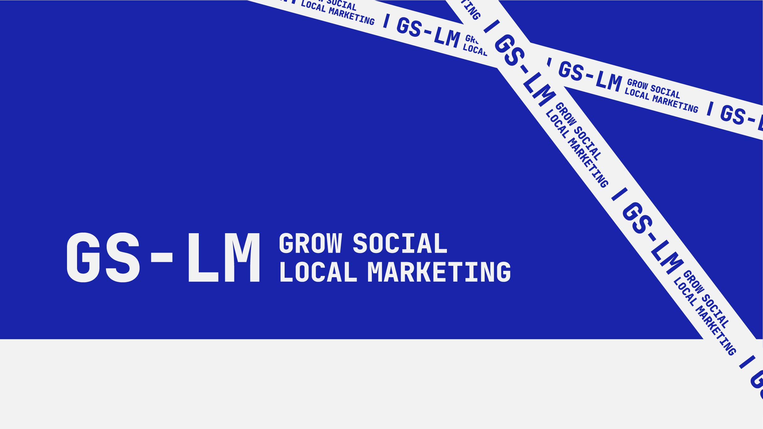
The Brand Identity for the GS-LM.
GS-LM stands for Grow Social – Local Marketing – is a new brand established in Ho Chi Minh City – Vietnam.
Currently, Vietnam’s economy and society is developing day by day. This leads to an increasing number of local and international advertising agencies. But most of the universities and colleges here are still teaching old knowledge, and it is not highly applicable.
Therefore, GS-LM was established with the main purpose of training low-level marketers, those who love marketing, and in the long run, building a community about communication – marketing exclusively for Vietnamese people.
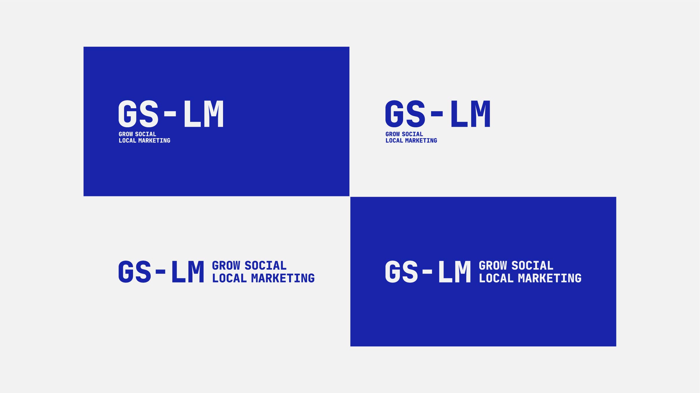
With the orientation to become the connecting place for the marketing community in Vietnam, GS-LM needs an identity for all ages, suitable for both print and display on digital platforms. Most of the customers are young people, students, or those who want to learn more about the communication and marketing profession, so the colors and fonts of the design also need to ensure flexibility in use.
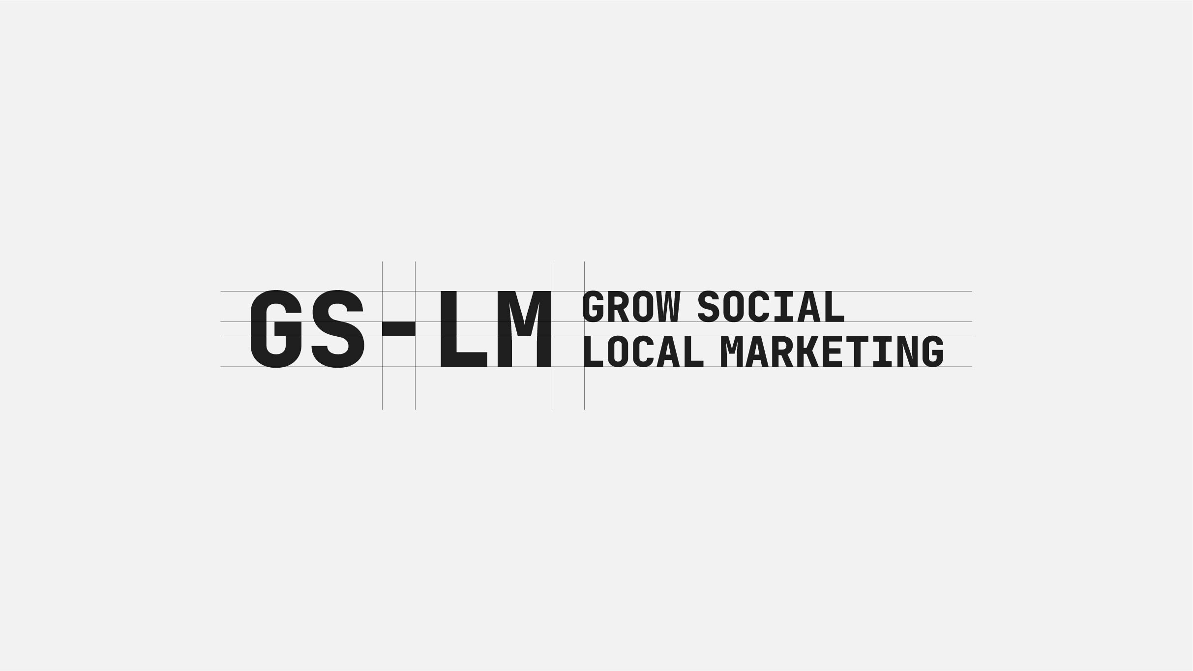
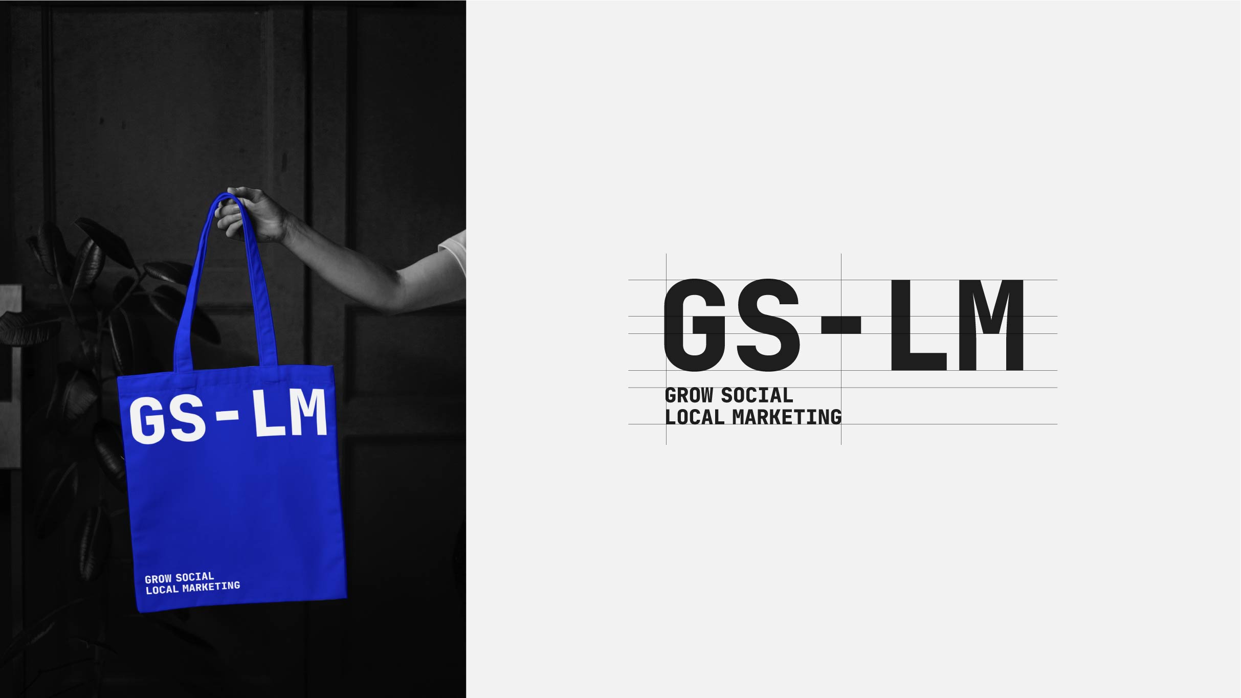
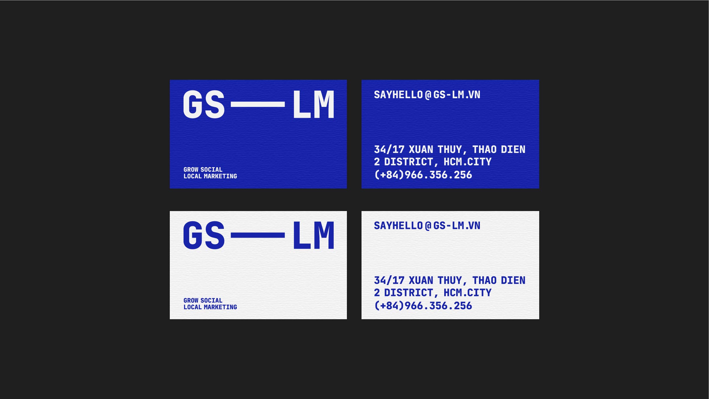
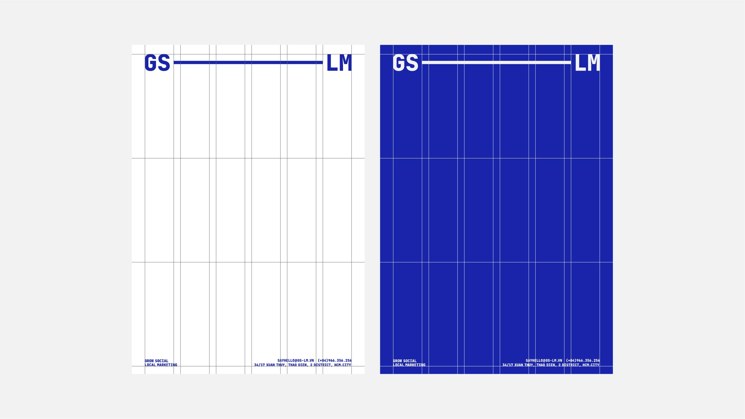
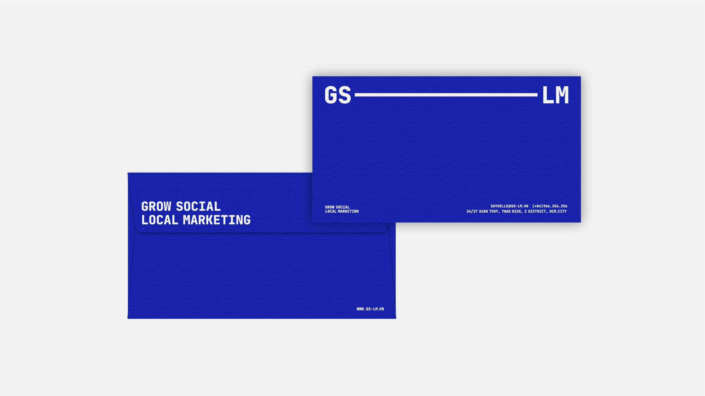
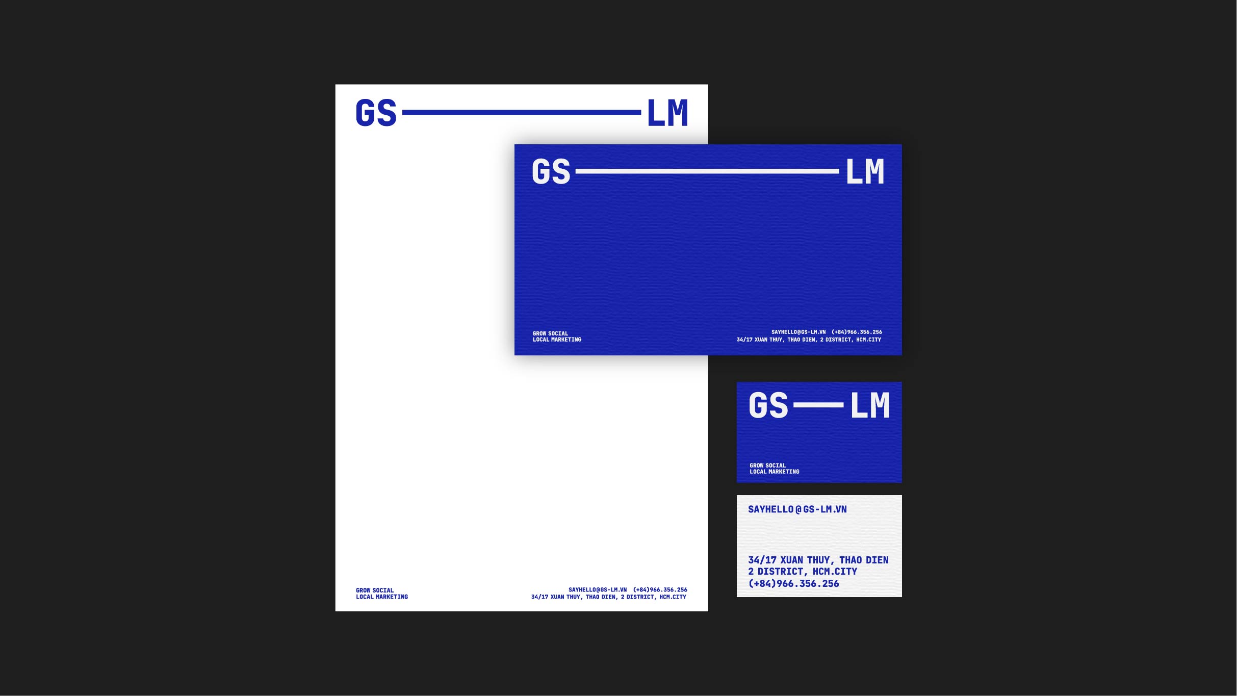
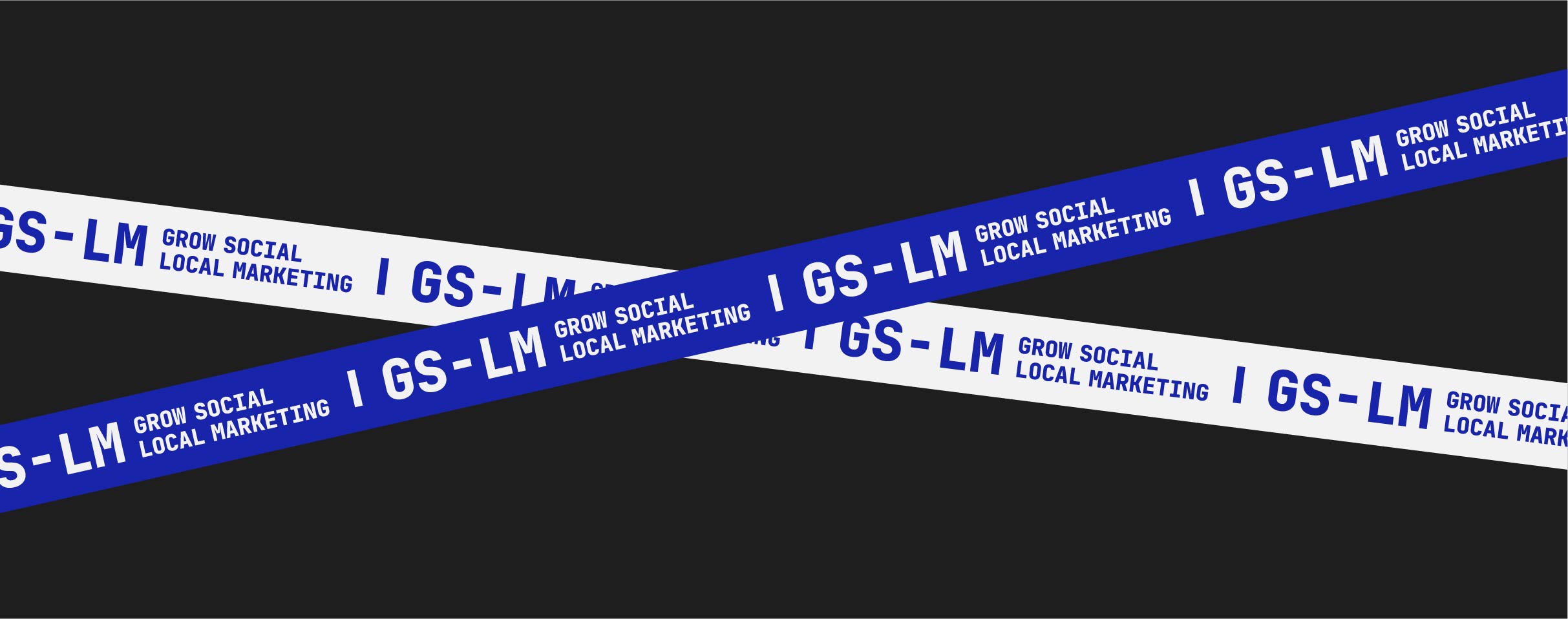
The design idea is based on simplicity, using a wordmark logo. With a hyphen “-” between GS and LM to explain the connection, balance and sociability, community. Blue is chosen as the main color of the GS-LM brand. This color represents youth, dynamism, and trust and transparency. Helps to express design ideas more clearly. Following a simple concept, GS-LM’s designs are all used text, not images. The typeface chosen by Overlay Vietnam is JetBrains Mono for this design in brand identity.
CREDIT
- Agency/Creative: Overlay Vietnam
- Article Title: GS-LM Brand Identity Designed by Overlay Vietnam
- Organisation/Entity: Freelance
- Project Type: Identity
- Project Status: Published
- Agency/Creative Country: Vietnam
- Agency/Creative City: Ho Chi Minh City
- Market Region: Asia
- Project Deliverables: Brand Identity
- Industry: Human Resources
- Keywords: logo type, type design, brand identity, company identity, vietnam, overlay vietnam, nguyen trong duc
-
Credits:
Art Director: Trong Duc nguyen


