


Background: The brand Grisbì has been owned by Vicenzi S.p.A., the Italian leader in the bakery sector, since 2005. It is the velvety cream-filled shortcrust pastry par excellence. Its delicious, exclusive recipe makes it a unique product; female consumers think it is synonymous with a shape and filling, even for products that are not pastries. This significant awareness forms the basis for the ‘Grisbì wild’ project.
Strategy: There are various ‘key’ moments throughout the lifecycle of a brand, each requiring certain actions from marketing. After introduction and growth, there is the mature stage and ‘revitalisation’ is necessary at this point. Thus, 2010 was the time of the first significant direct change to the use of language more in line with the brand’s target. The restyling of the brand, more adult and elegant, and the search for an iconographic key visual able to uphold the product’s uniqueness was the outcome of this first stage.
After seven years of analysis of the market and target, with focused action using all the levers of the marketing mix, realignment of all the elements of the visual identity (brand, system and product) was necessary with an increasingly precise, clear and outlined positioning. Both evolutionary stages were created by NEOM.
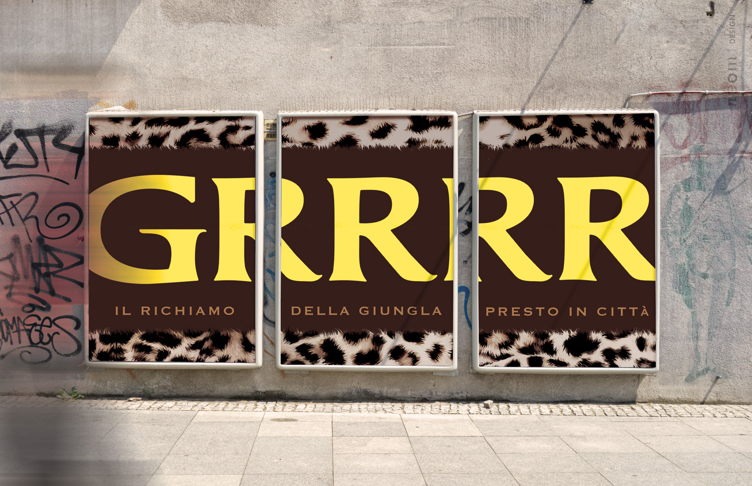
2020 was the right year for going further, dissolving the ‘invisible chains’ of pragmatism and freeing the brand’s essence. To do this, daring was required, where necessary, with sagacious breaking of some written and unwritten rules of ‘branding’.
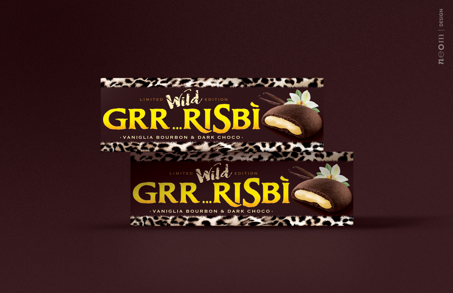
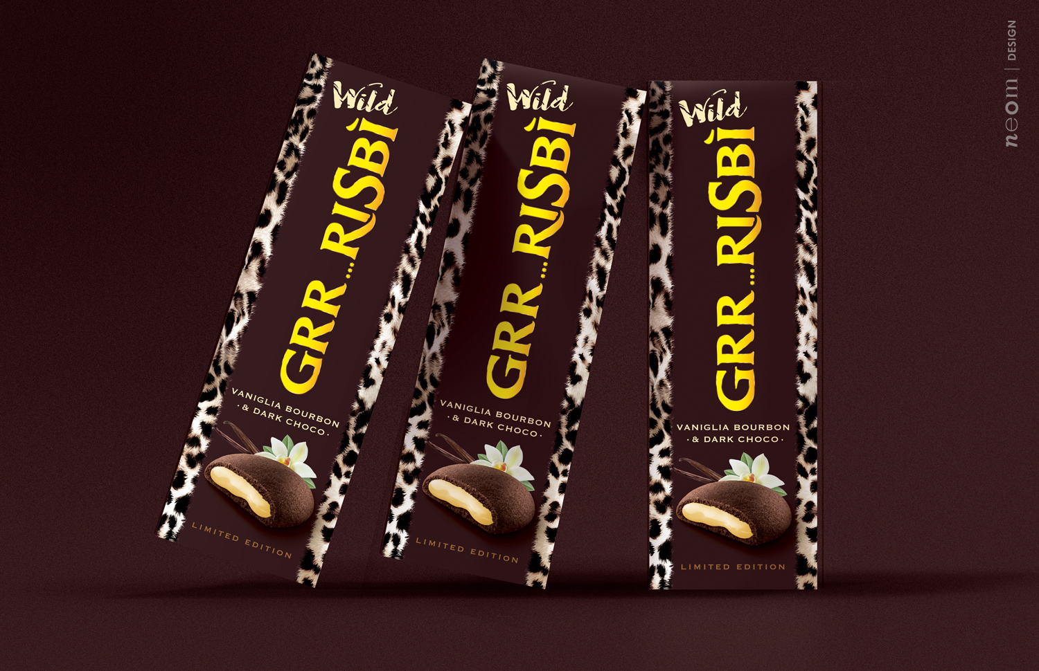
Project: Launch of the new Limited Edition Grisbì Wild, a dark chocolate biscuit filled with Bourbon vanilla cream. The ‘animalier’ concept, very much in vogue in 2020 and in line with the brand’s primary target, was used to talk about this new combination. The creative studio introduced the spotted texture, safeguarding the systemic structure of the range yet also creating an explosive identity able to transmit the product concept clearly, distinctively and immediately. The immediacy in particular, because of its nature, opened the way to daring, modifying the brand which adapted well, turning into ‘Grr…risbì’ from Grisbì. This breaking of all the rules could be done due to three synchronous elements: the brand’s maturity point; the product concept which adapts well to the brand name and brand positioning.
The result was a very powerful mix to talk about the brand and involve the public, both loyal and others, in a new way. A concept with the potential for great public and sales effects also through a product which really lives up to expectations.
CREDIT
- Agency/Creative: NEOM
- Article Title: Grisbì Wild Special Edition
- Organisation/Entity: Agency
- Project Type: Packaging
- Project Status: Published
- Agency/Creative Country: Italy
- Agency/Creative City: Teolo
- Market Region: Europe
- Project Deliverables: Graphic Design, Packaging Design
- Format: Box
- Substrate: Plastic
- Industry: Food/Beverage
- Keywords: Pastry
-
Credits:
Partner: NEOM sas di Stefano Giuseppe Dell'Orto


