


Our client is MT Bar, which has the largest collection of gins in Russia and its own Botanical Club tasting club. They are considered the leading experts in the country on gin-based cocktails. This year they introduced their own gin, made in Russia. Therefore, the agency was tasked with creating a unique and distinctive brand for this product, which would reflect the values that the bar team wanted to invest in it. The guys wanted to be part of the new wave of Russian products that are in demand not only at home, but also far beyond its borders, but at the same time they did not want to adapt to the market, and plan to talk about themselves, about the place where they come from, and about what is important to them.
Ideas and solutions:
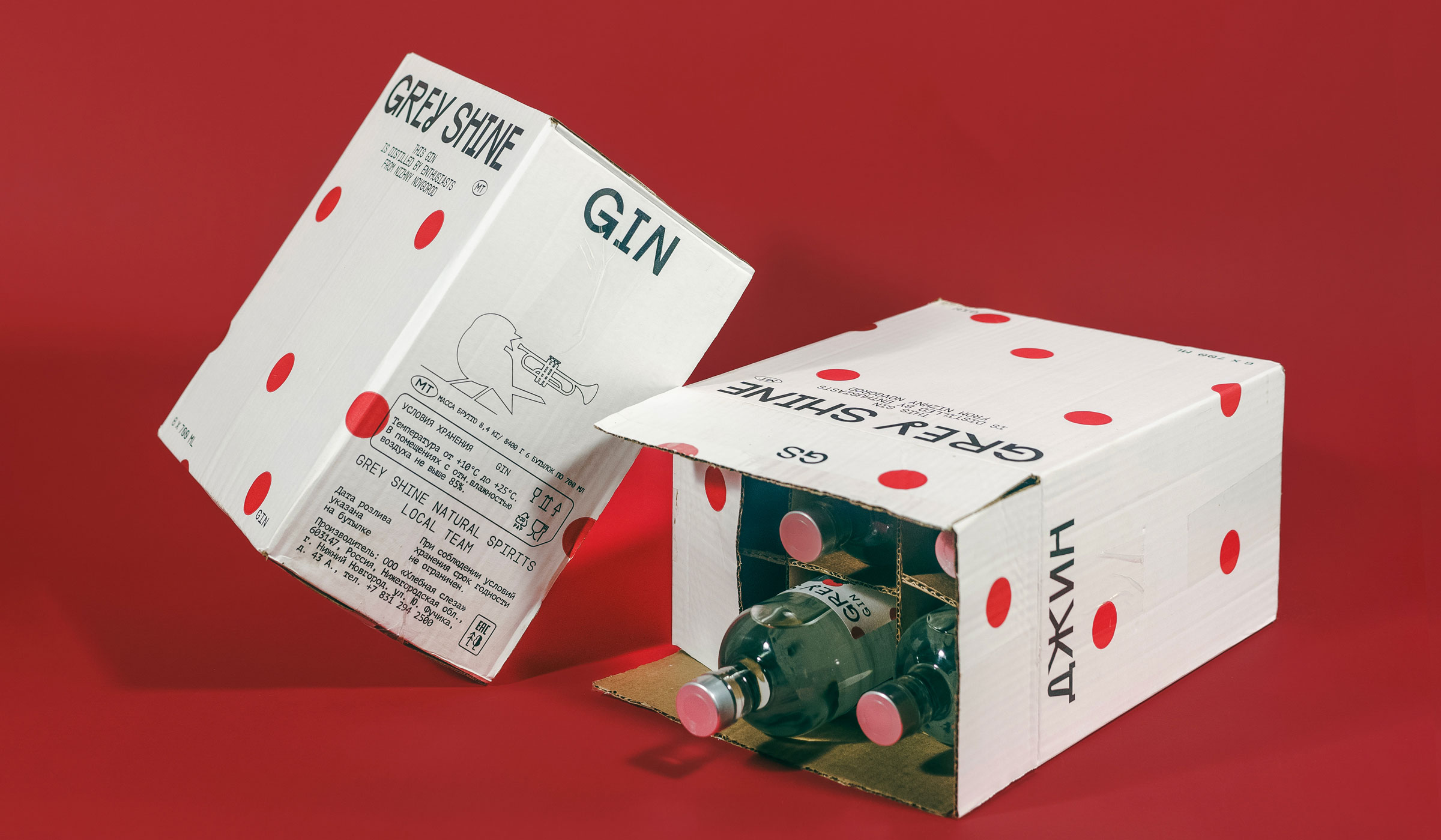
The first thing we encountered was choosing a name. We found the right option in the very first iteration, but it took us three more iterations to make sure it was the right one.
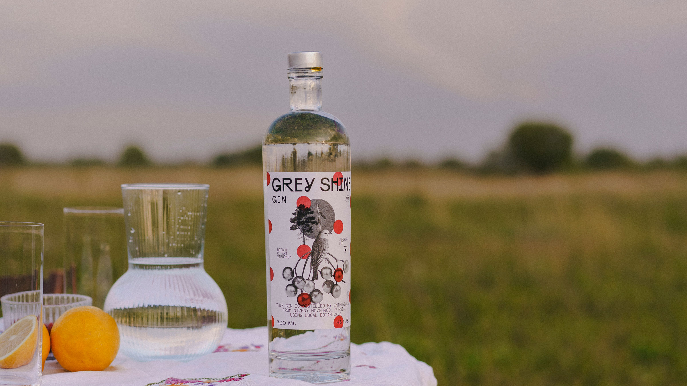
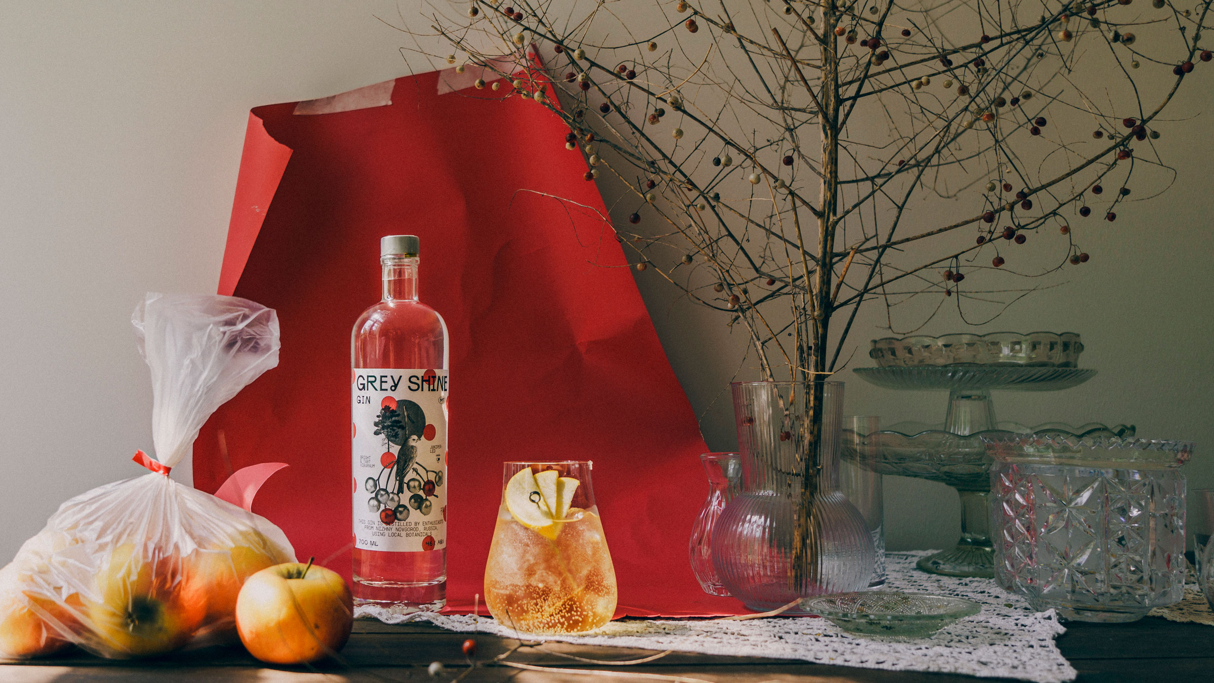
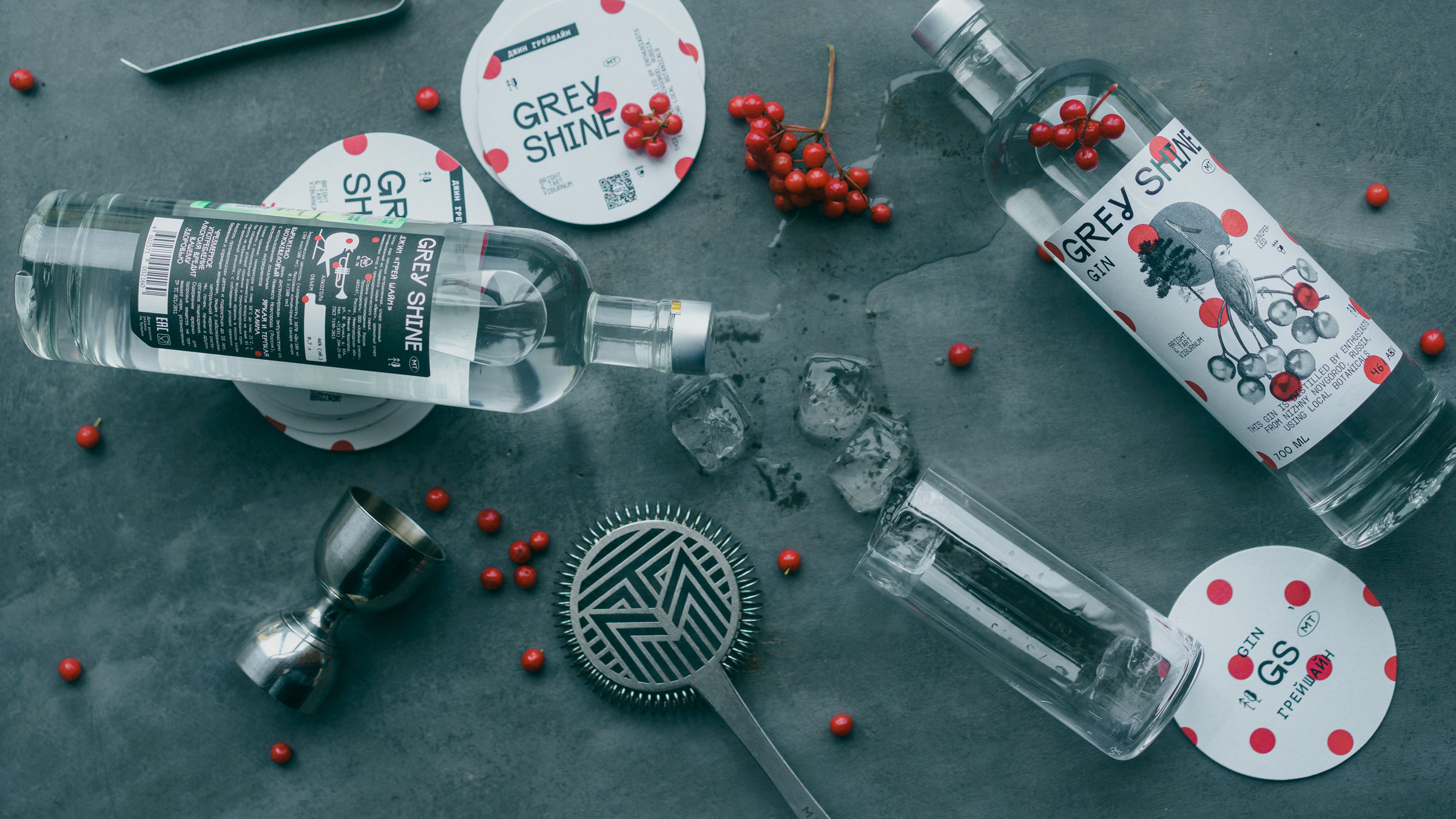
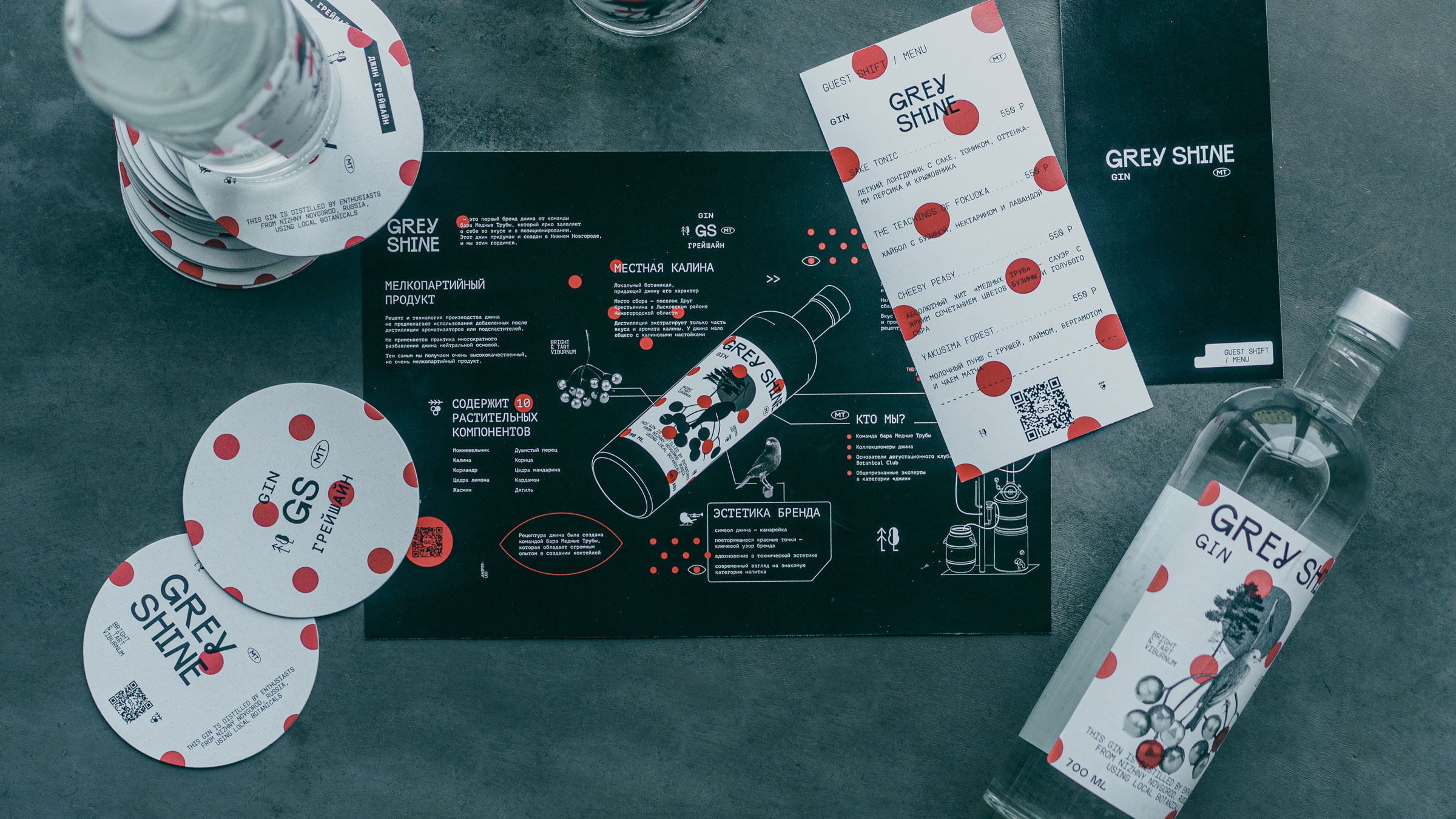
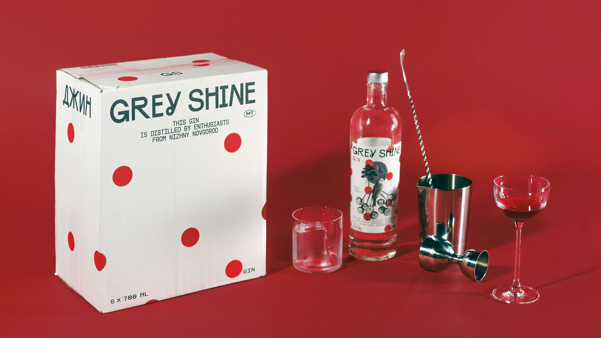
Grey Shine — The name that also became part of the brand’s main tagline — The Grey Shine of Russian Spirit
Since gin is primarily a cocktail drink, we tried to assemble our cocktail from visual images and meanings.
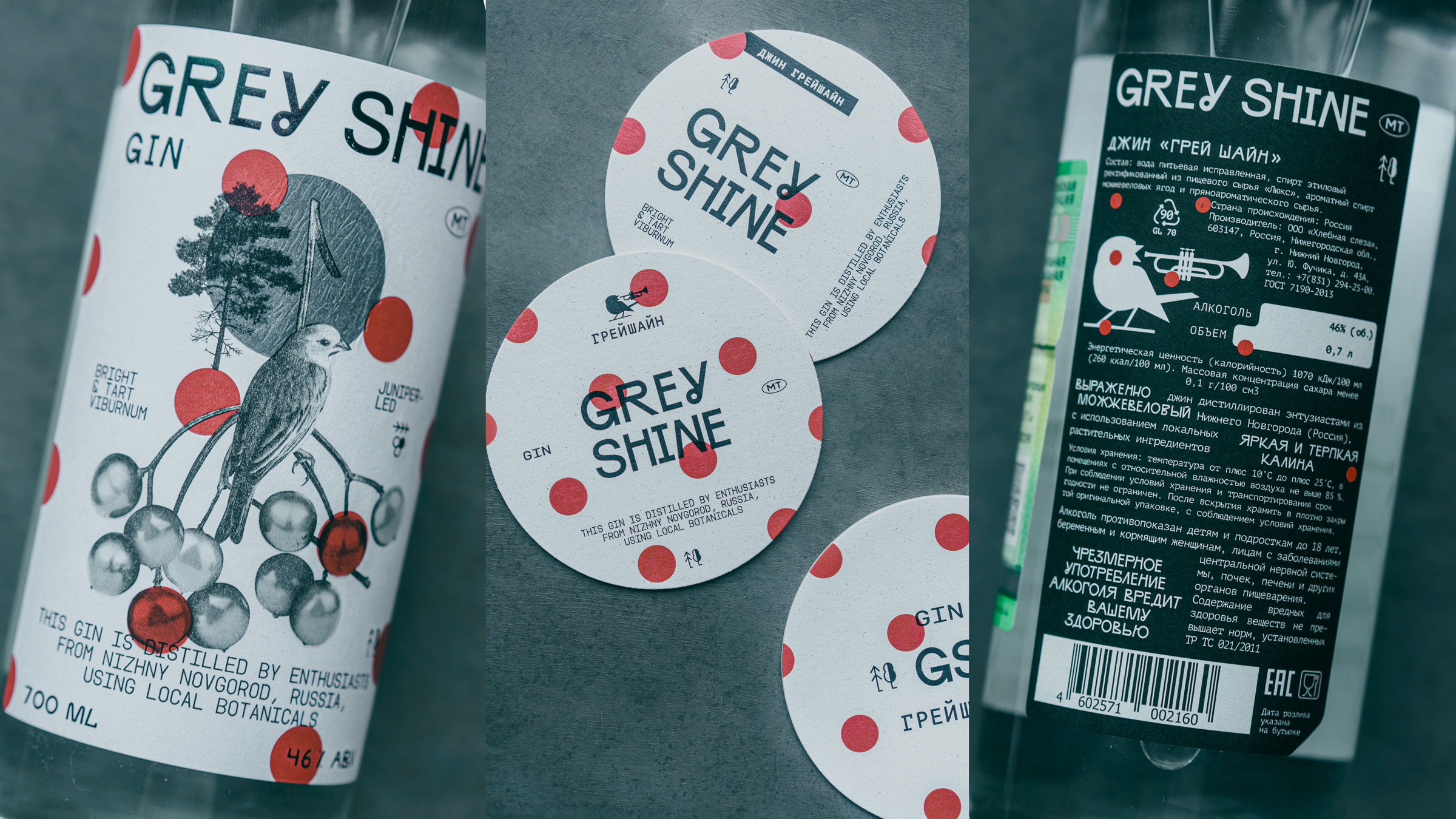
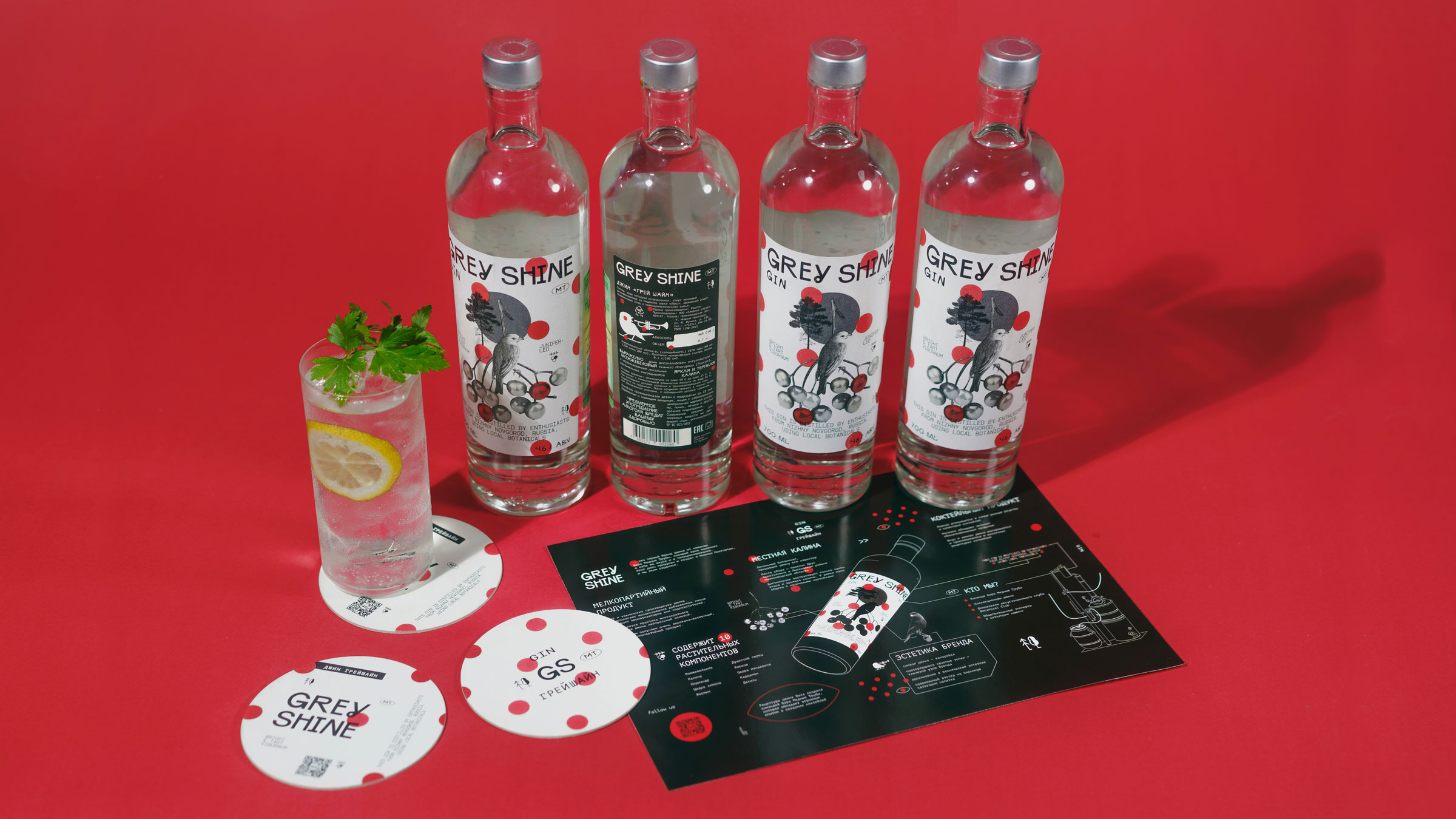
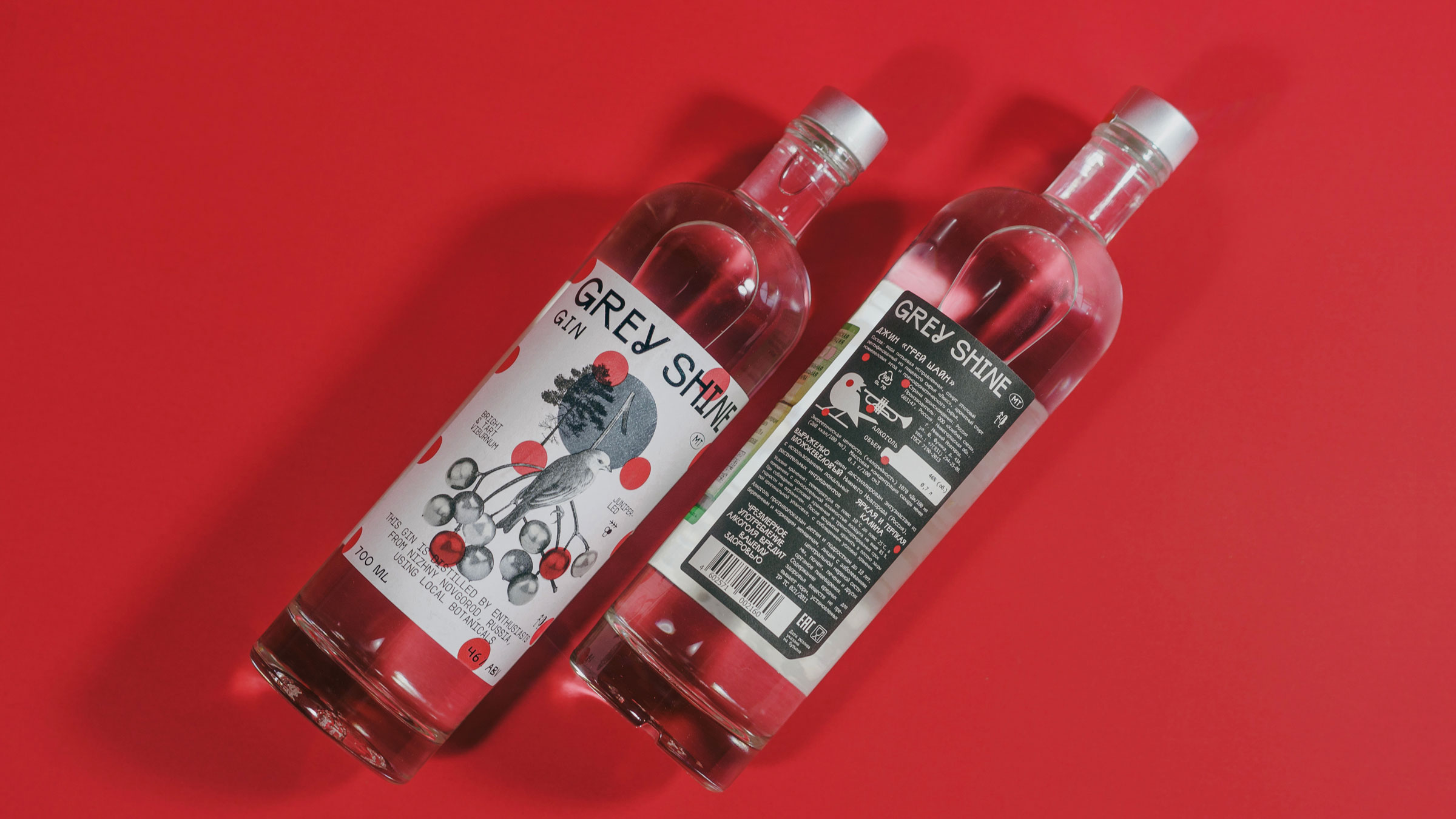
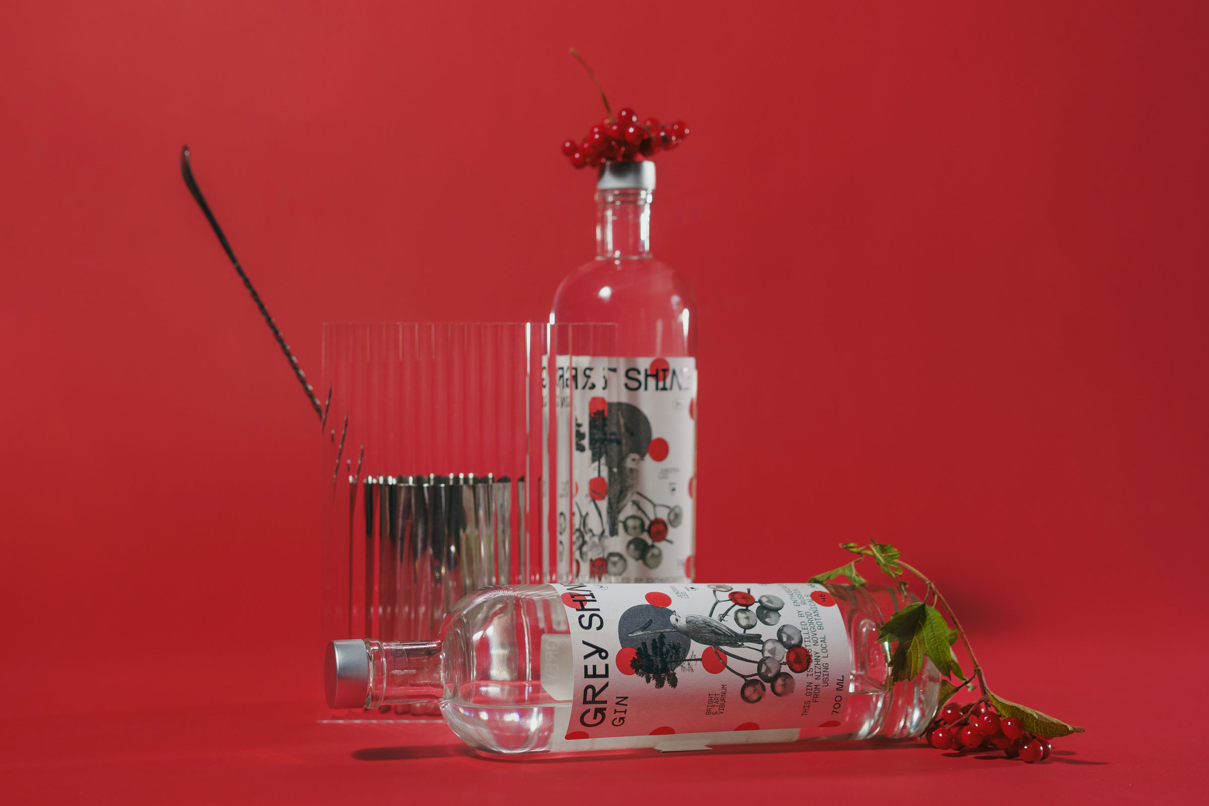
In the center of the composition is a shining gray metal circle, which is both straight and mesmerizing. Here we have a pine tree as a symbol of the Russian forest, which is itself an existential territory of Russian culture. There is a red viburnum, which on the one hand is an ingredient, on the other hand is not so red on the label.
There is a mysterious bird — the Pavlovsk canary. A symbol of the unexplainable, Russian enthusiasm that can lead on an unknown path to the creation of something new and beautiful.
The basis of the brand block is its own handmade font, which is deliberately strange, such a little crooked, but its own native. In the first briefing on design after the approval of the brand platform, we were joined by Sasha Zagorsky, who helped us understand what this true Russian spirit should be, shining in its homemade grayness.
The font is a bit little tipsy, but stable and durable. In addition to it, we used a monospace font, which is characteristic of our city’s radio amateurs, engineers, and IT specialists…
There is more to this gin than we can imagine, let alone explain. Because it is impossible to explain the shining of the gray Russian soul.
CREDIT
- Agency/Creative: Unblvbl Branding Agency
- Article Title: Grey Shine Gin Branding and Packaging Design
- Organisation/Entity: Agency
- Project Type: Packaging
- Project Status: Published
- Agency/Creative Country: Russia
- Agency/Creative City: Nizhniy Novgorod
- Market Region: Asia, Europe, Global
- Project Deliverables: Art Direction, Brand Creation, Brand Identity, Brand Naming, Brand Tone of Voice, Branding, Label Design, Packaging Design
- Format: Bottle, Box
- Industry: Food/Beverage
- Keywords: gin, bar, alcohol, cocktail, white spitir, label design, box
-
Credits:
Art director: Timur Saberov
Designer: Alena Orlova
Designer: Anna Garanicheva
Designer: Maria Volkova
Photography: Eugene Rusov
Brand Platform: Anton Bulekov
Naming: Igor Palashov
Guest: Sasha Zagorsky
Agency: Unblvbl
Client: MT Bar
Brand: Grey Shine Gin


