


About
Green Feast is a family-owned brand delivering hydroponically grown salad bowls through a subscription model. The brand stands for wholesome nourishment, sustainability, and heartfelt care, values that echo throughout the customer experience, from the source of the ingredients to the final moment at the dining table.
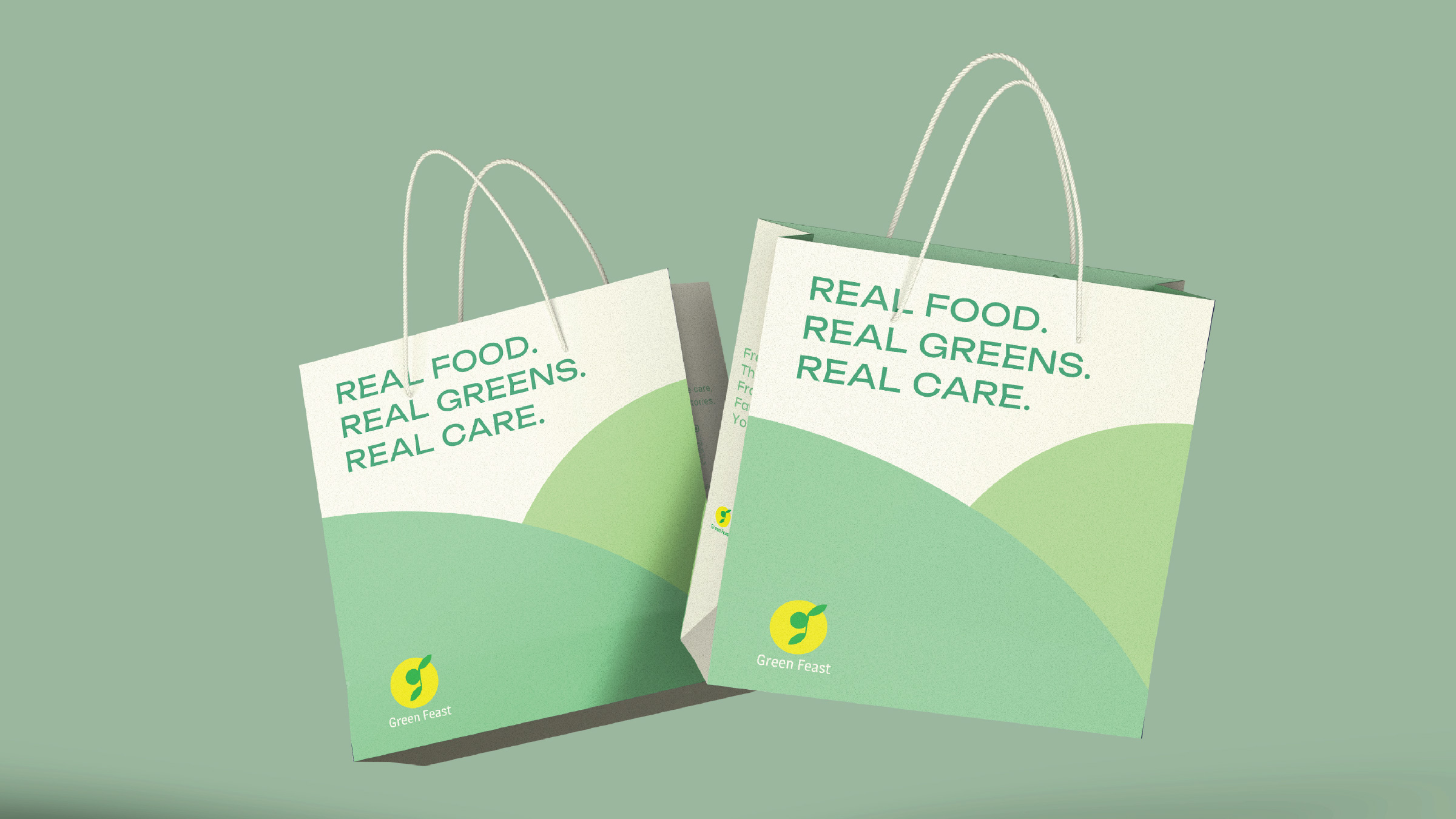
Concept Behind the Packaging Design
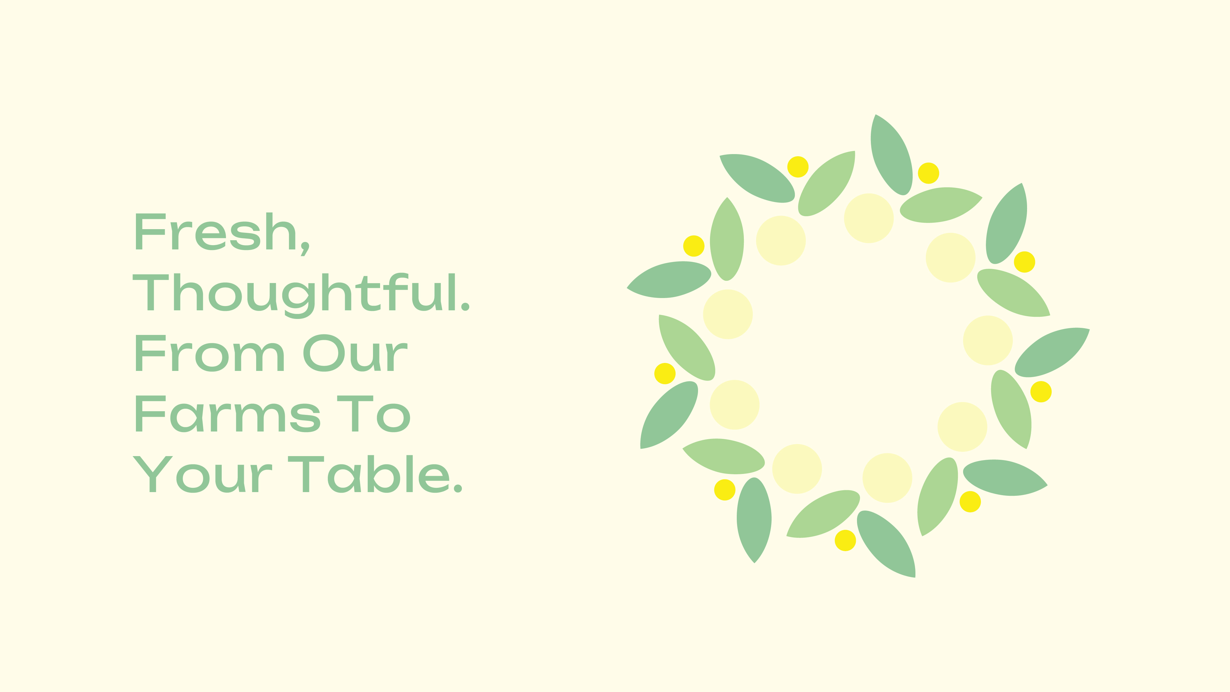
The design approach centers on simplicity and authenticity. Every visual element is distilled from the familiar shapes of the Green Feast logo. This creates a visual system that is gentle, accessible, and instantly recognizable, reminiscent of the purity and creativity found in a child’s drawing. The muted, earthy colour palette and organic forms evoke the freshness of the greens and the values of ecological responsibility.
Solution & Techniques
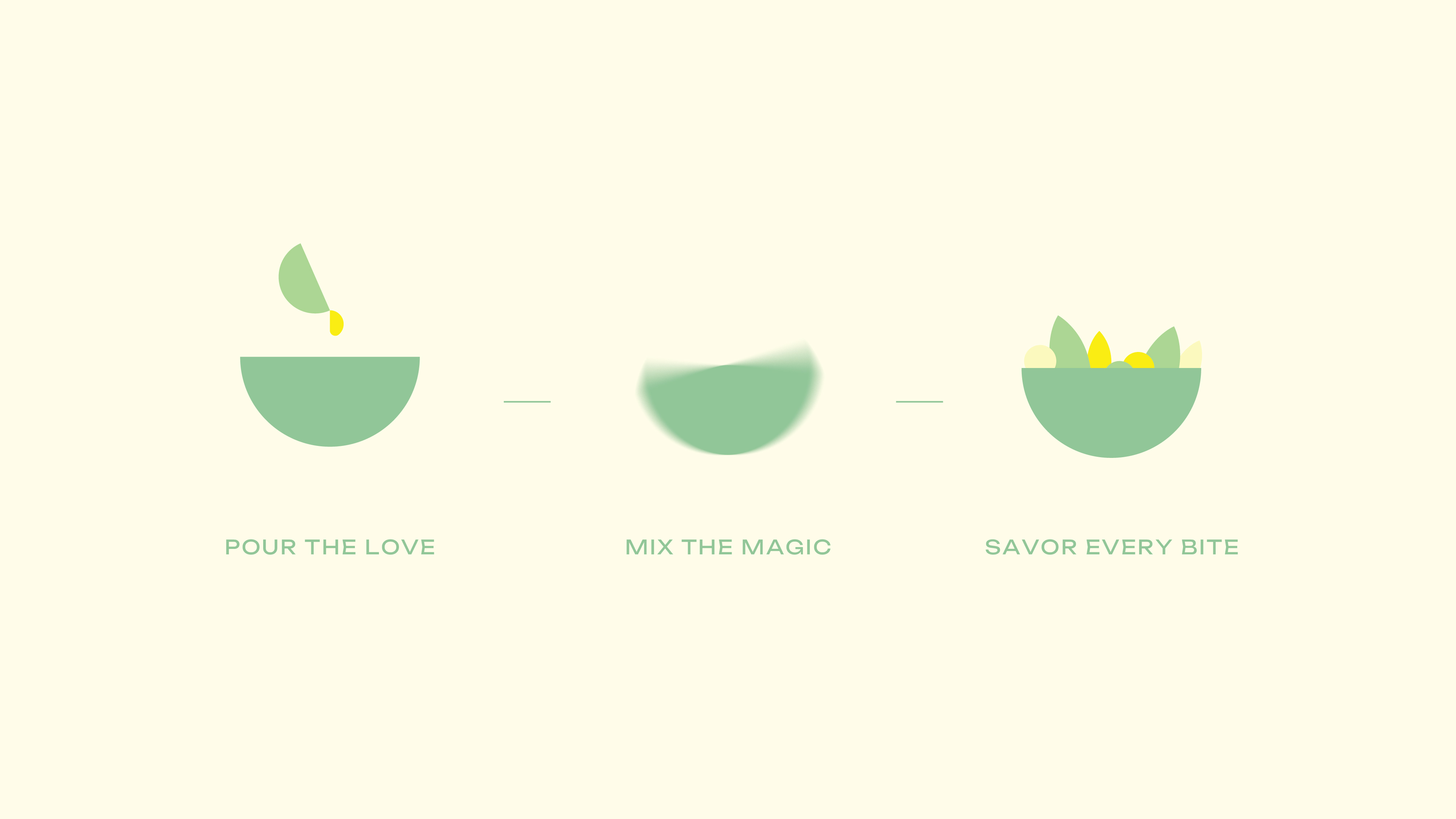
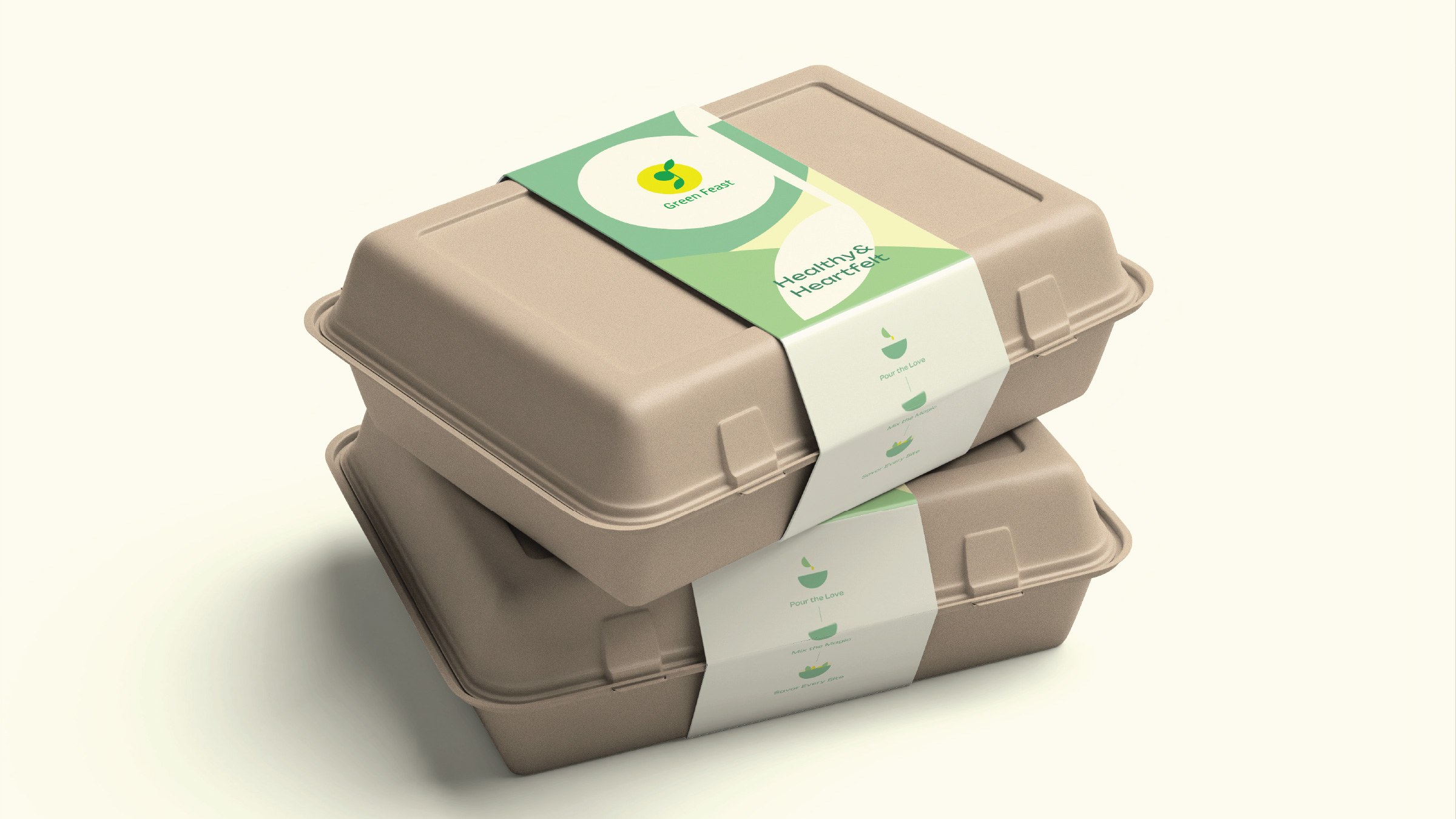
Instead of introducing external motifs, the visual system is constructed entirely from the logo’s shapes, creating a seamless brand language. The packaging, from compostable bowls to the instructional infographics, is adorned using these shapes, resulting in a design that is both minimal and evocative. For instance, the salad mixing guide is illustrated exclusively with logo-derived forms, guiding customers through “Pour the Love, Mix the Magic, Savor Every Bite,” reinforcing both emotional and practical aspects of the brand.
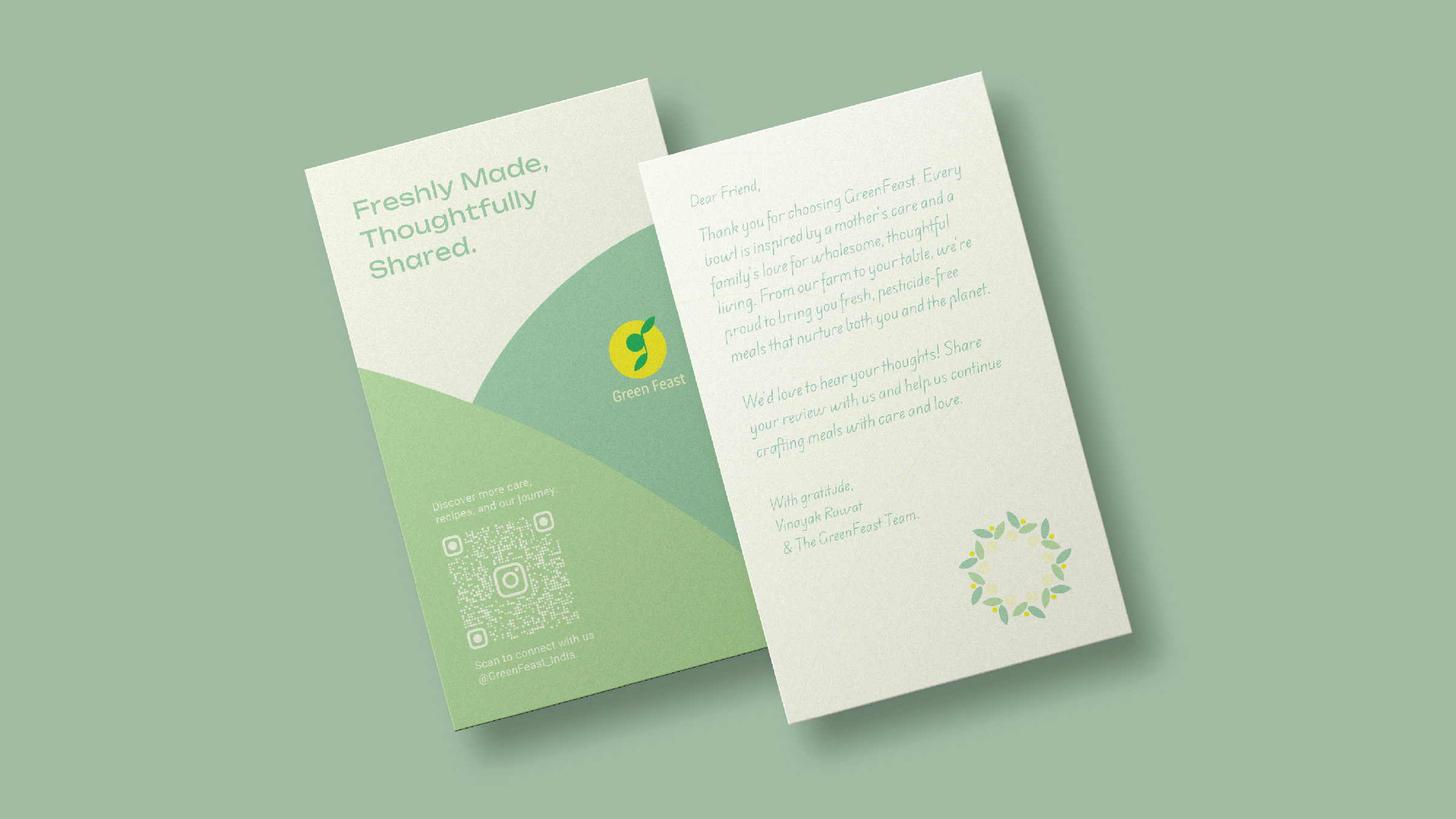
A personal note is included in every box, directly addressing the customer and thanking them for making a healthy, mindful choice for themselves and their families. This gesture highlights the brand’s familial roots and personalised service, transforming a simple meal into an experience of shared care.
What Makes This Packaging Unique
Unified Visual Language: The exclusive use of logo shapes for all brand assets yields an instantly cohesive and memorable identity.
Emotive Minimalism: While the packaging is simple and unembellished, it carries warmth and intentionality elevating eco-friendly materials with thoughtful design.
Emphasis on Care: The handwritten-style card and clear, friendly instructions foster a genuine connection with consumers, making them feel valued and included.
Childlike Freshness: The friendly, approachable graphics evoke the straightforward joy of a child’s painting, reinforcing the promise of freshness and naturalness.
Results
The new packaging system has made Green Feast’s offering singular in the salad bowl subscription space. Customers report feeling both nurtured and delighted, perceiving the packaging as a natural extension of the brand’s ethos of care and sustainability. The design stands out in its marketplace for its clear, heartfelt storytelling and visual coherence, shaping Green Feast as more than just a meal, but a movement in sustainable nourishment.

CREDIT
- Agency/Creative: Qoyn Collective
- Article Title: GreenFeast Packaging: Nurturing Freshness with Simple, Sustainable Design
- Organisation/Entity: Agency
- Project Type: Packaging
- Project Status: Published
- Agency/Creative Country: India
- Agency/Creative City: Mumbai
- Market Region: Asia
- Project Deliverables: Art Direction, Brand Identity, Copywriting, Graphic Design, Identity System, Packaging Design, Packaging Guidelines
- Format: Bag, Bowl, Sleeve
- Industry: Food/Beverage
- Keywords: Sustainable Packaging, Minimal
-
Credits:
Head of Design: Sushant Anikhindi
Head of Innovation: Bhavana Kumaraswamy
Head of Strategic Growth: Noaman Shaikh


