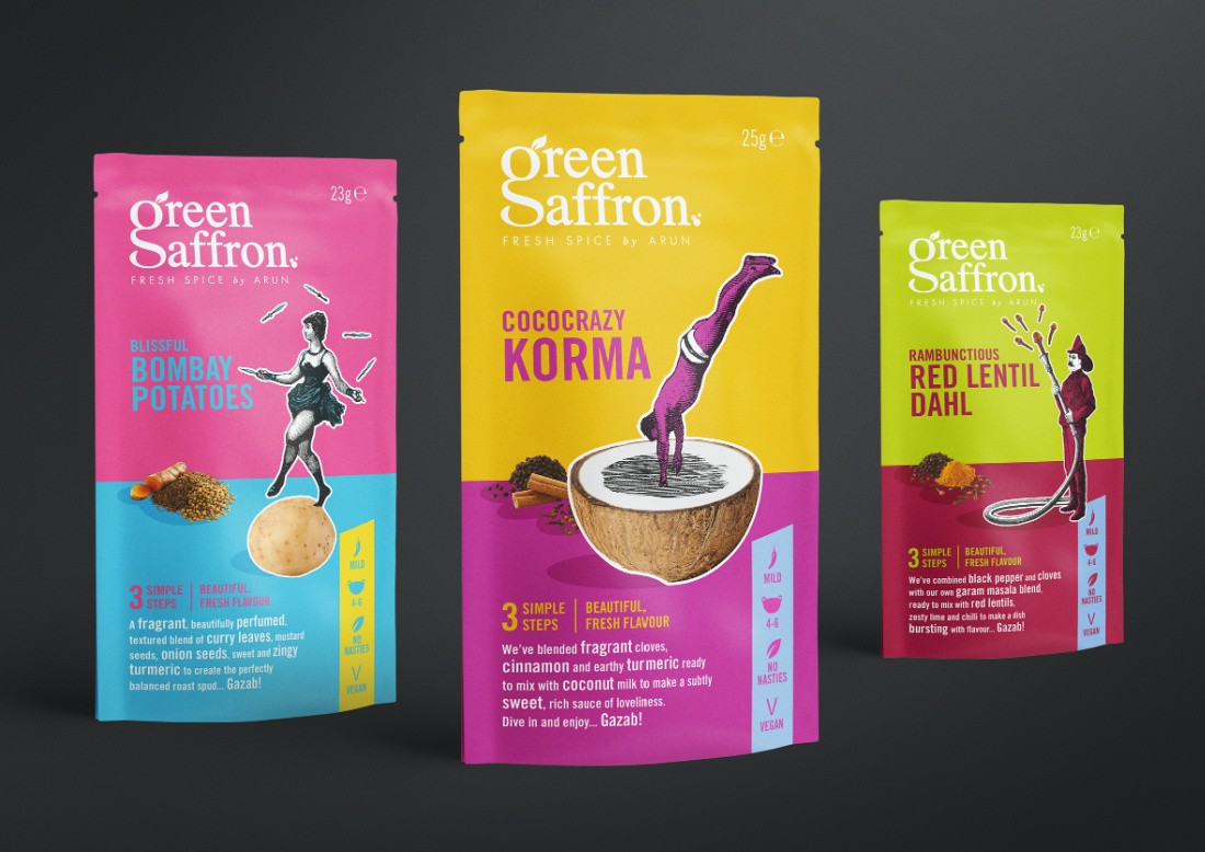
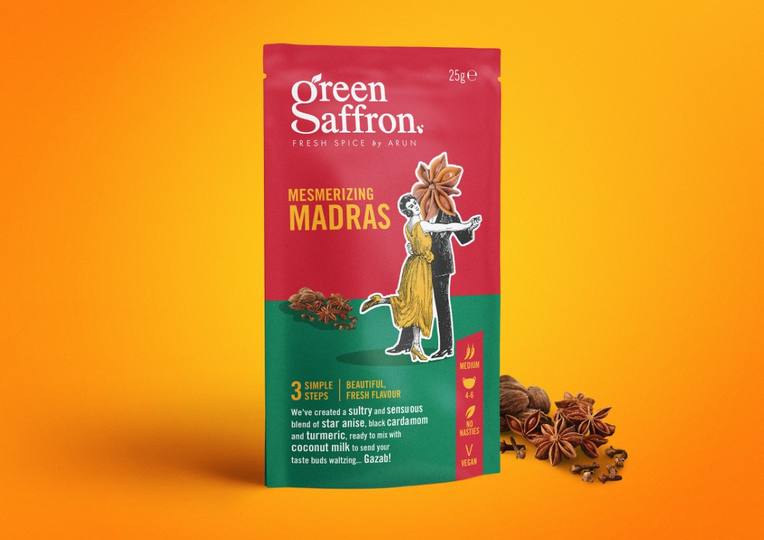
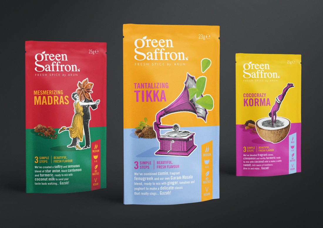
Green Saffron, led by their Anglo-Indian food entrepreneur and chef founder Arun Kapil, are an award-winning independent brand that produce stunning spice blends, sauces, rice, and chutneys made with spices sourced by their family members in India. Uniquely, their fresh spices travel from ‘source to sauce’ in just 8 weeks, and the Green Saffron pride themselves on sourcing and using absolutely the freshest spices possible.
Green Saffron are rightfully famous for their quirky and unexpected spice blends, and everything about this redesign reflects their ethos, and the vibrant personality of Arun himself…
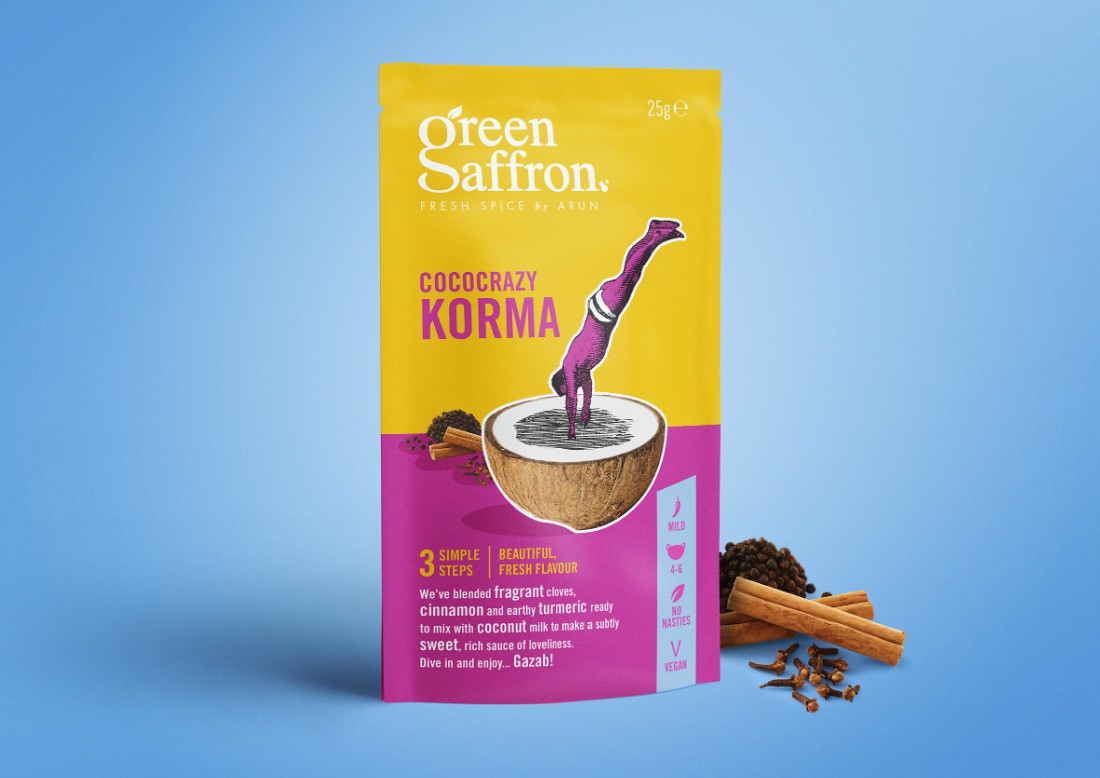
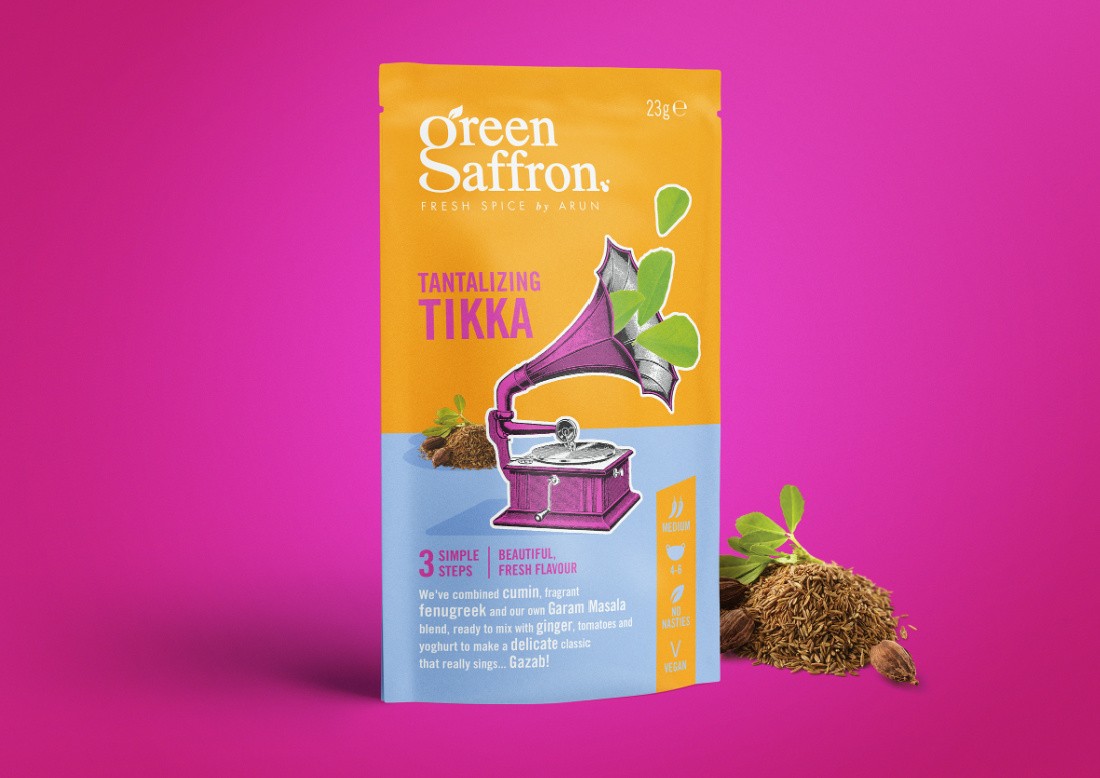
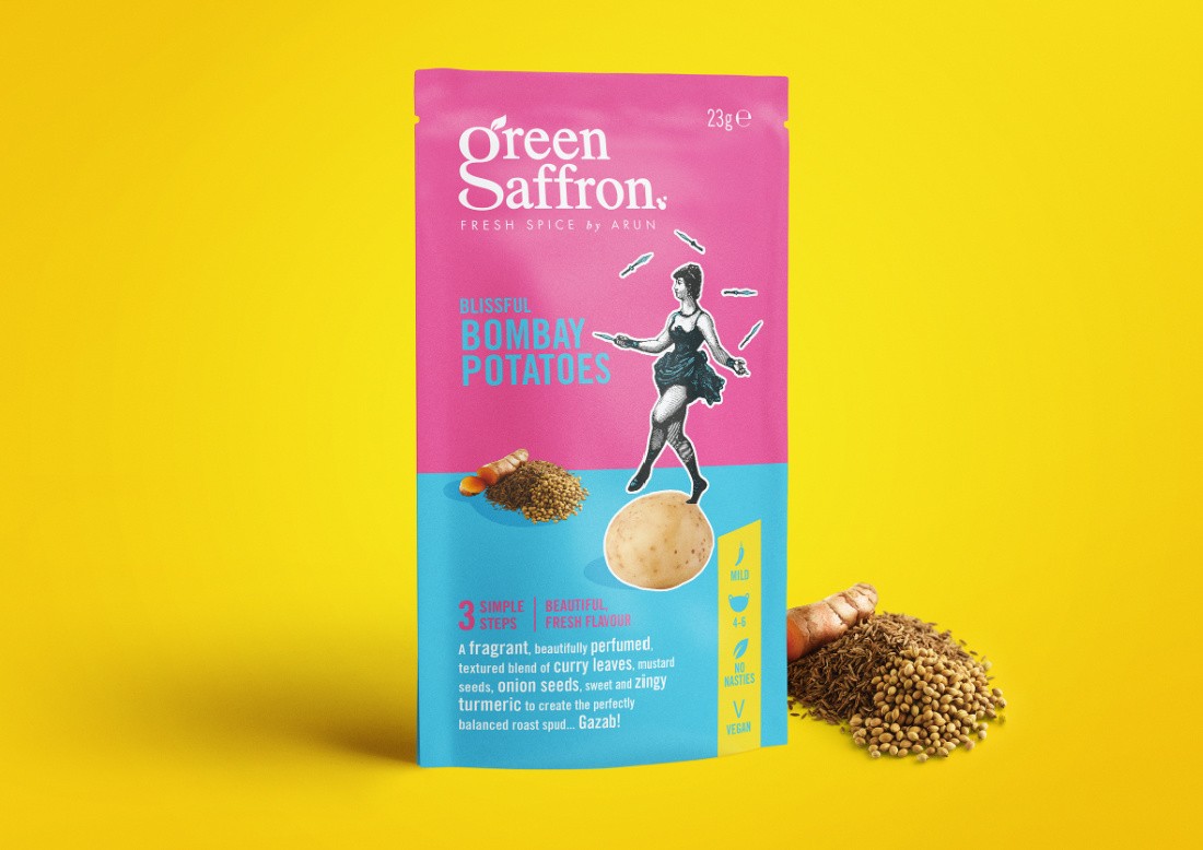
The brand marque blends the ‘g’ and the ‘s’ of Green Saffron giving us uniqueness, vibrant colour combinations have been used to convey the taste and provenance of the spices, and a collage style made up of Victorian illustrations together with ingredient photography creates an unexpected visual language for the brand that brings a smile to the mind.
A fun tone of voice has been developed which elevates the uniqueness of the Green Saffron blends… ‘Mesmerizing Madras’, ‘Tantalising Tikka’, and ‘Cococrazy Korma’ to name a few, add to the personality of this exciting brand.
And finally, the brand is passionate that good home cooked food should be available to everybody and be as simple to make and understand as possible. A clear system of ‘spice temperature’, ‘number of servings’ etc was developed on front of pack, and a simple three step recipe is supplied on the back of pack.
A tasty little redesign!
CREDIT
- Agency/Creative: Simon Pendry Creative
- Article Title: Green Saffron Packaging Redesign by Simon Pendry Creative
- Organisation/Entity: Published Work , Packaging Redesign
- Project Type: Packaging
- Project Status: Published
- Agency/Creative Country: Australia
- Market Region: Europe
- Keywords: WBDS Creative Design Awards 2020/21


