


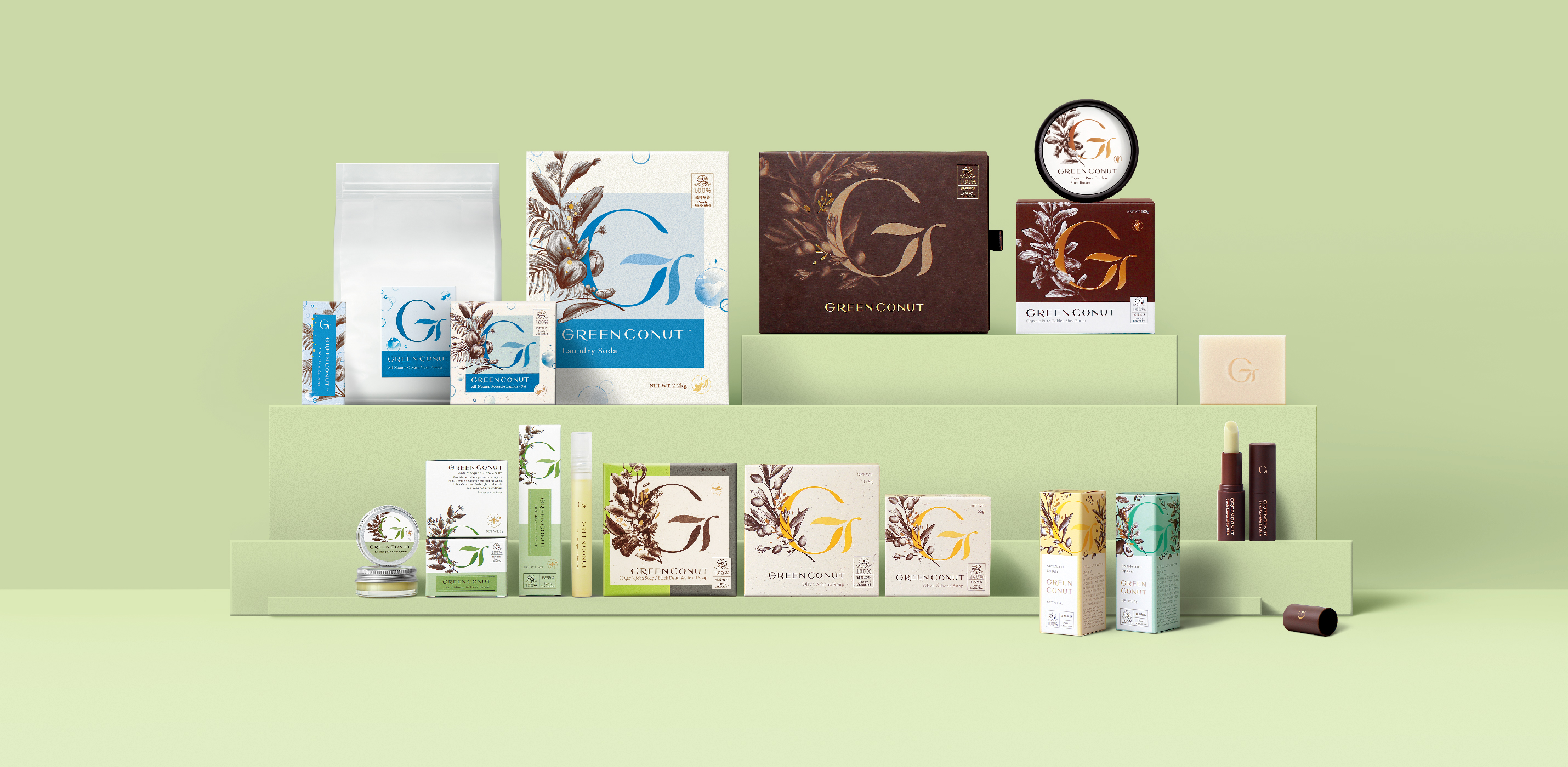
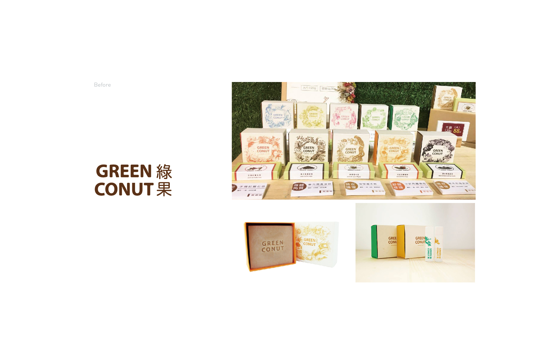
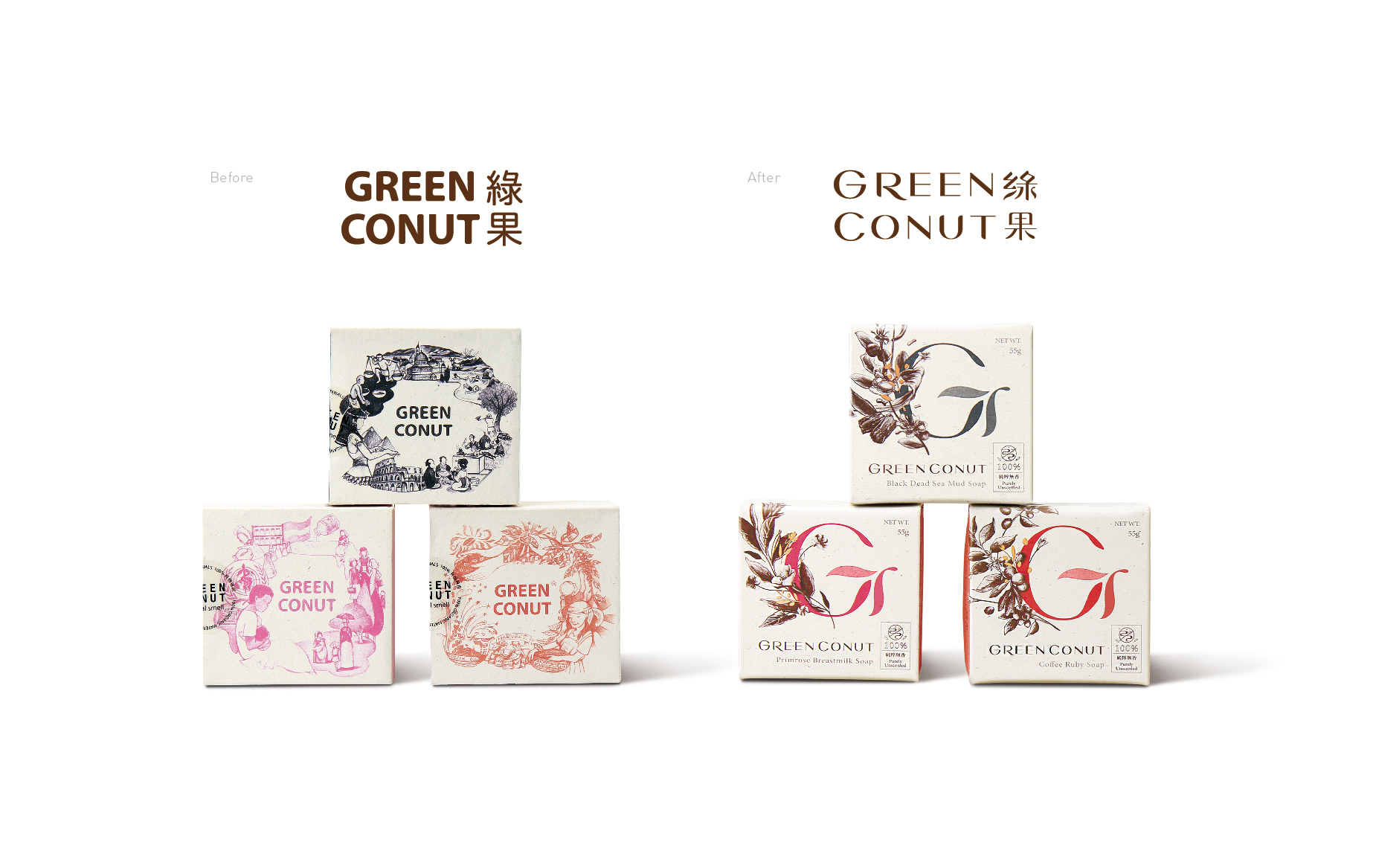
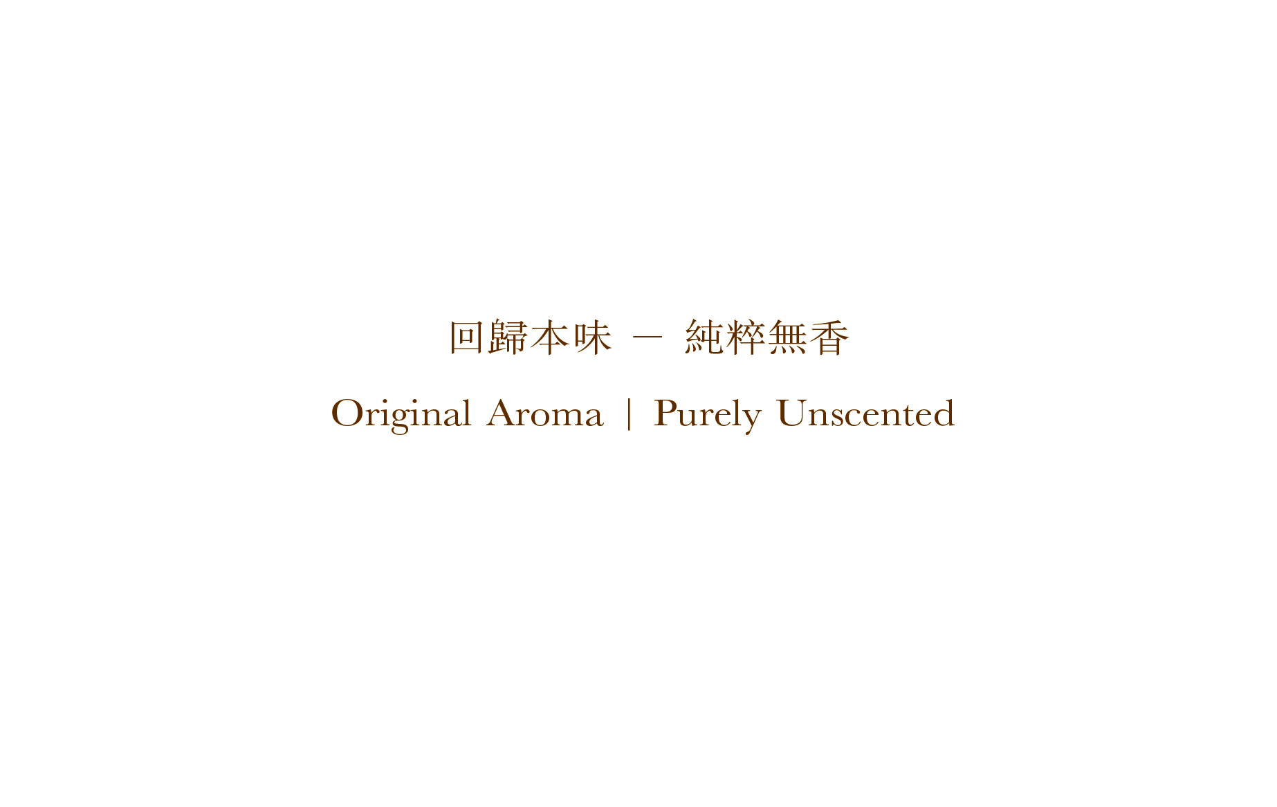
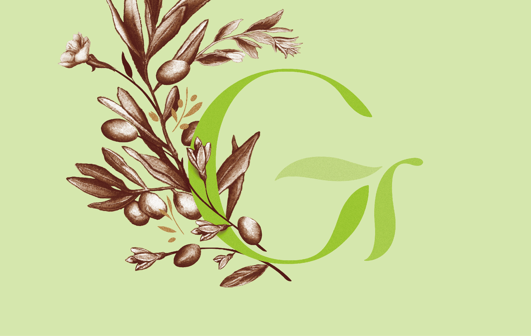
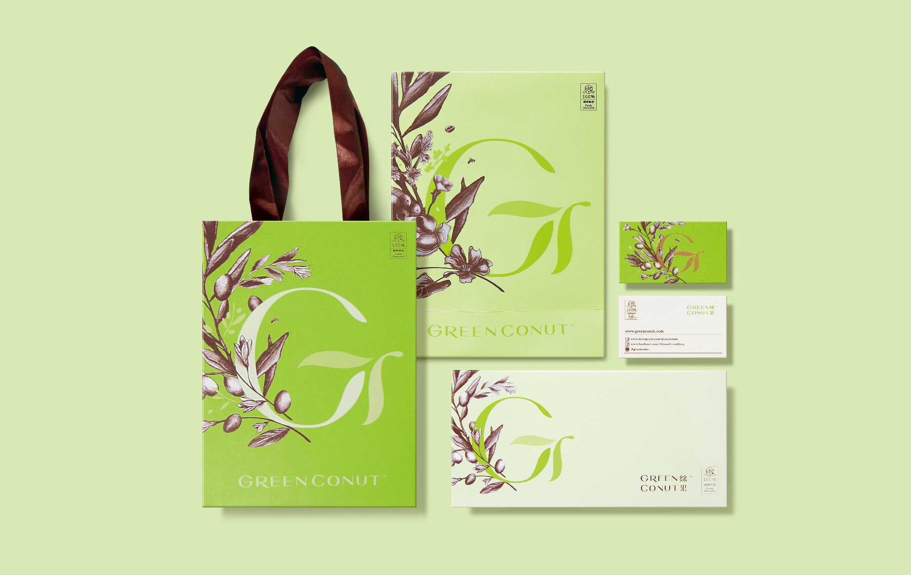
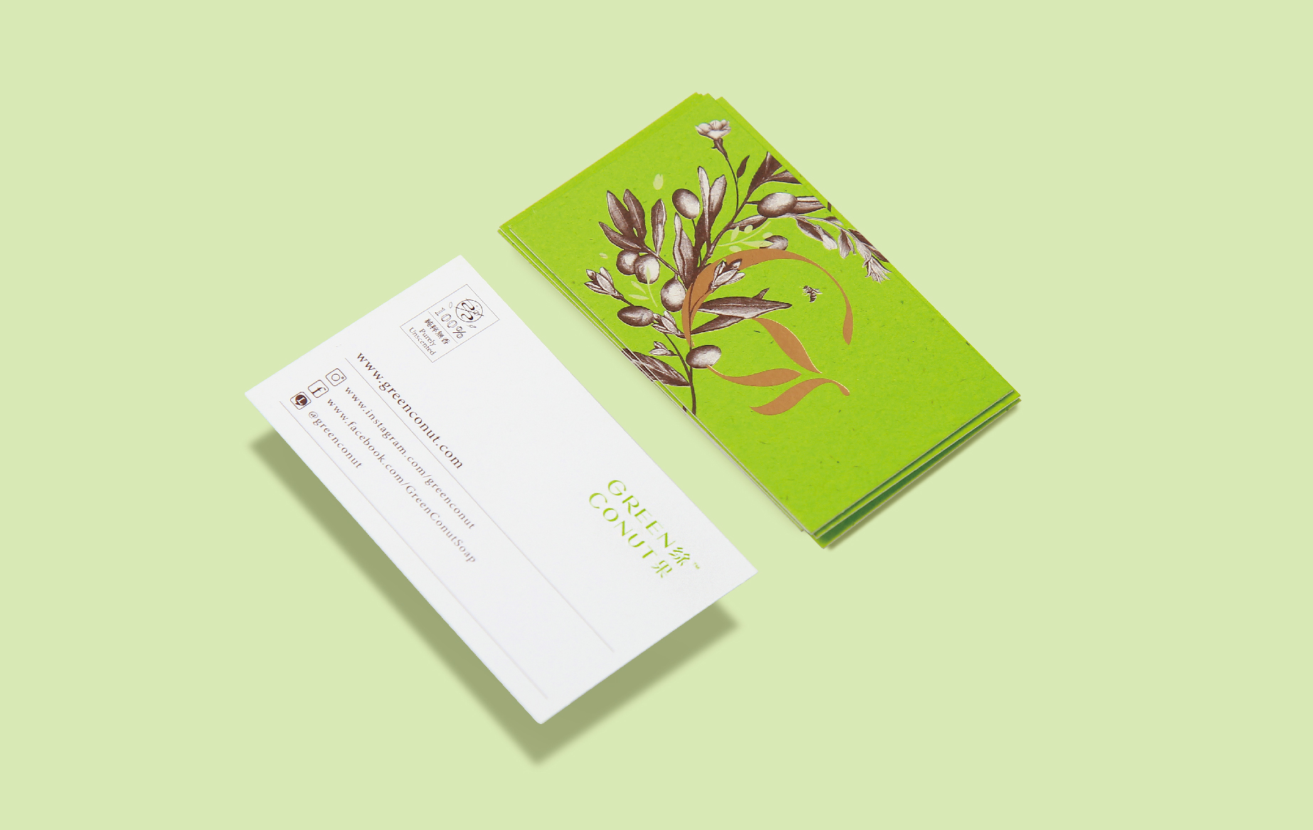
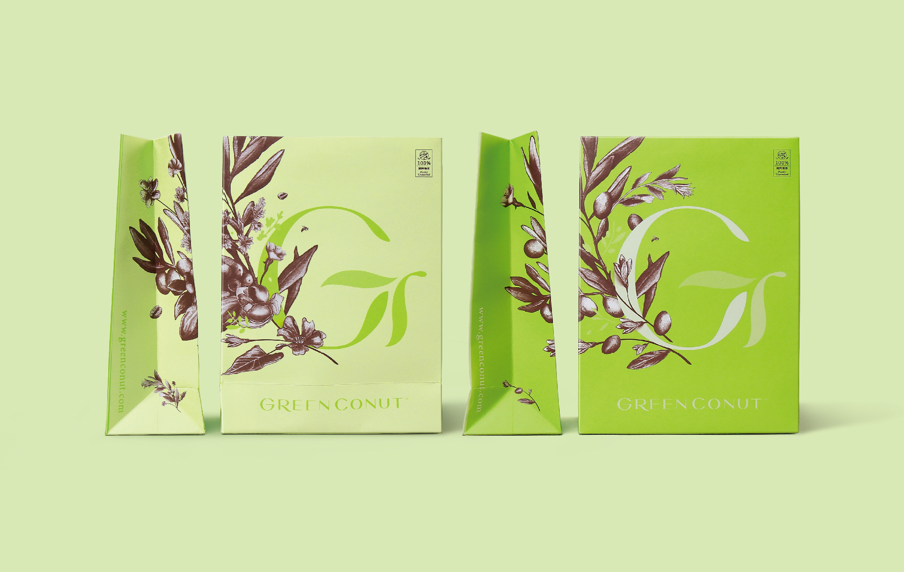
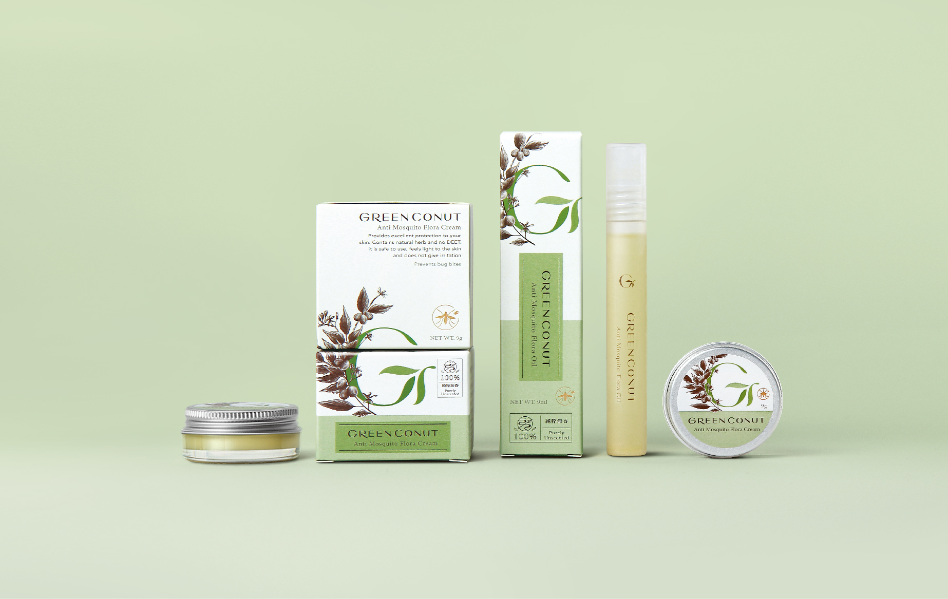
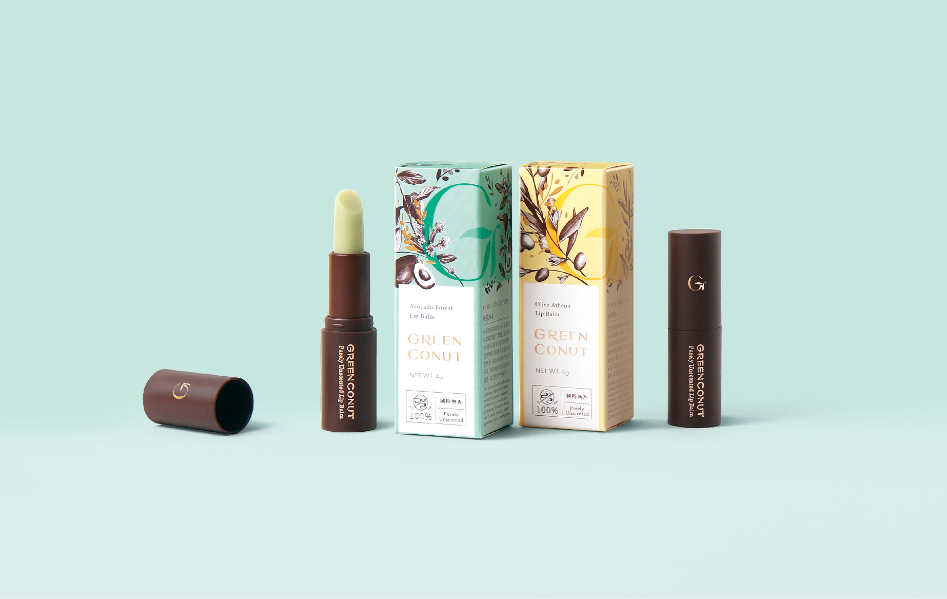
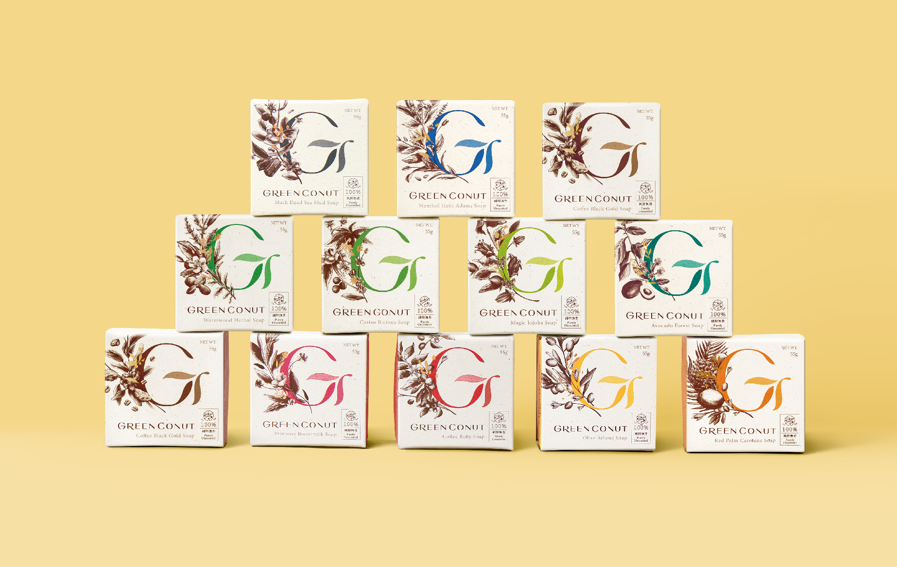
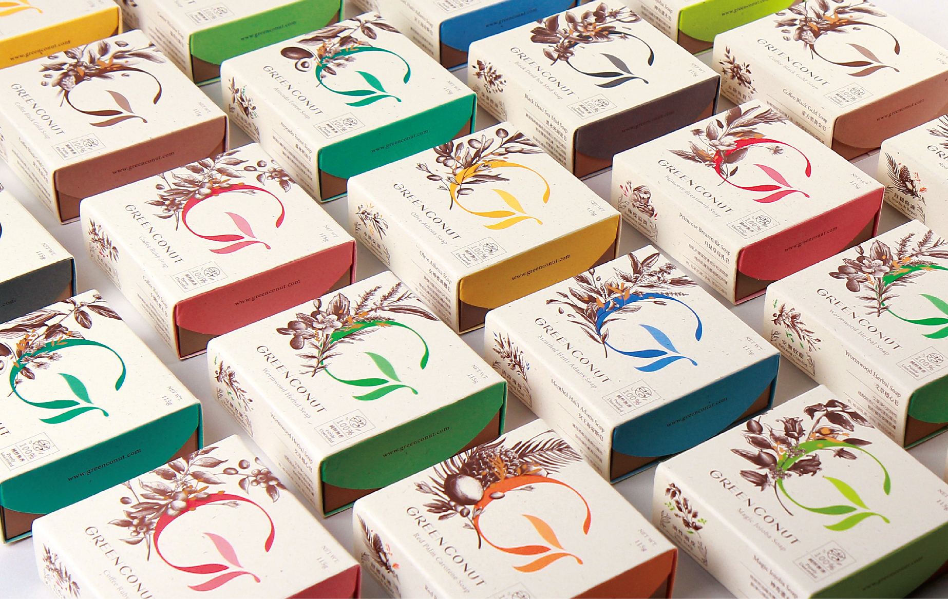
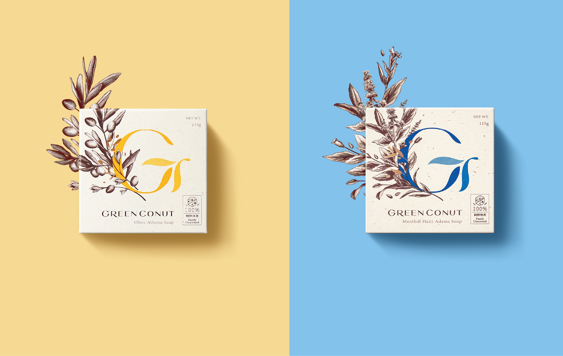
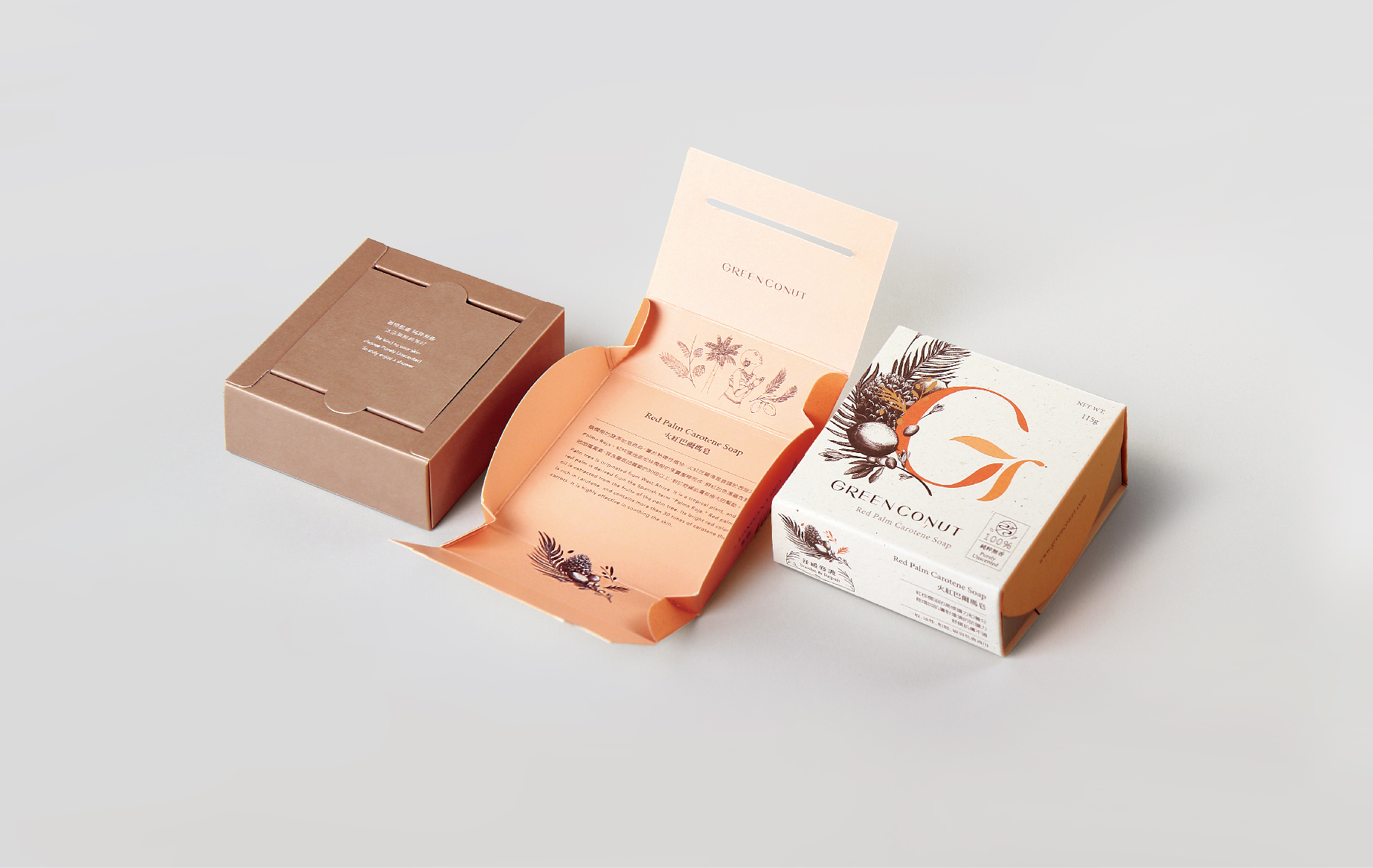
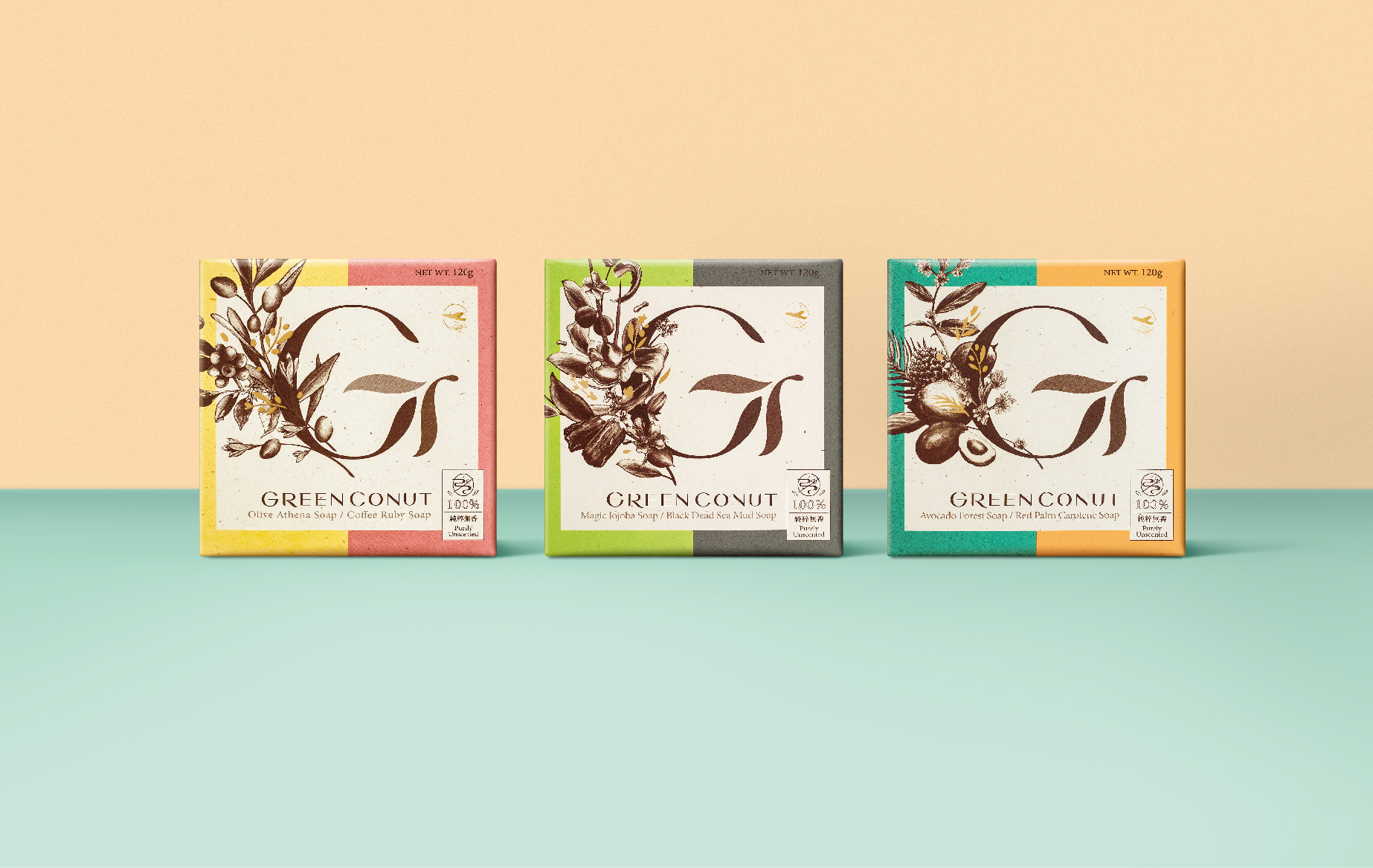
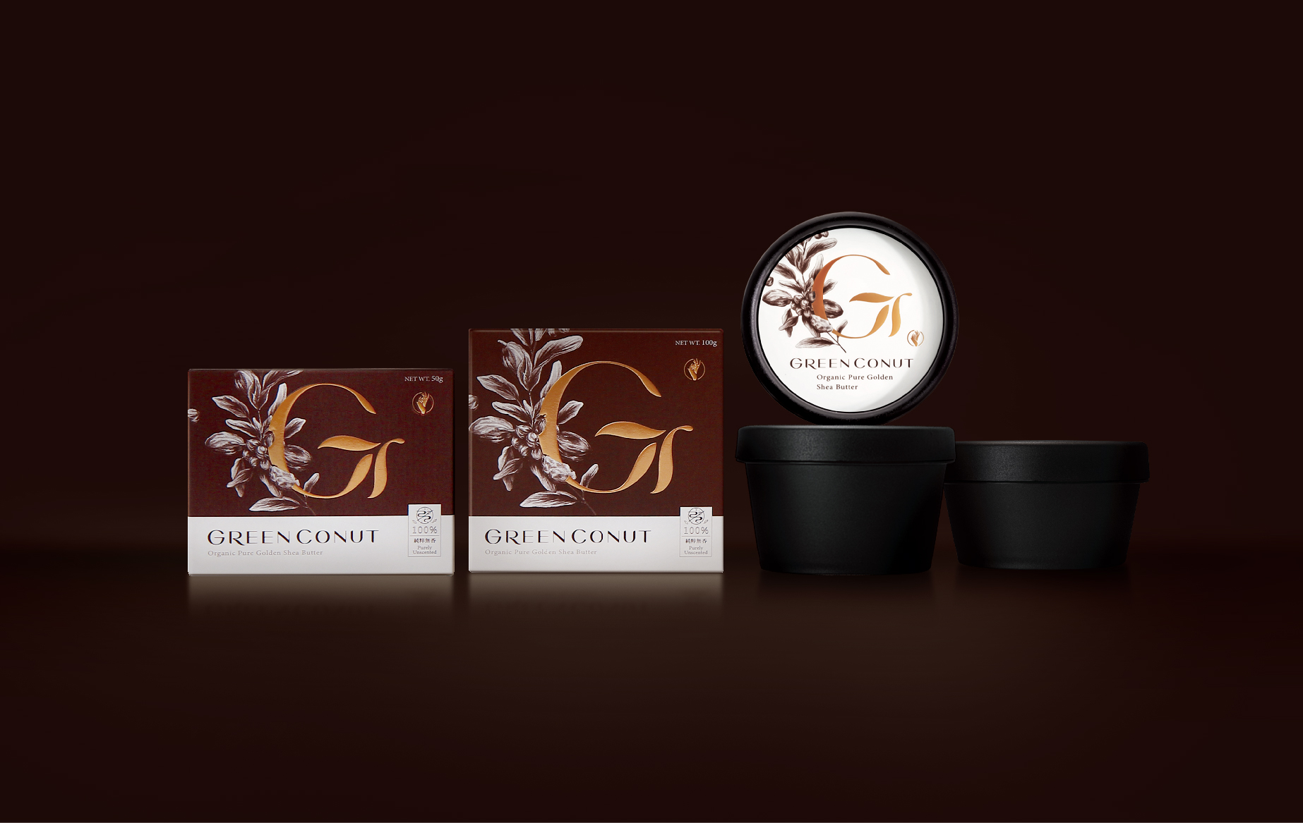
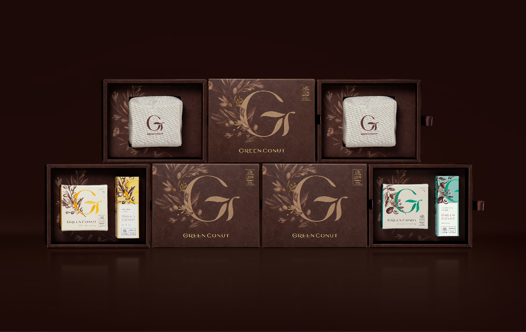
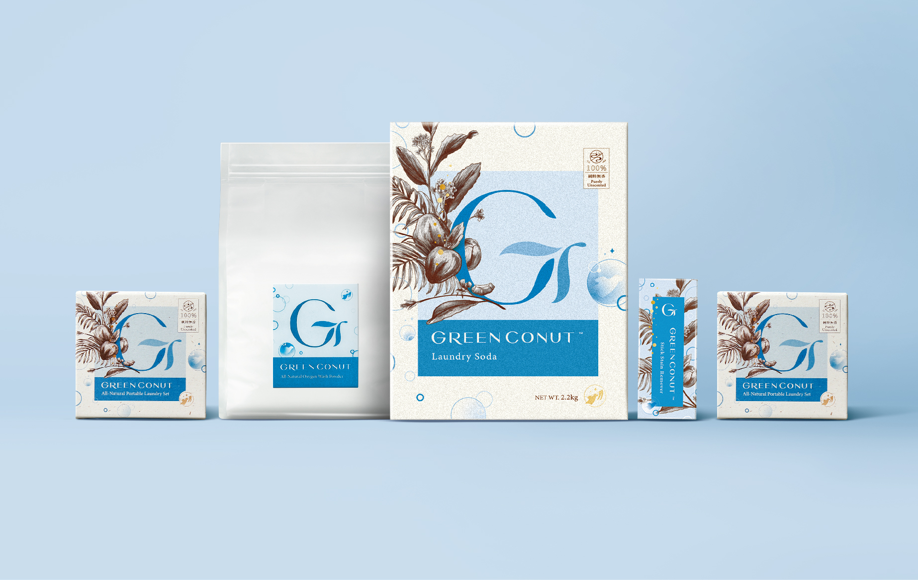
Green Conut is known for its professional handmade soaps. The soap product’s key feature is that it is “unscented,” giving it a good advantage in the market. The new corporate identity and rebranding strive to present the product’s natural scent with visual solutions that highlight its “unscented” quality. The rebranding starts by using a single color (brown) to illustrate the source ingredients. This ingredients image is combined with the logo to create an auxiliary image that conveys an unscented visual experience. The effect is to strengthen and differentiate the brand’s unique features, which has enabled Green Conut to stand out among similar products.
CREDIT
- Agency/Creative: SUMP DESIGN
- Article Title: Green Conut Rebranding and Corporate Identity
- Organisation/Entity: Agency, Published Commercial Design
- Project Type: Packaging
- Agency/Creative Country: Taiwan
- Market Region: Multiple Regions
- Project Deliverables: Brand Identity, Brand Redesign, Brand Strategy, Packaging Design, Rebranding, Retail Brand Design
- Format: Bottle, Tag, Tube, Wrap
- Substrate: Plastic, Pulp Carton
FEEDBACK
Relevance: Solution/idea in relation to brand, product or service
Implementation: Attention, detailing and finishing of final solution
Presentation: Text, visualisation and quality of the presentation


