


Bramley & Gage approached us midway through 2015 with the exciting brief of redesigning their locally-made, artisan 6 O’Clock Gin.
The original bottle and label was created on a shoestring budget and was in need of a new look. Since its creation, 6 O’Clock Gin has won an array of prestigious awards and is recognised as a leader in its category. However, it was time to rethink the look of 6 O’Clock, aiming to better convey its renowned silky smooth taste and high quality reputation, whilst retaining some of the key recognisable visuals that have helped to establish its existing fan base.
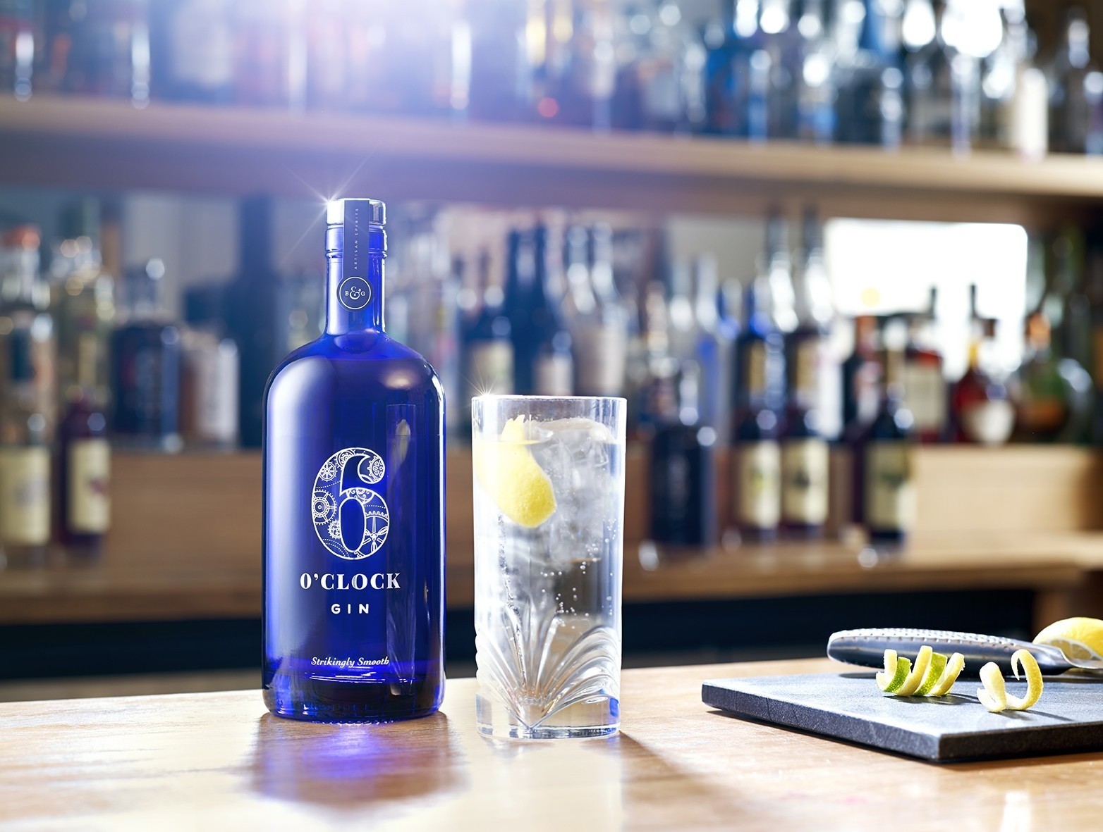
We worked closely with the client to choose a contemporary and recognisable new bottle. The blue glass is a nod to the Bristol based heritage of the brand and the proportions of the bottle are now more practical for retail space.
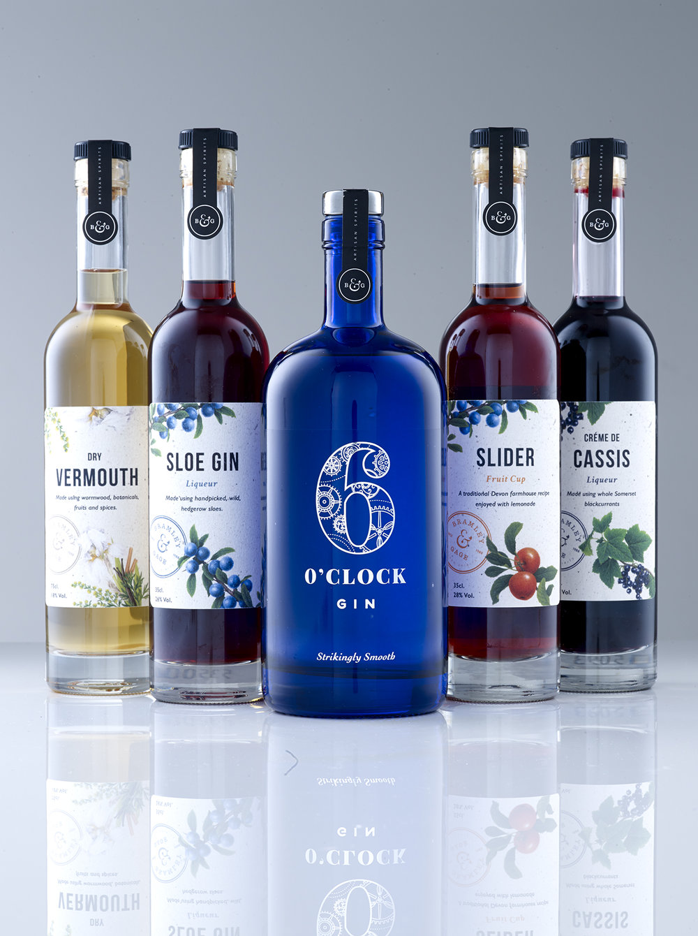
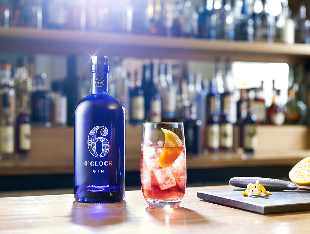
The bold, blue glass of the bottle also creates a powerful shelf presence. We decided to keep the layout of the label simple and clutter free, focusing on creating an iconic ‘6’ mark that could be used across the entire range. The ‘6’ itself houses seven intricate cogs, each of which contains.
CREDIT
- Agency/Creative: Green Chameleon
- Article Title: Green Chameleon – 6 O’Clock Gin Redesign
- Project Type: Packaging
- Format: Bottle, Sleeve
- Substrate: Glass, Metal


