Pecora Nera Design Studio – Pyrgiotiko – traditional sausage
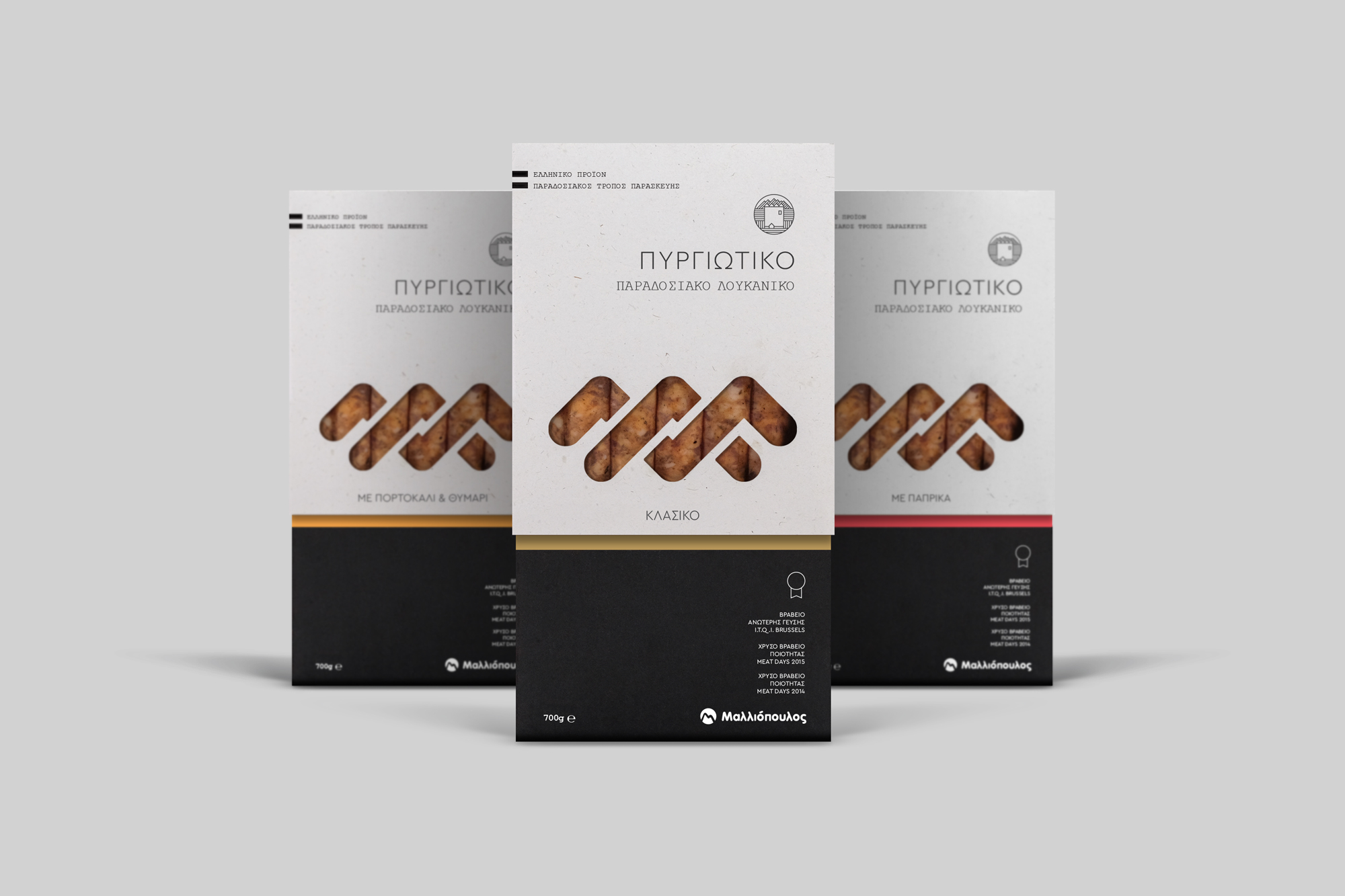
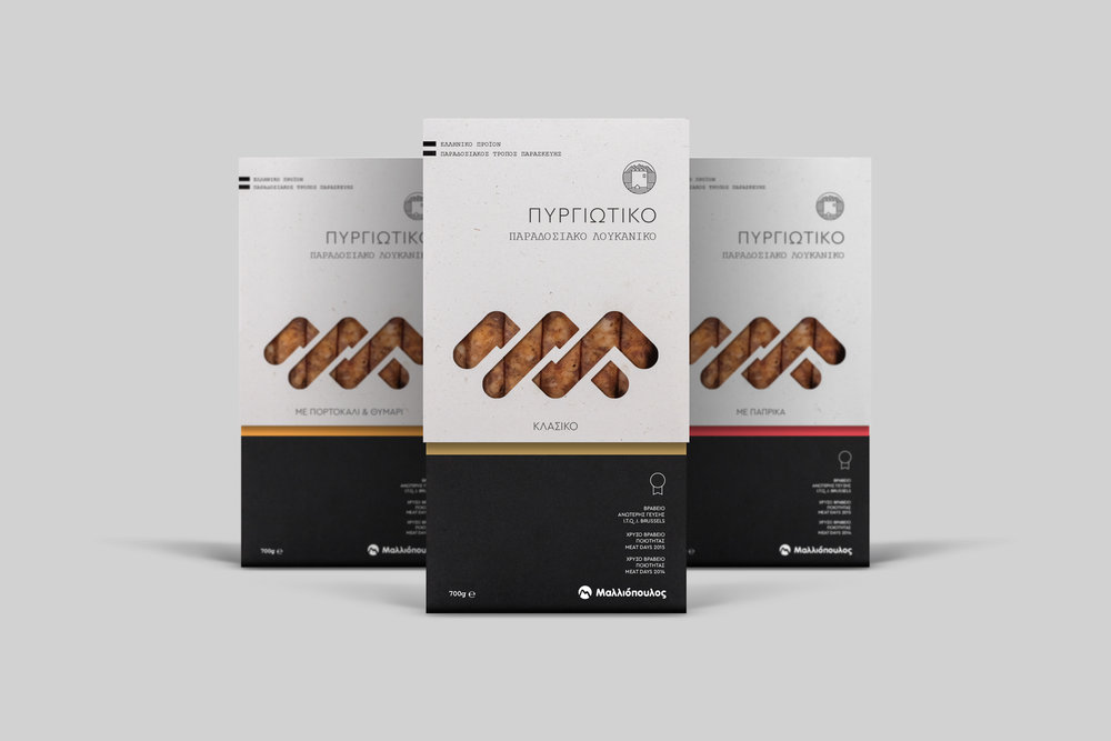
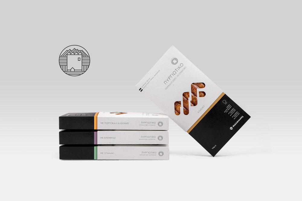
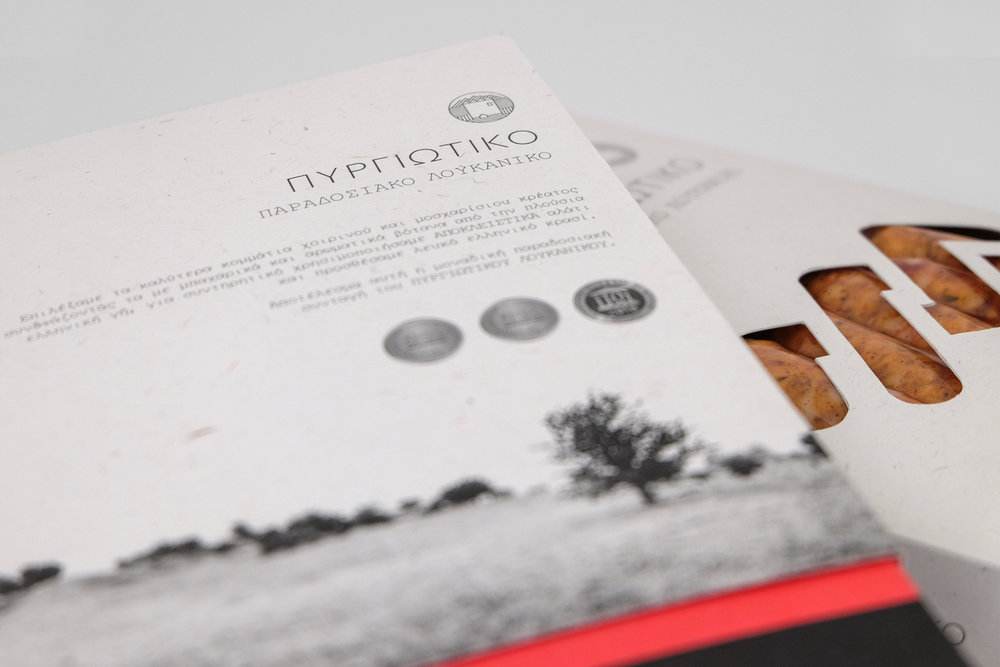
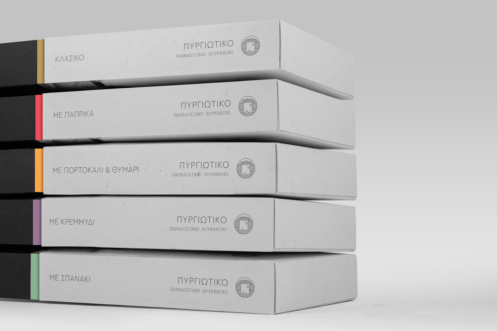
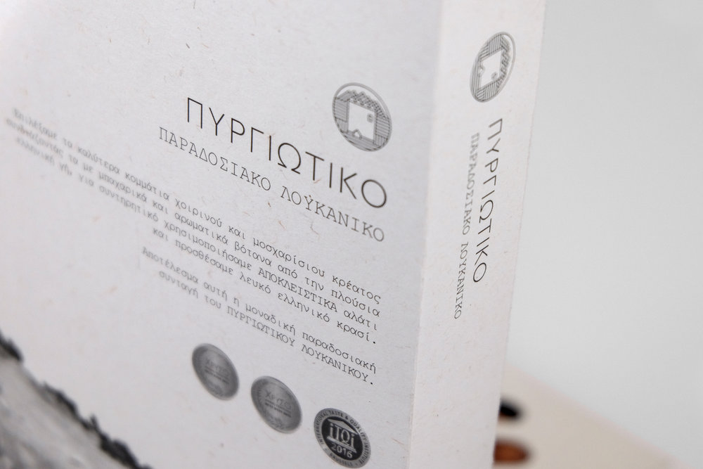
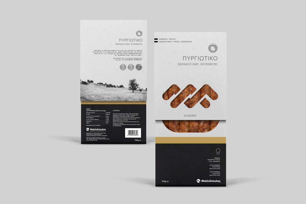
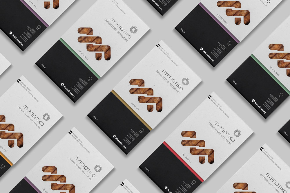
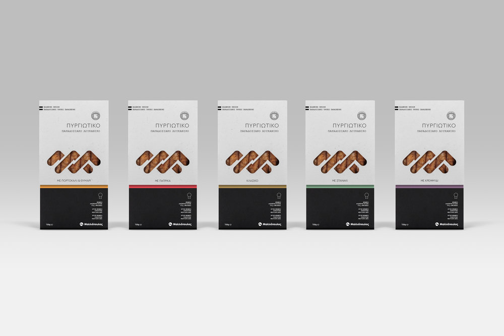
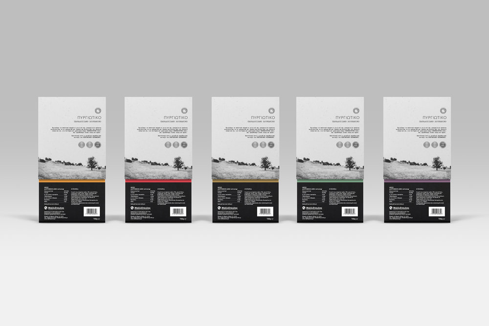
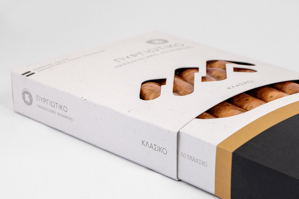
“When creating this brand we believed that both the geographical reference & origin were essential. Therefore we found necessary to include those design & communication elements that would characterise the Greek Providence of Peloponnese, and more specifically the town of Pyrgos (that in Greek means “the tower”) which has a long history in Greek traditional products. Our purpose was this quality awarded product (by the iTQi organization) to advertise and geographically categorise its shelf through its Greek name origin and its design elements such as the valleys, the mountains and the historic reference of the town’s first tower where the city was later named on. The design adopts simple black and white tones, praising packaging’s natural paper material, while the descriptive earthly colour details of gold, red, orange, purple and green are co-working in the purpose of communicating the ingredient differences of each package. Branding typography, is the result of a balanced combination between a mono spaced font and a geometrical one, in order to be in harmony with the logotype and all other design elements of this packaging series.
CREDIT
- Agency/Creative: pecora nera design studio
- Article Title: Greek Limited Edition Packaging Design for Traditional Sausage
- Organisation/Entity: Agency Commercial / Published
- Project Type: Packaging
- Agency/Creative Country: Greece
- Market Region: Europe
- Format: Box


