


Alden – A Fresh Chapter in Aged Care
Alden is the reinventing of Ultimate Care Group, one of New Zealand’s largest aged care providers. We were given the freedom to create something completely new. It was up to us to decide what, if anything, should be carried over from the old brand. In the end, not a lot was. What emerged was a brand that feels grounded, open, and real. Something that aged care in New Zealand desperately needed.
The Why
This branding project was driven by the need to transform the organisation’s identity into something modern, compassionate, and human-centred. It needed to reflect the changing expectations of both staff and families, moving away from outdated perceptions of aged care as institutional or clinical.
A key consideration was transparency. We knew our facilities weren’t the most luxurious, but what they offered was something more meaningful. A sense of belonging, trust, and deep connection to the local communities they serve. The brand needed to reflect that reality with honesty and pride.
Through research and stakeholder interviews, we identified what our audiences really valued. Potential employees and families wanted a brand that felt genuine, trusted, approachable, and truly committed to making a difference in people’s lives. They didn’t want fluff. They wanted to see the heart of the organisation. The people who show up every day to provide care, support, companionship, and take great pride in working on the front lines of caring for our elderly population.
The Idea
This project was never just about a name change or a logo refresh. It was about fundamentally rethinking how aged care is represented. Aged care is very different to retirement living, yet many brands in the sector rely heavily on the same aspirational, lifestyle-driven imagery. We knew Alden needed a different approach.
We chose to focus on the real relationships between staff and residents. The moments of laughter, reassurance, and humanity that make life in care homes meaningful. We needed a tone of voice that was honest, down-to-earth, and rooted in these everyday experiences.
A key audience for the new brand was staff. Not just potential hires, but the people who already work in the homes. People who give so much of themselves and are often overlooked in brand storytelling. The new identity needed to give them a sense of pride and belonging. It also had to resonate with families, especially adult children making difficult decisions for their parents. They needed to feel confident and reassured that Alden would be a safe and supportive choice.
We developed a single-minded proposition: all ageing Kiwis deserve to live with dignity, comfort, and respect. From there, we crafted a brand message that would anchor everything: Here for you. It became more than a tagline. It became a promise to staff, residents, and families alike.
The Design
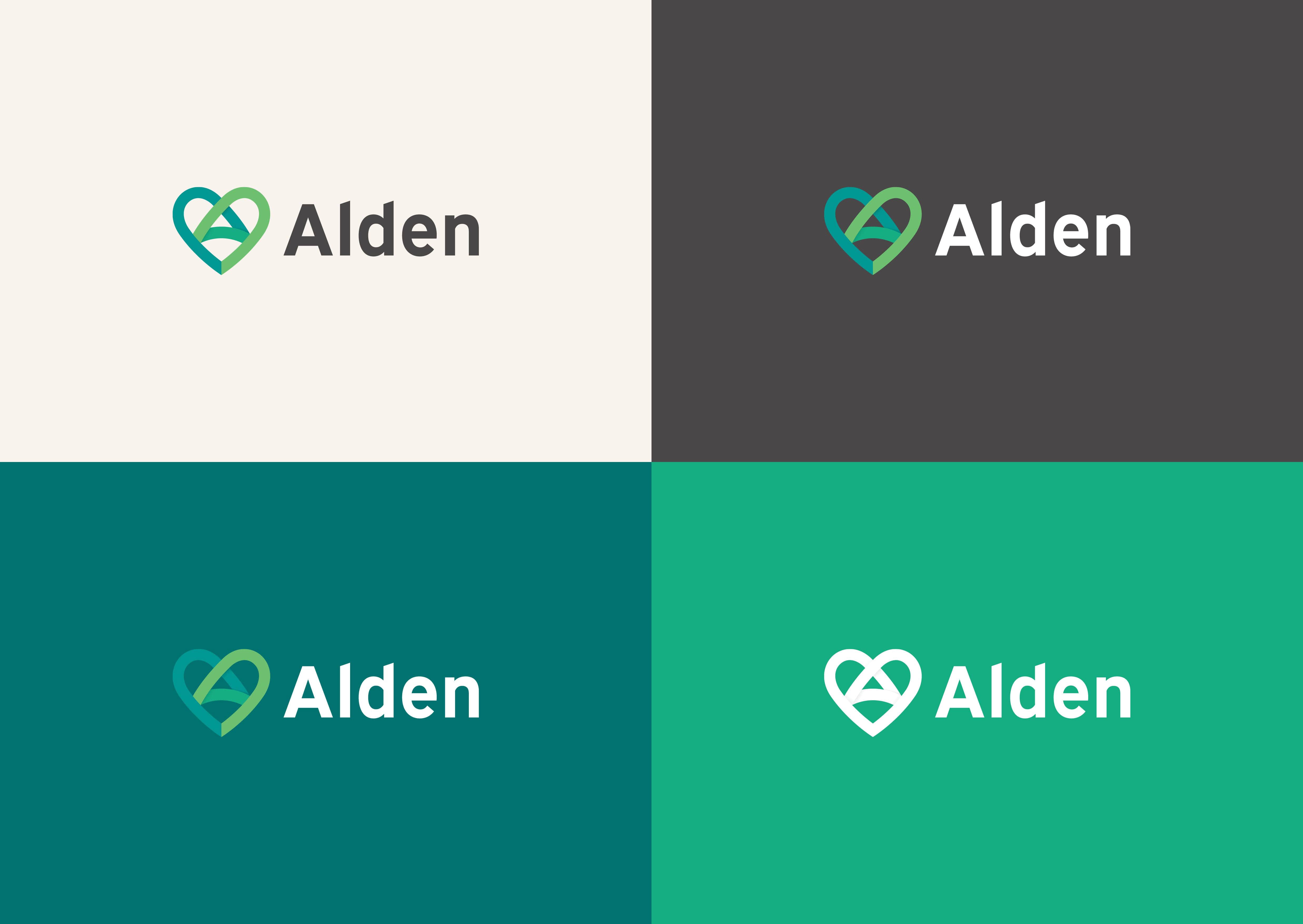
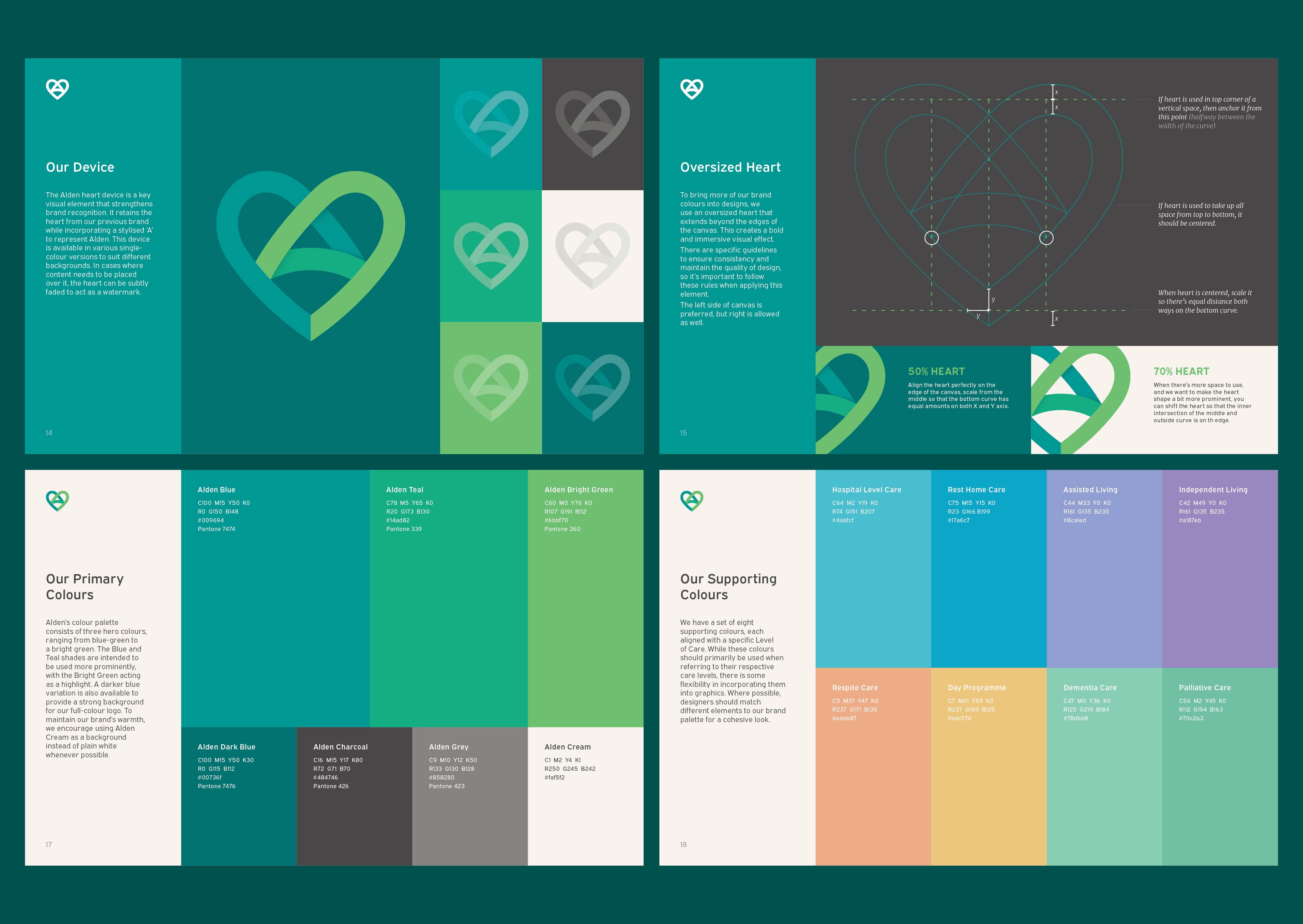
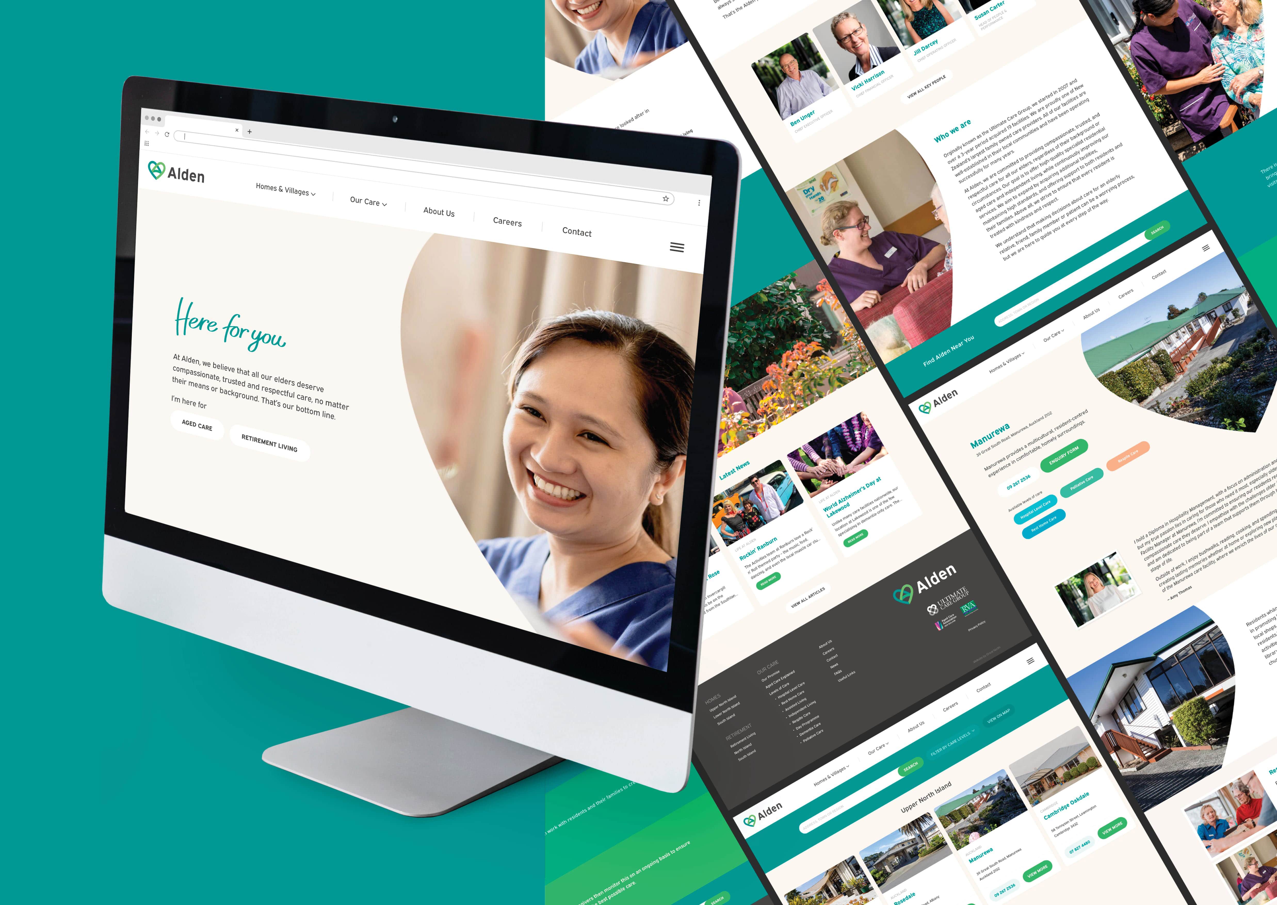
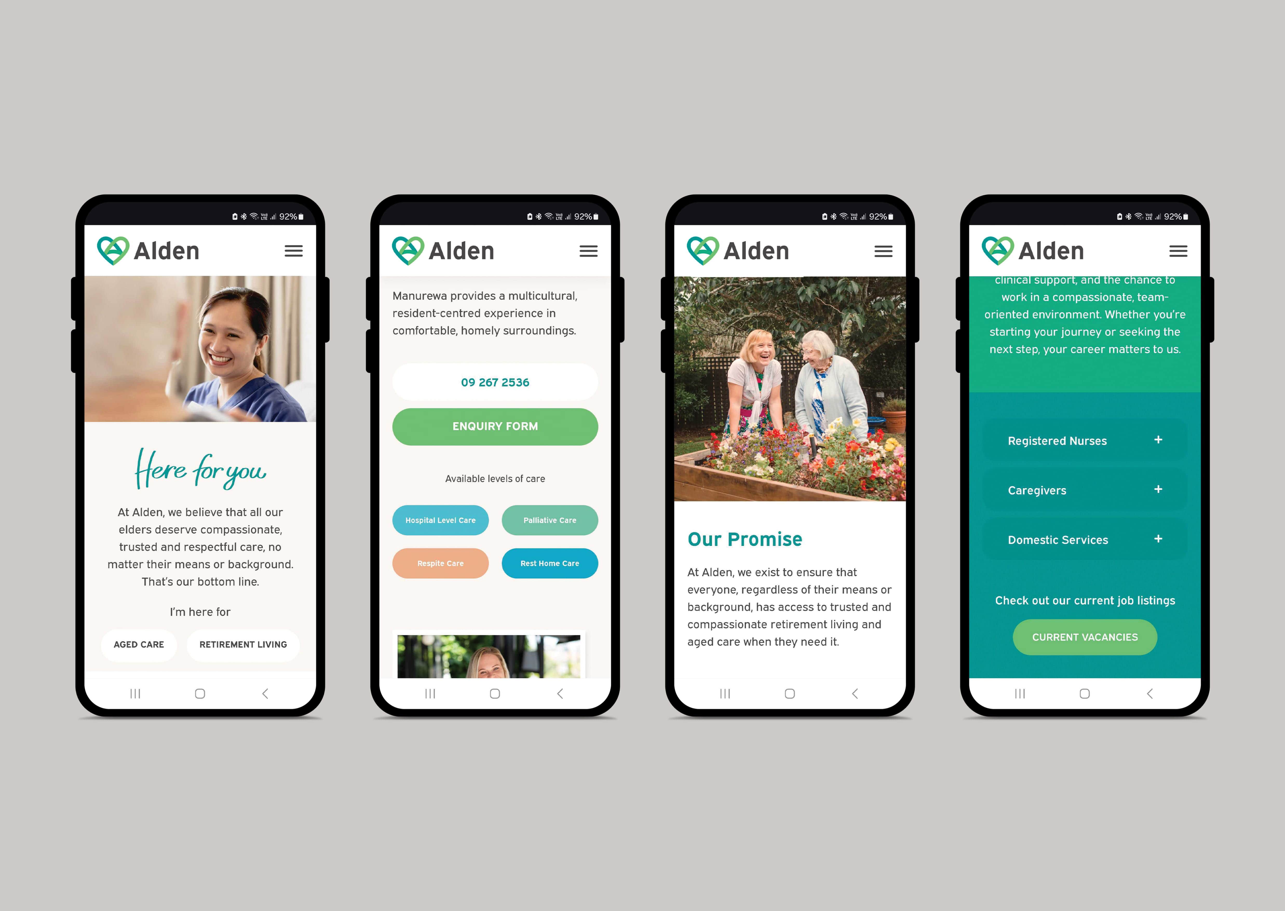
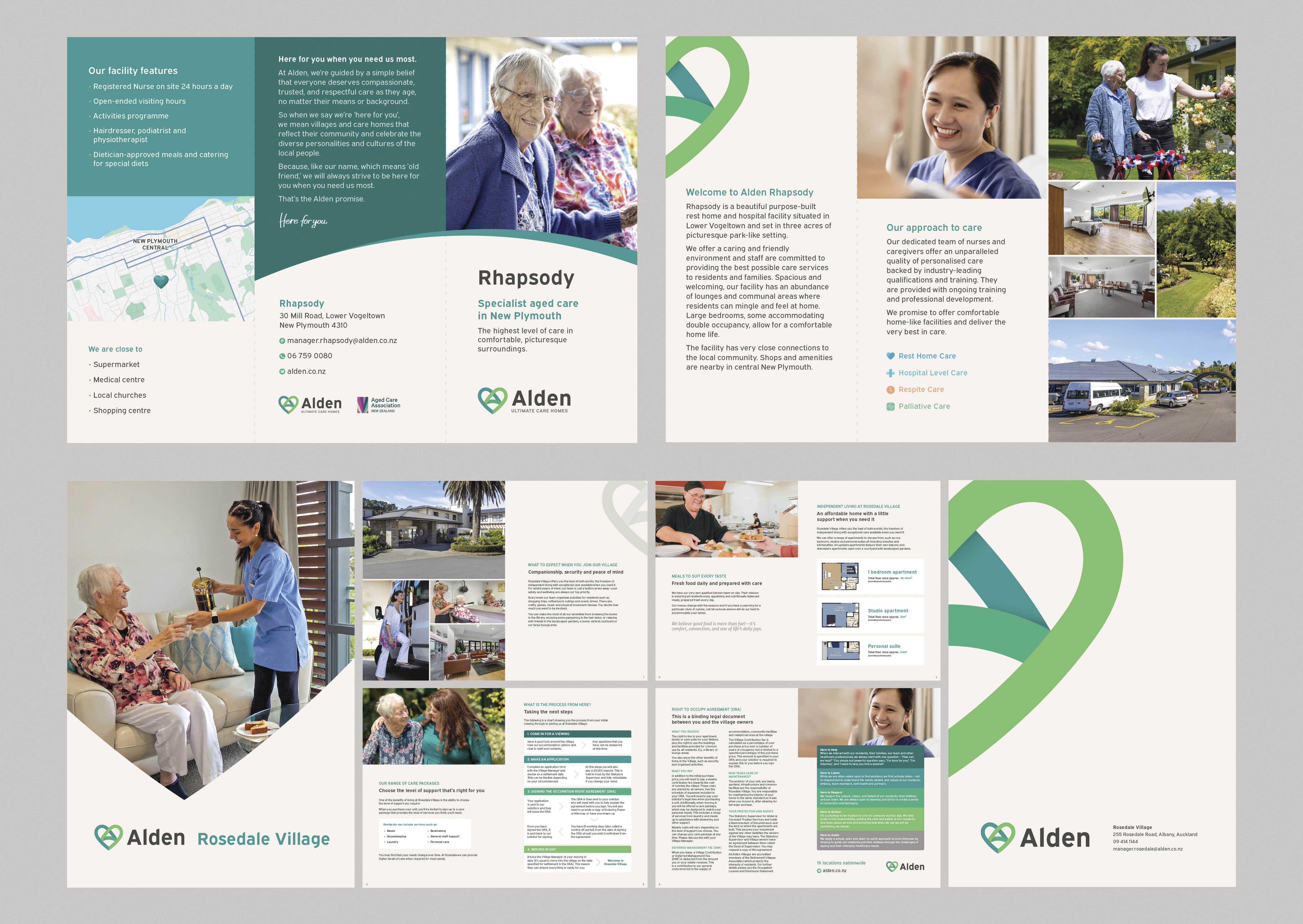
Visually, we wanted Alden to feel modern, but not trendy; soft, but not vague; familiar, but still fresh. We retained one of the few recognisable elements from the old brand. The heart. But we redesigned it to form a stylised ‘A’. It was a subtle nod to the past, but with a new meaning. The heart was no longer just a symbol of care, but a central element in spelling out the new brand name.
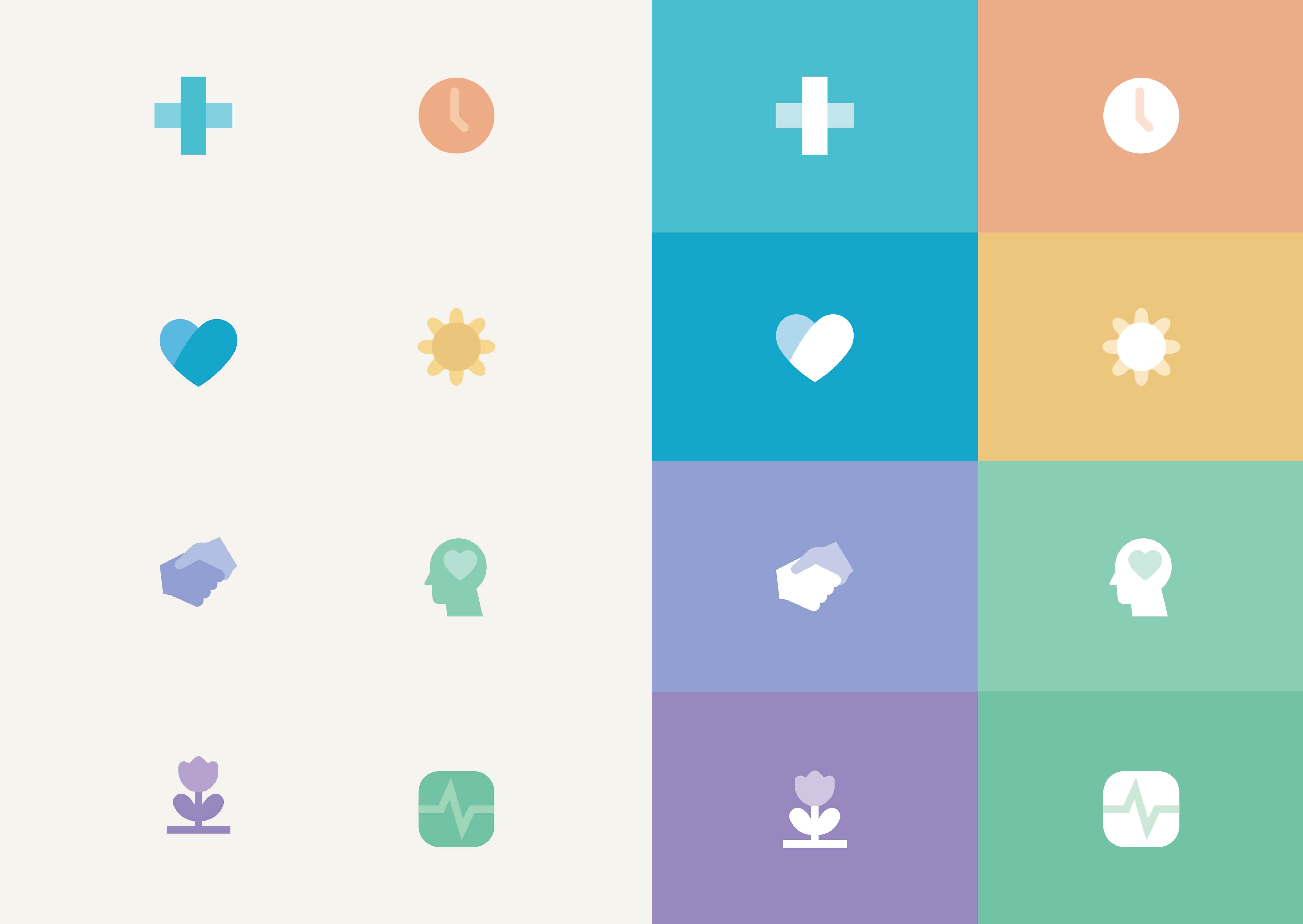
The colour palette was chosen for its emotional tone. A mix of soft greens and gentle blues, designed to evoke calm, trust, and approachability. These colours feel natural and warm, reflective of the everyday environments our residents live in.
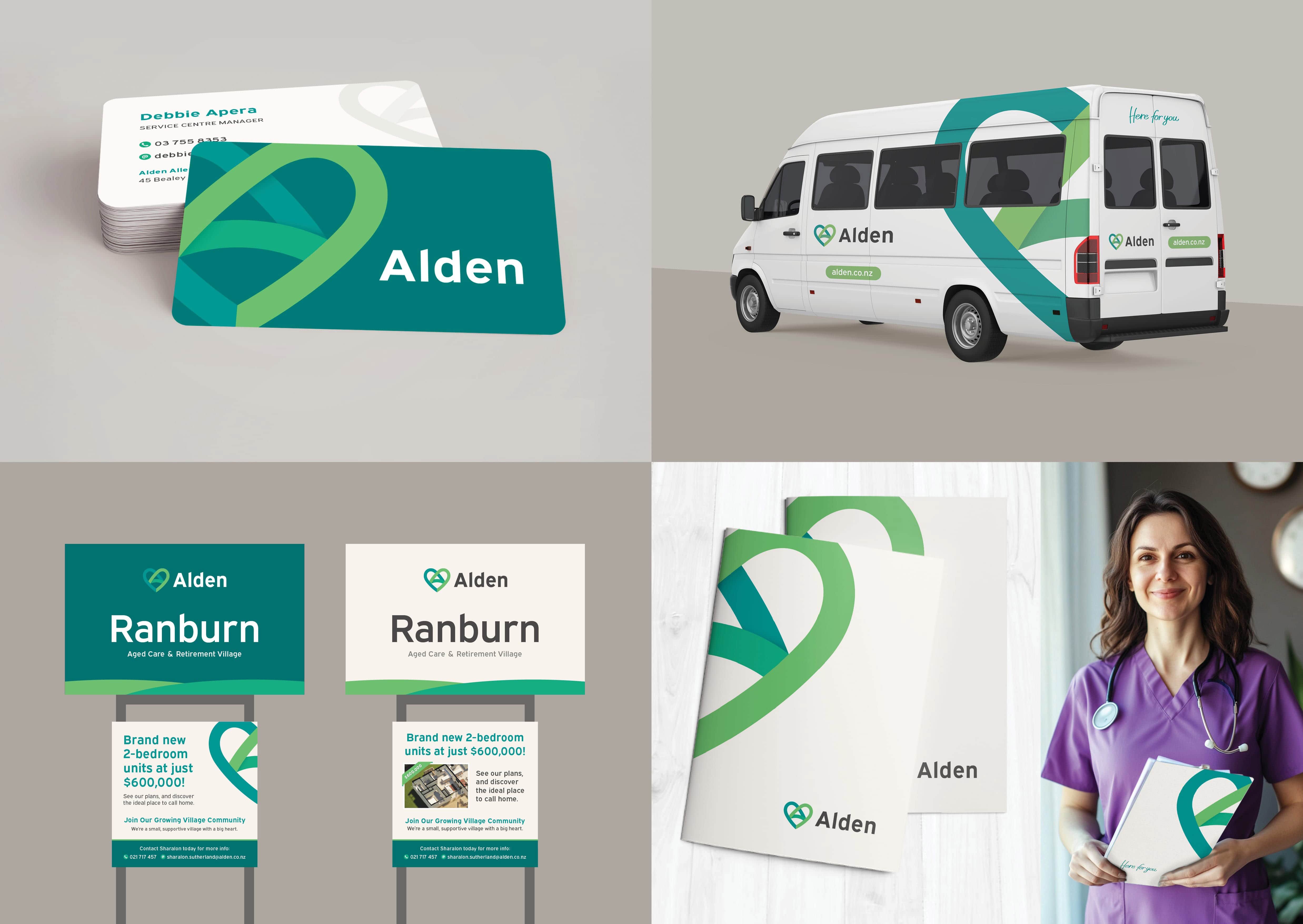
Typography, layouts, and visual assets were designed to be clean, accessible, and human. Photography focused on genuine, candid moments. No staged smiles or sterile interiors. Just real people doing real work and living real lives.
This approach was applied across all touchpoints. Website, signage, printed brochures, uniforms, badges, and sales materials. We created a complete brand toolkit that would support everything from marketing to operations, ensuring Alden would feel cohesive and consistent in every setting.
What Elevates the Work
What elevates this work is its authenticity and its deep connection to people. This brand wasn’t built in a boardroom. It was shaped by the lived experience of staff, residents, and families. It honours the reality of aged care. Not with gloss, but with empathy.
It tells staff: we see you. We value you. You are the heart of Alden. It tells families: we understand this decision is hard, and we are here to help you through it. And it tells residents: this is your home, and we are here for you.
Alden now has a brand that it can grow into. One that supports recruitment, builds community trust, and puts people first. In a sector where authenticity is everything, that is a powerful place to be.

CREDIT
- Agency/Creative: Great North
- Article Title: Great North Redefines Aged Care With a Human-Centered Brand Identity for Alden
- Organisation/Entity: Agency
- Project Type: Identity
- Project Status: Published
- Agency/Creative Country: New Zealand
- Agency/Creative City: Auckland
- Market Region: Oceania
- Project Deliverables: Brand Creation, Brand Design, Brand Experience, Brand Guidelines, Brand Identity, Brand Naming, Brand Strategy, Brand Tone of Voice, Branding, Logo Design, Web Design
- Industry: Health Care
- Keywords: Branding, Identity, Creative, Copywriting, Design, Logo, Website, WordPress, Elementor
-
Credits:
Client Management, Strategy, Art Direction: Pekka Malkamaki
Logo Design: Fraser Gardyne
Creative Direction: Anne Boothroyd
Web Developer: Willian Santos


