


the Labelmaker – Great Bulgaria Wine Label
The Brief
Great Bulgaria is an ambitious wine project by Medi Valley Winery. Based in Struma Valley, Bulgaria, probably the most distinguished wine location in the country, the winery pays special attention to local varieties like Melnik, Rubin, Gamza and Mavrud. This special red blend unites them all and is also a patriotic tribute to united Bulgaria.
That is the short story behind this project. My job was to find the proper integrity between all these elements and create a wine label.
The Project
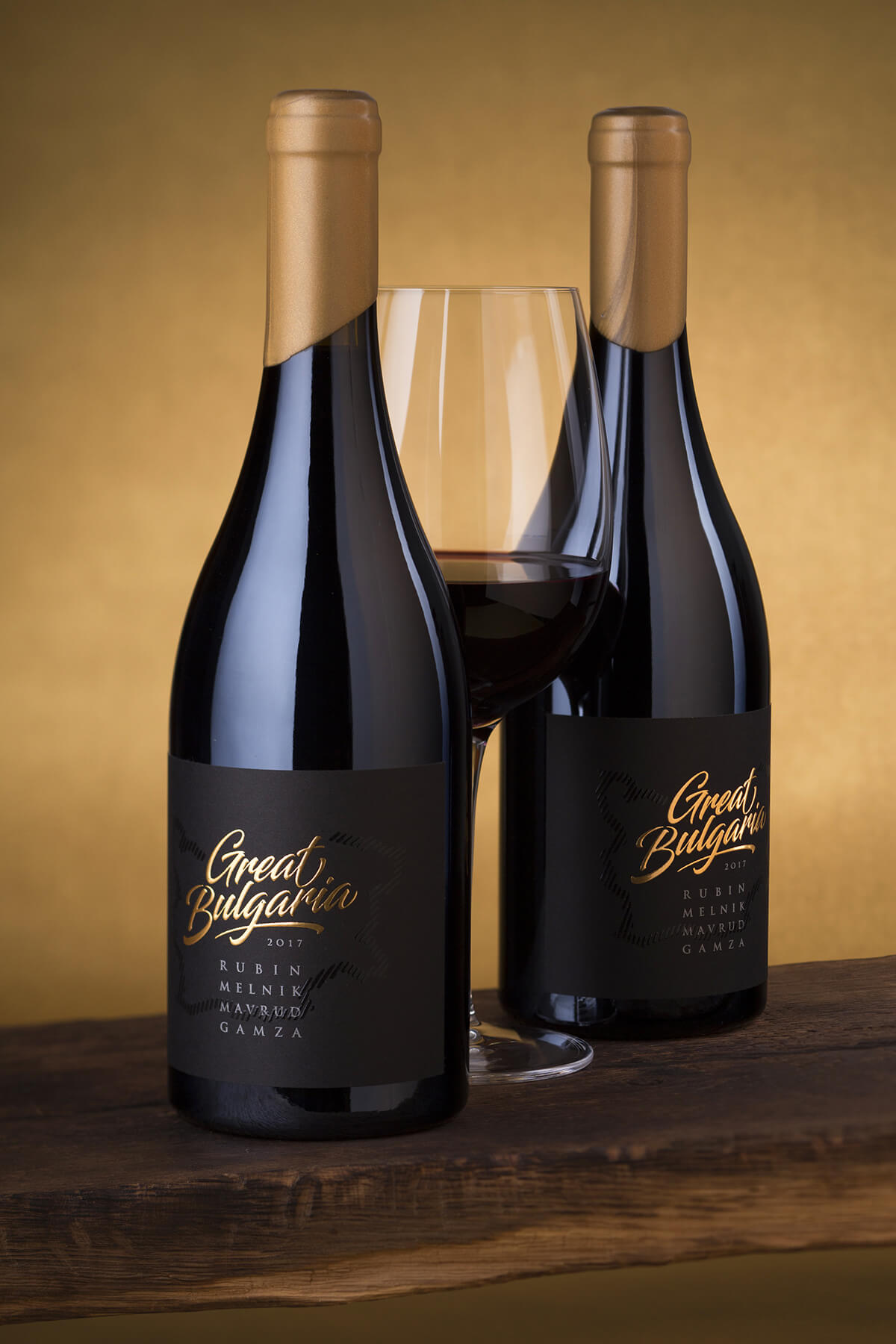
We did short brainstorming with marketing CEO and came up with the idea of black label, very simple and clean design. We also decided to use wax to seal the bottle instead of capsules. I used modern script for the title – not too classic but not too playful either. The brand name was really meaningful and strong, and I wanted somehow to find a good way to blend historical layers with balanced modern design. This is how the idea to use the map of Bulgaria came out. In fact, it really serves well first because it is a national symbol and second because it unites all themes in this wine label into one – the Great Bulgaria. Great for its history, great for its wines.
The Execution
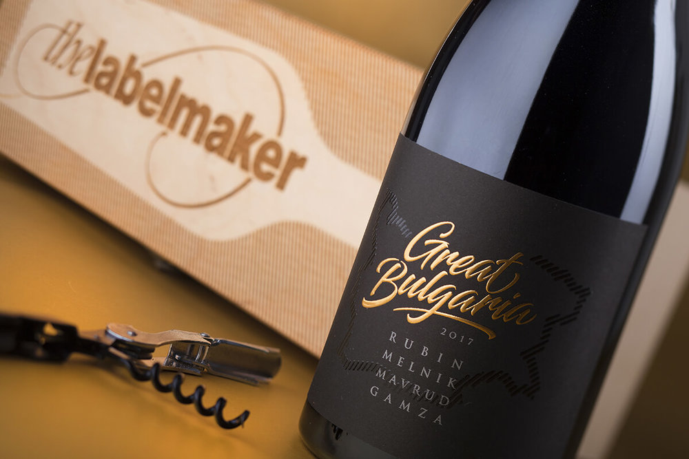
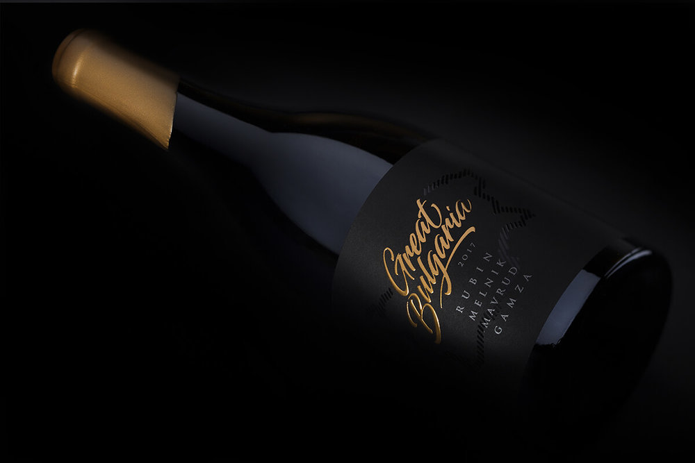
We used black smooth paper for this project. The paper is produced black, so we did not have to print black colour. The map is printed with high build transparent varnish while the title is done in gold silk-foil with high embossing. The paper has very delicate matt finish and the varnish of the map makes the black colour even darker and at the same time ads elegant gloss effect. The gold silk-foil on Great Bulgaria letters is semi matt and doesn’t shine too much while at the same time the level of embossing is quite visible especially if you rotate the bottle in your hand. Sealing is done with cork and then dipped in gold sealing wax.
The bottle we used for this wine label is Agape by Saverglass – one of my favorite in their diverse portfolio.
The Result
I feel happy with this wine label. The bottle is strong and solid – a good foundation for such ambitious project. I like the play between glossy and matt surfaces. Using gold wax was a nice move – we initially wanted to have black wax instead of gold but on the move, we eventually decided that gold looks best and pairs great with the gold silk foil on the title letters.
All in all, I think we managed to turn the original idea into serious and memorable wine label.

CREDIT
- Agency/Creative: the Labelmaker
- Article Title: Great Bulgaria Wine, Simple and Clean Label Design for Indigenous Varieties Red Blend
- Organisation/Entity: Agency Commercial, Published
- Project Type: Packaging
- Agency/Creative Country: Bulgaria
- Market Region: Europe
- Format: Bottle
- Substrate: Glass


