


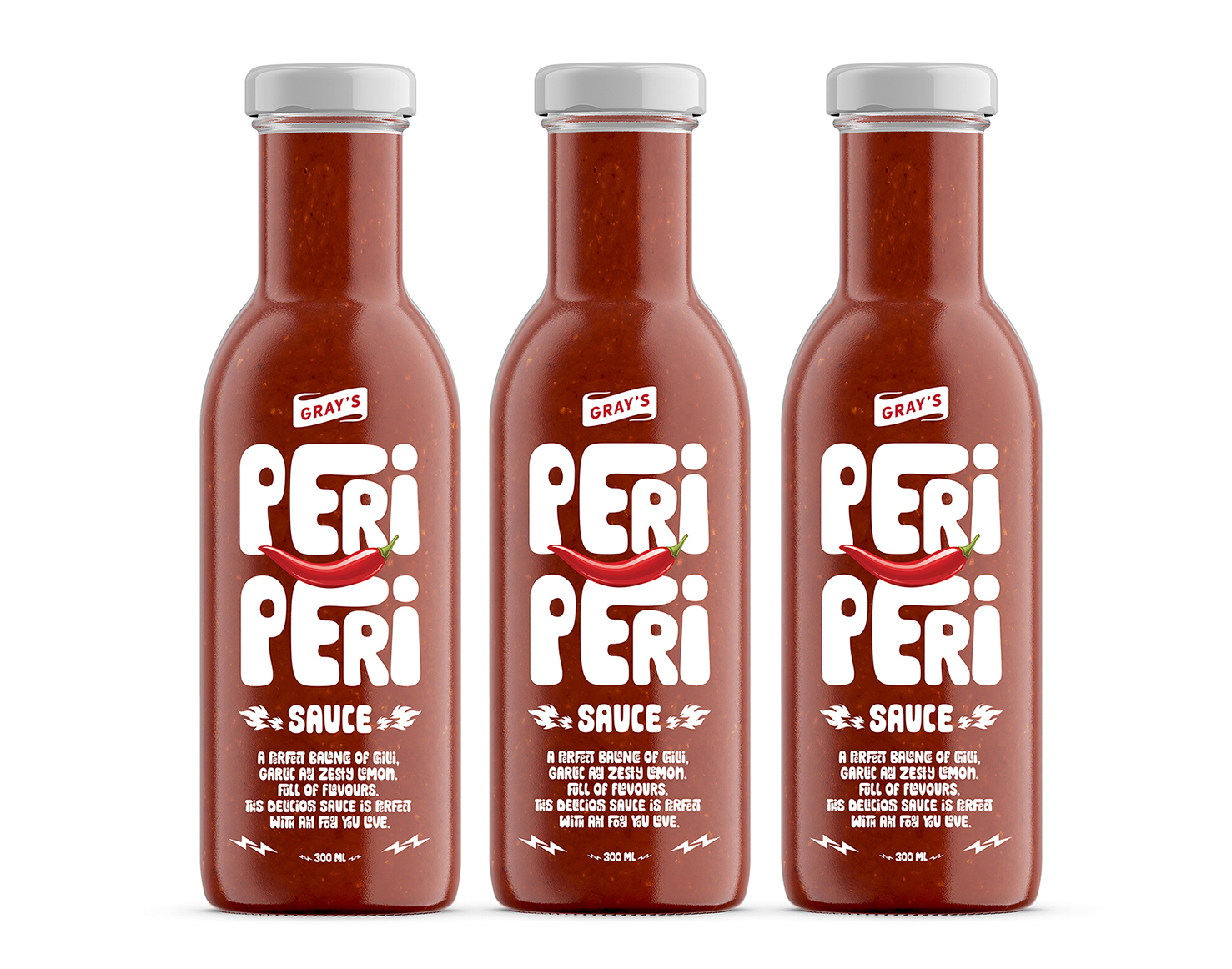
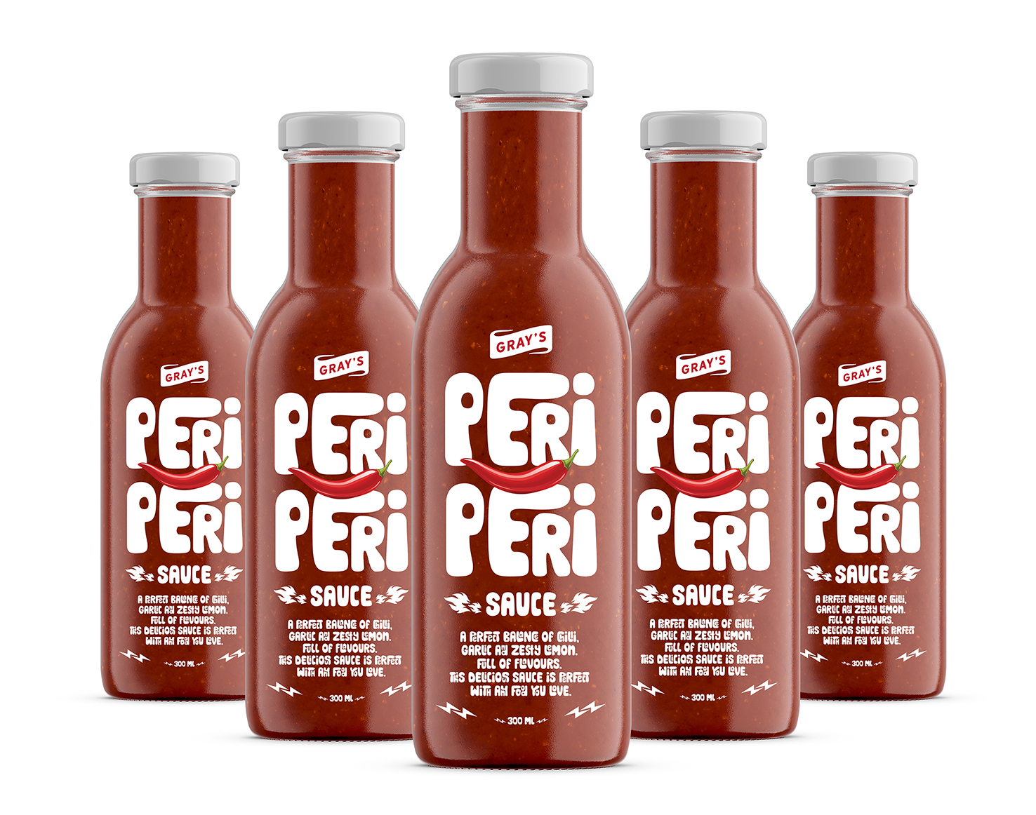
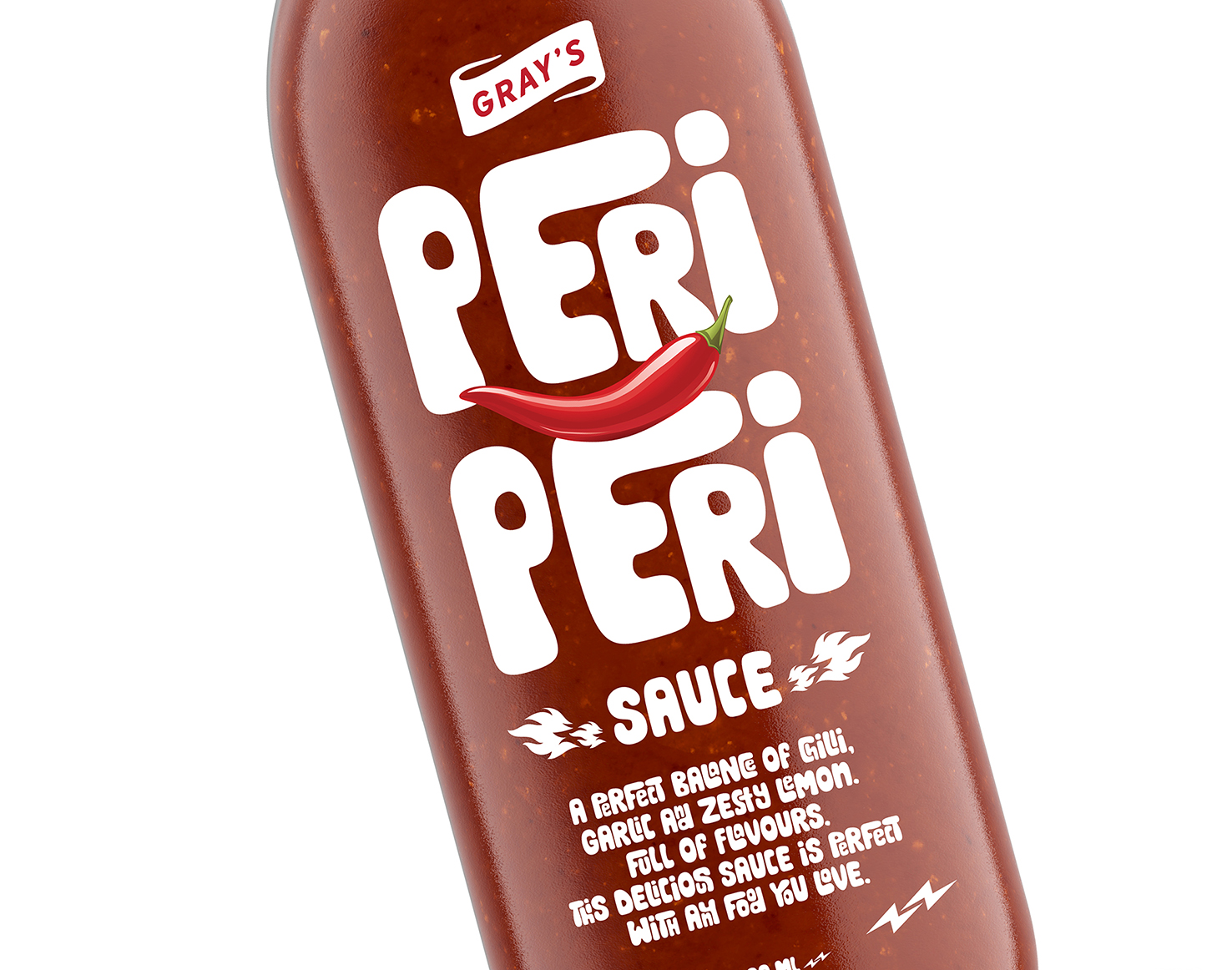
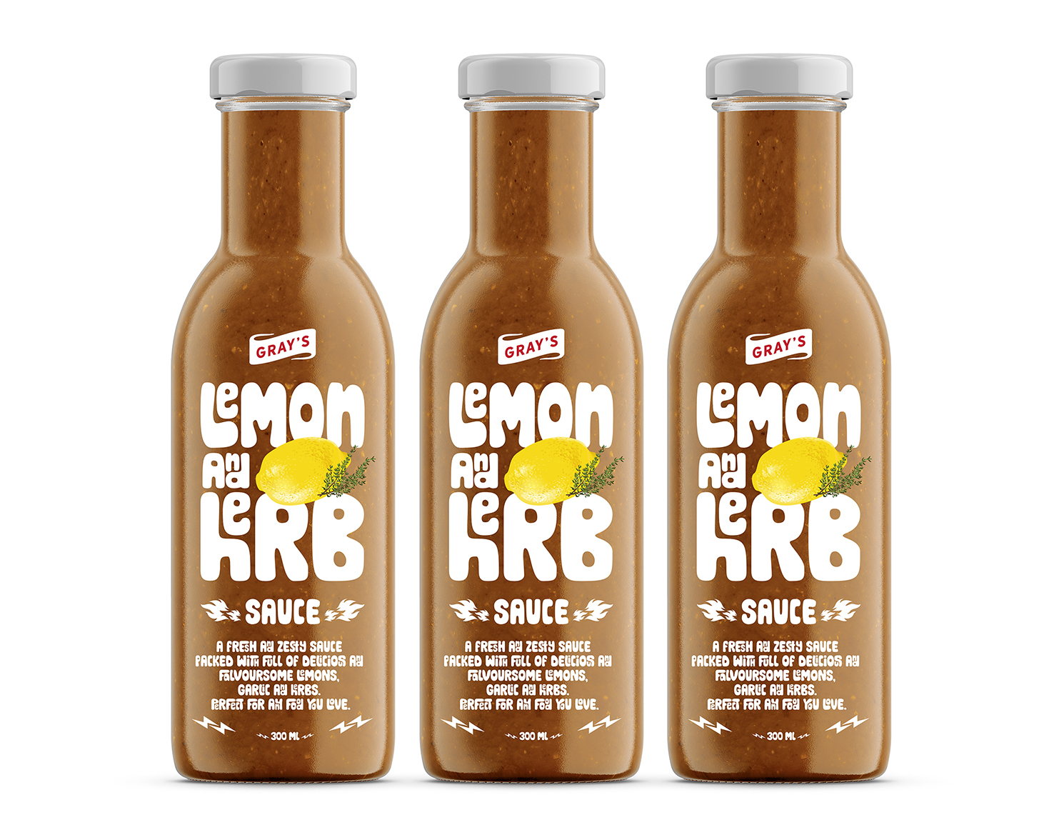
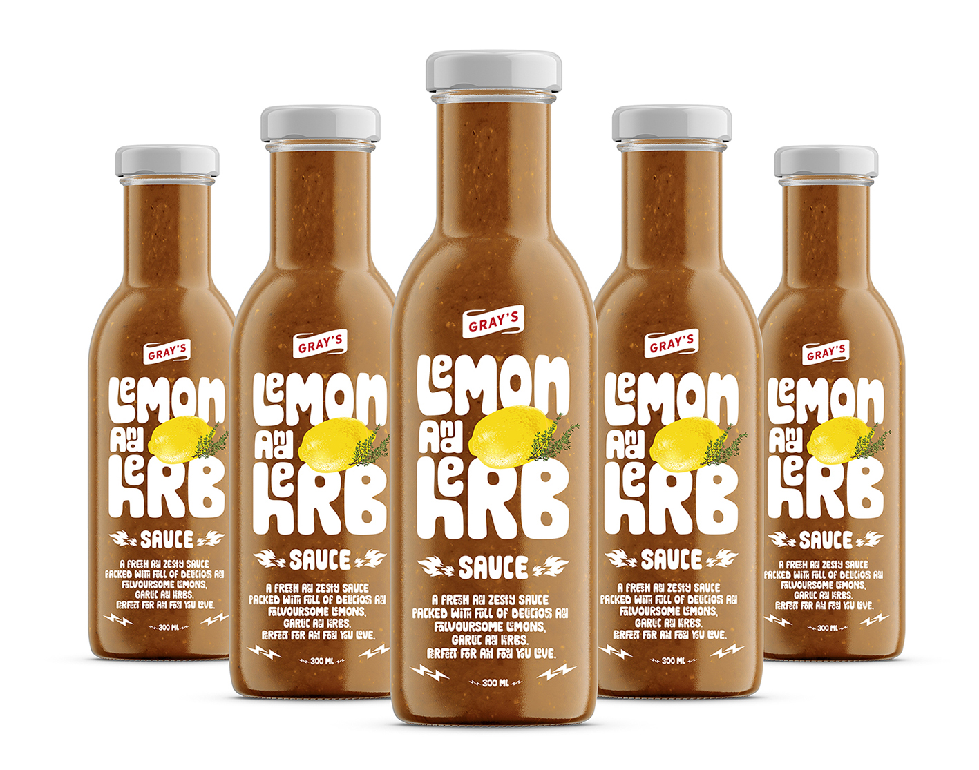
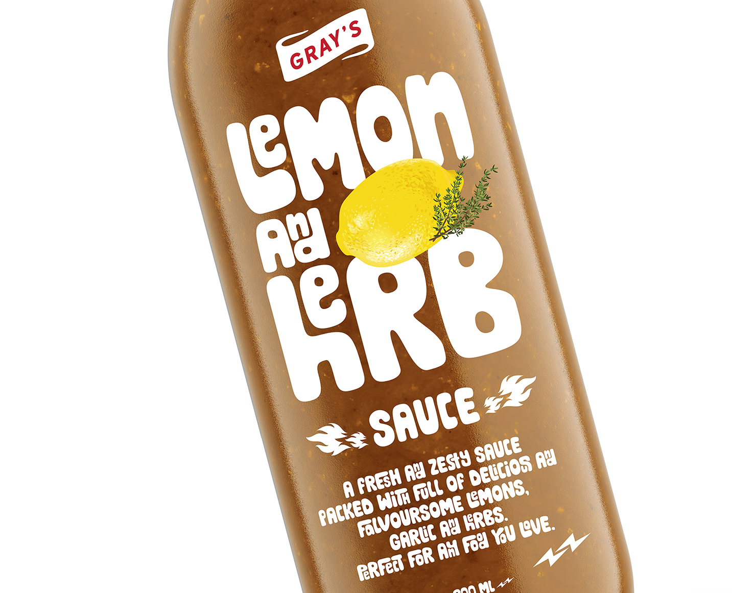
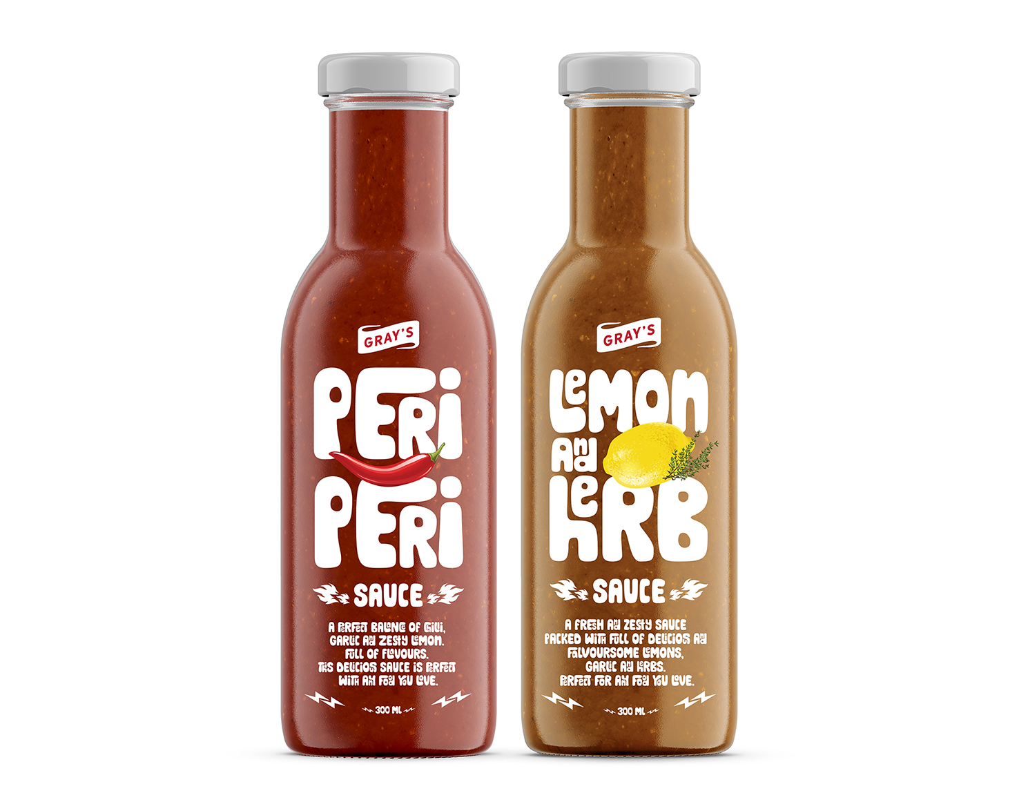
Gray’s challenged us to add more ‘zing’ to their brand. Gray’s came up with a brand essence ‘Sauce Beyond Ordinary’. This idea was then brought to life through expressive and playful ways of adding flavours to food : a slap of sauce, a scatter of spice. These were visually expressed through bold typographic design that captured both the excitement and involvement of adding some zing to your food. The result is a simple, emotive visual identity that’s lets the product do the talking, with striking on shelf impact.
CREDIT
- Agency/Creative: Lemon Yellow
- Article Title: Gray’s Sauce Packaging Design
- Organisation/Entity: Agency, Published Commercial Design
- Project Type: Packaging
- Agency/Creative Country: India
- Market Region: Africa
- Project Deliverables: Brand Architecture, Brand Strategy, Packaging Design, Tone of Voice
- Format: Bottle
- Substrate: Glass Bottle
FEEDBACK
Relevance: Solution/idea in relation to brand, product or service
Implementation: Attention, detailing and finishing of final solution
Presentation: Text, visualisation and quality of the presentation


