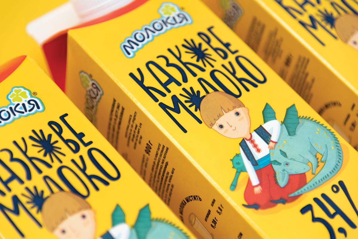
” Fairy Milk is a well-known and successful brand on the Ukrainian market. It has numerous fans that value its quality and philosophy. We were commissioned to redesign Fairy Milk line.
The main challenge was to analyze the old design and rethink it in a very careful way. As the brand is already successful, it is a huge responsibility to make any changes.
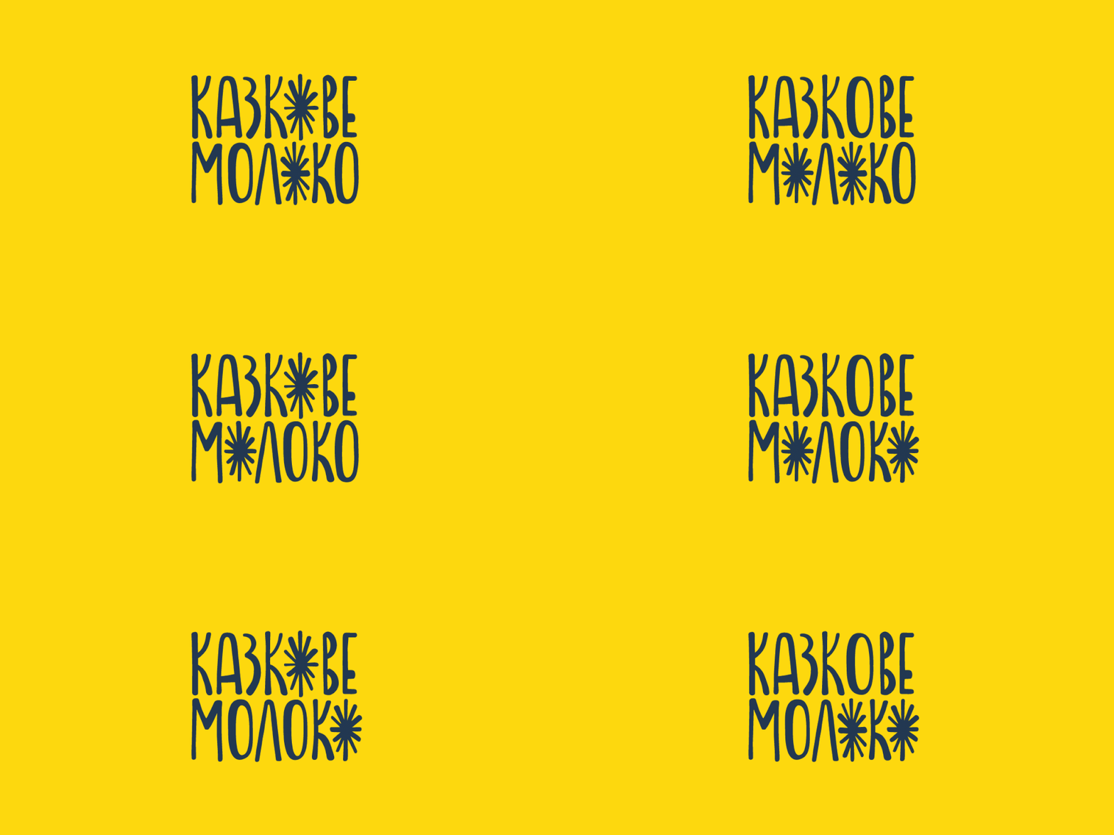
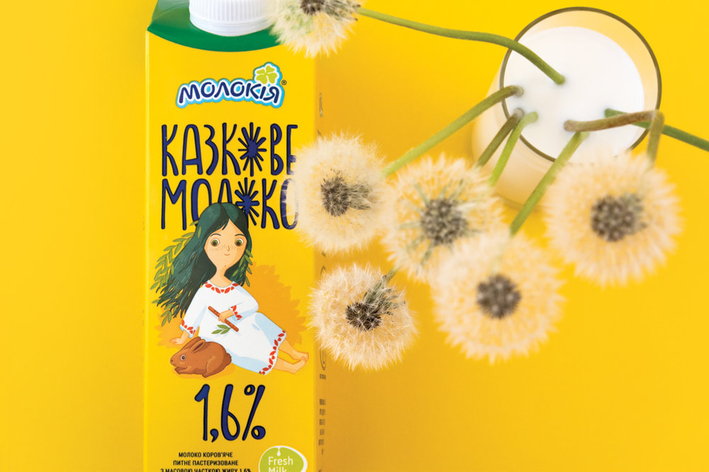
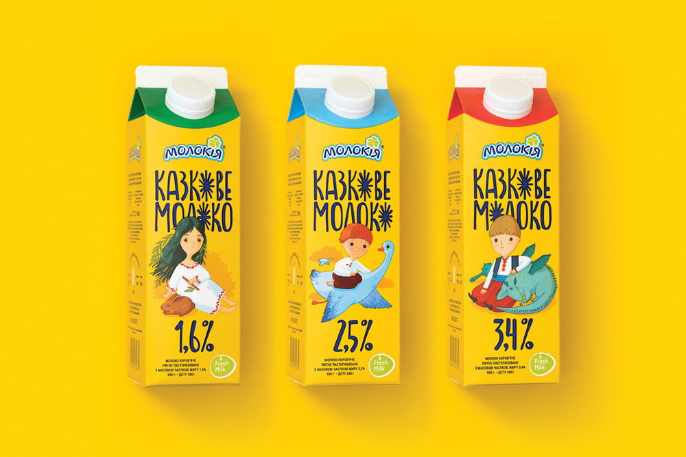
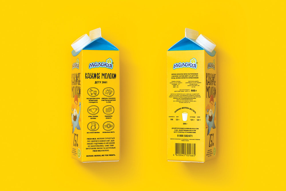
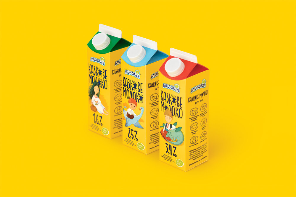
First of all, we had to keep the vivid yellow background of the packaging, as it has already become an important eye-catching attribute of Fairy Milk. The yellow color was chosen as it helps to differ from all competitors because all dairy products are mainly white and blue. In addition, yellow is a so-called childish color and Fairy Milk is targeted on kids and their parents. It was essential to follow the childish style and use fairy tales characters. To underline the origin of Fairy Milk, we used only Ukrainian fairy tales and got inspiration from children’s books design typical of Ukraine. Three fairy tales with the most recognizable characters were taken as a basis for milk line.
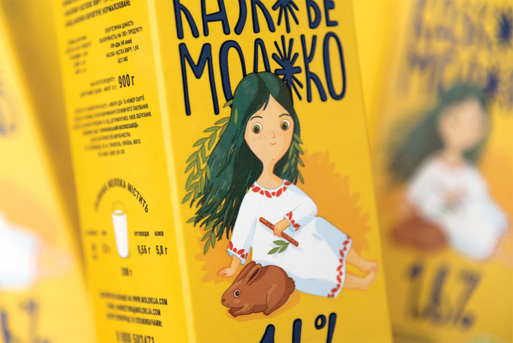
1.6% Mavka is a forest nymph who helps humans dealing with nature and enchants young men with her singing. Mavka is a character of numerous stories and legends. Green color is for the lightest milk with the least amount of calories.
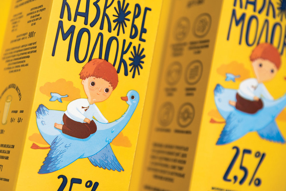
2.5% Ivasyk-Telesyk is a small boy who was kidnapped to be eaten by a witch. But kind goose helped him to escape. Blue color is for most popular middle-fat milk.
3.4% Kotyhoroshko is an amazingly strong boy that defeated the evil dragon with a mace. Red color is for caloric and nutritious milk.”

CREDIT
- Agency/Creative: Graphic design studio by Yurko Gutsulyak
- Article Title: Graphic design studio by Yurko Gutsulyak – Fairy Milk
- Project Type: Packaging
- Format: Box
- Substrate: Pulp Carton, Pulp Paper


