A first-person stories zine
Overview
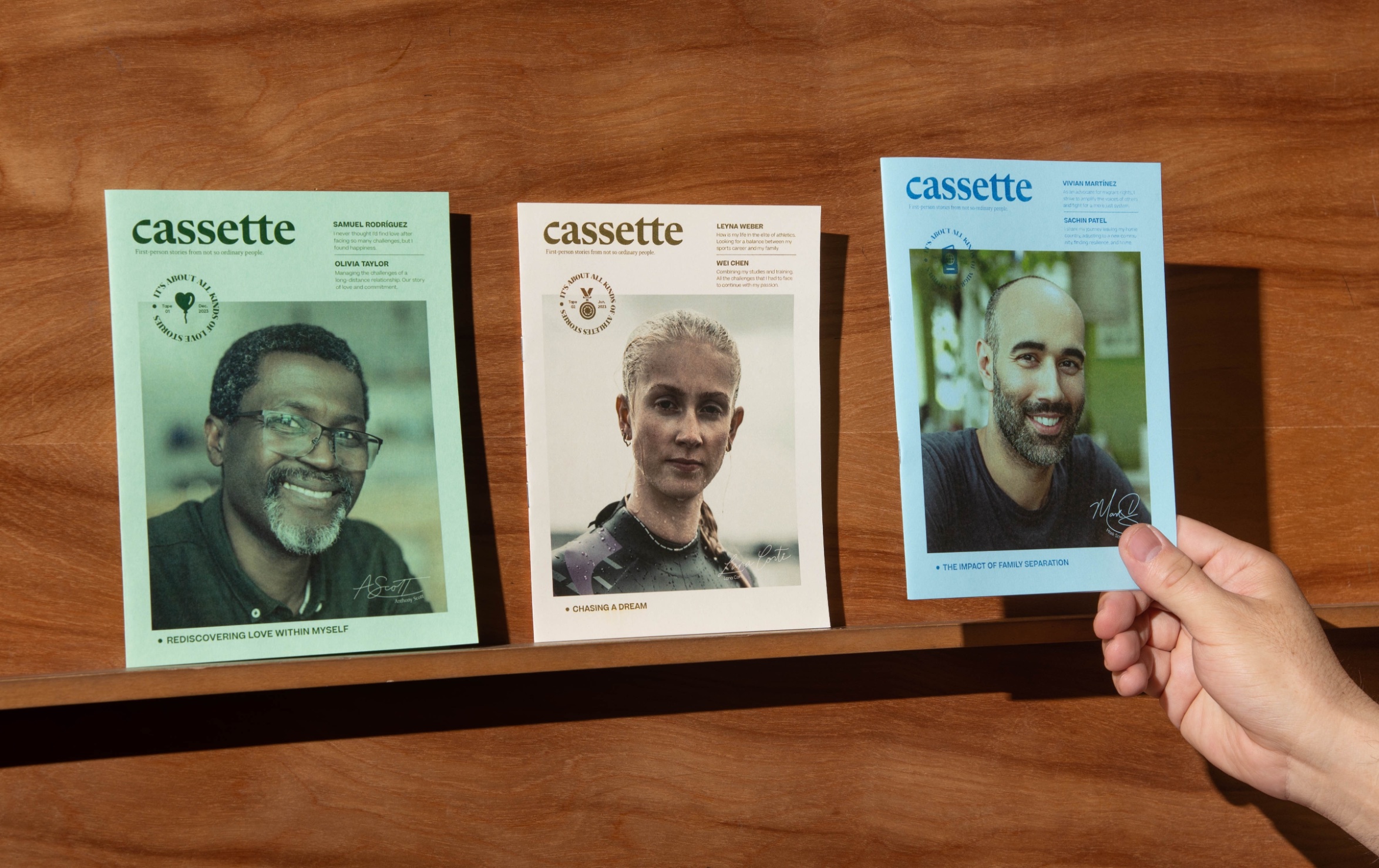
The Cassette zine stands as a thoughtfully curated collection of personal perspectives, delving deep into contemporary issues. Each issue seamlessly amalgamates firsthand stories with factual information, thus granting readers a multifaceted look at each topic, balancing intimate narratives with a global viewpoint. Rooted deeply in the ethos of the independent publishing movement, the zine emphasizes grassroots creativity and authenticity.
Approach
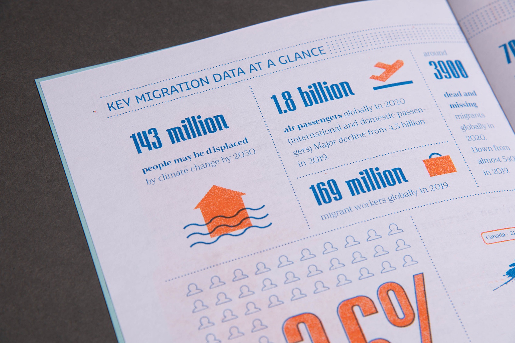
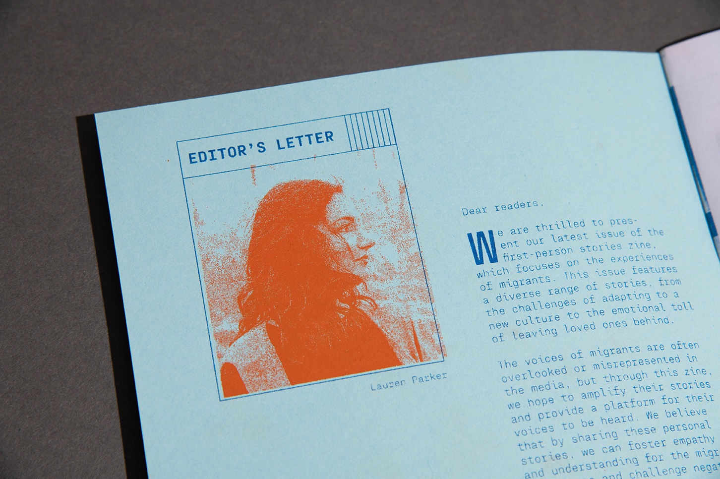
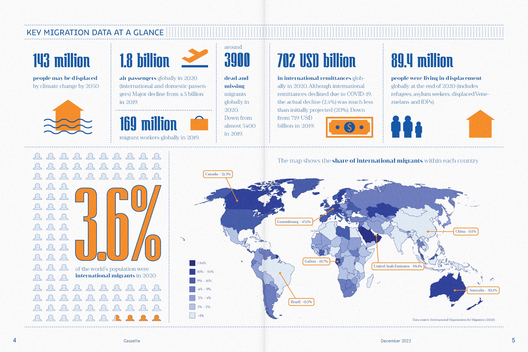
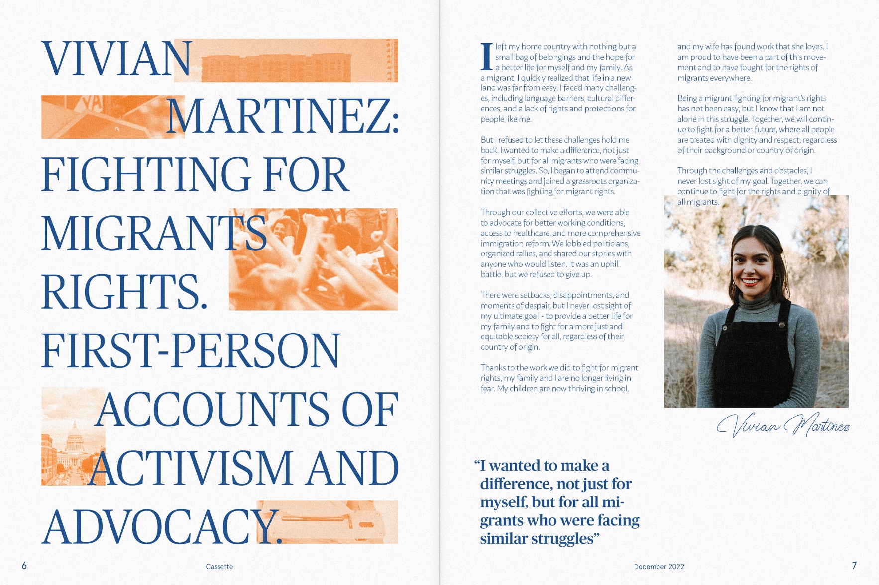
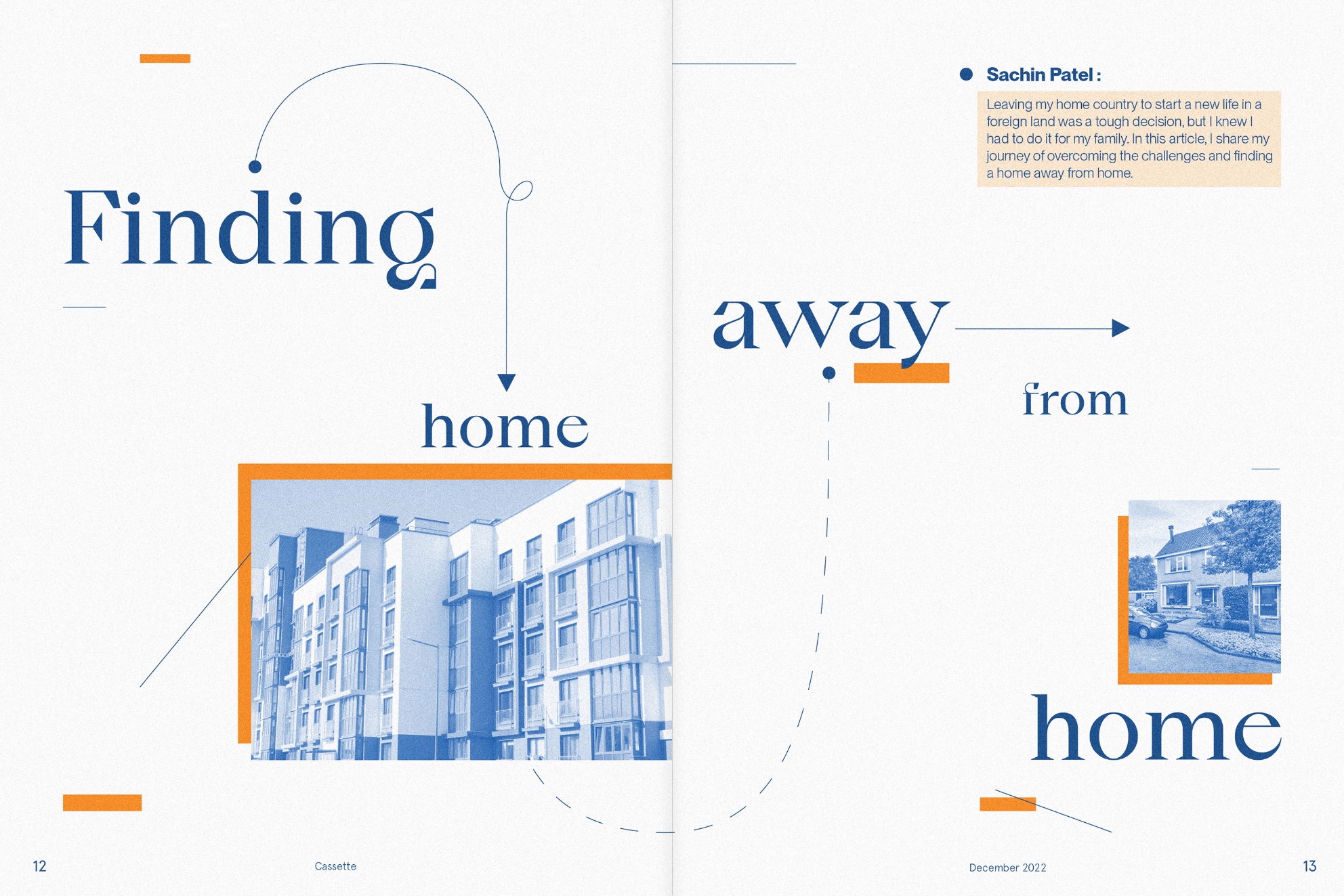
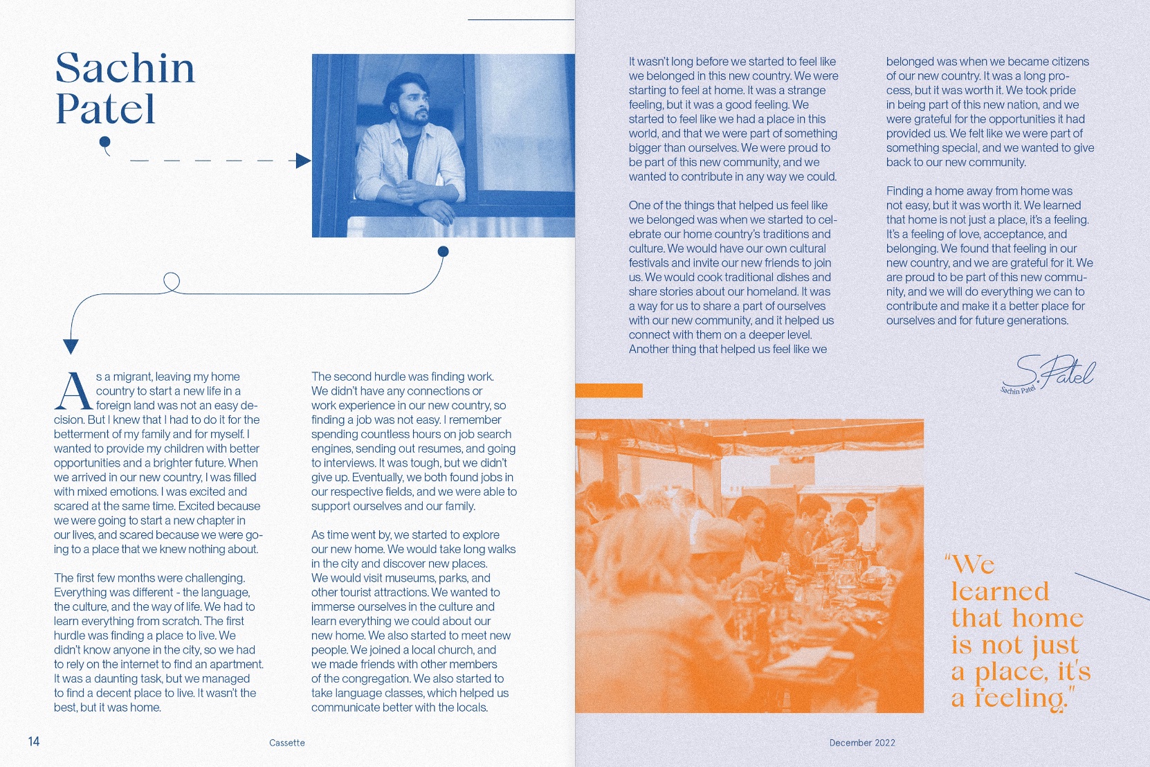
In capturing the authenticity of these individual tales, I embraced risograph printing, a technique celebrated for its unique textural attributes and inherent imperfections. This method, with its history deeply embedded in zine-making, offers the added advantage of producing striking overprinted visuals and a splash of neon inks. Reflecting the diverse range of voices and backgrounds present in the zine, I employed a distinct typeface for every story. This design choice was an intentional nod to the variety and depth of personal experiences being shared.
Process
Opting for the risograph printing technique was a deliberate decision aimed at fostering a tangible aesthetic connection. The resultant spreads are enriched with tactile textures and an array of vibrant hues, harmoniously juxtaposing with the personal narratives they envelop. Hand-printed and assembled with precision at San Diego City College, the zine exemplifies craftsmanship in independent publishing.
Page Layout
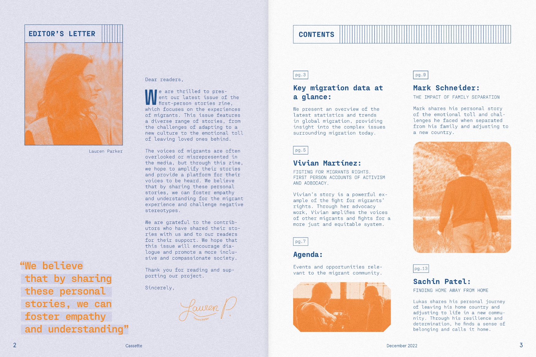
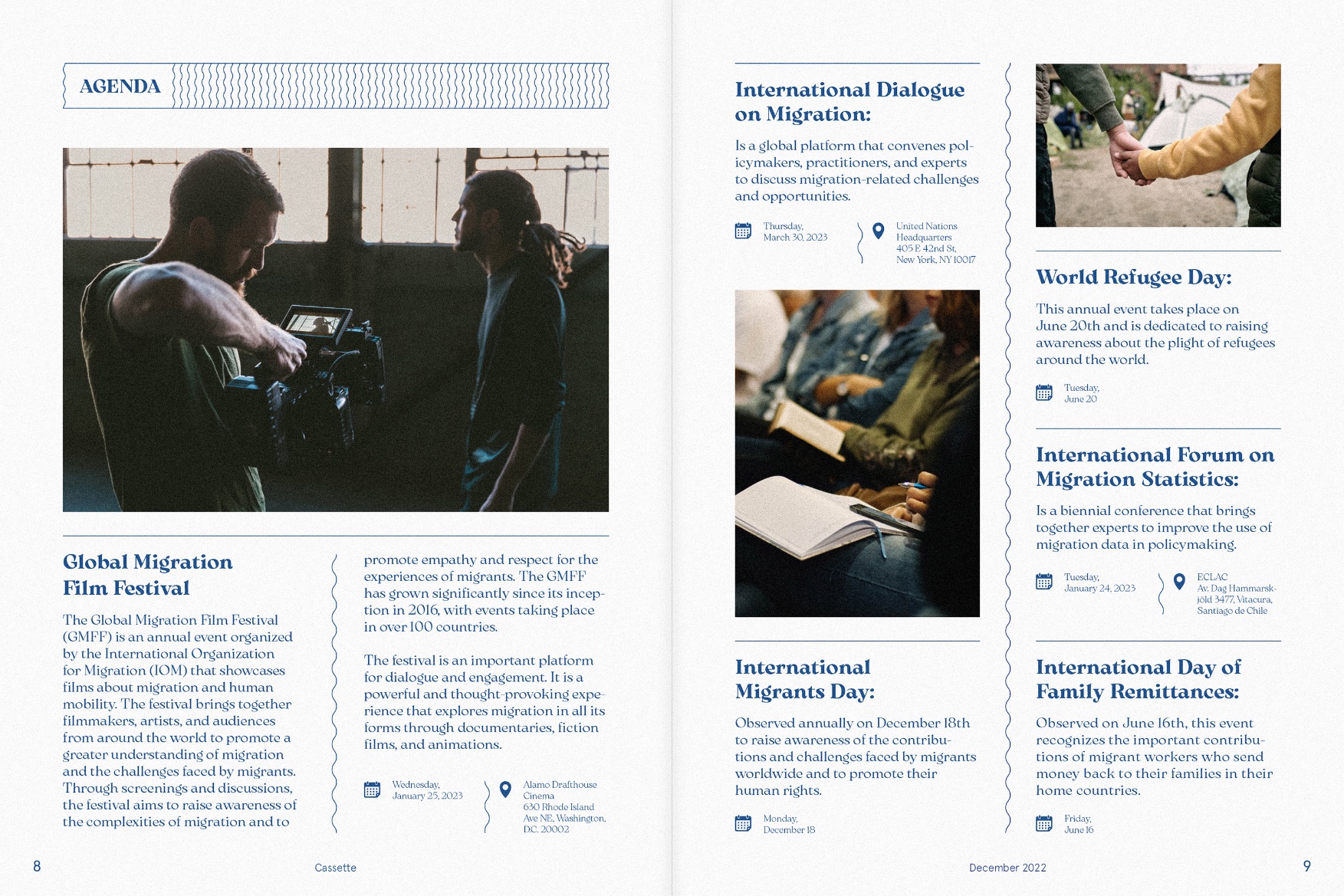
The underlying foundation of the zine’s design is a meticulously constructed four-column grid system. This choice ensures a uniform, organized layout, directing the reader’s journey through the pages. Typography and the careful placement of imagery work in tandem, amplifying the poignancy of the first-person accounts and creating a truly immersive reading experience. The interiors of the zine are punctuated with playful graphic elements, acting as dividers and lending structure to the content. Moreover, the use of monotone imagery, enriched by the risograph’s vibrant color palette, further accentuates the zine’s distinct visual language.
CREDIT
- Agency/Creative: Laura Rodríguez Porras
- Article Title: Graphic Design for Cassette Periodical Publication – A First-Person Stories Zine
- Organisation/Entity: Student
- Project Type: Graphic
- Project Status: Non Published
- Agency/Creative Country: United States
- Agency/Creative City: San Diego
- Market Region: North America
- Project Deliverables: Graphic Design
- Industry: Mass Media
- Keywords: WBDS Student Design Awards 2023/24
- Keywords: Graphic Design,Periodical Publication
-
Credits:
Educational Institution: San Diego City College - Graphic Design
Educator's Name: Sean Bacon and Bradford Prairie


