The Project: Red Church Vineyards is a young project on the map of Bulgarian wine industry. I had no idea it existed until one day Alex Kanev called me and said “Jordan, we have something new to do together!”. Alex is a name that doesn’t need any introduction if you are familiar with premium wine brands like Stallion and Enira. He teamed up with some of his partners and started the Red Church Vineyards named after the famous Byzantine Red Church basilica located nearby Perushtitsa.
The Challenge:Working with Alex has always been a challenge no matter how experienced you are. My task was not easy because I had to create very strong brand strategy for this new project without competing with Alex’s AK premium private wine brand I created a few years ago. In fact I was again in competition with myself. It does happen pretty often in my career so I wasn’t new to this feeling and the responsibility behind it.
I knew Alex was going to create some amazing wines and that this new brand concept should somehow reflect his own personality and his recognizable style in wine-making. He was and still is very different as a professional so I decided to focus on his individual style and uniqueness and create very memorable strong brand name to make his wines stand out among the others just like he did. This is how the Grand Sovereign brand was born.
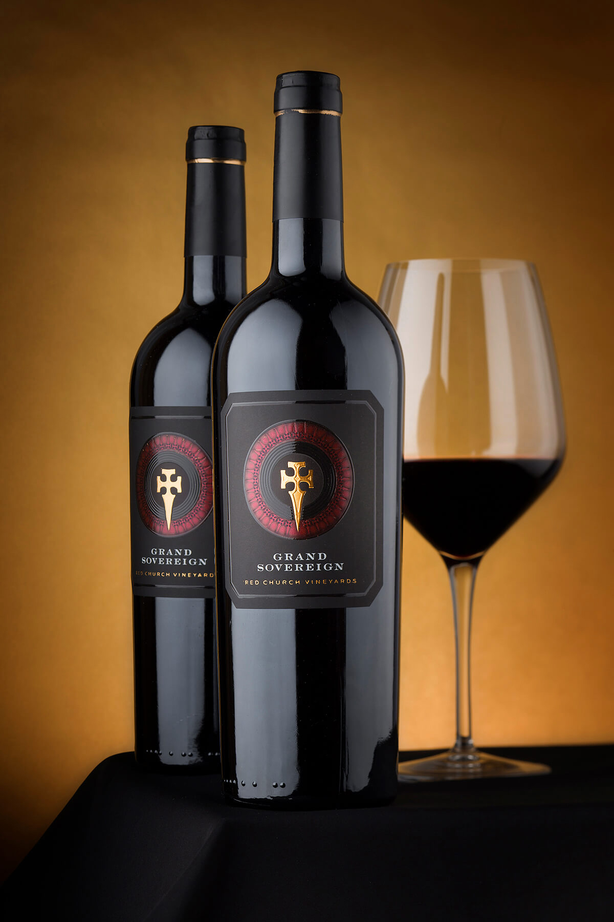
The Execution: Bottle – Alex picked the bottle himself and I agreed. A classic tapered bordolaise bottle lacquered with high gloss almost black varnish. Made by Vetreria Etrusca, Italy this bottle really stood out and was excellent background for my new wine label design.
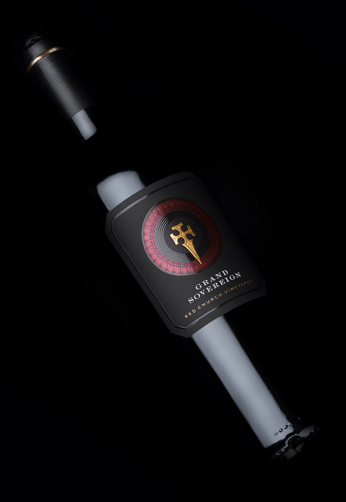
Sealing – When we started the Grand Sovereign brand Alex and I decided to use one capsule for all wines and I designed very simple black matt on with elegant yet very visible gold line at the top. Solid 50mm cork was used to seal the bottle and preserve the wine for long-time ageing.
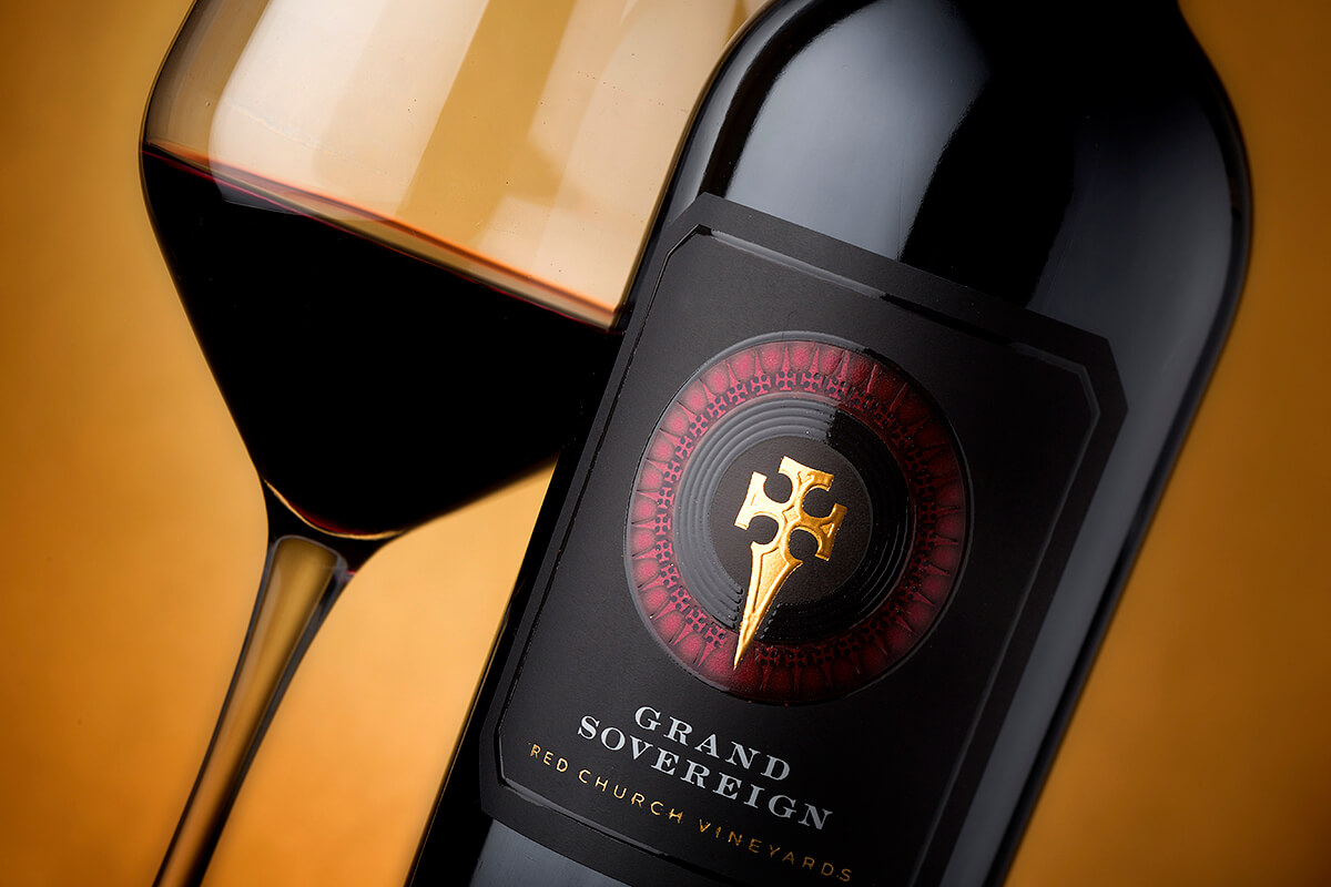
Paper – I picked one of my favorite papers by Arconvert, the Ispira Nero Mistero. I got addicted to this media since its first appearance on the market for its smooth soft surface and neutral black color. In this project this paper was probably the best choice because I wanted to use the black color in several different variations and perceptions.
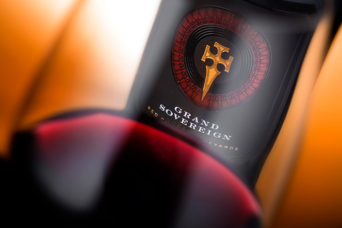
Print – Printing this wine label was even bigger challenge than creating the brand itself. Working with black paper is something very specific, non-traditional and in many aspects extremely risky if you don’t know what and how to do with it. In this wine label I used white hot foil for the Grand Sovereign text because I wanted to achieve maximum legibility of the brand. The dagger at the center is printed with gold foil and raised varnish gilded with gold leaf. There is a dark-red metallic circle around the logo which is a solid gold hot foil overprinted with deep ruby red and black ink. The space between the red circle and the dagger at the center is for a blend group of circles printed with black ink on black paper and then overprinted with transparent raised varnish.
The Result: Black paper always produces wine labels with strong more serious presence that somehow effortlessly captures customers attention. Grand Sovereign wine packaging is now exception not only because of the paper but also because of the special print features I used to print this design.
This new project has very strong captivating presence on the shelf. Once you see it among the other wines you always want to have it in your hands because you could sense it is something special. Physical contact with this wine bottle design is real pleasure as you could touch and feel all these different materials, embossing, and color reflections you couldn’t sense from a distant look but you really knew they were there.
In short Grand Sovereign is a strong brand project that turned into very distinguished design with multiple levels of communications with the audience.


CREDIT
- Agency/Creative: the Labelmaker
- Article Title: Grand Sovereign – Strong Brand for Premium Wines
- Organisation/Entity: Agency, Published Commercial Design
- Project Type: Packaging
- Agency/Creative Country: United States
- Market Region: Europe
- Project Deliverables: Brand Identity, Brand Naming, Brand Redesign, Brand Strategy, Branding, Graphic Design, Packaging Design, Photography
- Format: Bottle
- Substrate: Glass Bottle


