


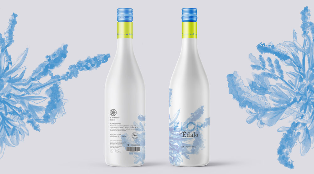
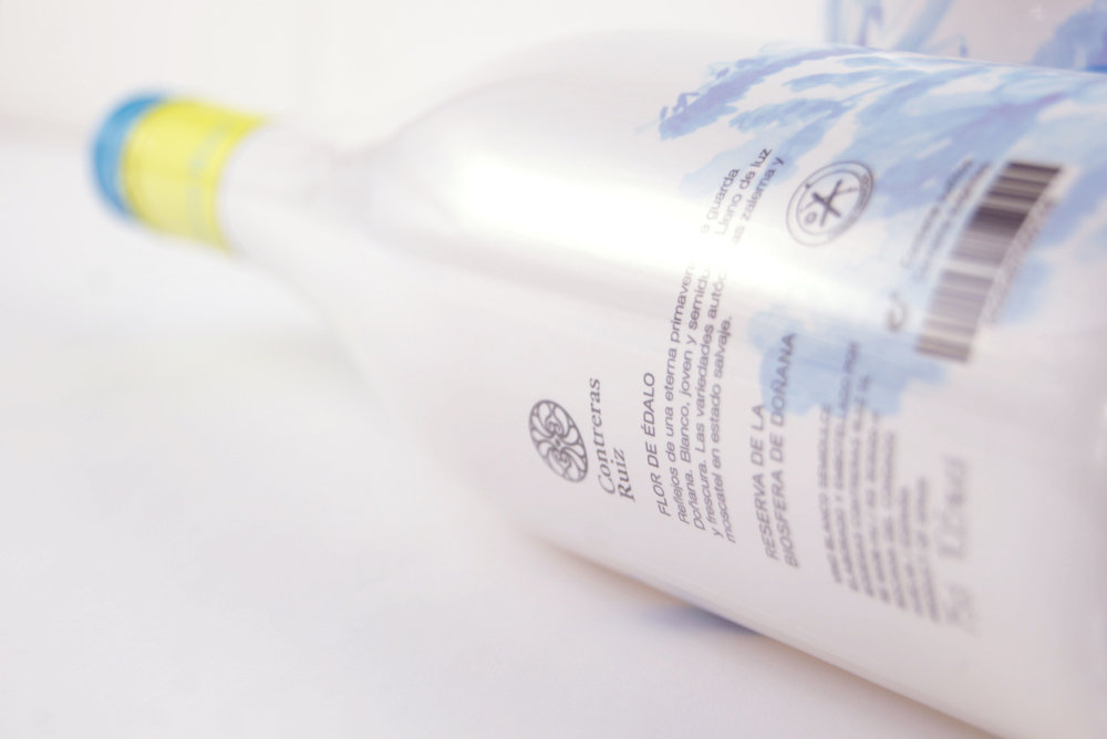
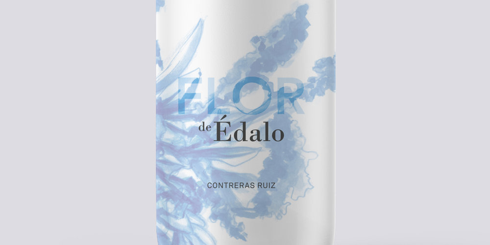
” Flor de Édalo is a young wine made from 100% zalema grape, which is grown in a marine origin land with high salinity that in addition to the weather conditions of the region provides this wine with a fresh and unique character. The image chosen for Flor de Édalo is a composition of halophyte plants that grow wild and naturally in the saline environment of Doñana National Park.
ASSIGMENT:
Being aware of current consumption patterns, these wineries have increased their wine offer by including a white young wine, fresh and very easy drinking, ideal for high temperatures.
Contreras Ruiz wished to transmit the vital, natural and fresh character of this wine, making evident its relationship with Édalo Family.
Besides, the company has taken on a commitment with the environmental preservation and is currently involved in obtaining the ecological certification for which Flor de Édalo is their flagship as it is created in the Biosphere Reserve of Doñana.
The assignment demanded us to show: freshness, nature, happiness, elegance and youth, connection with Doñana and Édalo wines.
CONCEPT:
For the design of Flor de Édalo, we focused on the deep relationship between the wineries, their vineyards and Doñana National Park.
The vineyard where Flor de Édalo is born has a marine origin that provides the land with a high salinity. This salinity together with the weather conditions of the region provide the grapes used for making Flor de Édalo with an unique character.
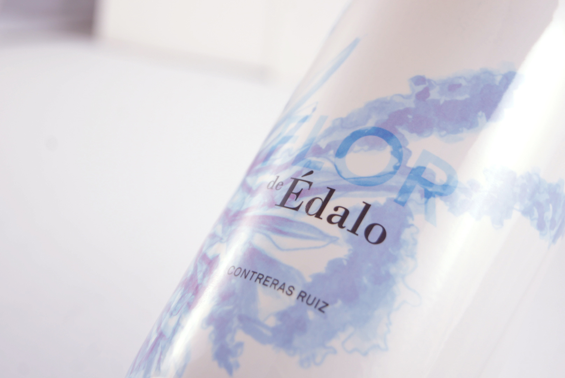
The original typography choice was kept with the objective of keeping the link with Édalo family, whereas for the new image of the flower (“flor” is the Spanish word for flower) a research on the local flora was done, especially on halophyte plants. Halophytes, also known as salt plants, grow wild and naturally in Doñana National Park.
MORE DETAILS:
Starting from the concept idea and after researching about Doñana’s Biosphere Reserve flora, the flower image was designed building a composition of halophyte plants. The final illustration gathered several techniques such as pencill or Chinese ink.
The Studio worked every element in the bottle so that the whole set resulted to be attractive and light as the wine itself. In order to create a balanced image between the content and the continent some blue and lime greens were used to supply color and freshness to the white sleeve covering the whole bottle.
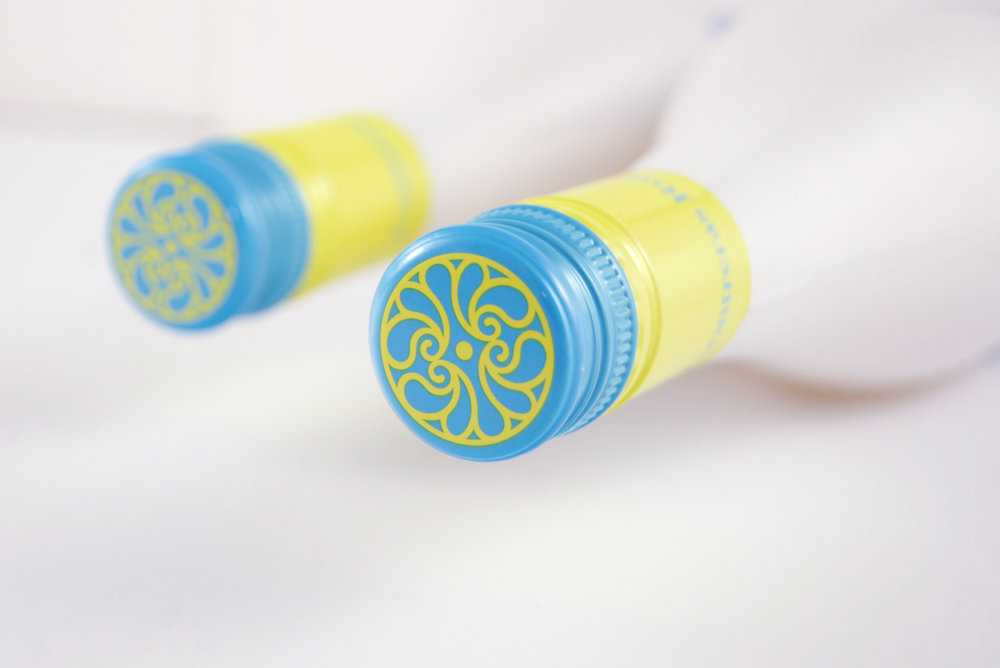
Lastly, a screw cap was chosen as it is ideal to ease the consumption and suitable for this type of young wines that don’t need to mature inside the bottle.”
CREDIT
- Agency/Creative: Granada Barrero studio
- Article Title: Granada Barrero studio – Flor de Édalo
- Project Type: Packaging
- Format: Bottle, Sleeve
- Substrate: Glass, Plastic


