Brief:
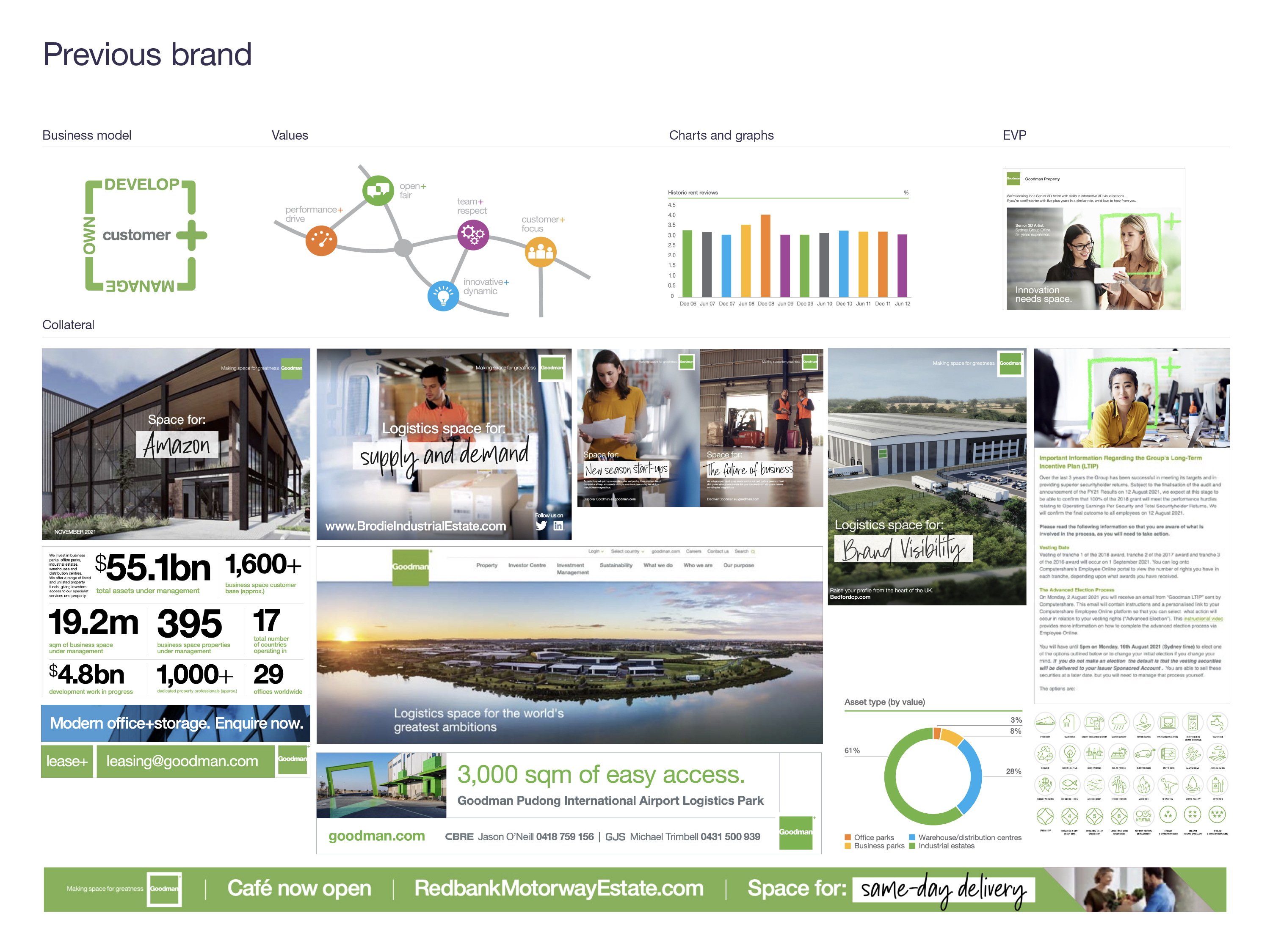
As a global leader in the industrial property space, Goodman Group is by far the most progressive company in the category. Unfortunately, their existing brand wasn’t conveying this strongly enough. Our task was to comprehensively redesign their visual brand, while retaining recognition of the logo, to reflect the contemporary, innovative, and digital nature of their business. The design work needed to be distinctive enough to set them apart from their competitors and flexible enough to take them well into the future.
Solution:
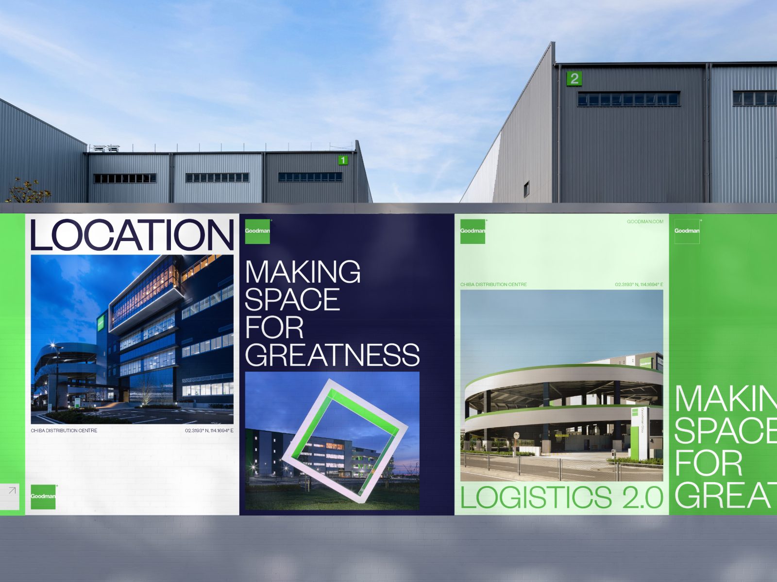
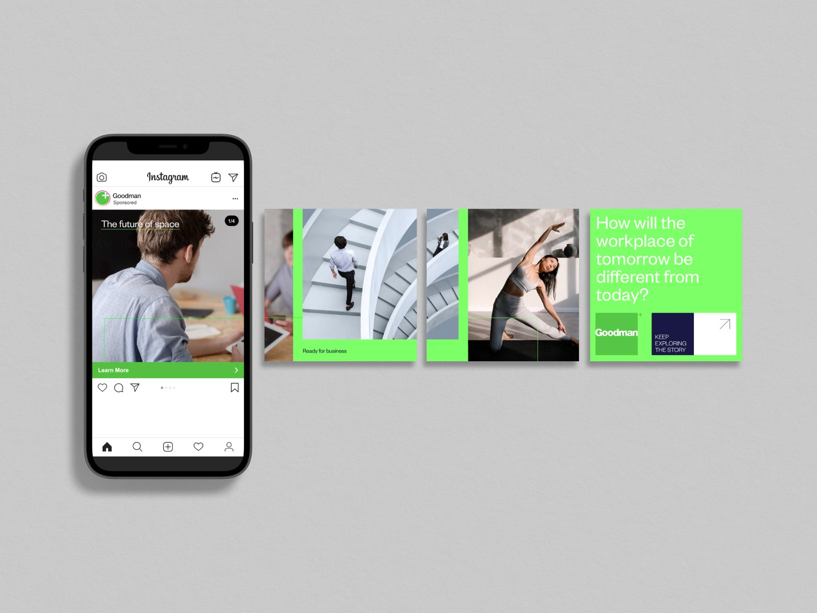
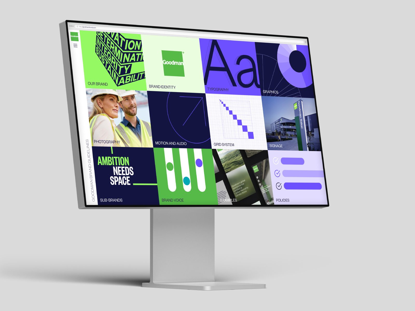
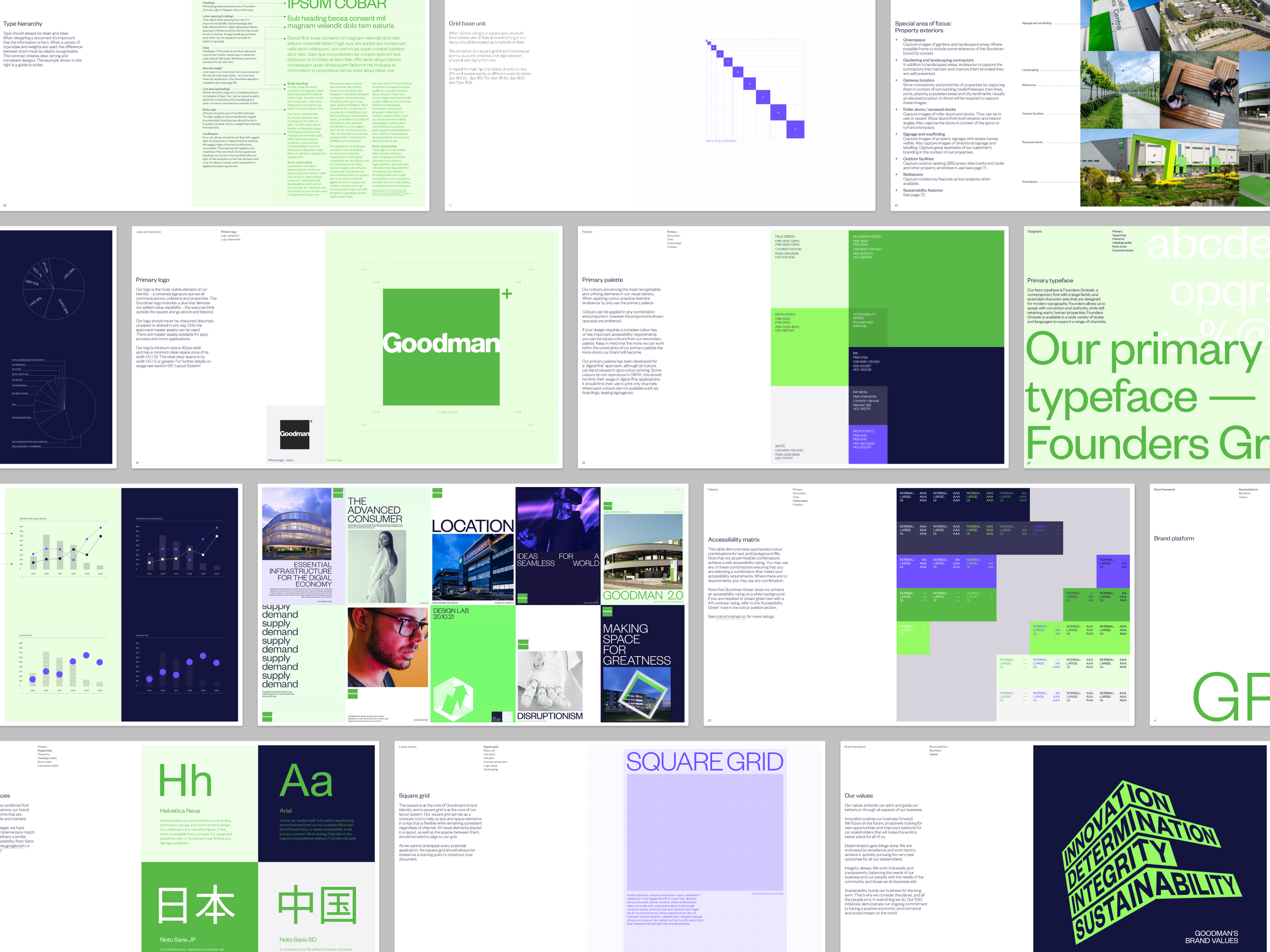
The visual principles we developed are an intentional echo of the patterns and systems commonly seen throughout the warehousing and logistics industries. Contained in a square grid layout, all visual elements are tightly packed but balanced with generous amounts of space. Movements are deliberate and precise. Our tone is clear and confident, and our mindset is future-focussed.
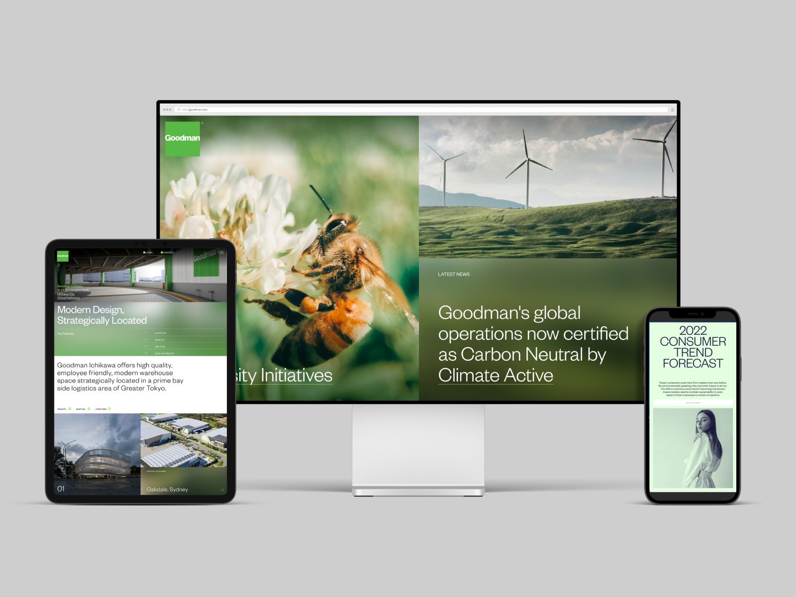
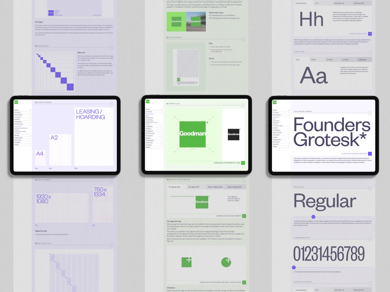
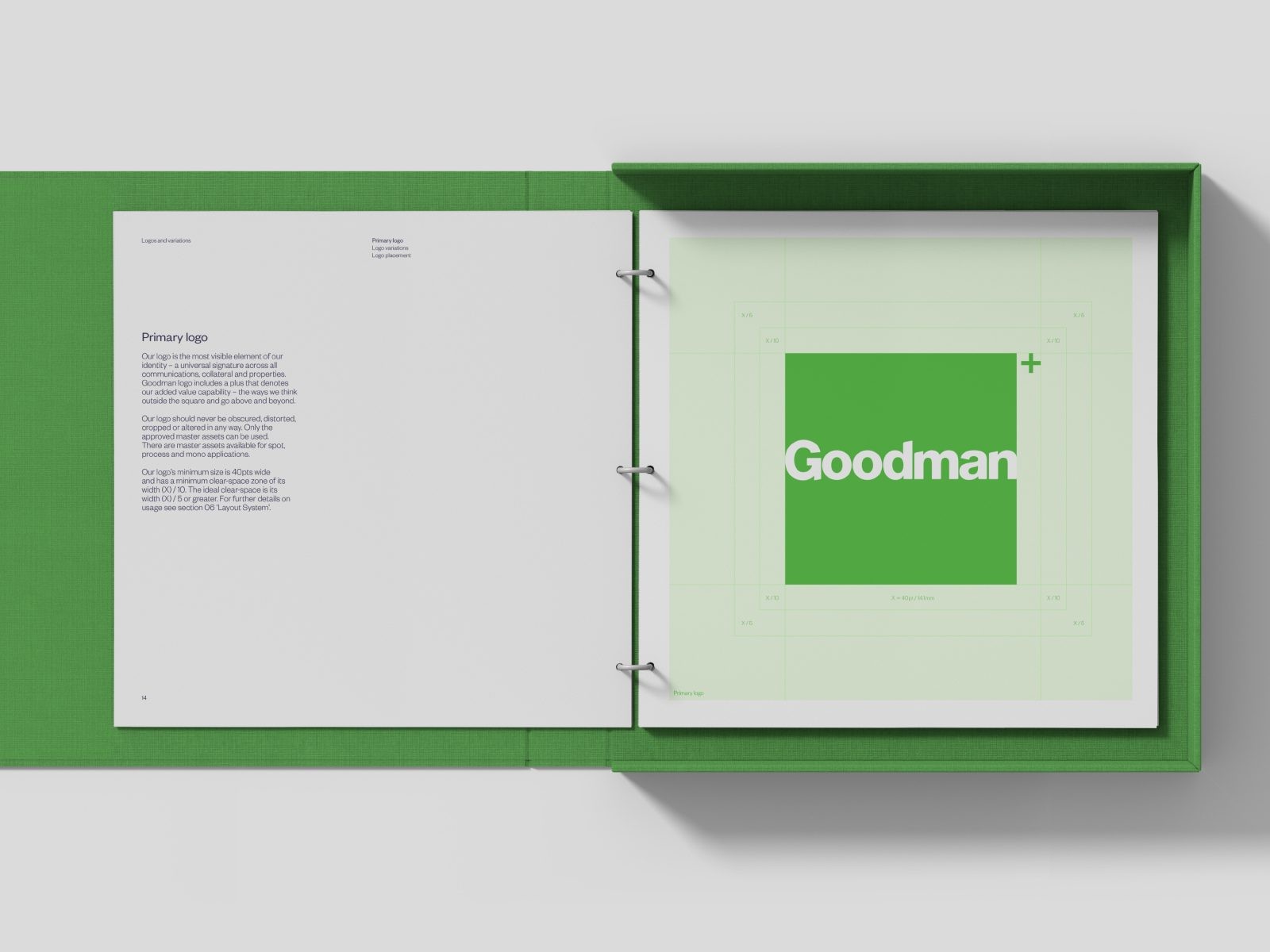
We refined the Goodman logo to improve its application and reproduction in all mediums. A new ‘dark mode’ logo was introduced and small space logo reductions created for digital and social channels.
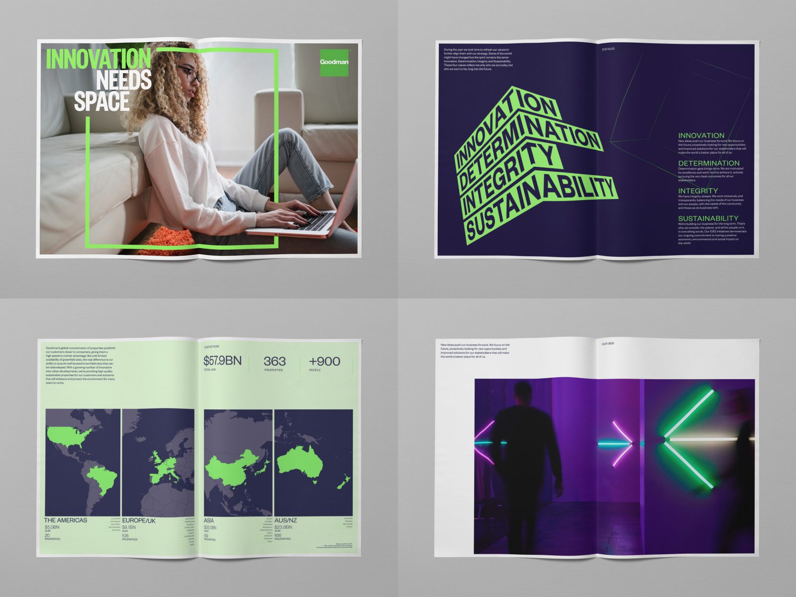
The typographic system was updated, introducing fonts that balance an editorial style with the confident tone of a category leader. The system was localised with non-latin character families that display cohesive forms and have similar optical size and weight to the primary typeface.
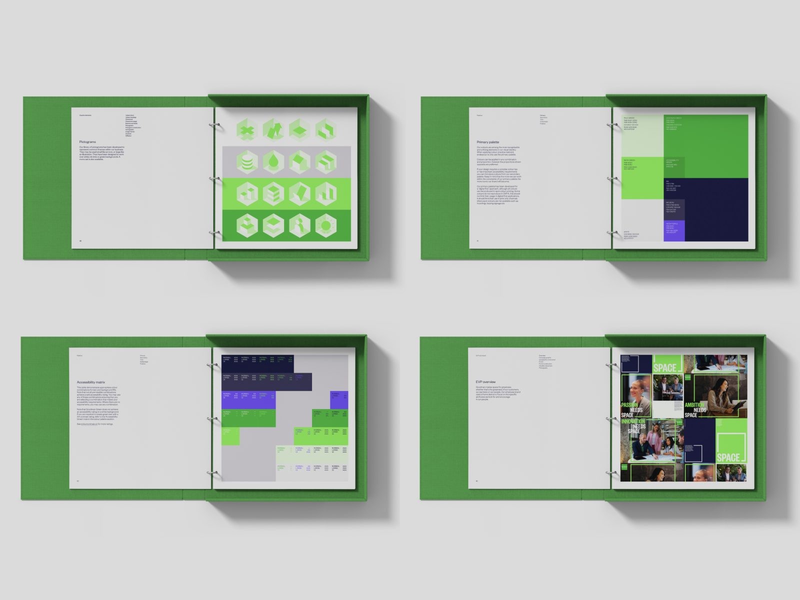
We contemporized and expanded the Goodman palette leading with neon RGBs that have Pantone counterparts. The CMYK palette now restricted in its use. Dark ink now replaces the harsh black of the old brand and all colour combinations are rated against accessibility standards. The secondary palette was selected to create the greatest visual separation possible and is limited to complex infographic applications only.
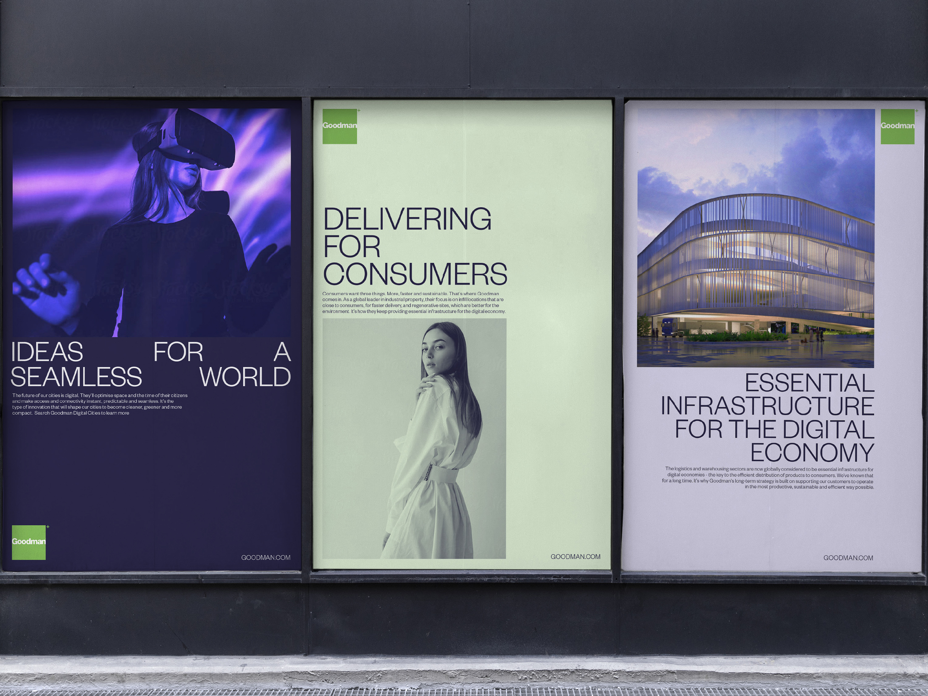
We developed a distinctive verbal language that conveys authenticity and intelligence to ensure audiences feel reassured. And defined a new photographic style that matches Goodman’s energy and innovative approach to logistics.
CREDIT
- Article Title: Goodman Brand Redesign
- Organisation/Entity: Agency
- Project Type: Identity
- Project Status: Published
- Agency/Creative Country: Australia
- Agency/Creative City: Surry Hills
- Project Deliverables: Brand Design
- Industry: Technology
- Keywords: WBDS Agency Design Awards 2022/23
-
Credits:
Creative Director: Benjamin Gay
Creative Director: Julie Faktor
Designer: Benjamin Gay
Designer: Judit Arroyo
Designer: Yuna Moon
Designer: Danyin Zhu
Art Director: Benjamin Gay
Writer: Julie Faktor
Account Manager: Stacey Paton


