


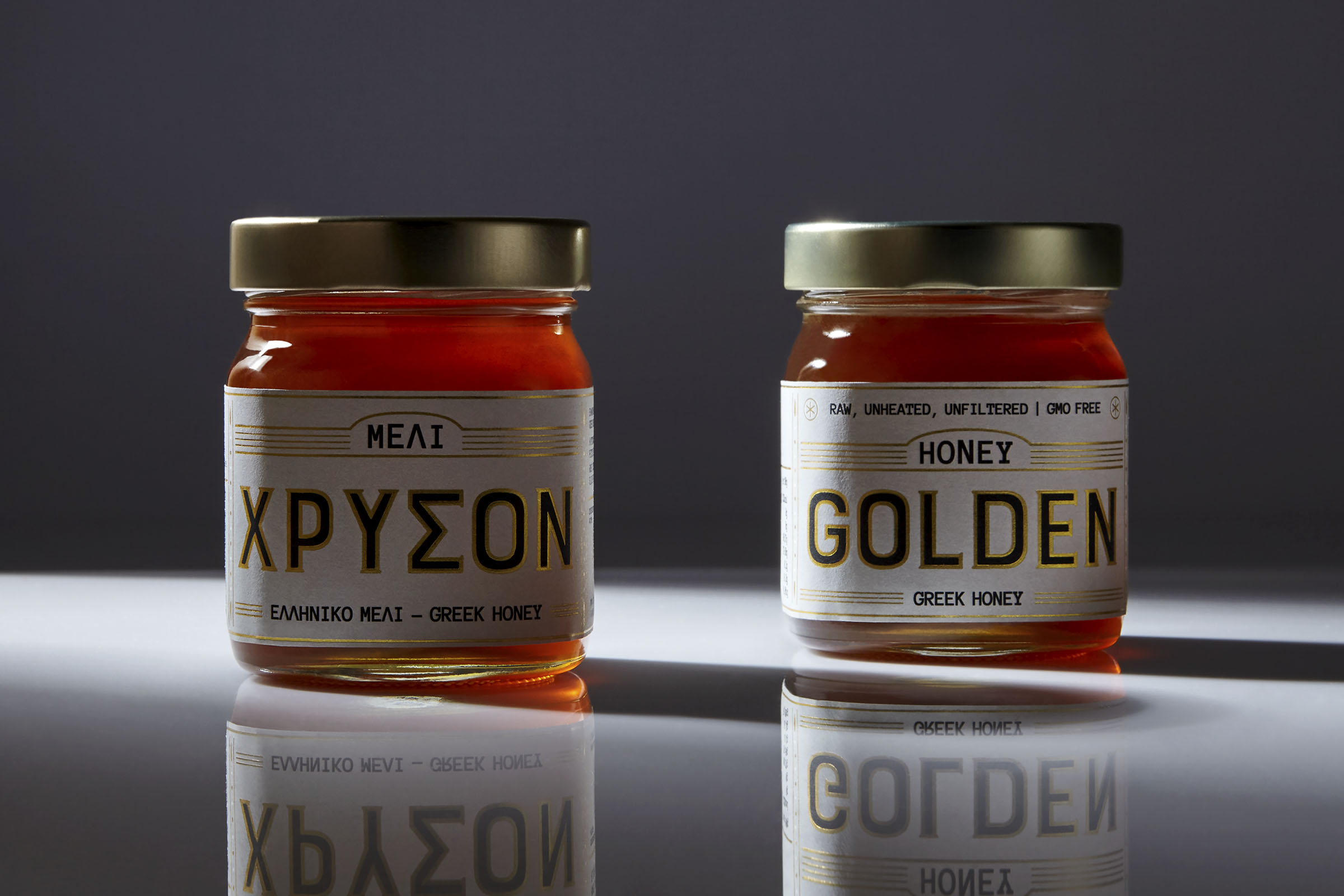
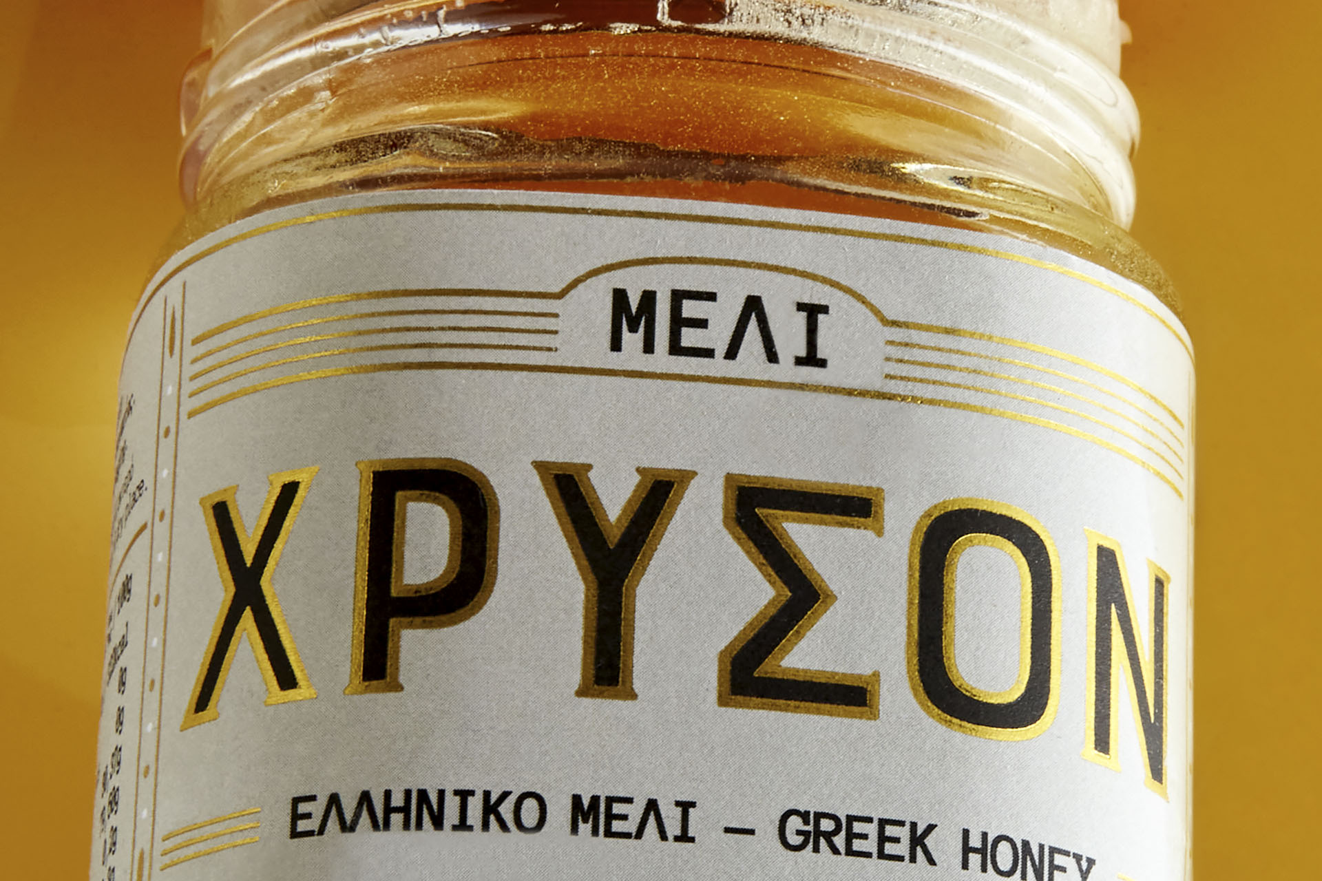
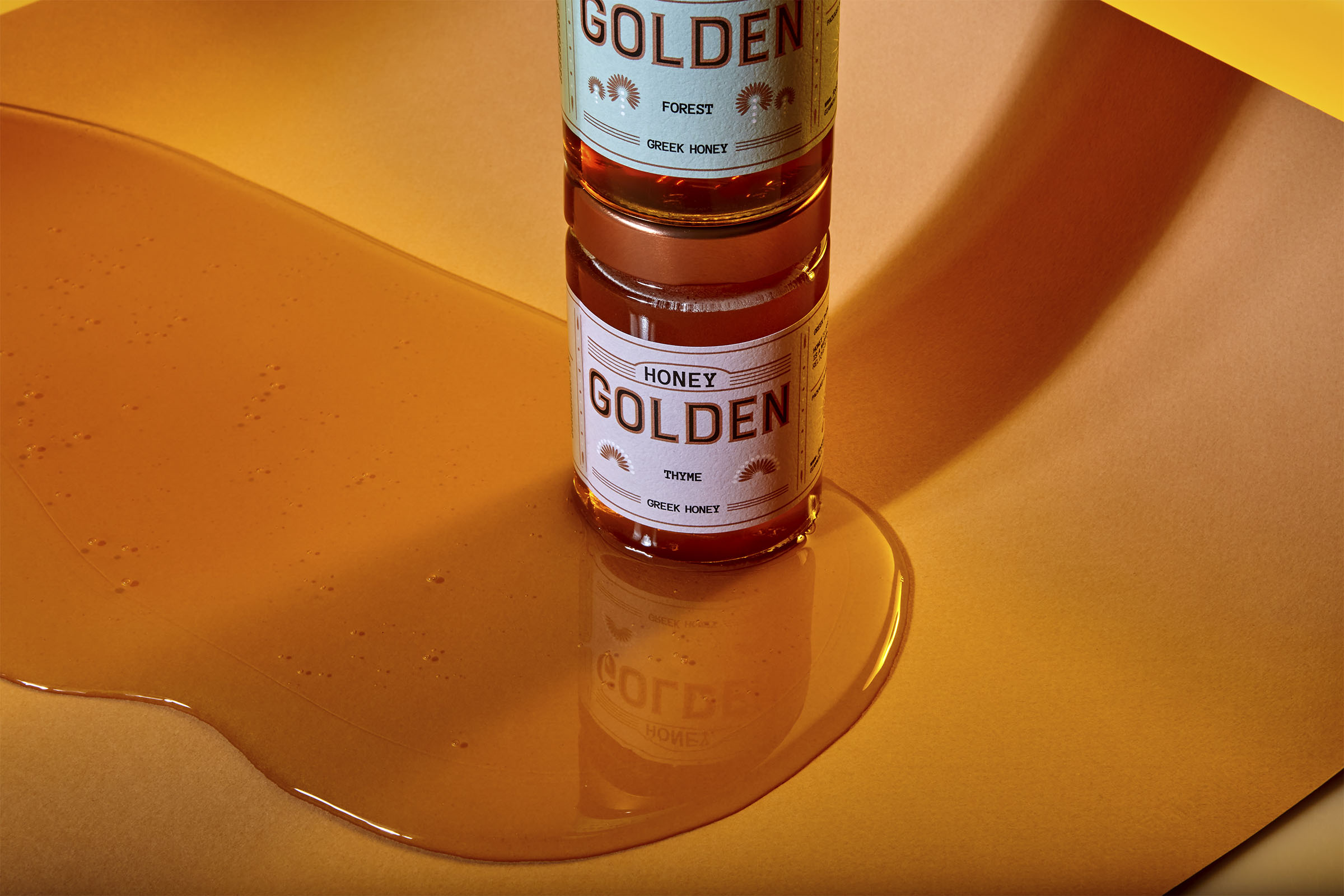
Label design for a new premium Greek honey from Food Surfing Company, presented in three carefully selected varieties: Flower, Forest, and Thyme. Honey is a product deeply rooted in Greek tradition, carrying with it connotations of purity, wellness, and natural richness. The challenge was to respect this long-standing heritage while creating a label identity that feels relevant, contemporary, and capable of competing in today’s demanding market environment. Our design solution strikes a balance between tradition and modernity, preserving the authenticity of the product while dressing it with a refined visual language.
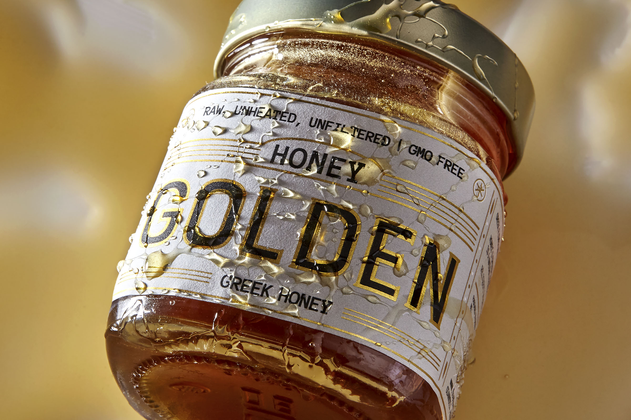
The concept was built around the expressive power of typography, which serves as the main storytelling element. By limiting both information and color to only what is absolutely essential, the design avoids visual clutter and instead communicates clarity, simplicity, and confidence. This reductionist approach allowed us to highlight the essence of the brand in a way that is both timeless and memorable.
To introduce a distinctive signature element, we applied an embossed gold coating. This subtle yet striking detail captures light, creates tactile interest, and embodies the values of sophistication and excellence. It is also directly aligned with the brand’s very name, Golden, reinforcing the identity at every touchpoint.
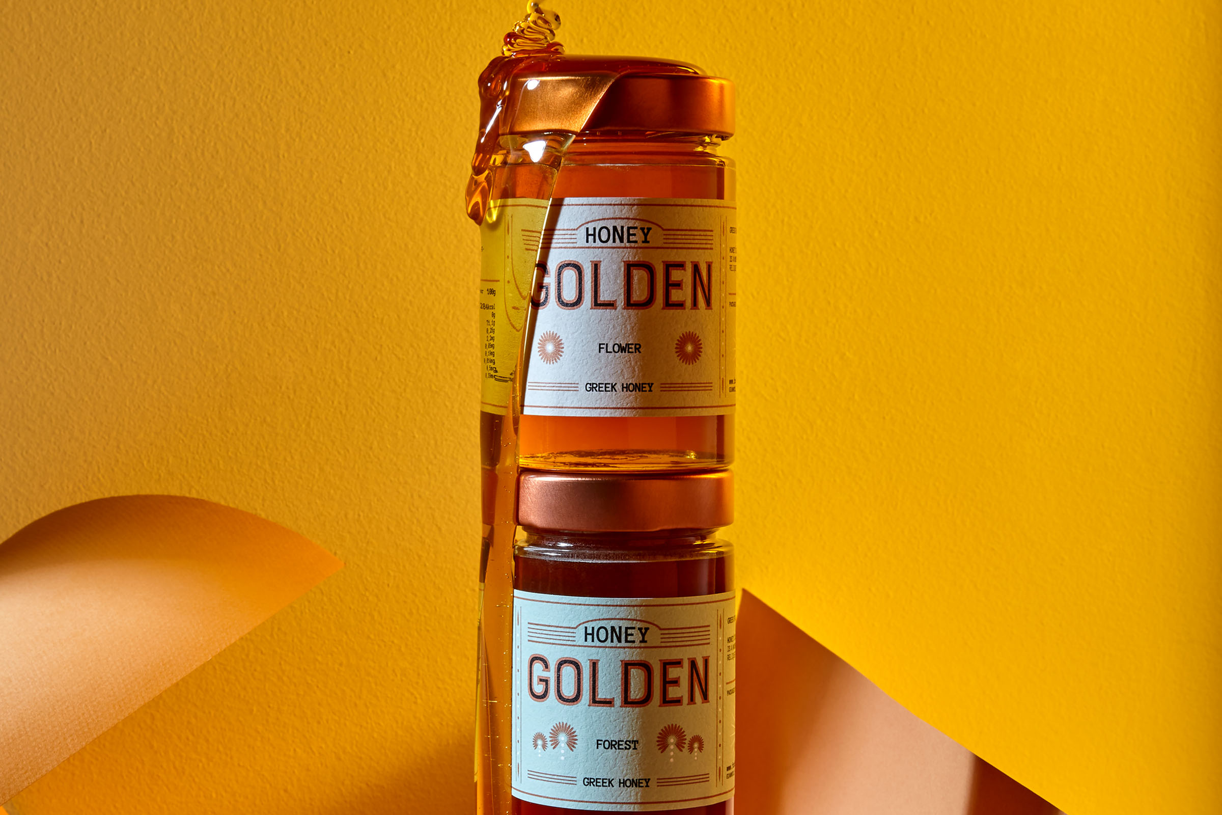
Differentiation among the three varieties was achieved through the introduction of simple geometric icons, each symbolizing the natural origin of the honey: a blossom for the Flower honey, two trees for the Forest variety, and a thyme sprig for the Thyme honey. These motifs serve as intuitive visual cues, ensuring easy recognition while maintaining the minimal and premium character of the design.
The final result is a label system that communicates purity, authenticity, and superior quality. It speaks to an audience that values not only the excellence of the product itself but also the story and craftsmanship embedded in its presentation. By merging heritage with modern aesthetics, the design elevates a classic Greek product into a premium proposition with international appeal.


CREDIT
- Agency/Creative: Cursor Design Studio
- Article Title: Golden Honey Packaging Design by Cursor Design Studio
- Organisation/Entity: Agency
- Project Type: Packaging
- Project Status: Published
- Agency/Creative Country: Greece
- Agency/Creative City: Larissa
- Market Region: Europe
- Project Deliverables: Food Photography, Graphic Design, Label Design, Packaging Design
- Format: Jar
- Industry: Food/Beverage
- Keywords: CursorDesign,Graphic design, packaging design, label design, makes things visible, honey, Greece, food product, golden, design, graphic designer
-
Credits:
Photographer: Michael Koronis


