


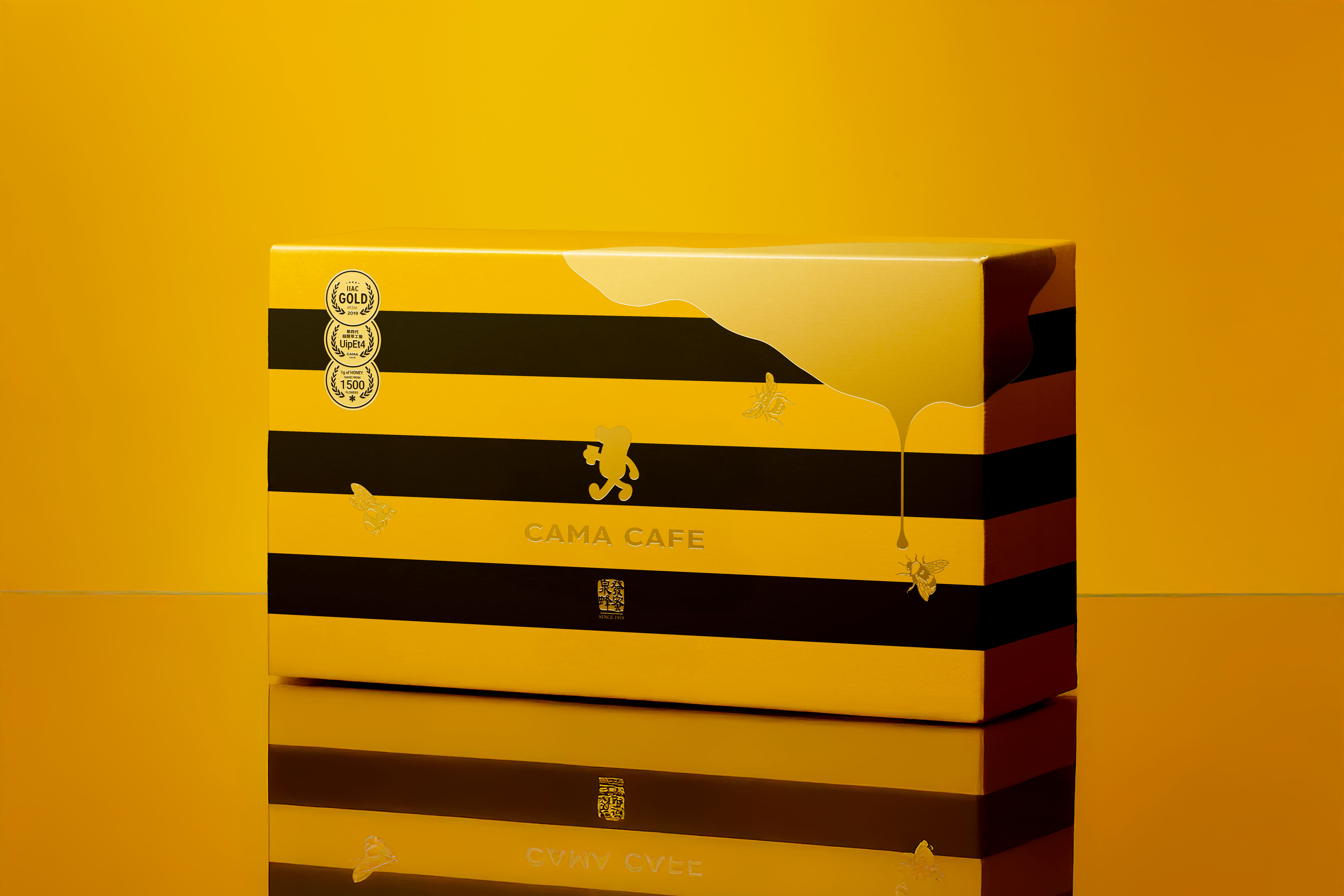
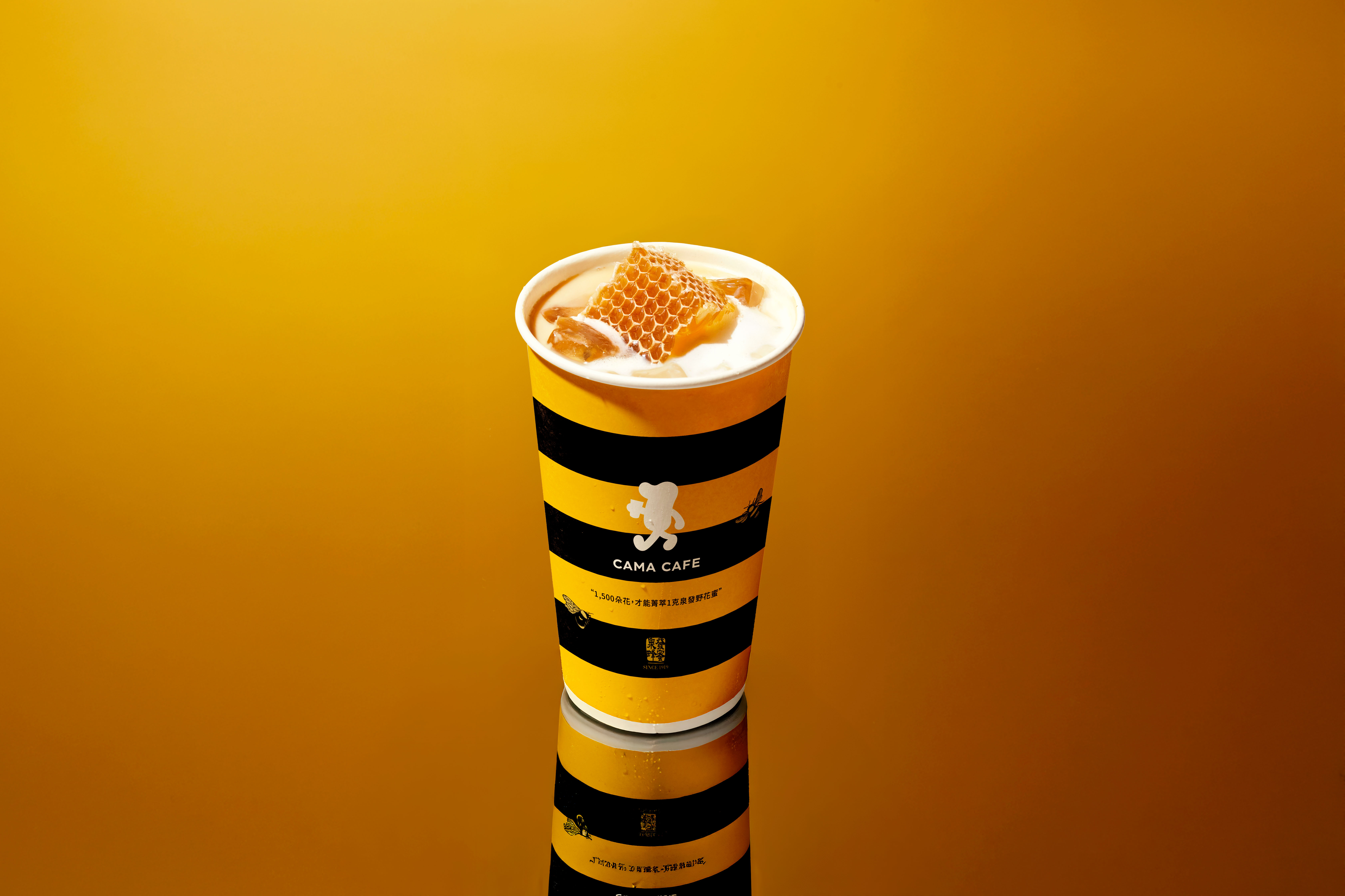
“Every 1,500 blossoms yield just 1 gram of honey.”
This poetic yet scientific fact carries with it a profound message about rarity, patience, and precision. Each droplet of honey represents thousands of flowers visited, countless flights of bees, and a long ritual of nature distilled into a golden fragment. It was this rarity — something both fragile and powerful — that became the spark and guiding metaphor for our design strategy.
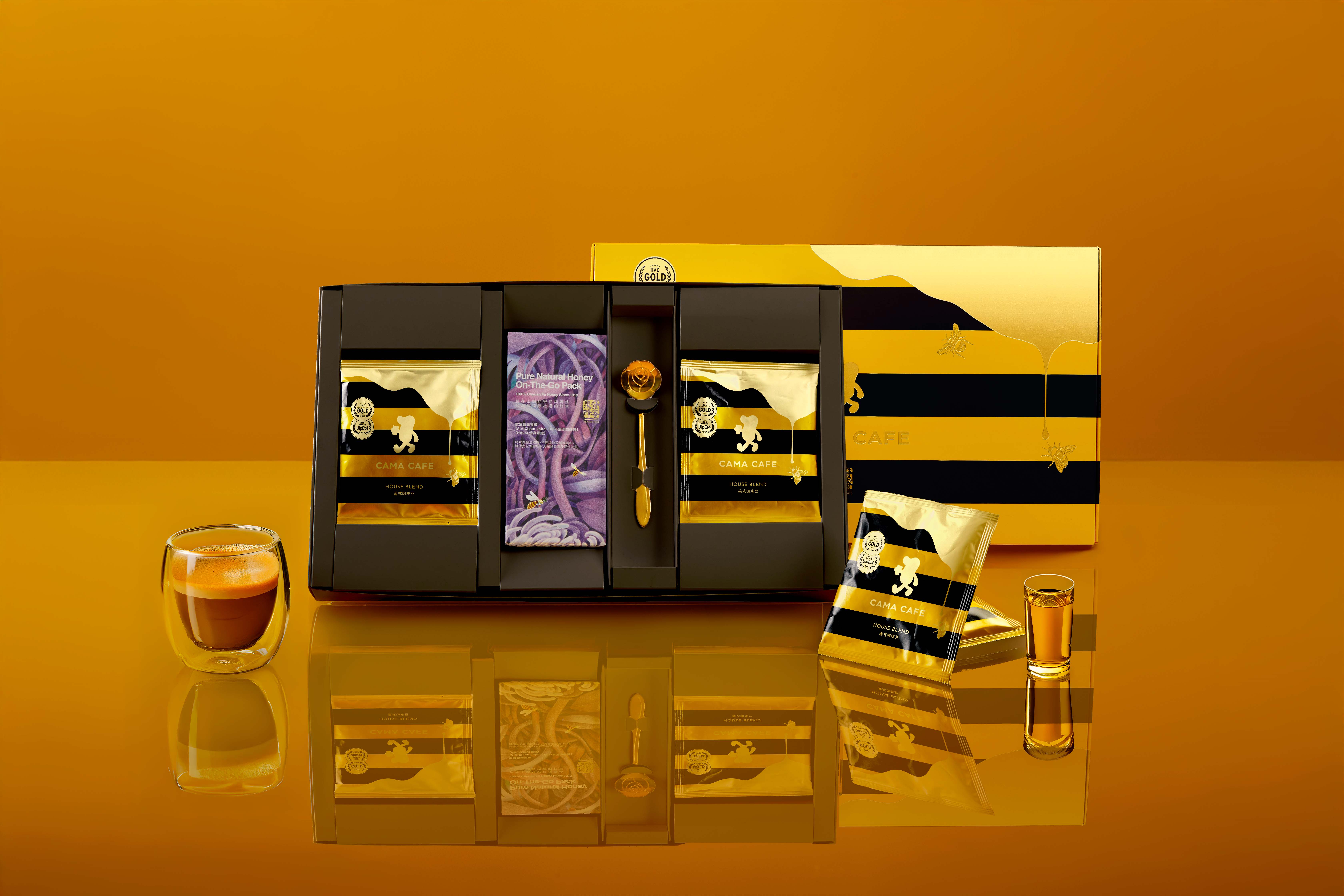
In this collaboration, CAMA CAFE partnered with Chyuan Fa Honey, a heritage house founded in 1919 with over a century of expertise in beekeeping and honey craftsmanship. Together, the two brands sought not only to showcase their respective legacies but also to weave a new narrative that translates craftsmanship, flavor, and culture into an experience that is at once visible, tangible, and deeply sensorial.
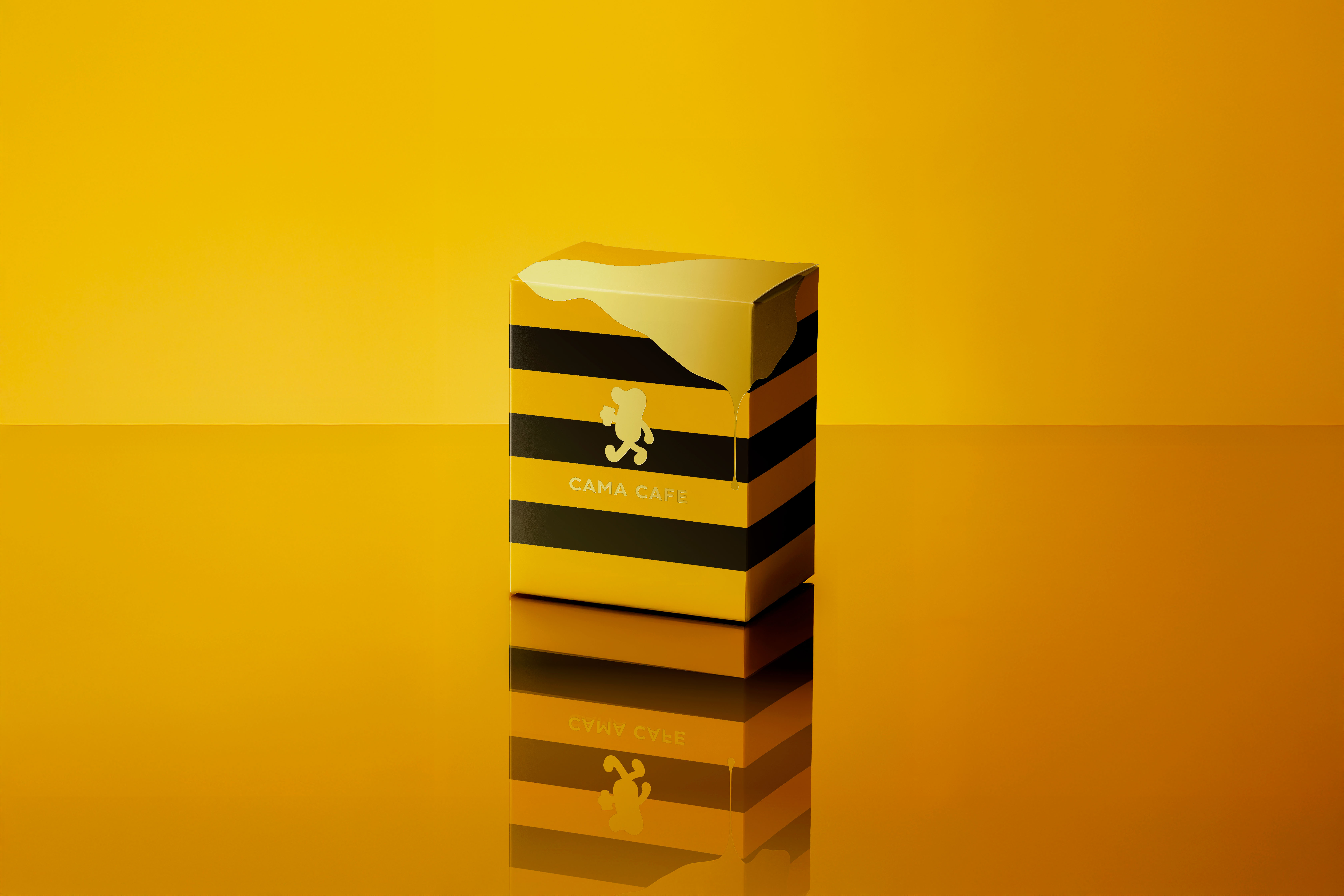
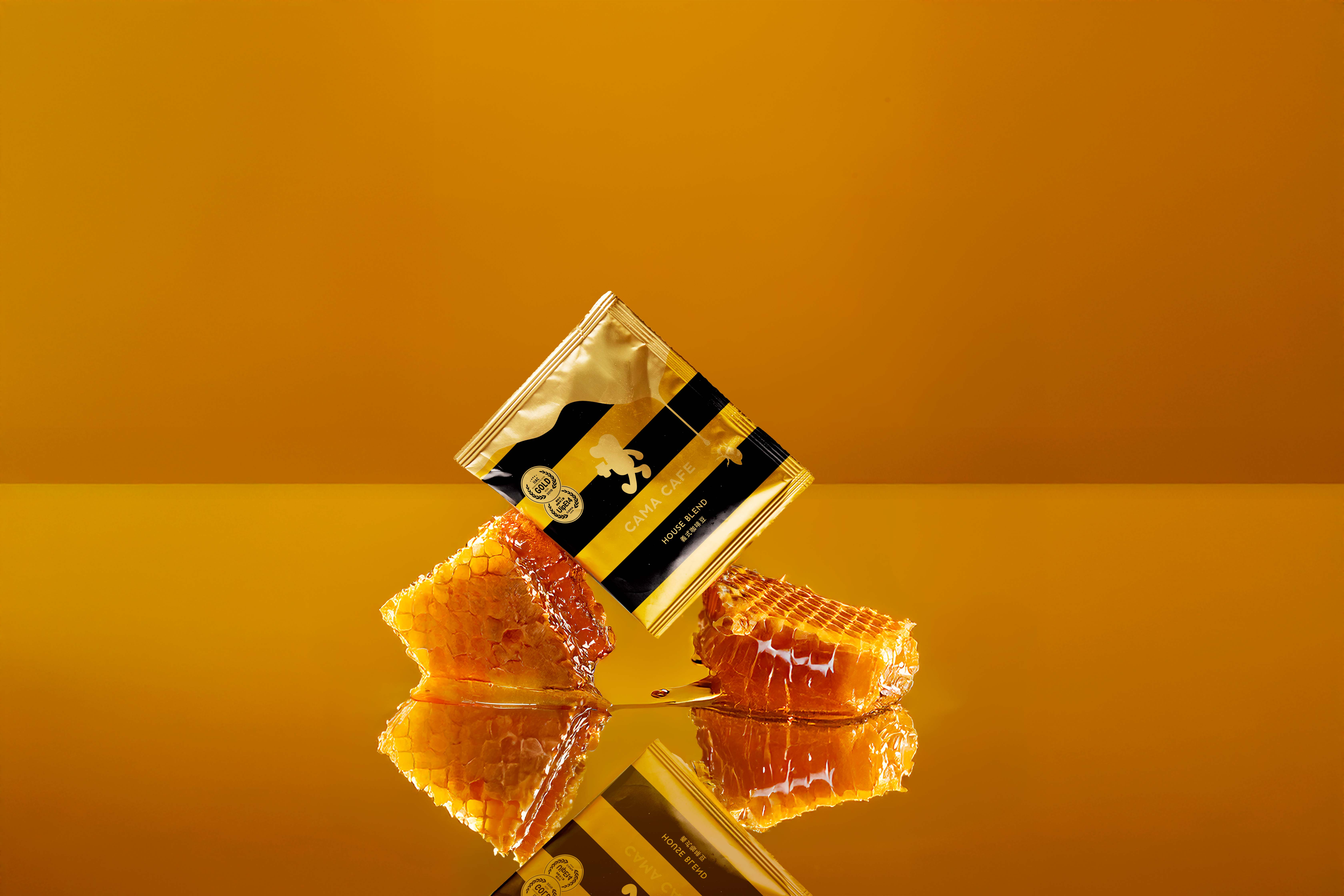
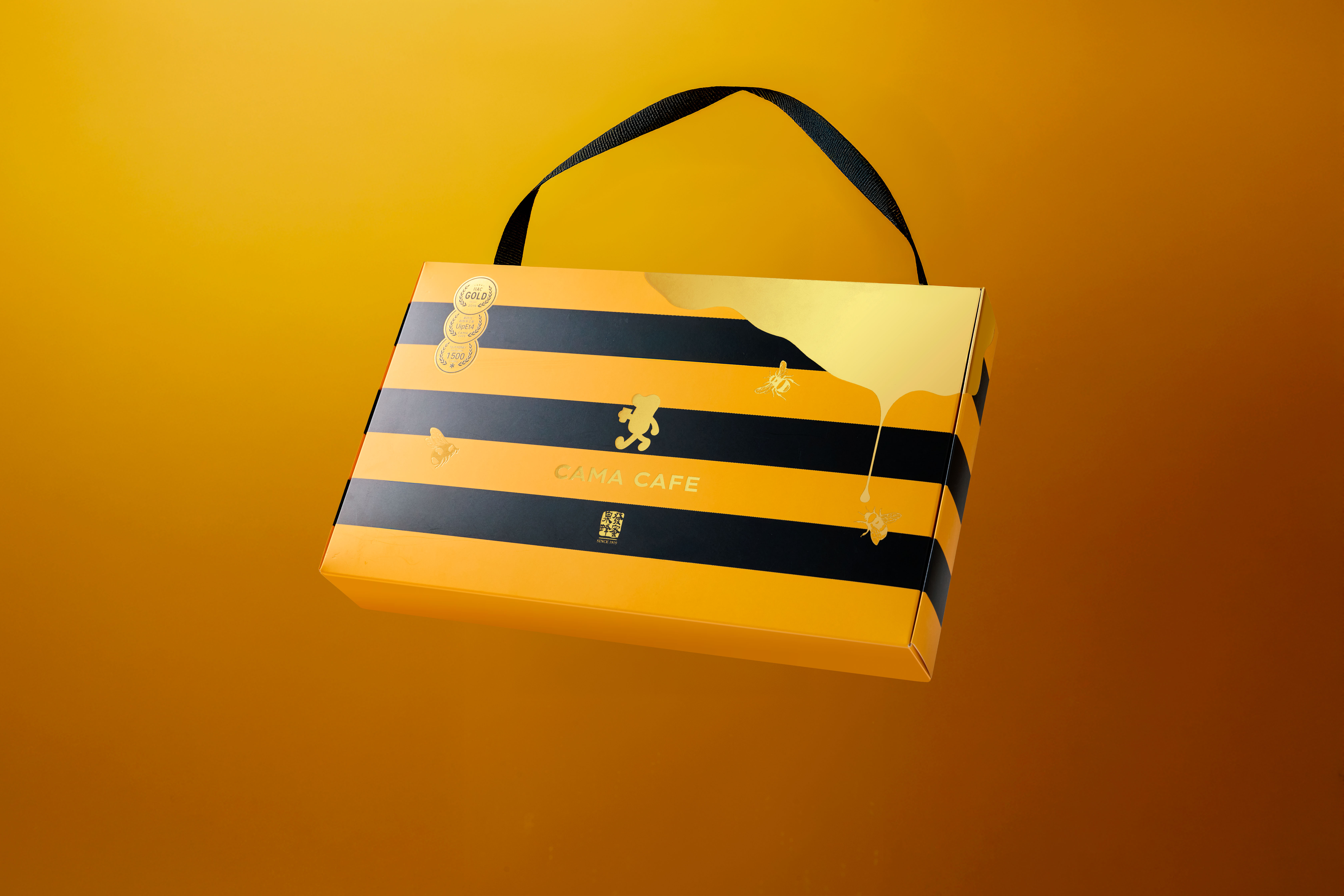
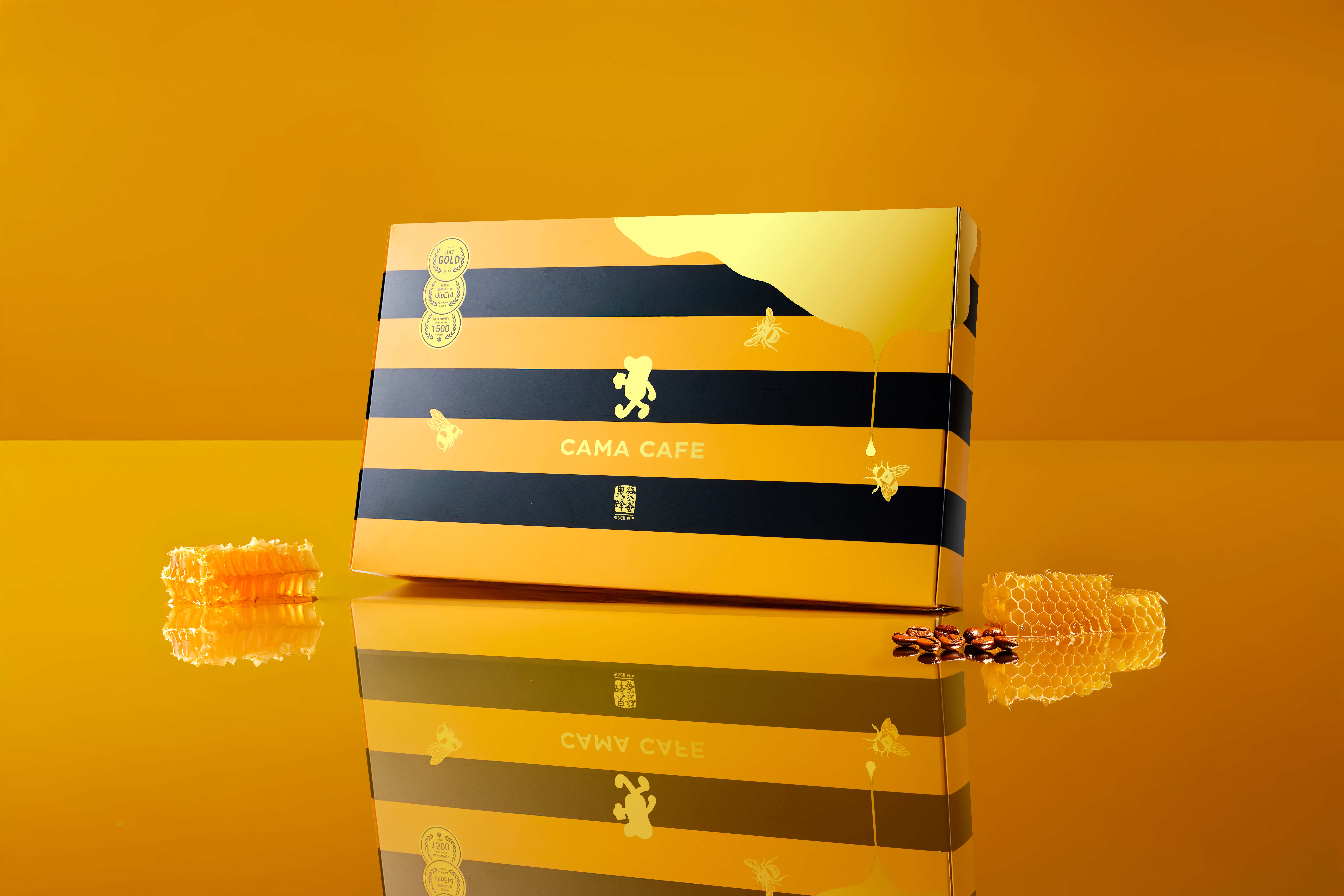
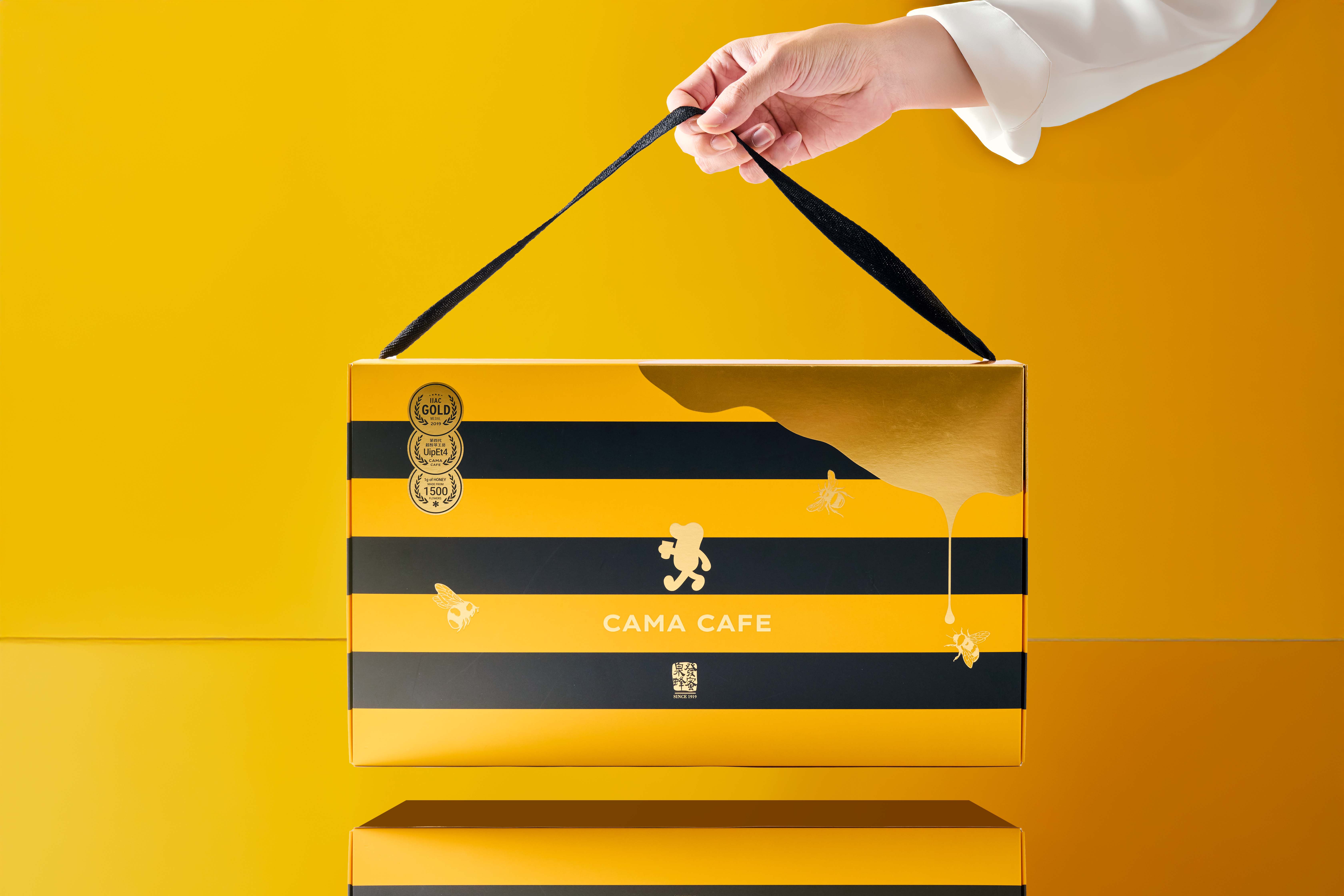
At the core of our concept lies the visual and emotional language of honey itself. We explored the way honey flows: golden streams cascading with slow elegance, capturing both gravity and grace. This fluidity was reimagined into packaging design — surfaces resembling confections dipped in honey, shimmering with layers of gloss that catch the light and instantly trigger a memory of taste. The black-and-yellow stripes, inspired by the bee itself, were refined into elegant proportions, abstracted into a graphic rhythm that balances order with tension, resulting in a look that feels both natural and premium. It was important for the design not to fall into cliché, but to elevate a familiar symbol into something worthy of connoisseurs.
The physical event was envisioned as an immersive environment titled the “Apiculturist’s Honey Realm.” The idea was to craft not simply a launch venue, but a world that translated the act of beekeeping and the richness of honey into spatial storytelling. Stepping inside felt like entering the inner sanctum of a hive. Light was carefully filtered to emulate the warm glow of amber, creating a sense of being enveloped by honeycomb. Scent was diffused into the air, blending subtle notes of honey with the aroma of freshly roasted coffee, allowing guests to perceive taste even before a sip was taken. Materials such as wood, glass, and fabric were layered to evoke textures both raw and refined, extending the design narrative into a tactile journey.
By curating a multi-sensory experience, the collaboration elevated the rarity of honey and the daily ritual of coffee into a refined dialogue between nature and culture. The result was not simply packaging or a temporary installation, but a narrative that honored heritage while appealing to modern sensibilities. Guests were invited to see, smell, touch, and ultimately taste the story. This immersion transformed the launch into an unforgettable experience — a honey realm designed not for casual consumption, but for connoisseurs who appreciate the beauty of rarity, the discipline of craftsmanship, and the luxury of savoring something made with patience and devotion.
CREDIT
- Agency/Creative: Lung-Hao Chiang
- Article Title: Golden Bloom Series Coffee Visual Identity Design
- Organisation/Entity: Agency
- Project Type: Packaging
- Project Status: Published
- Agency/Creative Country: Taiwan
- Agency/Creative City: Taipei, Taiwan
- Market Region: Asia
- Project Deliverables: Brand Identity, Packaging Design
- Format: Box
- Industry: Food/Beverage
- Keywords: coffee
-
Credits:
Art Director: Lung-Hao Chiang


