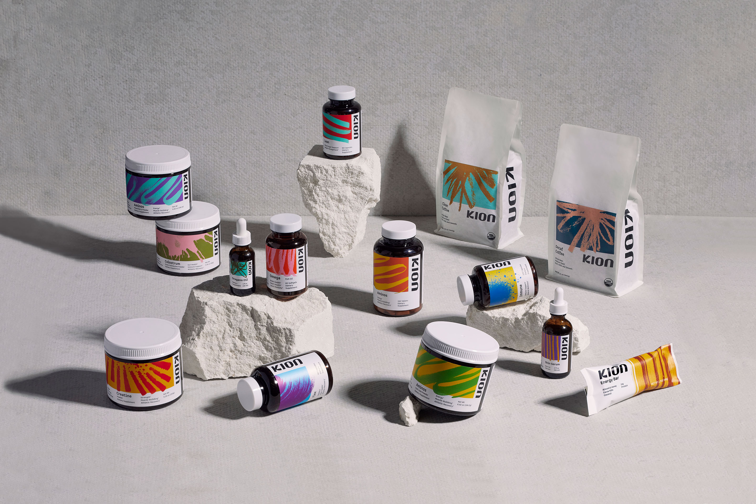
Kion is an e-commerce, DTC health & wellness supplement brand based in Boulder, Colorado. While the brand has experienced solid growth and success over the past 3 years, their branding and packaging suite has been clinical, uninspired and lacking a strong visual perspective.
The goal of the assignment was to rebrand Kion – from identity, to packaging, to photography style and beyond, injecting life into the brand while also maintaining a science-backed and credible visual tone.
At the core of the positioning and personality work is the idea that Kion exists to embody “energy”, so giving the brand new life meant leaning into this idea, and allowing this sentiment to be the linchpin of the entire branding suite.
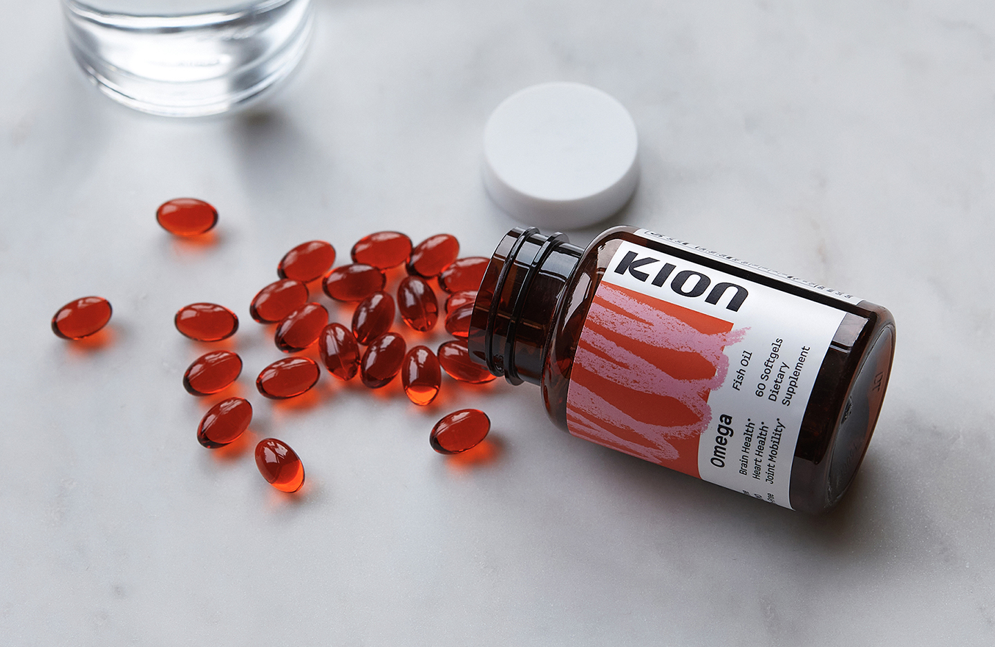
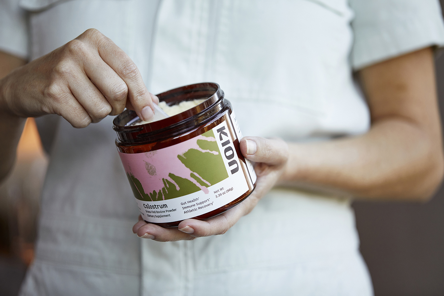
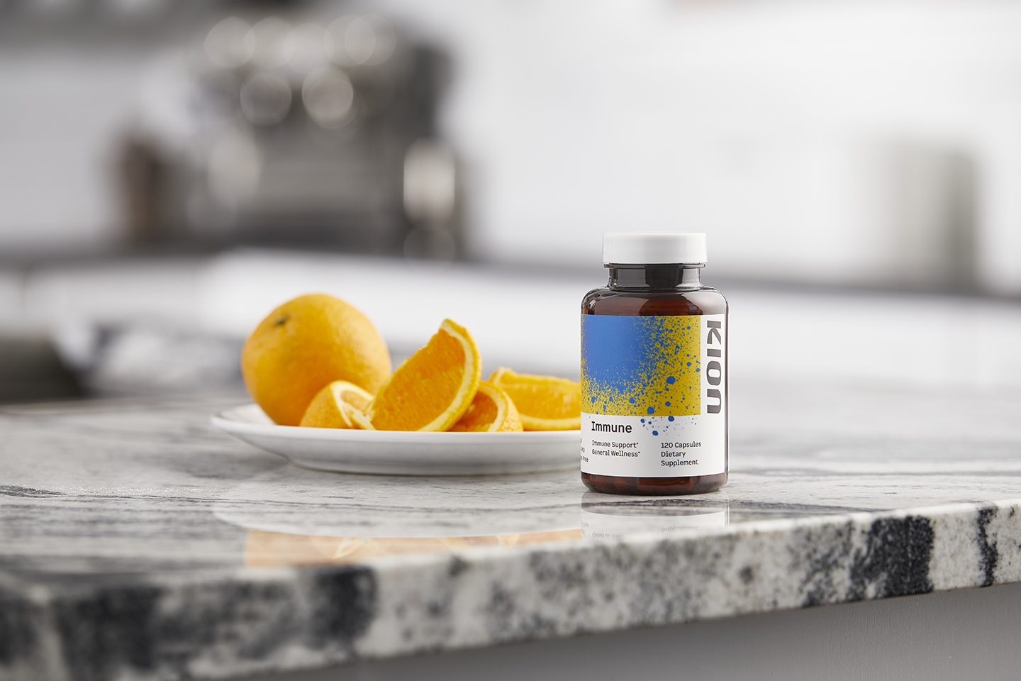
To do this, we developed what we’ve internally named “Energy Markings” – the visual representation and expression of different energies we each contain within us as humans – both physically and emotionally.
Kion exists to supply clean energy to every human, enabling them to live their most fulfilling and vibrant life. This sentiment is a softer, more vulnerable, more human approach as compared to what is currently offered in the Health Supplement category.
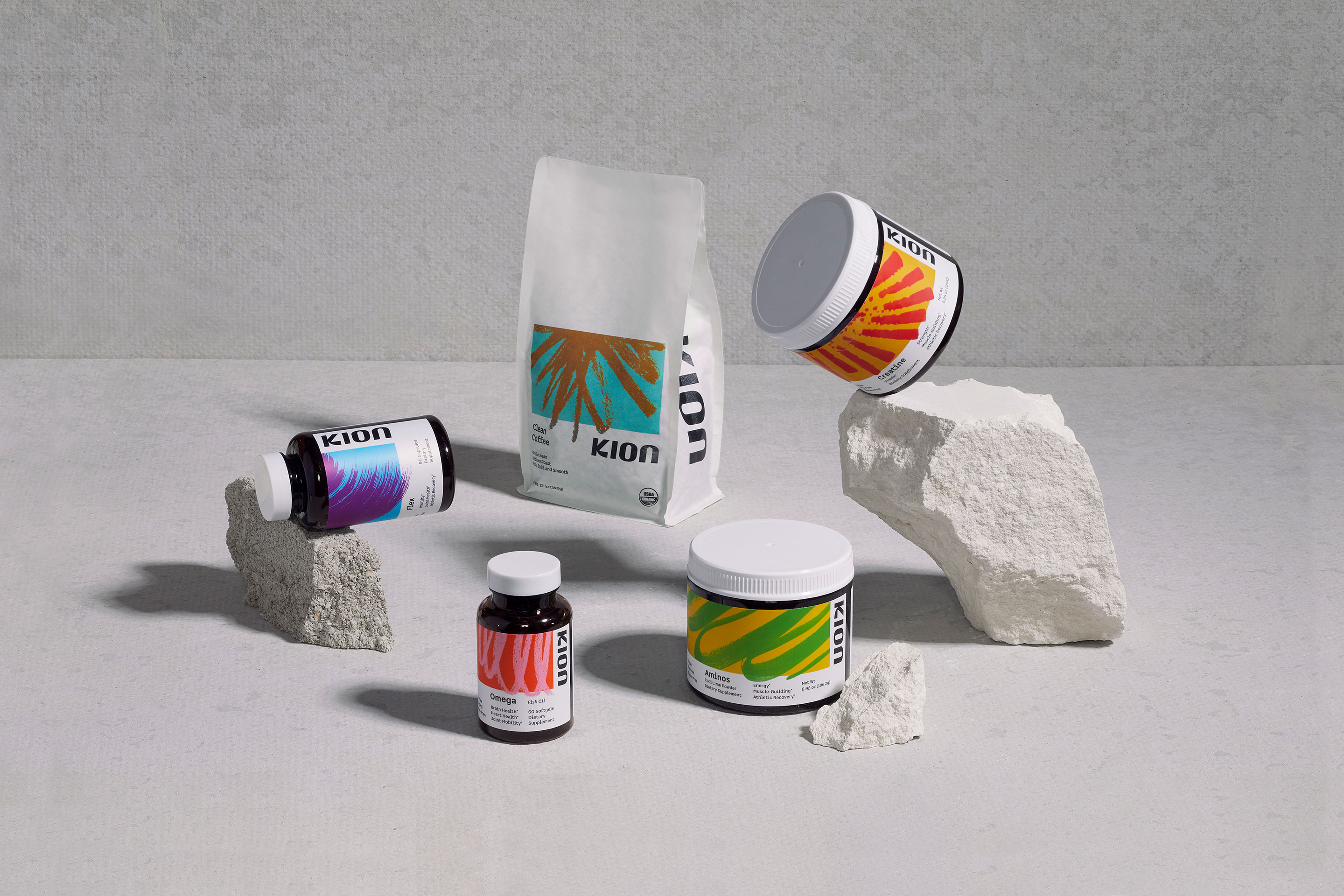
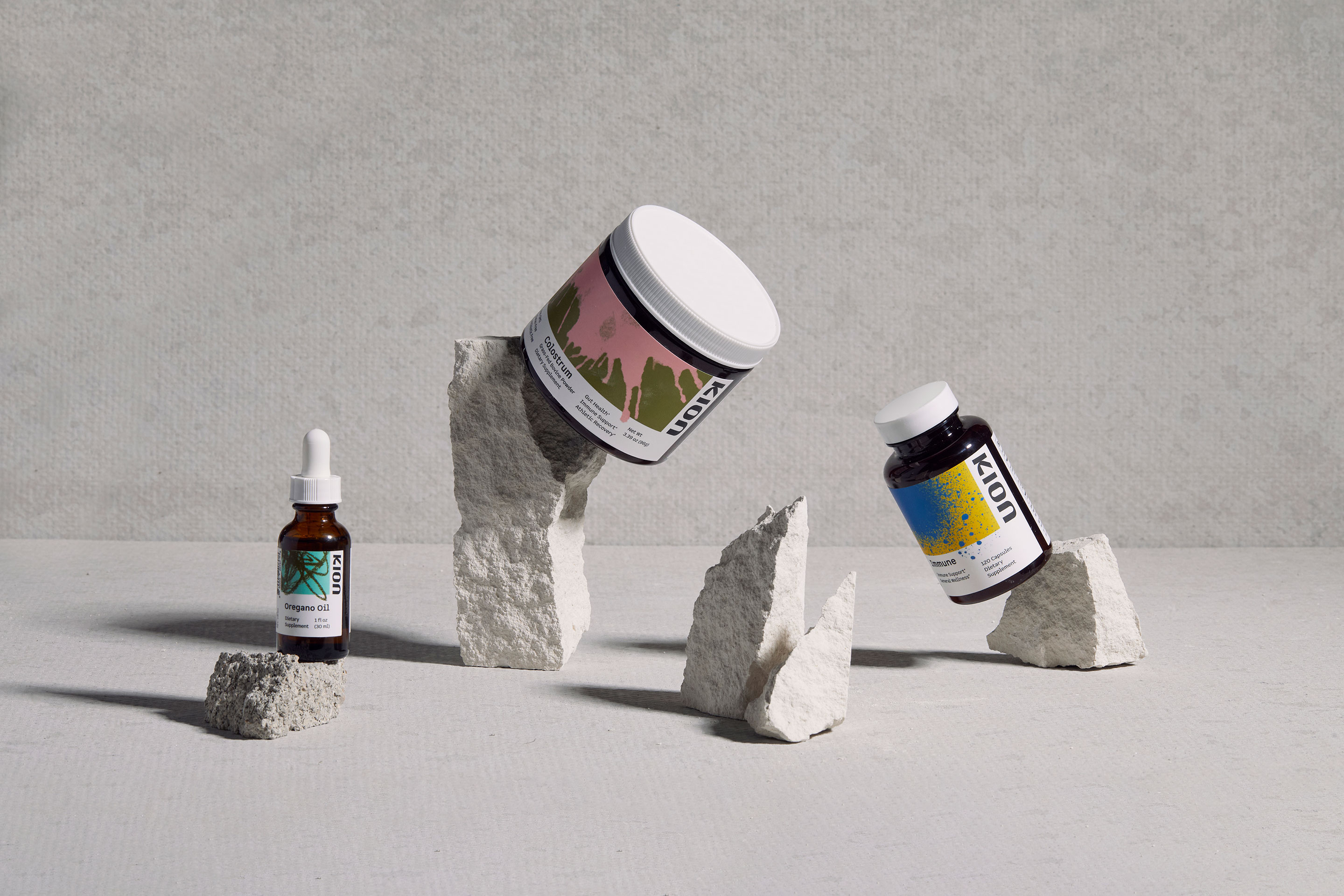
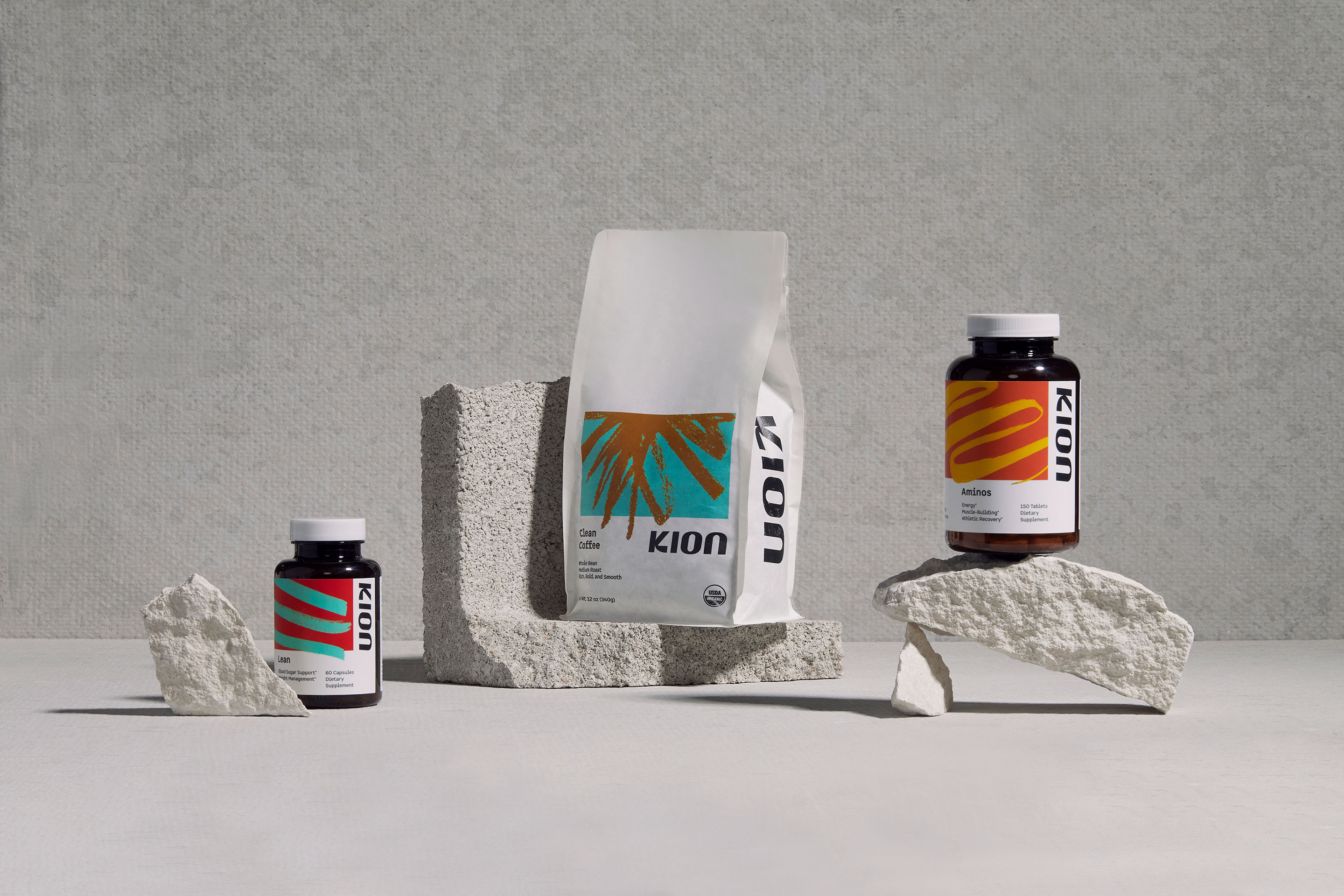
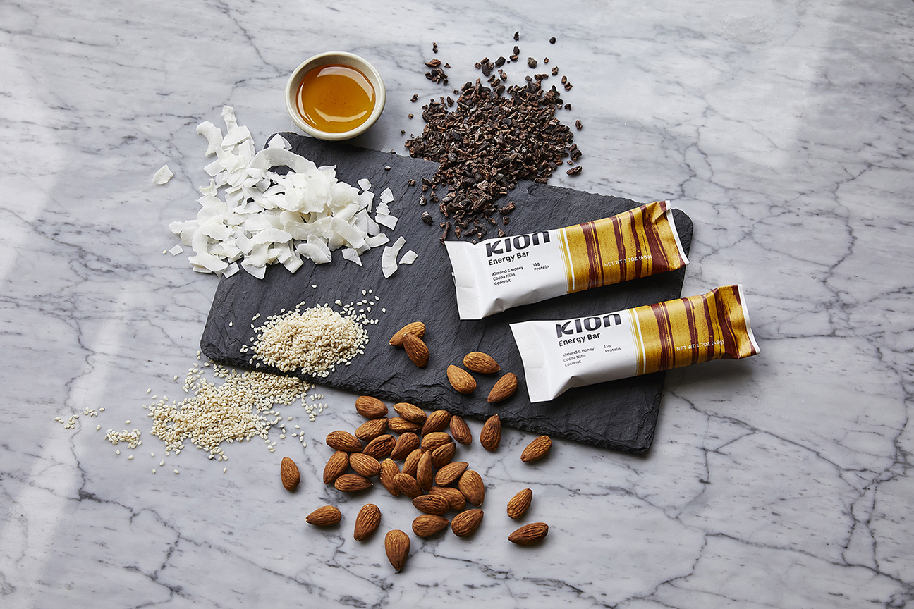
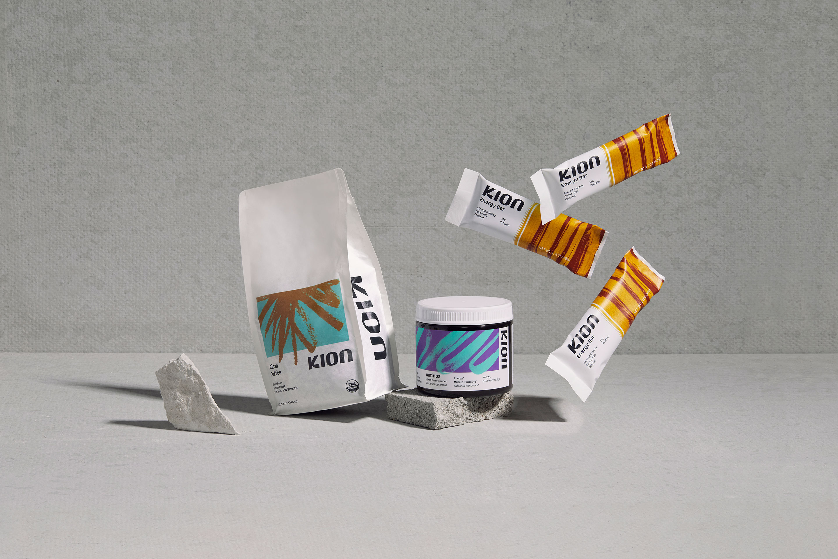
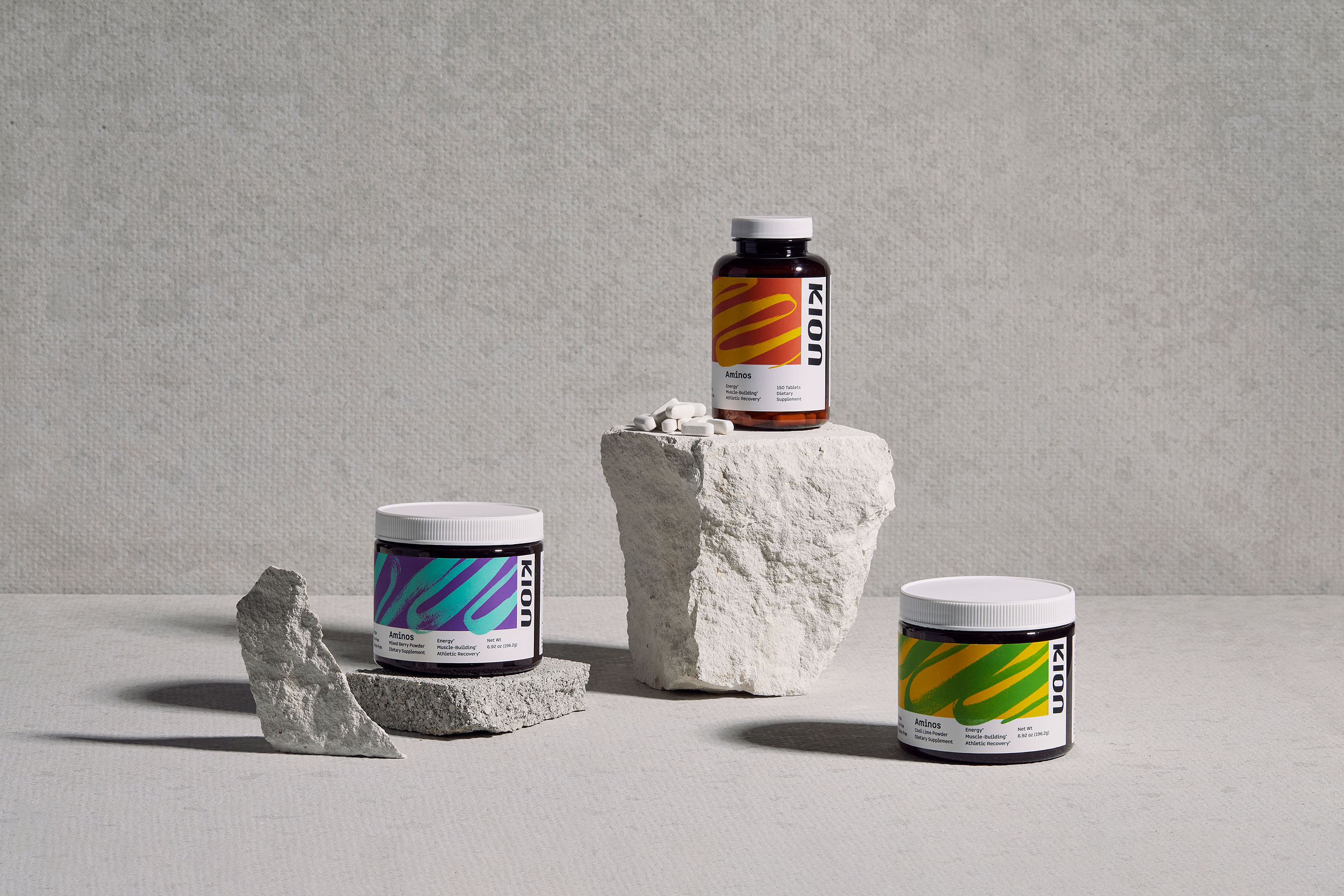
By using strong and compelling color combinations, and a multitude of mediums to create each marking by hand, we were able to create a system that fully expresses a wide range of energies and emotions as diverse as we humans are. Because the visual language was developed by hand, there is an innate human spirit baked into the packaging and communication style of the entire Kion brand.
These expressive markings are counter-balanced by a sturdy, rigid design grid that allows easy access to important label information, and helps position the brand as science-backed and credible. Black and white is at the core to the brand’s palette, and acts as the tie that binds the entire product lineup together.
Balancing emotion and science can be a tricky challenge and takes time. From the start of strategy to the launch of the new brand and packaging suite, a total of 2 years passed. But with patience and focus this brand has reignited itself in the market, and now has a strong and own-able place in the health and wellness market.
CREDIT
- Agency/Creative: Gold Lunchbox
- Article Title: Gold Lunchbox Reimagines Supplement Brand and Embraces Energy
- Organisation/Entity: Agency, Published Commercial Design
- Project Type: Packaging
- Project Status: Published
- Agency/Creative Country: United States
- Market Region: North America
- Project Deliverables: Brand Identity, Brand Redesign, Brand Strategy, Brand World, Branding, Graphic Design, Identity System, Packaging Design, Photography, Product Architecture, Rebranding, Tone of Voice
- Format: Bag, Bottle
- Substrate: Plastic
- Keywords: WBDS Agency Design Awards 2021/22
-
Credits:
Photography: Caleb Kerr


