


Today’s commercial fans—the lifeblood of our buildings—are overly expensive, complicated, and demanding. All too often, they’re more of an obstacle to comfort than a solution. Q-PAC is disrupting the space with a modular, tech-enabled fan system that removes all the complexity from commercial airflow. Working closely with their CEO Matt Kent & John Rougeux from Flag & Frontier, we created their new messaging, brand, website, and more, with a single, ambitious goal: to make commercial fans sexy.
—
When Q-PAC came to us, they already had an amazing new product and a killer strategic narrative. Problem was, they needed new messaging, a rebrand, web design+copy, and web development—all in four months (before their biggest event of the year). So we got to work.
First, we took John’s strategy—inspired by Matt’s revolutionary vision for a simple, tech-enabled fan that moves air 24/7—and jumped right into messaging mode. After lots of collaboration, Miro comments, and late nights, we rallied around a simple, disruptive idea: make fans sexy.
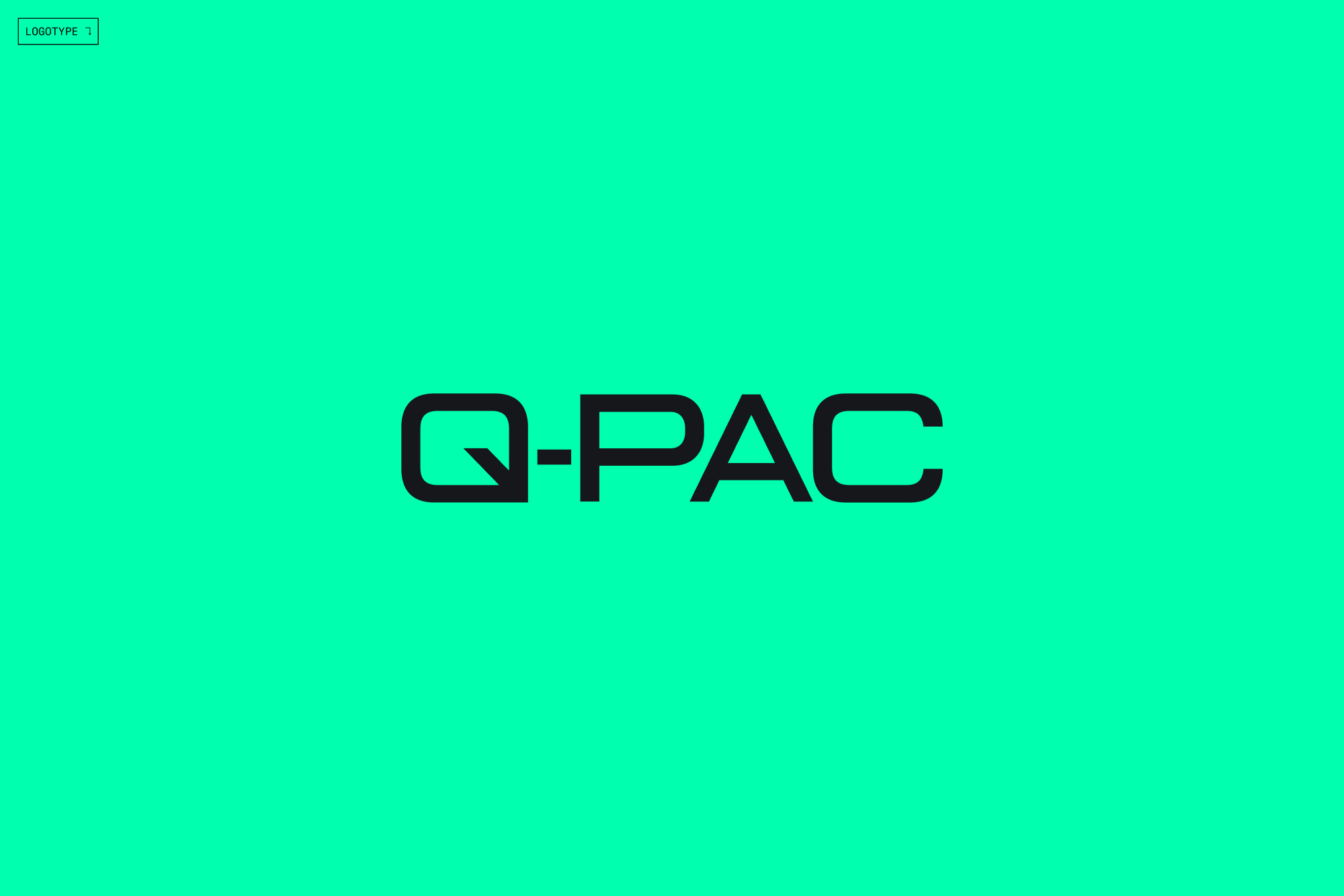
Next up, design. We started by inviting Q-PAC’s leadership to a visual POV workshop, where we explored how the sexiest, most innovative tech products, like Q-PAC, show up in the world. After gauging the team’s design likes and dislikes, we took a shot at the logo. Actually, about 500 shots. We showed them to Matt, and got about 500 No’s. Back to work. Another 500 designs later, we finally found a total winner, with the “Q” taking inspiration from the shape of Q-PAC’s iconic new-age fan.
In the following months, we did three key things to make fans sexy.
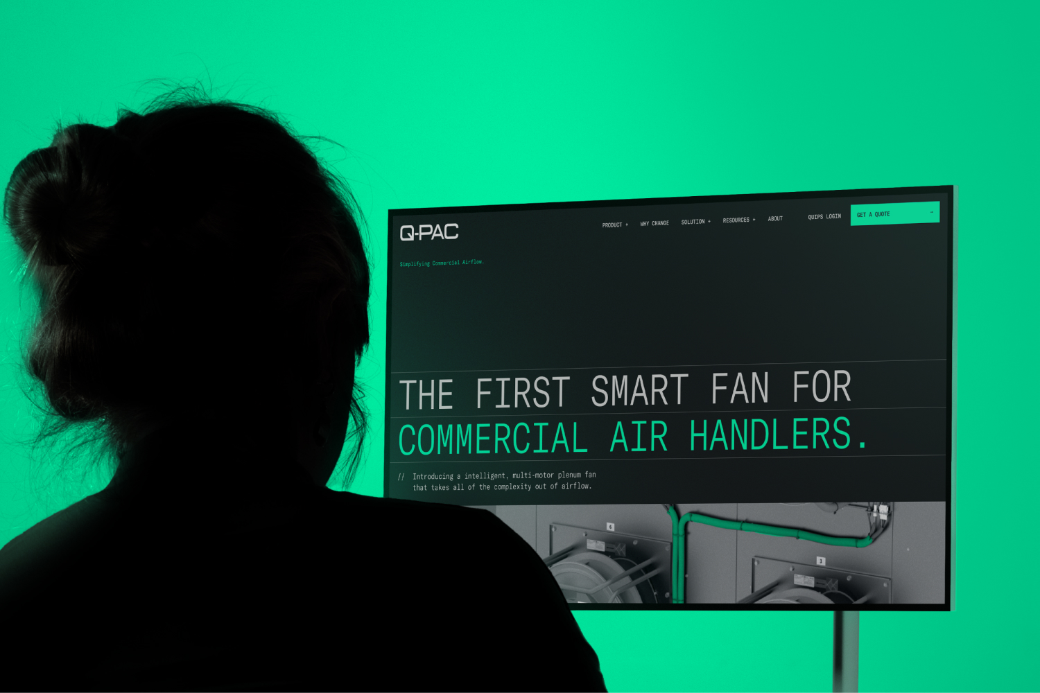
1) We put everything in a dark, techy world, effectively showcasing Q-PAC’s novel innovations while also standing apart from every other commercial fan company. To contrast the darker tones, we added bright, saturated greens that represent the life airflow gives to a building.
2) We wrote bold, no B.S. headlines to show Q-PAC’s confidence as the authority for commercial fans. Like “Newsflash, your fan sucks,” “Commercial fans are a pain in the ass,” and “Airflow made simple.”
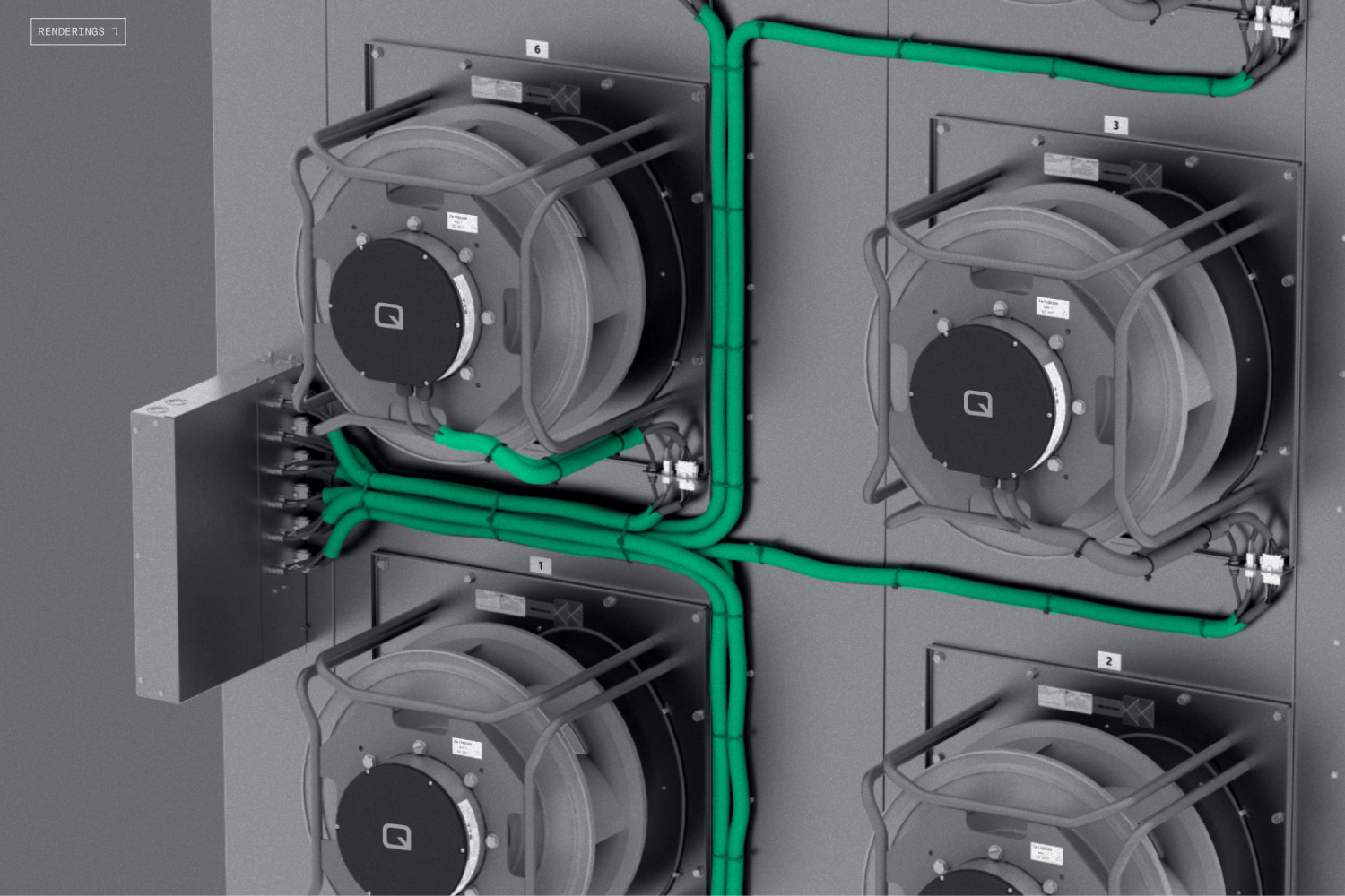
3) We worked with Q-PAC to create all-new renderings that make their fans feel technologically advanced, while using pops of color to evoke the sense that they are a living, breathing part of the building.
We launched the new messaging, brand, and website with 5 days to spare. Matt and the team debuted it all at their event to rave reviews from customers and competitors alike. We love it when making fans sexy goes exactly (almost) according to plan.
CREDIT
- Agency/Creative: Gold Front
- Article Title: Gold Front Transformed Q-PAC’s Airflow Tech into a Design Powerhouse
- Organisation/Entity: Agency
- Project Type: Identity
- Project Status: Published
- Agency/Creative Country: United States
- Agency/Creative City: San Francisco
- Market Region: Global
- Project Deliverables: 3D Motion, Brand Design, Brand Guidelines, Design, Web Design, Writing
- Industry: Professional Services
- Keywords: Q-PAC, Brand Identity, Website
-
Credits:
Chief Creative Officer: Josh Lowman
Head of Accounts: Alex Romero
Sr. Designer: Gustavo Rodas
Sr. Designer: Tyrell Cerveny
Jr. Designer: Paulina Ramirez
Designer: Ksenia Vistovskaya
Designer: Shehan Rodrigo
Designer: Shehan Rodrigo
Creative Director / Writer: Patrick Haadsma
Creative Director / Writer: Madeleine Mogul
Copywriter: Jake Kaye
Project Manager: Ana Gil
Motion Designer: Emanuel Peres
Digital Producer: Rayna Weinreb
Web Development: White Rabbit Group


