About the project
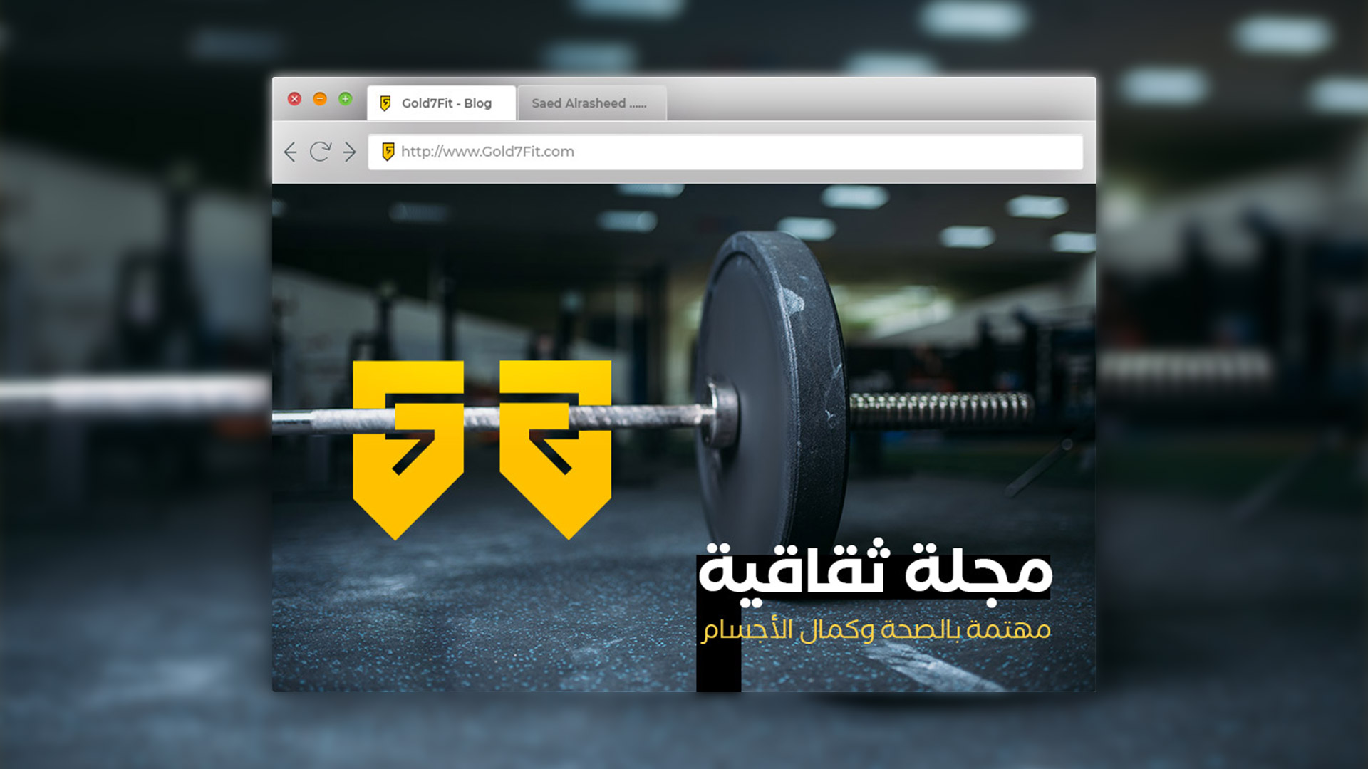
An electronic sports cultural magazine to build healthy, integrated sports bodies.
The magazine aims to connect young people to the shining golden body through seven steps that we follow in educating young people and providing them with information
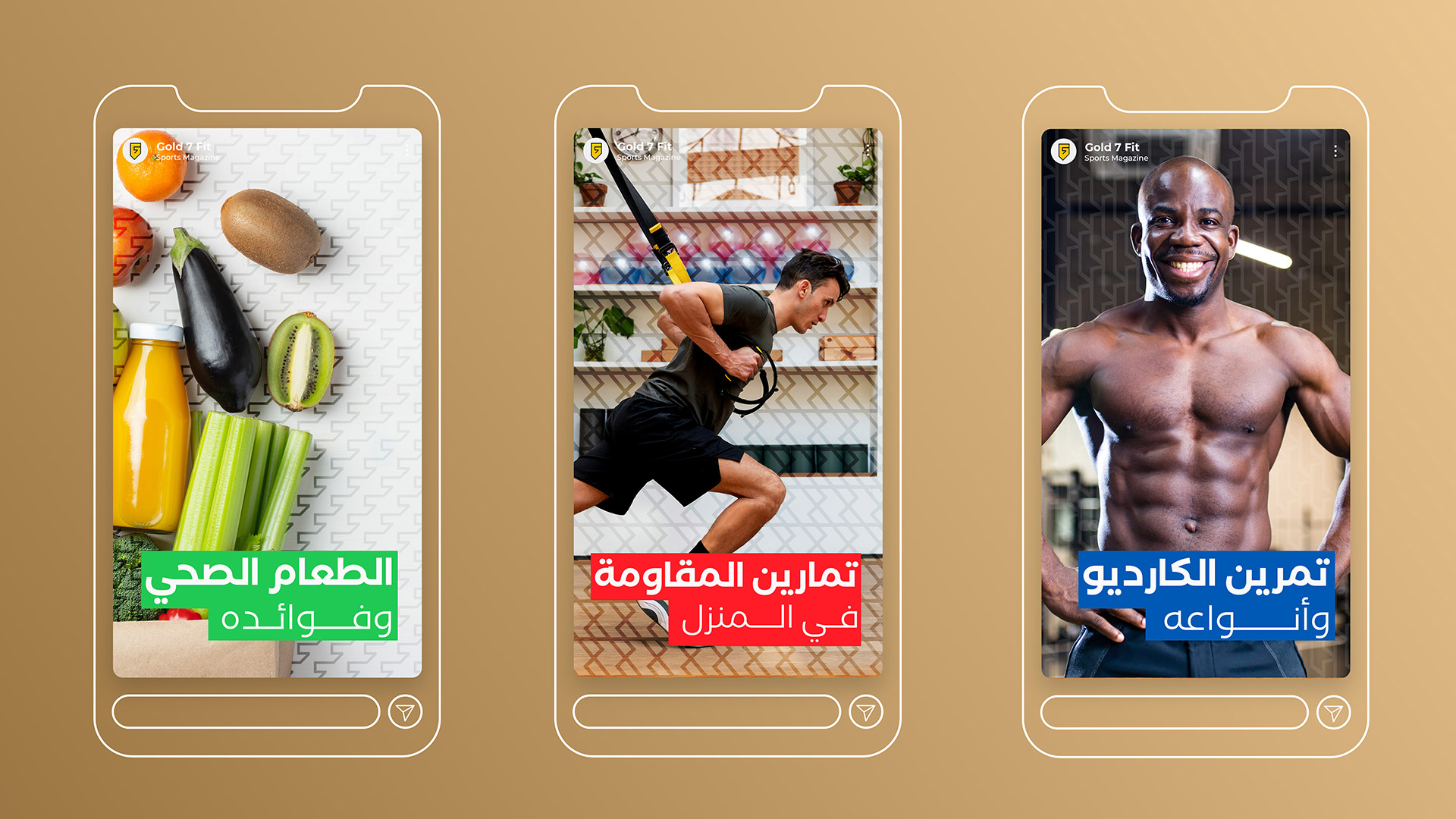
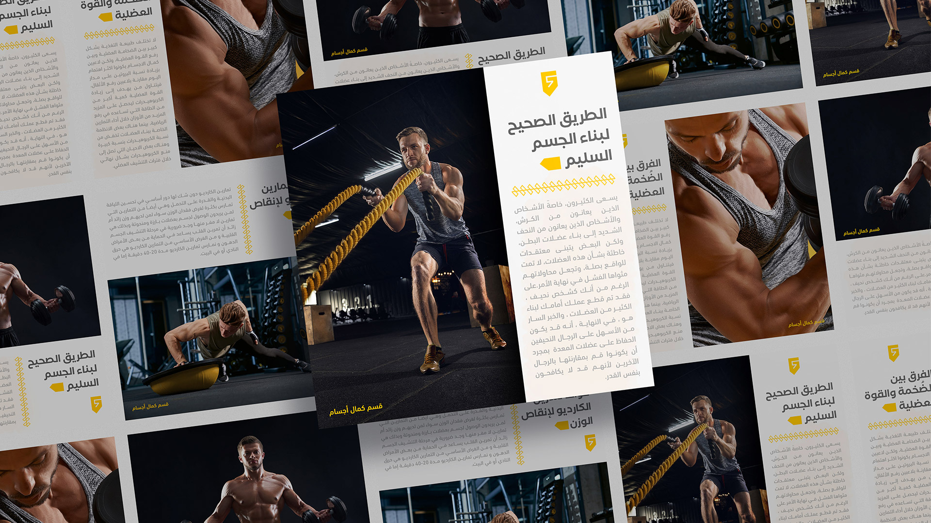
The magazine presents its content in several ways and on several platforms, including YouTube, through videos and multi-page publications on Facebook and Instagram summarizing the content on the blog and sufficiently lengthy and detailed articles on the website
The project seeks in the long term to create an electronic application on smart devices, provide advisory services related to health and safety, bodybuilding training, and sell some products related to this field of supplements and other things.
meaning of the name:
The name is inspired by the meaning that there are seven right steps to build the golden body that everyone who cares about strength, beauty, and health dreams of
The seven steps are: 1.Learning, 2. Process, 3. stimulus, 4. happiness, 5. evolution, 6. continuity, 7. Excellence
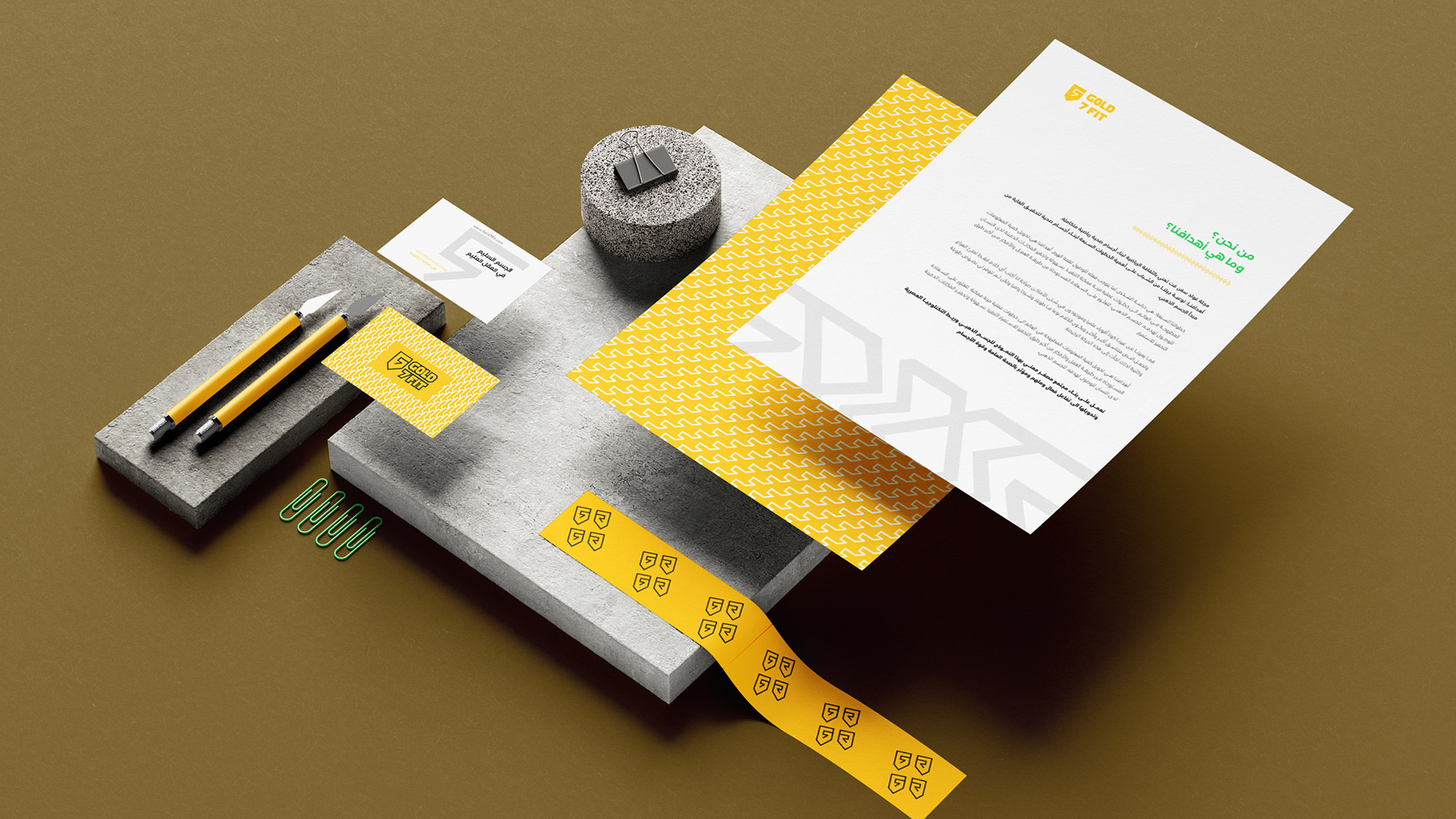
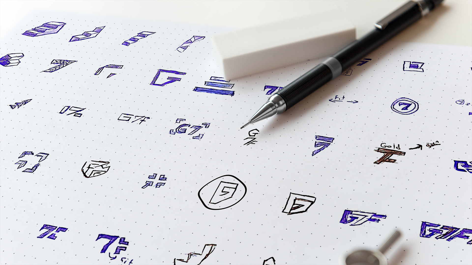
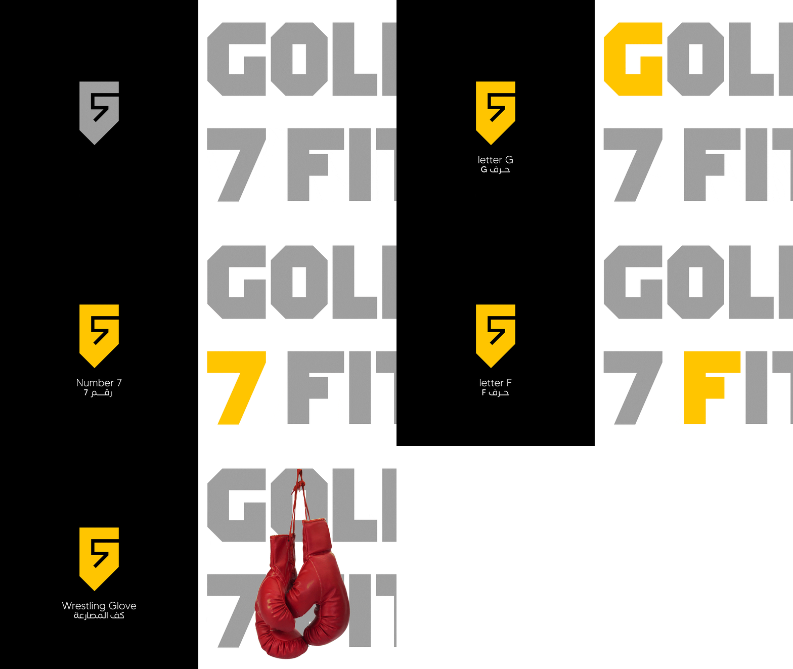
In this project, I tried to make its logo iconic, to suit its use in the website and applications in general. The choice was on the fist-ups, which symbolize strength, determination, and determination. Also, the grip is the basis for the bodybuilder, as he carries all the weights with his fist, and we combined the beginning of the letters of the name in the logo. G + F + 7 Then we chose the golden color because the name bears the word gold also I used the golden ratio to build this logo in an orderly and beautiful manner
I hope that I have presented this project in a strong way that matches the strength of the projects in this field because there is a huge competition
CREDIT
- Agency/Creative: saedalrasheed
- Article Title: Gold 7 Fit Sports Magazine and Blog Visual Identity
- Organisation/Entity: Freelance
- Project Type: Identity
- Project Status: Published
- Agency/Creative Country: Turkey
- Agency/Creative City: Urfa
- Market Region: Africa, Europe, Middle East
- Project Deliverables: Brand Identity, Logo Design
- Industry: Health Care
- Keywords: Blog, fitness, gym, hand, Health, identity, magazine, medical, pattern, sports,
-
Credits:
Graphic Designer: saed alrasheed


