


Pond Design – God Morgon EKO Juice
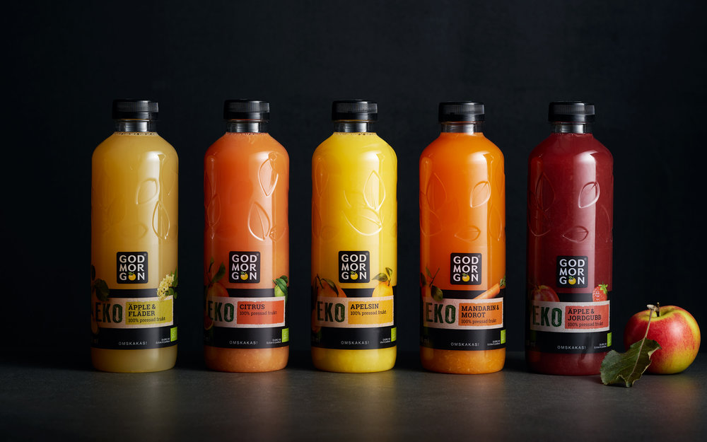
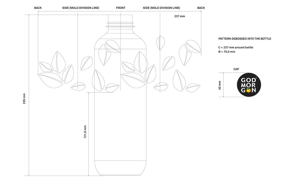
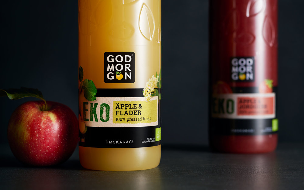
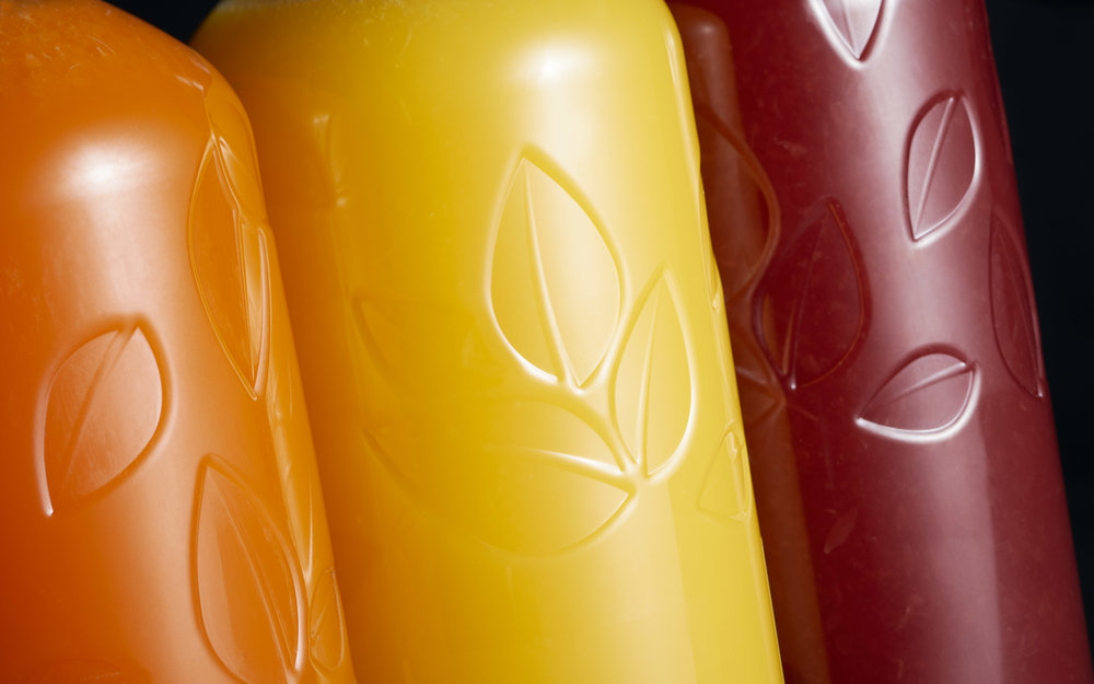
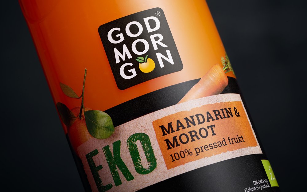
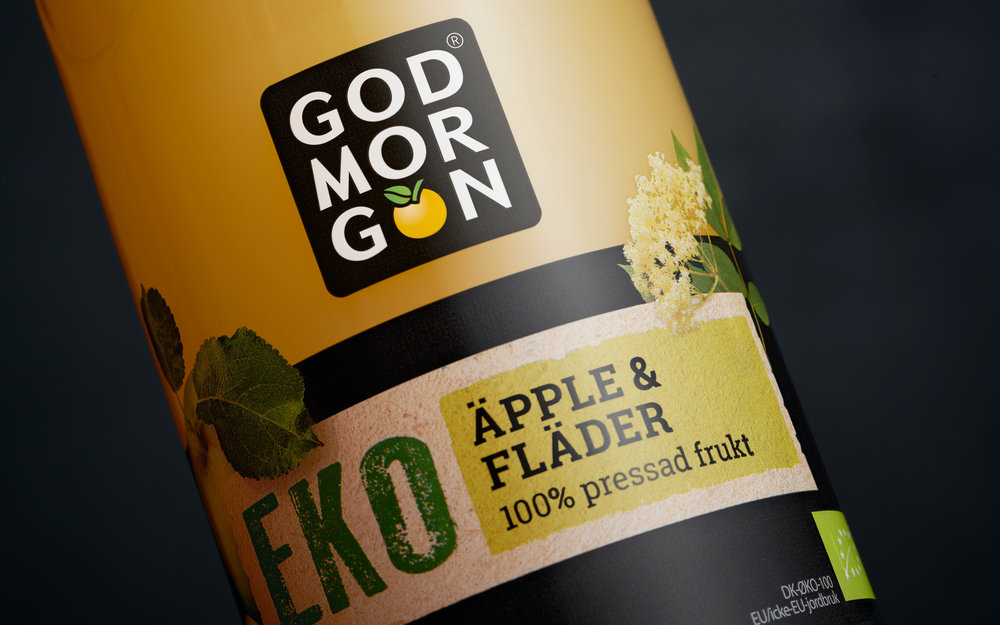
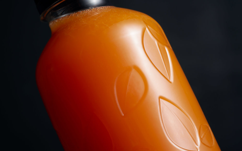
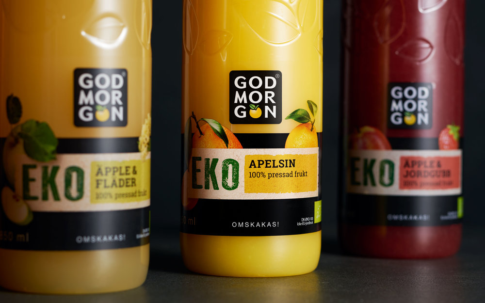
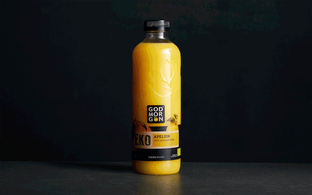
God Morgon is a well-known juice brand in Sweden, Denmark, Norway and Finland. God Morgon has been a provider of quality juices for almost 50 years and offers a wide assortment of products, ranging from classic orange and apple juices to refreshing lemonades and smoothies. The brand’s mission is to inspire people to have better mornings, every day. With its friendly and approachable personality, the brand is a household favourite in Nordic homes.MissionGod Morgon wanted to create a new recyclable PET-bottle that could be integrated in the Swedish Redemption-System, where consumers get a small refund when they recycle. The new bottle needed to look and feel premium, in terms of colour, shape and tactility, and at the same time adhere to formal “Redemption” criteria, such as material type, thickness, weight and placement of barcode. Pond Design was commissioned to create a new bottle solution for God Morgon that will successfully combine the above-mentioned technical specifications with premium-ness and the brand’s core values.Idea In order to create a new, iconic God Morgon bottle, we looked for inspiration in the heritage of God Morgon and the Nordic Design Movement with its clean, functional and nature-inspired approach to design. Applying this philosophy onto our work, we created impact through simplicity. The bottle was designed with a minimal, natural and streamlined look, which feels both premium and contemporary. To accentuate the brand’s focus on quality and nature, the bottle was debossed with leaves, a unique detail based on the leaf in the God Morgon’s logotype. The bottle’s elegant transparency let the natural colour of the juice shine through in an impactful way.Once the new bottle was in place, the next phase of the project was to design a new label for the God Morgon Organic Range. The new transparent bottle became a perfect fit for an organic juice range, with focus on naturalness, freshness and sustainability. To ensure brand recognition, the God Morgon’s iconic black colour was kept on cap and label. The black was harmonized by added freshness through a light brown-paper background, gentle colour details and images of organic fruit, naturalistically photographed with stems and leaves integrated into the design. The new iconic bottle is now used in other markets, for a wide range of God Morgon.What we did: Structural Design, Packaging Design, Product Brand Assets, Visual identity
CREDIT
- Agency/Creative: Pond Design
- Article Title: God Morgon EKO Juice
- Organisation/Entity: Agency, Published Commercial Design
- Project Type: Packaging
- Agency/Creative Country: Sweden
- Market Region: Multiple Regions
- Format: Bottle
- Substrate: Plastic


