Go… Land of Portugal
(the client / the product) Vinalda Companhia Comercial de Bebidas S.A., founded in 1947, is the oldest Portuguese distributor of alcoholic beverages. Having started out importing prestigious international brands, today it is a company focussed on services, consultancy for producers and proximity to consumers, promoting Portuguese wines internally and externally.
Based on its knowledge of the market and the potential of Portuguese wine, Vinalda strategically decided to design its own brand for ‘entry-level’ wines destined for export and domestic consumption that would refer to the territory of each wine region.
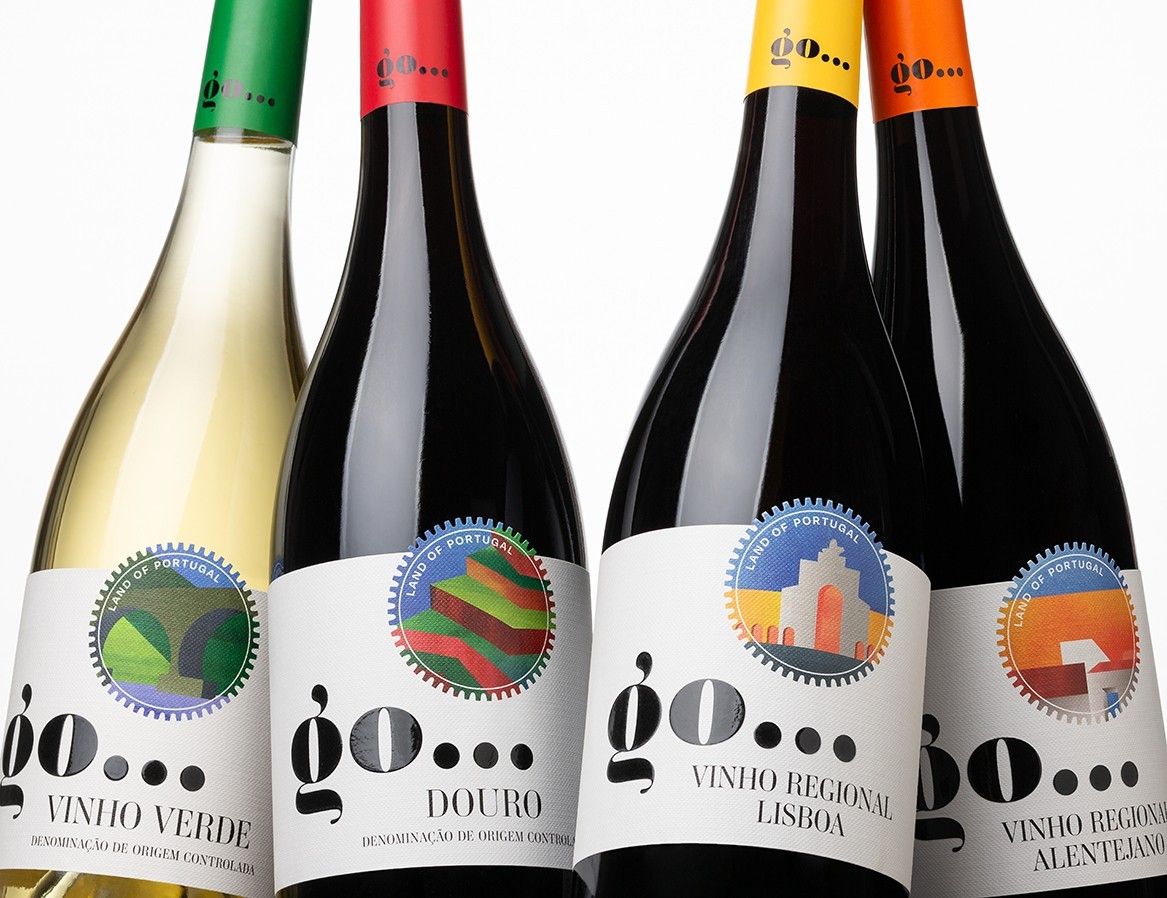
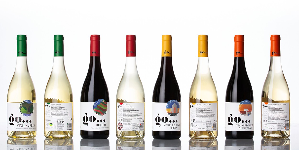
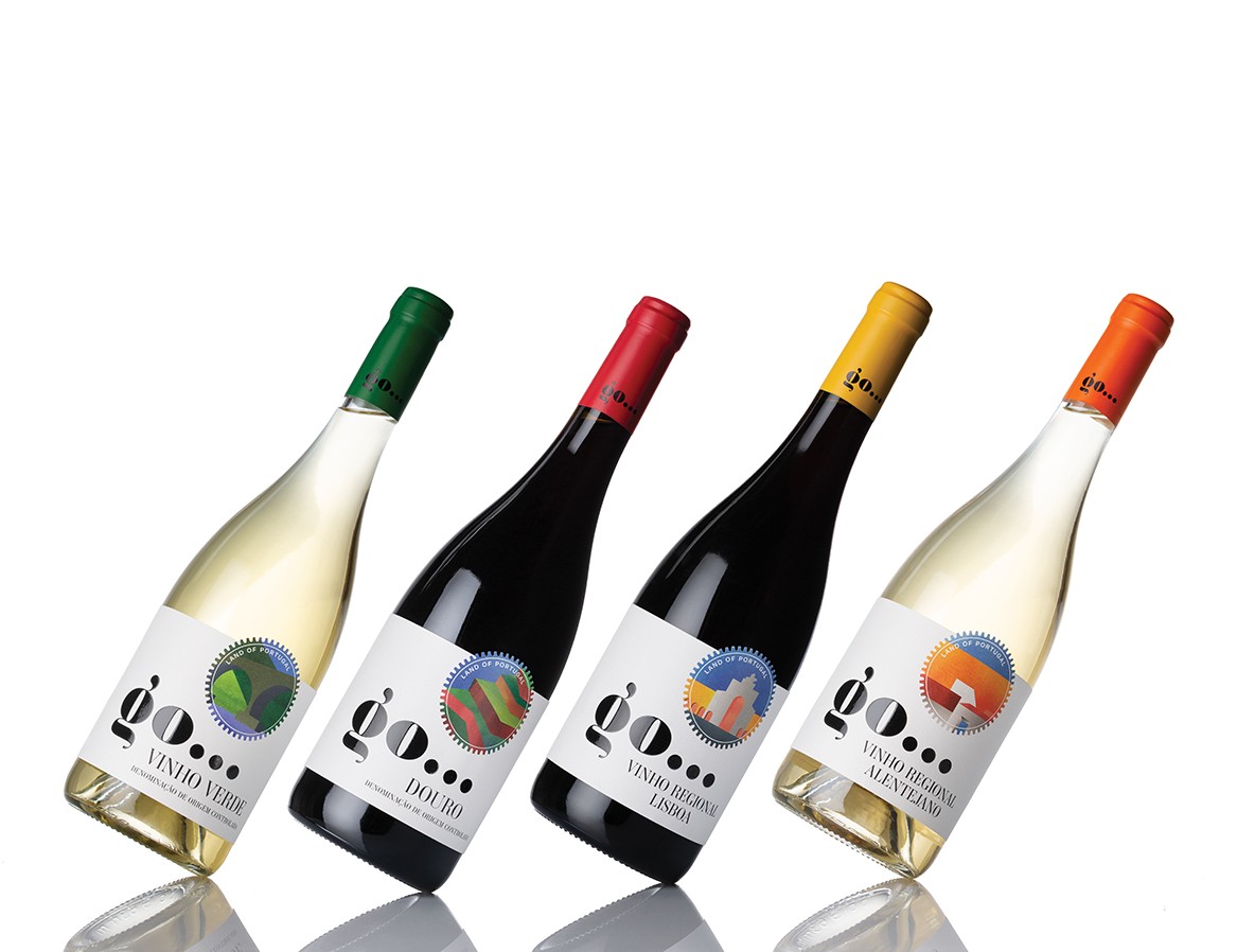
The wines for the launch of the first references were selected from four different wine regions in Portugal: Vinho Verde, Douro, Lisboa and Alentejo. As ‘entry-level’ wines, they are less complex, with a price/quality ratio that allows them to easily reach a young, urban public that is not very knowledgeable about wine but is expectant and interested, in an age group between 25 and 40 years old.
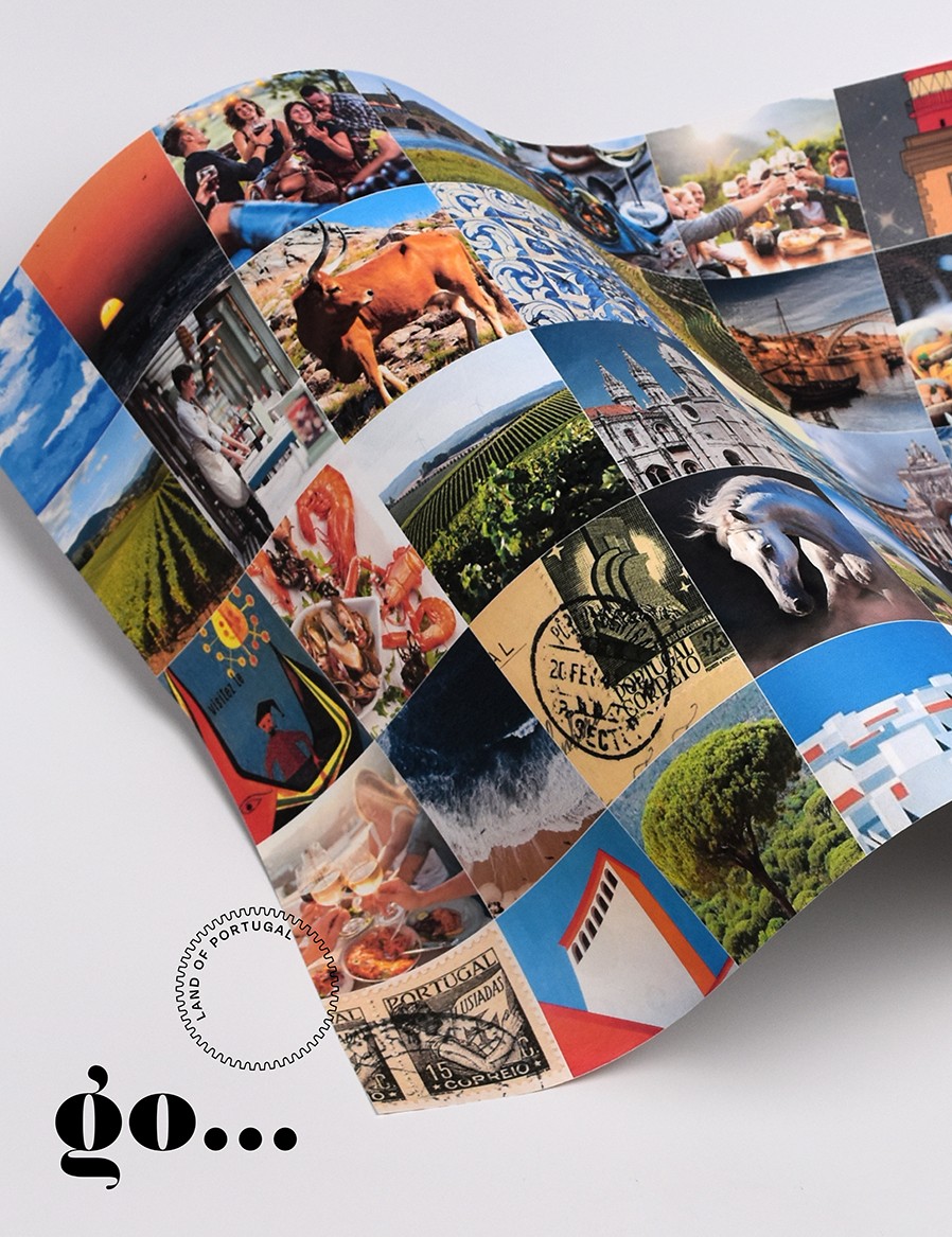
(the briefing / the project) The creation of the brand – ‘go…’, the copy ‘land of Portugal’ and the graphic project were worked on simultaneously so that each bottle would be an invitation to discover the wines and the respective region. The challenge was to design and build a narrative that would be an invitation to get to know Portugal through wine.
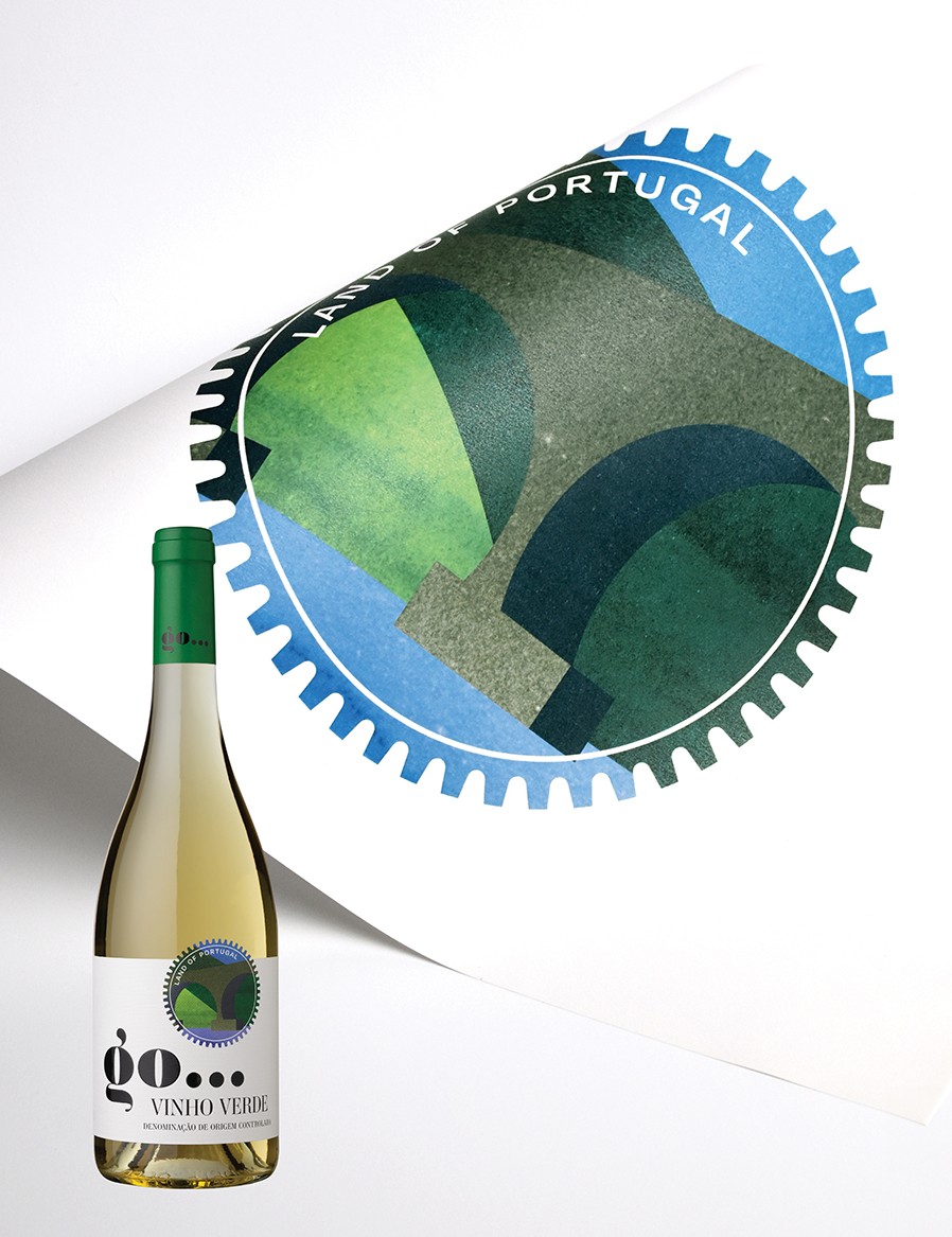
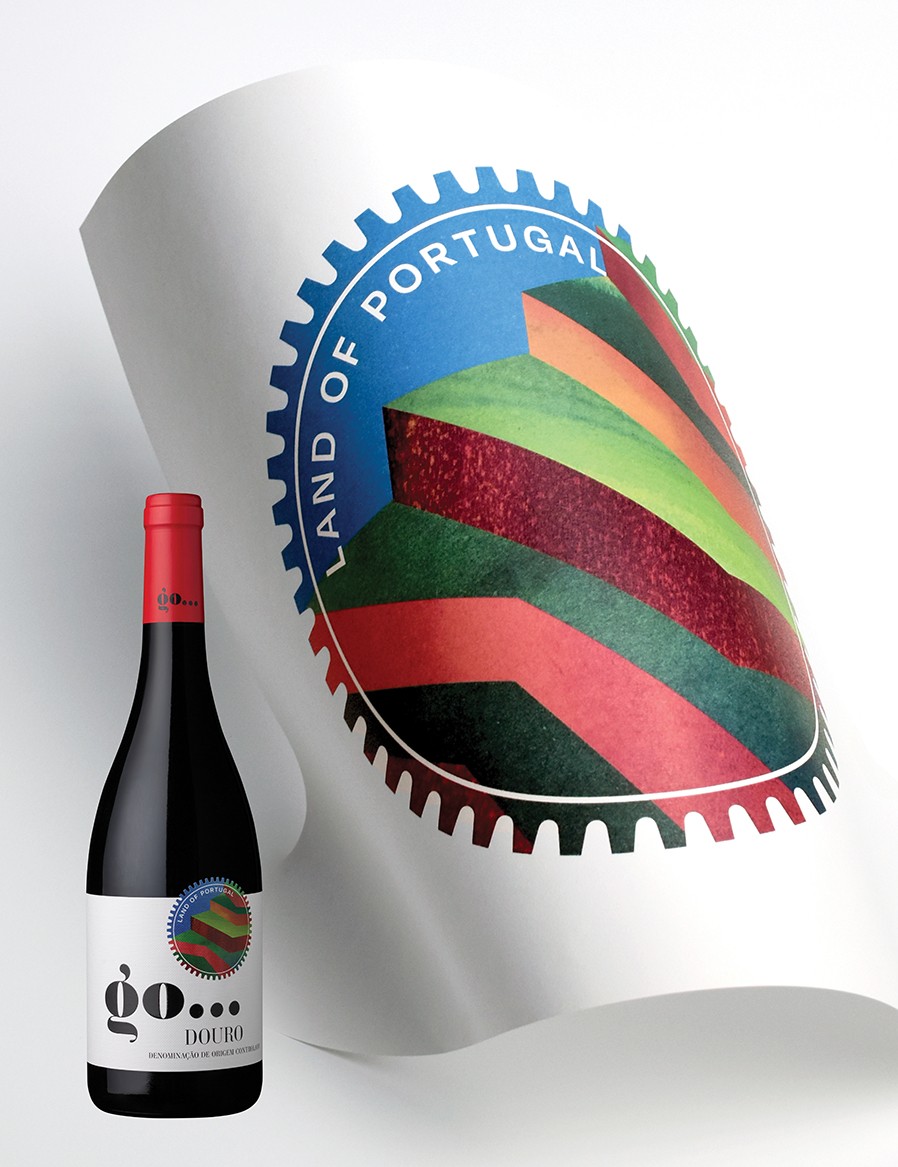
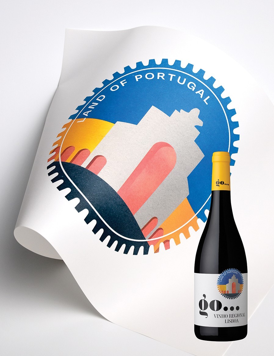
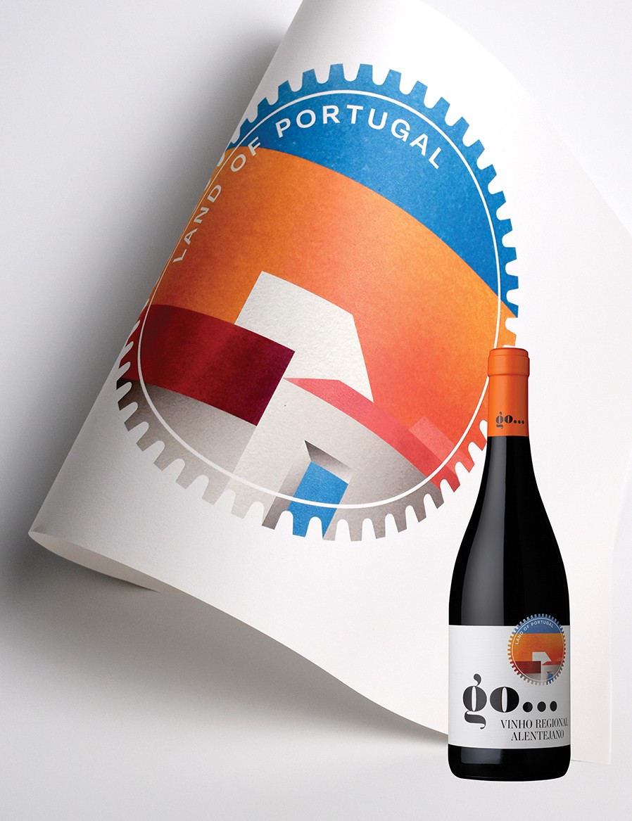
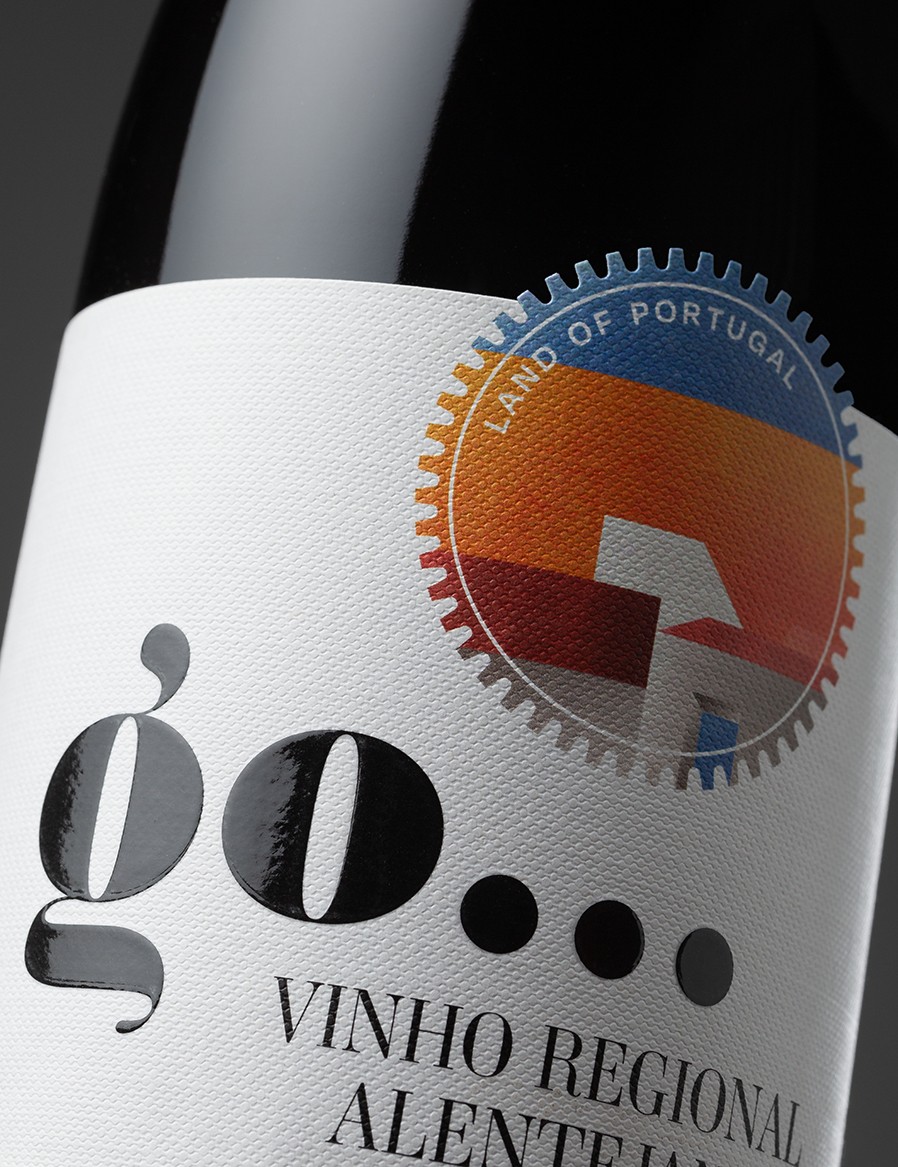
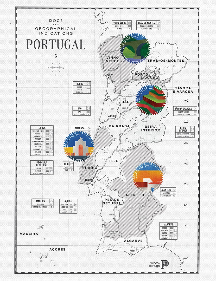
The brand name ‘go…’ is easy to memorise and conveys a sense of movement, the two letters and the ellipsis have a strong visual impact and create empathy with the consumer, reinforced by the illustrations that appear cut out on the label, referring to the shape of a seal and simultaneously the sun. The illustrations recreate and represent the landscape, aspects of the architecture and colours that characterise each of the wine regions in this collection.
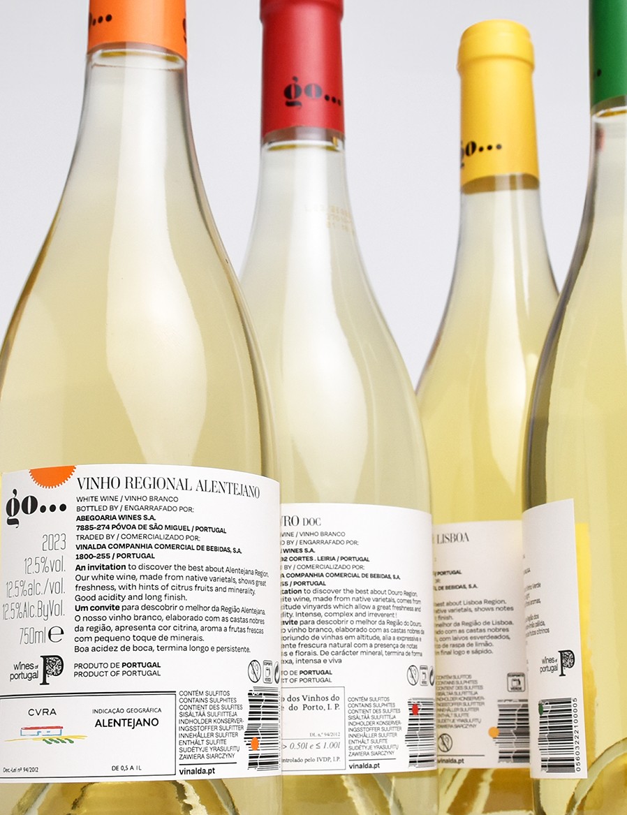
The colours of the capsules only distinguish the regions, since white wine is distinguished from red wine by the use of transparent and dark bottles respectively. The back label uses the colour of the capsules; between the various legal information and the text characterising each wine, we used the barcode in the shape of Portugal’s territory to locate the region using a circle in the corresponding colour.
The ‘invitation’ idea we developed, the message ‘go… land of Portugal’ and the graphic design resulting in a simple but strong and colourful image, made it possible to have a strong linear impact and therefore easily reach the target audience.
The quality and finish of the paper chosen (Fasson® rOxford White FSC®), characterised by its thickness and texture, complements the distinctive simplicity intended for this project. The matt, white finish and its texture allowed for excellent rigour in the printing (cmyk) and cutting out of the illustrations; the structured varnish applied to the print (black) of the brand distinguishes it by its brightness in contrast to the highly decorative relief in a canvas pattern.
CREDIT
- Agency/Creative: MPFXdesign
- Article Title: Go… Land of Portugal Packaging Design by MPFXdesign
- Organisation/Entity: Agency
- Project Status: Published
- Agency/Creative Country: Portugal
- Agency/Creative City: Porto
- Market Region: Portugal & rest of Europe
- Project Deliverables: Packaging Design
- Industry: Food/Beverage
- Keywords: WBDS Agency Design Awards 2024/25 , Go... Land of Portugal , MPFXdesign
- Keywords: WBDS Agency Design Awards 2024/25 , Go... Land of Portugal , MPFXdesign


