Go.Compare, the UK’s leading price comparison website, has had a dramatic rebrand by Ragged Edge.
With 97% awareness, the work aims to leverage the brand’s fame and persuade more people to actively choose it.
To do so, the rebrand focuses on a genuine point of difference. In a fiercely competitive market, Go.Compare is the sole comparison site accredited by BIBA, ensuring integrity and trustworthiness in every recommendation.
“Unlike others, Go.Compare doesn’t just list options; it serves up choices that are genuinely beneficial for users, placing their interests at the forefront,” says Max Ottignon, co-founder of Ragged Edge. “So we amplified that difference, positioning Go.Compare as the Champions of Choice.”
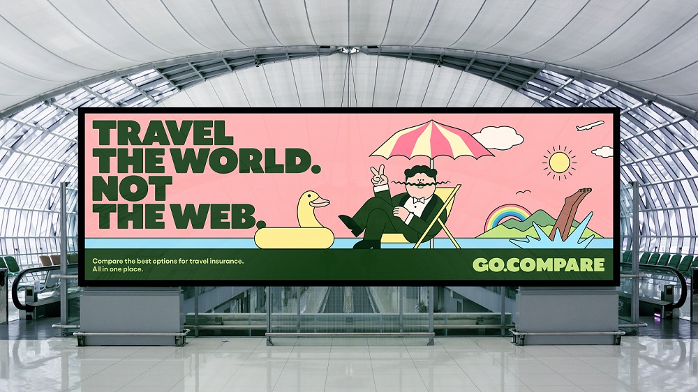
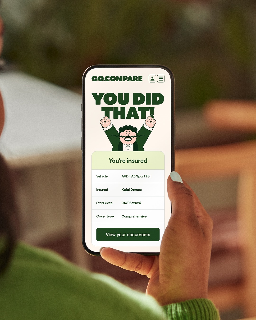
A new identity puts Gio Compario, the brand’s infamous mascot, at its heart, exaggerating his distinctive features in cartoon form to create a charming choice champion. The animated Gio now advocates for your and your choices across every part of the Go.Compare experience, from comms, to check-out and beyond.
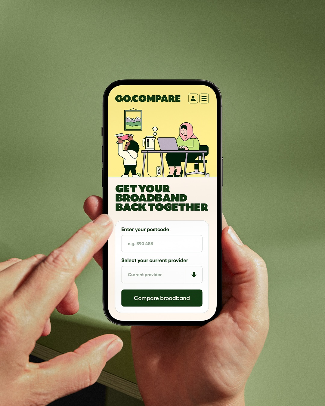
To stand out in a category dominated by stock imagery, the illustrative style, created in collaboration with artist Rami Niemi, extends to a suite of different situations, bringing the brand’s insurance products to life in an entirely new way.
A new verbal identity, ‘the voice of choice’, uses relatable wit to connect with customers, while a customised typeface echoes the warm and characterful style of the illustrations.
The rebrand is designed to be instantly campaign-ready, iconic, and scalable, ensuring maximum visibility and engagement. Notably, Ragged Edge helped bring the re-imagined Gio to life as part of the brand’s high-profile sponsorship of the Wales rugby union team.
“Ragged Edge worked closely with every part of our business to ensure they understood exactly what our aspirations were and how we wanted to evolve in the future.” says Paul Rogers, Marketing Director at Go.Compare. “Insurance can be heavy going – a grudge purchase. Ragged Edge has made it fun and rewarding. The rebrand has helped us to evolve visually and strategically and given us an even stronger sense of purpose, authority and momentum as we continue to provide transparency and support for customers across a broad range of complex products.”



CREDIT
- Agency/Creative: Ragged Edge
- Article Title: Go.compare Becomes the Champion of Choice With Bold Rebrand From Ragged Edge
- Organisation/Entity: Agency
- Project Type: Campaign
- Project Status: Published
- Agency/Creative Country: United Kingdom
- Agency/Creative City: London
- Market Region: Europe
- Project Deliverables: Brand Design
- Industry: Information
- Keywords: Go Compare
-
Credits:
Co-Founder: Max Ottignon


