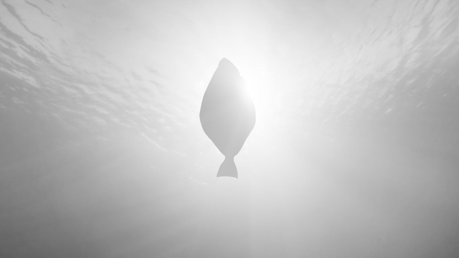
Branding a fish of legendary quality
Myth comes to life in the tale of the snow-white halibut.
We developed the name, visual identity, storytelling, photography and full brand platform for the aquaculture company Glitne. The unique taste and texture of Snow White Halibut from Glitne is shaped by the deep, cold, crystal-clear waters of the Sognefjord — a fjord surrounded by mountains and glaciers steeped in mythology. This became the foundation for our brand development and the storytelling used in a major international campaign.
Steeped in Legend
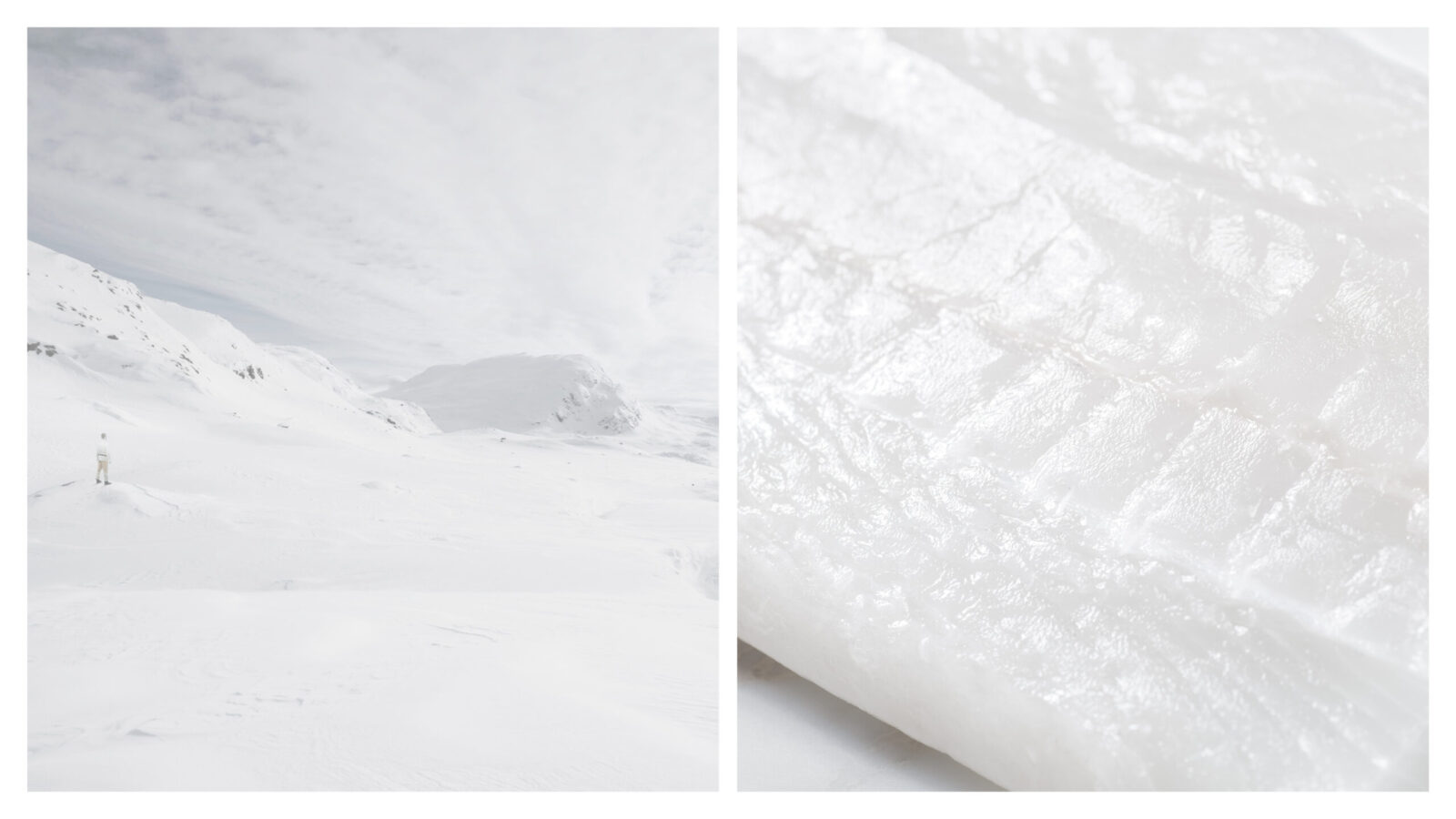
No fish is whiter, no fish is firmer, than halibut from the Sognefjord. Nobody knows why — it remains a mystery. Perhaps it comes from the ice-cold, crystal-clear fjord water where the salty Atlantic meets glacier melt from the surrounding mountains. Or perhaps it lies in the distinctive natural formations — landscapes infused with ancient legend.
Love, Light, Beauty, Happiness
Wherever you are in the world, gourmet halibut from the Sognefjord tells you where it comes from. You only need to savour the taste and listen to the stories of old. Marvel at the tales of the handsome god Balder and the hideous ogress, and of the Vikings Sverre and Magnus, who fought for Norway’s throne at the Battle of Fimreite.
The Name
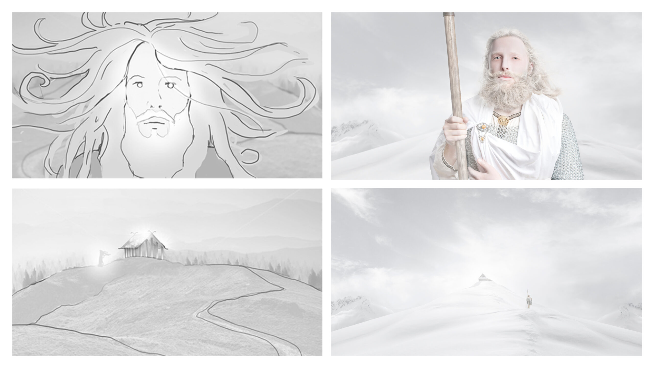
Glitne means ‘the shining’ — a name rooted in Norse mythology. In Norse mythology, Glitne was the home of Forseti, the god of justice. His great hall was said to have golden pillars and a silver ceiling. The fortress was believed to be a gift from his father, Balder. As the god of justice, Forseti sat by the temple to act as legislator and judge in difficult matters. Both gods and humans came to him for guidance, and he almost always found compromise.
But it was Balder who was associated with the halibut. Along the coast, people believed the halibut to be the personification of the wise god Balder. Shrouded in myth, the halibut was believed to embody the same qualities as Balder: love, light, beauty, and happiness.
A visual language shaped by light and time.
The identity is built around the iconic G-symbol, illustrating the cycle of nature. The colour palette draws from the halibut’s almost divine white flesh — white on the underside, and brown, almost copper-toned on the top. The lines in the fish’s flesh echo the natural striations found in sea-softened stones shaped by water and time.
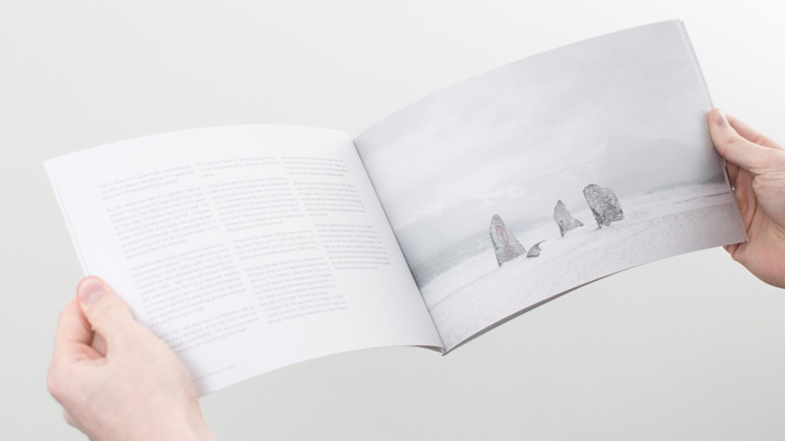
These lines also form the pattern used as a subtle embossed graphic element in the white paper materials and on the packaging — a delicate hint of the pristine white halibut within.
The packaging is elegant and understated, giving a quiet suggestion of the Snow-white Hallibut hidden inside. It is sealed with a copper label. The fillet is revealed as the packaging slides open like a drawer, bringing the fish gracefully into view.
Mystique in Words and Visuals
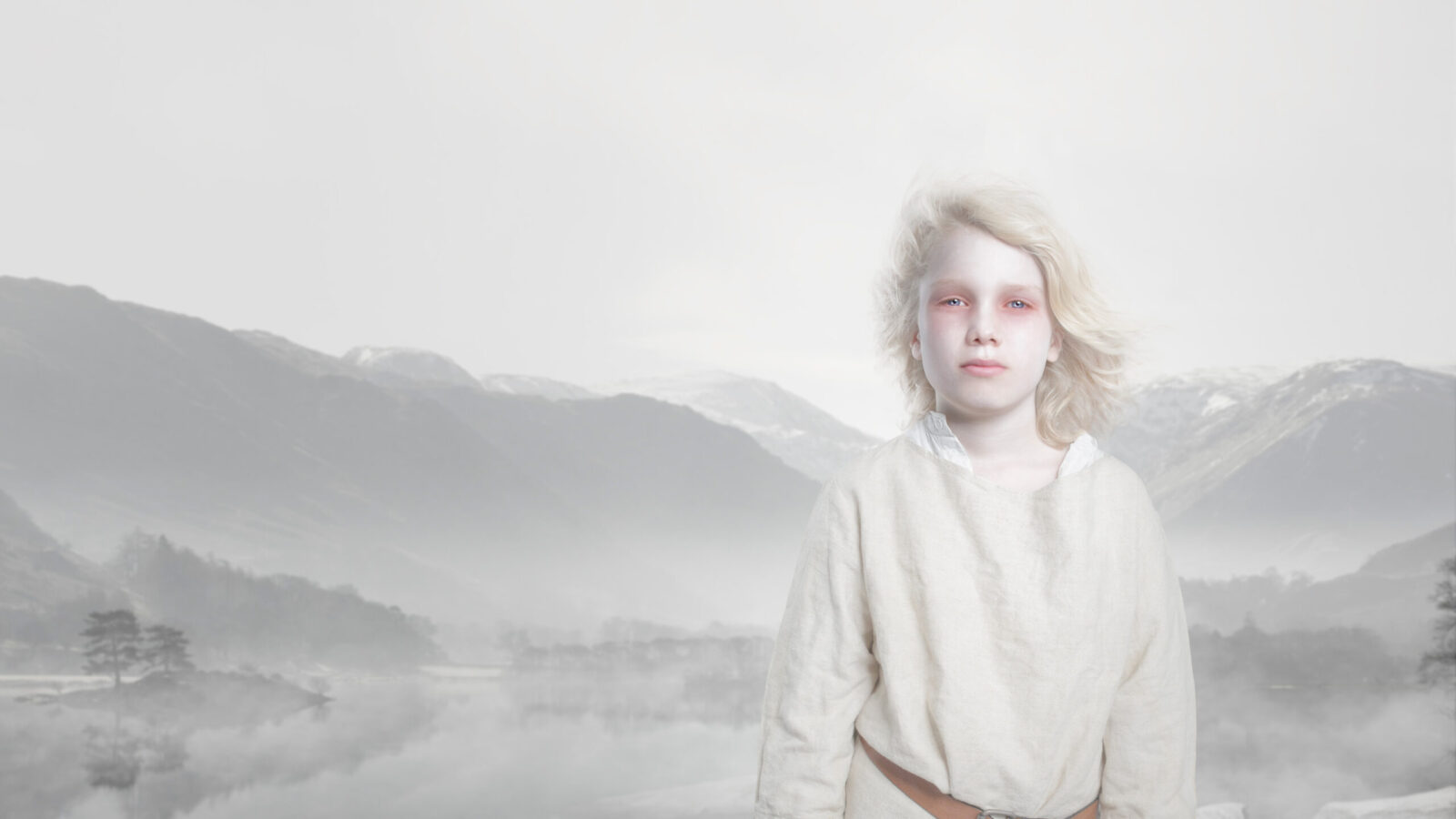
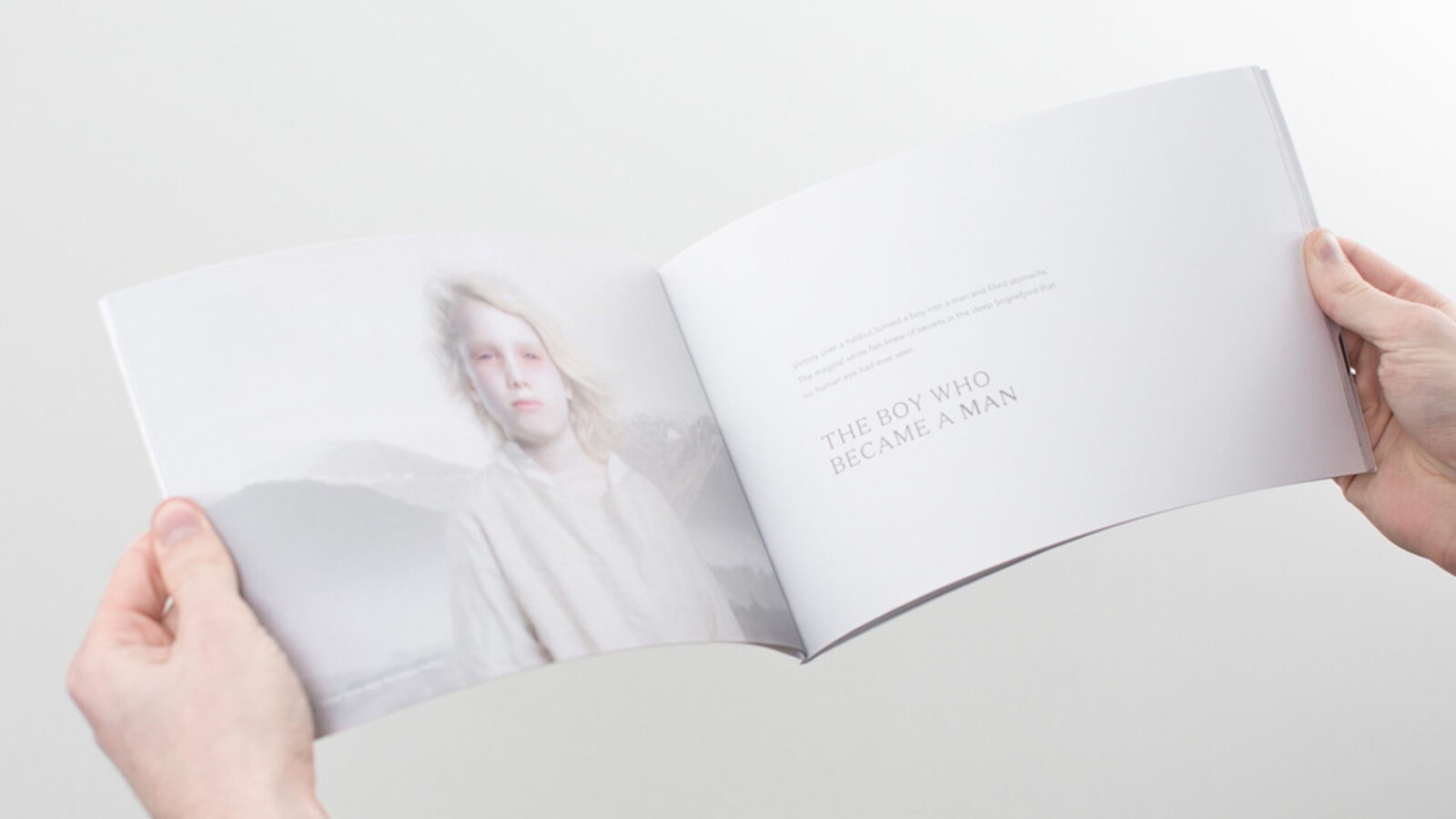
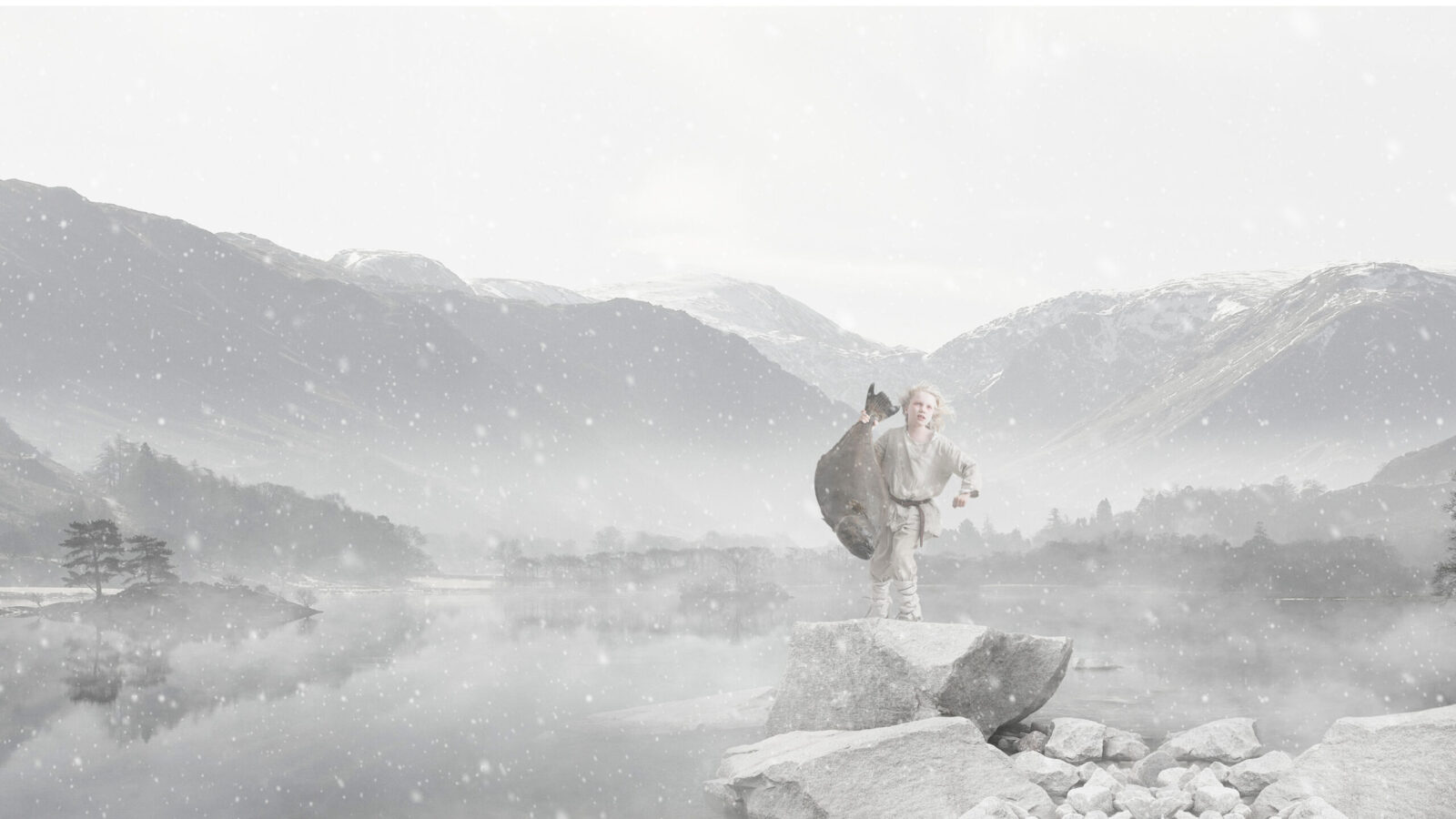
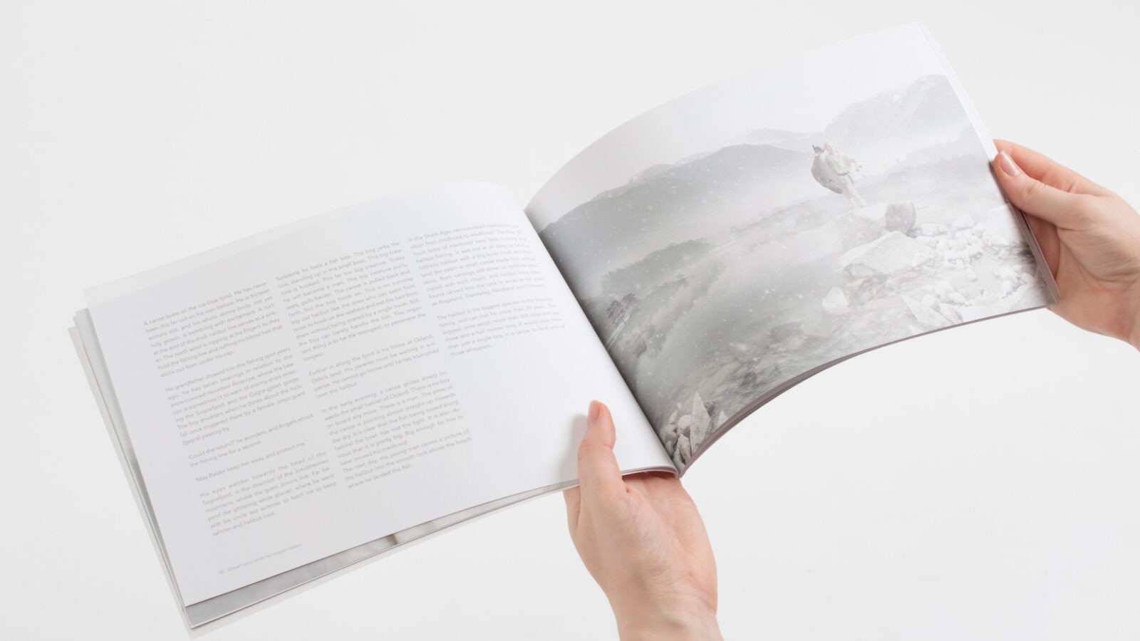
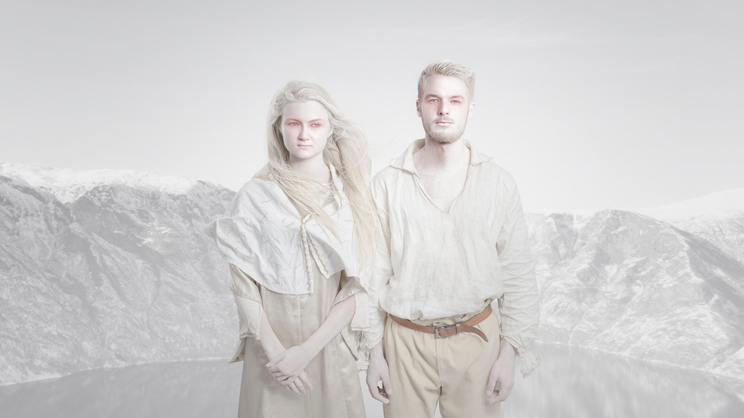
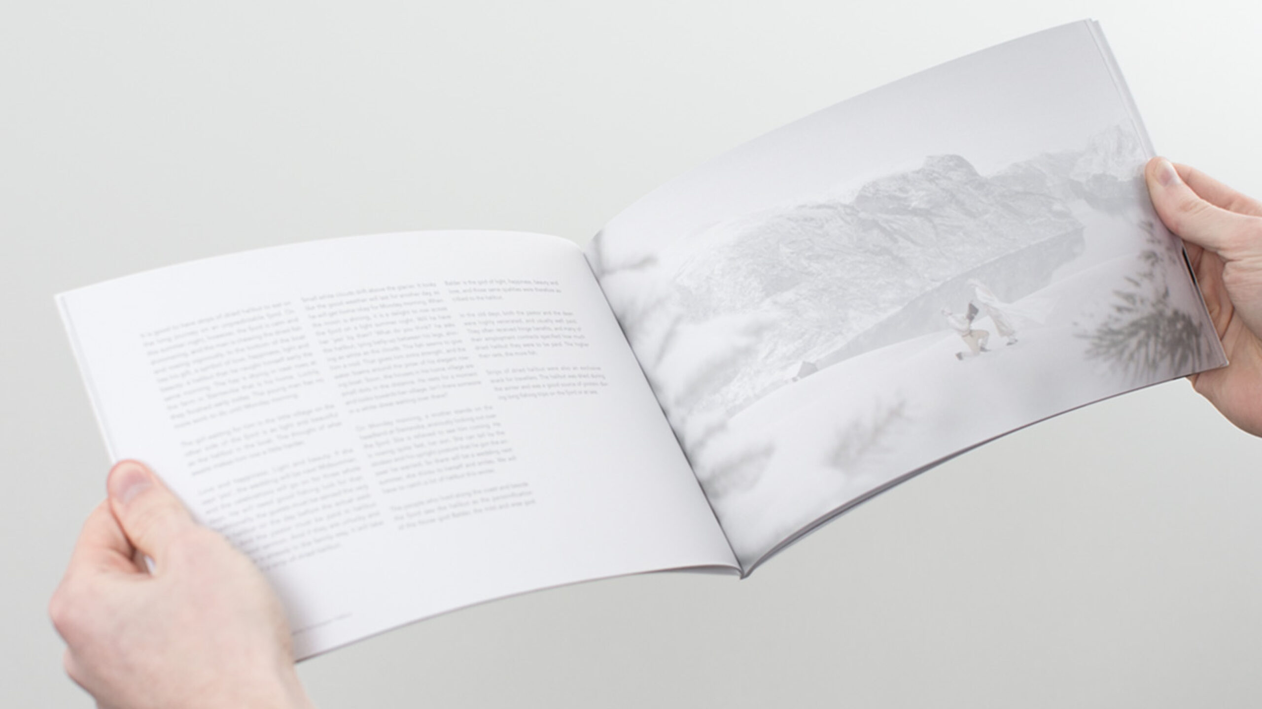
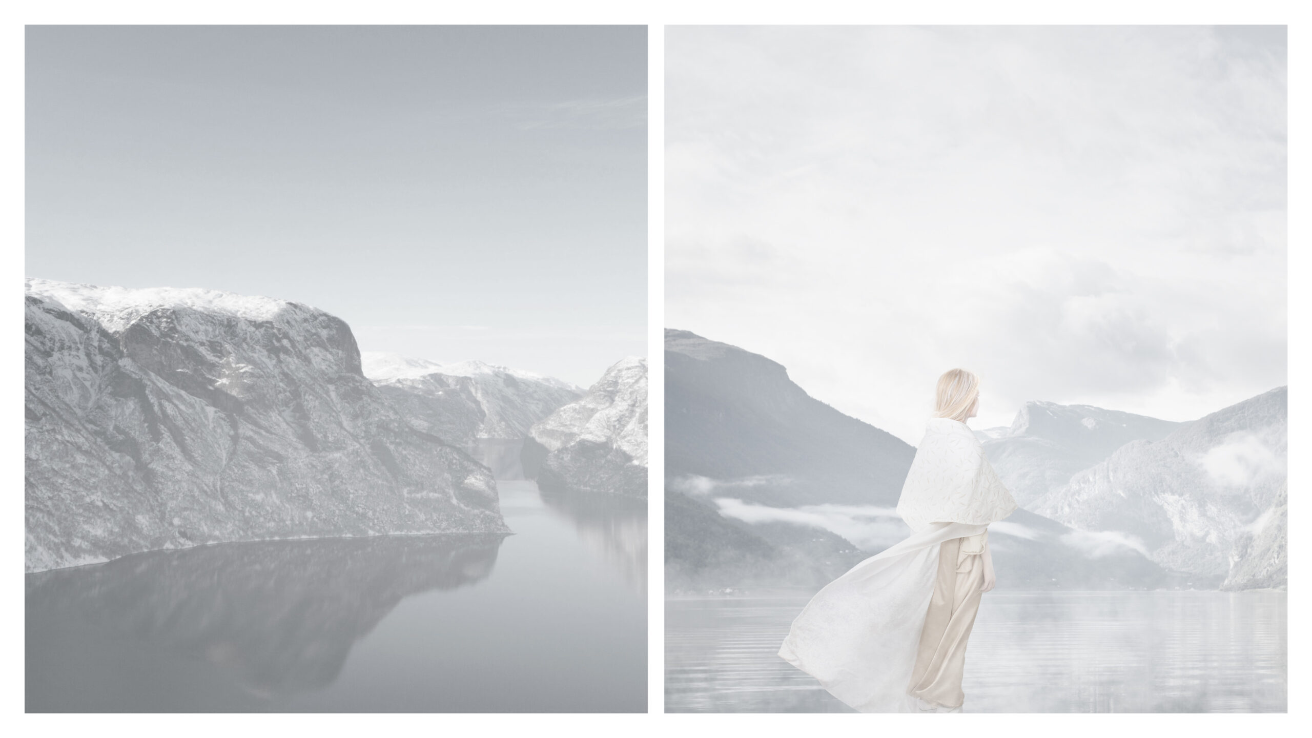
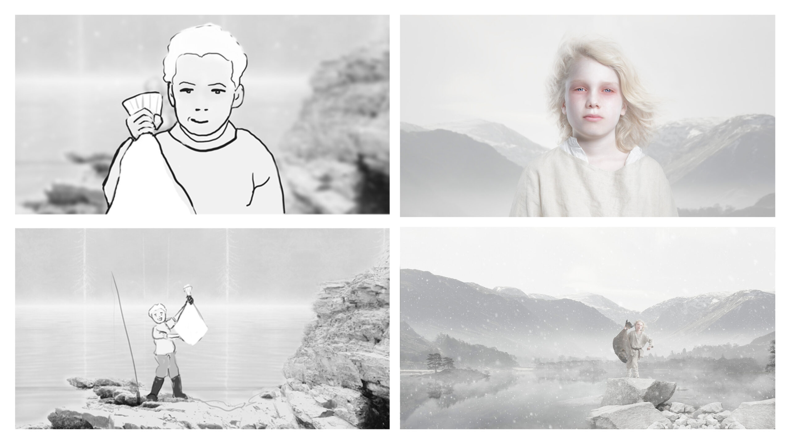
The visual style reinforces Glitne’s inherent mystique, captured in a light, high-key photographic style. Food and product photography is styled with elements in soft, natural tones — stone, mineral, and organic textures. The conceptual imagery conveys the myths of Norse storytelling: the tale of the boy who became a man, the trials of strength that marked adulthood — from wrestling a bear to pulling a halibut from the sea with bare hands.
It was even said that the perfect marriage proposal in those days was to offer your future bride a halibut, the divine fish.
Through visual and verbal storytelling, the myths and mystique are brought to life — and at the centre of every tale stands the divine halibut, a symbol of light, godliness, and grace.



CREDIT
- Agency/Creative: KIND (Conceptual Branding AS)
- Article Title: Glitne Snow White Halibut’s Legendary Origin Interpreted Through Photography by Kind
- Organisation/Entity: Agency
- Project Status: Published
- Agency/Creative Country: Norway
- Agency/Creative City: Bergen
- Project Deliverables: Branding, Photography, Photography Styling
- Industry: Food/Beverage
- Keywords: WBDS Agency Design Awards 2025/26 , halibut, norse mythology
-
Credits:
CEO, Creative Director: Tom Emil Olsen
Design Director: Knut Harald Longva
Senior Designer: Emil Olsen
Senior Designer: Agnieszka Gawlik
Director of Photography: Christoffer Meyer
Photographer & Cinematographer: Isak Norum
Cinematographer: William James Campbell
Key Account Manager: Marianne Erdal Holm
Project Manager: Laure Mediavilla
Strategic Brand Director: Thomas Danielsen
COO, Key Account Manager: Beate Myren Romslo
Strategic Brand Consultant: Brede Lie Reime


