


Gleam is a brand that makes seeing clearly as effortless as it should be. In a world where vision care can feel clinical, complicated, or intimidating, Gleam brings a fresh, approachable, and fun perspective to daily contact lenses. The brand is built around the idea that maintaining eye health and enjoying clear vision should be simple, seamless, and even enjoyable, not something that adds stress to your day.
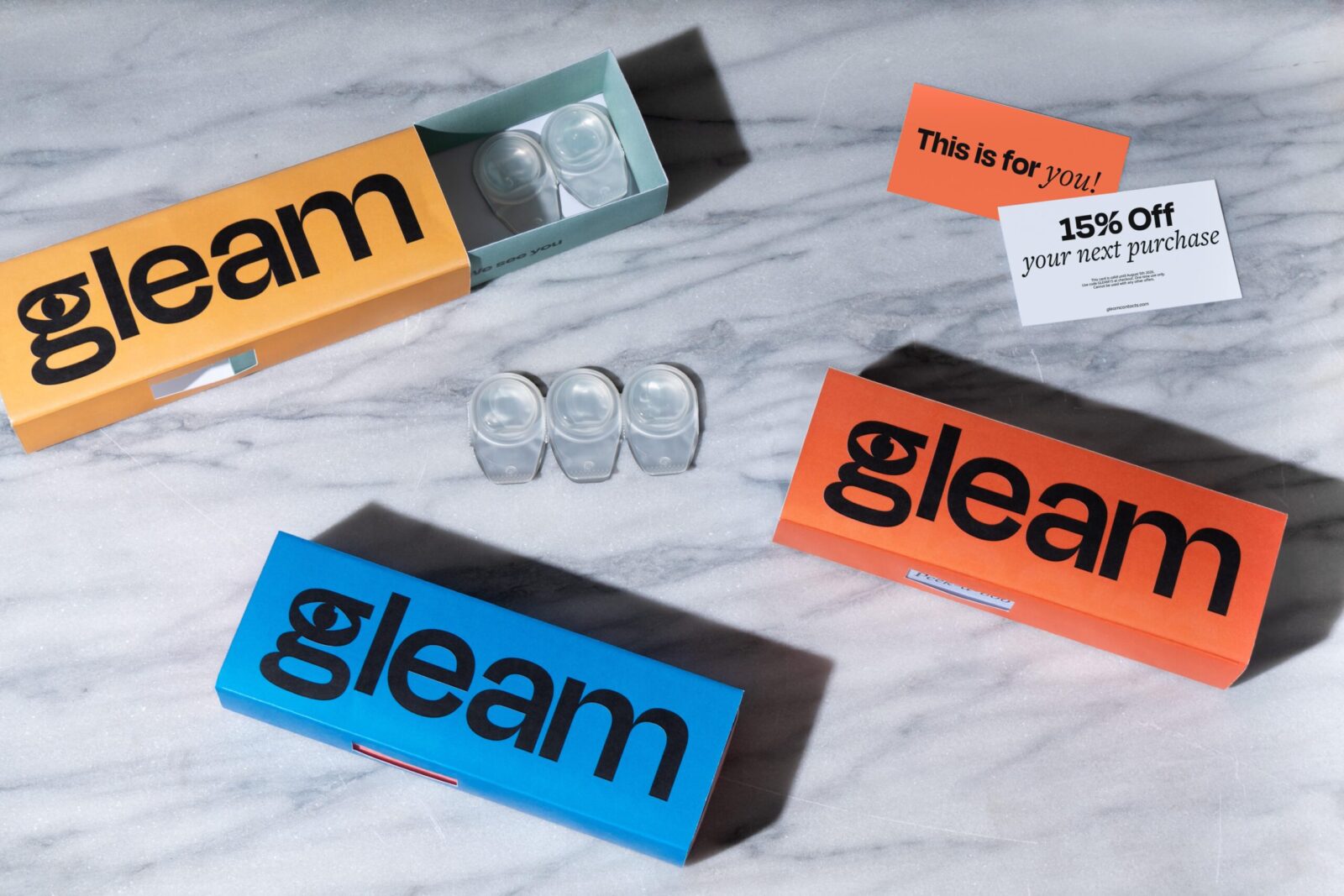
At its core, Gleam combines high-quality, reliable daily lenses with a modern, lifestyle-focused approach. Every order is delivered straight to your door, removing the hassle of repeated trips to the store and making it easy for people to incorporate vision care into their everyday routines. Gleam emphasizes convenience without compromising on quality, ensuring that each lens provides comfort, clarity, and consistent performance.
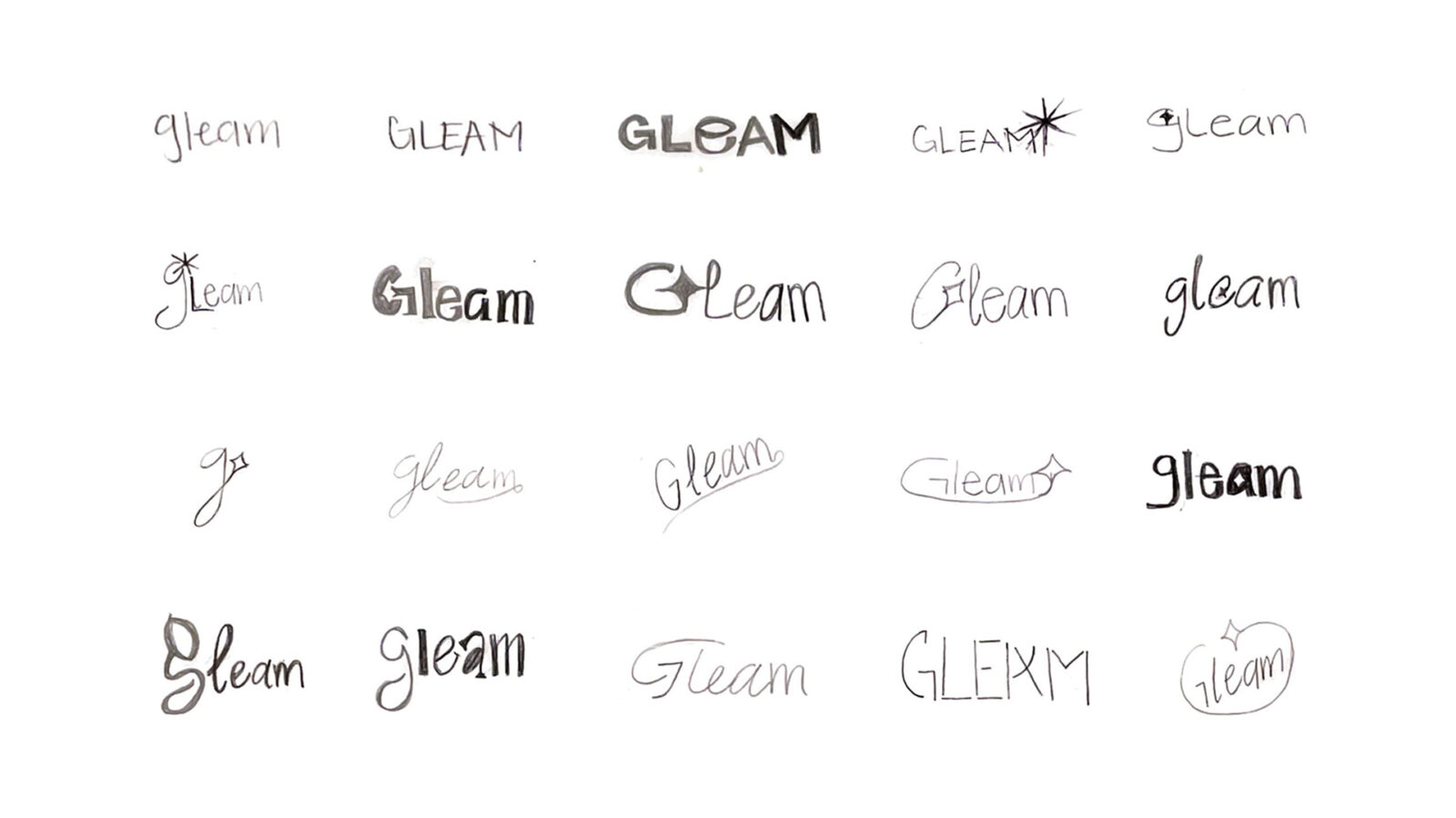
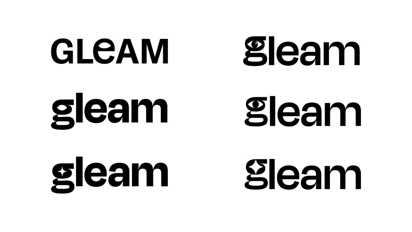
The brand’s identity is intentionally clean, vibrant, and approachable, steering away from the overly medical or clinical aesthetics often associated with eye care. Gleam’s packaging and design feature bold colors, playful messaging, and simple typography that communicate the brand’s energy and personality. From the bright, inviting logo to the witty, engaging copy, every touchpoint is crafted to make customers feel seen, understood, and excited about taking care of their vision.
Beyond just providing lenses, Gleam is about creating a seamless and enjoyable experience. The brand understands that people want more than a product; they want convenience, trust, and confidence. By delivering lenses directly to customers with easy-to-use subscription options, Gleam makes it effortless to stay consistent with eye care. Its messaging focuses on empowerment, accessibility, and a little fun, making the brand approachable for anyone who wears daily contacts, whether they are new to lenses or long-time users.
Ultimately, Gleam reimagines vision care for a modern audience. It’s about clarity, convenience, and confidence, wrapped in a brand experience that’s fresh, bold, and human. With Gleam, seeing clearly doesn’t have to be a chore; it’s simple, reliable, and even enjoyable, reflecting the way people live their lives today.

CREDIT
- Agency/Creative: Alexa Rendon
- Article Title: Gleam by Student Alexa Rendon Repositions Daily Contact Lenses as an Effortless Routine
- Organisation/Entity: Student
- Project Status: Non Published
- Agency/Creative Country: United States of America
- Agency/Creative City: San Diego
- Project Deliverables: Brand Identity, Branding, Design, Graphic Design, Label Design, Logo Design, Packaging Design, Photography, Sketching, Type Design
- Industry: Pharmaceutical
- Keywords: WBDS Student Design Awards 2025/26 , Clean branding, Minimalist design, Eye care packaging, Approachable, Logo


