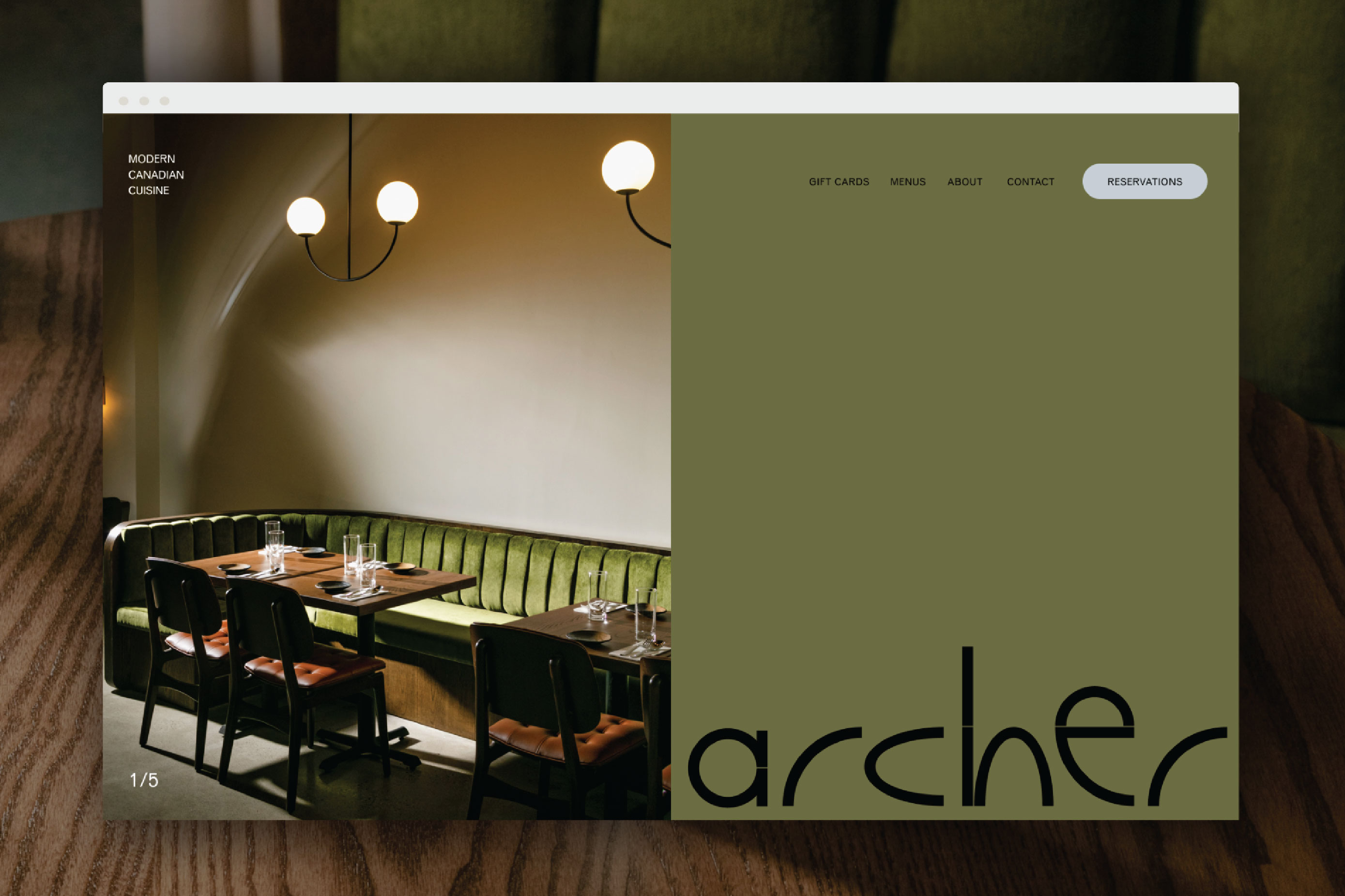
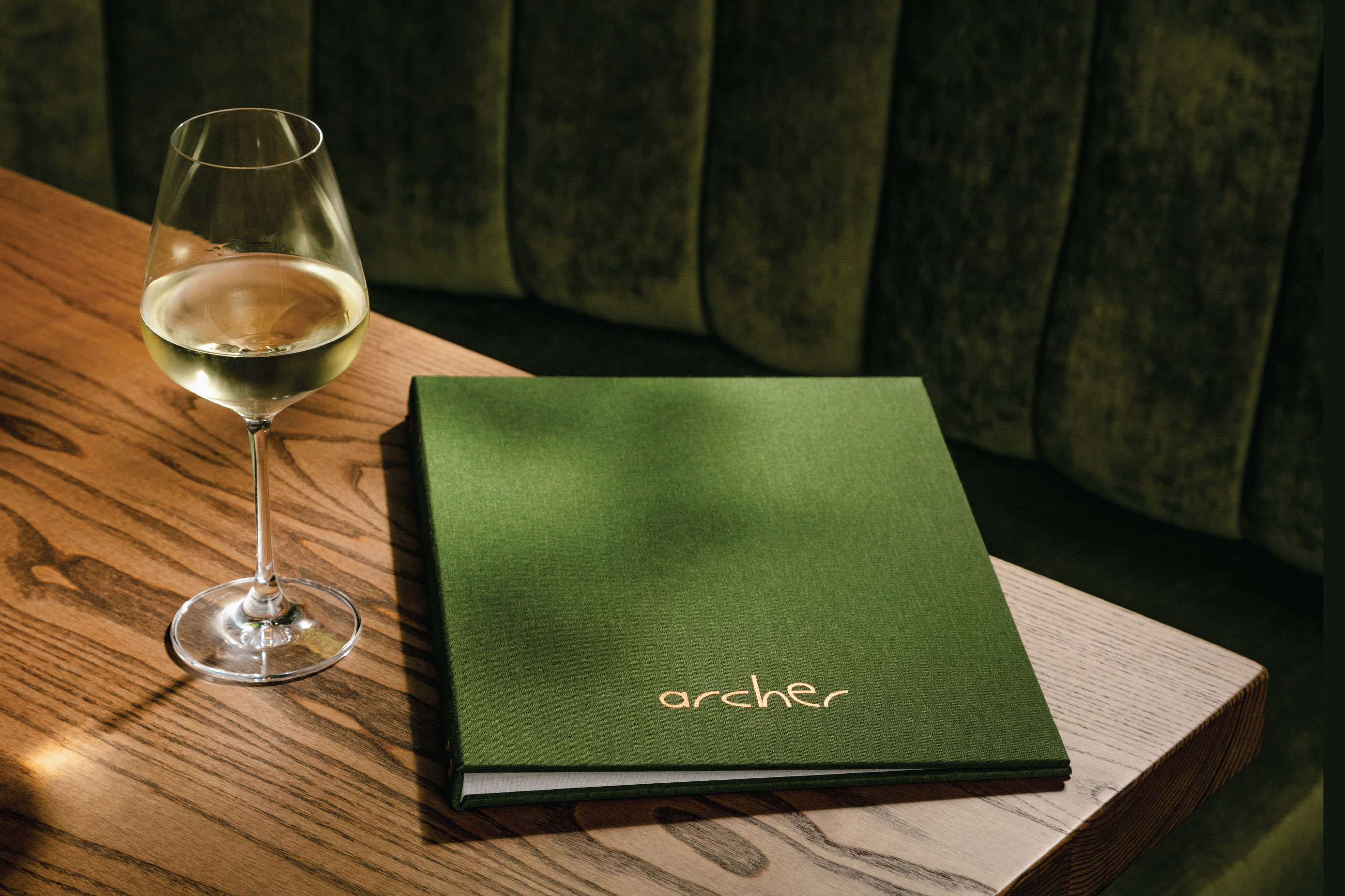
At Archer, guests are invited to experience the magic of the Pacific Northwest through their carefully crafted menu, design-focused room and thoughtfully created brand identity. The goal was to capture both the serene atmosphere of the forest and the raw power of the ocean, creating an experience that is unique and textural. This is achieved in the room with the use of luxurious green velvet banquettes, muted lighting, and an impressive stone masonry bar and through the culinary team’s use of local produce artfully reinterpreted and presented.
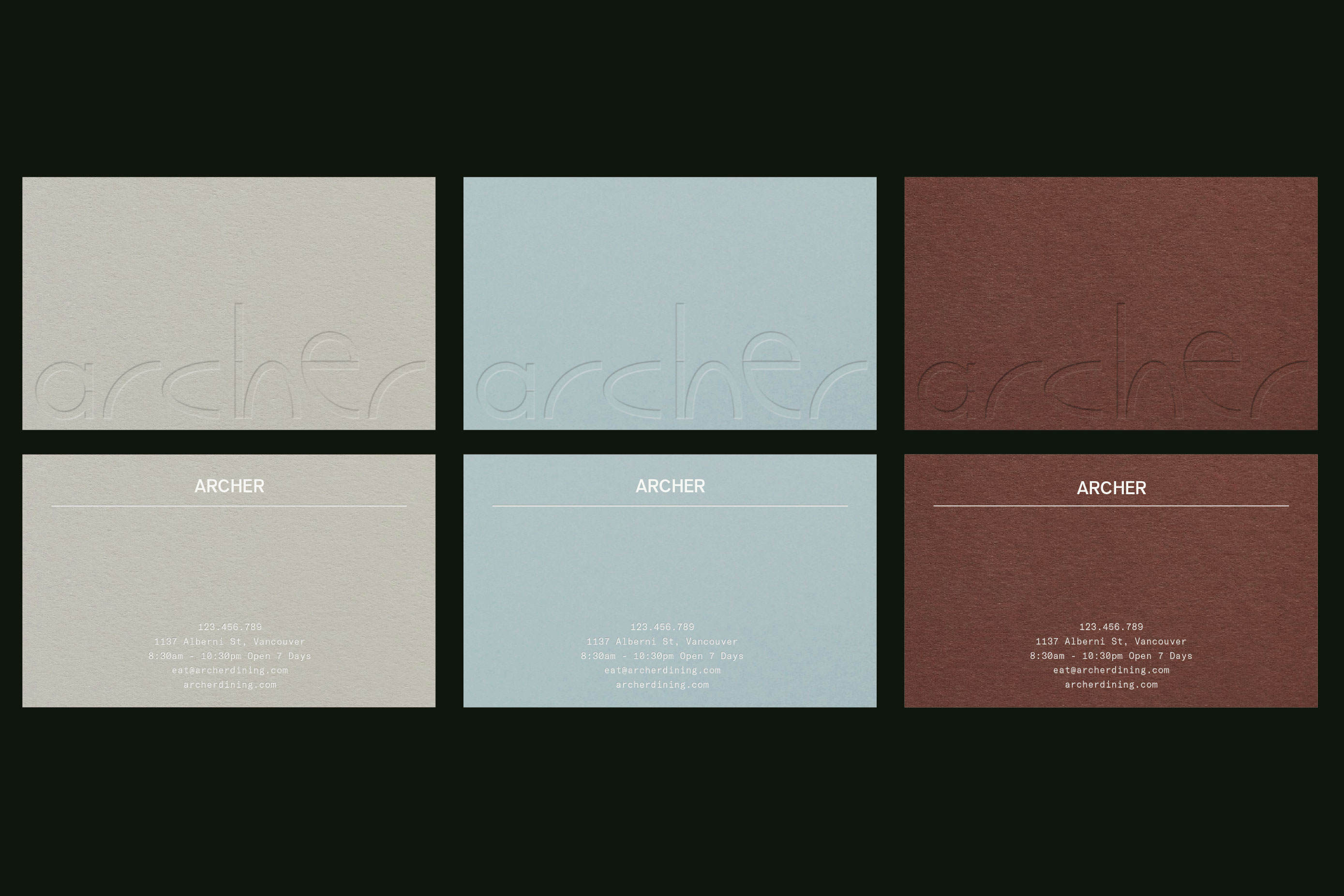
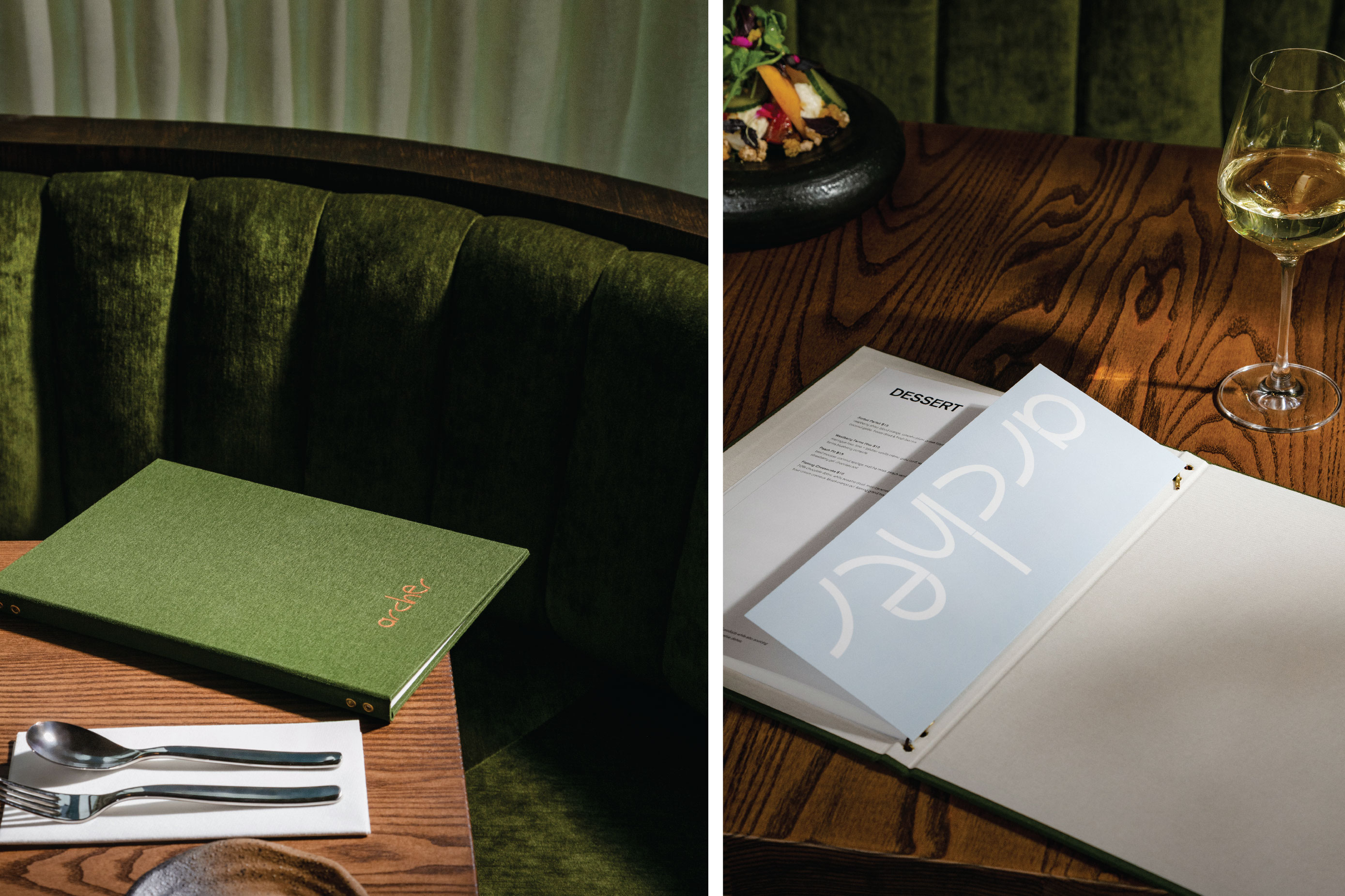
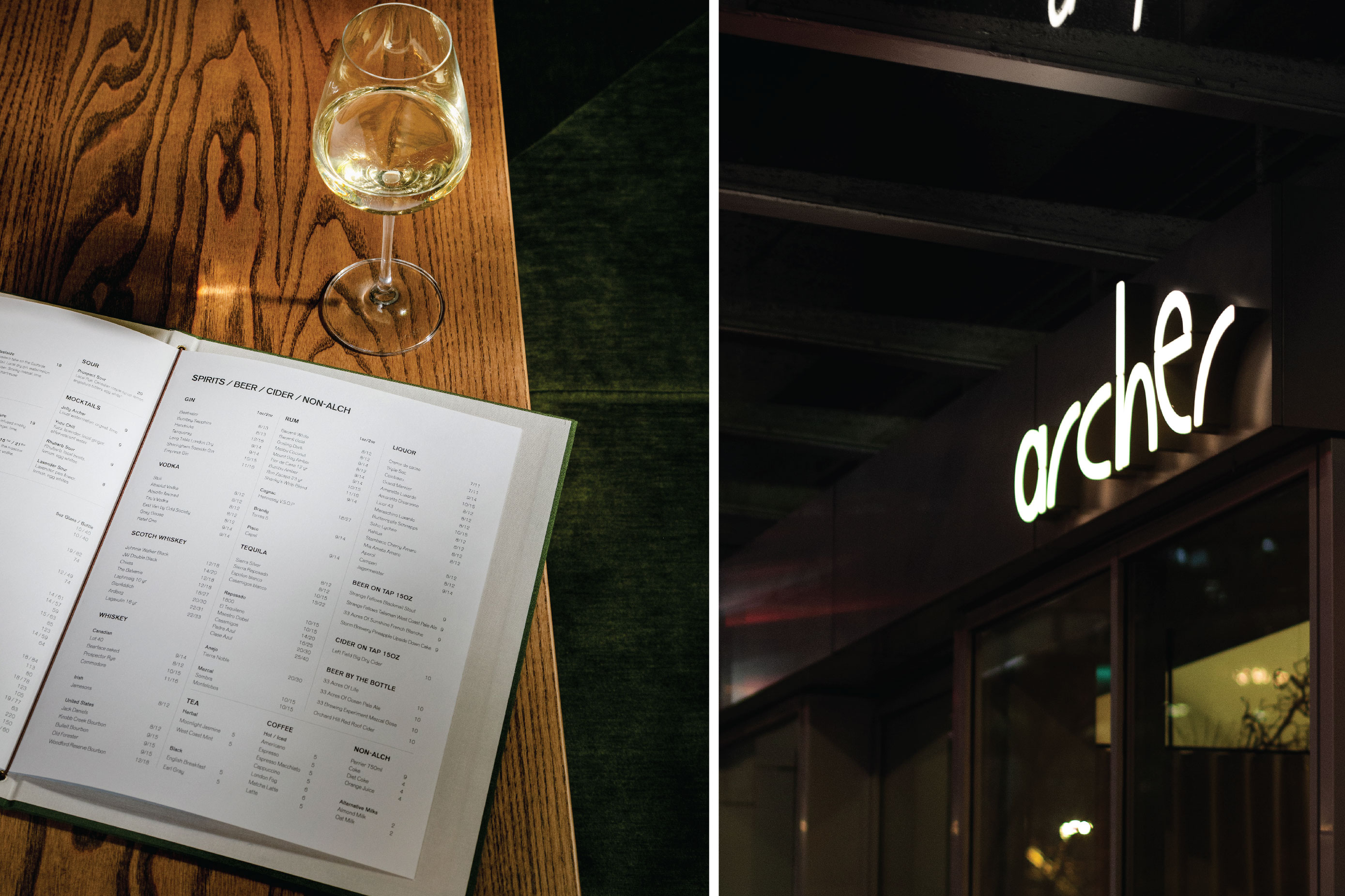
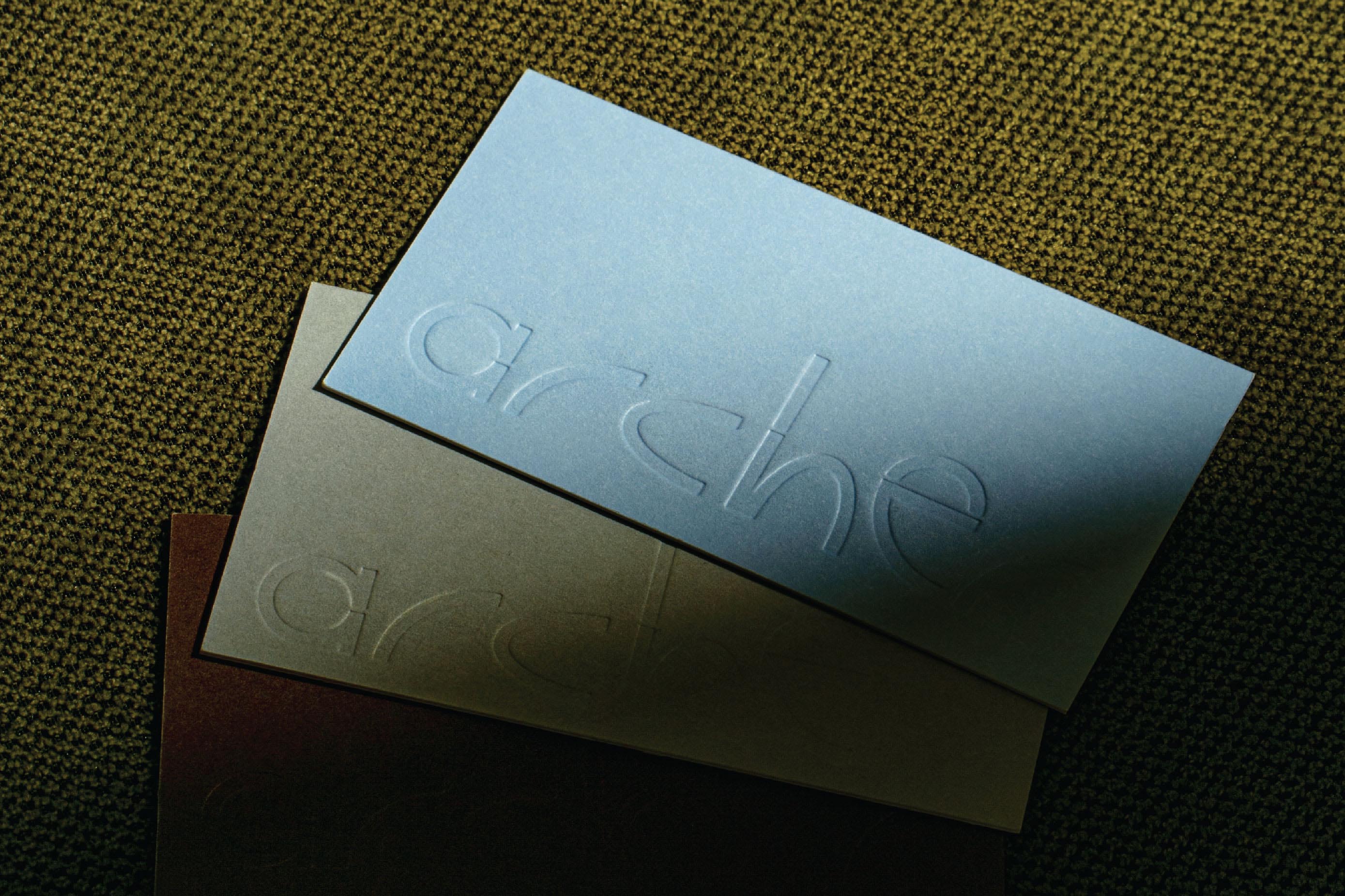
When it comes to Archer’s brand identity created by Vancouver-based, Glasfurd & Walker is elemental and distinct. Inspired by the earthy tones of the Pacific Northwest landscape, featuring deep browns, light blues, and mossy greens. Each branded touchpoint within the Archer brand world, from the menu to the business card, is enhanced with textured elements such as embossed logos, copper foiling and linen textures to create a rich sensory experience for diners.
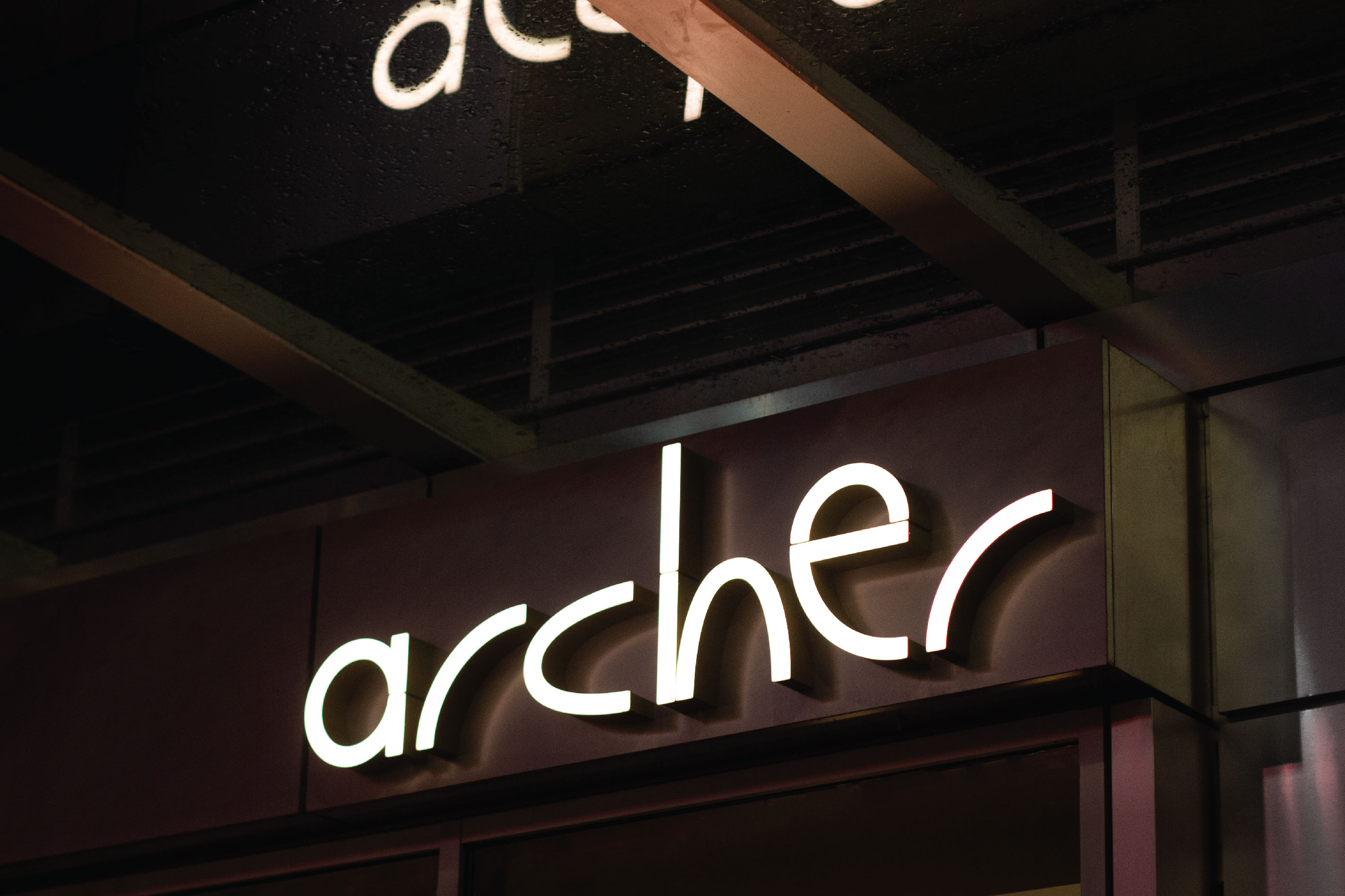
The signage is a channel-cut illuminated sign beautifully constructed with a green edge by Franklin Signage Company.
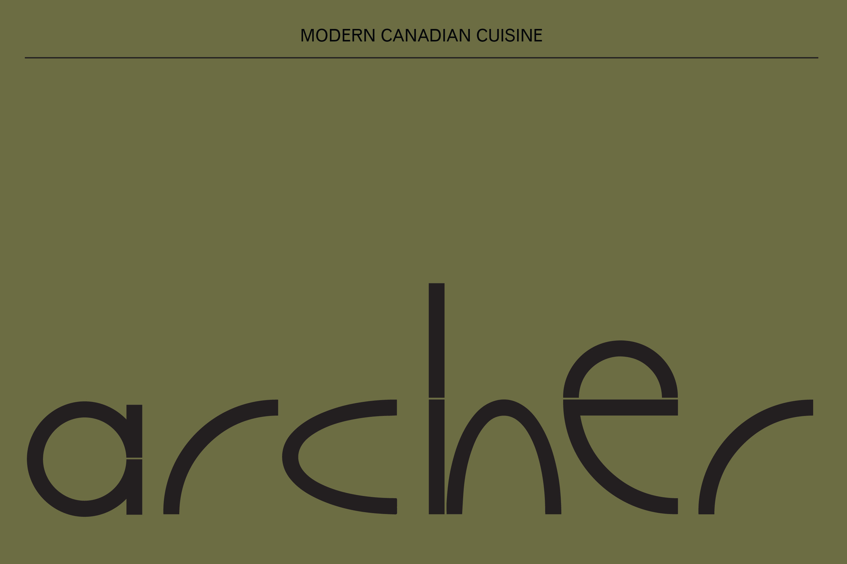
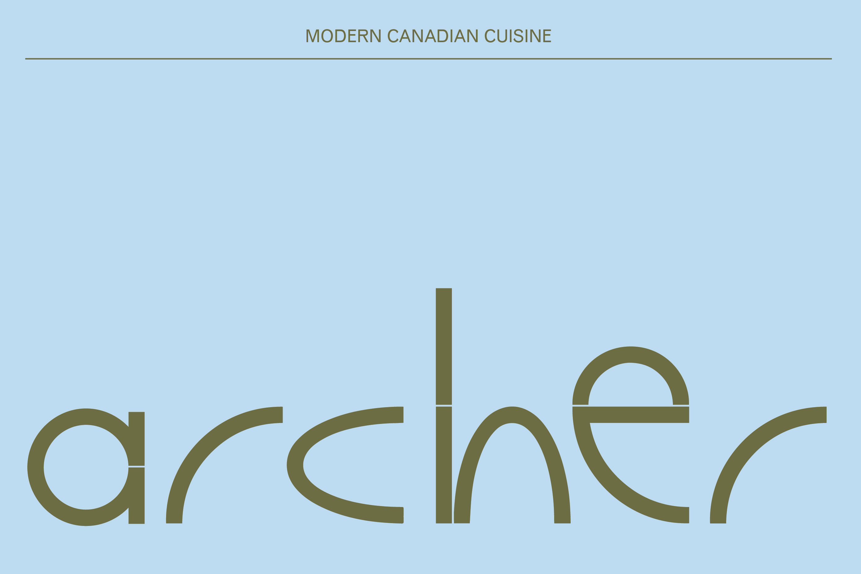
The typeface for the logo is Dinamo type’s Galapagos, a uniquely futuristic yet subtly biological font, paired with URW Venus Sans for the body and the brand, conveying a sense of naturalism with a touch of modernity.
Every detail has been meticulously crafted to create a rich sensory experience for diners.

CREDIT
- Agency/Creative: Glasfurd & Walker
- Article Title: Glasfurd & Walker Represent Modern Canadian Cuisine Through a Unique Yet Surprisingly Simple Identity
- Organisation/Entity: Agency
- Project Type: Identity
- Project Status: Non Published
- Agency/Creative Country: Canada
- Agency/Creative City: Vancouver
- Market Region: North America
- Project Deliverables: Brand Identity, Food Photography, Typography
- Industry: Food/Beverage
- Keywords: Restaurant, Branding, Vancouver, Canada, Design
-
Credits:
Photography: Ian Lanterman


