


There was a time when a magazine lived on the coffee table, folded open to a page someone liked. A time before scrolls and swipes, when brands were built on paper and products were made to last. Typical comes from that spirit. The brand rethinks the things always within reach, designing with intention to make simple objects a little less ordinary. A stripe slightly off. A stretch that surprises. A palette pulled from memory rather than trend. Small shifts that turn the familiar into something with quiet personality.
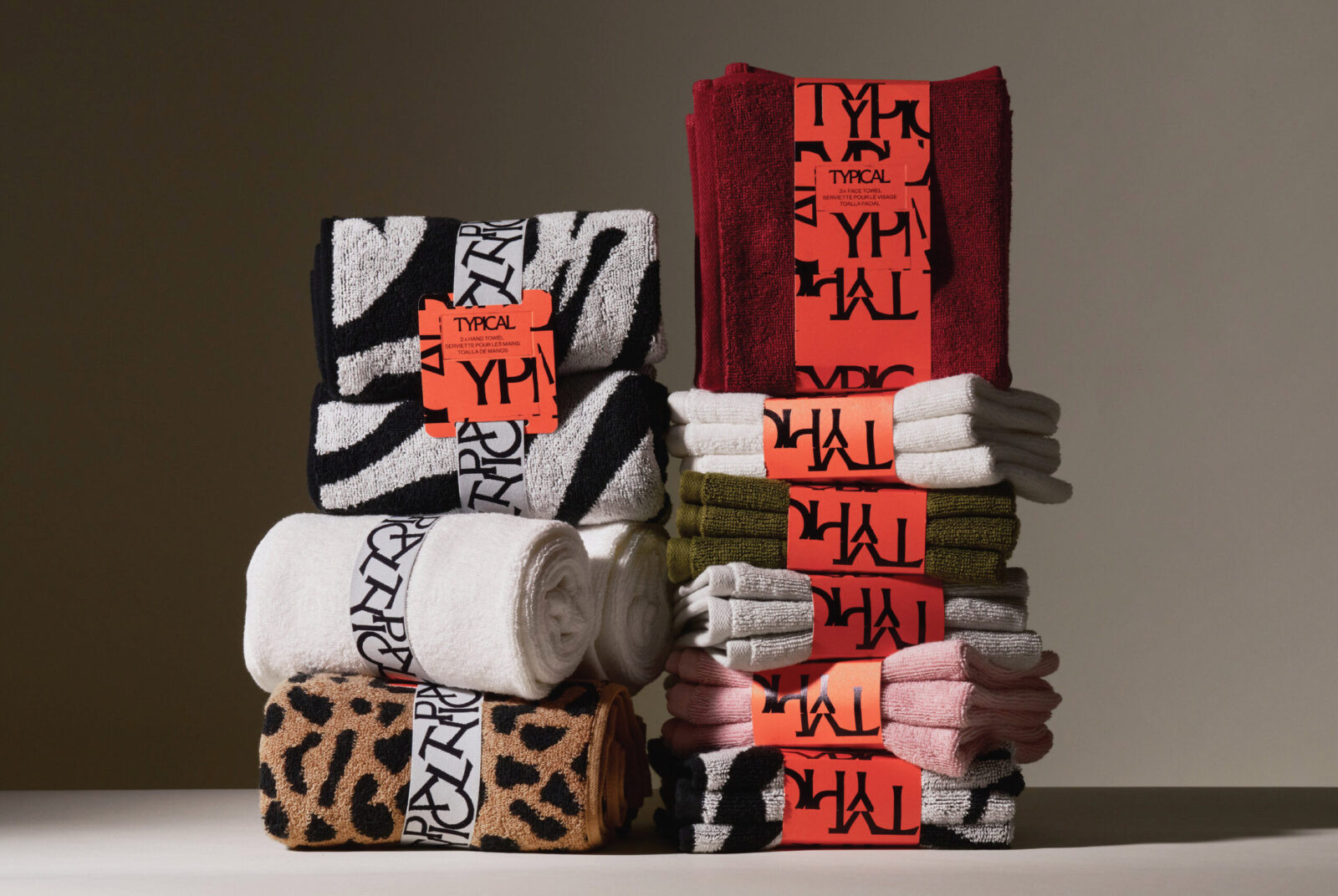
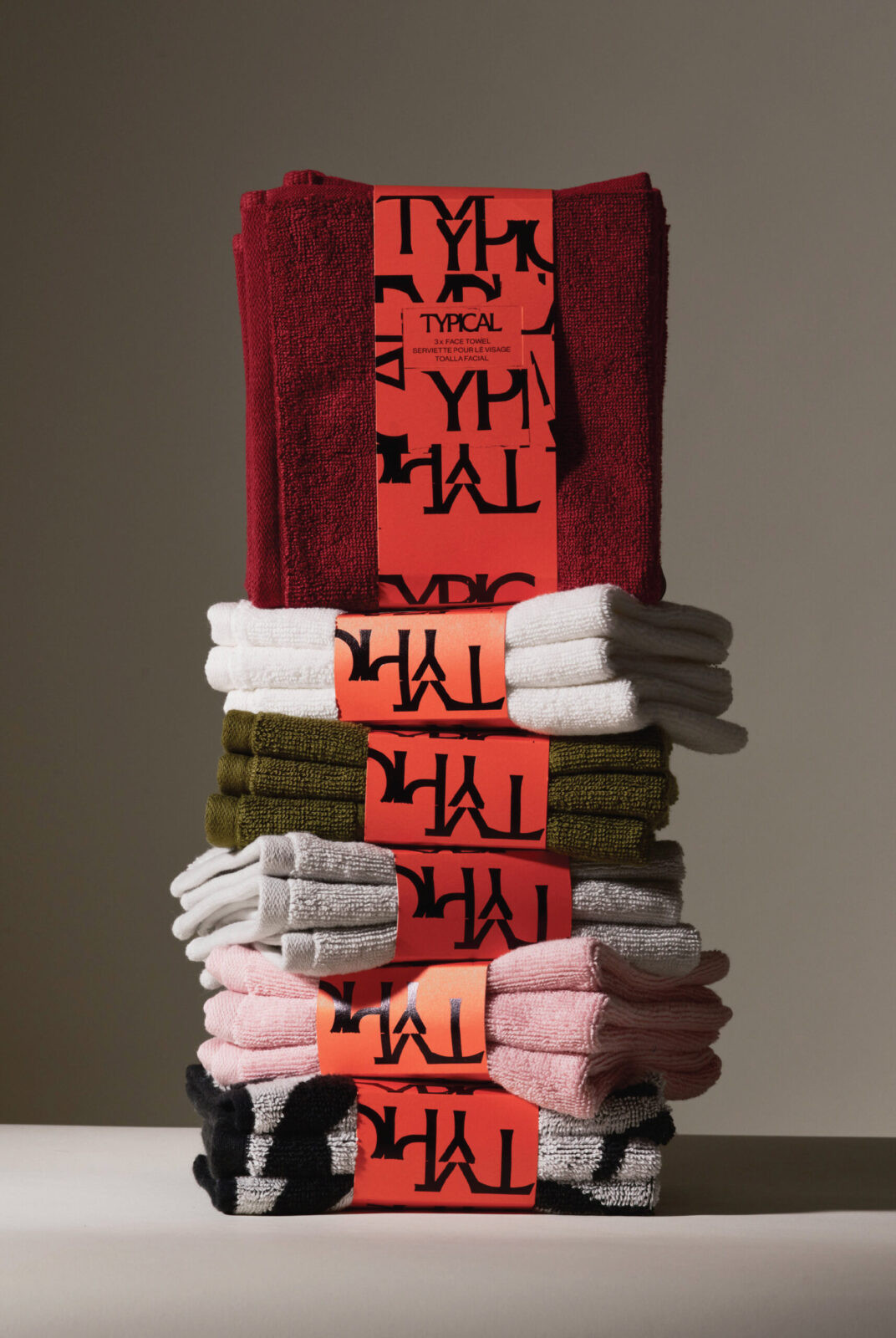
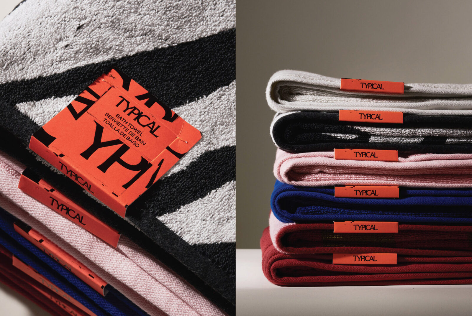
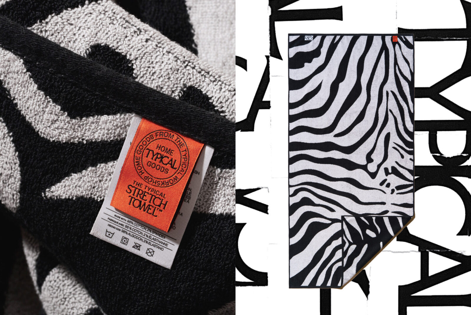
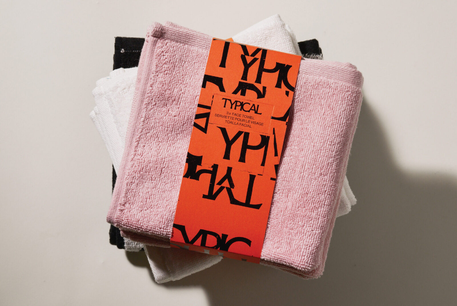
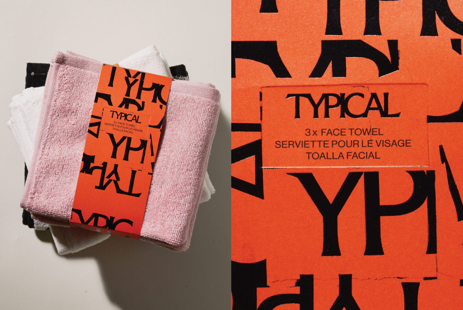
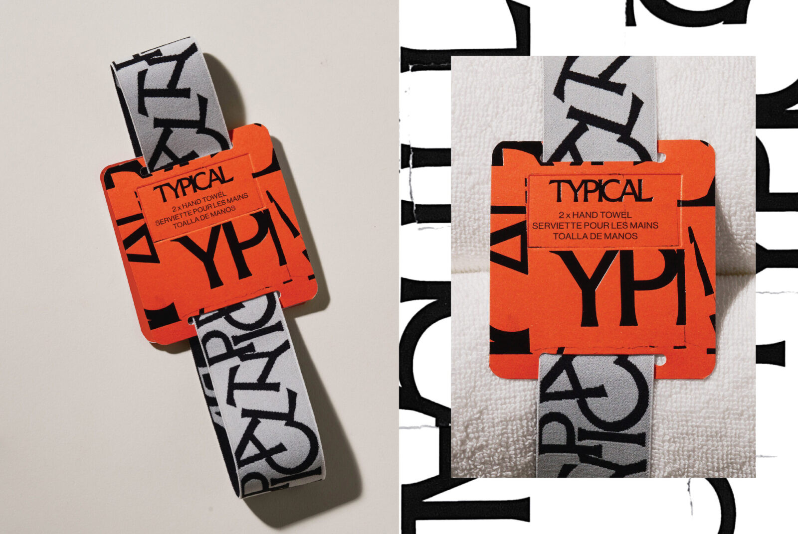
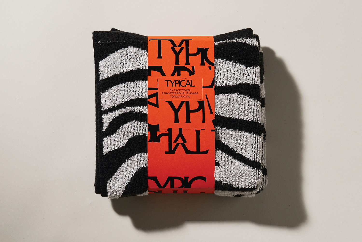
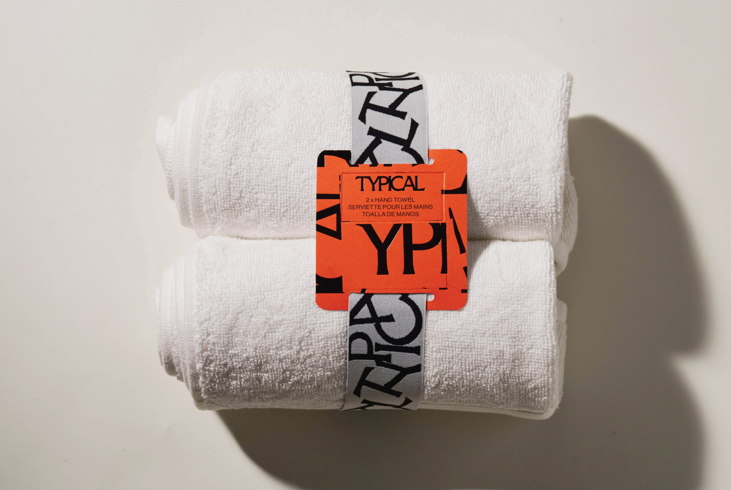
The packaging extends this philosophy through materiality, craft, and restraint. Every element is made from paper, chosen for its honesty and tactility. Embossed details add depth without decoration, while a textured foil of the broken collaged logo introduces a subtle shimmer and an imperfect, hand-made quality. The foil technique draws from an art process created manually, reinforcing the brand’s connection to craft and the beauty found in irregularity. The signature orange adds a vibrant counterpoint to the minimal forms, giving the packaging confidence without noise.
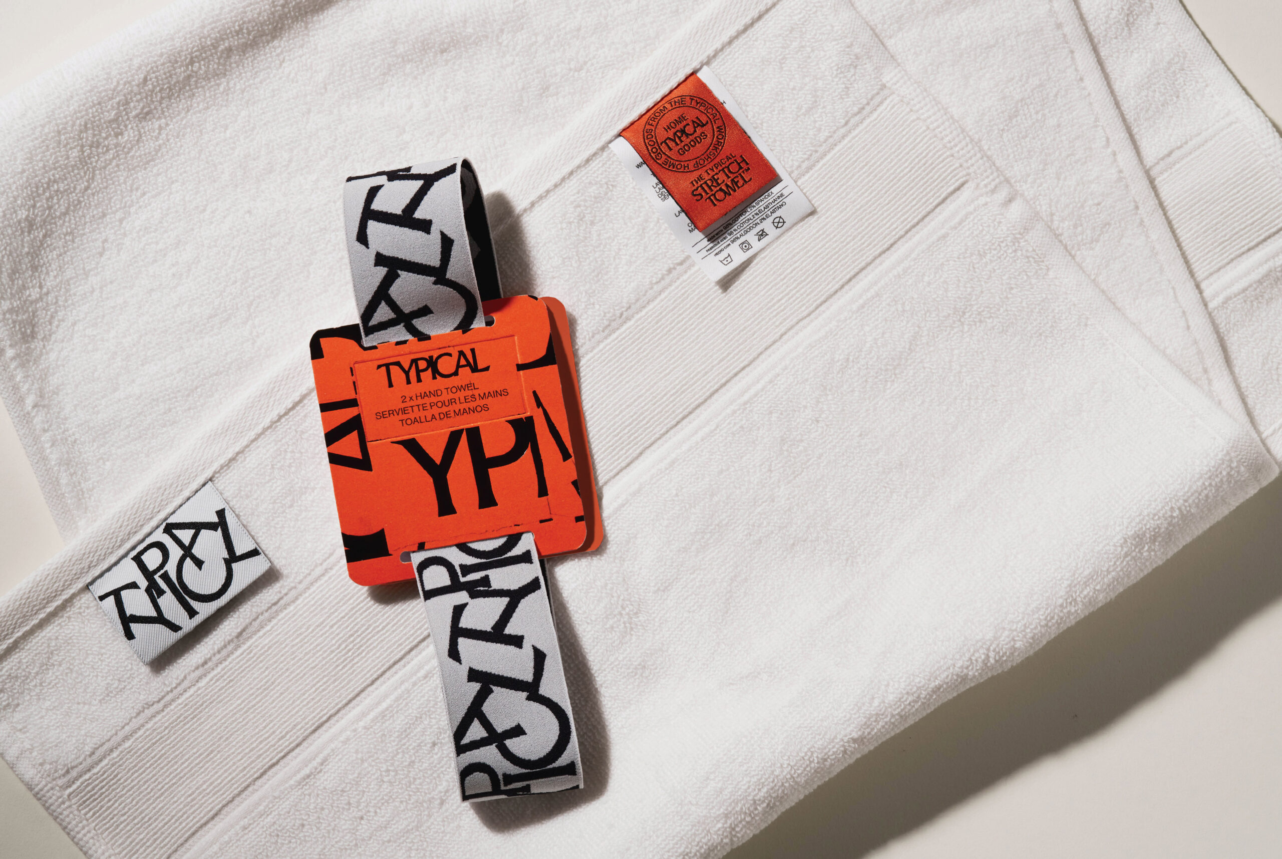
Each product is wrapped in a way that feels thoughtful and intentional. The face towels are secured with a paper band that includes a small hook attachment, designed so the towel can hang naturally in-store or at home. The hand towels are finished with a custom jacquard woven elastic band created specifically for the brand. The mosaic logo appears as a playful detail across this band, adding character without overwhelming the simplicity of the object.
The packaging is minimal but impactful, balancing clarity with a sense of memory and handmade warmth. It reflects the essence of Typical: simple things, reconsidered with care. In every detail, the brand invites a slower look, encouraging people to notice the quiet beauty in everyday objects and to recognise how thoughtful design can gently transform the rhythm of daily life.

CREDIT
- Agency/Creative: Typical , Glasfurd & Walker
- Article Title: Glasfurd & Walker Define a Quietly Distinctive Packaging Identity for Typical
- Organisation/Entity: Agency
- Project Status: Published
- Agency/Creative Country: Canada
- Agency/Creative City: Vancouver
- Market Region: North America
- Project Deliverables: 2D Design, Graphic Design, Packaging Design
- Industry: Retail
- Keywords: WBDS Agency Design Awards 2025/26 , Packaging, Towel, Paper
-
Credits:
Creative Director: Glasfurd & Walker


