


OVERVIEW
Animo is a stationery brand designed to spark joy and creativity in everyday life. It serves individuals who value self-expression, curated aesthetics, and products that support organization, planning, writing, and creative hobbies. The goal of designing the Animo e-commerce website was to translate the charm and delight of its physical products into a digital experience that feels playful, intuitive, and user-centered.
RESEARCH
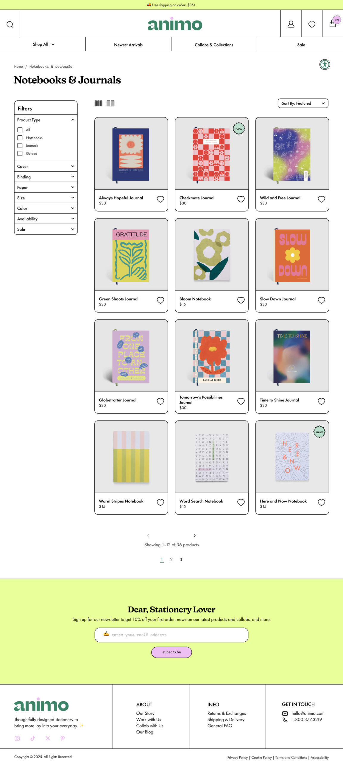
Competitive analysis of stationery e-commerce platforms revealed common pain points: overwhelming filters, unconventional layouts that compromise navigation, limited accessibility features, and a lack of brand personality. These insights highlighted an opportunity for Animo to combine playful character with seamless navigation and thoughtful design, creating a more engaging and frictionless shopping experience.
VISUAL IDENITY
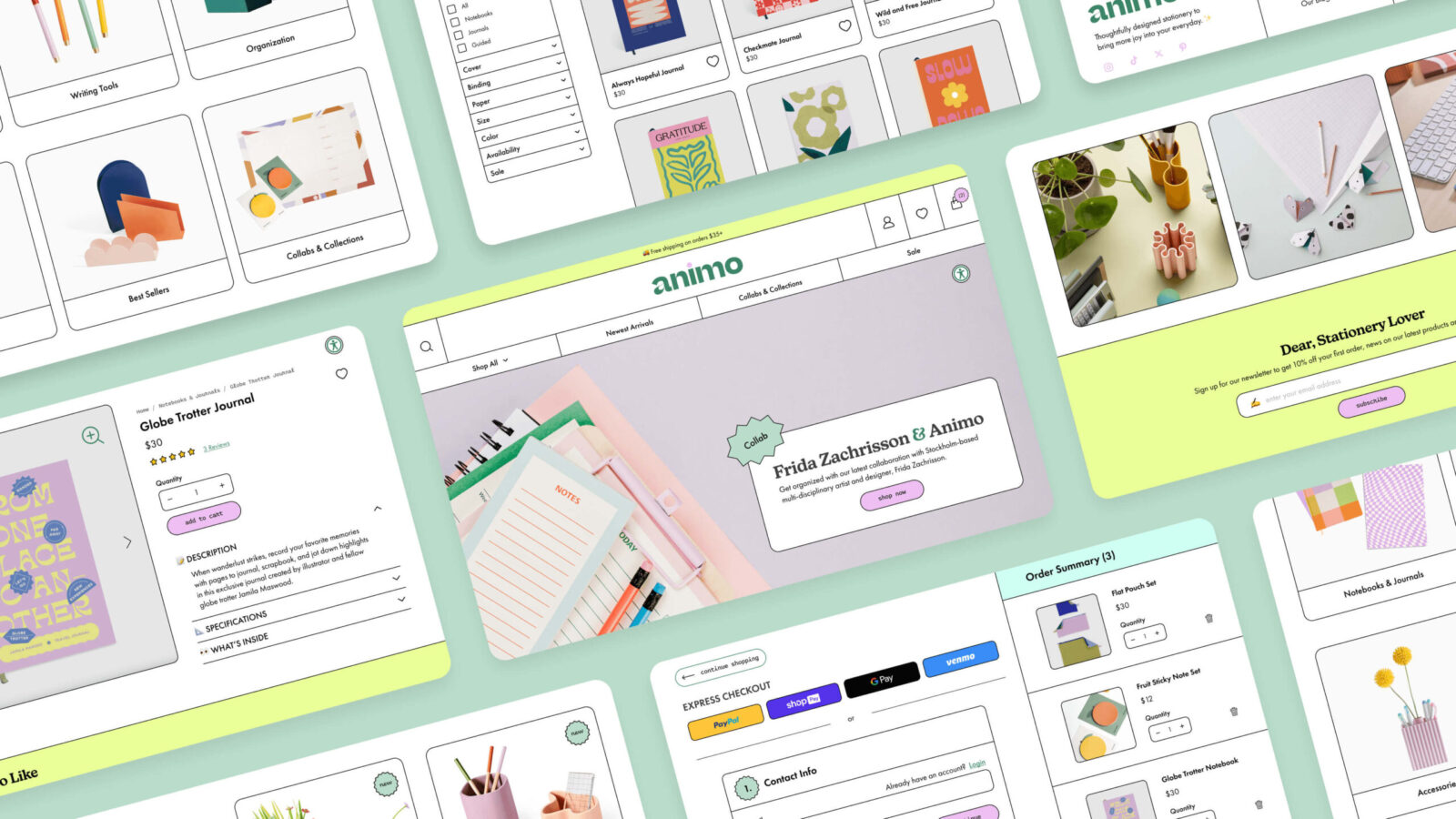
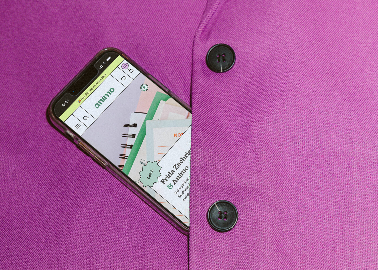
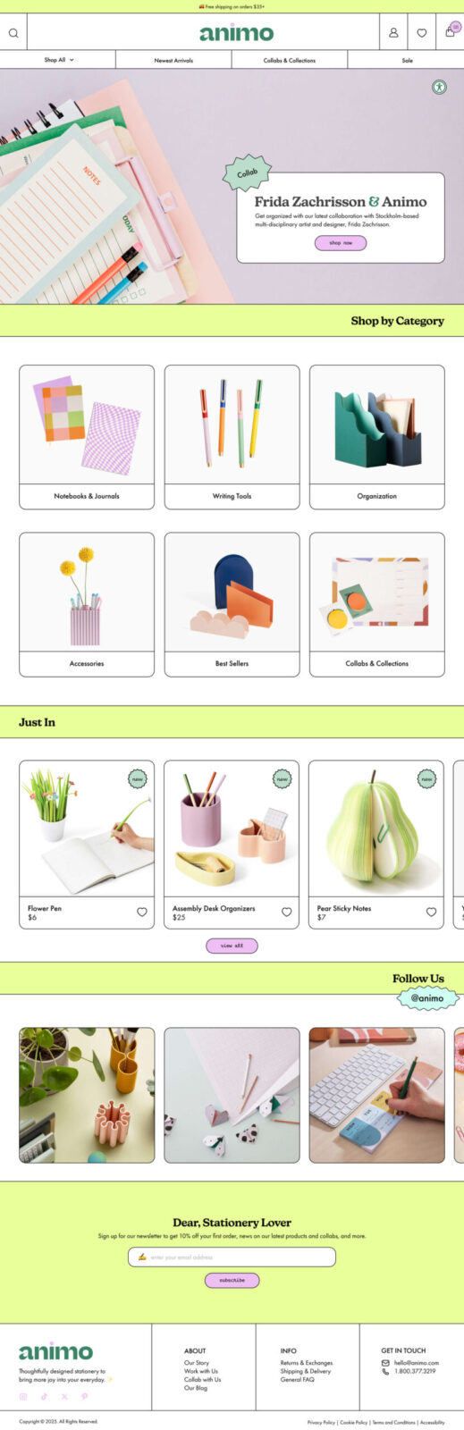
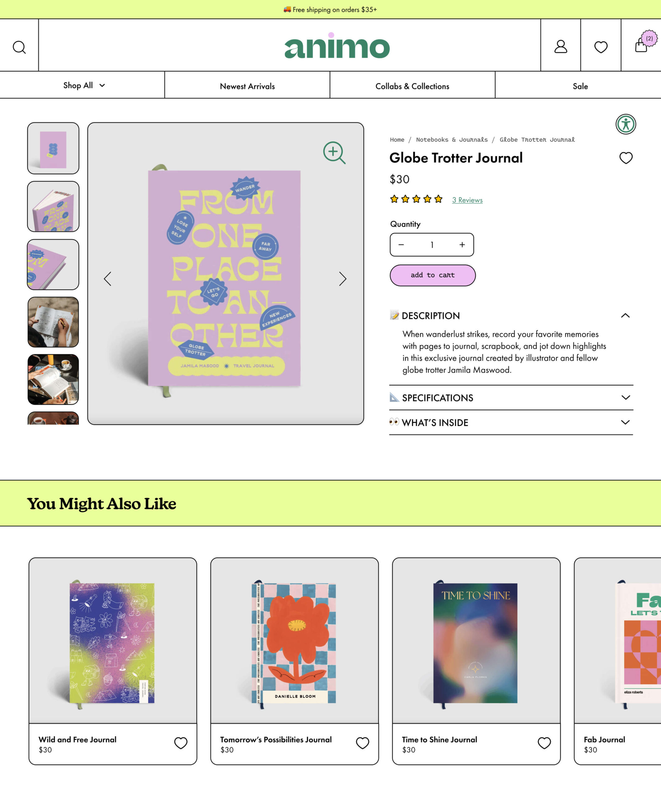
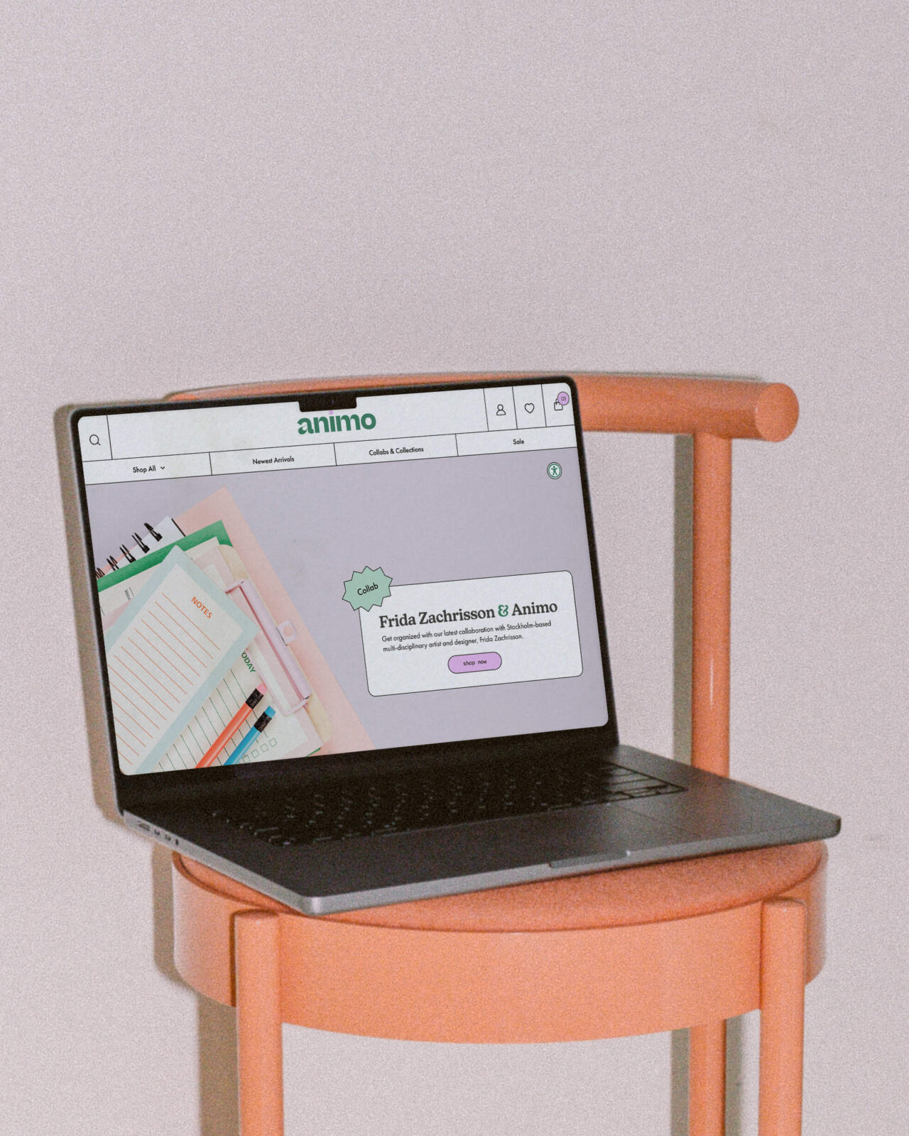
The visual language draws from neubrutalism, establishing a bold, distinctive personality while maintaining clarity. Color choices reinforce the brand’s playful tone. Soft pastels such as mint green, fuchsia, and cyan feel fresh and lively, while energetic chartreuse and grounding viridian add contrast and create a balanced, expressive palette. Color is applied strategically to interactive elements, hover states, microinteractions, and key sections, guiding users through the shopping journey.
Typography plays a central role in shaping the visual identity. New Kansas, a friendly and approachable serif, brings warmth and readability to headings. Futura PT feels classic yet modern, providing clean legibility for product information. Monoitalic and Eldwin Script add stylistic flair, inspired by handwriting and subtly grounding the digital experience in the analog world of stationery. Together, these typefaces create a visual hierarchy that balances classic, modern, and playful energy. Emojis are also used as playful icons on product detail pages, reinforcing the brand’s personality.
FEATURES
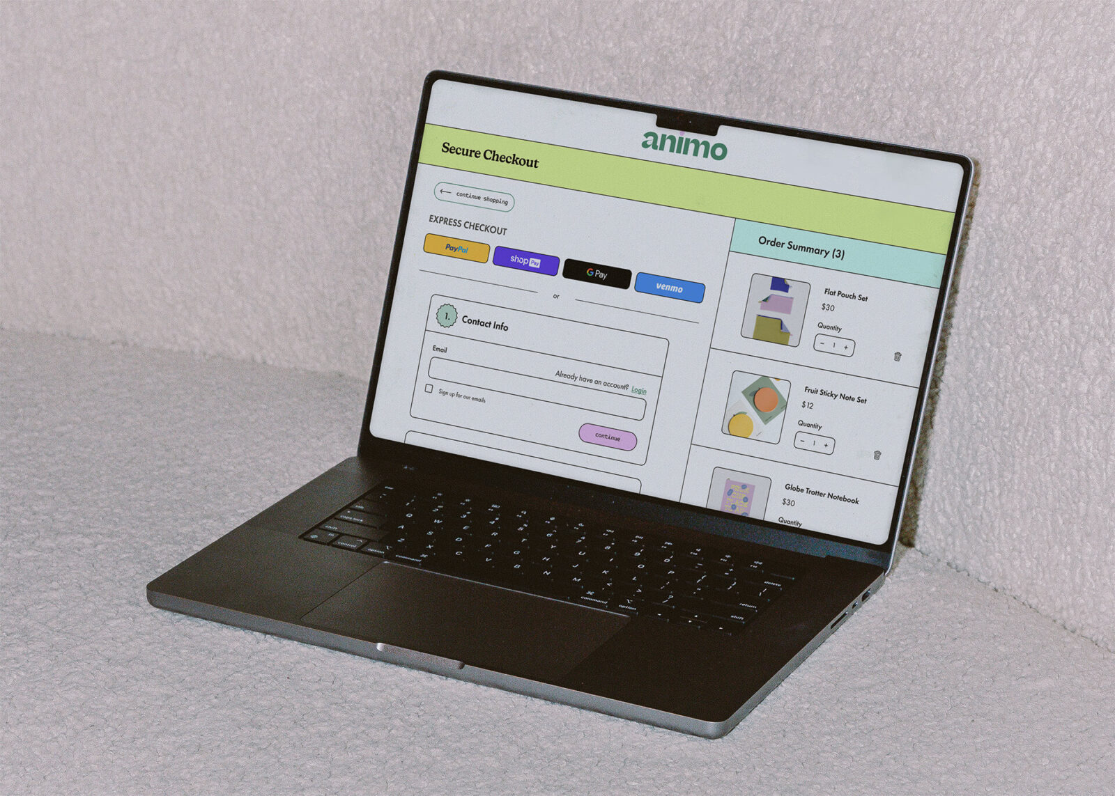
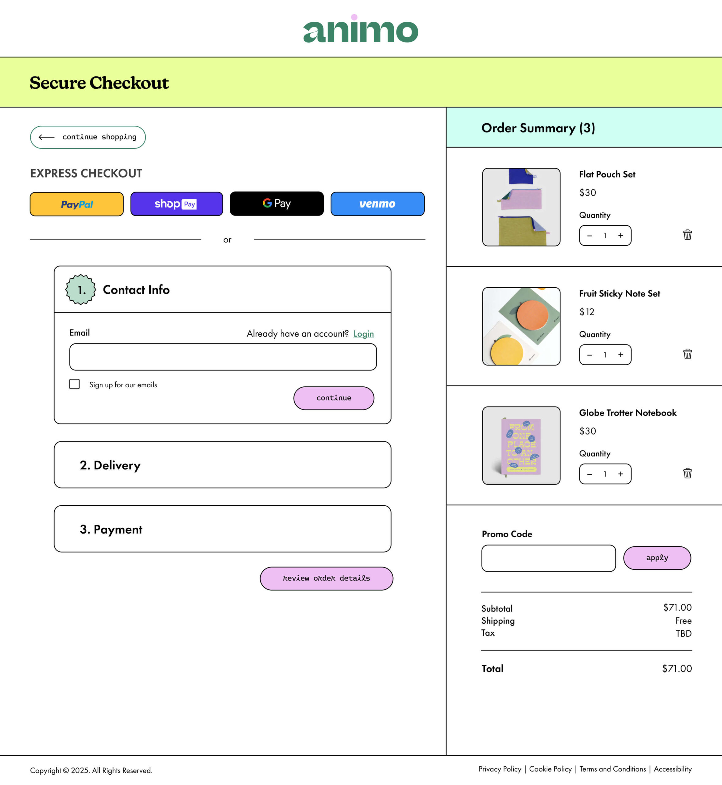
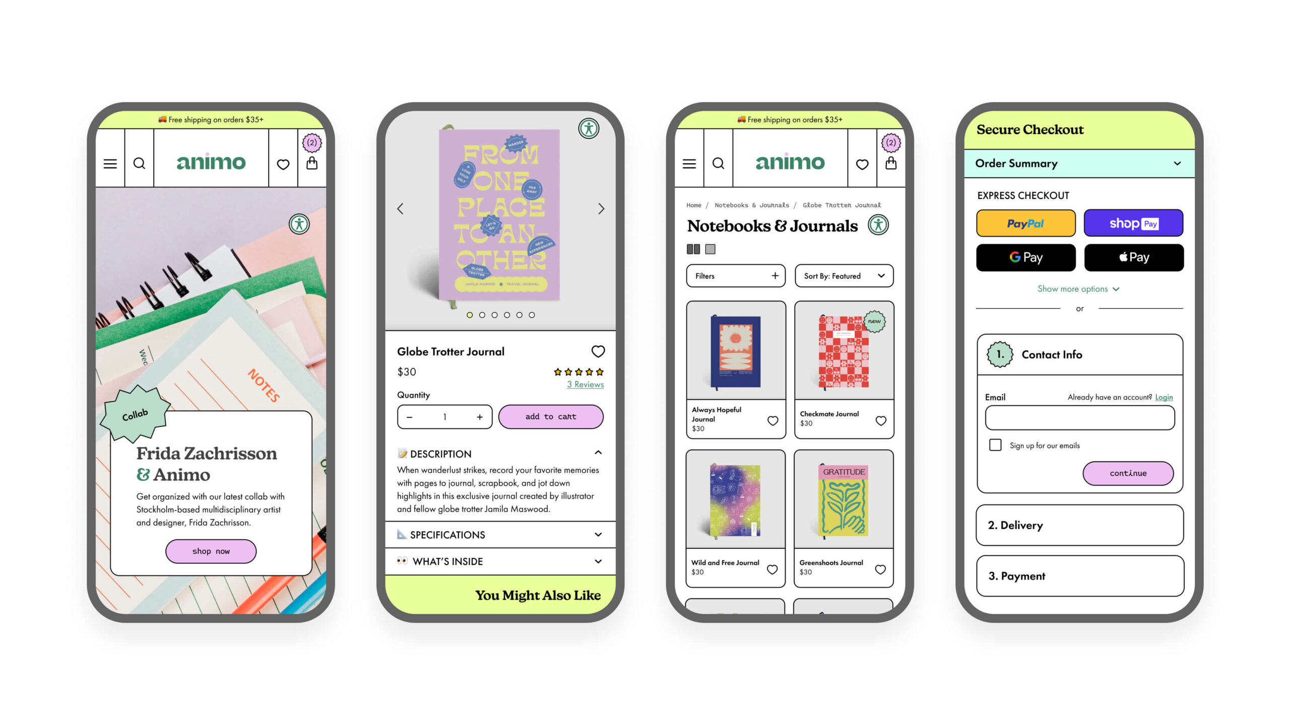
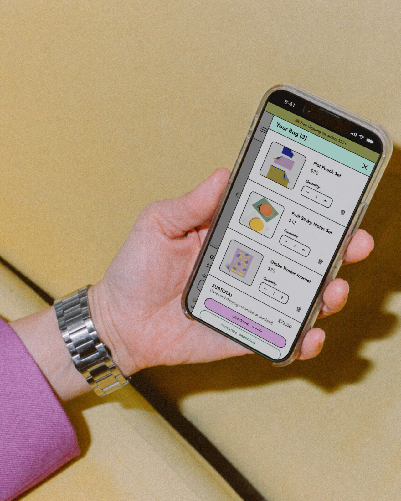
Features that enhance the shopping experience include hover-based microinteractions for browsing product images and quickly adding items to the cart. Category pages offer view toggle icons to control how many products are displayed, complemented by search and filter tools tailored to each category. Accessibility is prioritized with a visible icon allowing users to adjust the interface for a comfortable browsing experience. Express checkout options streamline the purchase flow, minimizing friction and reducing cart abandonment.
Ultimately, Animo reimagines e-commerce stationery shopping into a visually engaging, intuitive experience that encourages users to explore, shop, and create.
CREDIT
- Agency/Creative: Gizelle Farinas
- Article Title: Gizelle Farinas Designs Animo as a Playful and Intuitive Stationery E-Commerce Experience
- Organisation/Entity: Student
- Project Status: Non Published
- Agency/Creative Country: United States of America
- Agency/Creative City: San Diego
- Project Deliverables: Brand Identity, Brand Naming, Design, Interaction Design, User Experience, Web Design
- Industry: Retail
- Keywords: WBDS Student Design Awards 2025/26 , e-commerce, ui/ux design, ux/ui design, ui design, ux design, brand identity, website design, stationery, lifestyle


