


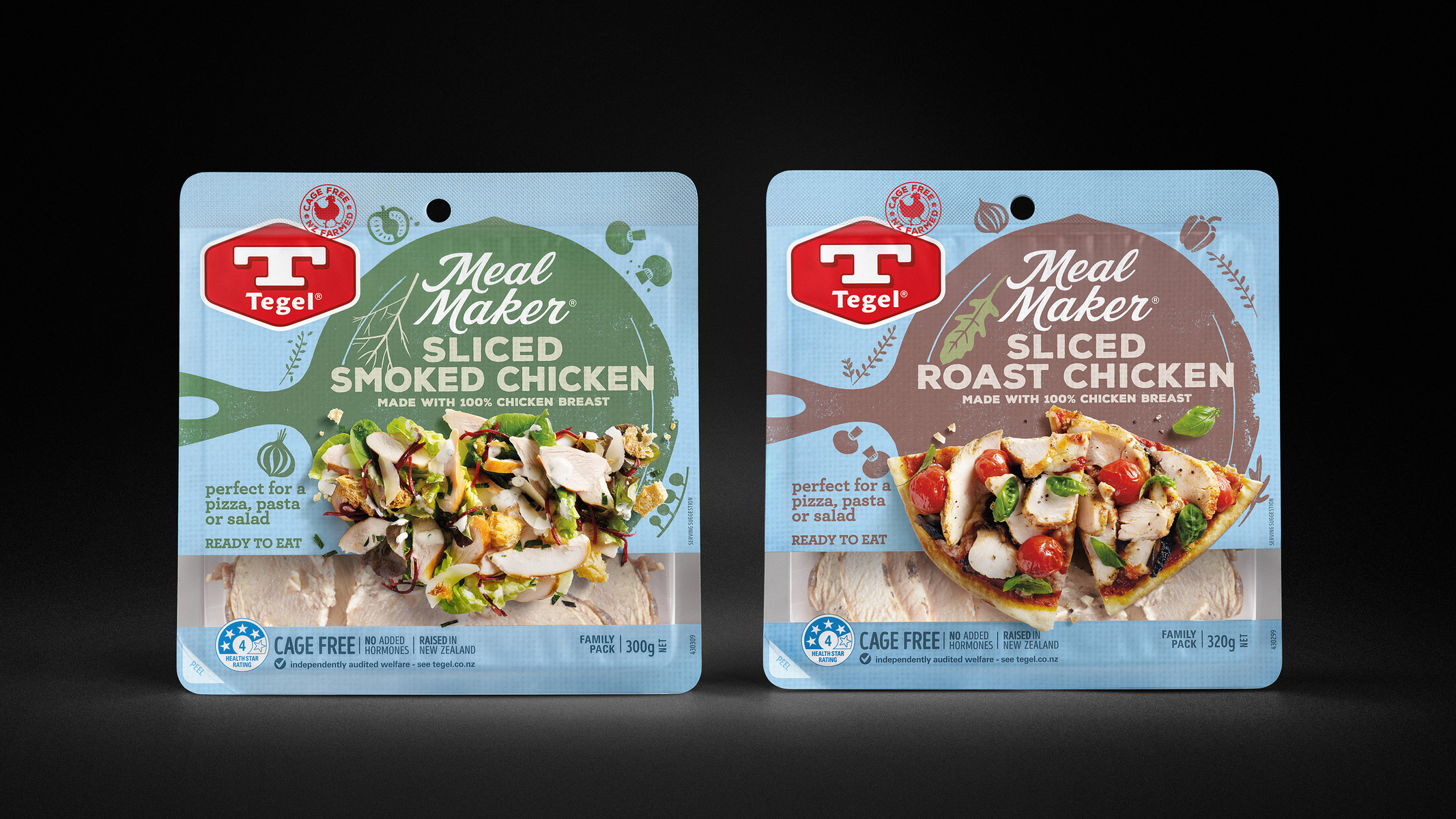
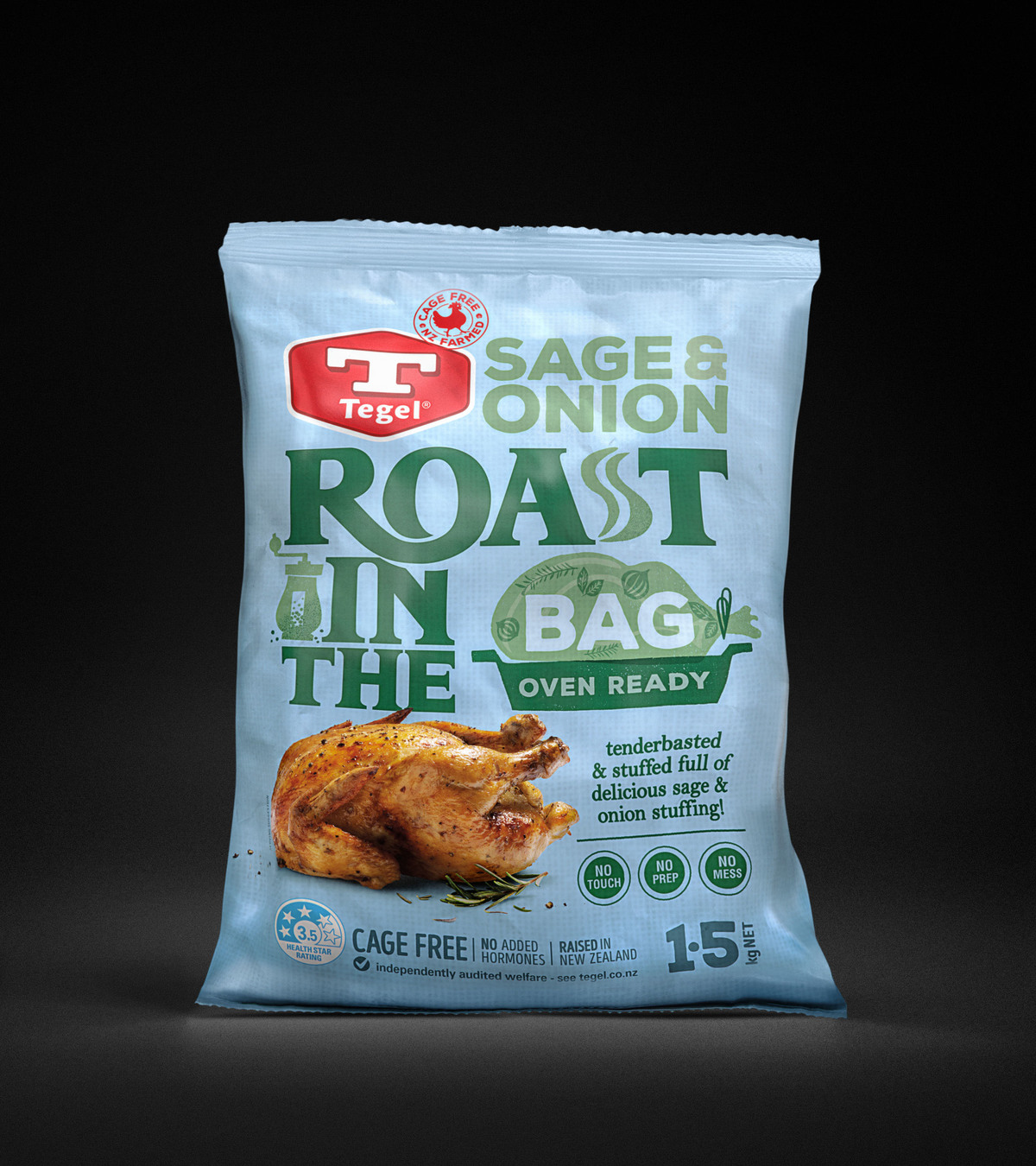
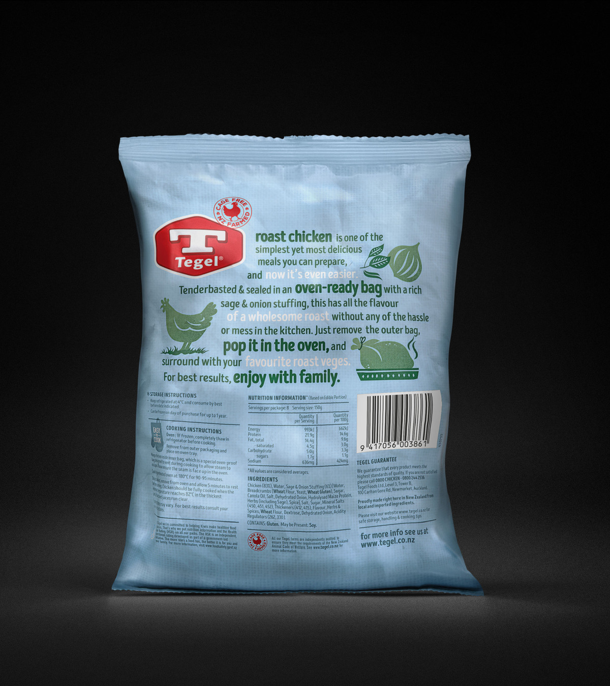
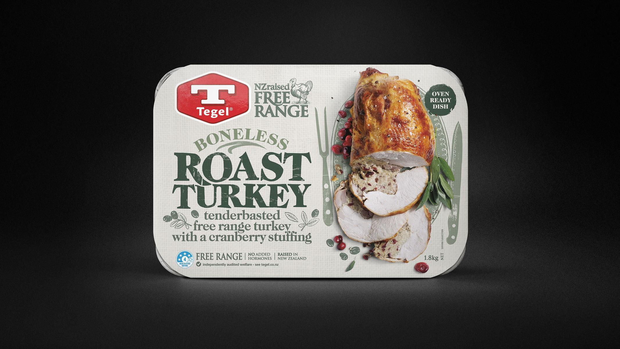
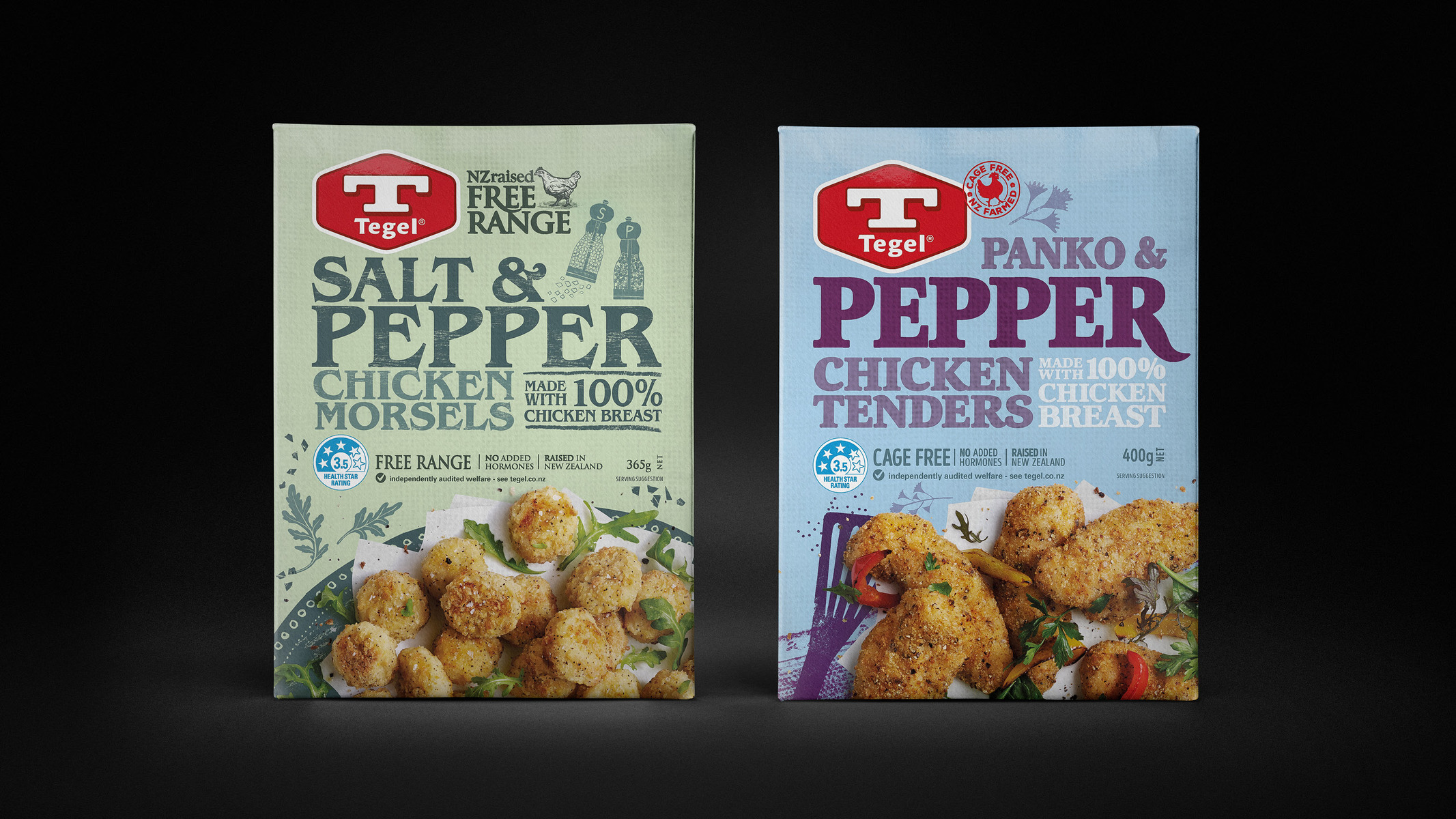
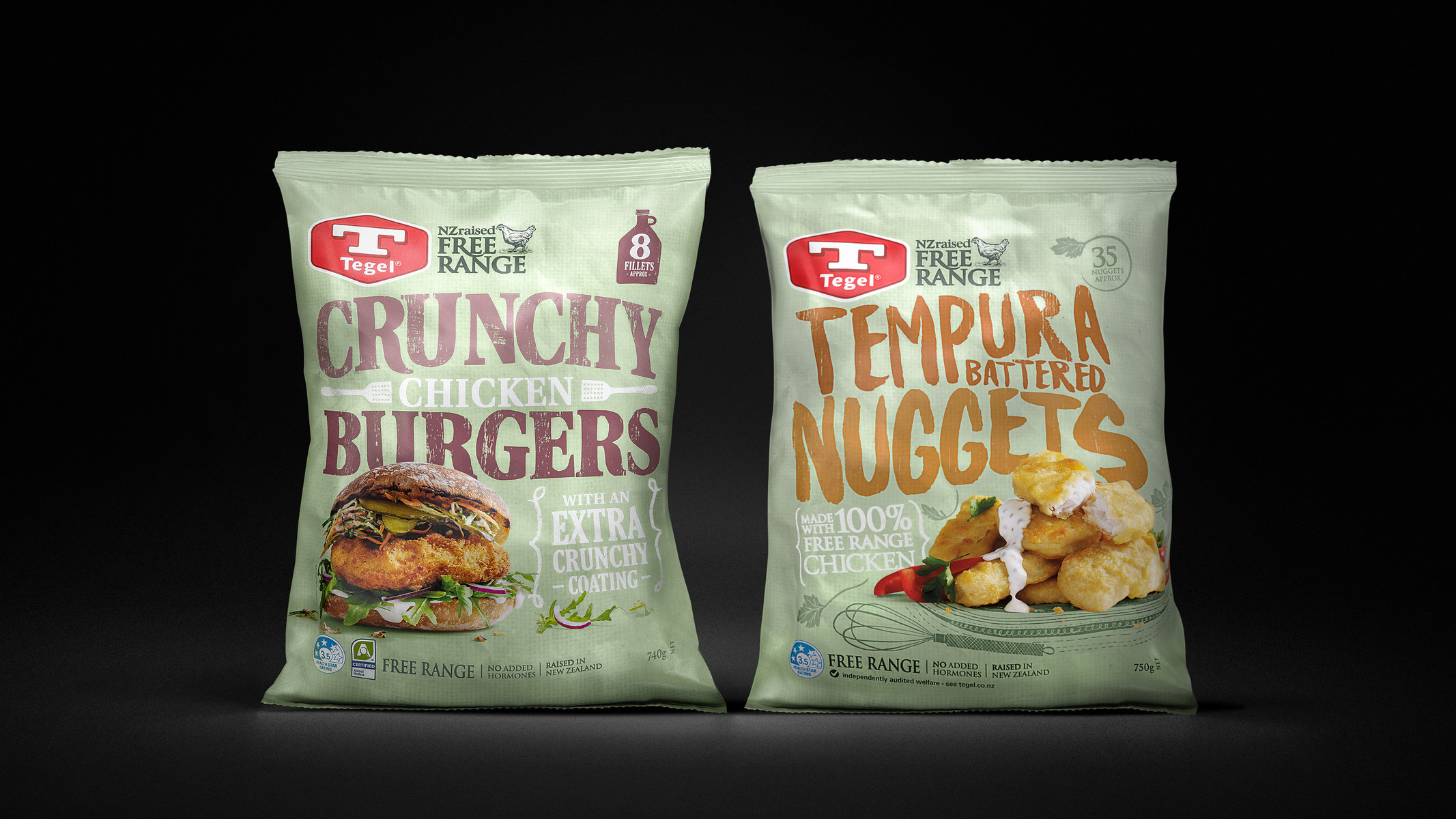
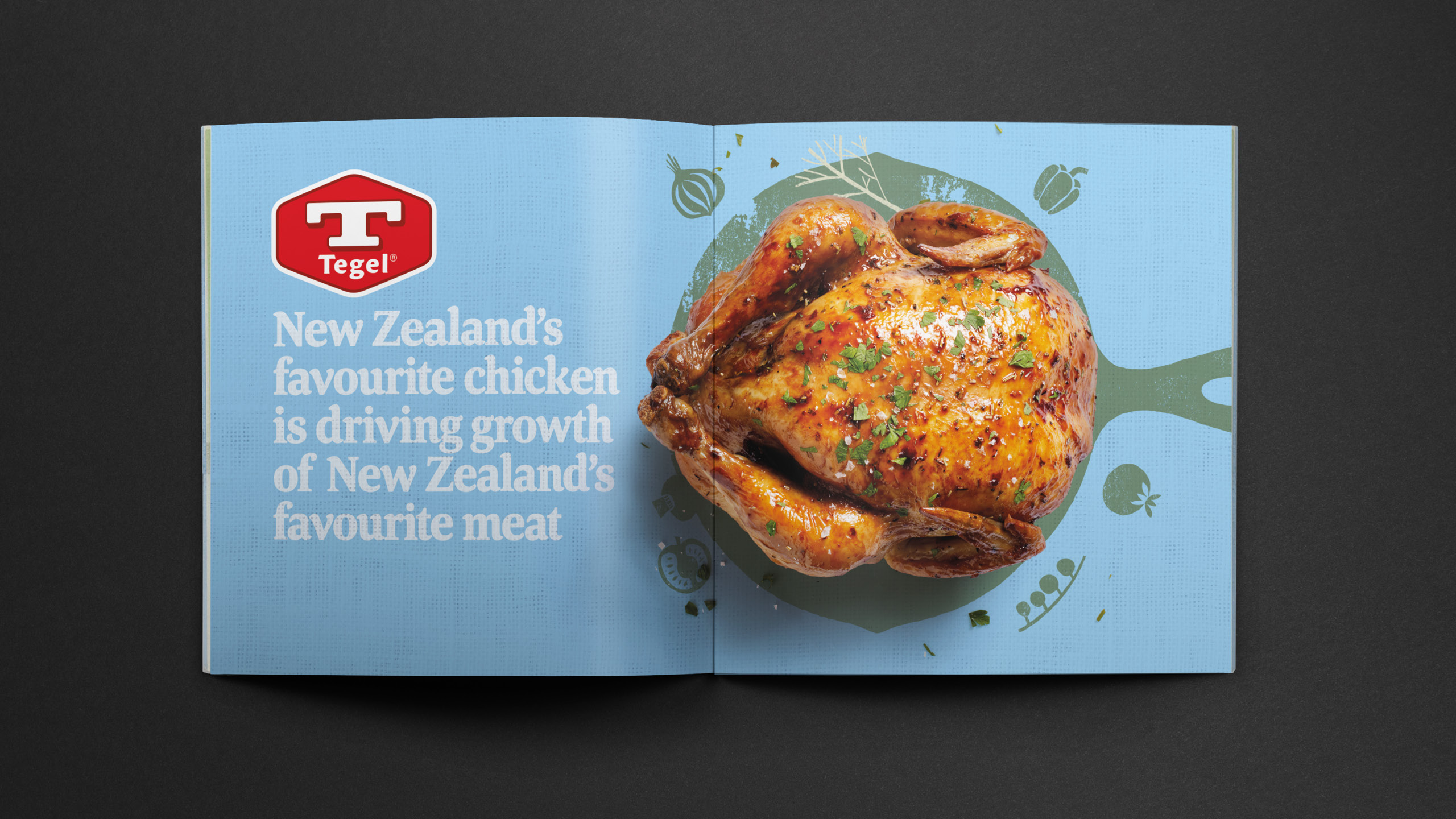
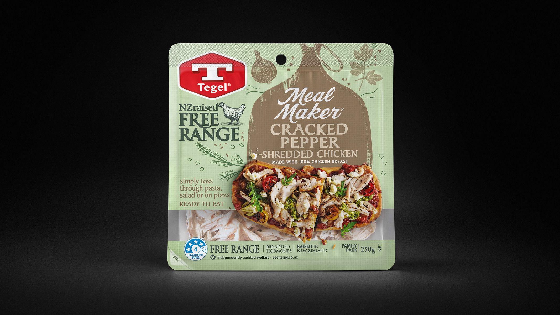
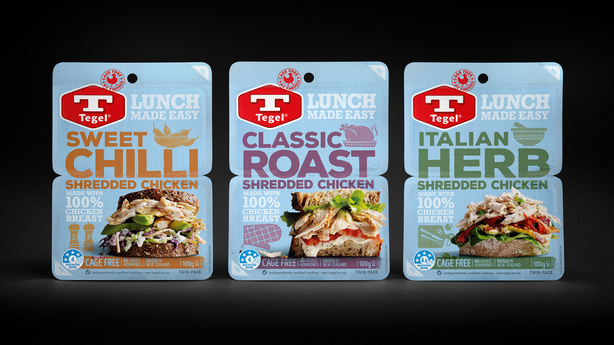
Once renowned for its bright blue colour and big red T, Tegel had become a brand of many different looks across both packaging and the brand mark itself. Our job was to strengthen the logo and redefine the Tegel blue – an intrinsic characteristic that we couldn’t shy away from.
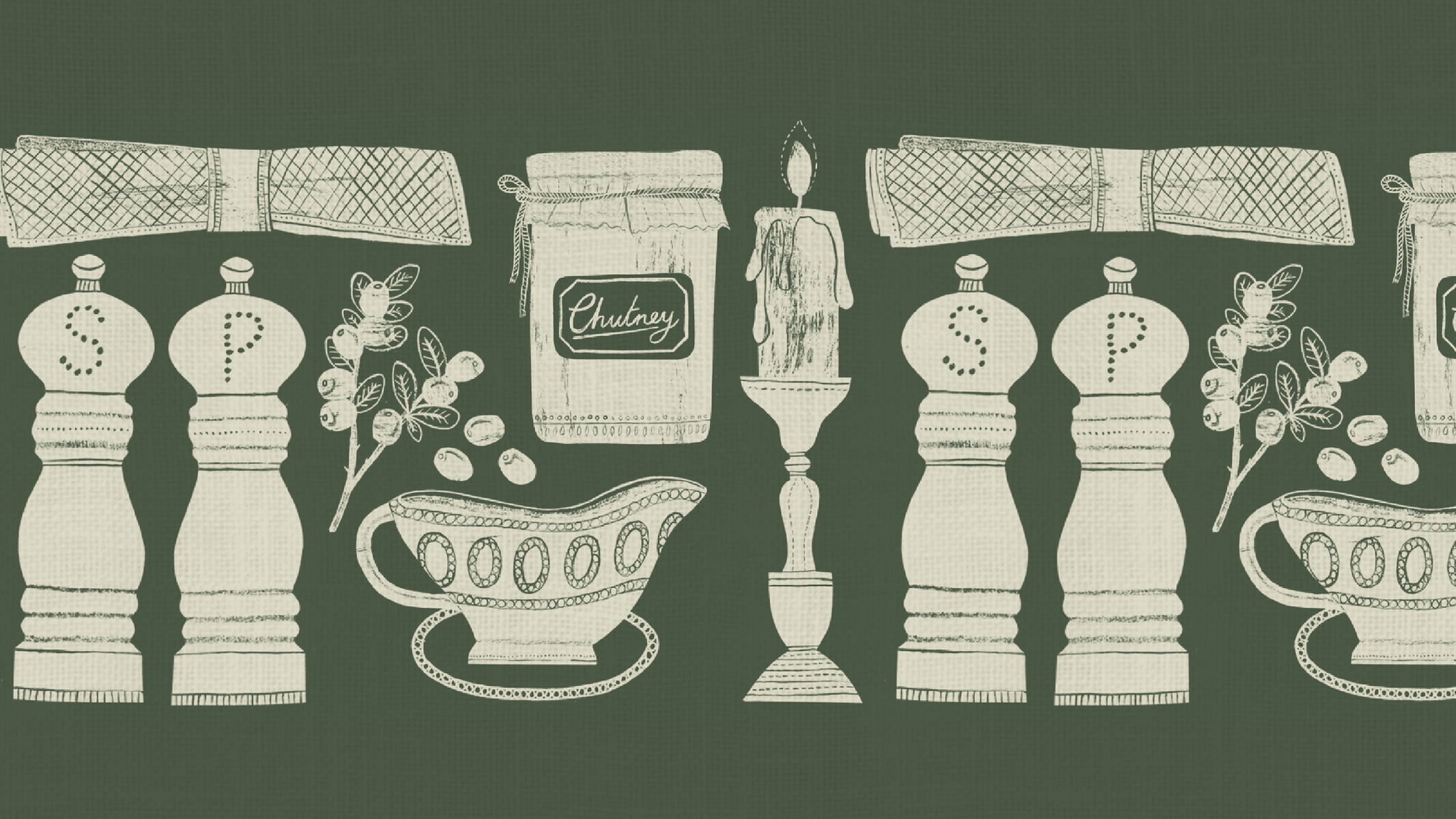
We re-ignited Tegel’s brand by giving it a heart and soul, through a dynamic family look that could stretch across 240+ SKUs nationally as well as an extensive export portfolio. The design needed enough flexibility that it could target different need states across every category.


CREDIT
- Agency/Creative: Tried&True Design
- Article Title: Giving It Heart and Soul
- Organisation/Entity: Agency, Published Commercial Design
- Project Type: Packaging
- Agency/Creative Country: New Zealand
- Market Region: Oceania
- Project Deliverables: Brand Architecture, Brand Creation, Brand Guidelines, Brand Identity, Brand Redesign, Brand Refinement, Branding, Graphic Design, Identity System, Illustration, Packaging Design, Photography, Product Architecture, Product Naming, Rebranding, Tone of Voice
- Format: Bag, Blister-Pack, Box, Case, Flow-Pack, Pouch, Sleeve, Tray, Wrap
- Substrate: Plastic, Pulp Board, Pulp Carton, Pulp Paper
FEEDBACK
Relevance: Solution/idea in relation to brand, product or service
Implementation: Attention, detailing and finishing of final solution
Presentation: Text, visualisation and quality of the presentation


