


Challenge
Cebu Pacific Air started operations in 1996 as one of the pioneers of Asia’s low cost carrier (LCC) category, ready to disrupt the industry and open opportunities for Filipinos to take to the skies. By 2014 Cebu Pacific had carried over 100 million passengers, introduced long-haul routes and significantly grown its fleet and regional footprint. Despite the boomtime for LCCs, the competitive and operational challenges were significant, with over 20 LCCs vying for routes and market share and the national flag carriers remodelling to compete on price.
Cebu Pacific’s ambitious long-term vision demanded international growth to support the Philippine diaspora and increasingly to convince global travellers that the airline was a credible alternative to the major carriers.
Solution
As the lines between LCCs and flag-carriers became increasingly blurred, our task was to refresh the Cebu Pacific brand. We needed to reflect its growing international reach and stature while remaining true to the Philippine heart and soul that had helped it connect so powerfully with its domestic audience.
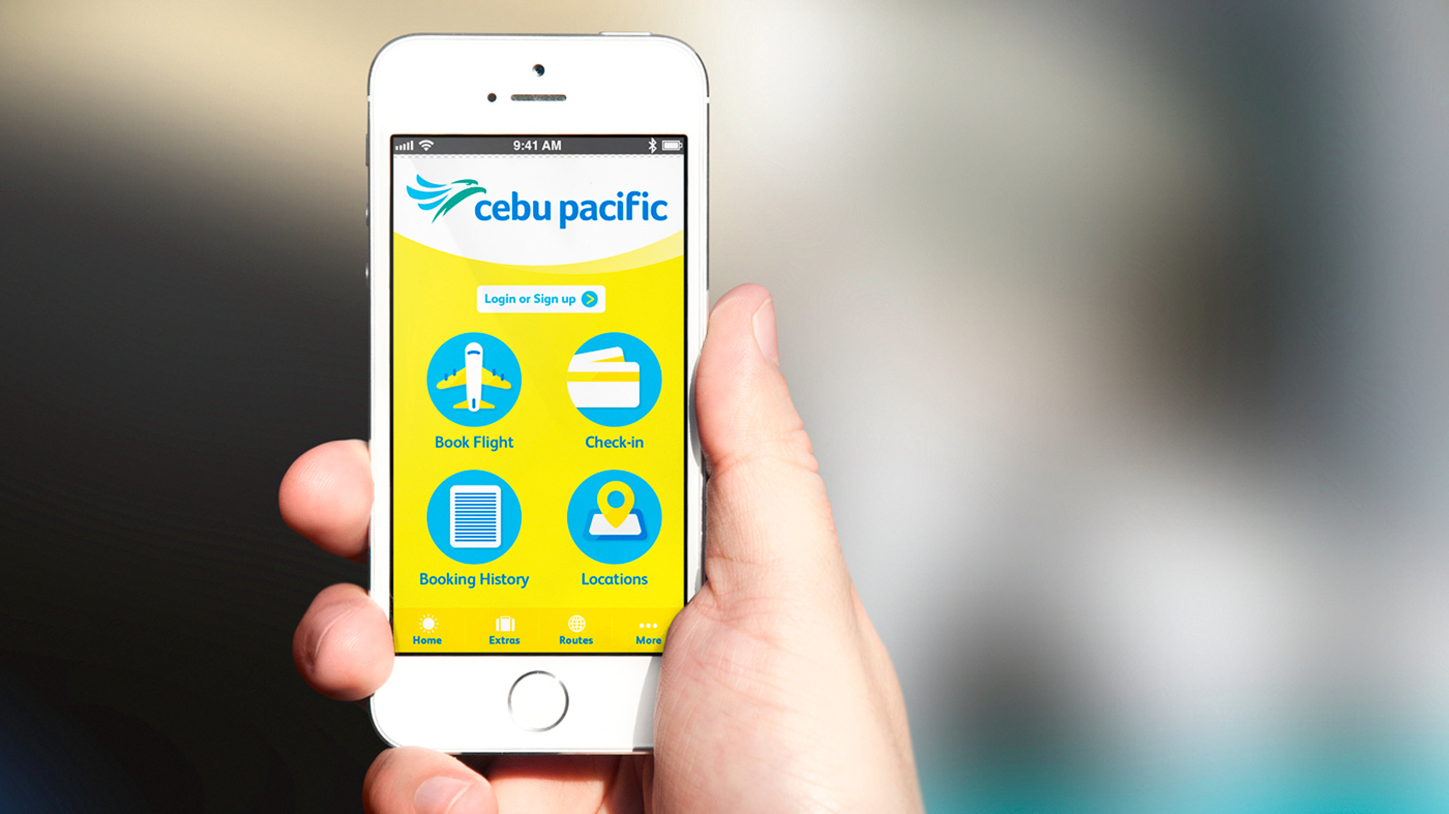
The revitalized brand would need to work seamlessly across every point along the customer journey, extending into the digital channels and also providing a platform for renewed internal engagement and culture development.
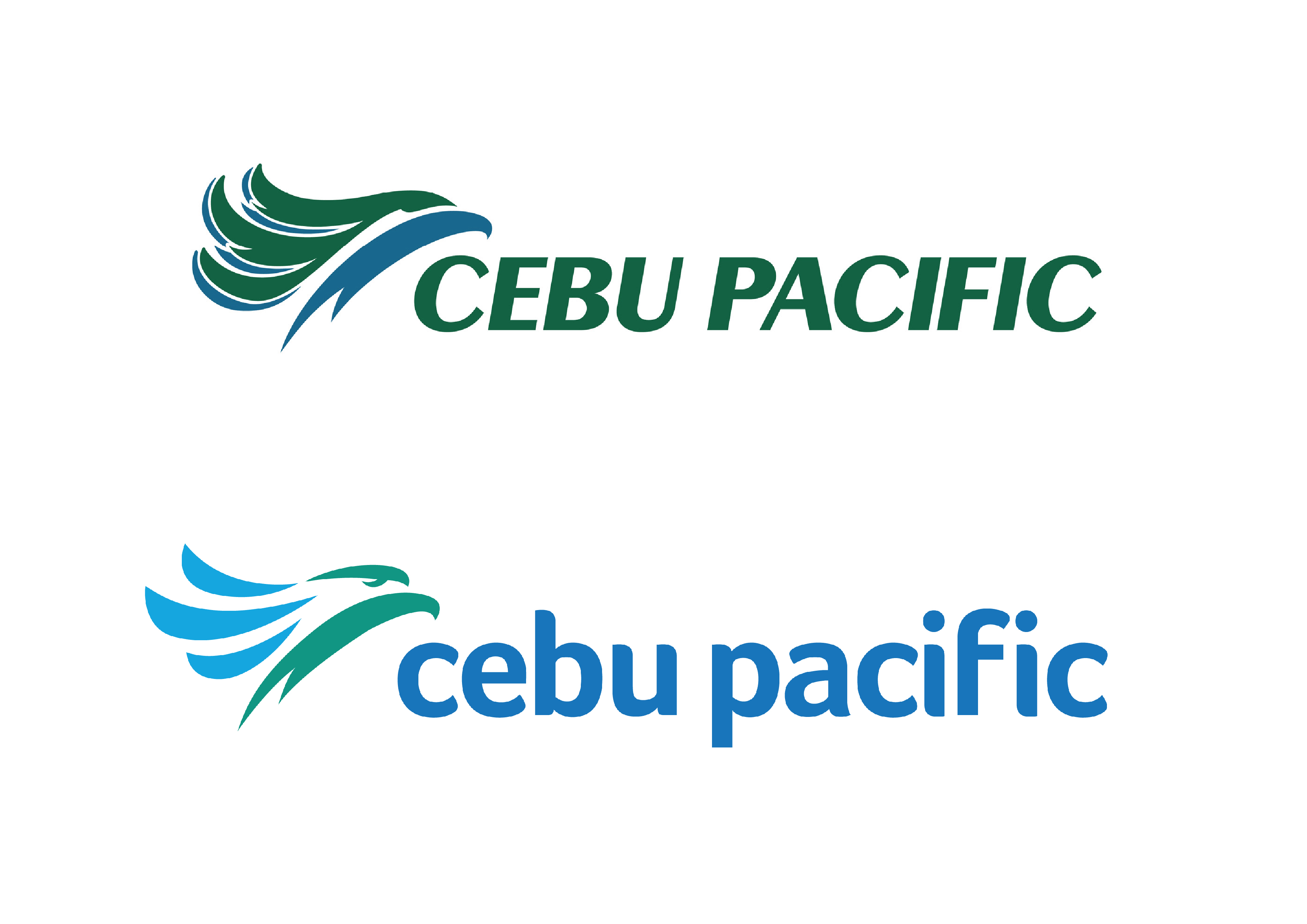
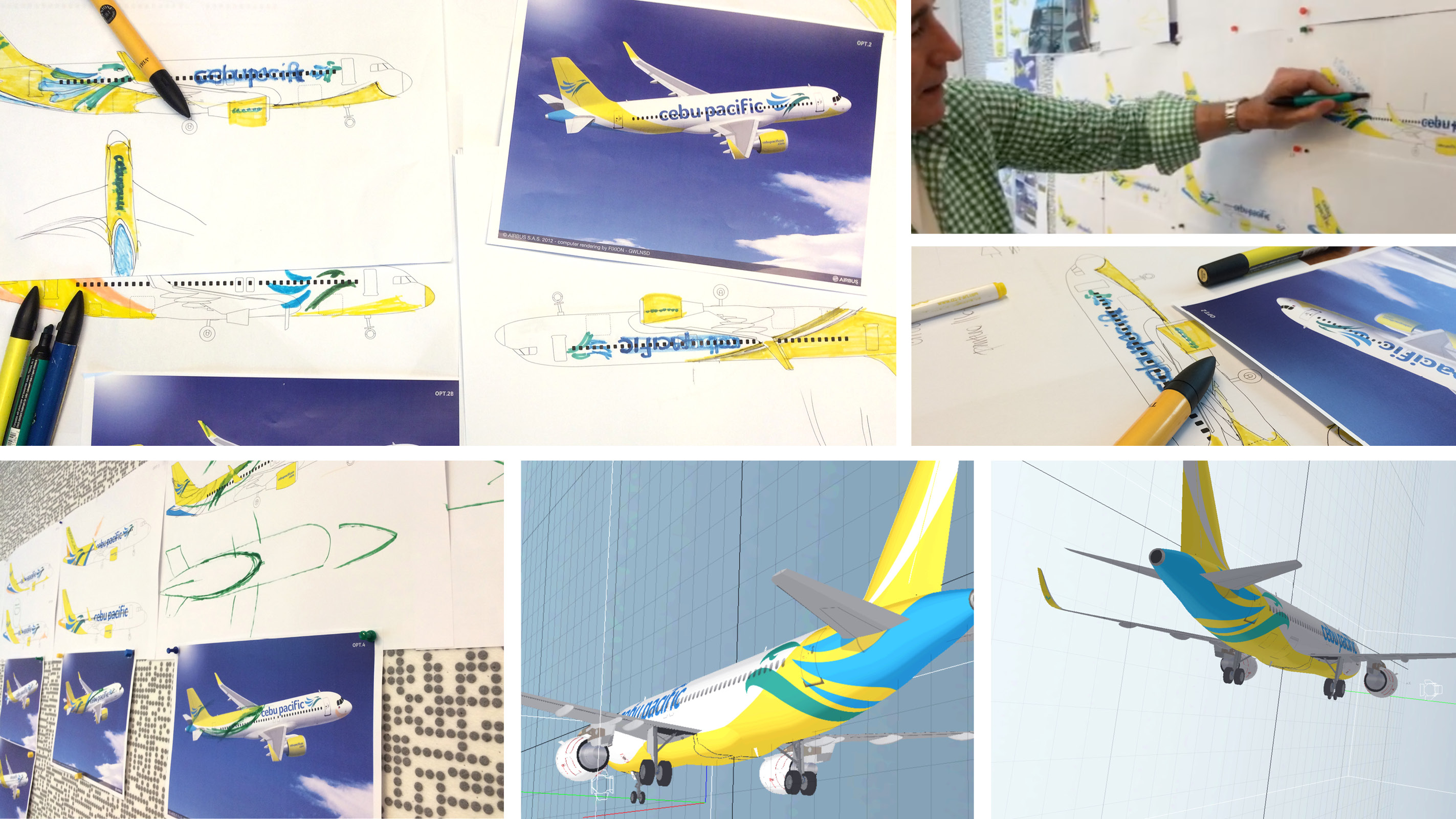
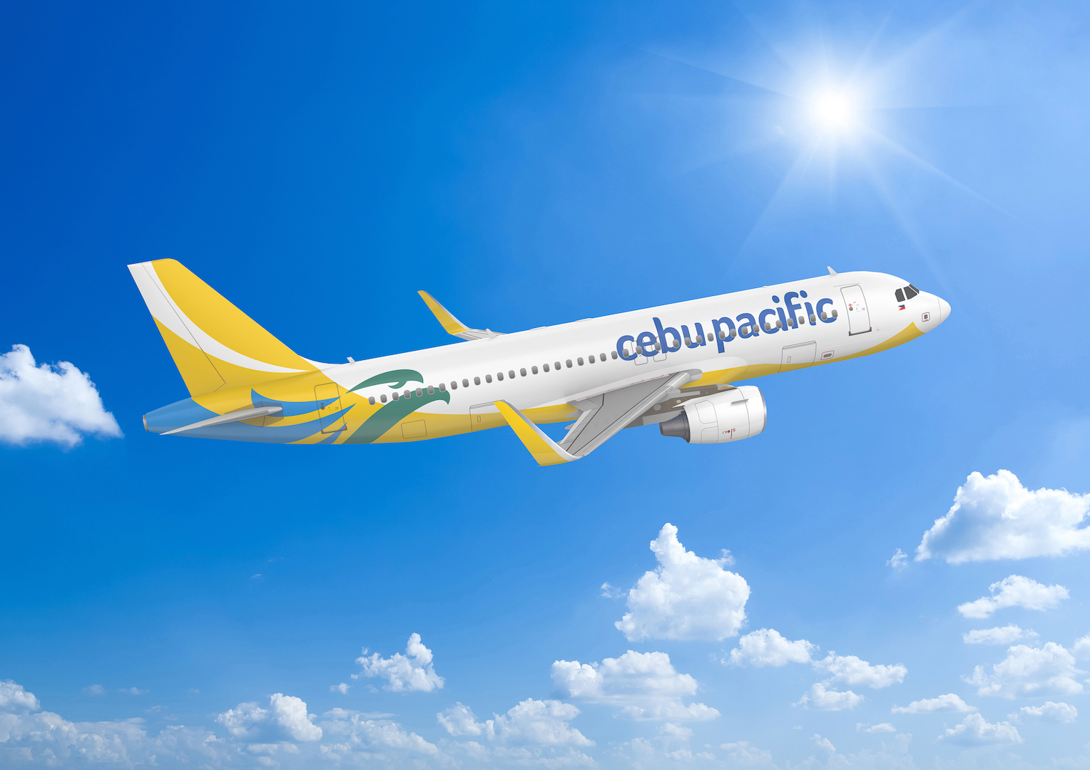
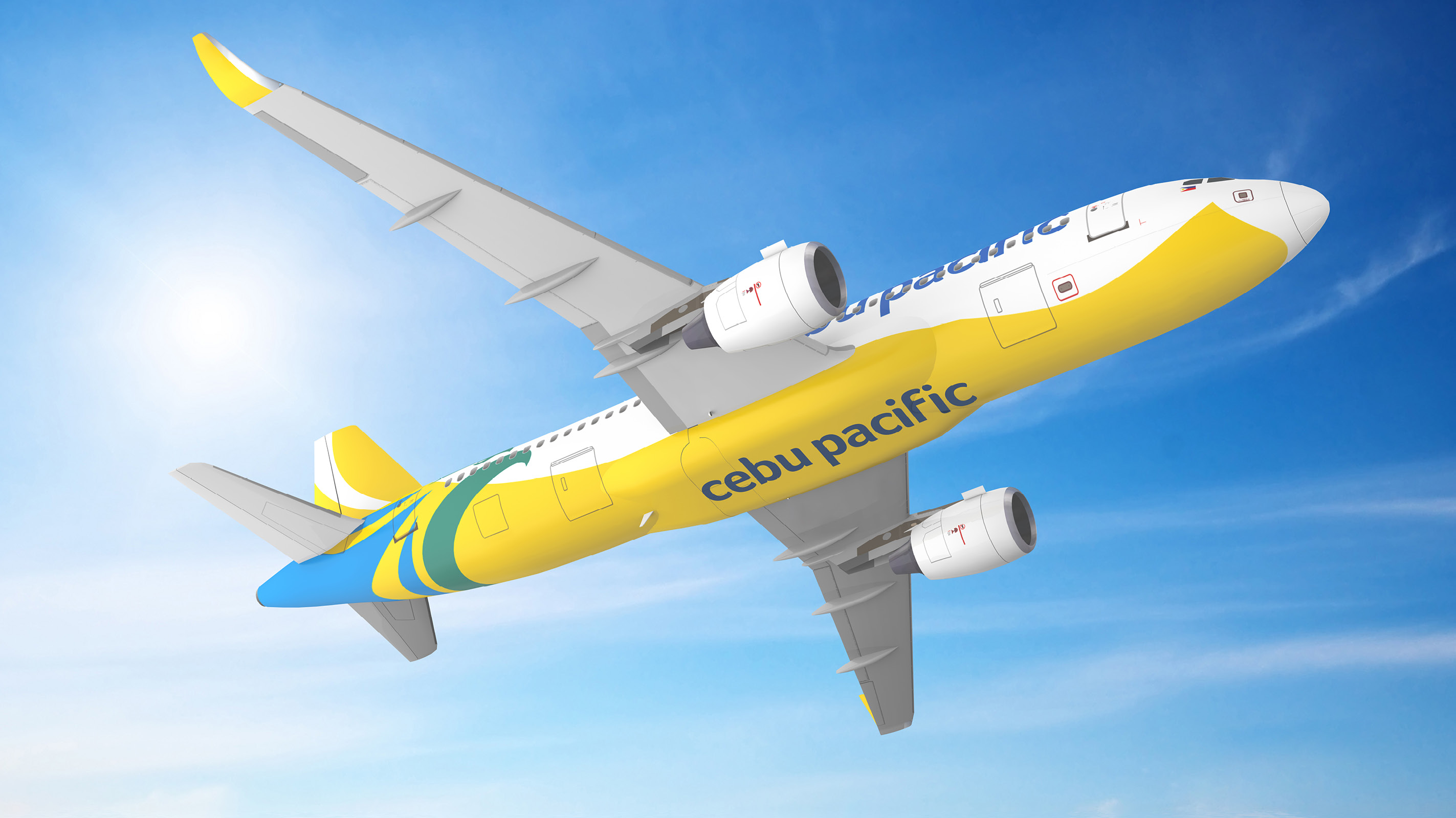
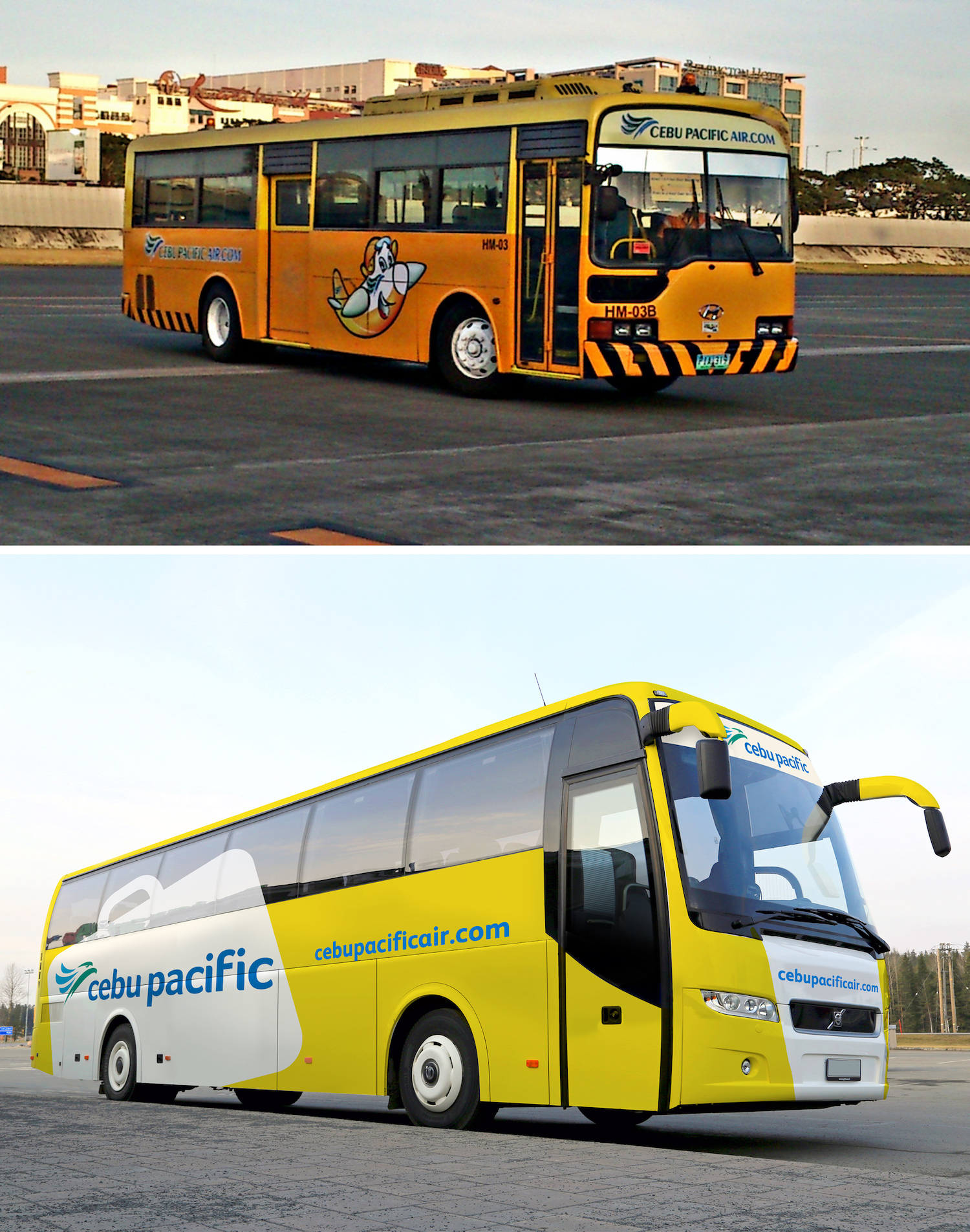
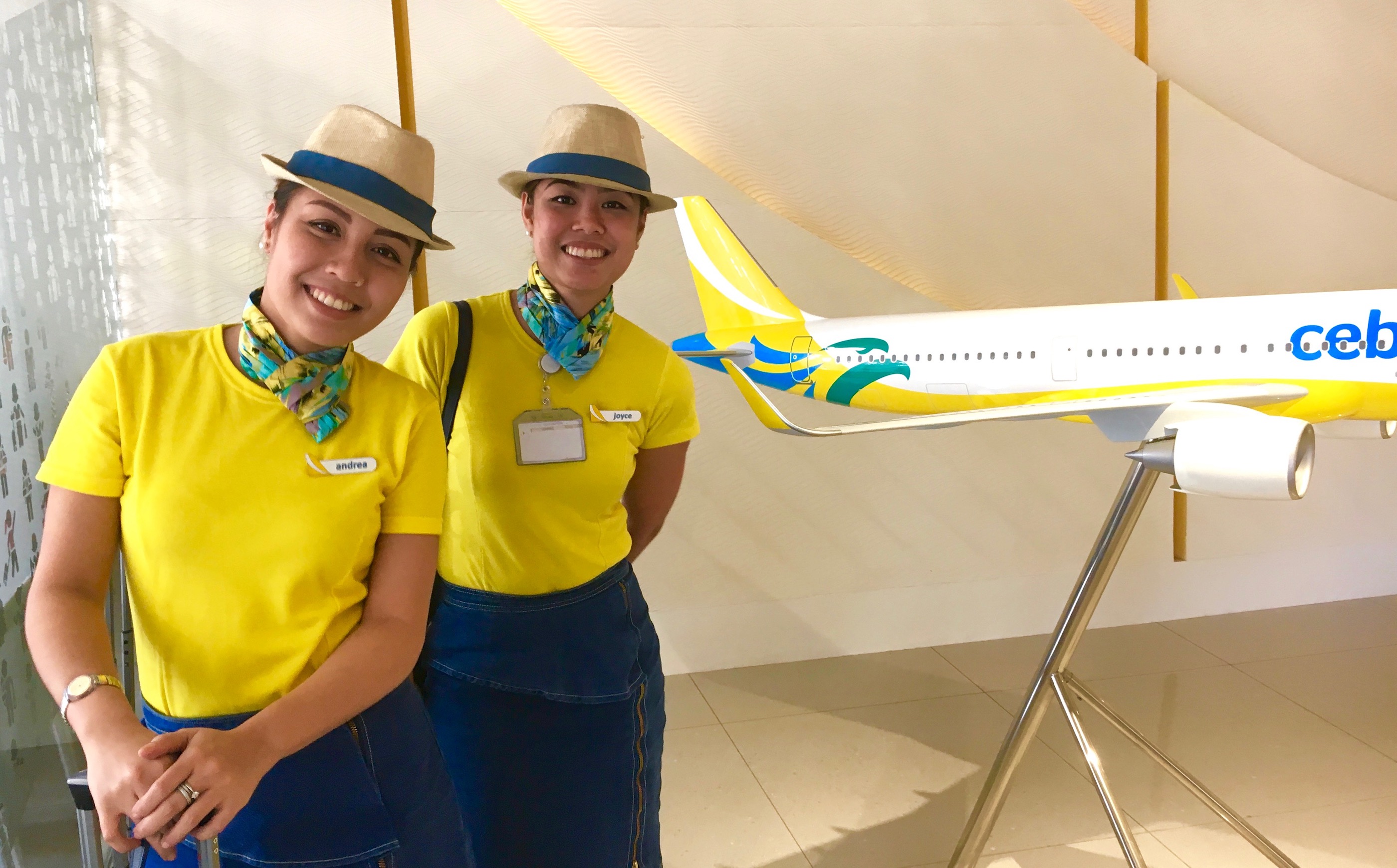
The beautiful natural landscape of the country and the symbol of the Philippine eagle were key points of inspiration. The landscape was reflected in a reinvigorated colour palette and the eagle found a more contemporary, dynamic expression in the redesigned aircraft livery.
Every detail of the airline’s expression was refreshed, from uniforms to inflight magazines, support vehicles to airport signage and air tickets to apps.
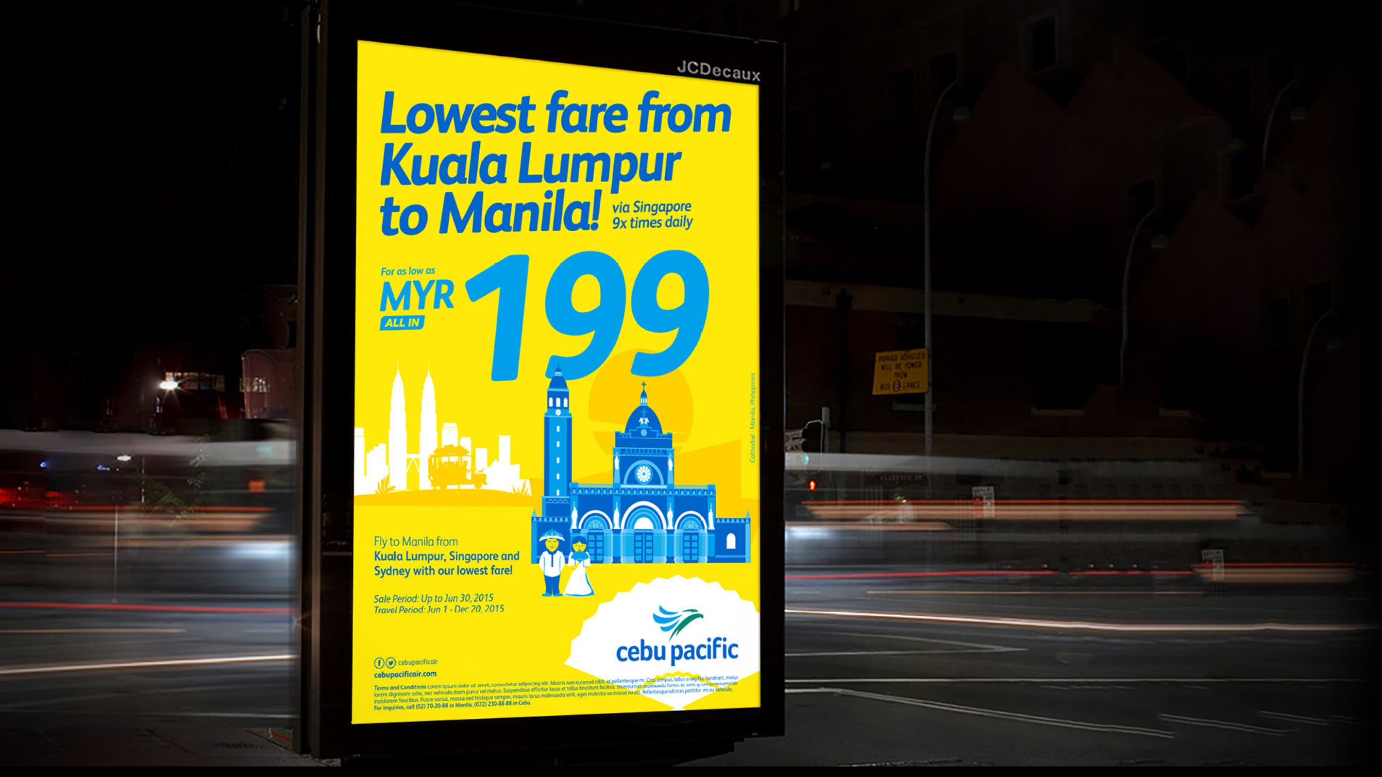
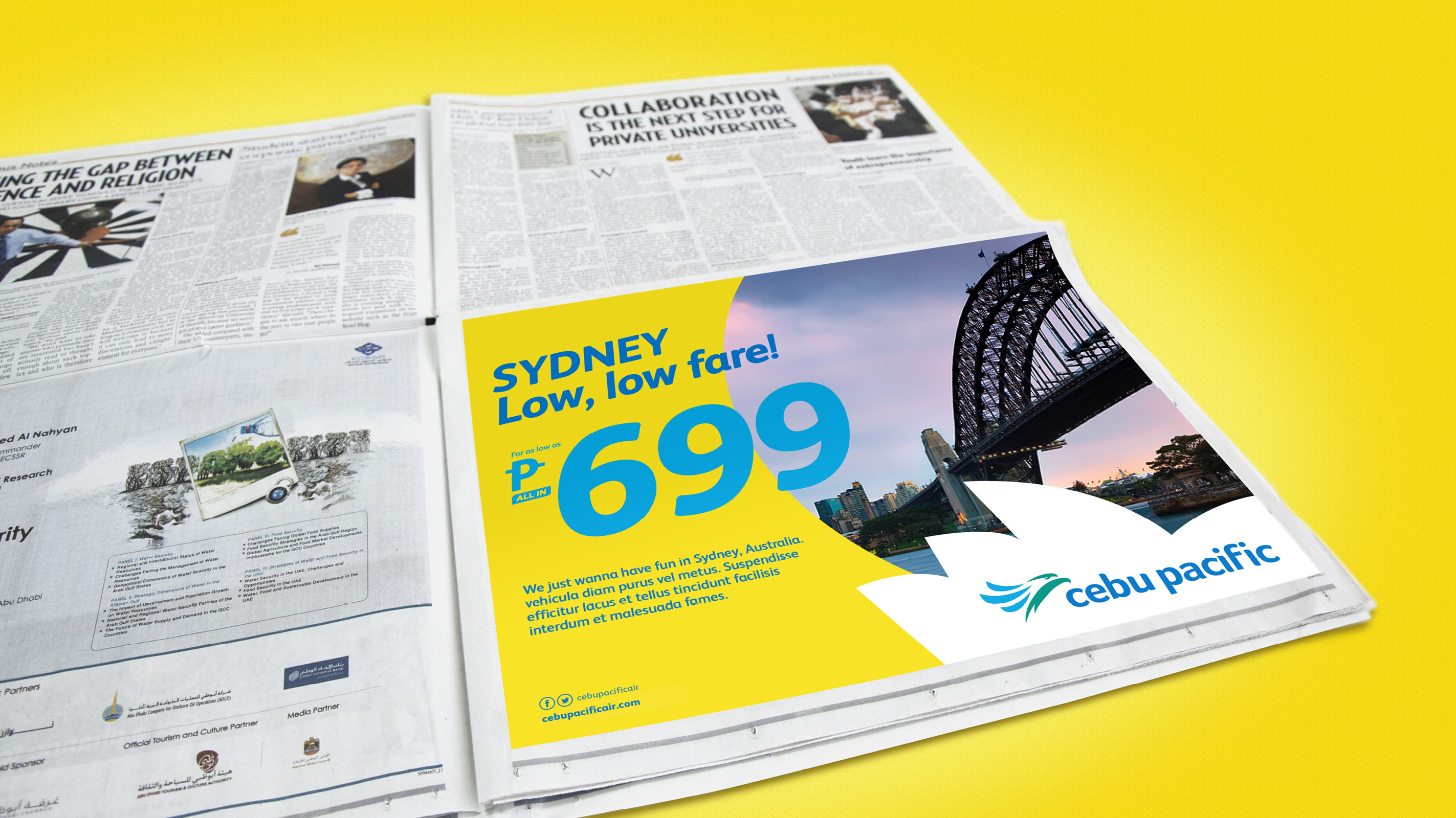
We developed a new visual identity system for online and offline communications which included chunky, fun typography, brilliant yellow and blue colours, and a distinctive illustration style. Even the fun-loving brand mascot, CEB, got a perky makeover.
Throughout the programme, the guiding principles were to find a balance between the innate joyfulness of the Cebu Pacific brand and the customers’ escalating expectations of professional reliability for a contemporary carrier.
Result
Since the brand refresh and in a category that continues to be fiercely competitive, Cebu Pacific has gone from strength to strength. The new brand identity has contributed to a business ready to take the next leap in its growth, extending seamlessly across its ever-expanding range of customer touchpoints and providing a rallying point for customer loyalty, recruitment and the strengthening of its culture.

CREDIT
- Agency/Creative: The Bonsey Design Partnership
- Article Title: Giving Asia’s First Low Cost Carrier International Credibility
- Organisation/Entity: Agency, Published Commercial Design
- Project Type: Identity
- Agency/Creative Country: Singapore
- Market Region: Global
- Project Deliverables: Brand Advertising, Brand Design, Brand Experience, Brand Guidelines, Brand Identity, Brand Redesign, Brand Rejuvenation, Brand Strategy, Graphic Design, Identity System, Illustration
- Industry: Transport
- Keywords: Service, Transportation, Airlines, Philippines, Asia, Cebu Pacific, Rebrand,


