


Metrika Studio – Beyond form, within space
Metrika Studio is born from the synergistic union of two distinct yet complementary disciplines: Architecture and Engineering. The studio is the brainchild of its two founders, Maglio (Architect) and Spada (Engineer). The challenge was to create a brand identity that could represent this duality without prioritizing one discipline over the other. The goal was to visualize a perfect equilibrium: the artistic sensitivity of architecture merging with the structural precision of engineering. The brand needed to communicate reliability, mathematical rigor, and spatial vision to a high-end market.
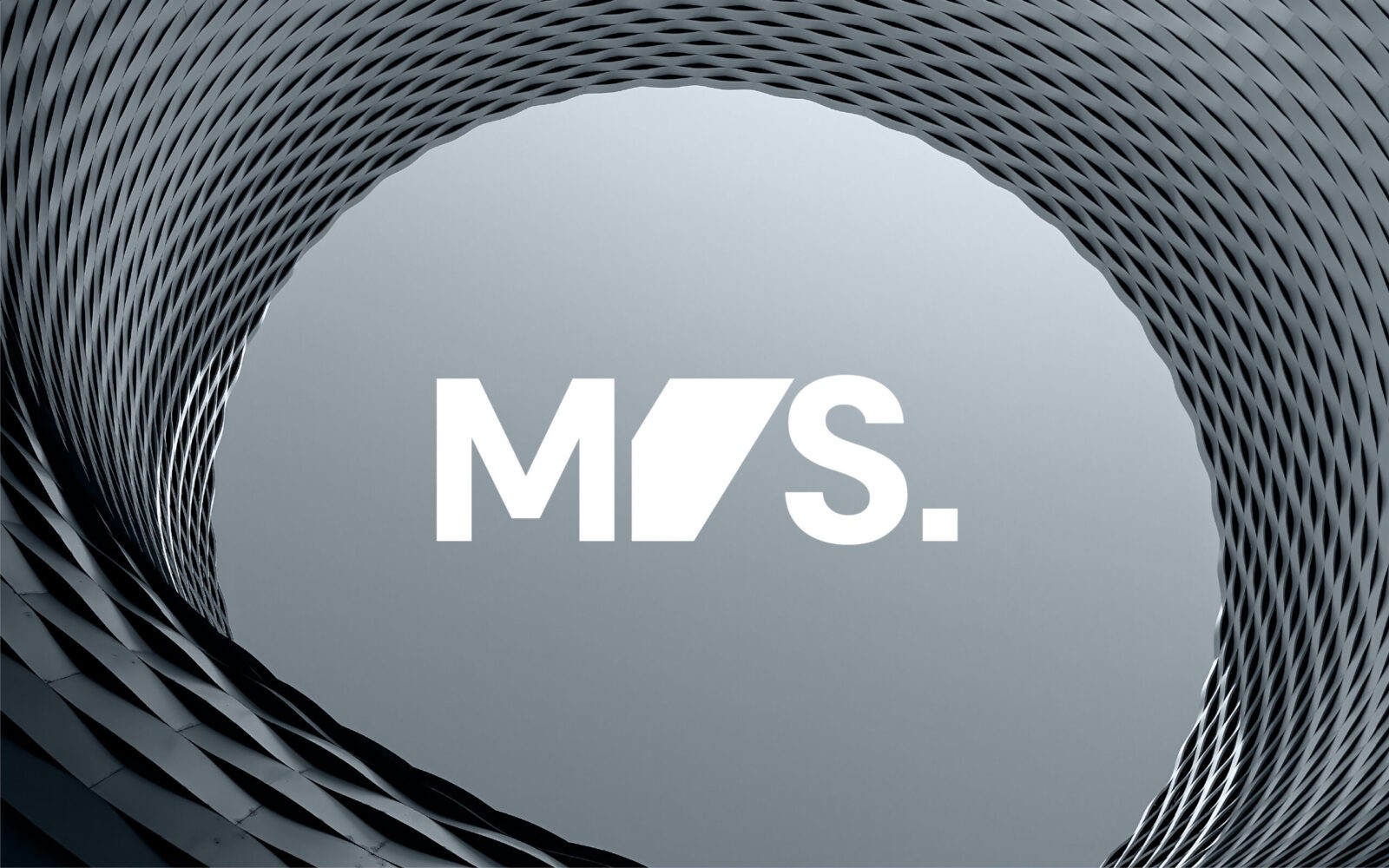
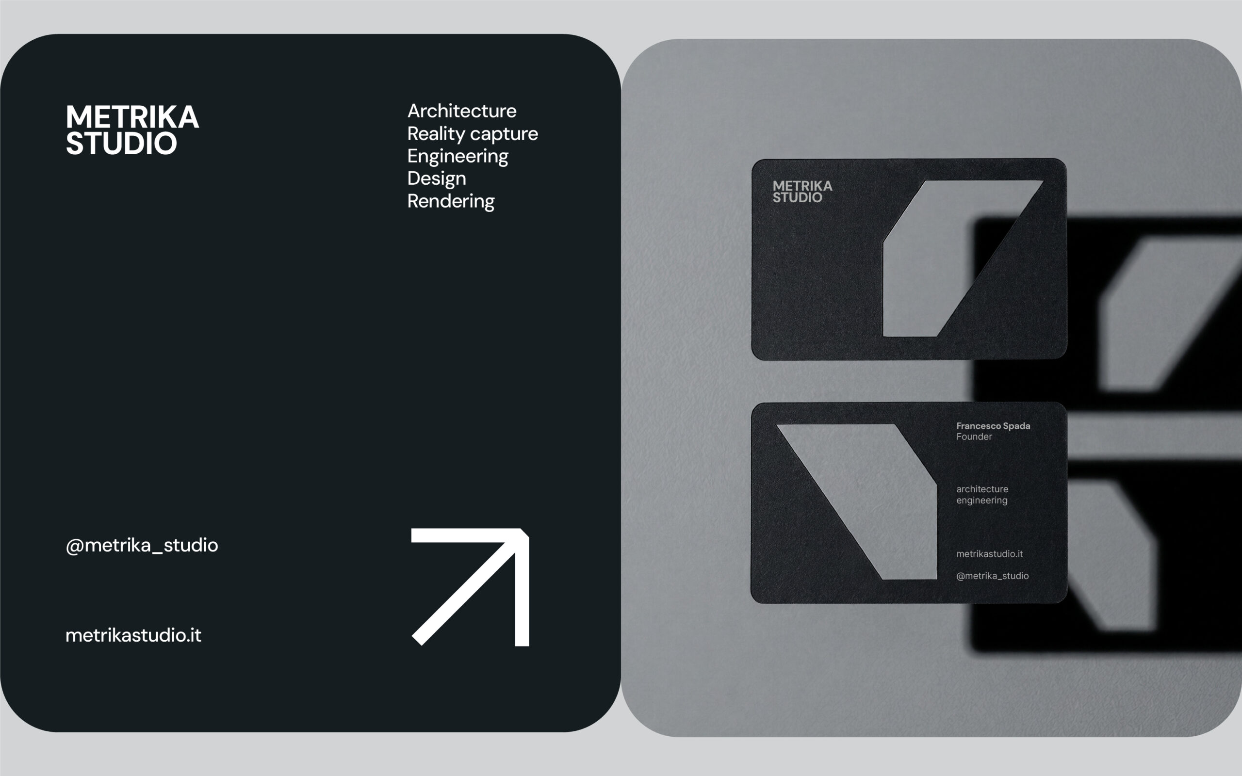
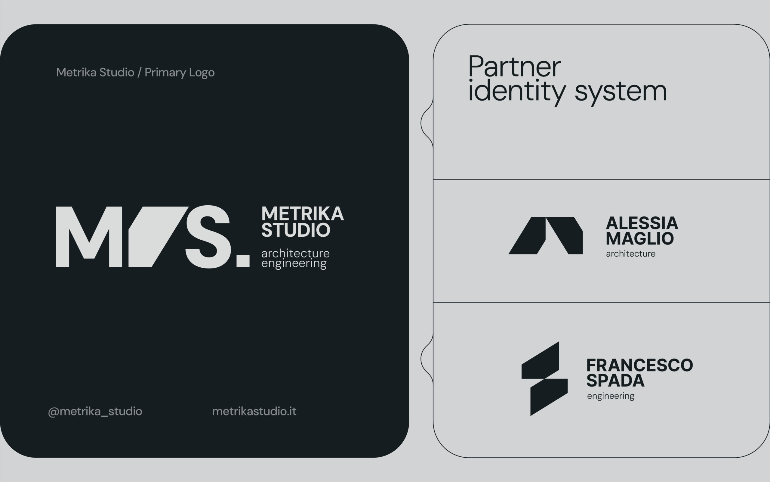
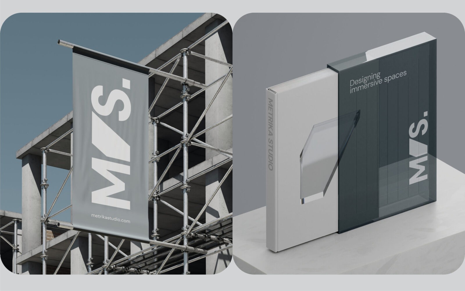
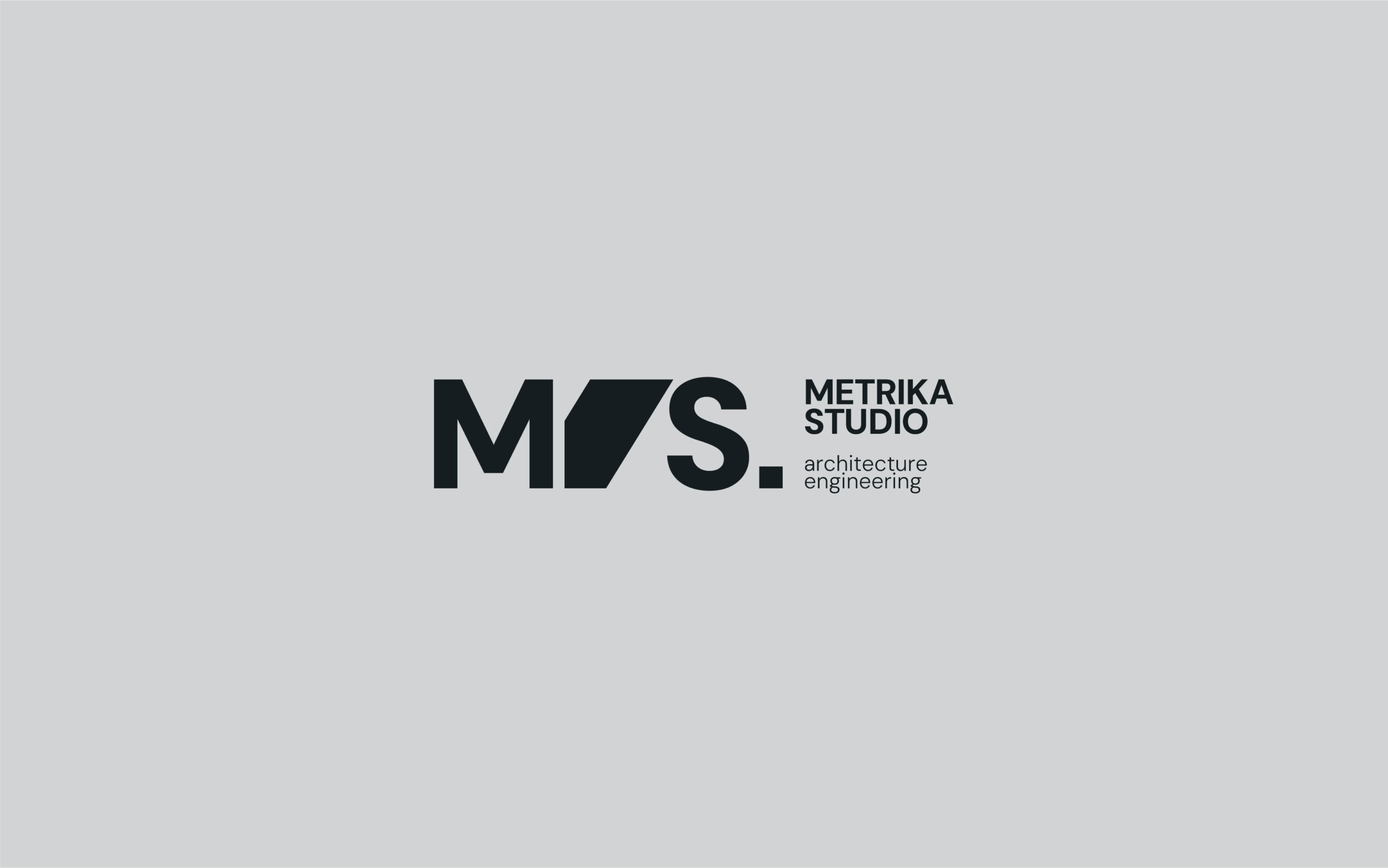
Defining the Space Between The core of the visual identity lies in the typographic interaction between the founders’ initials: ‘M’ and ‘S’. Usually, architecture and engineering are seen as separate phases of a project. In Metrika, they are fused. A trapezoid derived directly from the structural grid of the letter ‘M’ represents the “shared space” where the two minds meet. It is the bridge between form (Maglio) and function (Spada).
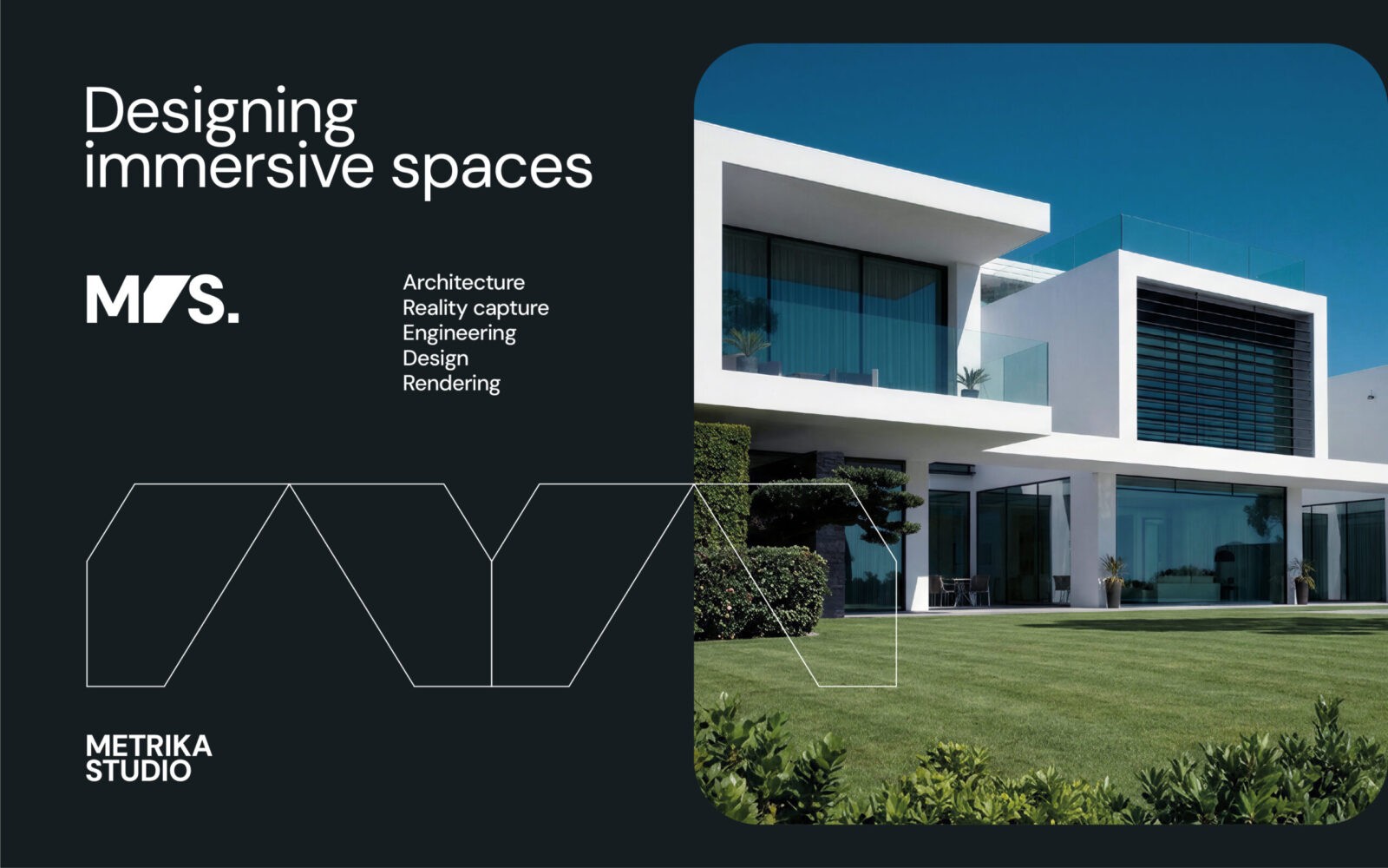
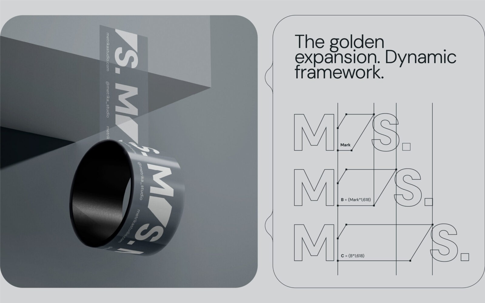
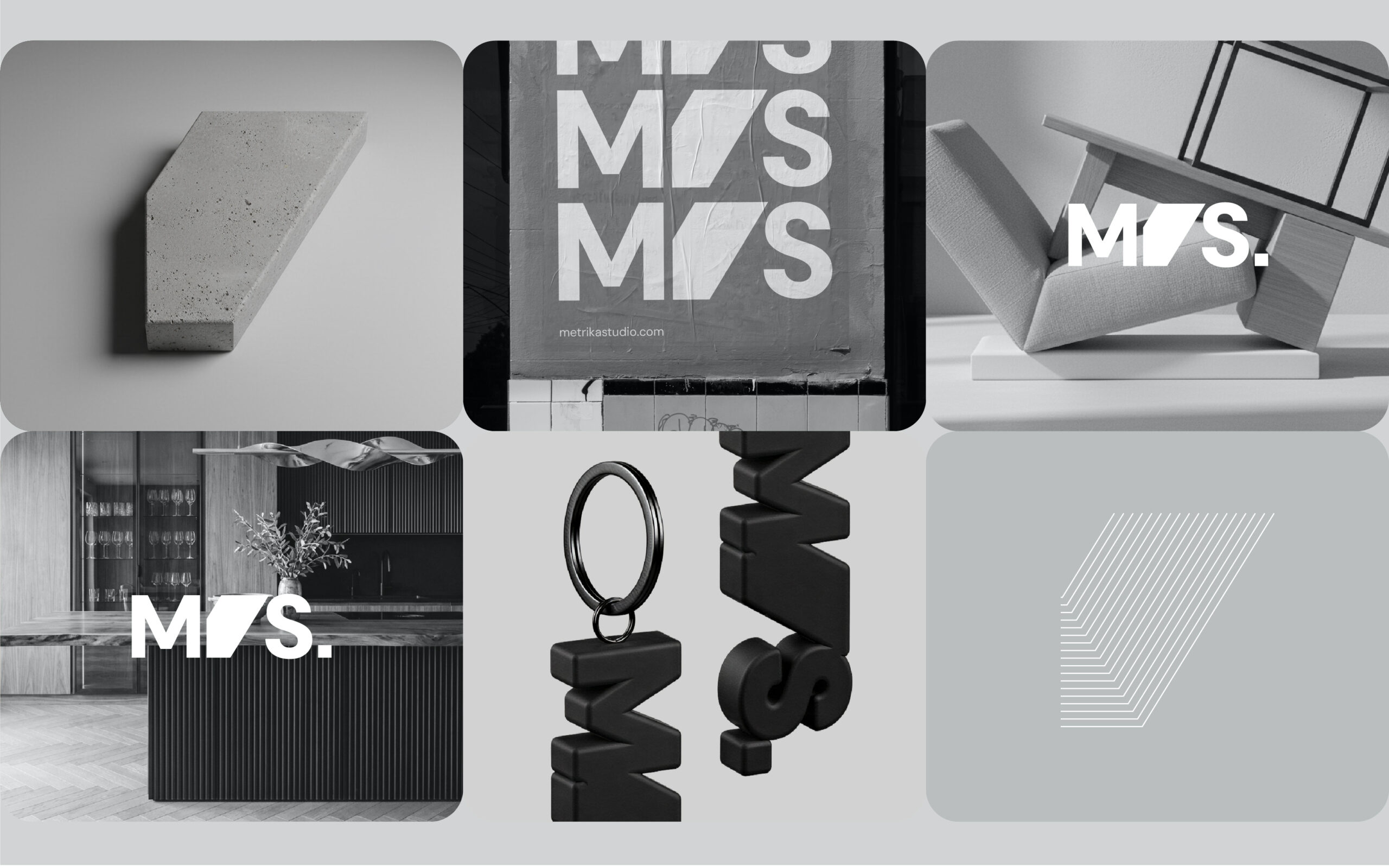
The Golden Ratio The visual system is not arbitrary; it is engineered. The expansion of the logomark into a dynamic visual frame is governed by the Golden Ratio (φ = 1.618). This choice pays homage to the classical roots of architecture and the mathematical constants of engineering. The central mark acts as an “Adaptive Frame,” a window that expands horizontally to contain content, images, and architectural plans.
The Partner Identity System The identity system extends beyond the collective studio entity to empower the professional autonomy of its founders. The main logomark deconstructs into two distinct geometric elements representing the specific initials: the left trapezoid for Maglio (‘M’) and the right one for Spada (‘S’). This design strategy creates a dedicated personal brand for each partner that is visually coherent with the Masterbrand yet independent. This addresses a crucial operational requirement: it allows the founders to act as external consultants for other firms or third parties individually. By using these derived marks, they can operate outside the studio’s perimeter without generating commercial conflict or brand confusion with Metrika Studio’s core activities.
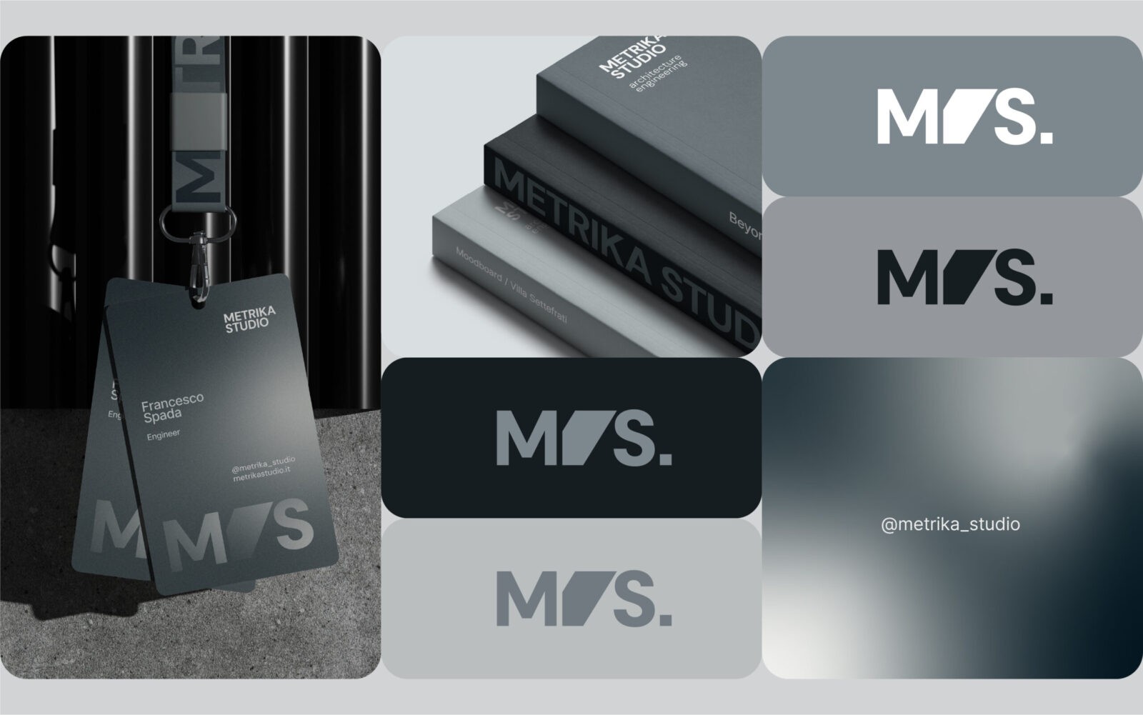
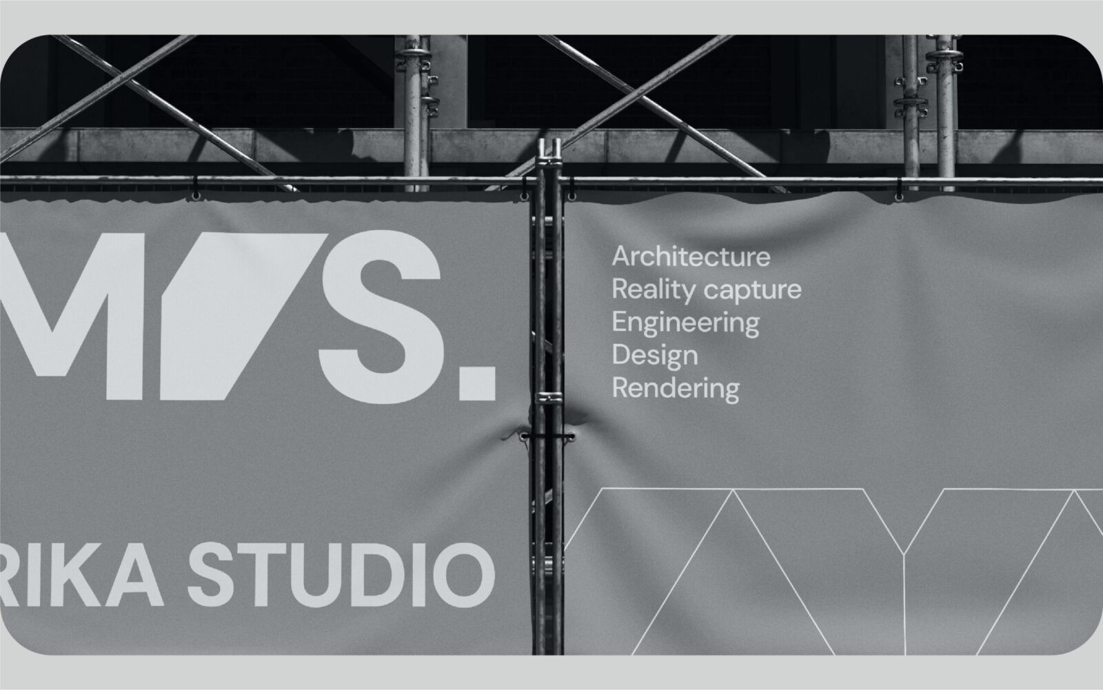
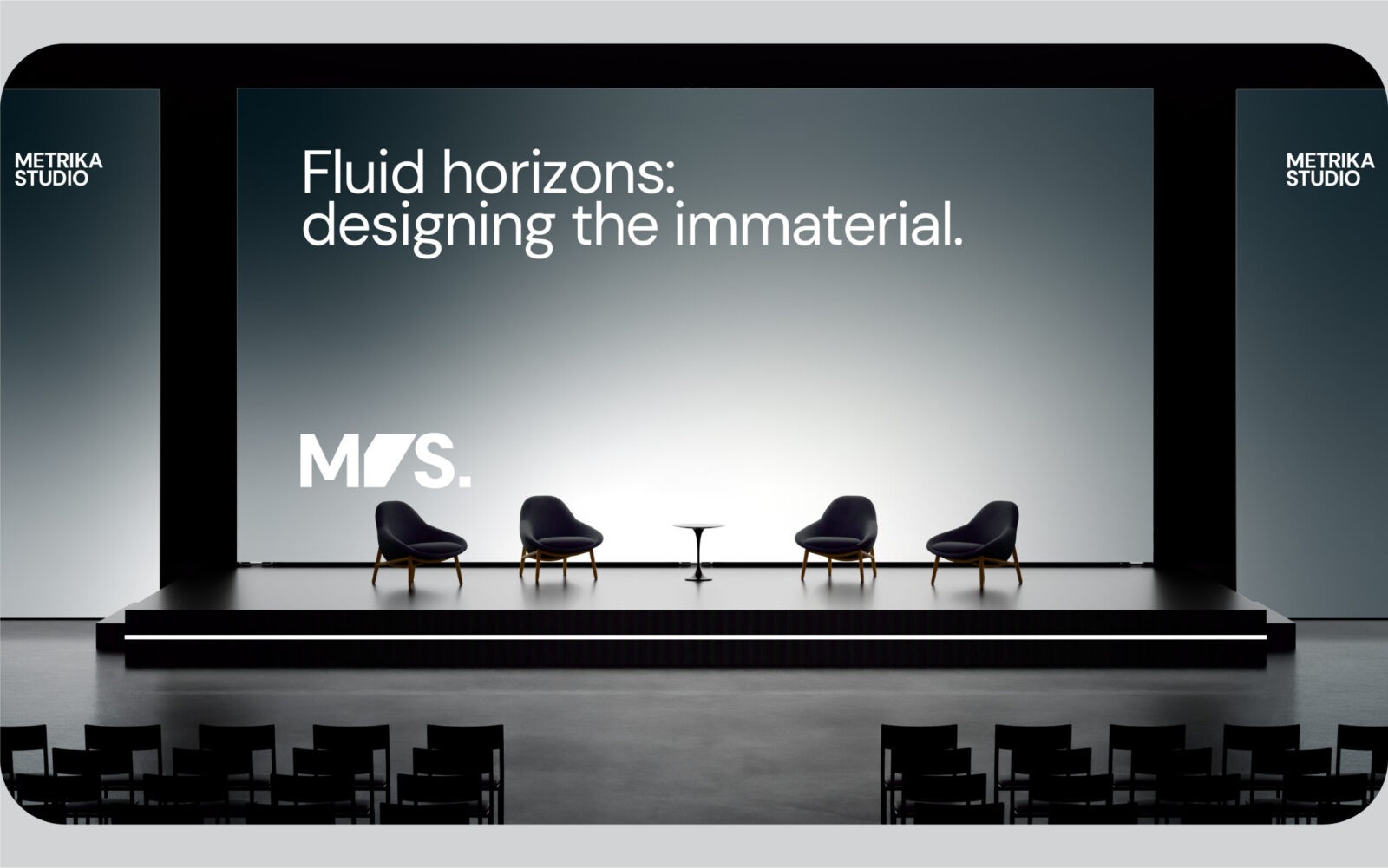
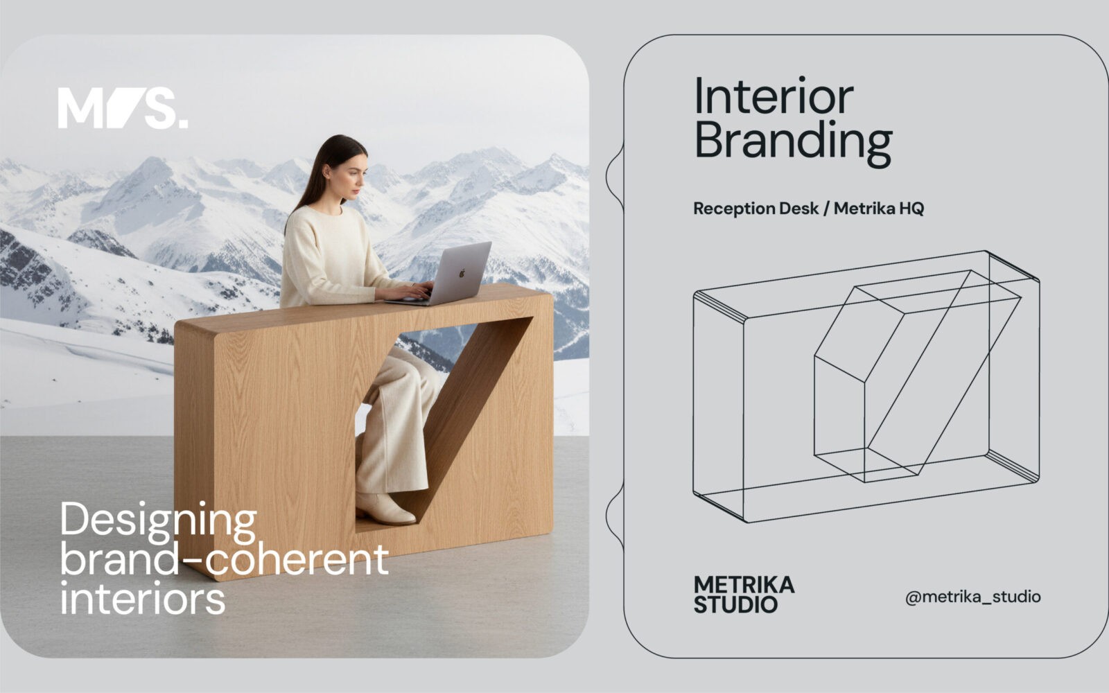
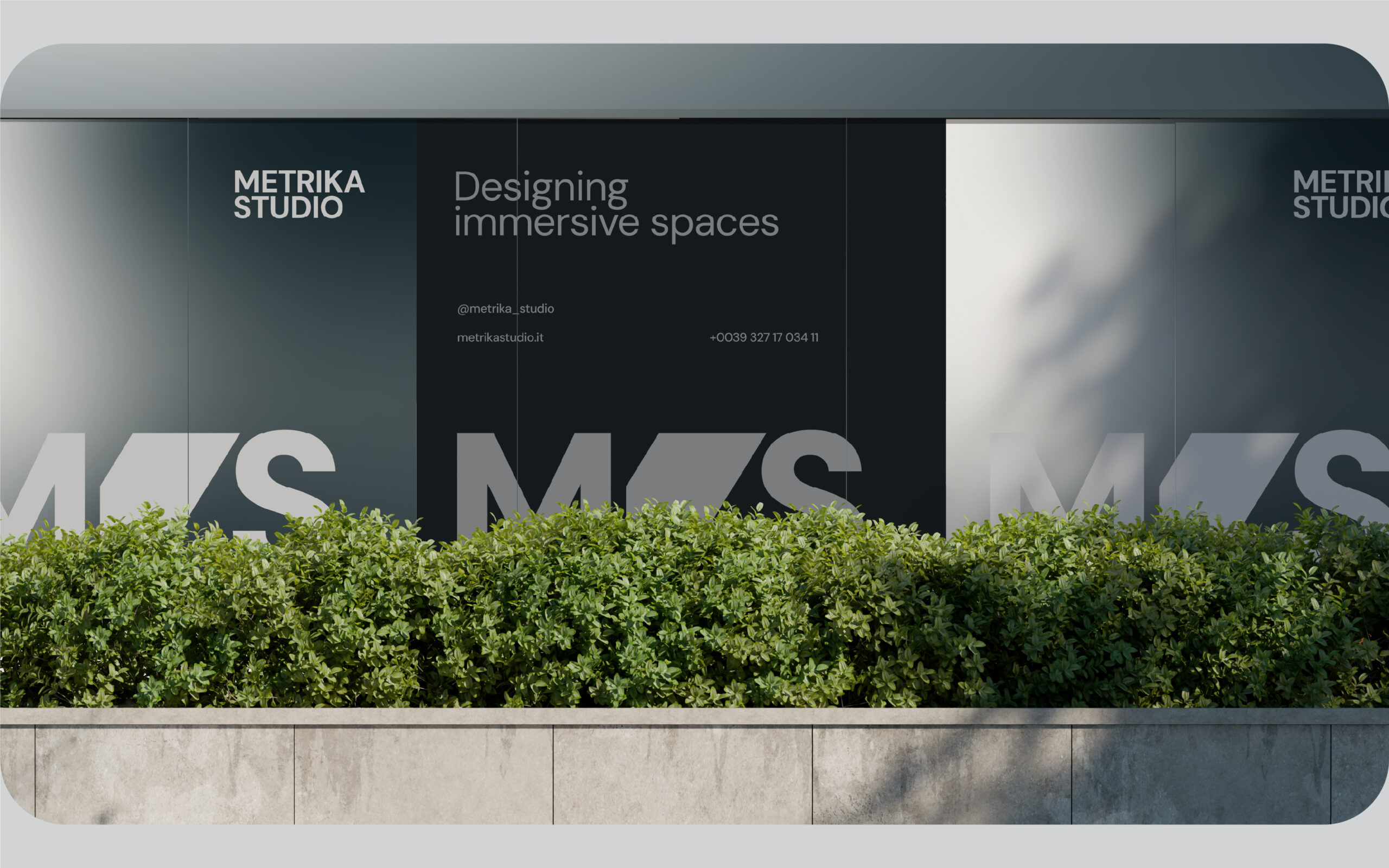
The color palette reflects the technical nature of the profession, relying on shades of “Blueprint Blue,” concrete greys, and stark black and white. The typography is clean and modernist, evoking the clarity of technical drawings. The brand experience extends beyond paper. The identity informs the physical environment, as seen in the custom furniture design and the way the signage interacts with the built environment. The use of technical grids and wireframes in the brand communication reinforces the studio’s capability to manage complex, large-scale projects.
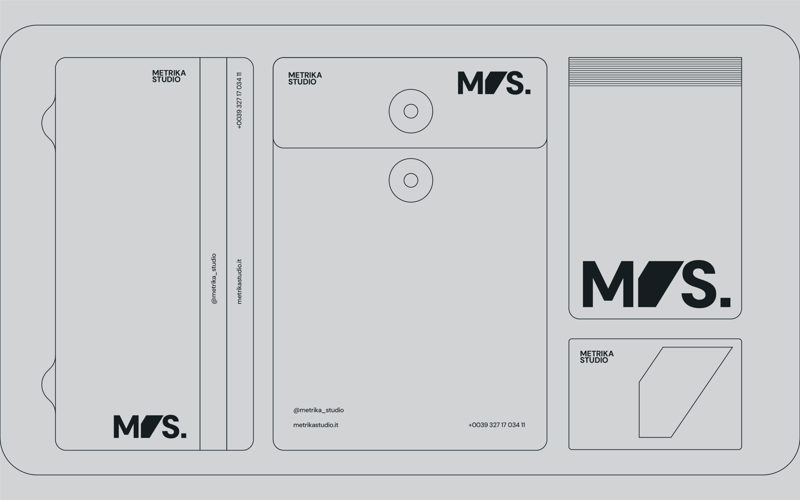
Commissioned in the first half of 2025, the project is currently in its active implementation phase. To date, the core identity has been produced and applied to essential corporate collateral, including: business cards, official letterheads, corporate stamps, adhesive systems, and the main exterior signage. The brand rollout is ongoing, with further environmental applications scheduled.
The resulting identity for Metrika Studio is a celebration of the “Space Between.” It successfully transforms the founders’ surnames into a unified philosophy. It is no longer just Maglio or Spada; it is Metrika: a singular entity where precision measures emotion, and where engineering supports art.


CREDIT
- Agency/Creative: Giuseppe Terrasi
- Article Title: Giuseppe Terrasi Designs the Metrika Studio Identity Around Precision, Space, and Balance
- Organisation/Entity: Creative
- Project Status: Published
- Agency/Creative Country: Italy
- Agency/Creative City: Roma
- Project Deliverables: Brand Design, Brand Identity, Brand Naming, Brand Tone of Voice, Branding, Graphic Design, Identity System, Logo Design
- Industry: Construction
- Keywords: WBDS Creative Design Awards 2025/26 , Brand Identity, Logo design, Architecture, Engineering, Golden Ratio, Geometric Design, Visual System, Minimalist, Spatial Design, Corporate Identity


