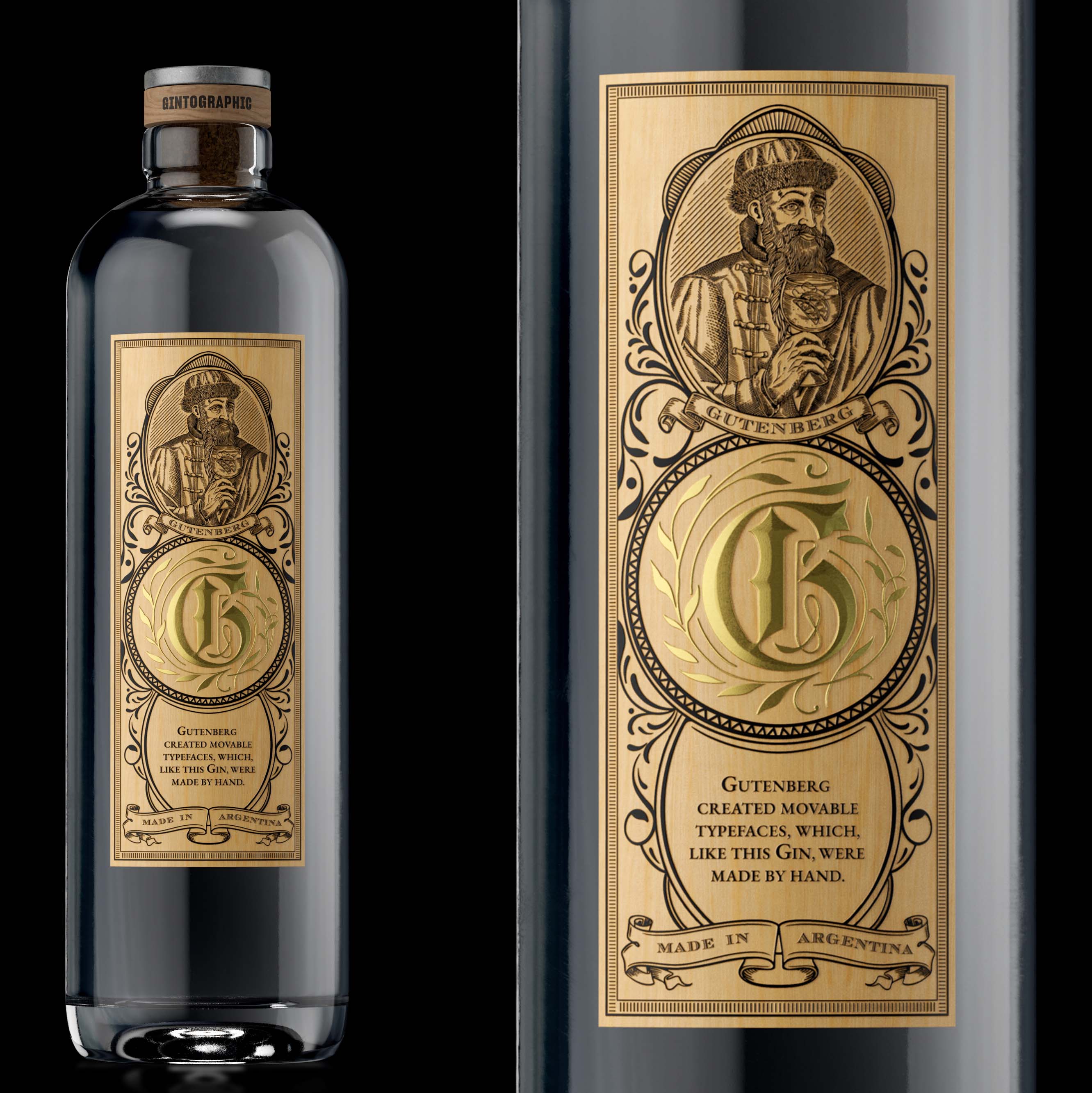
“Gutenberg created movable typefaces, which, like this Gin, were made by hand”.
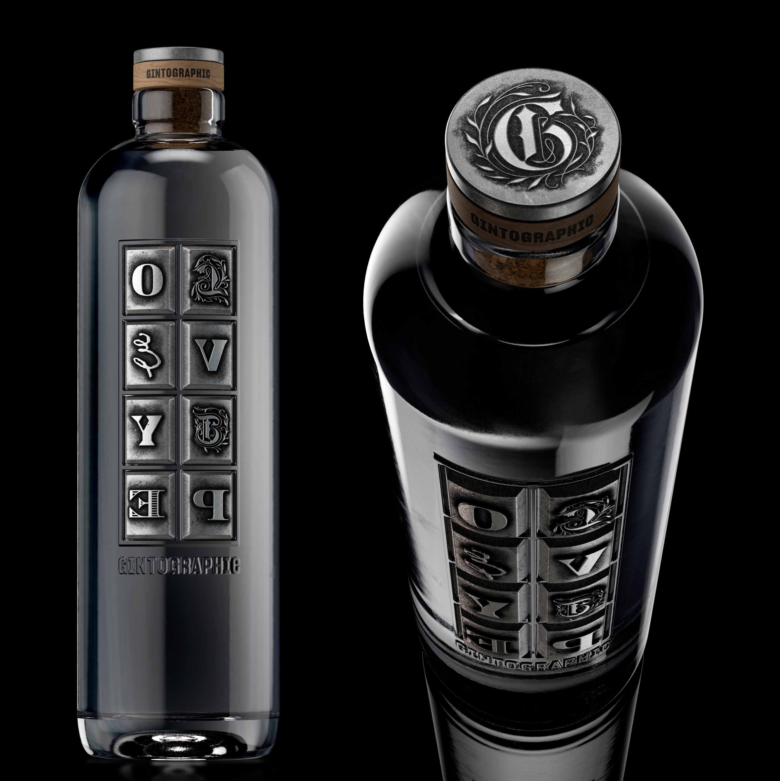
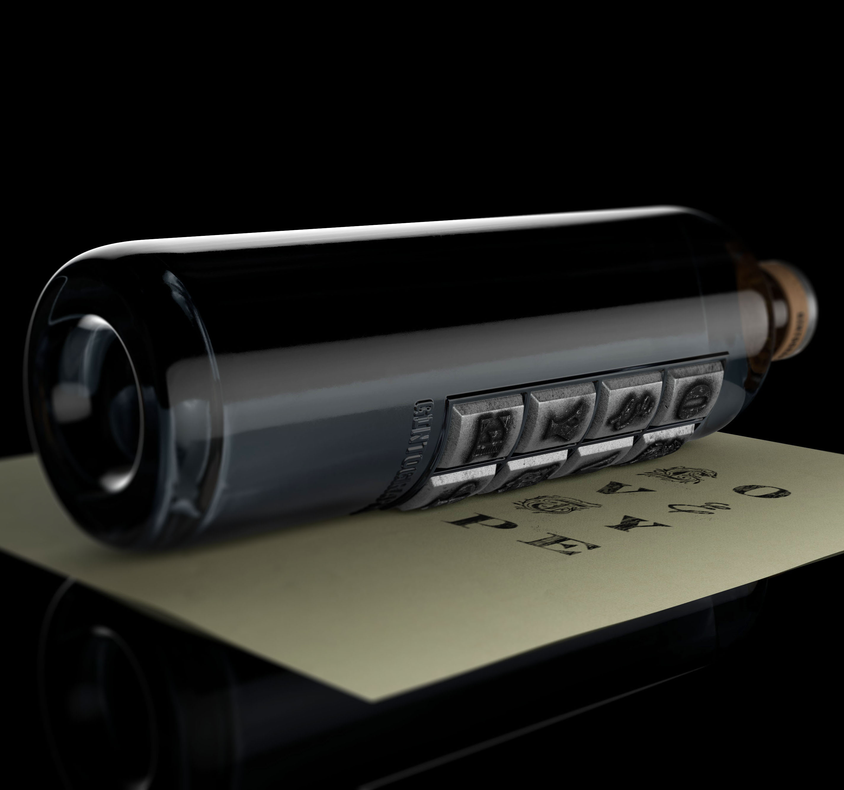
Diego Giaccone designed alphabets and was one of the founders of Sudtipos.com. As true lovers of design and typography, the team at Sure wanted to pay homage to the first printing system, the movable type press created by Gutenberg in 1440. The concept is to represent this printing method on a playful bottle that can be used as a printing press. With this, people could experience the process of printing with movable types, and roller like it was done centuries ago. The cap is a movable type with a wooden base, and the back label is made up wood-like paper.
This is how Gintographic (Gin + Typographic) was born, were we express our love for Gin and Typography with the message Lovetype on the bottle.
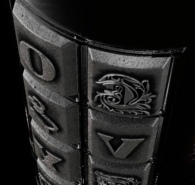
The bottle features low relief so that the movable types developed by Apholos can be applied. By soaking them with ink can be printed on paper and live that beautiful experience.
The stopper is from Labrenta and is based on wood with a metallic type on the top. For the back label we use an Avery paper, Fasson Birch Wood, similar to wood, and the printing is through two Kurz Luxor stampings.


CREDIT
- Agency/Creative: Sure Brandesign
- Article Title: Gintographic Packaging Design by Sure Brandesign
- Organisation/Entity: Agency
- Project Type: Packaging
- Project Status: Published
- Agency/Creative Country: Argentina
- Agency/Creative City: Buenos Aires
- Market Region: Global
- Project Deliverables: Brand Design, Brand Mark, Packaging Design, Typography
- Format: Bottle
- Substrate: Glass Bottle
- Industry: Food/Beverage
- Keywords: #creativedesignawards #wordlbranddesign #WBDSAwards
-
Credits:
Agency: Sure Brandesign


