


A project created in collaboration with: UPM Raflatac, Luxoro – Leonhard Kurz, VETROelite Group, Vinolok, Sovemec, T&K Srl, SenseCatch.
Ginnasium, the first neuromarketing case study of gin design. A packaging project to tell the story of my region, Abruzzo.
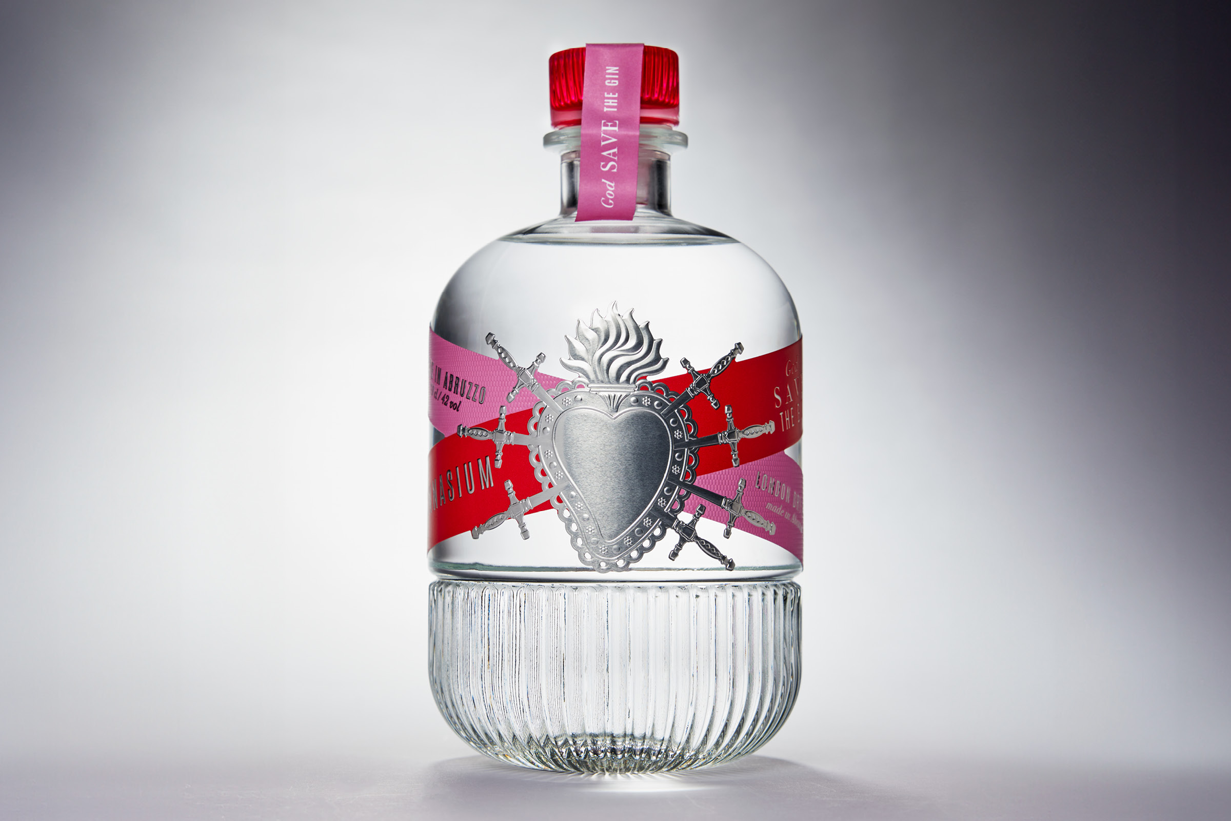
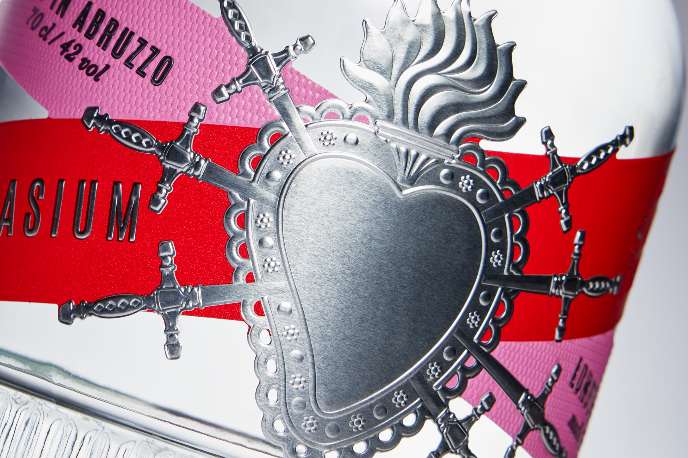
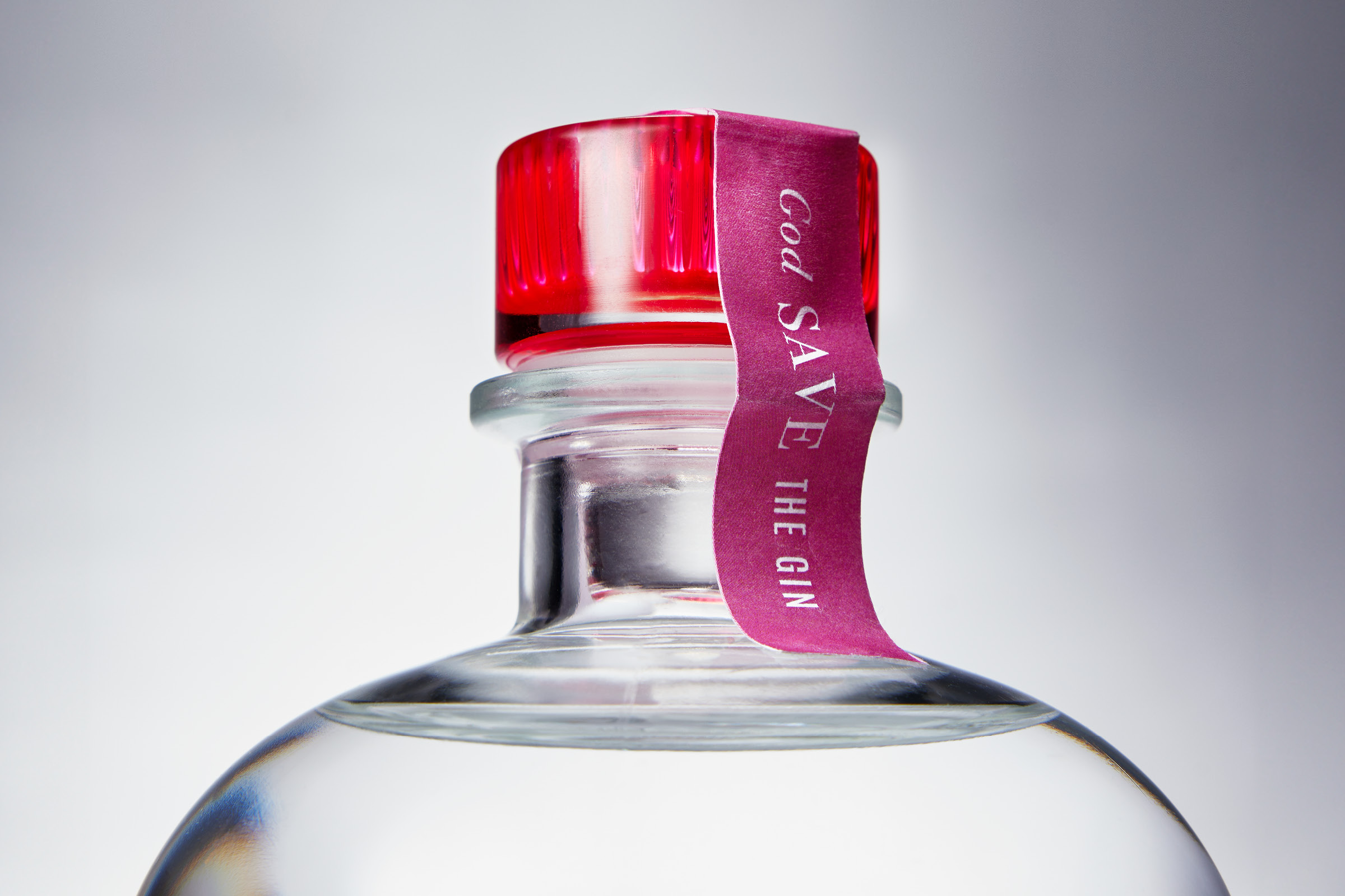
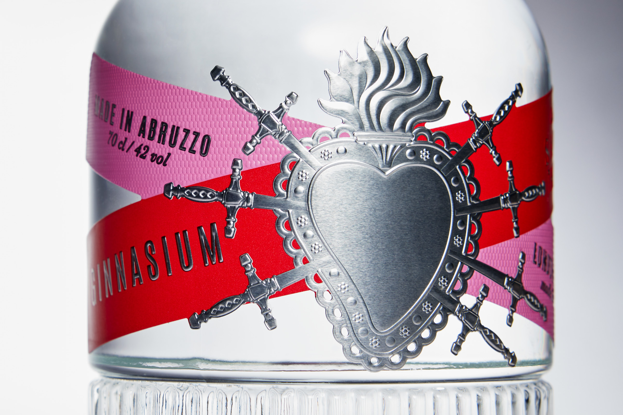
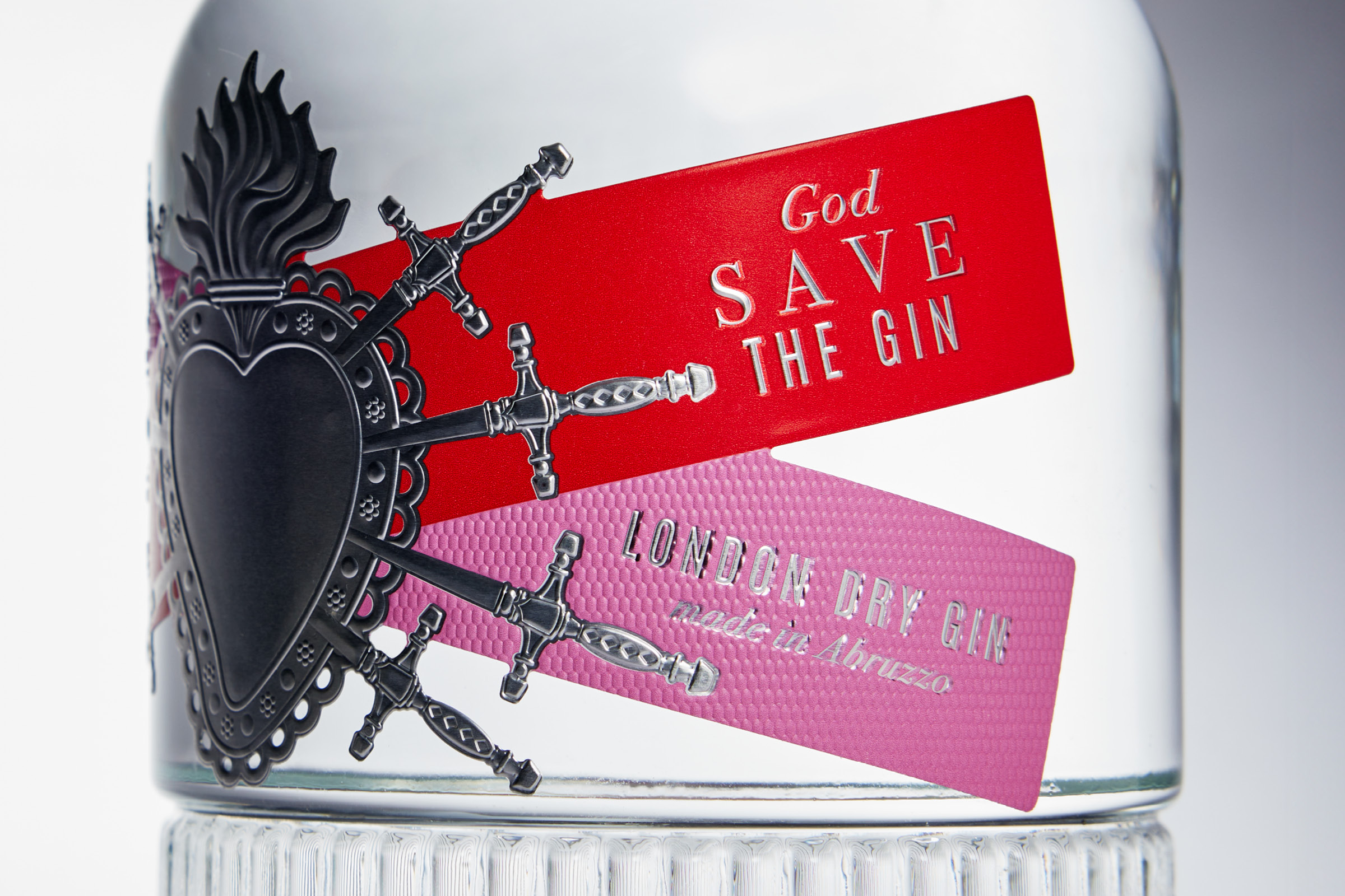
The heart pierced by the seven swords, an expression of religiosity and popular culture of the Abruzzo region, is combined with English punk imagery. An unusual bond that underlines the relationship between the Abruzzo territory and the type of product, London Dry Gin.
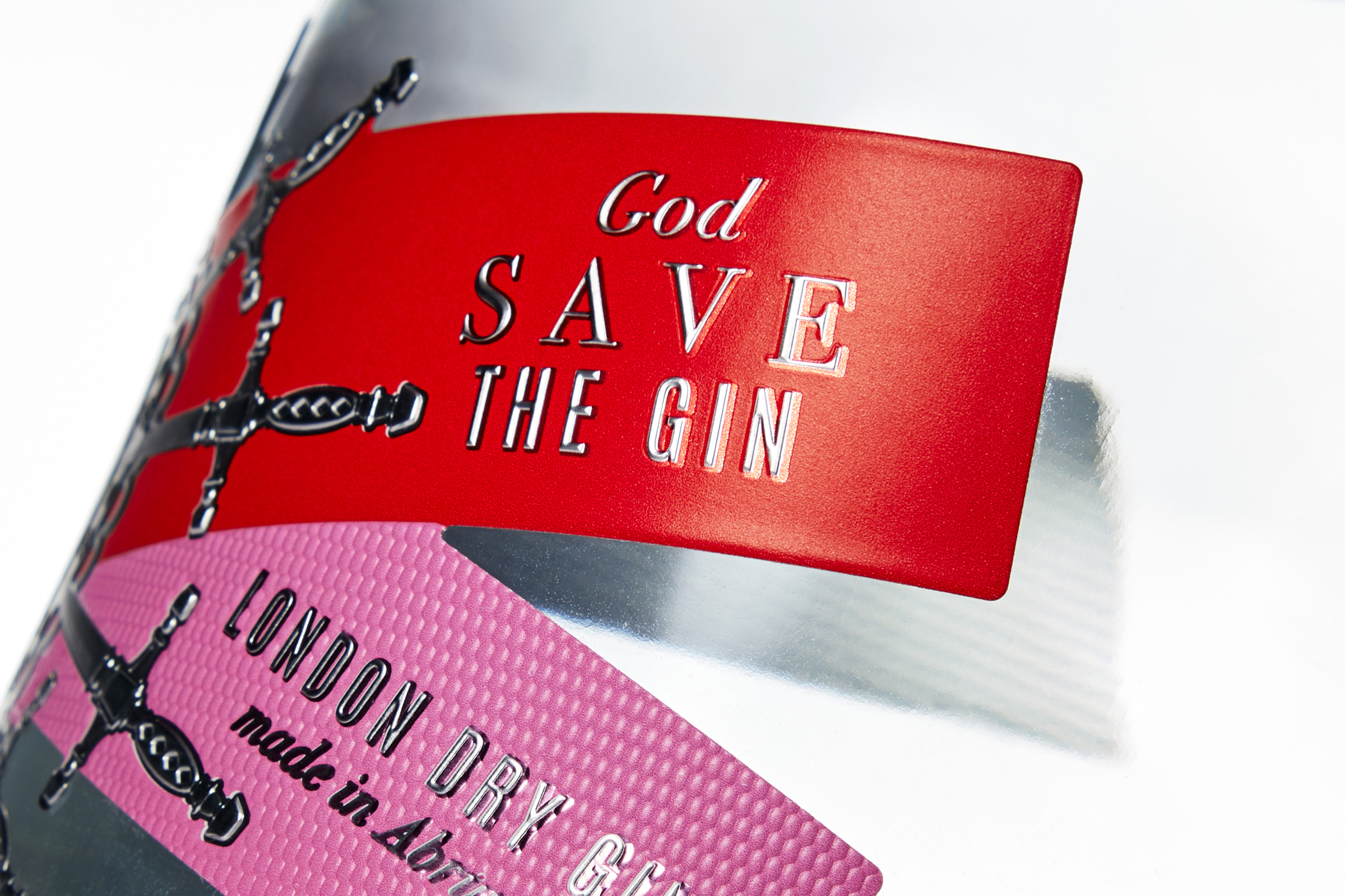
The graphic language used is a synthesis of the aspects described above: stick lettering associated with a classic serif; cardinal red and shocking pink. A continuous contrast that finds its maximum balance in the project.
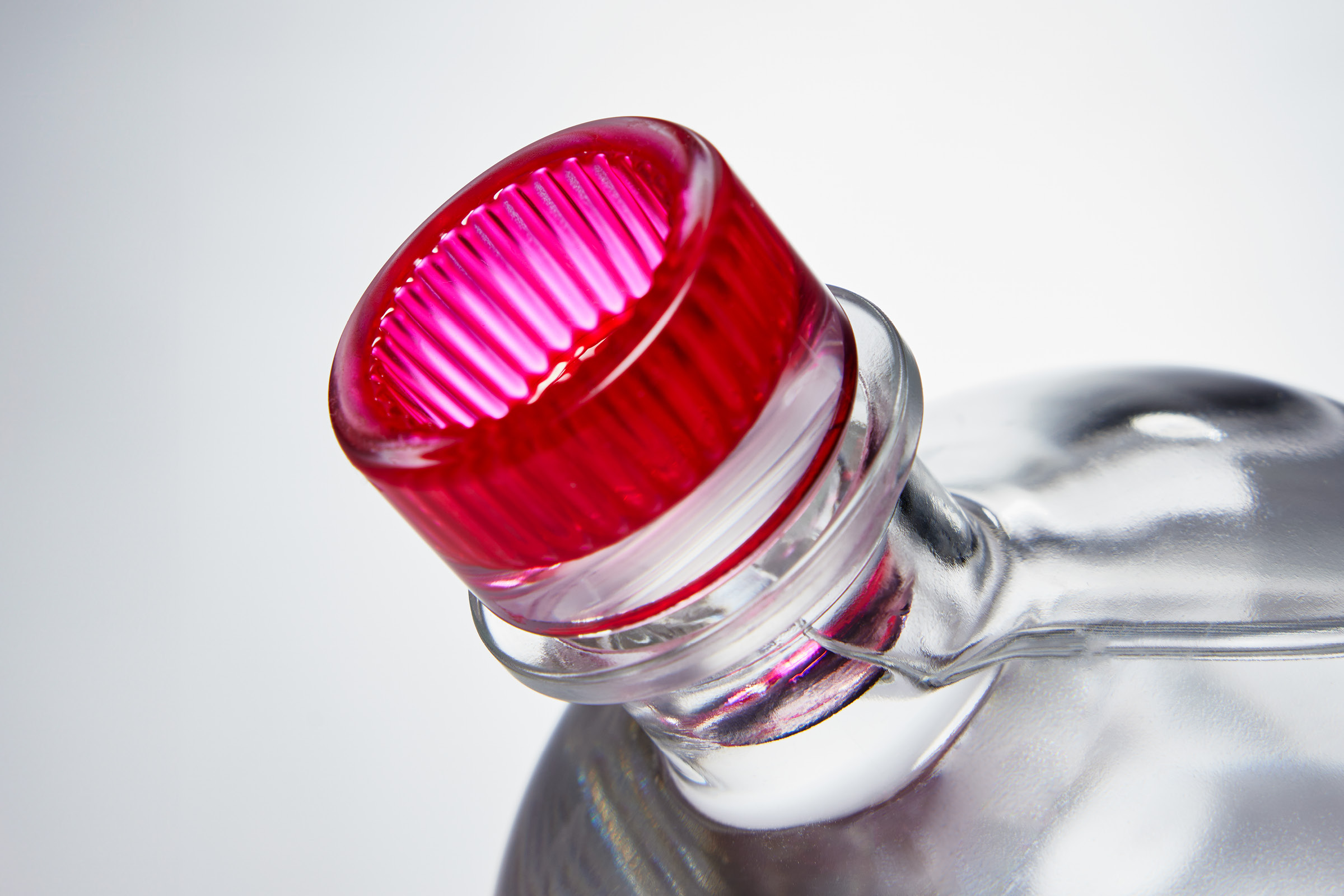
In projects we always look for a relationship between support and creative concept, in this case, Aluflex Premium UPM Raflatac lent itself by its nature and aesthetics to the realization of the project. The Luxoro – Leonhard Kurz multilevel relief allowed us to create an ex-voto comparable to the original. Cusp reliefs on the writing and tactile textures were also used. The “Clear Deco” closure, stylistically coordinated with the “Manila” Glass Elite bottle, was printed internally, increasing the family feeling with the entire project.
The neuromarketing study.
The study analyzed consumer behavior: the attention paid to the label, the most observed areas, the reading method; Furthermore, the sensations that the pack system generates in the consumer were analysed, from the first moment in front of the shelf, up to the choice and physical interaction with the bottle. The entire experience was measured with neuromarketing technologies: an Eye-Tracker to monitor visual attention, a Bio-Tracker skin micro-sweating sensor to measure emotional involvement and an EEG helmet to understand implicit satisfaction. In addition to these behavioral metrics, the perceived value positioning, product expectations and choice motivations were analysed.
CREDIT
- Agency/Creative: D'Aroma Studio
- Article Title: Ginnasium Packaging Design – God Save the Gin
- Organisation/Entity: Agency
- Project Type: Packaging
- Project Status: Published
- Agency/Creative Country: Italy
- Agency/Creative City: Pescara
- Market Region: Europe
- Project Deliverables: Packaging Design
- Format: Bottle
- Industry: Food/Beverage
- Keywords: gin, spirits
-
Credits:
Art director: Marco D'Aroma


