


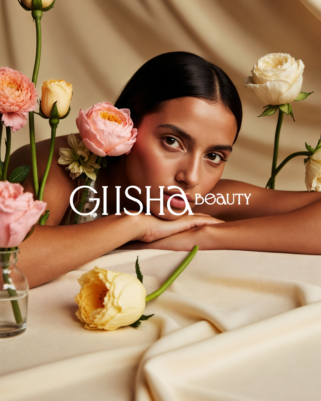
Giisha Beauty – Complete Branding Identity Design
Overview Giisha Beauty is a luxury skincare brand grounded in the philosophy: “Pure by Nature, Glow by Choice.”
The brand embodies a harmonious blend of nature-inspired purity and scientific sophistication, and this core belief guided every aspect of the visual identity design. The branding captures a calm yet elevated aesthetic to reflect a premium, confident, and clean beauty experience.
Word mark & Brand-mark The primary logo system is built around a minimal yet elegant word mark combined with a sophisticated monogram crafted from the initials G & B. The monogram reflects balance, growth, and renewal, symbolizing the rejuvenation process at the heart of skincare. Inspired by organic curves, the structure subtly alludes to transformation and softness, while remaining timeless and easily adaptable across touch points.
Typography System Giisha Beauty uses a refined combination of typefaces: Classy Vogue & Bickham Script Pro — to convey elegance, softness, and femininity, Gotham & Quiche Display — for a modern, versatile look in communication and packaging. This typography palette ensures both readability and luxury tone, maintaining brand coherence across all applications.
Color Palette The color scheme is built from warm, muted tones and deep earthy shades, capturing both the organic roots and premium positioning of the brand: Rich hues like Pantone 7622 C & #64001d reflect strength, depth, and trust. Soft accents like #e7d4a7, #fff4de, and #b39c6e bring in calmness, light, and balance. The palette delivers an inviting and modern sensibility while remaining rooted in purity and elegance.
Pattern & Submark The branding includes a custom pattern system derived from botanical cues and minimal geometry to reinforce the feeling of clean, natural luxury. The sub mark and favicon allow for versatility in applications like social media, packaging seals, and website icons — ensuring recognizability even in smaller spaces.
Packaging Design The packaging system maintains the brand’s premium, pure, and purposeful tone. Clean layouts, muted backgrounds, gold foiling, and intentional white space establish a high-end, clinical yet approachable look. Each box and label is an extension of the brand’s mantra — to celebrate inner radiance through outer care.


CREDIT
- Agency/Creative: Jaheratdesign
- Article Title: Giisha Skincare Brand Identity by Jaheratdesign
- Organisation/Entity: Agency
- Project Type: Identity
- Project Status: Published
- Agency/Creative Country: India
- Agency/Creative City: Ahmedabad
- Market Region: Asia
- Project Deliverables: Brand Design, Brand Guidelines, Brand Identity, Illustration, Logo Design, Packaging Design, Visualisation
- Industry: Beauty/Cosmetics
- Keywords: branding design
-
Credits:
Branding Designer: Sachin Nimbark


