


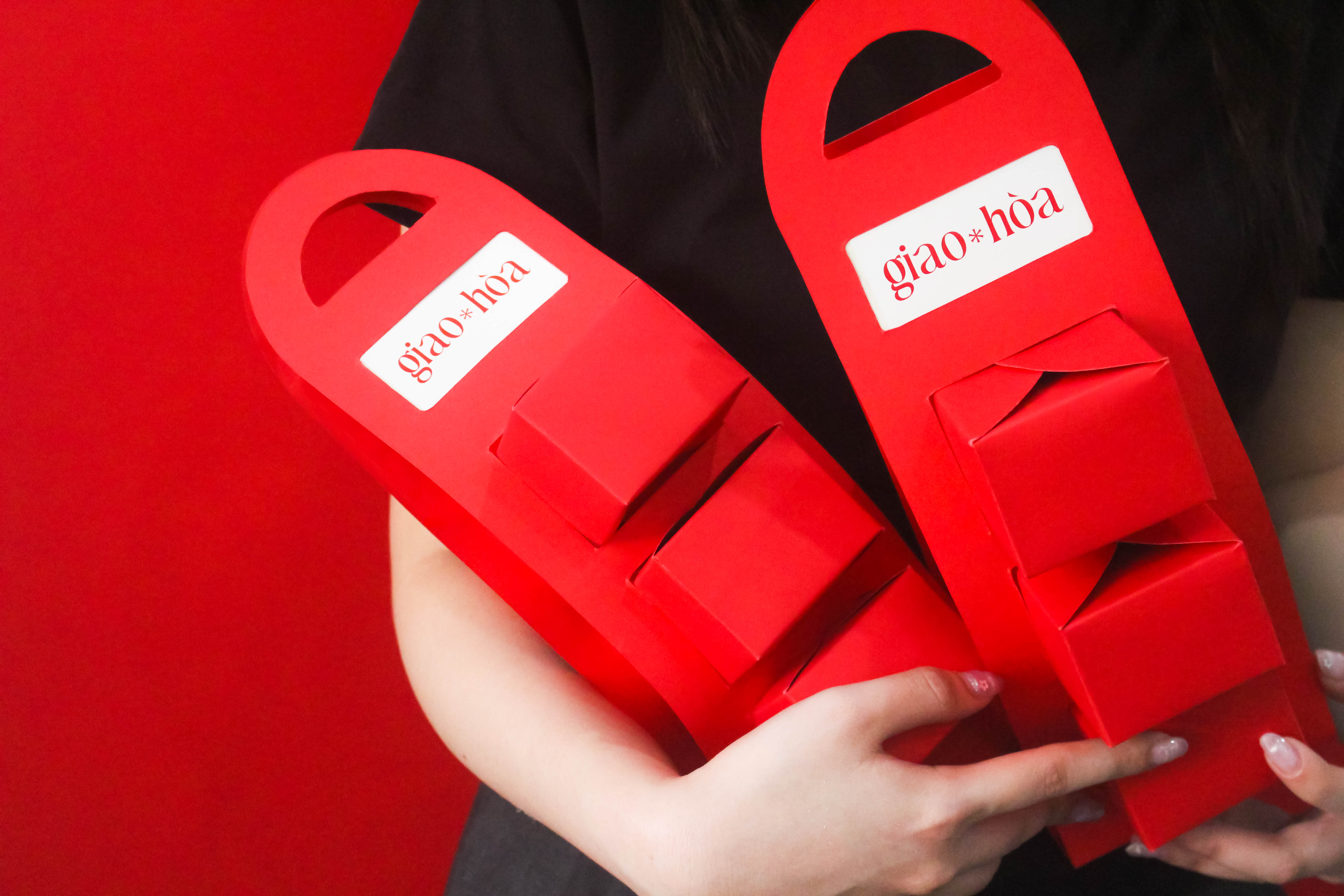
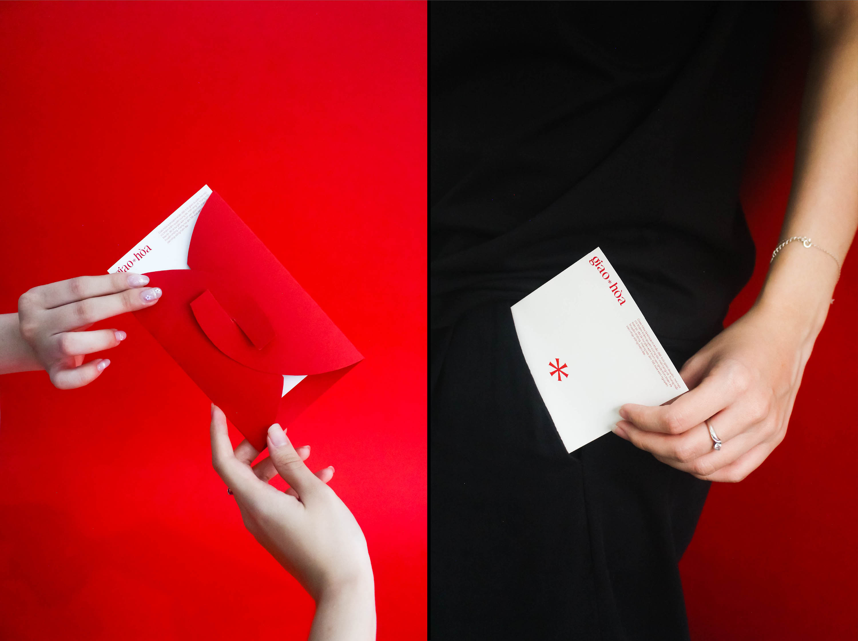
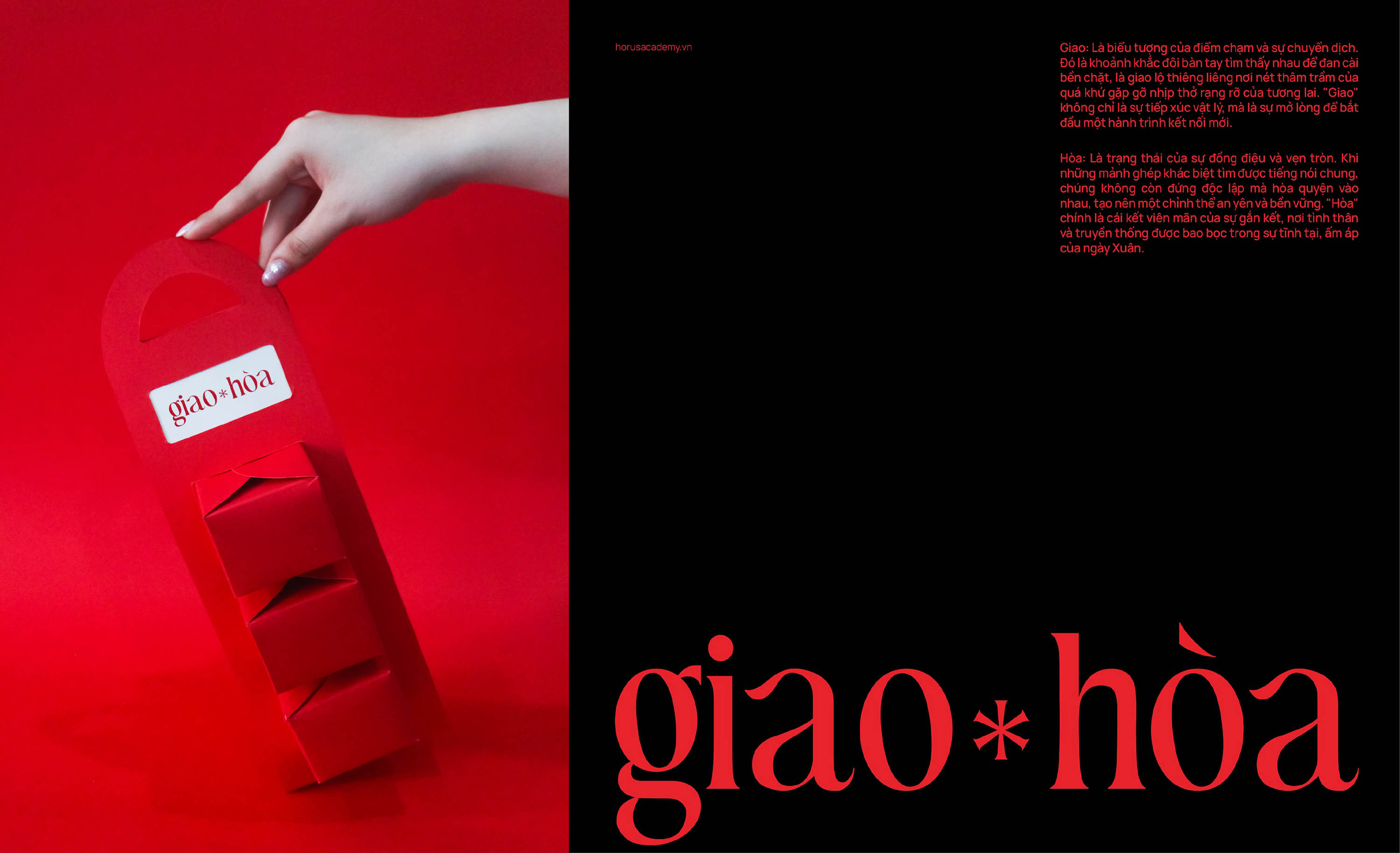
Giao Hoa represents the sacred moment of nature’s union, where profound heritage intertwines with vibrant new beginnings. Within each package lies a seamless bond between kinship and tradition, bringing the timeless warmth of an ancient Tet into the rhythm of modern life.
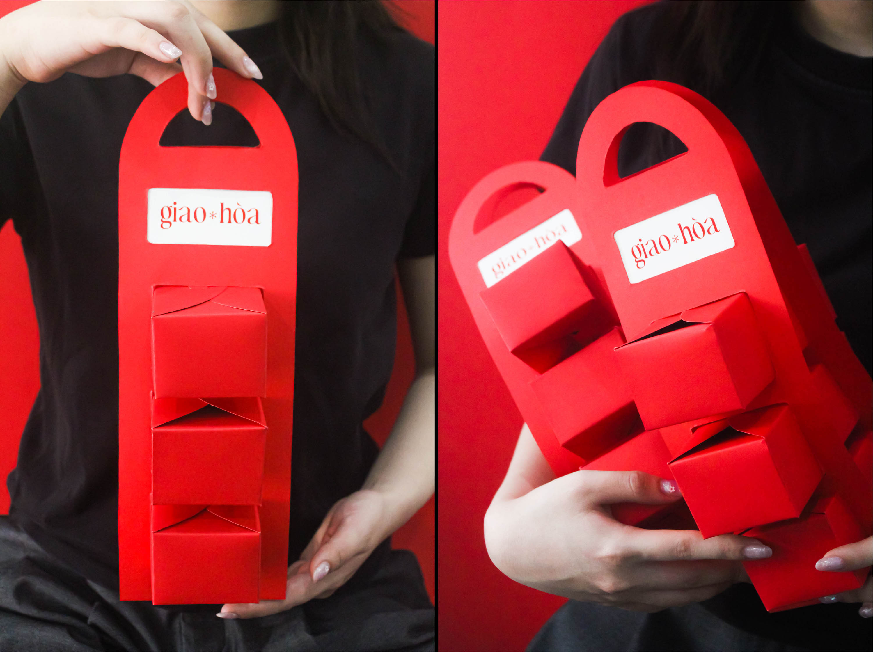
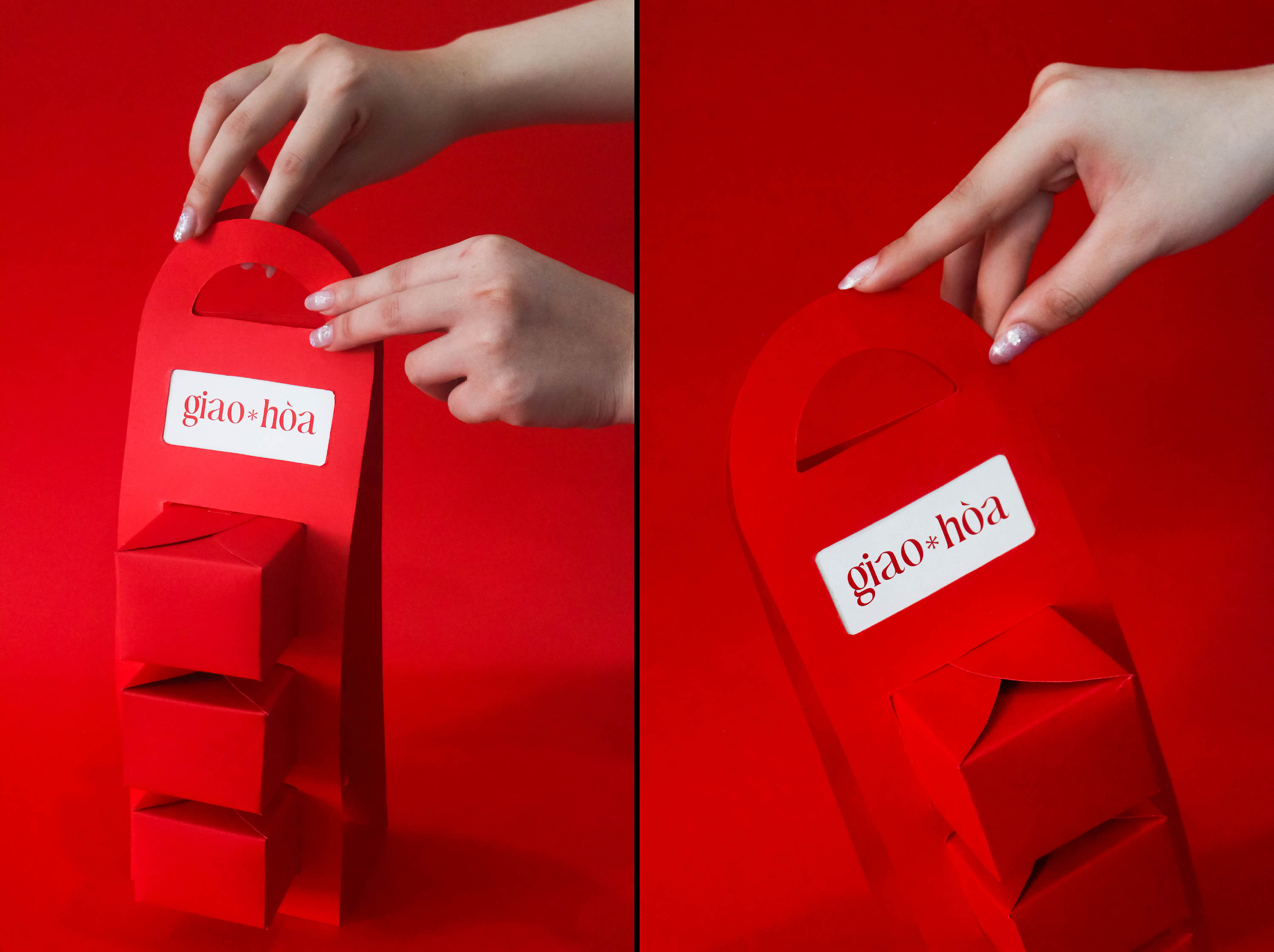
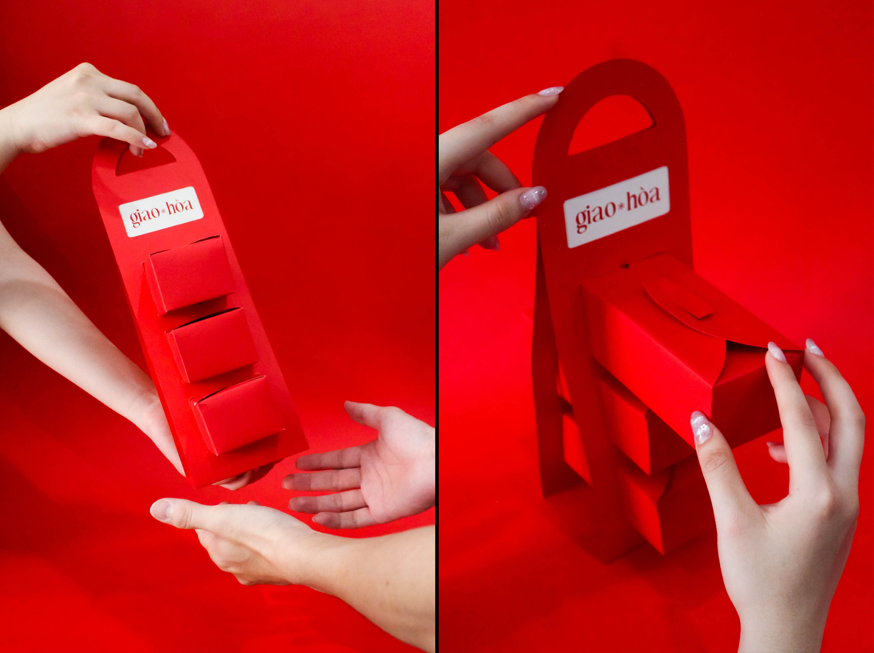
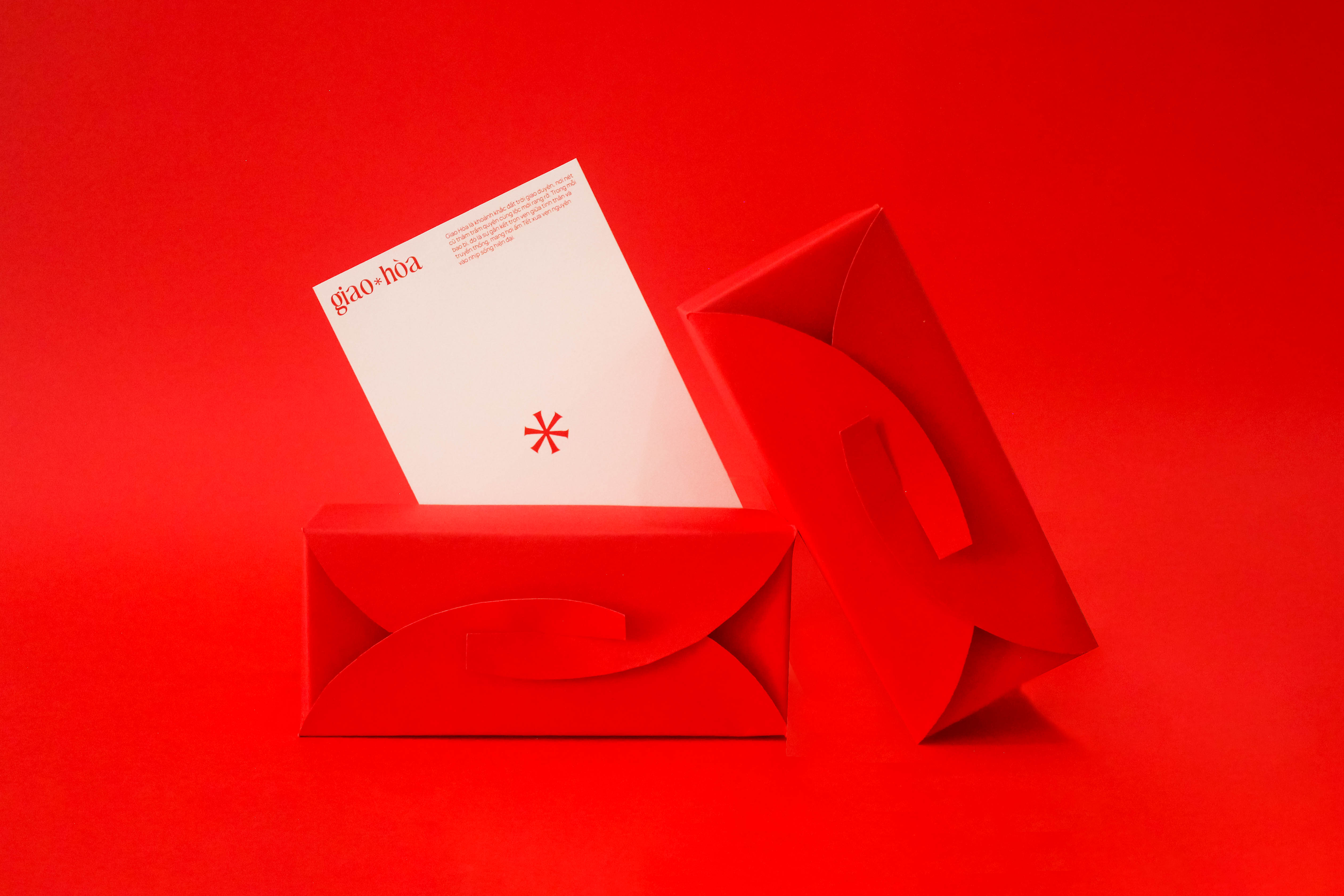
The highlight of Giao Hoa packaging lies in its unique interlocking lid structure. The two flaps weave together, evoking the image of hands firmly clasped—a symbol of enduring family bonds and the warm connections shared during the Lunar New Year.
Beyond representing unity, the intersection of the two lids serves as a poetic metaphor for Giao Thừa (New Year’s Eve)—the sacred threshold where the old year fades and the new begins. At this very “touchpoint,” traditional values and modern vitality converge in perfect harmony. Opening the box is more than just unboxing a gift; it is an act of welcoming new hopes and cherishing the heartfelt emotions passed from giver to receiver.
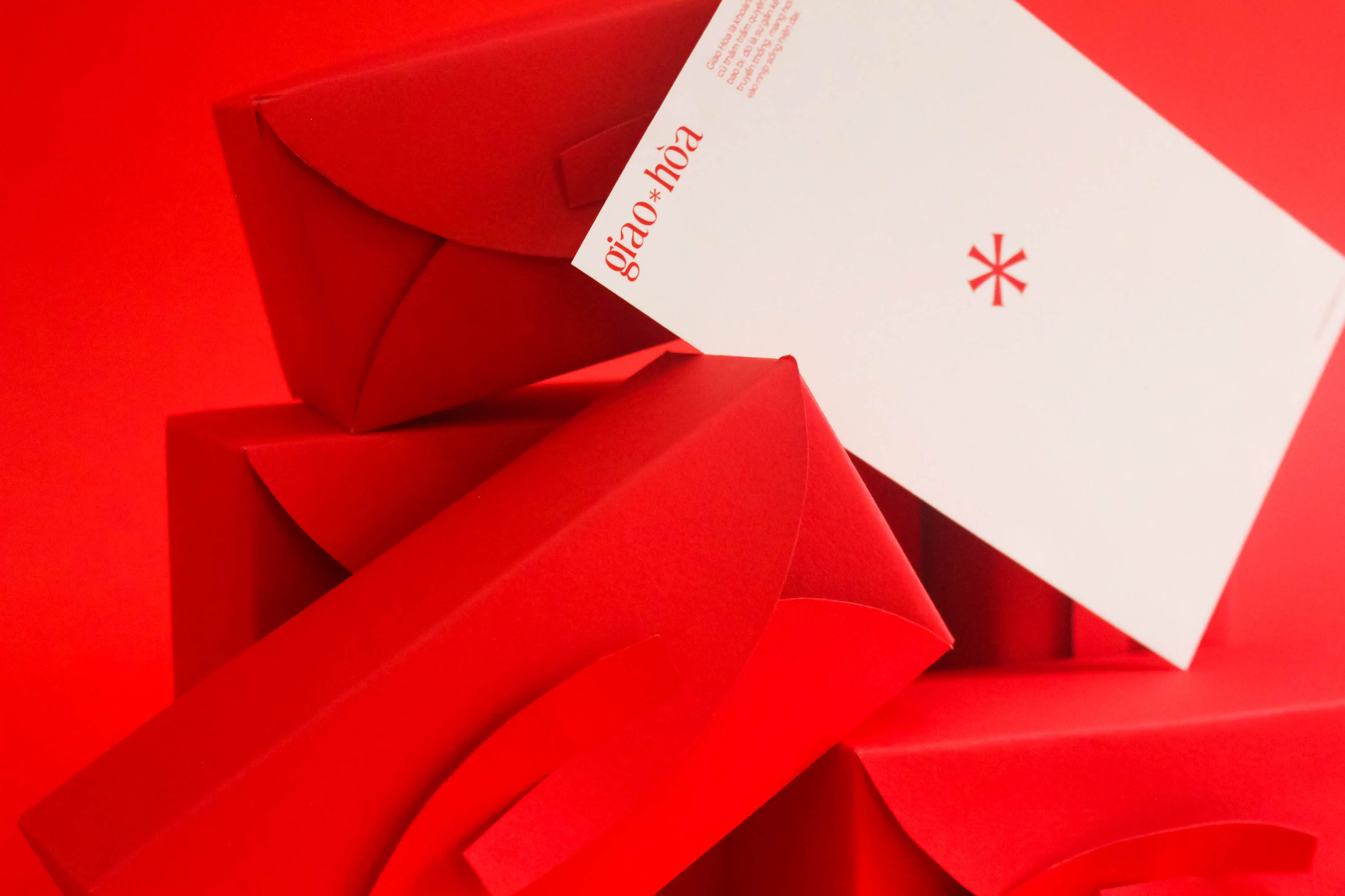
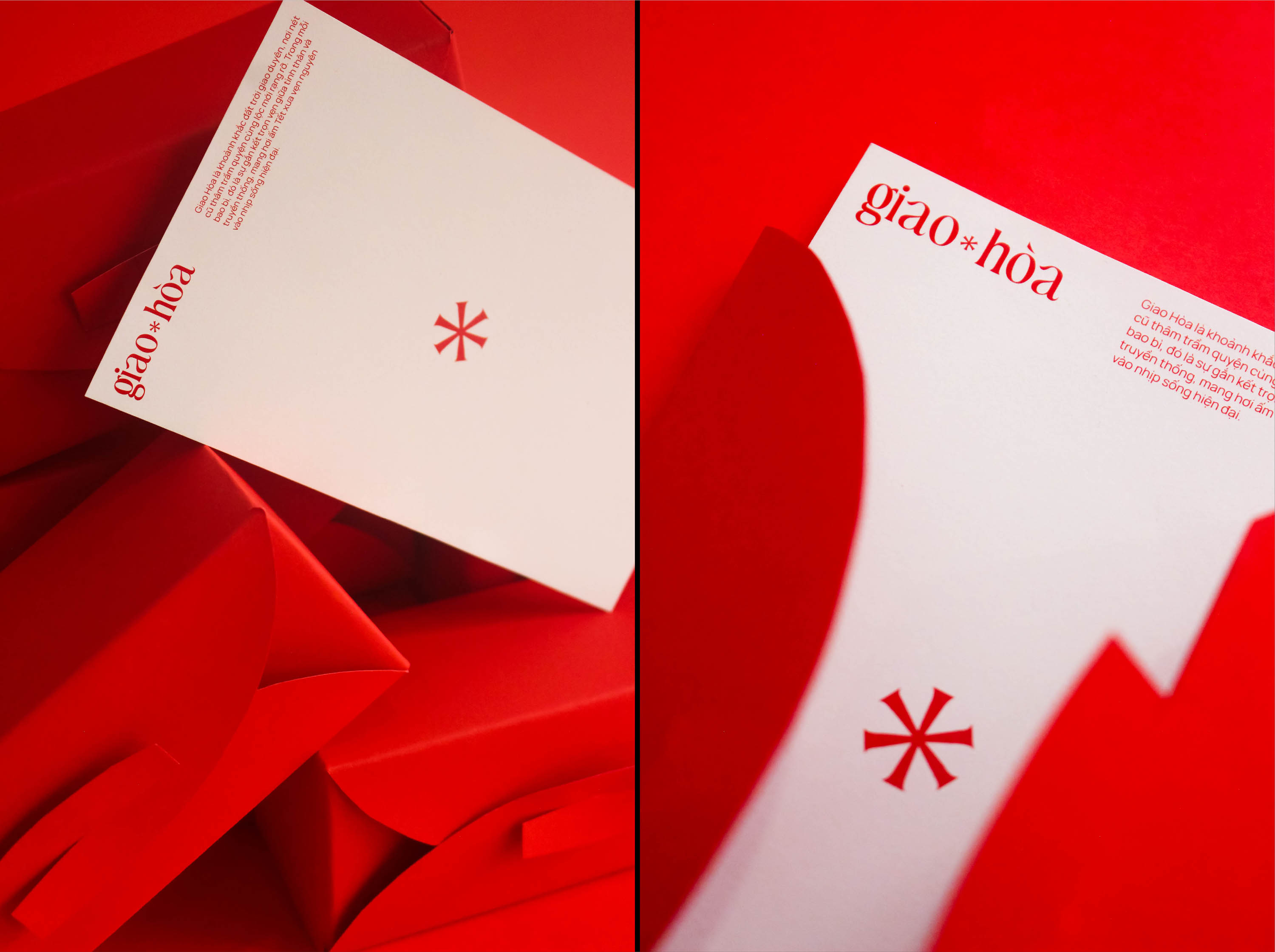
The combination of traditional red, elegant cream, and powerful black creates a palette that is both vibrant and profoundly deep. While the red represents luck and the warm flame of family bonds, the cream tone softens the visual experience, evoking a sense of nostalgia and grace. The accents of black provide a solid, luxurious foundation, offering a strong contrast that highlights the intersection between contemporary aesthetics and enduring Asian values.
The use of a Modern Serif font, with its slender and sharp lines, serves as a bridge connecting classical beauty with the spirit of the times. The serif details recall the meticulousness of heritage prints, while the modern letterforms convey a sense of premium minimalism. The contrast between thick and thin strokes not only creates a fluid visual rhythm but also asserts a sophisticated design style, allowing the packaging to transcend traditional boundaries and embrace a new aesthetic language.
Opening a Giao Hoa gift box is a journey back to cherished memories, where familiar scents and flavors converge. This subtle harmony awakens the senses, creating an invisible bond of peace and warmth during the sacred transition of the New Year.

CREDIT
- Agency/Creative: Ceris Creative
- Article Title: Giao Hoa Packaging Design by Ceris Creative Celebrates Tet Unity With an Interlocking Lid Ritual
- Organisation/Entity: Agency
- Project Type: Packaging
- Project Status: Published
- Agency/Creative Country: Vietnam
- Agency/Creative City: Da Nang
- Market Region: Asia
- Project Deliverables: Packaging Design
- Format: Box
- Industry: Food/Beverage
- Keywords: tet, viet nam, ceri creative, packaging, gift set
-
Credits:
Client: Horus Academy
Design Studio: Ceris Creative
Art Director: Phuoc Thien
Designers: Tam Nhu, Thuy Ngan
Showcase & Motion: Tam Nhu


