David Iverieli is a name, which is well known among classic Georgian brandy lovers. Because the very first blends under this brand name were created back in the 1960’s, and have garnered acclaim all across the Soviet Union. In our days the brand remains quite popular and adheres to the classic recipes developed over 60 years ago. However, from a visual standpoint, the need for a modern and relevant packaging design became apparent in order to make the product more competitive. On top of that, we had to keep the recognizability of the brandy and emphasize its traditional spirit.
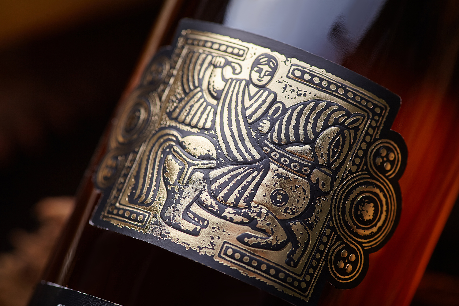
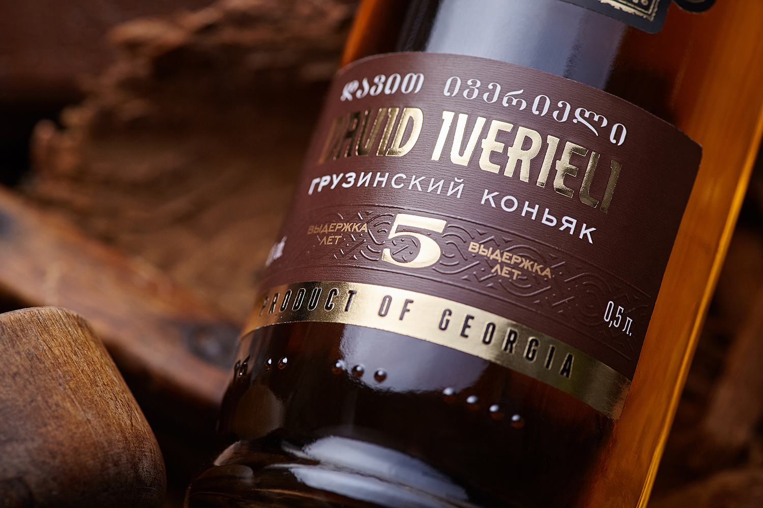
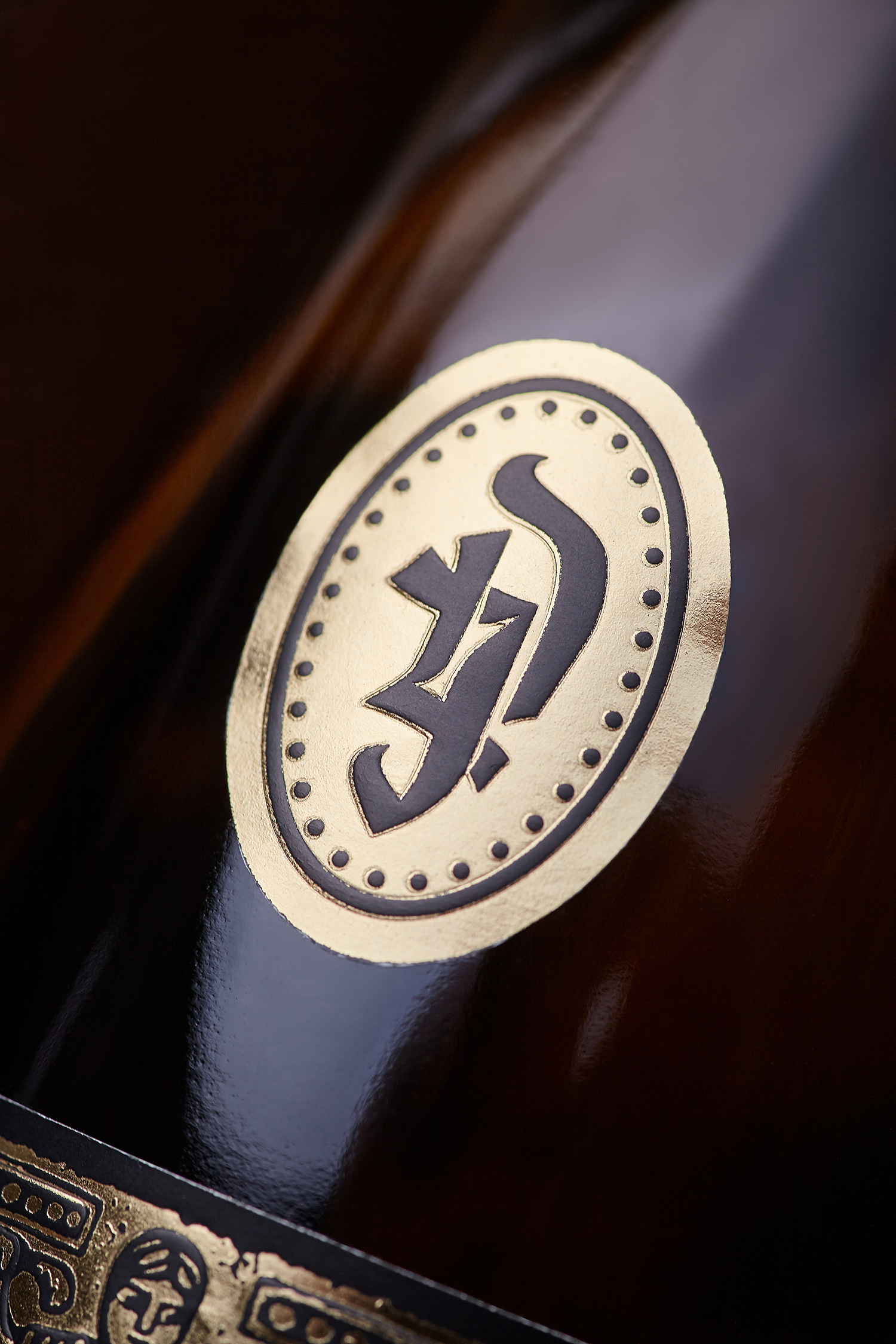
The design concept developed by our studio is based on the historical aspect of the David Iverieli brandy, which was created as a tribute to the Georgian king David IV The Builder. We’ve used an authentic image of the ruler, who united numerous Georgian kingdoms into a single state, and stylized it as a traditional Georgian gold stamping. The informational and graphic elements echo the style of the central element, which was made possible by intensely applying tactile varnish and foil stamping. As a result the three-piece label composition wields a pronounced ethnic character, which takes you into the depths of Georgian history, and at the same time looks quite relevant to the product shelf of today.







CREDIT
- Agency/Creative: 43oz.com - Design Studio
- Article Title: Georgian Brandy Label Design – David Iverieli
- Organisation/Entity: Agency, Published Commercial Design
- Project Type: Packaging
- Agency/Creative Country: Moldova
- Market Region: Europe
- Project Deliverables: Brand Rejuvenation, Graphic Design, Packaging Design, Tone of Voice
- Format: Bottle
- Substrate: Glass Bottle


