


Iconoclast Design Co – Georgia Fire Hot Sauce
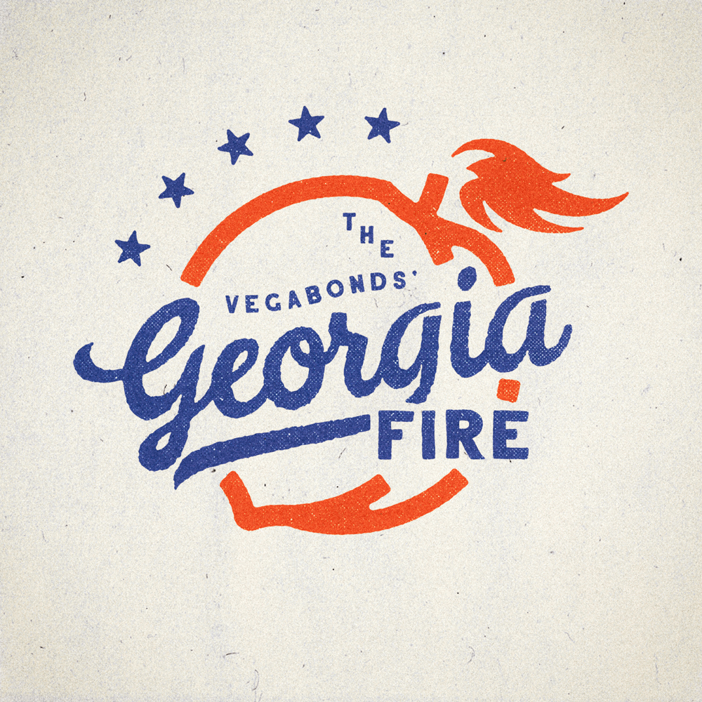
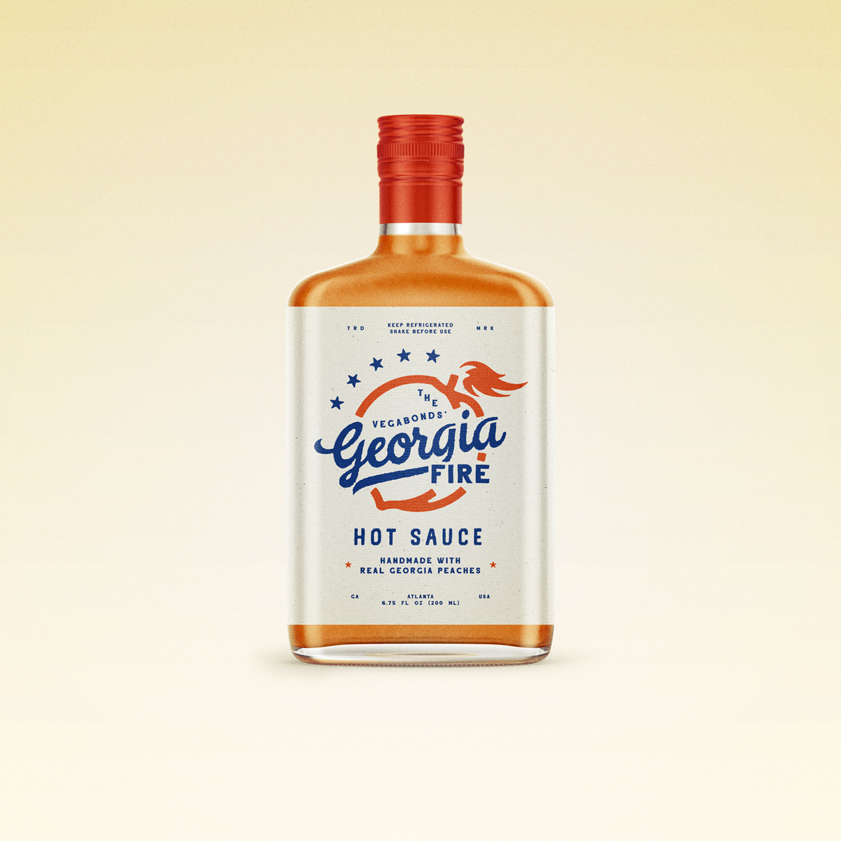
It’s a pleasure to share Georgia Fire — a hot sauce I worked on with Nashville based rock group The Vegabonds. It’s handmade from real Georgia peaches and habanero peppers and is super tasty. I had a lot of fun bringing this product to life visually and helping The Vegabonds realize a dream. The sauce gets its name from the band’s hit song “Georgia Fire” — a tune about the day the historic Georgia Theater burned down. The solution — an iconic flaming peach. It works on a bottle of sauce. It works on a t-shirt. It works on a trucker hat and a sticker. It works on a show poster and a drumhead. As with most clear package design projects where the contents show through, color can be one of the biggest challenges. Since the color of the sauce is orange, we chose a light natural paper for contrast, hit on a subtle Georgia/American theme with the blue and red design, and finally the red cap — which in my opinion brought the whole package together.
CREDIT
- Agency/Creative: Iconoclast Design Co
- Article Title: Georgia Fire Hot Sauce — Brand Identity for The Vegabonds
- Organisation/Entity: Agency, Published Commercial Design
- Project Type: Packaging
- Agency/Creative Country: United States America
- Market Region: North America
- Format: Bottle
- Substrate: Glass


