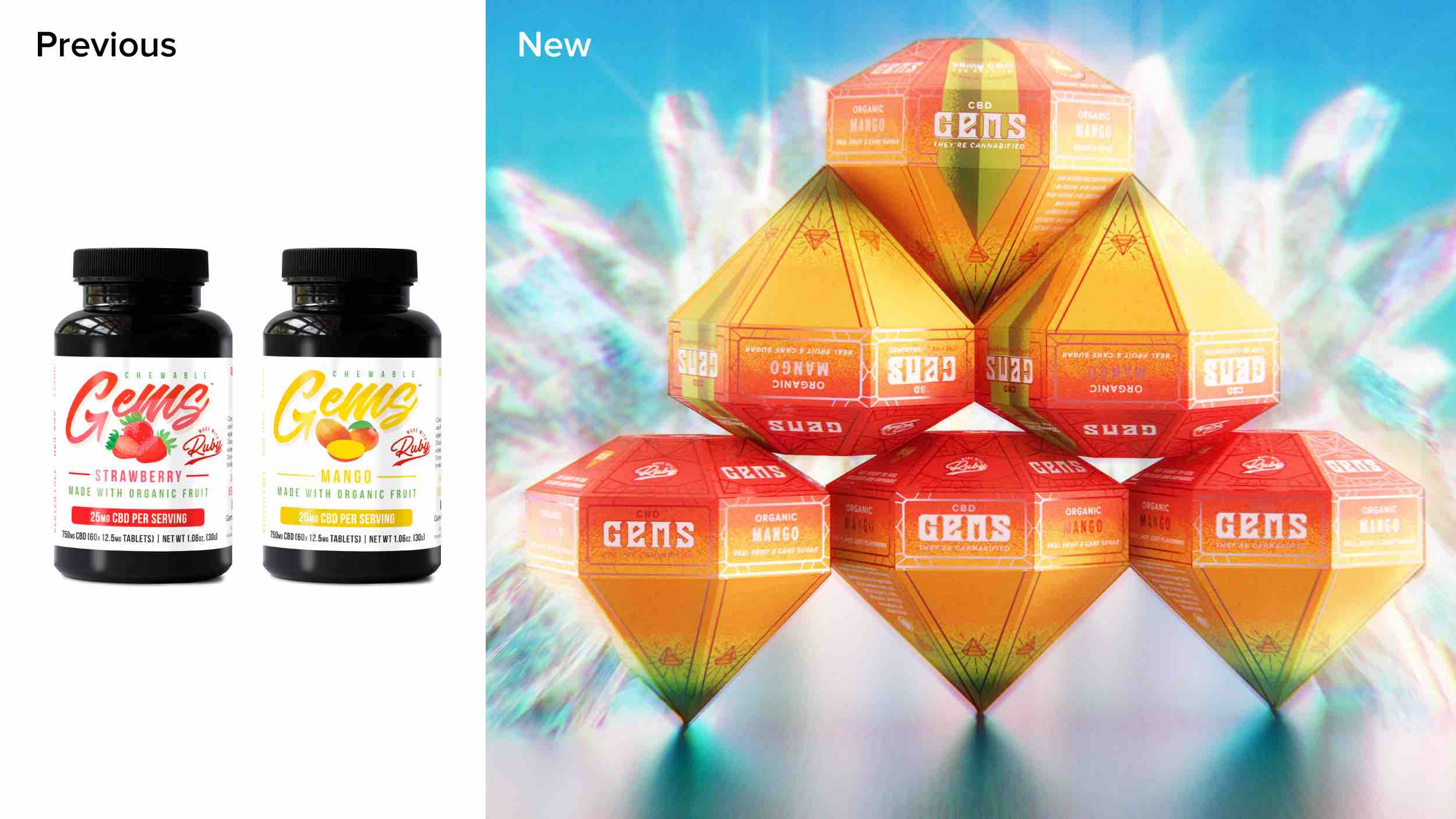
Gems are a premium edible that combines real organic fruit with cannabis infused sugar for a bliss-filled experience and none of the chemical aftertaste. Such a uniquely exceptional product requires branding and packaging to complement it and incite consumer curiosity. Unfortunately, the current packaging (a standard pill bottle) and visual identity didn’t support this. To compound the problem, the US market is flooded with run-of-the-mill pill bottles, boxes and zippered pouches.
We had the unique pleasure of shaping several facets of the brand (pun intended) from the shape and design of the packaging itself to the logo and extended visual language. All of these work together to elevate the consumer experience as they spot and engage with this incredible product.
Packaging:
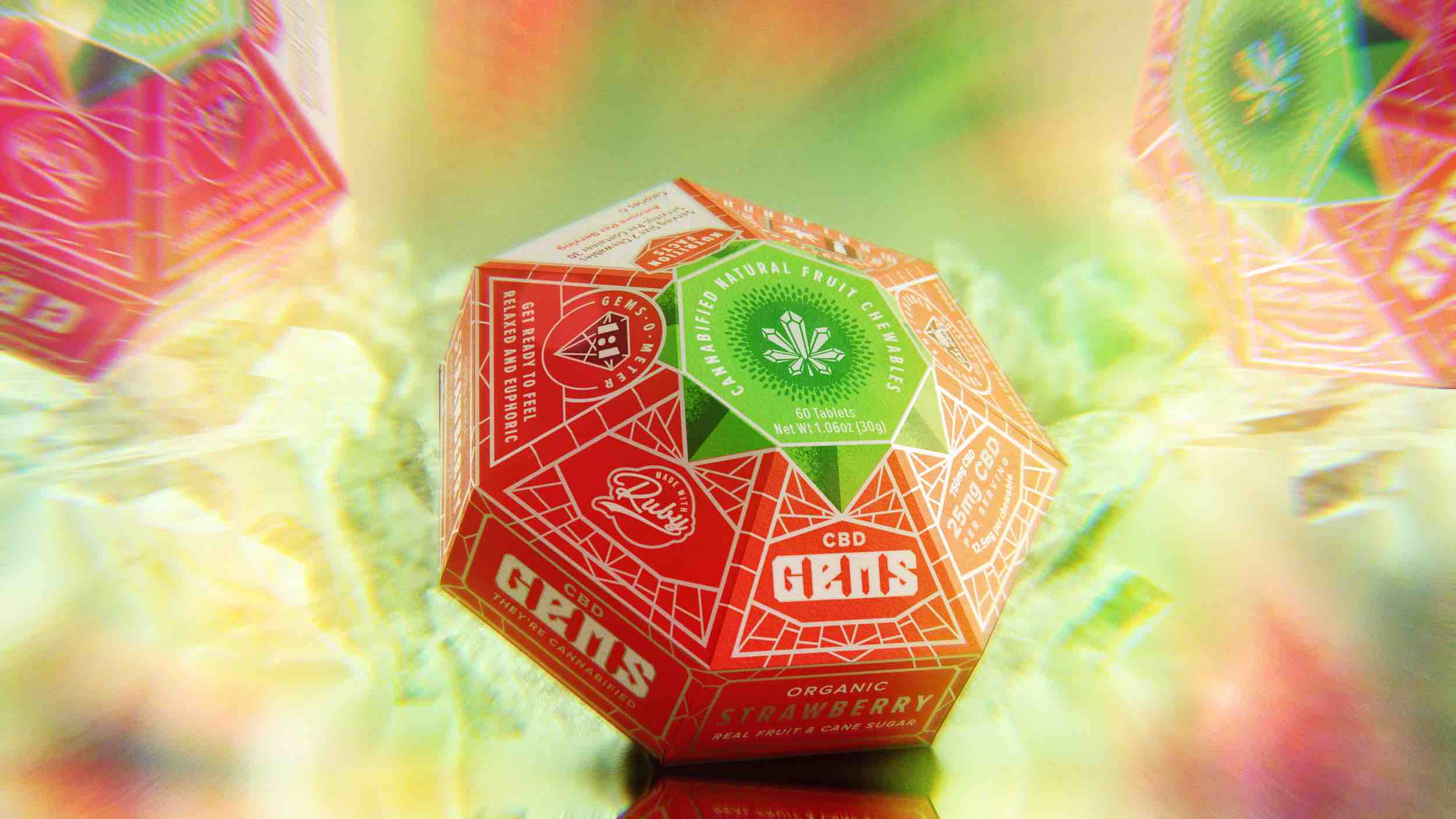
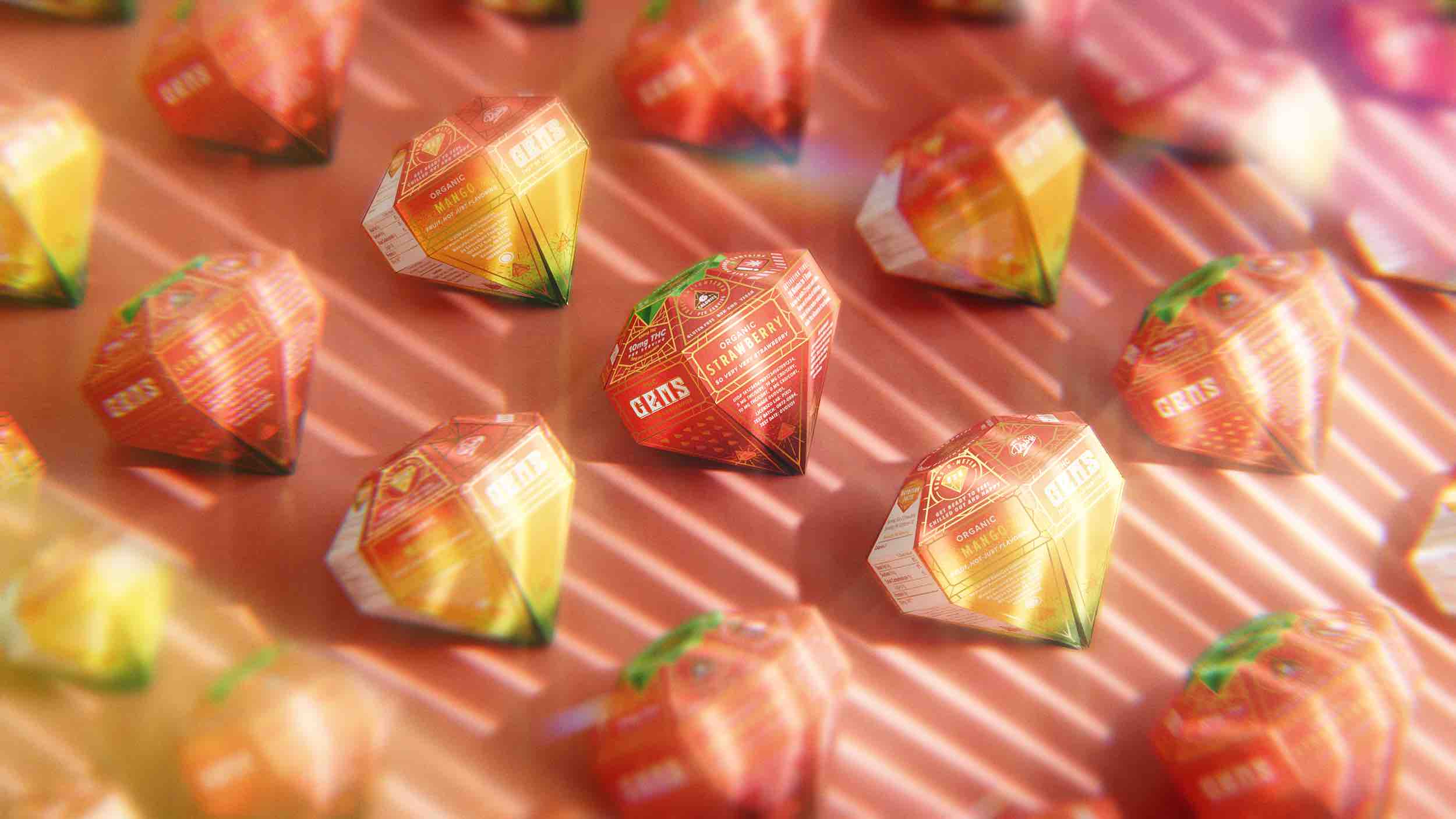
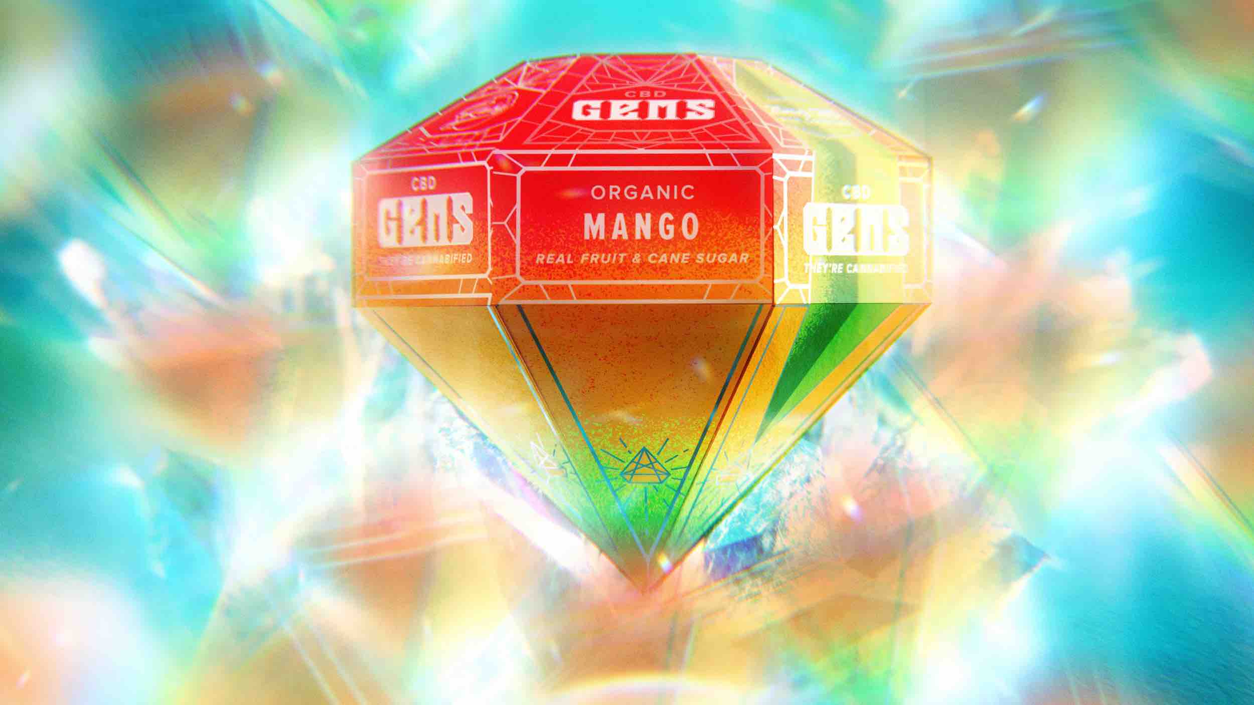
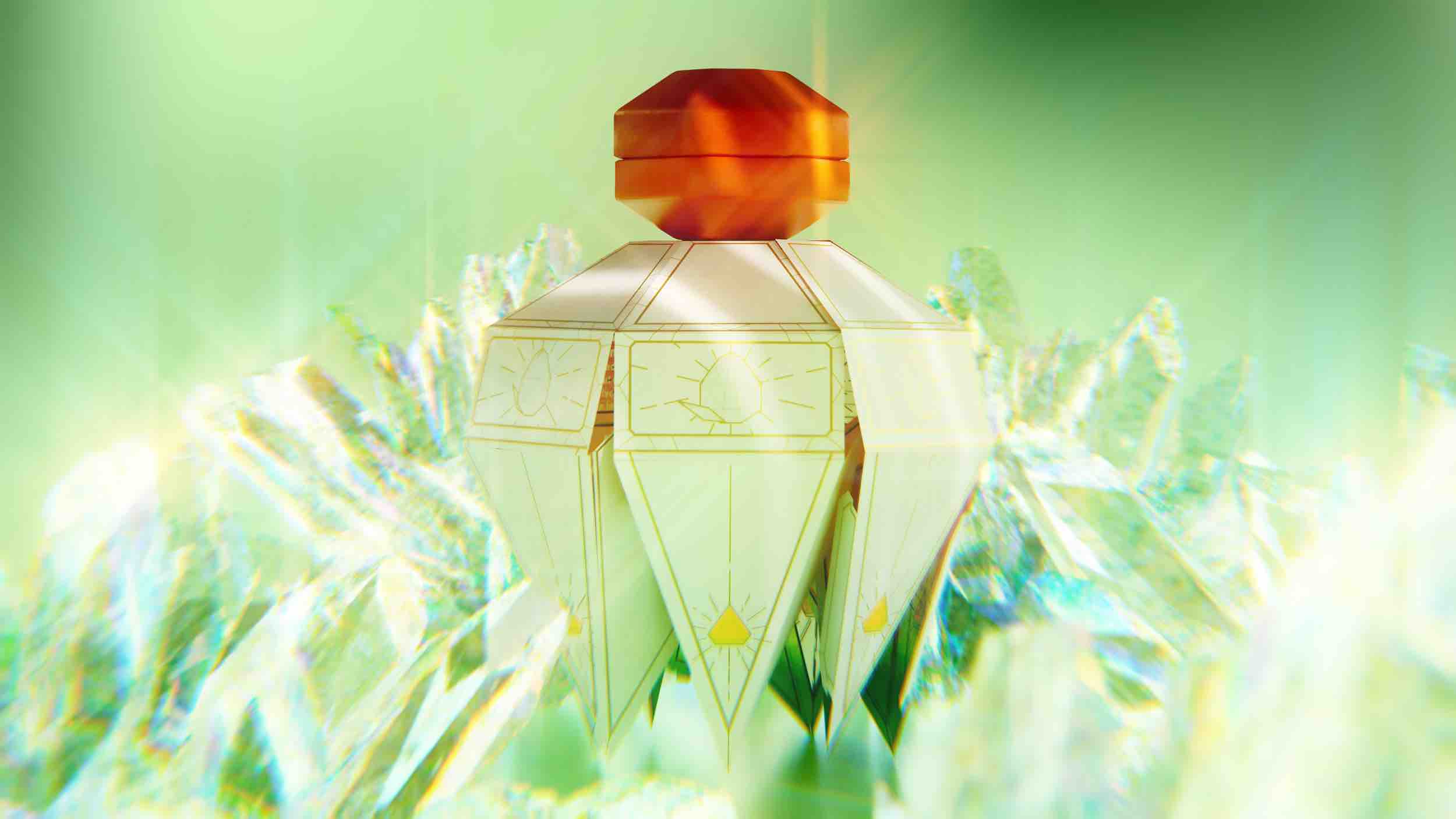
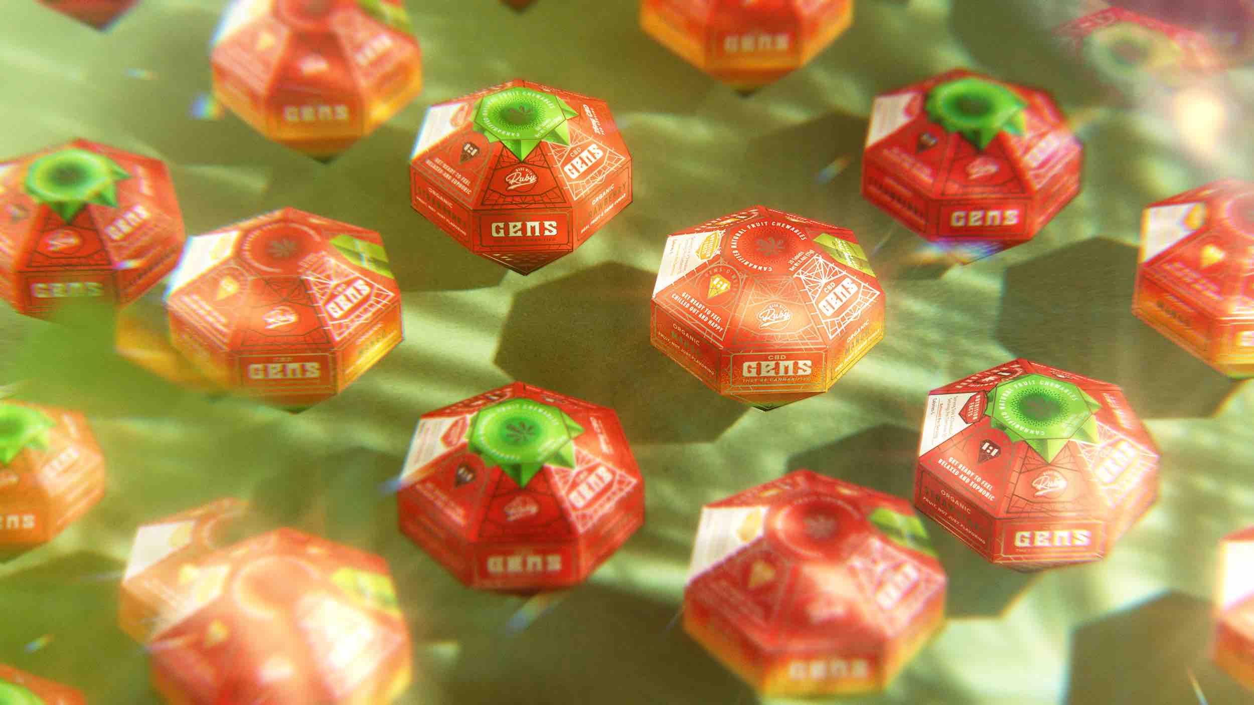
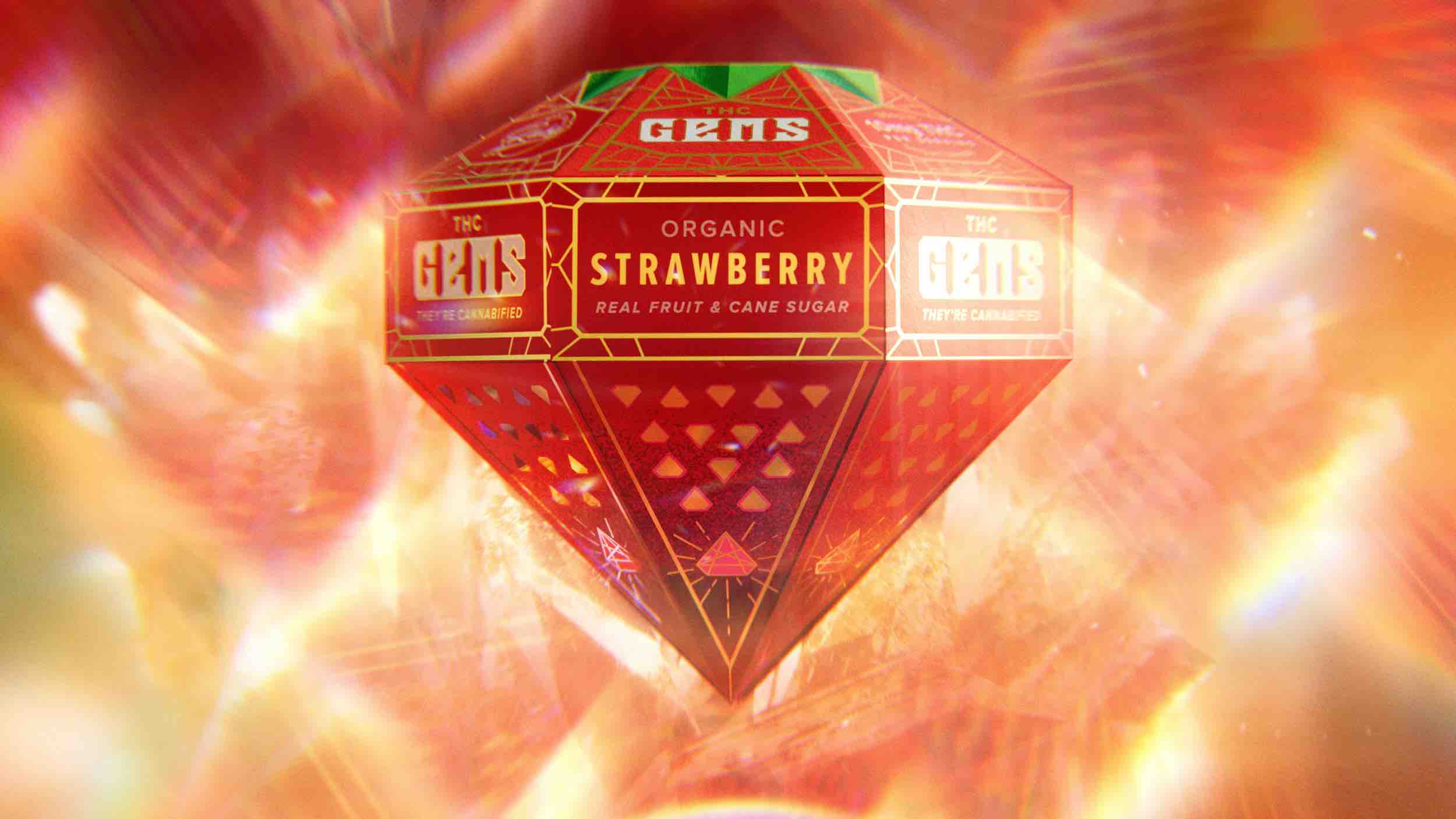
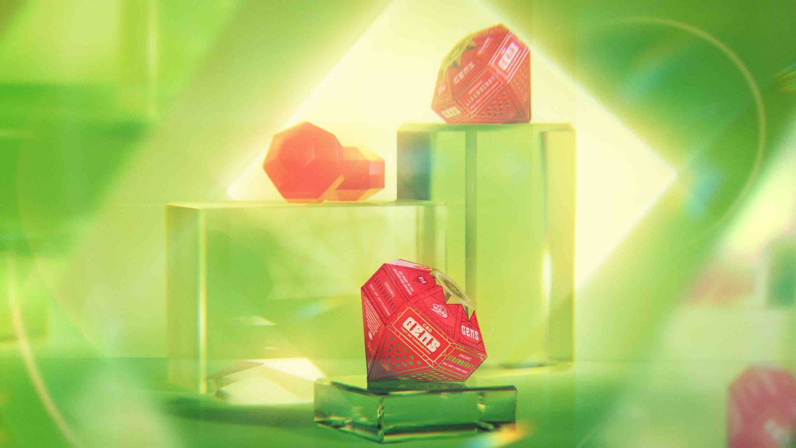
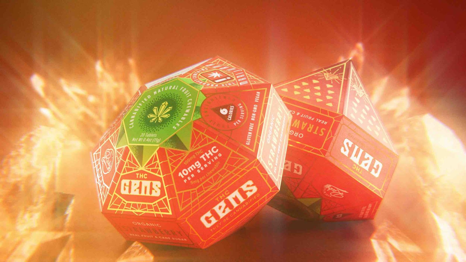
We wanted the experience of holding Gems to feel precious, incredibly engaging and stand far apart from the competition. A custom seven-sided gemstone dieline for the outer packaging was developed that would be consistent for all flavors and varieties so that consumers could identify the product easily from a distance. This gemstone silhouette is decorated to resemble a “gemified” fruit through bright, eye-catching colors and other decorative elements that mirror the flavor of the product within.
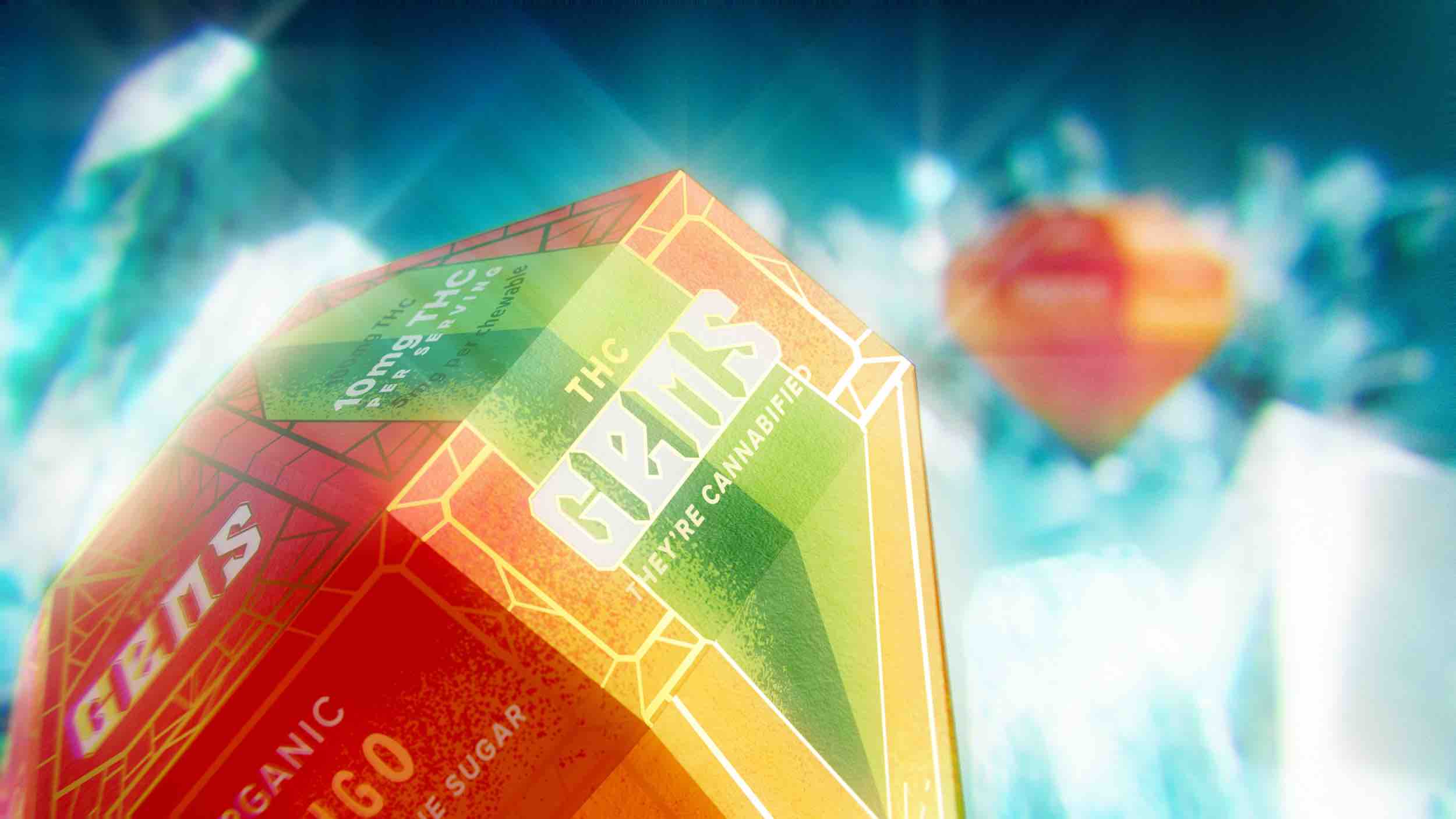
Silver and gold metallic foils were utilized to not only add a touch of luxe, but also quickly differentiate between the two varieties available in each flavor (CBD and THC).
All of these elements work together to create a unified system that is flexible enough to easily allow future flavors to be brought into the product line.
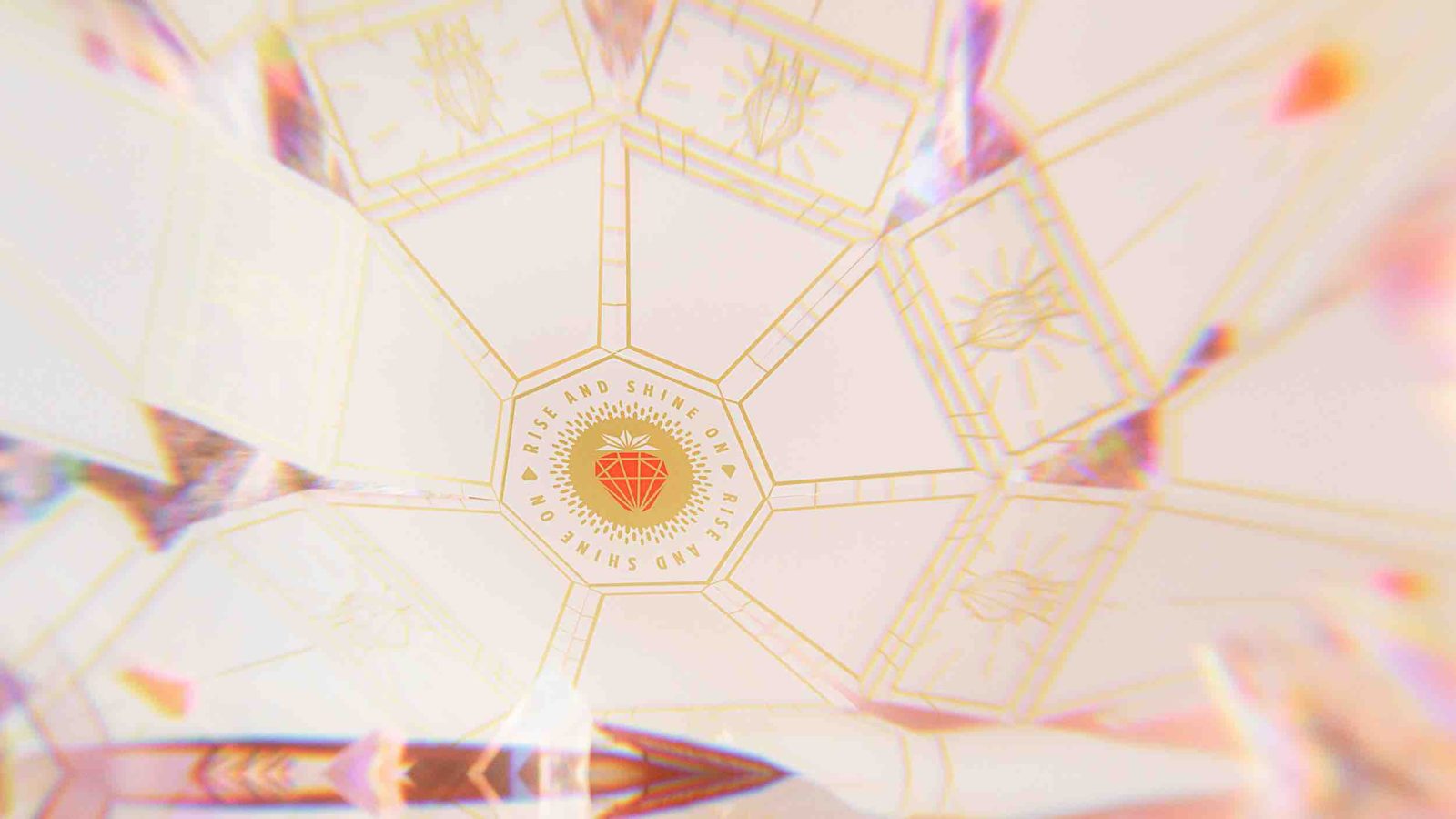
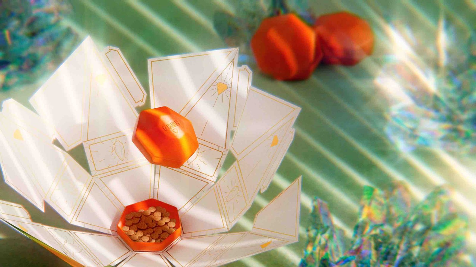
As it is opened, the gemstone box blossoms like a flower to reveal the inner child-proof box inside. Thus even the shape of the packaging and unboxing experience are brand assets.
As a final easter-egg, the bottom panels of the outer packaging are adorned with fruit graphics that when spun function as an animated zoetrope.
The Logo:
Gems get their name from the propriety process by which THC and CBD are infused at the molecular level into the sugar crystals themselves. The core logomark was developed with this in mind: A crystalized cannabis leaf emitting its essence as it dissolves. To complement this, custom gemstone letterforms with gemstones in their negative space were created and could be used as a standalone wordmark or locked up with the logomark.

CREDIT
- Agency/Creative: Mindprizm
- Article Title: Gems Cannabis Chewables Packaging Redefined for a Luxe Experience
- Organisation/Entity: Agency
- Project Type: Packaging
- Project Status: Published
- Agency/Creative Country: United States
- Agency/Creative City: Springfield, Missouri
- Market Region: Global
- Project Deliverables: Packaging Design
- Format: Box
- Industry: Health Care
- Keywords: WBDS Agency Design Awards 2023/24
- Keywords: Packaging Design, Product Redesign
-
Credits:
Creative Director / Designer / Packaging Development: Michael Dockery
3d Photographer: Dany Diaz
Photo Retouching: Drew Lundquist
Composer / Original Music for Promo Videos: Colton Jackson


