


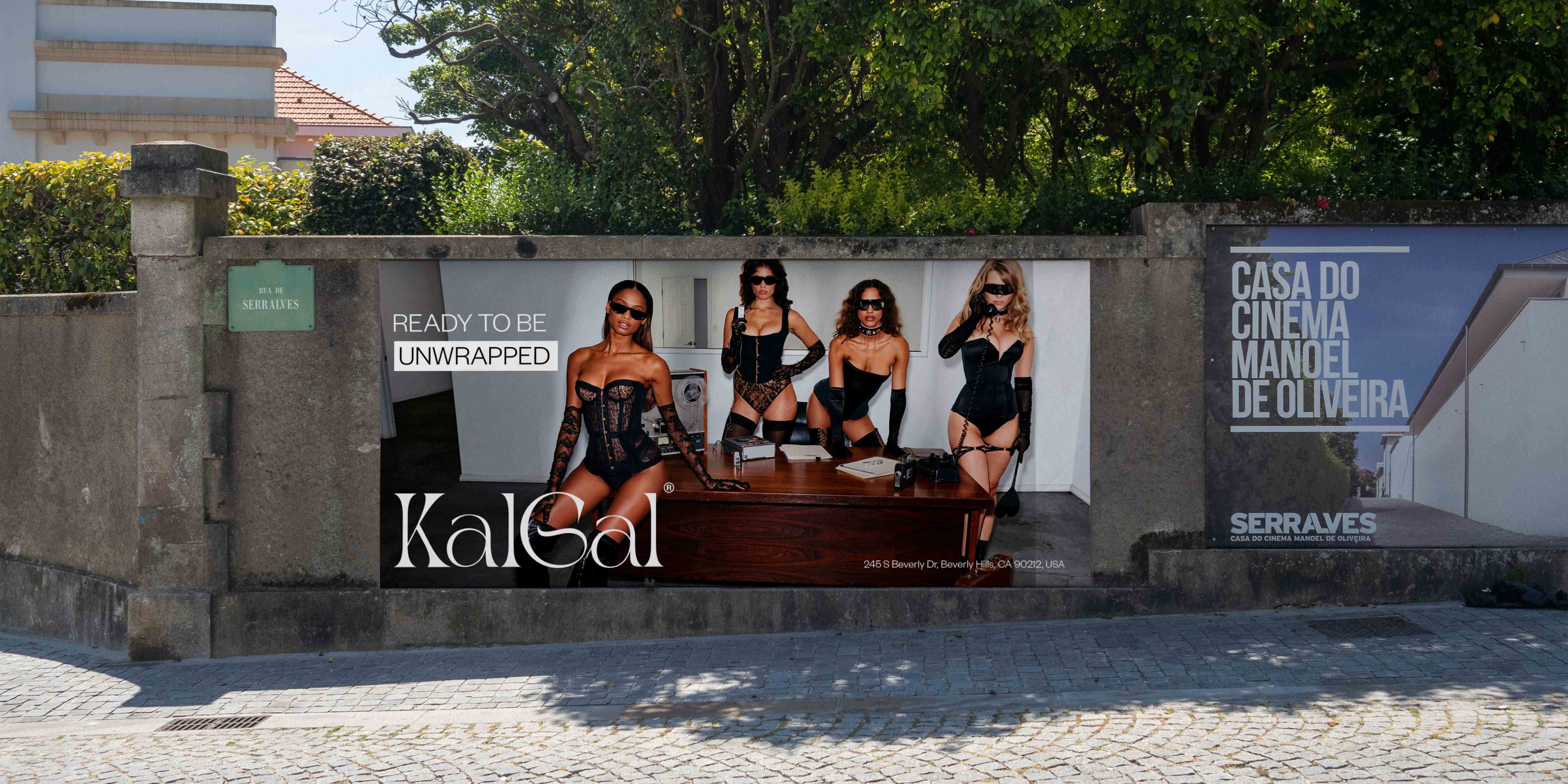
The brand concept for Kalgal took root in the recognition of the complex dynamics surrounding sensuality, particularly in attire like bikinis and lingerie. The aspiration was to create a space that celebrated allure, elegance, and confidence without adhering to conventional stereotypes. Kalgal was envisioned as a platform to challenge norms, advocate for inclusivity, and advocate for the legalization and regulation of professions like call girls, understanding the impact and demand within society.
The name “Kalgal” is derived from a combination of influences. “Kal” reflects the concept of allure and beauty, drawing inspiration from various languages where “kal” signifies beauty or allure. “Gal” represents empowerment, symbolizing strength and confidence. Together, “Kalgal” embodies the fusion of allure and empowerment, signifying a brand that celebrates beauty while empowering individuals to embrace their sensuality on their terms.
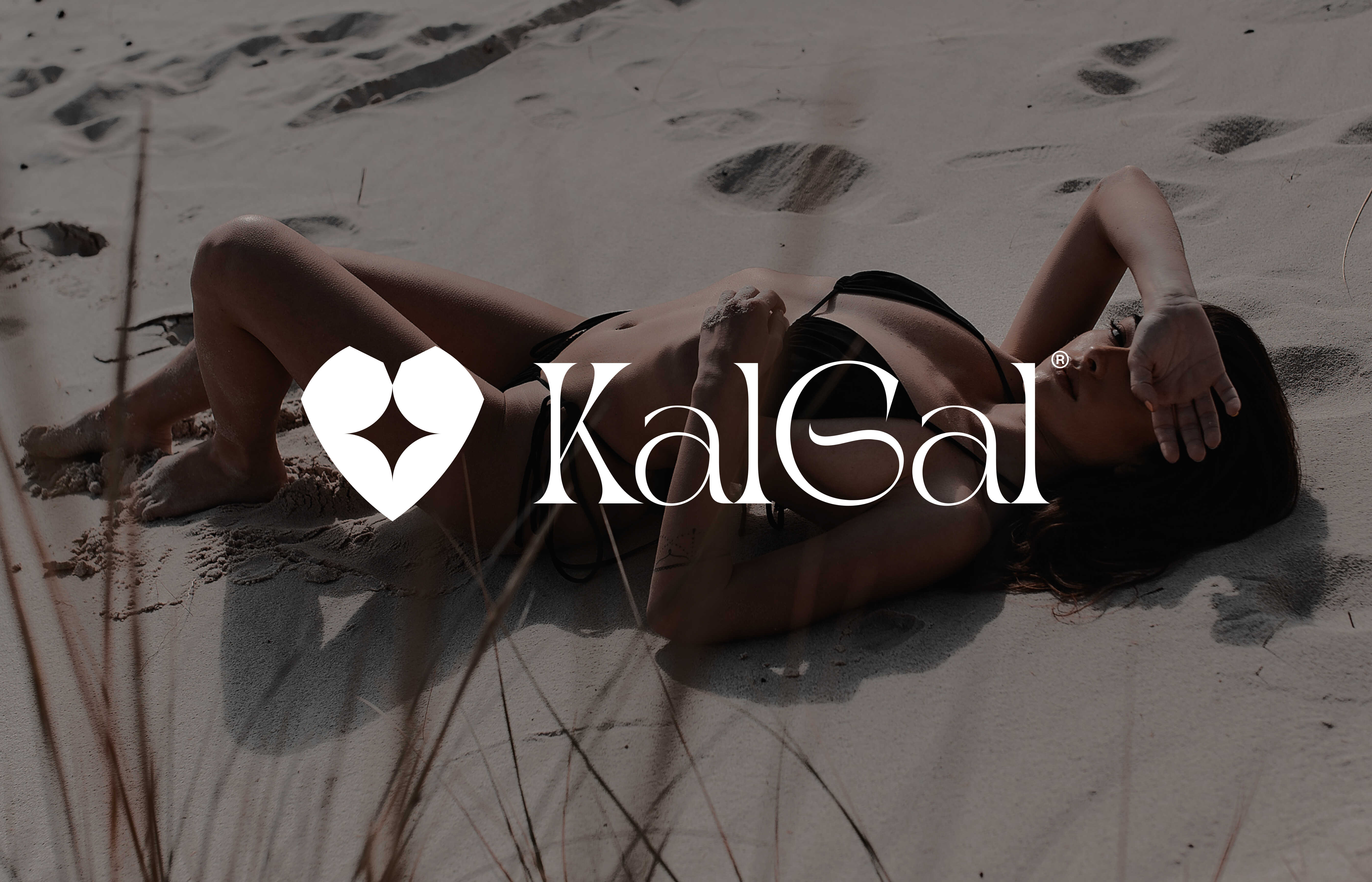
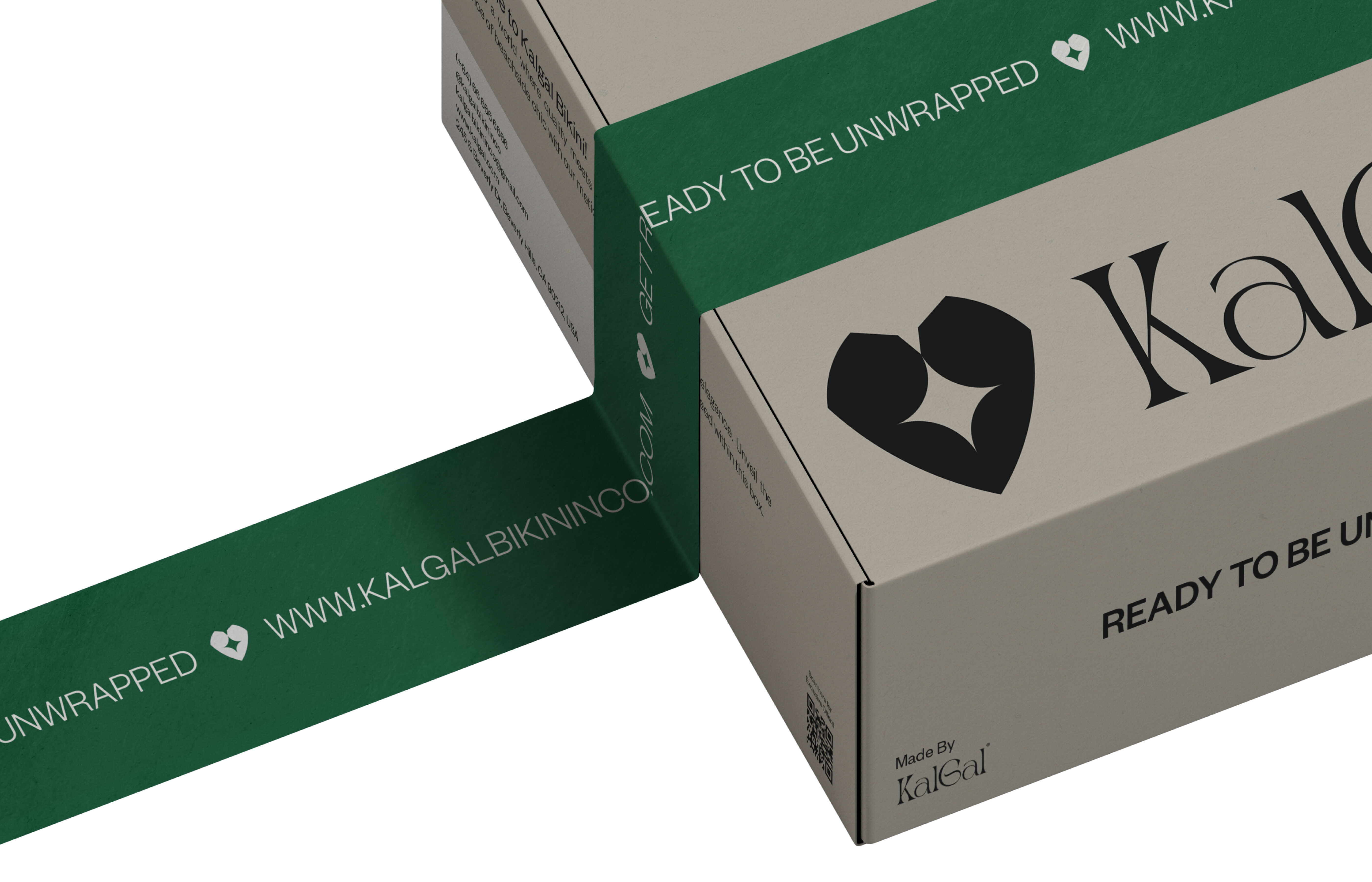
The brand’s visual identity centers around the logo, a heart-shaped gem with a star at its core. This design draws inspiration from the romantic “Titanic” scene where Jack sketches Rose adorned with the “Heart of the Ocean” necklace, symbolizing love, allure, and empowerment. The depiction of Rose with aristocratic allure, tasteful yet alluring under Jack’s loving gaze, encapsulates the brand’s ethos of sophistication and empowerment.
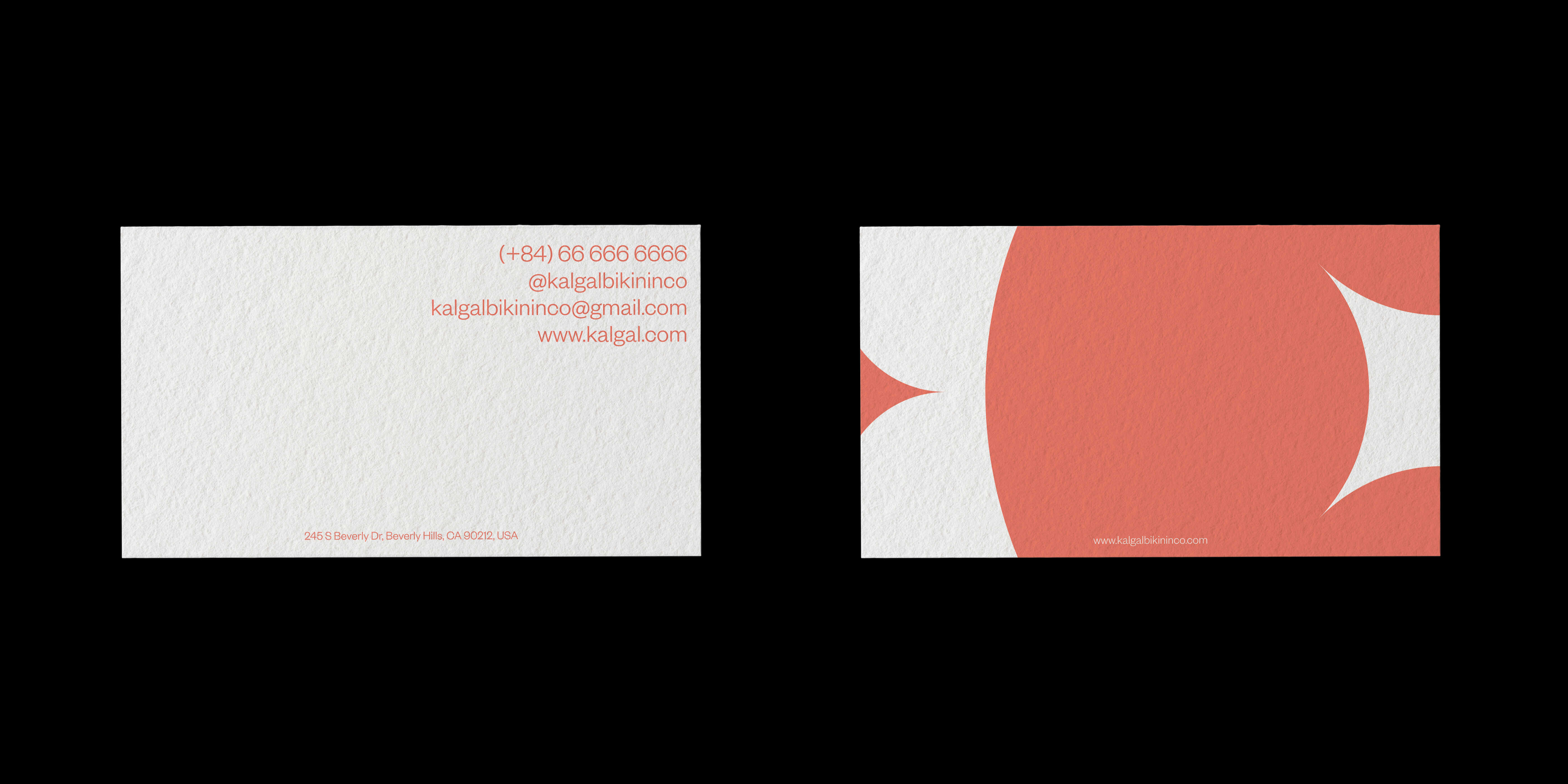
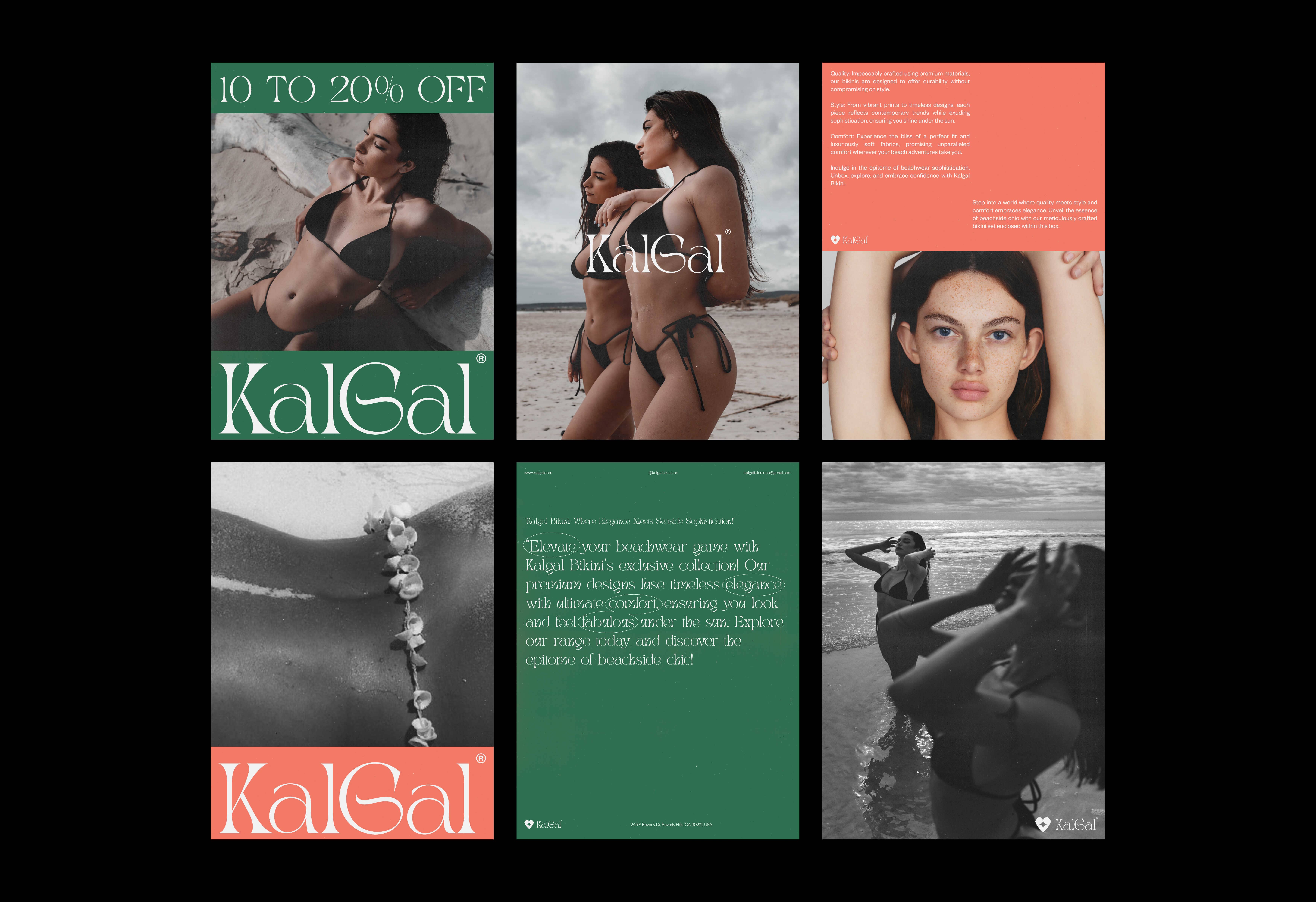
The sparkling star within the gem echoes feminine curves, representing Kalgal’s blend of beauty and sensuality that’s never excessive. The choice of the turquoise color, inspired by the elegance and mystery of emerald and the tenderness of nature, symbolizes serenity and sophistication. Orange complements this palette, representing dynamism, enthusiasm, and intense desire, reflecting the brand’s energy and passion for challenging norms.
The overall graphic design elements of Kalgal aim to evoke a sense of elegance, allure, and empowerment, intertwining sophistication with a celebration of sensuality, setting the tone for a brand that seeks to redefine beauty and challenge societal standards in the world of intimate attire.

CREDIT
- Agency/Creative: Quan Vu
- Article Title: Gem-Inspired Beauty: Kalgal’s Heart-Centric Visual Identity Designed by Quan Vu
- Organisation/Entity: Student
- Project Type: Graphic
- Project Status: Published
- Agency/Creative Country: Vietnam
- Agency/Creative City: Ho Chi Minh City
- Market Region: North America
- Project Deliverables: 2D Design
- Industry: Fashion
- Keywords: Kalgal Bikini & Lingeries
-
Credits:
Graphic Designer: Quan Vu


