Texcoco is a small town located an hour away from Mexico City, with many small businesses full of tradition. Gelana is an ice cream shop established in 1999 by a local businessman as a small corner shop. After twenty-two years, it is now positioned within other restaurants in the area, delivering delicious, handmade ice creams. It has also opened a second, slightly bigger store.
However, the Covid-19 pandemic in 2020 challenged most local businesses. More prominent companies such as Walmart and Sams were still running and offered a wide variety of international ice cream brands. Although locals deeply love Gelana for its tradition, many people still buy ice creams from commercial brands in supermarkets.
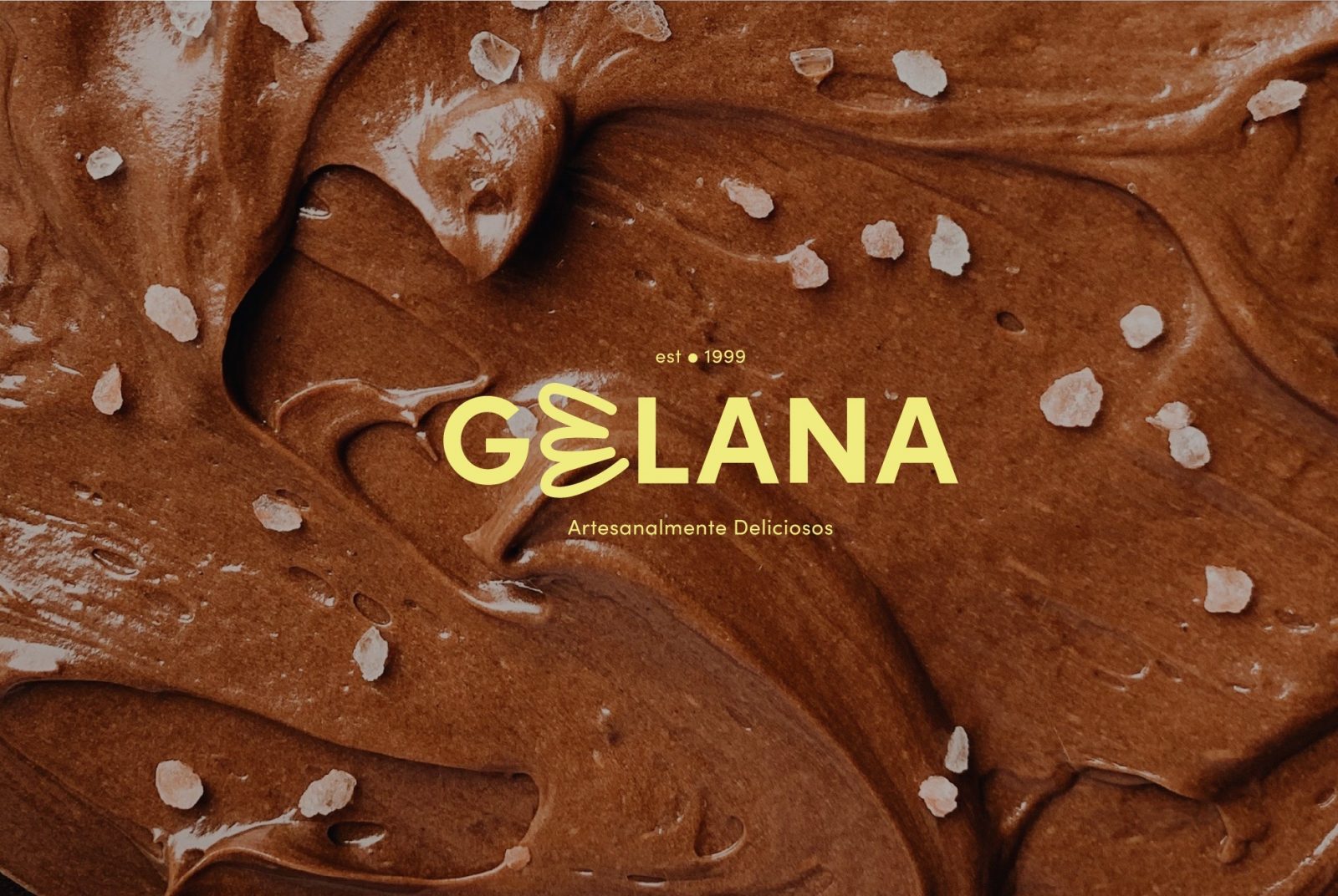
This project takes Gelana’s previous graphic identity. It turns it into a young, colorful, and bold branding proposal to make it look and feel as authentic and vibrant as its community. The main objective is to make it thrive, become a popular destination for ice-cream lovers in town, and make people support local businesses.
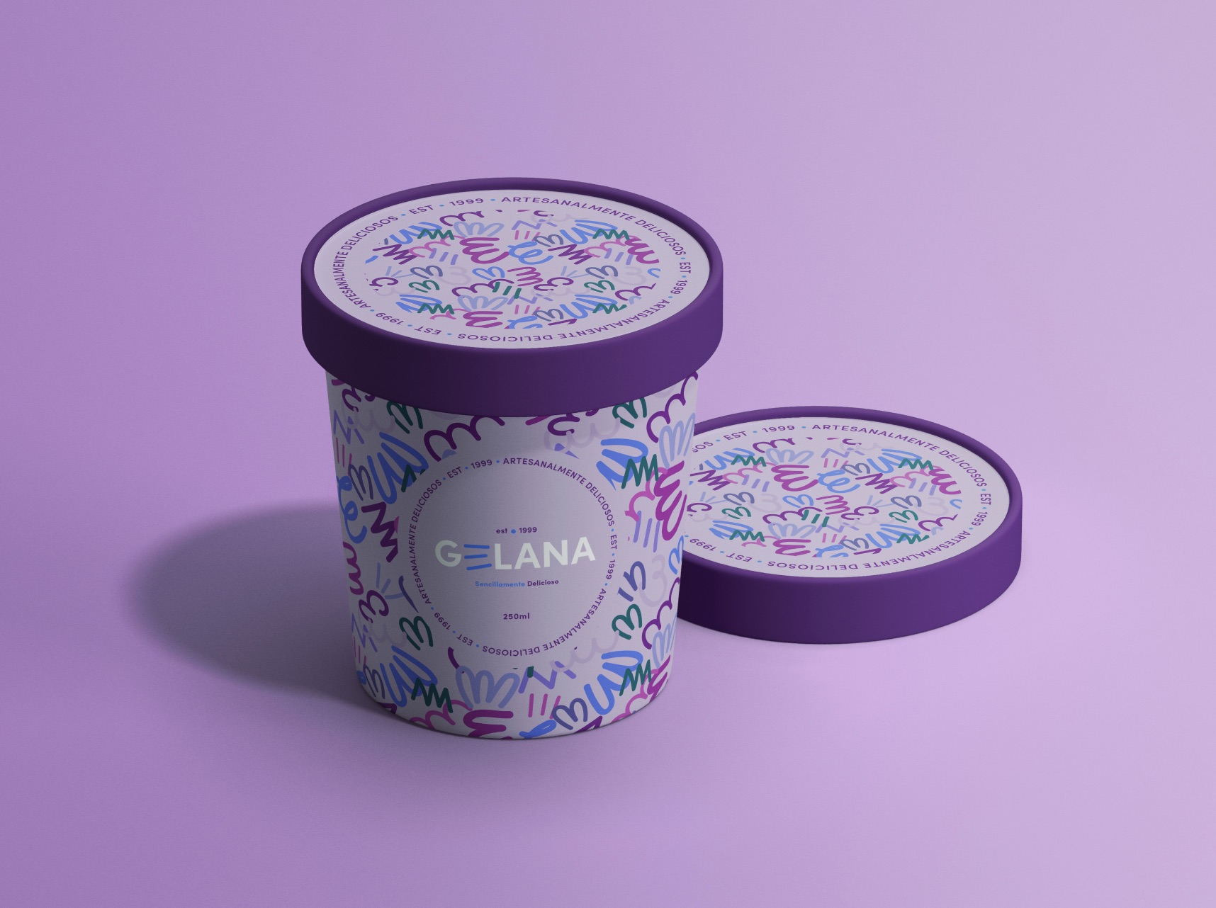
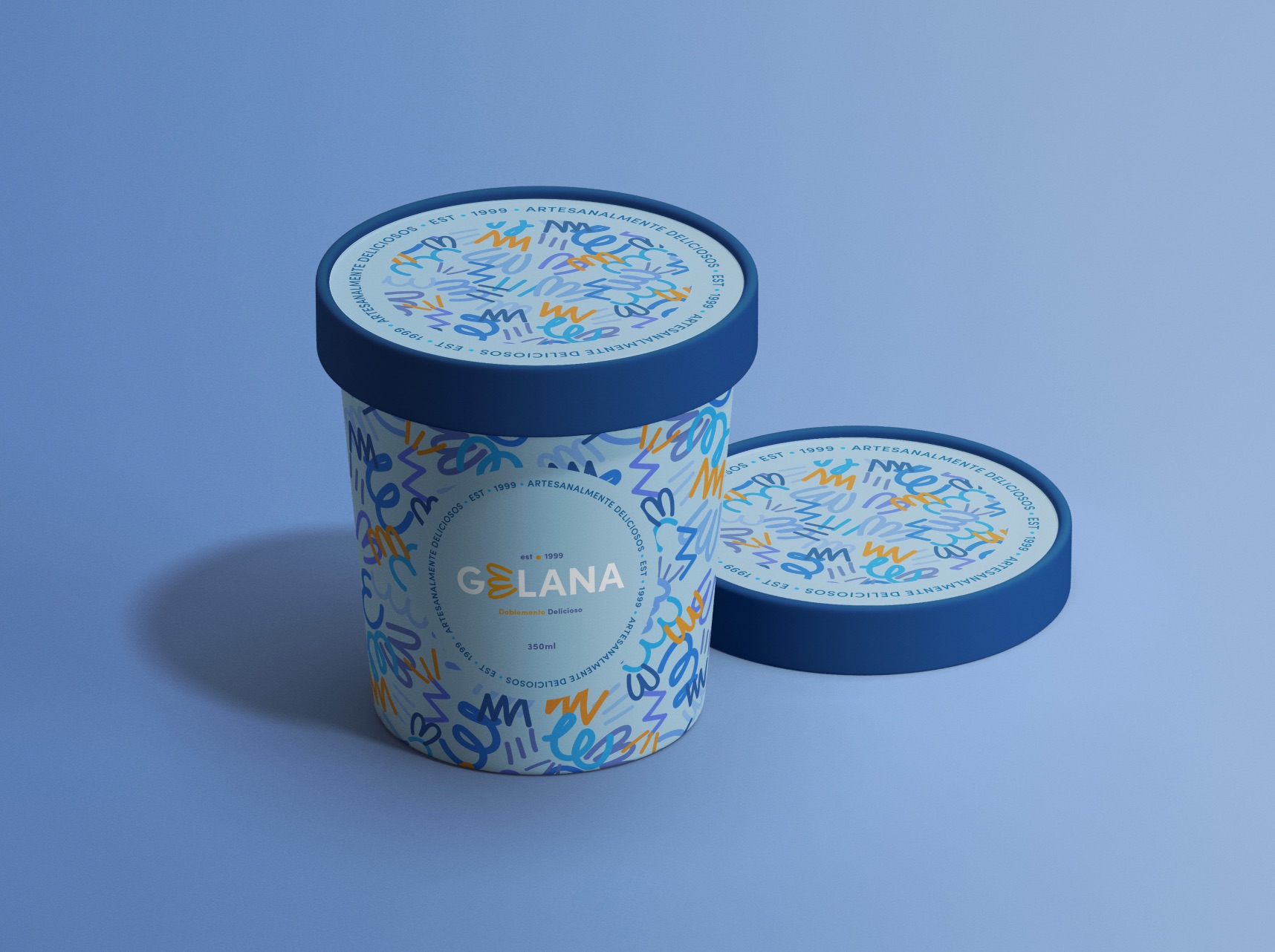
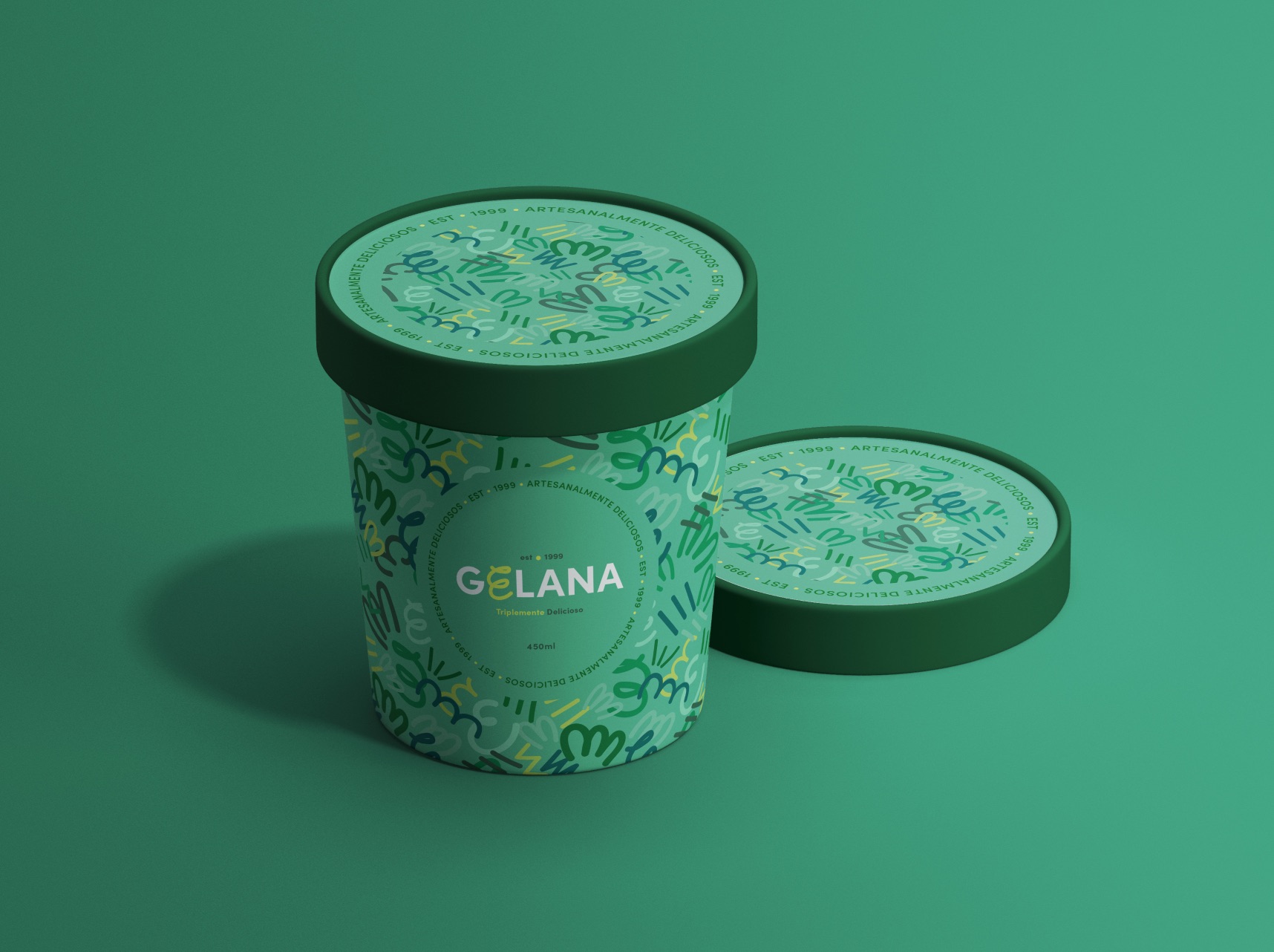
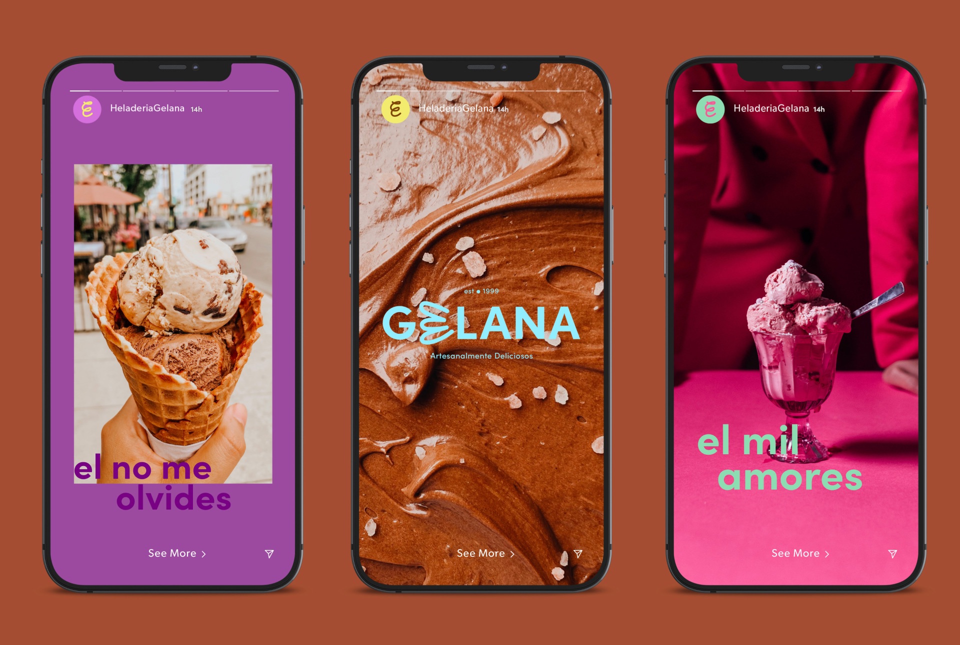
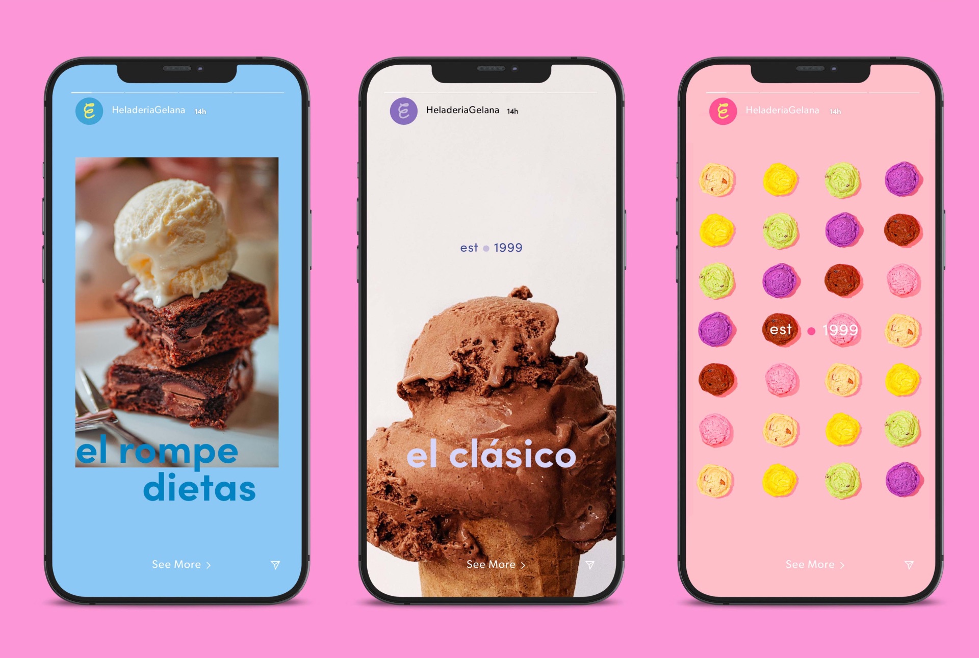
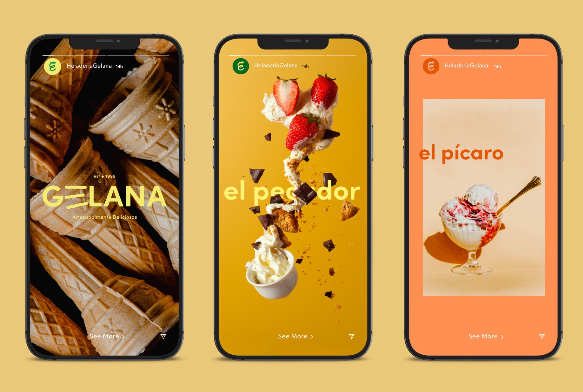
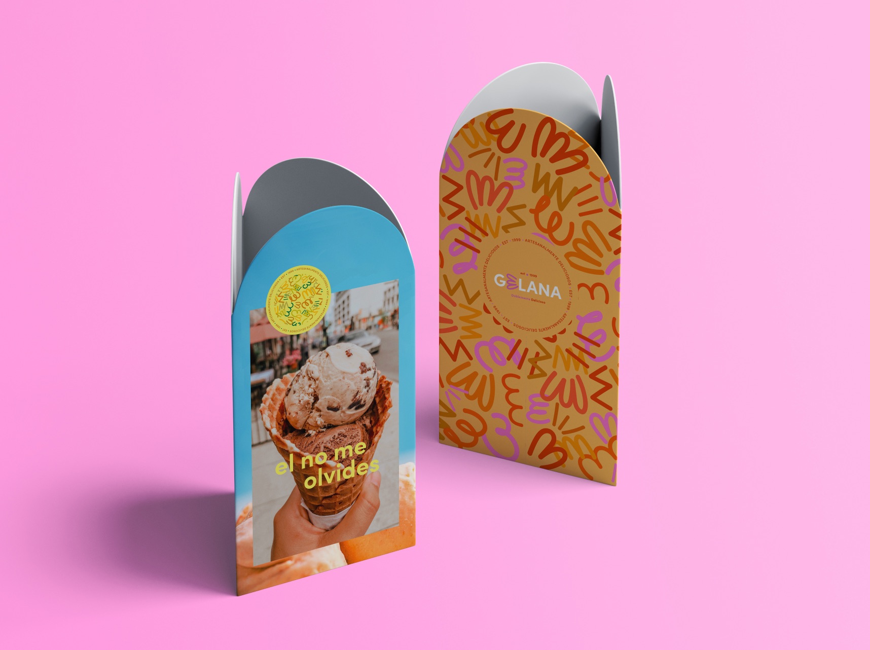
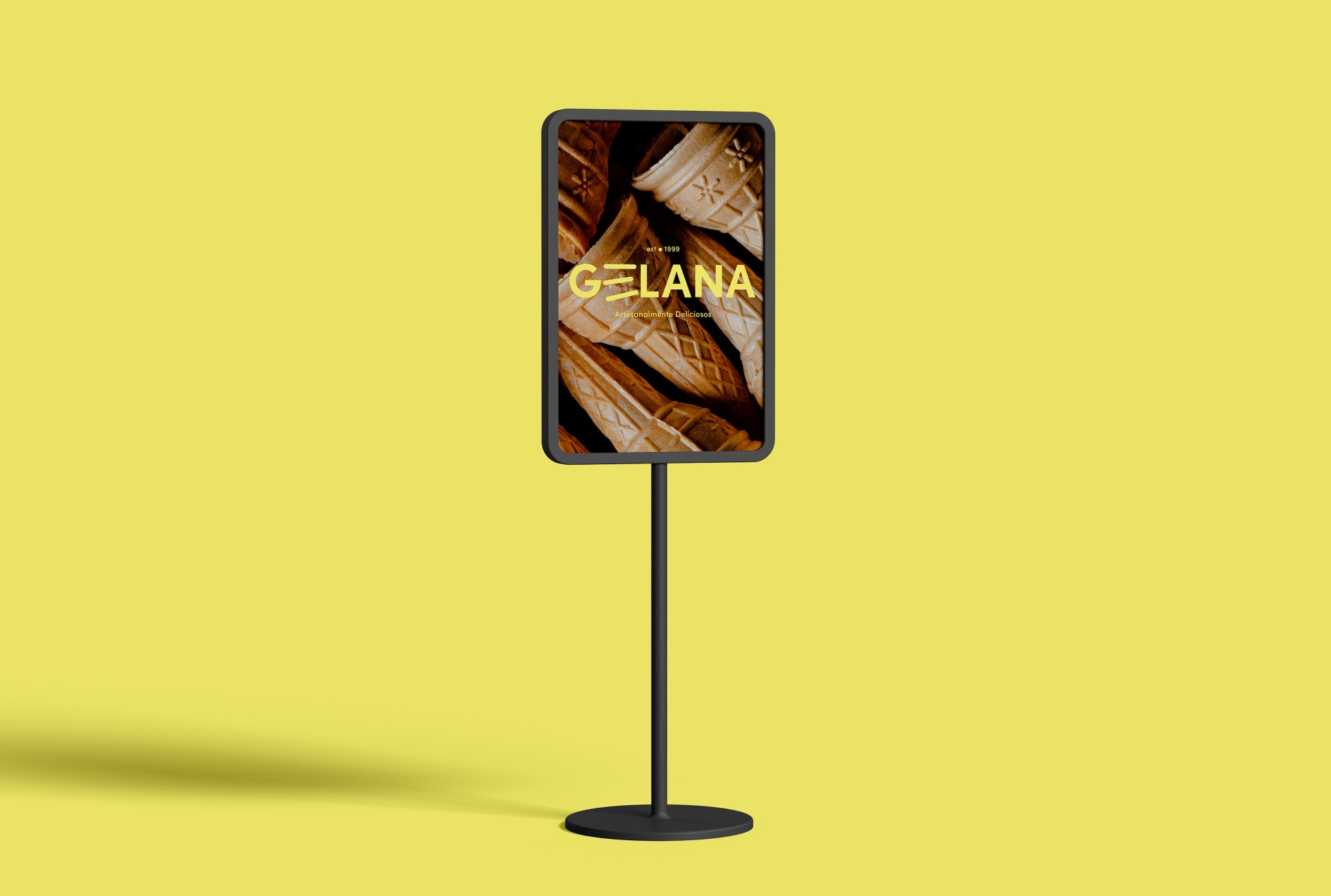
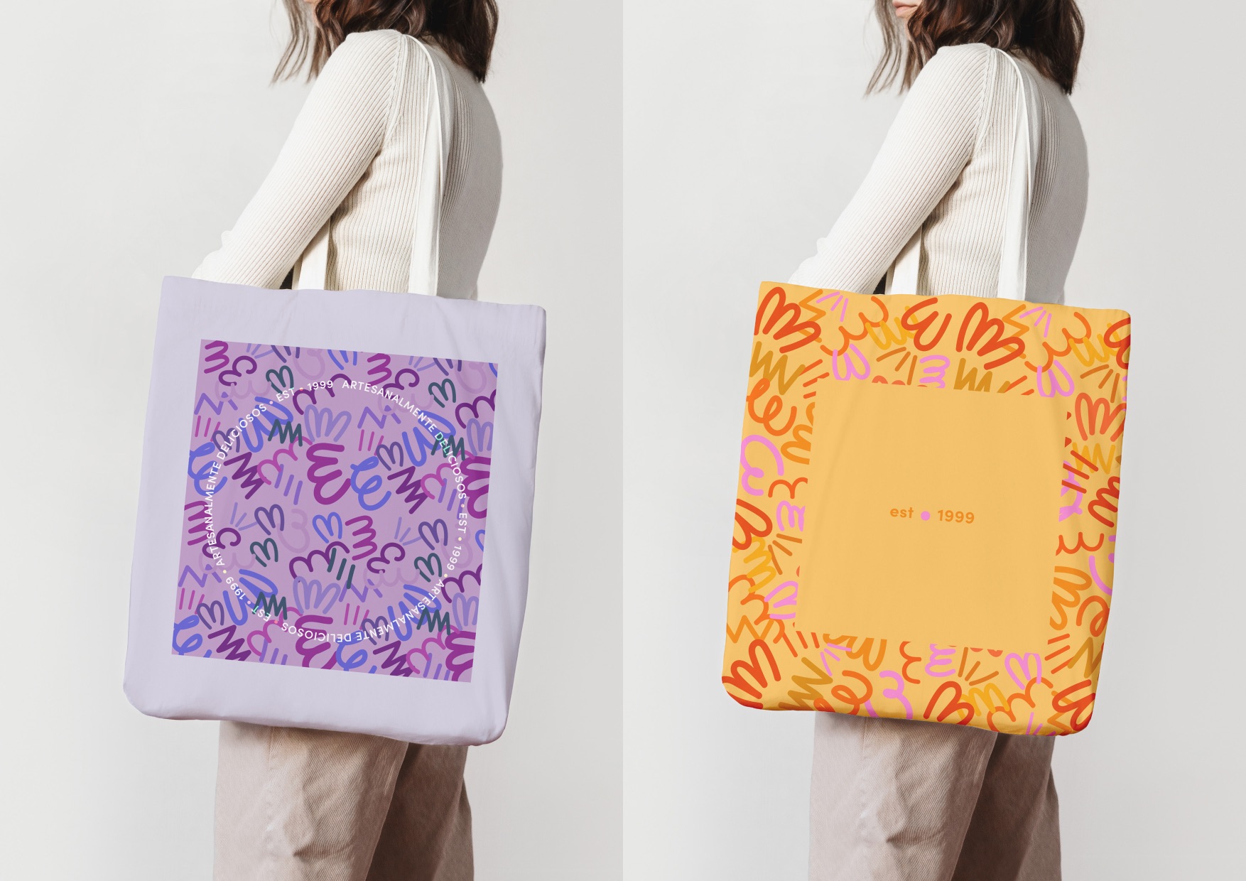
The design focused on abstract variations for the “e” in Gelana by creating a series of engaging, playful shapes to attract younger audiences and families. These shapes eventually became five individual patterns for different ice cream cup sizes and bigger packaging versions. It also includes a series of printed and digital rollouts such as indoor posters, table menus, tote bags, and a digital campaign on their social platform.
Being surrounded by such a diverse culture, I decided to convey the essence of Mexican humor in the ice cream names. As a result, customers would have a fun, engaging, and relatable experience while visiting the store, choosing their (most fun) flavor, and enjoying it in beautiful and colorful packaging to eat there or take away. For example, an ice cream accompanied by a piece of chocolate brownie would be called “the diet-breaker.” A deliciously handmade strawberry ice cream would be called “A thousand loves (El mil Amores),” referencing a classic film of The Golden Age of Mexican cinema. Thus, the illustration, color palette, and photography convey the mood of the local atmosphere, but the language plays an essential part in the design.
Gelana is a fun, relatable, meaningful design experience meant to support local consumption. However, it is not only for locals but also for people who want to have an exquisite ice cream experience and have a taste of Mexican humor.
CREDIT
- Agency/Creative: Miranda Mora Gutierrez
- Article Title: Gelana Ice Cream Brand Design Communication Concept
- Organisation/Entity: Student
- Project Type: Identity
- Project Status: Non Published
- Agency/Creative Country: Mexico
- Agency/Creative City: Mexico City
- Market Region: North America
- Project Deliverables: Brand Identity
- Industry: Food/Beverage
- Keywords: WBDS Student Design Awards 2021/22
-
Credits:
Educational Institution: Universidad Iberoamericana
Educator's Name: Frankie Ratford
Photographer: Amy Shamblen
Photographer: Dovile Ramoskaite
Photographer: Irene Kredenets
Photographer: Junel Mujar
Photographer: Kelsey Curtis
Photographer: Eva Elijas
Photographer: JJ Jordan
Photographer: Koolshooters
Photographer: Elza Kurbanova


